What is Japanese Mon (Family Crest)?什么是 Japanese Mon (Family Crest)?
Kamon distills eight centuries of Japanese heraldic discipline into a single circle — monochrome ink, radial symmetry, and negative space that speaks louder than any mark.家紋将八个世纪的日本纹章克制之道浓缩进一枚圆形——墨黑单色、放射对称,留白比任何笔迹都更响亮。
Japanese Mon (Family Crest) in briefJapanese Mon (Family Crest) 速览
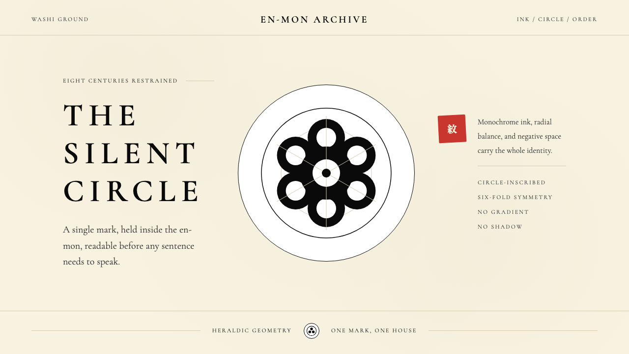
Kamon — Japanese family crests, literally 'family pattern' — form one of the world's most rigorous pre-modern mark systems. Over twenty thousand individual crests were developed across eight centuries to identify samurai clans, noble houses, merchant families, and theater troupes. Every kamon operates inside an invisible bounding circle called the en-mon, and every element within that circle is constructed from arc segments, radially balanced, and rendered in a single tone. The result is a mark that reads instantly at a distance, reproduces cleanly in any medium, and carries meaning without explanation.家紋——日本家族纹章,字面意义为「家族的纹样」——构成了世界上最严格的前现代标志体系之一。逾两万枚纹章历经八个世纪陆续发展,用于识别武家、公家、商家与歌舞伎屋号。每一枚家紋都在一个名为「圆紋」的隐形外框圆内运作,圆内一切元素皆由弧段构成、放射对称、单色呈现。其结果是一枚能在远处即刻辨识、在任何媒介上清晰再现、无需说明即能传递意义的标志。
The design language inherited from kamon is built on three interlocking disciplines. First, monochrome commitment: the palette is ink black on washi-paper cream, with a vermilion seal red appearing only for ceremonial impressions and a deep indigo used for warrior banner grounds. No gradations, no tonal variations — the crest is either marked or unmarked. Second, the circle as grid: the en-mon is not decoration but the underlying structural constraint that forces every motif — pine needles, chrysanthemum petals, paulownia leaves, triple hollyhock — into radial symmetry. Third, silhouette legibility: shapes are built as filled contours, not line drawings, so they remain identifiable even at the scale of a helmet badge or a wax seal.继承自家紋的设计语言建立于三项相互咬合的纪律之上。其一,单色承诺:色板为和纸米色底上的墨黑,朱红印泥仅用于仪典钤印,深蓝(绀色)则取自武家旗印底色。无渐变,无色调变化——纹章非黑即白,非留即印。其二,圆即格律:圆紋不是装饰,而是底层结构约束,它迫使每一种母题——松叶、菊瓣、桐叶、三葵——都进入放射对称。其三,剪影易读性:形态以填充轮廓而非线描构成,因此即便缩至头盔徽章或蜡封印章的尺寸,仍保持可辨识性。
What distinguishes kamon from other heraldic traditions — European quarterings, Chinese seal characters, Ottoman tughra — is the completeness of the self-imposed constraint. European heraldry accumulated complexity over generations, adding charges, supporters, and mottoes. Kamon moved in the opposite direction: each generation refined, simplified, and geometricized the motif further. A mid-period crest of the Tokugawa clan's triple hollyhock is more abstract, more perfectly balanced, and more immediately recognizable than its early variants. The discipline is not reduction for its own sake but reduction as intensification.家紋有别于其他纹章传统——欧洲盾徽分区、中国印章文字、奥斯曼帝国花押——之处在于自我施加约束的完整性。欧洲纹章学历代积累复杂性,不断添加纹饰、护盾兽与格言。家紋走向相反:每一代将母题进一步提炼、简化、几何化。德川氏三葵在中期的版本比早期变体更抽象、更完美均衡、更令人一眼难忘。这种纪律不是为减而减,而是以减促深。
See the Japanese Mon (Family Crest) design system查看 Japanese Mon (Family Crest) 完整设计系统
Where does Japanese Mon (Family Crest) come from?Japanese Mon (Family Crest) 从何而来?
The earliest kamon emerged during the Heian period (794–1185) as decorative motifs on ox-cart curtains and court robes used by the Kyoto aristocracy. These were not yet heraldic marks in any martial sense — they were aesthetic preferences, particular floral or geometric patterns associated with a household by custom rather than law. The paulownia (kiri) motif appears in Heian-era textiles connected to the imperial family; the chrysanthemum (kiku) was used by the court for centuries before it became the formal imperial crest. The step from decorative preference to identifying emblem happened gradually across the twelfth century as warrior clans rose to political dominance.最早的家紋出现于平安时代(794—1185年),以装饰纹样的形式出现在京都贵族的牛车帷幔与宫廷礼服上。彼时尚无任何武家纹章的意涵——它们是审美偏好,是某个家族约定俗成地与特定花卉或几何纹样的联结,而非法律规定。桐纹出现于与皇室相关的平安时代织物之中;菊纹在成为正式天皇家纹之前,已在宫廷使用数百年。从装饰偏好到识别标志的转变,在十二世纪武家兴起、执掌政权的过程中逐渐完成。
The samurai adoption of kamon transformed the aesthetic object into a functional communications system. In the chaotic cavalry battles of the Genpei War (1180–1185) and the subsequent Kamakura period, identifying friend from enemy at a distance became a matter of survival. Clan symbols were applied to flags (hata-jirushi), curtains (maku), and eventually armor. The constraint of battlefield legibility drove the system toward simplicity: a kamon that could be misread at fifty paces was a liability. This pressure produced the defining formal properties — large-scale radial symmetry, high-contrast silhouette, containment within a circle — that remained stable for six centuries afterward.武士对家紋的采用,将审美对象转变为功能性传播系统。在源平合战(1180—1185年)混乱的骑兵冲突及其后的镰仓时代,在远处辨识敌我成为生死攸关之事。氏族纹样被施于旗印、幔帐,最终绘入铠甲。战场辨识性的约束驱使体系走向简洁:一枚在五十步外可能被误读的家紋是致命弱点。这一压力催生了此后六个世纪保持稳定的形式特质——大尺度放射对称、高对比度剪影、圆形内切包含。
The Edo period (1603–1868) under Tokugawa rule was kamon's golden age of codification. Political stability and the rigid hierarchies of the sankin-kotai system made visual identification of clan affiliation socially and legally significant. The shogunate assigned specific crests to daimyo houses and regulated their use. Simultaneously, the rising merchant class (chonin) — legally excluded from samurai status — adopted kamon for their own houses, shops, and theater troupes, producing an explosion of new motifs drawn from commerce, craft, and popular culture. By the late Edo period, specialist kamon designers and comprehensive encyclopedias (such as the Bukan compendiums of daimyo crests) had turned the tradition into a structured visual vocabulary with its own grammar of combination and variation.德川幕府统治下的江户时代(1603—1868年)是家紋体系化的黄金时代。政治稳定与参勤交代制度的严格等级秩序,使家族归属的视觉识别在社会与法律层面都具有重要意义。幕府向诸藩大名分配特定纹章并规范其使用。与此同时,法律上被排除在武士身份之外的町人阶层,为自家店铺与歌舞伎屋号采用家紋,带来了从商业、工艺与民间文化中汲取的大量新母题。至江户后期,专业纹章设计师与综合性图录(如记录大名纹章的《武鑑》系列)已将这一传统构建为具有自身组合与变体语法的结构化视觉词汇。
The Meiji Restoration (1868) formally abolished the samurai class but accelerated kamon's influence on modern visual identity. The new government adopted the chrysanthemum crest for the imperial household and the paulownia for state instruments, giving kamon-derived marks a constitutional status. More broadly, the Meiji encounter with Western corporate branding revealed to Japanese designers that kamon had anticipated many principles that Western design theory was only beginning to articulate: the single-color mark, the contained geometric form, the abstraction of natural motifs into legible symbols. This recognition fed into the Showa-era logo design lineage, in which designers such as Yusaku Kamekura and Ikko Tanaka drew explicitly on kamon geometry to create corporate marks for brands including Nippon Design Center and the 1964 Tokyo Olympics.明治维新(1868年)在形式上废除了武士阶级,却加速了家紋对现代视觉识别的影响。新政府将菊纹赋予皇室、将桐纹赋予国家公器,使家紋衍生标志获得宪制地位。更广泛而言,明治时代与西方企业品牌形象的相遇让日本设计师意识到:家紋已预先解决了西方设计理论方才开始阐明的许多原则——单色标志、内切几何形态、将自然母题抽象为可读符号。这一认识汇入昭和时代的标志设计传承:龟仓雄策、田中一光等设计师明确援引家紋几何,为日本设计中心及1964年东京奥运会等创作出标志性视觉符号。
Contemporary relevance extends beyond Japan. The formal properties of kamon — radial symmetry, circle containment, monochrome discipline, silhouette legibility — align precisely with the constraints of contemporary digital iconography. App icons, favicon-scale logos, and single-color brand marks face the same legibility demands that kamon solved eight centuries earlier. Several contemporary global brands have arrived at kamon-adjacent solutions independently; the formal logic is that universal.当代的相关性已延伸至日本之外。家紋的形式特质——放射对称、圆形约束、单色纪律、剪影易读性——与当代数字图标设计的约束条件高度吻合。应用图标、极小尺寸的网站标志与单色品牌标志,面临的辨识性要求与家紋八个世纪前所解决的问题如出一辙。全球多个当代品牌已独立抵达与家紋近似的解决方案,这套形式逻辑具有如此普遍性。
What defines the Japanese Mon (Family Crest) look?Japanese Mon (Family Crest) 的视觉特征是什么?
Palette色板
The kamon palette is one of the most restricted in design history: ink black and washi cream are the only working colors. Vermilion appears as a ceremonial accent — the stamped seal impression — and a deep warrior indigo surfaces occasionally for background fields. No tonal gradation exists within any element; a mark is fully inked or entirely open ground. This binary commitment gives every composition an absolute clarity that survives reproduction at any scale, in any medium, in any era.家紋色板是设计史上最受限制的色板之一:墨黑与和纸米色是仅有的工作色。朱红作为仪典强调色出现——即钤印的印泥印迹——深绀色偶尔用于背景底面。任何元素内部都不存在色调渐变;纹章非满墨即完全留白。这种二元承诺赋予每幅构图绝对的清晰度,无论在何种尺度、何种媒介、何个时代,均能经受再现的考验。
Radial Symmetry放射对称
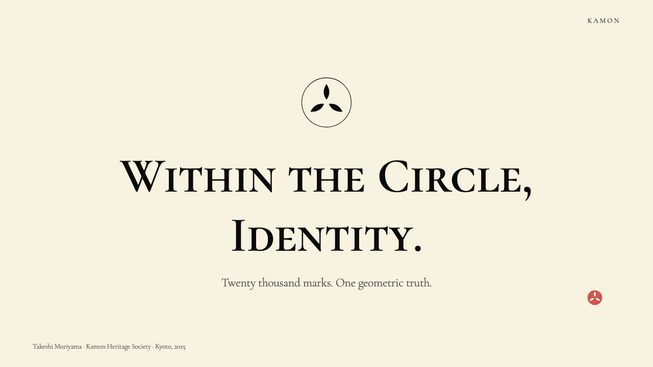
Every kamon is organized around a center point, with motif elements radiating outward in balanced intervals. The degree of rotational symmetry varies by crest type — a five-petal plum achieves five-fold symmetry, a triple-tomoe achieves three-fold — but asymmetric compositions are essentially absent from the tradition. This radial organization is not merely aesthetic: it encodes authority (the centered, balanced mark signals completeness and stability) and ensures that the crest reads identically from every approach angle.每一枚家紋都围绕一个中心点组织,母题元素以均等间隔向外放射。旋转对称的度数因纹而异——五瓣梅花实现五重对称,三巴纹实现三重对称——但非对称构图在这一传统中几乎不存在。这种放射组织不仅仅是审美选择:它编码了权威(居中、均衡的标志传达完整与稳定),并确保纹章从任何观察角度均以相同方式呈现。
Silhouette Construction剪影构成
Kamon forms are built as filled silhouettes and open counter-forms, never as outline drawings. A chrysanthemum petal is rendered as a solid ink shape, not as two inked lines with open fill. This silhouette discipline ensures that the mark functions as a single unified shape rather than a collection of strokes — it can be stamped, embroidered, lacquered, or woven without any ambiguity about what is figure and what is ground. Counter-shapes (the spaces between ink) are as carefully designed as the inked areas themselves.家紋形态以填充剪影与开放反形构成,而非轮廓线描。菊花花瓣呈现为实心墨色形态,而非两条勾线中间留白。这种剪影纪律确保标志作为单一统一形态而非一组笔划发挥作用——无论钤印、刺绣、漆绘还是织入布帛,图与底之间都毫无歧义。墨迹之间的反形(留白)与墨迹本身受到同等细心的设计。
The En-Mon Circle圆紋框架
The en-mon — the invisible or lightly ruled outer circle — functions as the grid, the bleed line, and the compositional law simultaneously. Every motif must be legible within it and must relate harmoniously to its curvature. The circle itself is not merely a frame: it is a statement of completeness. A kamon that overflows its circle or leaves its interior compositionally unresolved is considered formally incorrect. This circle-as-constraint is the kamon tradition's single most transferable design principle.圆紋——那个隐形或以细线标出的外框圆——同时充当网格、出血线与构图法则。每一种母题都必须在其内清晰可读,并与其曲率和谐呼应。这个圆本身不仅仅是边框:它是完整性的宣言。一枚溢出圆框或内部构图未能圆满解决的家紋,在形式上被视为不合格。圆框即约束,是家紋传统中可移植性最强的单一设计原则。
Negative Space as Signal留白即信号
In kamon design, the unprinted areas carry equal or greater communicative weight than the inked marks. Two crests built from identical motifs — say, three pine needles — can read as completely different marks depending on how their designers handled the counter-spaces between needles, between the motif and the circle edge, and at the geometric center. The tradition holds that a master designer can be recognized by the quality of the spaces, not the strokes. This principle runs directly counter to the Western instinct to define a mark by its positive form.在家紋设计中,未印墨之处所承载的传达重量等同于、甚至超过墨迹本身。两枚由相同母题构成的纹章——例如三枚松叶——根据设计者如何处理松叶之间、母题与圆边之间以及几何中心处的反形空间,可以呈现为截然不同的标志。传统认为,名家可从留白的品质而非笔划来辨认。这一原则与西方以正形定义标志的直觉恰好相反。
Motif Abstraction母题抽象化
Natural subjects — flowers, leaves, birds, crustaceans, celestial objects — are the raw material of kamon, but they are not rendered naturalistically. Each motif is abstracted to its essential geometric identity: a chrysanthemum becomes a radially perfect arrangement of identical petals, a crane becomes a silhouette whose wing geometry satisfies the circle constraint, a wave becomes a repeated arc pattern. The degree of abstraction increases over time within any given lineage. The most evolved kamon are so geometrically purified that their botanical or zoological origin is only recognizable to someone who already knows it.花卉、叶片、鸟禽、甲壳生物、天体——自然界的物象是家紋的原材料,但它们并非以写实方式呈现。每种母题被抽象至其本质的几何身份:菊花变为同等花瓣的放射完美排列,鹤变为翼部几何满足圆框约束的剪影,波浪变为重复弧形图案。在任何特定谱系内,抽象程度随时代推移而加深。最成熟的家紋在几何上已如此纯粹,其植物学或动物学起源只对已知晓者方可辨认。
Arc-Only Construction纯弧线构成
Traditional kamon craftsmen worked with a compass and a ruling circle as their only drawing instruments — no freehand strokes. Every edge in a kamon is therefore either a segment of a circle or the meeting point of two arcs. Straight lines, where they appear, are the limiting case of an arc with an infinitely large radius. This construction method is not merely historical procedure: it is the reason kamon forms feel mathematically resolved rather than drawn. The arc-only discipline connects kamon directly to classical Japanese geometry (wasan) and gives its forms an internal consistency that distinguishes them from superficially similar heraldic traditions.传统家紋工匠以圆规与定规圆为唯一绘图工具——不用徒手笔画。因此家紋中的每一条边缘,都是某一圆的弧段,或两段弧的交汇点。直线一旦出现,是半径无限大的弧的极限情形。这种构成方法不仅仅是历史性惯例:它正是家紋形态令人感到数学上圆满而非手绘的原因。纯弧线纪律将家紋与日本古典几何学(和算)直接相连,赋予其形式以内在的一致性,使之有别于表面相似的其他纹章传统。
See the Japanese Mon (Family Crest) design system查看 Japanese Mon (Family Crest) 完整设计系统
Who shaped Japanese Mon (Family Crest)?谁塑造了 Japanese Mon (Family Crest)?
Tokugawa Ieyasu unified Japan in 1603 and established the Edo shogunate that would govern for over two and a half centuries. His clan's crest — the mitsuba aoi, or triple hollyhock — became the most politically charged kamon in Japanese history, its use strictly regulated and its geometry refined over generations into a near-perfect radially symmetric form. The mitsuba aoi's evolution across the Edo period illustrates how political power drove formal refinement: each successive version is slightly more abstracted, more geometrically resolved, and more immediately identifiable than the last. The Tokugawa crest remains the canonical example used to teach kamon principles today.德川家康于1603年统一日本,建立了延续两个半世纪以上的江户幕府。其家族纹章——三叶葵——成为日本历史上政治含义最为深重的家紋,其使用受到严格规范,几何形态历代精进,臻至近乎完美的放射对称形式。三叶葵在江户时代的演变展示了政治权力如何推动形式精炼:每一个后继版本都比前一版本略为抽象、几何上更圆满、更令人一眼辨认。德川纹章至今仍是讲授家紋原则时使用的典范案例。
Oda Nobunaga, the great unifier who preceded Tokugawa, employed the mokko — a four-lobed form derived from the Chinese quince flower — as his primary crest. The mokko is remarkable in kamon history for its formal economy: four identical lobes meeting at a center point, with the counter-spaces between them as carefully balanced as the lobes themselves. Nobunaga's aggressive use of visual identity — applying his crest to banners, armor, and architecture on a scale unprecedented in Japanese warfare — established kamon as a strategic communications tool and accelerated the tradition's formalization. His period also saw some of the earliest known kamon encyclopedias commissioned to track and regulate the growing inventory of marks.先于德川的统一者织田信长以木瓜纹——源自中国木瓜花的四叶形——为主要纹章。木瓜纹在家紋史上以形式经济著称:四片相同的叶瓣交汇于中心点,叶瓣之间的反形空间与叶瓣本身同样精心均衡。信长以前所未有的规模将纹章施于旗帜、铠甲与建筑,将家紋确立为战略传播工具,并加速了这一传统的体系化。他的时代也见证了最早一批家紋图录的编撰,用以追踪并规范日益增长的纹章目录。
Yoshioka was a prominent Kyoto dyer and textile house whose family crest became associated with a particular standard of formal elegance in kamon application to fabric. The Yoshioka lineage's work represents the merchant-class expansion of kamon into commercial branding — demonstrating that the same formal principles that governed samurai heraldry could produce marks of equal sophistication for civilian houses. Their crests appeared on noren (shop curtains), fabric bolts, and packaging, in each case adapted to the specific reproduction constraints of the material. Their practice influenced the subsequent development of kamon as applied commercial mark rather than purely heraldic emblem.吉冈是一个著名的京都染织商家,其家族纹章与家紋应用于织物时的特定形式优雅标准相关联。吉冈家系的工作代表了家紋向商业品牌形象的町人阶层扩展——证明了支配武士纹章的同一形式原则,能为平民商家产生同等精致的标志。他们的纹章出现于暖帘(店铺门帘)、布匹与包装之上,在每种情况下都针对该材质的具体再现约束进行了适配。他们的实践影响了家紋作为应用商业标志而非纯粹纹章徽号的后续发展。
Niwa Motoji was a twentieth-century kamon researcher and cataloguer whose systematic documentation of the tradition produced some of the most comprehensive visual encyclopedias of Japanese family crests assembled in the modern era. His analytical work — which cross-referenced crests by geometric structure, motif category, and historical lineage — gave designers and historians a rigorous reference framework that had not previously existed in such organized form. Niwa's catalogues are a primary resource for contemporary designers working with kamon-derived visual systems, and his structural analysis of how crests are built from geometric primitives remains the standard framework for understanding the tradition's formal logic.丹羽基二是二十世纪的家紋研究者与目录编纂者,其对这一传统的系统性记录产生了现代所编撰的最为全面的日本家族纹章视觉图鉴。他的分析工作——按几何结构、母题类别与历史谱系交叉索引纹章——为设计师与历史学家提供了此前从未以如此有组织形式存在的严格参考框架。丹羽的目录是当代设计师使用家紋衍生视觉体系的基础资源,他对纹章如何从几何基元构建的结构性分析,至今仍是理解这一传统形式逻辑的标准框架。
Ikko Tanaka (1930–2002) was one of the twentieth century's most important graphic designers and a central figure in the lineage connecting kamon to modern Japanese visual identity. His work synthesized traditional Japanese visual vocabulary — including kamon geometry, ukiyo-e color logic, and the compositional principles of classical textile design — with the graphic design language of his contemporaries. His poster work for Nihon Buyo and other cultural clients demonstrated how kamon-derived formal principles — the circle as organizing constraint, radical reduction to silhouette, the expressive power of a restricted palette — could generate contemporary marks of international visual authority. Tanaka's practice established a design genealogy that Japanese designers continue to reference.田中一光(1930—2002年)是二十世纪最重要的平面设计师之一,也是联结家紋与现代日本视觉识别这一传承谱系的核心人物。他的工作将日本传统视觉词汇——包括家紋几何、浮世绘色彩逻辑与古典染织设计的构图原则——与同时代的平面设计语言融为一体。他为日本舞踊等文化客户创作的海报作品,展示了家紋衍生形式原则——以圆为组织约束、向剪影的根本性简化、有限色板的表现力——如何产生具有国际视觉权威性的当代标志。田中一光的实践建立了日本设计师至今仍持续援引的设计谱系。
How do you use Japanese Mon (Family Crest) today?今天怎么用 Japanese Mon (Family Crest)?
The kamon design system is among the most disciplined visual languages available to contemporary designers, and its transferability comes precisely from the specificity of its constraints. Applying it correctly means internalizing three non-negotiable conditions: monochrome commitment (one dark ink tone on a light ground, with the restricted palette functioning as an absolute structural rule, not a starting point for adjustment), circle containment (every compositional element oriented toward and resolved within a circular boundary), and silhouette logic (shapes defined by their filled area and counter-spaces, not by outline strokes). When these three conditions hold, the system produces work of immediate recognizability across any medium or scale.家紋设计系统是当代设计师可用的最具纪律性的视觉语言之一,其可移植性恰恰来自约束条件的具体性。正确应用它意味着内化三项不可妥协的条件:单色承诺(浅色底面上一种深色墨调,有限色板作为绝对结构规则而非可调整的起点)、圆形内切(每一个构图元素都朝向并在圆形边界内得到解决)、以及剪影逻辑(形态由其填充面积与反形空间界定,而非由轮廓描线界定)。当这三个条件成立时,无论在任何媒介或尺度上,系统都能产生即刻可辨的作品。
For presentation slides, the kamon system works best when it is applied with restraint across the full deck rather than used decoratively on a single cover. A cover slide benefits from a single large circle-inscribed mark — original or adapted from kamon geometry — centered or quarter-positioned on a washi-cream field, with a title set in clean, light-weight type at significant scale contrast below or beside it. The simplicity must be genuine, not performed: a cover that deploys the circular motif but crowds it with subtitles and logos violates the system's logic. Content slides should carry the circle motif as a navigational element — section dividers, data point markers, or a recurring small circle anchoring the slide's identifying information in one corner. Data slides translate well: circular charts are literal applications of the en-mon principle, and bar or comparative data visualizations can be reduced to monochrome with a single vermilion accent for the highlighted value.对于演示文稿,家紋系统在以克制姿态贯穿整套幻灯片时效果最佳,而非仅作装饰用于单张封面。封面幻灯片得益于一枚大型圆内切标志——原创的或改编自家紋几何的——居中或四分之一定位于和纸米色底面上,标题以简洁的细字重、在其下方或侧方以显著的尺寸对比排布。简洁必须是真诚的,而非表演性的:部署了圆形母题却被副标题与徽标挤满的封面违反了这套系统的逻辑。内容页应将圆形母题作为导航元素——章节分隔、数据点标记,或在幻灯片一角锚定识别信息的反复出现的小圆。数据幻灯片转化效果良好:圆形图表是圆紋原则的字面应用,条形或对比性数据可视化可简化为单色,以单一朱红强调色标注高亮数值。
For web interfaces, the kamon system suits dashboards, portfolio pages, and brand identity sites where authority and precision are primary values. The structural approach: a cream or off-white background field, near-black for all text and primary UI elements, circle motifs used as avatar containers, icon backgrounds, or state indicators. Navigation elements should be typographic and spare, with circle-enclosed numerals or initial letters serving as markers. Pricing pages work particularly well: each tier differentiated by a circle-inscribed symbol rather than by color variation, with the single accent color (vermilion or indigo) reserved for the recommended tier call-to-action. The system does not accommodate soft shadows, rounded-corner cards with blur effects, or gradient backgrounds — these violate monochrome discipline and should be replaced by clean borders and hard-edge dividers.对于网页界面,家紋系统适合仪表板、作品集页面与品牌识别网站,在权威性与精准感是核心价值的场景中尤为适用。结构方法:米白色或近白色背景底面,近黑色用于所有文本与主要界面元素,圆形母题用作头像容器、图标背景或状态指示符。导航元素应是字体性且节制的,以圆框数字或首字母作为标记。定价页面尤为适合:以圆内切符号而非色彩变化区分各等级,单一强调色(朱红或绀蓝)保留给推荐等级的行动号召。这套系统不容纳柔和阴影、带模糊效果的圆角卡片或渐变背景——这些违反单色纪律,应以简洁边框与硬边分隔线取代。
For editorial design and marketing materials, kamon's strength is its poster-quality legibility and the ceremonial weight that its formal restraint conveys. An editorial spread using kamon-derived principles would deploy a large circle motif as a visual anchor — section heading enclosed in a ruled circle, or a full-bleed circle in the washi tone as background for a pull quote. Marketing pages benefit from the system's inherent hierarchy: a hero section with a single large enclosed mark and minimal type, followed by content sections that alternate between ink-dark and cream-ground fields. The vermilion accent should appear once and decisively — a single call-to-action, a featured price, a key data point — not scattered across the page as decoration. Print collateral (letterheads, packaging, event programs) is where the system reaches its full potential, since the single-color constraint was historically designed for production on limited-color media.对于编辑设计与营销物料,家紋的优势在于海报级的视觉辨识度,以及其形式克制所传达的仪典分量。运用家紋衍生原则的编辑跨页,会将大型圆形母题作为视觉锚点——章节标题封入有线圆框,或以满版和纸色圆形作为引用段落的背景。营销页面受益于这套系统内在的层级结构:英雄区域以单一大型内切标志与极简文字呈现,随后内容区块在墨深底色与米色底色之间交替。朱红强调色应只出现一次且决断有力——单一的行动号召、精选的价格、关键数据点——而非作为装饰散落于页面各处。印刷品(信头纸、包装、活动节目册)是这套系统充分发挥潜力之处,因为单色约束在历史上本就是为有限色彩媒介的生产而设计的。
A common and fundamental mistake when working with kamon-derived aesthetics is treating the circle motif as a frame and filling it with unrelated decorative content — photography, gradients, or illustrative elements that break the silhouette discipline. The circle in kamon is not a container for other visuals; it is itself the visual. Equally damaging is the introduction of a second typeface or a third color in the name of hierarchy — in this system, all hierarchy is achieved through scale and weight within a single type treatment and a single ink color. Designers who have absorbed other minimalist traditions sometimes introduce generous white space and call it kamon; genuine kamon compositions are not sparse — they are precise. The difference is that every element, including every area of ground, is placed rather than left over.使用家紋衍生美学时最常见且最根本的错误,是将圆形母题当作边框,在其中填入无关的装饰内容——破坏剪影纪律的摄影、渐变或插图元素。家紋中的圆不是容纳其他视觉物的容器;它本身就是视觉物。同样有害的做法是以层级为由引入第二种字体或第三种颜色——在这套系统中,所有层级都通过单一字体处理与单一墨色内的尺度与字重变化来实现。有些吸收了其他极简主义传统的设计师有时引入大量留白并称之为家紋风格;真正的家紋构图并非稀疏——而是精确。区别在于:每一个元素,包括每一处底面区域,都是被放置的,而非被剩余的。
See the Japanese Mon (Family Crest) design system查看 Japanese Mon (Family Crest) 完整设计系统
Japanese Mon (Family Crest) — FAQJapanese Mon (Family Crest) · 常见问题
How is kamon different from other heraldic traditions like European coats of arms?家紋与欧洲盾徽等其他纹章传统有何不同?
The most fundamental difference is direction of development. European heraldry evolved toward increasing complexity — adding quarterings, charges, supporters, crests, and mottoes as families merged and alliances formed, until many coats of arms became visual catalogues of dynastic history. Kamon evolved in the opposite direction: toward greater simplicity, higher geometric abstraction, and more perfect radial symmetry. A kamon that has been in use for six centuries is typically more geometrically resolved than its earliest recorded form. European heraldry is cumulative and encyclopedic; kamon is reductive and purifying. The second major difference is medium: European heraldry was designed for polychrome reproduction on shields, banners, and seals, which made color a primary identifier. Kamon was designed for monochrome reproduction — lacquer, embroidery, textile weaving, ink stamping — which made shape and silhouette the only reliable identifiers.最根本的差异在于发展方向。欧洲纹章学朝向日益增长的复杂性演进——随着家族联姻与政治结盟,不断添加盾形分区、纹饰、护盾兽、头盔饰与格言,直至许多盾徽成为王朝史的视觉目录。家紋朝向相反的方向演进:走向更大的简洁性、更高的几何抽象度与更完美的放射对称。一枚使用了六个世纪的家紋,通常比其最早的记录形式在几何上更为圆满。欧洲纹章学是累积性和百科性的;家紋是减法性和纯化性的。第二项主要差异是媒介:欧洲纹章学为在盾牌、旗帜与印章上的多色再现而设计,使色彩成为主要识别手段。家紋为单色再现而设计——漆绘、刺绣、织物编织、墨水钤印——使形态与剪影成为唯一可靠的识别手段。
Can the kamon system work in a dark-background version?家紋系统能用于深色背景版本吗?
A dark inversion is historically authenticated: many kamon were rendered as white on black (known as kage-mon, or shadow crest), which reverses the ink-and-ground relationship while preserving the radial form and silhouette logic exactly. A contemporary dark-background application is therefore not a departure from the tradition but a known variant within it. The critical rule for the dark variant is that the inversion must be complete and binary: deep ink-dark background, near-white or cream mark, no intermediate tones. Introducing a warm cream background with a soft dark mark instead of a crisp near-white on deep black will produce something that looks neither authentically kamon nor authentically contemporary. The vermilion accent remains appropriate in dark versions — it was used on dark ground in warrior contexts — but indigo drops out since it becomes illegible against a dark field.深色反转在历史上有所依据:许多家紋以黑底白纹呈现(称为「陰紋」或「影紋」),在完整保留放射形态与剪影逻辑的同时,反转了墨与底的关系。当代深色背景应用因此不是对传统的背离,而是其内部一种已知的变体。深色变体的关键规则是:反转必须完整且二元——深墨暗色背景,近白或米色标志,无中间色调。以柔和暗色标志叠于温暖米色背景,而非以清晰近白标志置于深黑背景,产生的结果既不像真实的家紋,也不像真实的当代设计。朱红强调色在深色版本中仍然适用——它在武家语境中曾用于深色底面——但绀蓝应当去除,因为它在深色底面上会丧失辨识度。
What motifs are most transferable to contemporary design contexts?哪些家紋母题在当代设计语境中最具可移植性?
The most transferable kamon motifs are those with the highest degree of geometric abstraction — the tomoe (swirling comma forms), the kikko (tortoiseshell hexagonal lattice), and the shippo (interlocking circles) — because these are already non-representational and read as pure geometric pattern without requiring cultural knowledge of their origin. Botanical motifs (chrysanthemum, plum, paulownia) carry strong cultural associations within Japan that may not translate legibly in international contexts; used carefully, they signal sophistication and historical depth, but used carelessly, they risk reading as generic Asian decoration. The structural principle — a radially symmetric form contained within a circle, built from consistent arc-segment geometry — is always more transferable than any specific motif, and original marks derived from this principle tend to read more freshly than direct quotations of historical crests.最具可移植性的家紋母题是几何抽象程度最高的那些——巴纹(涡旋勾玉形)、龟甲(六边形龟壳格网)与七宝(连环圆形)——因为这些本已是非具象的,无需了解其起源的文化知识便可作为纯几何图案阅读。植物母题(菊、梅、桐)在日本境内承载着强烈的文化联想,这种联想在国际语境中未必能清晰传递;谨慎使用时,它们传达精致感与历史深度,但随意使用时,则有被解读为泛亚洲装饰的风险。结构原则——圆形约束内的放射对称形态,由一致的弧段几何构成——始终比任何具体母题更具可移植性;从这一原则衍生的原创标志,往往比直接引用历史纹章的作品显得更为鲜活。
How does kamon handle typography, and what type approach fits the system?家紋如何处理字体排印?什么样的字体处理方式与这套系统相匹配?
Historical kamon does not incorporate letterforms — the mark system is entirely visual and non-verbal by design. When applying kamon principles to contemporary design that requires text, the guiding principle is that type should behave as a kamon element: structured, balanced, and making use of negative space. In practice, this means clean geometric or humanist sans-serif letterforms (not decorative, not calligraphic), set in a single weight and size hierarchy against the washi ground, with generous spatial intervals between elements. Japanese settings pair the kamon marks naturally with Mincho or geometric gothic type. Latin settings work with type that shares the arc-geometry sensibility — letterforms where the curves have architectural precision rather than calligraphic flow. Type should never compete with the circle mark for visual dominance; the mark is primary, the type is secondary.历史上的家紋不包含文字字形——这套标志体系在设计上完全是视觉性的、非言语的。在将家紋原则应用于需要文字的当代设计时,指导原则是:文字应像家紋元素一样运作——结构化、均衡,并善用负空间。在实践中,这意味着在和纸底面上以单一字重与尺寸层级排布简洁的几何或人文主义无衬线字形(而非装饰性或书法性字形),元素之间保持充裕的空间间隔。日文排版中,家紋标志与明朝体或几何哥特体自然相配。拉丁文排版与具有弧线几何感性的字体相匹配——那些曲线具有建筑精准度而非书法流动感的字形。文字绝不应与圆形标志争夺视觉主导权;标志是主体,文字是从属。
Is kamon appropriate for Western or non-Japanese brands, or does it carry too much cultural specificity?家紋适合西方或非日本品牌使用吗?还是说它承载了过多的文化特殊性?
The question is whether a designer is applying the formal principles of kamon or appropriating specific historical crests. Applying kamon formal principles — radial symmetry, circle containment, monochrome discipline, silhouette logic — to original visual marks is a legitimate design act and one that produces results with universal legibility. The formal logic is not culturally proprietary; it is a set of geometric and compositional constraints that happen to have been developed to their highest refinement in Japan. Directly reproducing the Tokugawa triple-hollyhock or the imperial chrysanthemum for a non-Japanese brand, on the other hand, would be appropriative and likely to generate confusion or offense. The practical boundary is: derive from the system's logic, not from its specific historical marks. A brand that develops an original radially symmetric circle-inscribed mark using arc-only geometry is working in the kamon tradition; a brand that reproduces Tokugawa's specific crest is not.问题的关键在于设计师是在应用家紋的形式原则,还是在挪用特定的历史纹章。将家紋形式原则——放射对称、圆形内切、单色纪律、剪影逻辑——应用于原创视觉标志,是合法的设计行为,且能产生具有普遍易读性的结果。这套形式逻辑不是文化专有财产;它是一套几何与构图约束,恰好在日本被发展至最高程度的精炼。另一方面,将德川三叶葵或天皇菊纹直接用于非日本品牌,则构成挪用,并可能引发困惑或冒犯。实践边界是:从这套系统的逻辑中推导,而非从其具体的历史纹章中照搬。一个使用纯弧线几何开发出原创放射对称圆内切标志的品牌,是在家紋传统中工作;直接复制德川特定纹章的品牌则不然。
Related design styles相关设计风格
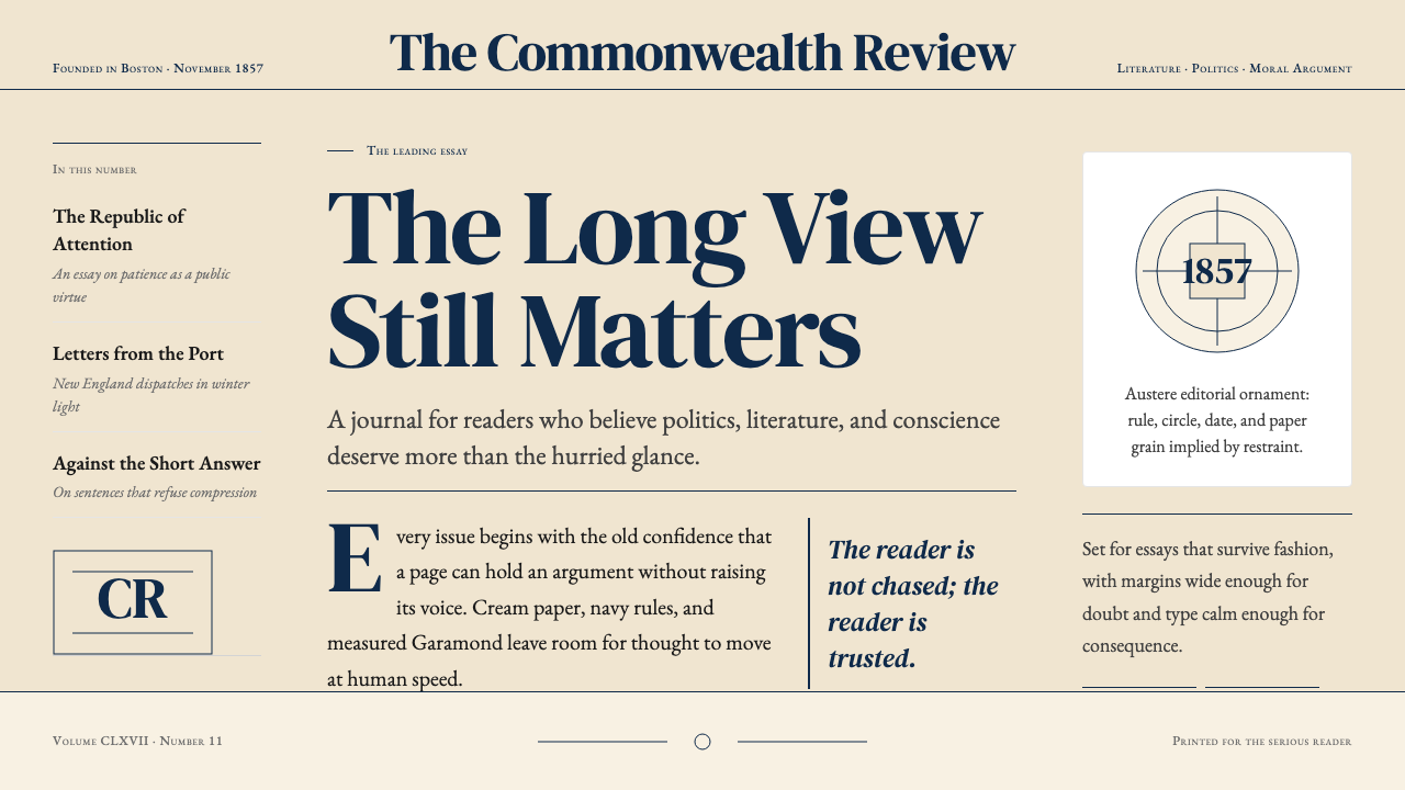 The Atlantic MonthlyAuthority slows down. Navy Garamond on warm cream, ruled like an essay page.权威主动放慢:米色纸底、海军蓝Garamond与细栏线。
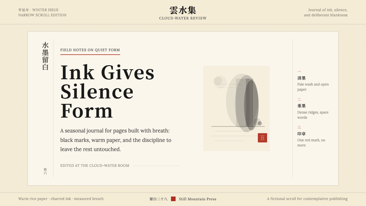 Chinese Ink Wash 水墨A thousand years of restraint. Six tones of ink on rice-paper warmth, a singl…千年单色绘画的精髓:墨分六彩、宣纸暖白底色、一抹印泥红作落款——留白即意。
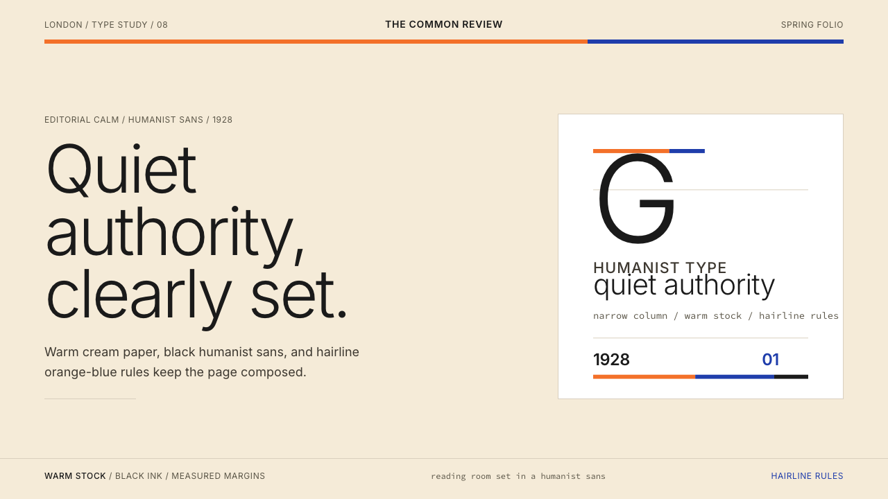 Gill Sans (BBC, 1928)Quiet authority, clearly set. Warm cream, black humanist sans, and hairline o…安静而权威。奶油底、黑色人文无衬线与橙蓝细线。
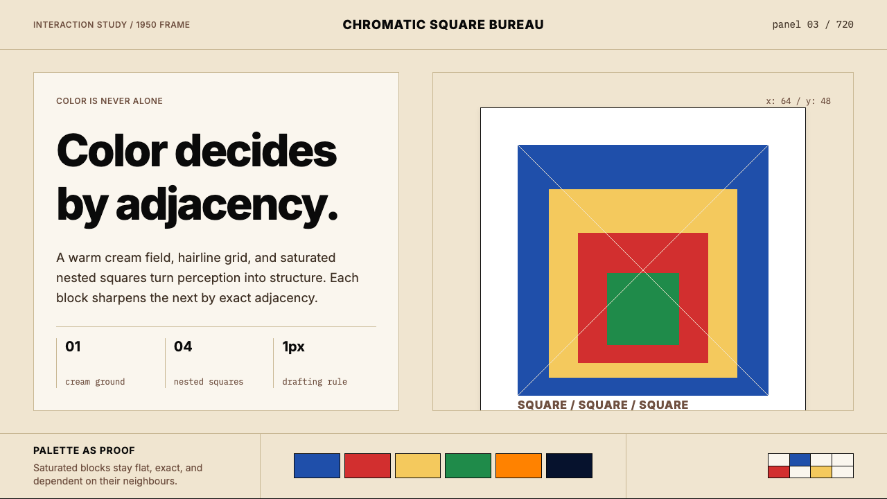 Josef Albers — Homage to the SquareColor becomes event. Warm cream, cobalt-red-yellow nested squares, exact hair…色彩成为事件。暖米底、钴蓝红黄嵌套方块与精确发丝线。
 Dieter Rams / BraunQuiet by design. Warm gray, white panels, hairline grids, and one earned gree…安静即设计:暖灰、白面板、细网格,只留一枚绿色指示点。
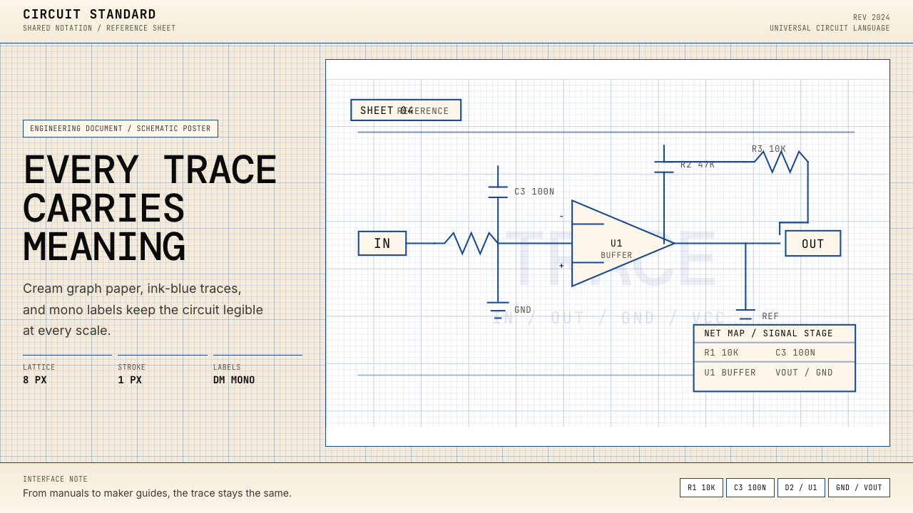 Electrical Schematic WiringAustere and exact. Cream graph paper, ink-blue traces, and mono labels make e…克制而精确。奶油方格纸与墨蓝细线,让每个标签都准确发声。