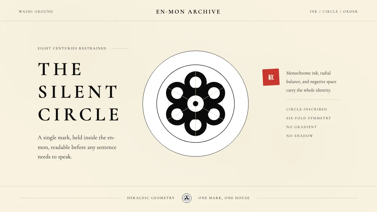
About Japanese Mon (Family Crest)
Kamon is Japan's pre-modern logo system — over 20,000 single-tone, circle-inscribed crests refined across eight centuries to mark samurai clans, merchant houses, and theater troupes. Every kamon is a self-contained mark, mathematically balanced inside an invisible en-mon circle, readable from horseback at fifty paces.
This design system inherits the discipline: monochrome ink, washi-paper cream ground, radial symmetry, and silhouettes built from circle-arcs only. No shading, no gradient, no asymmetry — the circle is the grid, and restraint is the entire vocabulary.
- Origin
- Japan (Kyoto and Edo)
- Era
- 1100s onward (Heian); samurai dominance 1200–1600; merchant adoption 1600–1868; 20,000+ catalogued
- Key figures
- Tokugawa Ieyasu · Oda Nobunaga · Kyō Yoshioka · Niwa Motoji
- Movements
- samurai clan heraldry · Meiji heraldry codification · Showa logo-geometry lineage
Japanese Mon (Family Crest) design spec
Colors
Typography
The other 11 sections — buttons, cards, spacing, motion, techniques and more — open once you unlock. Download the DESIGN.md or send it to your AI in one click. Unlock once, yours forever.
Sign up nowStyles similar to Japanese Mon (Family Crest)
Also inspired by crafts & folk art, with a close feel.
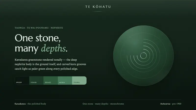 Pounamu Greenstone MonoOne stone, many depths. Tonal kawakawa greenstone, carved koru grooves catching paler light.
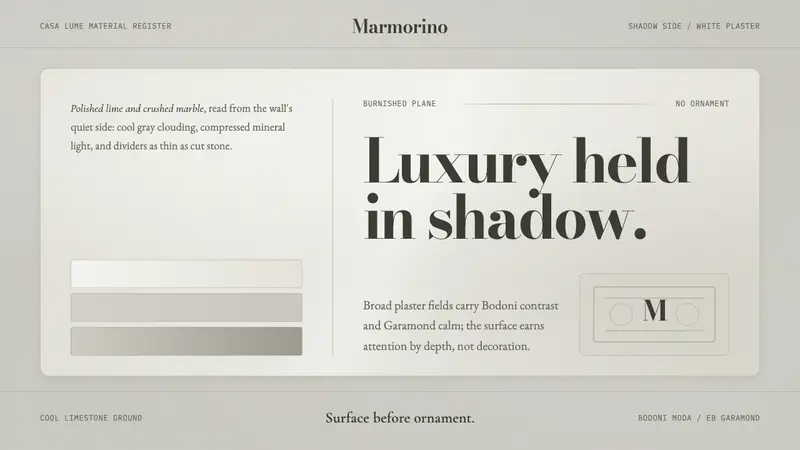 Venetian Plaster WhiteQuiet luxury in cool shadow. Bodoni type rests on clouded gray plaster planes.
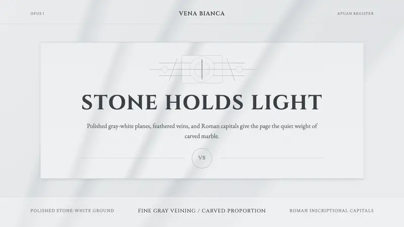 Carrara MarbleLuxury in restraint. Cool stone-white fields, feathery gray veins, and Cinzel capitals.
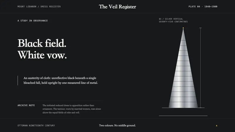 Druze Mount Lebanon DressAusterity becomes luxury. Matte black, a bleached-white fall, and one silver vertical hold the frame.