What is Bodoni Didone Fashion Masthead?
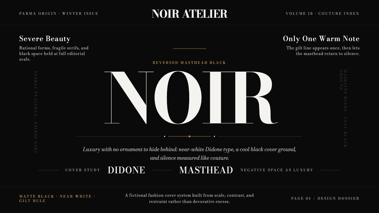
Bodoni Didone turns luxury into black silence: white hairline type, microscopic coverlines, a gilt rule, and enough emptiness to make every mark feel deliberate.
Bodoni Didone Fashion Masthead in brief
Bodoni is Giambattista Bodoni’s Parma type of around 1798, later codified in the posthumous 1818 Manuale Tipografico. It is the defining Didone, built on extreme contrast between thick and thin strokes, flat unbracketed hairline serifs, and a strictly vertical axis. The result is cool, rational, and severe: a modern serif that abandons the softer calligraphic movement of old-style type.
Its contemporary identity is inseparable from luxury fashion publishing. White Bodoni reversed out of a solid black ground became the visual face of Vogue and Harper’s Bazaar, turning a typeface into an editorial signal. The masthead is not merely a title; it is the dominant object on the cover, carrying authority through proportion, contrast, and restraint.
The system is organized around a small number of highly controlled gestures: an oversized reversed logotype, tiny coverlines opened with generous tracking, a single gilt hairline, and negative space treated as a material of value. Nothing is casual. The black field creates silence, the white type creates incision, and the gold rule supplies a controlled glint rather than decorative richness.

Where does Bodoni Didone Fashion Masthead come from?
The type began in Parma, Italy, where Giambattista Bodoni developed the face around 1798. Its construction marked a decisive break with the old-style calligraphic serif. Instead of allowing the letterform to suggest the movement of a broad-nib pen, Bodoni made contrast itself the subject: vertical stress, sharply differentiated strokes, and serifs reduced to flat hairlines.
The posthumous 1818 Manuale Tipografico gave the design its durable historical definition. The manual established Bodoni not as a loose impression but as a disciplined typographic system whose character could be recognized through its formal logic. Its rational severity made it a monument of Enlightenment printing, where order, clarity, and controlled contrast carried cultural force.
The type’s later life changed its emotional register without abandoning its structure. In twentieth-century fashion publishing, Bodoni moved from the history of printing onto the magazine cover. The black ground, reversed white masthead, diminutive coverlines, and carefully isolated metallic accent transformed its cool modernity into a language of luxury.
That rebirth belongs to the editorial worlds of New York and Paris, and the style’s key-figure lineage includes Alexey Brodovitch and Diana Vreeland alongside Bodoni himself. Their place in the system signals that the fashion masthead is not simply a font choice. It is a coordinated editorial atmosphere in which typography, silence, hierarchy, and cultural confidence operate as one surface.
What defines the Bodoni Didone Fashion Masthead look?
Extreme Contrast
Bodoni’s identity begins with the dramatic difference between heavy vertical stems and fragile hairlines. This contrast should remain visible even when the type is used quietly. Large display words gain their authority from the tension between strength and disappearance; small text must be protected from clutter so its fine structure remains legible.
Vertical Axis
The letterforms stand upright with a strict vertical stress. This gives the type a composed, almost architectural poise. Layouts should support that stability through clean alignment and restrained movement. Slanted compositions, loose rotation, and playful distortion weaken the disciplined character that separates Didone from more calligraphic serif traditions.
Hairline Serifs
The serifs are flat, unbracketed, and sharply detached from the main strokes. They do not flow into the stem through a soft transition; they terminate it. In a luxury masthead, these hairlines read almost like drawn rules, making the boundary between letter and ornament unusually precise.
Black Ground
Black is not treated as a neutral background but as an active field of silence. It absorbs incidental detail and gives the masthead room to dominate. A rich black ground also makes every light element feel intentional, so additional panels, textures, and tonal effects should be avoided unless they perform a clear editorial function.
Reversed White Type
White Bodoni against black creates the system’s signature incision. The reversal should feel clean and severe, with no haze around the letterforms and no attempt to soften their thin strokes. White is the voice of the masthead; it should not be diluted by competing bright colors or crowded supporting text.
Editorial Scale
The masthead is oversized and treated as an image as much as a word. Coverlines are deliberately tiny by comparison, creating a hierarchy based on scale rather than decoration. This contrast allows the page to feel both abundant and empty: the title occupies the visual field while the surrounding information remains discreet.
Gilt Restraint
Gold appears as a controlled glint, most convincingly through a single hairline rather than a broad metallic treatment. Its purpose is to mark distinction and finish the composition, not to compete with the white masthead. The restraint matters: once gold becomes a field, texture, or repeated ornament, the silence of the black ground is lost.

Who shaped Bodoni Didone Fashion Masthead?
Bodoni created the Parma type around 1798 and gave the Didone tradition its defining formal severity. The type’s extreme thick/thin contrast, flat hairline serifs, and vertical axis turn his name into a complete visual grammar rather than a historical attribution. The 1818 Manuale Tipografico, published after his death, codified that grammar and preserved the design as a monument of Enlightenment printing.
Alexey Brodovitch belongs to the style’s twentieth-century fashion-publishing lineage. His inclusion in this system marks the moment when Bodoni’s rational severity became part of an editorial language built for the cover: black silence, a commanding masthead, discreet supporting text, and space used as a sign of confidence. The association connects historical type design with the cultivated atmosphere of New York and Paris fashion publishing.
Diana Vreeland is another named figure in the fashion-publishing afterlife of Bodoni Didone. Her place in the lineage reinforces that the style operates at the level of editorial identity, not isolated lettering. Bodoni becomes powerful when the entire cover adopts its discipline: severe contrast, controlled hierarchy, a sparse accent, and enough negative space for the publication to appear assured rather than overworked.
How do you use Bodoni Didone Fashion Masthead today?
For presentation slides, use the style most decisively on the cover. Set a large white Bodoni masthead or title against a solid black field, then let a narrow gilt rule establish the only metallic note. On content slides, reduce the display scale and keep supporting text quiet, using generous empty areas to separate sections. Data slides benefit from the same hierarchy: a dominant title, restrained labels, and charts treated as clean editorial evidence rather than colorful decoration.
For web dashboards and pricing pages, Bodoni Didone works best when the product wants to communicate luxury, exclusivity, or a highly curated point of view. Use the black ground to establish a strong surface, reserve white for primary headings and essential values, and keep secondary labels small and widely spaced. Pricing tiers can be separated through editorial hierarchy and a restrained gold accent, but the interface still needs clear contrast and practical reading order beneath the fashion surface.
For editorial and marketing work, the style is naturally suited to magazine covers, campaign landing pages, luxury announcements, product launches, and brand stories. Treat the headline as a visual object, keep body copy narrower and quieter, and allow the composition to breathe around the message. A single rule can divide sections or signal a premium detail. The strongest result feels composed before it feels decorated.
In a brand system, the masthead can become the fixed anchor while imagery, headlines, and supporting information change around it. Black, white, and restrained gold provide a disciplined container for photography or product detail. Keep the type-led identity consistent across cover, campaign, and interface states so the audience recognizes the editorial voice even when the content changes.
The common mistake is confusing luxury with accumulation. Adding several gold treatments, multiple display typefaces, oversized ornaments, glossy gradients, or dense coverlines destroys the very scarcity that gives the style its authority. Another failure is using delicate Bodoni text at small sizes without enough contrast or space. The system depends on fewer decisions, sharper hierarchy, and generous silence.

Bodoni Didone Fashion Masthead — FAQ
Is Bodoni Didone simply a fashionable serif typeface?
No. Its fashion identity is powerful, but its structure predates the magazine cover. Bodoni was developed in Parma around 1798 and codified in the 1818 Manuale Tipografico as a defining Didone: extreme thick/thin contrast, flat unbracketed hairline serifs, and a vertical axis. Fashion publishing gave that rational system a new emotional role, turning severity into luxury.
Does the style require a black background?
The defining fashion-masthead version does. The approved system is built around white Bodoni reversed on solid black, with tiny coverlines, a gilt hairline, and negative space treated as luxury. A lighter variation can preserve the typeface, but it changes the emotional center. Without the black field, the design loses much of its silence and begins to read as historical typography rather than the full fashion-publishing language.
Why are the supporting coverlines so small and widely spaced?
Their small scale protects the masthead’s authority. The cover is not meant to give every message equal visual volume; it establishes a dominant title and lets supporting information remain discreet. Wider spacing slows the reading rhythm and gives delicate letterforms room to remain distinct. The effect is editorial rather than utilitarian: information is present, but it does not interrupt the atmosphere.
What role does the gilt hairline play?
It supplies distinction without adding another visual subject. Against black and white, the gilt line behaves like a precise glint that marks a boundary, separates editorial zones, or closes the composition. Its value depends on rarity. If gold becomes a repeated border, broad surface, or decorative texture, it stops functioning as a signal of refinement and becomes visual noise.
Where does Bodoni Didone struggle?
It struggles when a product needs warmth, informality, or dense everyday utility. The severe contrast, black ground, and fashion-editorial hierarchy naturally communicate curation and distance. They are persuasive for luxury campaigns, covers, launches, and selective interfaces, but can feel cold when the experience depends on friendliness, casual conversation, or constant scanning. The style should be chosen when its restraint matches the product’s desired character.
Related design styles
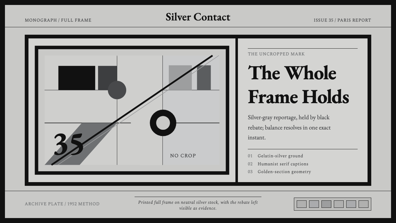 Cartier-Bresson Decisive MomentNever cropped. Silver-gray tonality is locked by a dead-black film rebate.
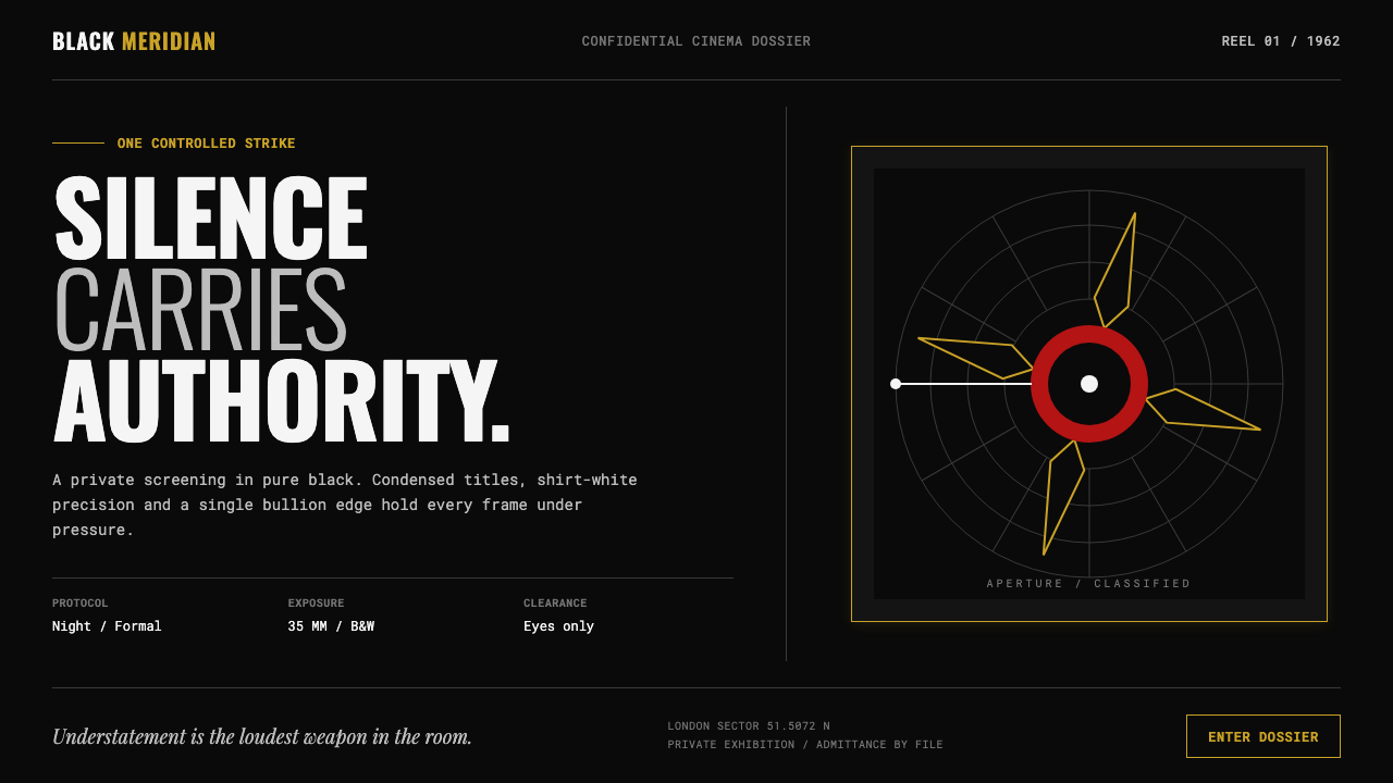 James Bond 007 (1962)Understatement carries authority. Pure black, condensed white type and one pr…
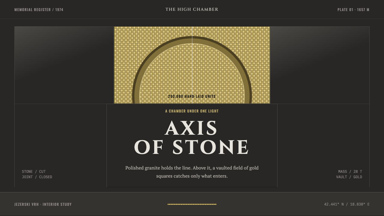 Njegoš MausoleumGravity is the ornament. Dark granite meets a strict axis and a vault of disc…
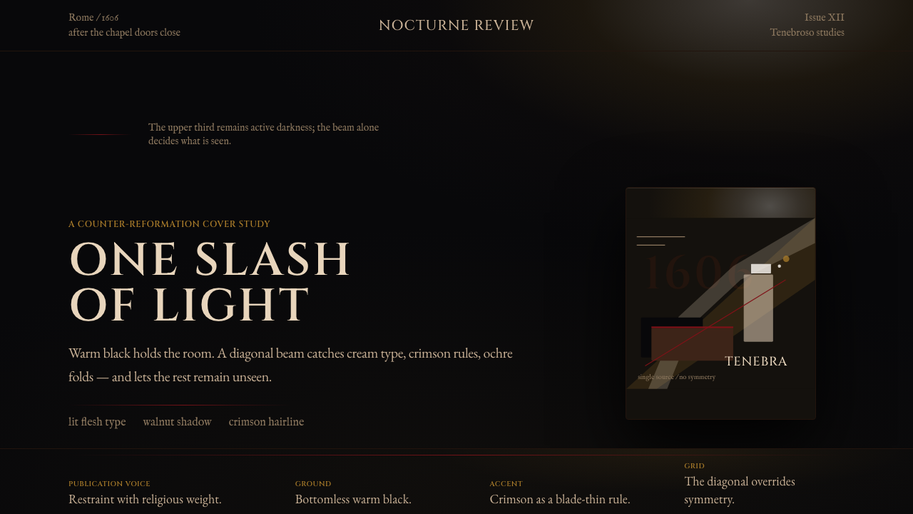 Caravaggio TenebrismDarkness acts first. Warm-black voids, Cinzel capitals, and one ochre raking…
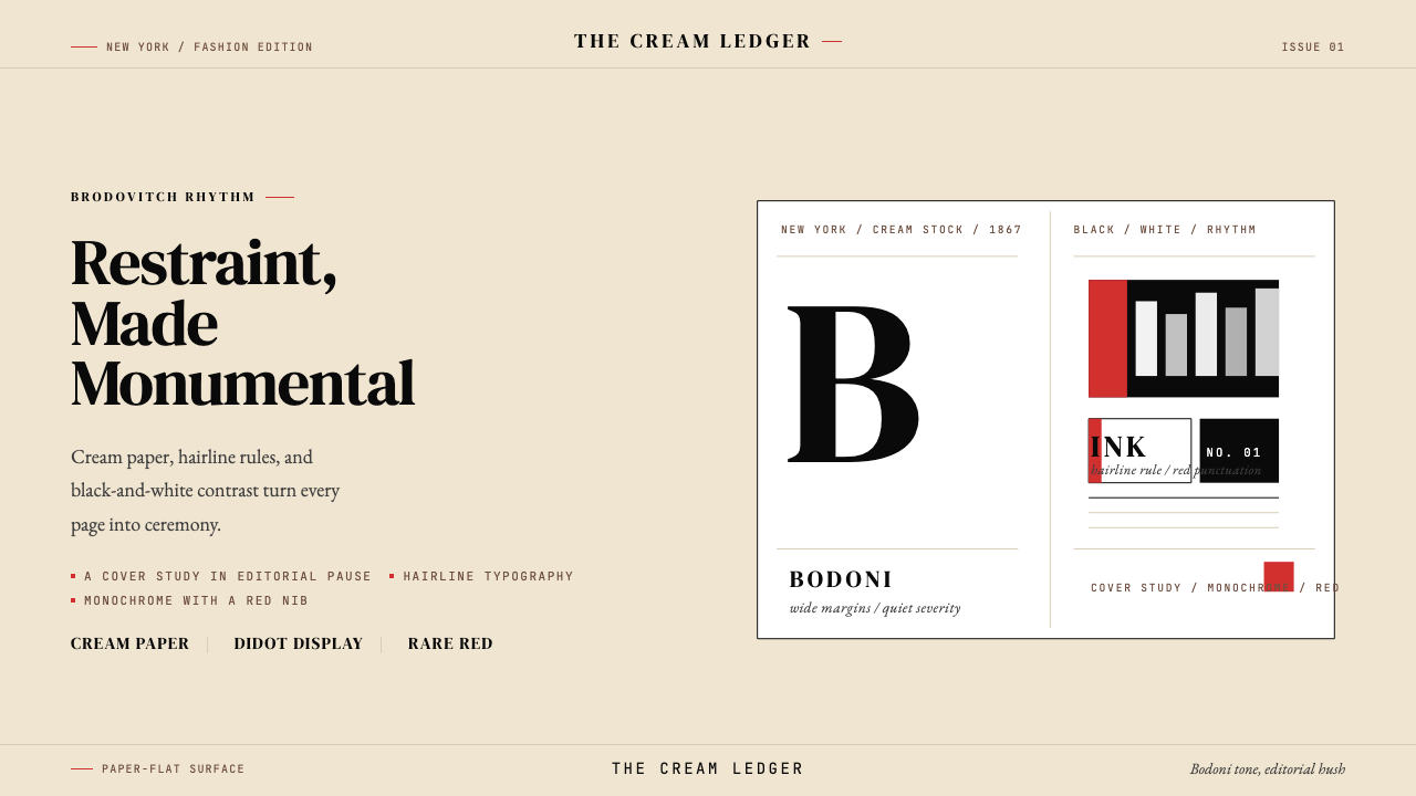 Harper's BazaarLuxury through restraint. Cream paper, Didot scale, and hairline rules carry…
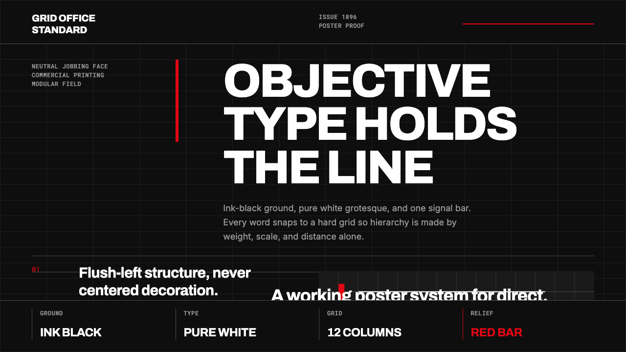 Akzidenz-Grotesk BertholdObjectivity in black ink. White grotesque type, hard grid, one rationed red b…