What is Njegoš Mausoleum?
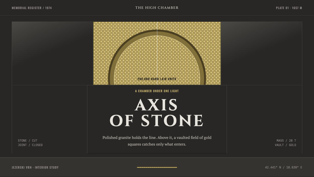
The Njegoš Mausoleum style makes a burial chamber into a design language: dark polished granite, a strict central axis, and a vault of thousands of discrete gold squares in which gravity does the work of ornament.
Njegoš Mausoleum in brief
The Njegoš Mausoleum style is a dark, monumental design language taken from a single room: the burial chamber of Petar II Petrović-Njegoš, cut into the summit of Jezerski Vrh on Mount Lovćen in Montenegro, at 1,657 metres above sea level. The chamber's walls are close-jointed polished granite. Its barrel vault is covered with more than 200,000 Italian mosaic tesserae in gold. On the centre line, under an eagle, sits a 28-ton figure of Njegoš carved from one block of black granite.
The design system takes the room literally. Dark stone is the ground plane. Gold appears only where the vault would be, and never as a smooth sheen. It is always rendered as thousands of discrete square units, so that the eye can see it was set piece by piece. Everything is axial, symmetrical and heavy. Boundaries are straight cuts, joints are narrow and tight, and light arrives from one direction and stops where the stone begins.
The motto that sums it up is that gravity is the ornament. There are no flourishes, no soft glows, no decorative borders. Weight, alignment and the contrast between dark mass and a small area of gold supply all the drama. The result is solemn, ceremonial and calm, and it makes any layout built on it feel like a place one enters rather than a surface one scrolls.
Where does Njegoš Mausoleum come from?
Petar II Petrović-Njegoš was the nineteenth-century Prince-Bishop and poet of Montenegro, and his tomb is among Montenegro's major memorial sites. It lies in the mountains of Lovćen National Park above Cetinje, on the summit of Jezerski Vrh. Choosing a mountaintop for a burial place gave the monument a natural stage: a bare ridge and open sky, with the architecture meant to hold its own against them.
The mausoleum was conceived by the sculptor Ivan Meštrović and belongs to two overlapping traditions: Yugoslav monumental sculpture and late-modern memorial architecture. Both favour mass over detail and symbol over narrative. The design is dated to 1970, and the mausoleum was completed and opened in 1974. Rather than building a structure and placing a room in it, the project cut a burial chamber directly into the rock of the summit, and finished its walls in close-jointed, polished granite.
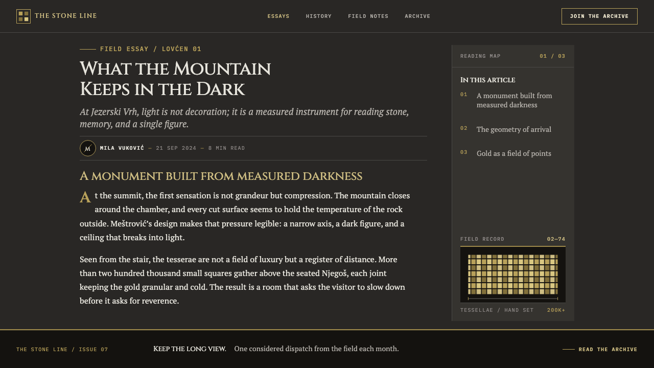
The vault is the room's single extravagance. Above the granite walls, the barrel vault is roofed in more than 200,000 gold mosaic tesserae of Italian make. It is a classic case of an old craft used for a modern memorial: the gold is not a coating but a field of small square units, each catching light slightly differently, which is why the vault glows rather than gleams. Beneath it, on the centre line, Njegoš sits in black granite under an eagle, a single 28-ton block that anchors the entire interior.
The contrast between outside and inside completes the design. Outside, the same kind of stone weathers to a pale grey against the bare limestone ridge. Inside, the only light is the gold of the vault. The style inherits this double character: a cold, weathered, mineral exterior and a warm, small, concentrated interior. It reads as an architecture of procession toward a single figure, symmetrical on its axis, in which every surface is subordinate to weight and to one controlled source of light.
What defines the Njegoš Mausoleum look?
Dark Granite Ground
The ground is a dark stone tone, deep and slightly cool, with the quiet density of polished granite. It is the floor and walls of the page, not a backdrop. Surfaces are matte-to-polished rather than glossy, and the dark does not feel like emptiness; it feels like mass. Content sits in this ground as if cut into it, which gives even a plain layout a sense of weight.
Gold as Discrete Tesserae
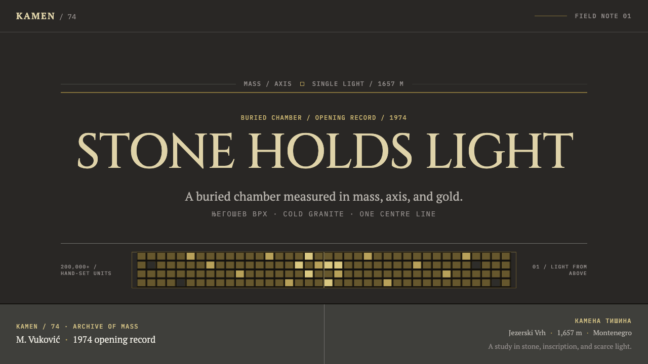
Gold is the single rich colour, and it obeys a strict rule: it appears only where the vault would be, and never as a smooth fill. It is rendered as thousands of small square units, so that the pattern of individual tiles is visible. There is no gradient and no electroplated gloss. In layout terms, gold usually occupies the upper part of a composition, a band or field above the dark stone, and it is always a mosaic, never a sheet.
Strict Central Axis
Everything is organised on a single vertical axis, as in the mausoleum, where one line runs from the entrance past the eagle to the seated figure. Layouts are symmetrical: left mirrors right, and the most important element sits on the centre line. This is not a stylistic whim but the structure of a procession. The eye is led, and the layout expects it to arrive at one place.
Gravity as Ornament
The style carries no ornament in the usual sense. Weight does what decoration would do: large, simple blocks, generous thickness, and an unwavering evenness. Type should feel cut rather than written, set in upright, solid forms with ample space around them, almost like an inscription. Where other styles add flourishes to signal importance, this one removes them and adds mass.
Close Joints and Cut Edges
The granite walls are close-jointed, which means panels meet with narrow, exact seams. The same logic applies to the layout: blocks and cards are separated by thin, consistent gutters, and edges are straight lines, cut rather than rounded. Corners stay crisp. The joints themselves become a quiet pattern, showing that the whole was assembled from precisely fitted parts.
Light from One Direction
Light in the chamber arrives from one direction and stops. In the style this means a single, controlled light source: highlights fall on one side of forms, edges catch light and then give way to dark, and there is no ambient glow filling the shadows. Illumination is dramatic because it is limited. An element that is lit stands out strongly because everything around it is not.
Weathered Limestone Grey
Outside the chamber, the same kind of stone weathers to a pale grey against the bare ridge. This is the style's secondary neutral: a cool, pale, mineral grey used for supporting text, dividers and lighter surfaces. It reads as the exterior to the gold-and-dark interior, and it keeps text legible without introducing a competing warm tone. Think of it as daylight on stone, as opposed to the light of the vault.
Who shaped Njegoš Mausoleum?
Meštrović was the sculptor who conceived the mausoleum, and his name ties it to Yugoslav monumental sculpture. His approach is the source of the style's reliance on large, simplified masses, carved from single blocks of stone and arranged on a clear axis. For designers, he supplies the principle that a form can be monumental through restraint and weight rather than detail.
Njegoš was a nineteenth-century Prince-Bishop and poet of Montenegro, and the mausoleum exists to hold his tomb. The sculpture of him, seated in black granite beneath an eagle, is the focal point of the entire interior and the reason for its axis. His presence explains the style's tone: not commemorative sentiment, but the gravity of a ruler and poet placed at the end of a procession.
The mausoleum stands within Lovćen National Park above Cetinje, on a summit of bare limestone. The setting matters to the style because it explains the pale, weathered exterior tone and the sense of architecture standing against an open sky. The protected mountain landscape is the stage that makes a small, dark, gold-roofed room feel monumental.
How do you use Njegoš Mausoleum today?
The Njegoš Mausoleum style is for subjects that deserve ceremony: memorials, heritage, institutions, awards, serious cultural programmes and craft at its highest end. Use it with restraint, because its weight is its strength. Decide where the axis runs, where the one gold field belongs and what single element will be the focal point, and let everything else stay quiet.
For presentation slides, a cover works with a dark stone ground, the title centred on the axis in solid, upright type, and a band of gold squares across the top like a vault. Content slides should be symmetrical and spare, with one idea per slide set on the centre line and plenty of dark space around it. For data, a single large figure or one monumental bar often suits the style better than a busy chart, and where a chart is necessary, the gold tiles can mark the one value that matters, while the rest stays in stone grey.
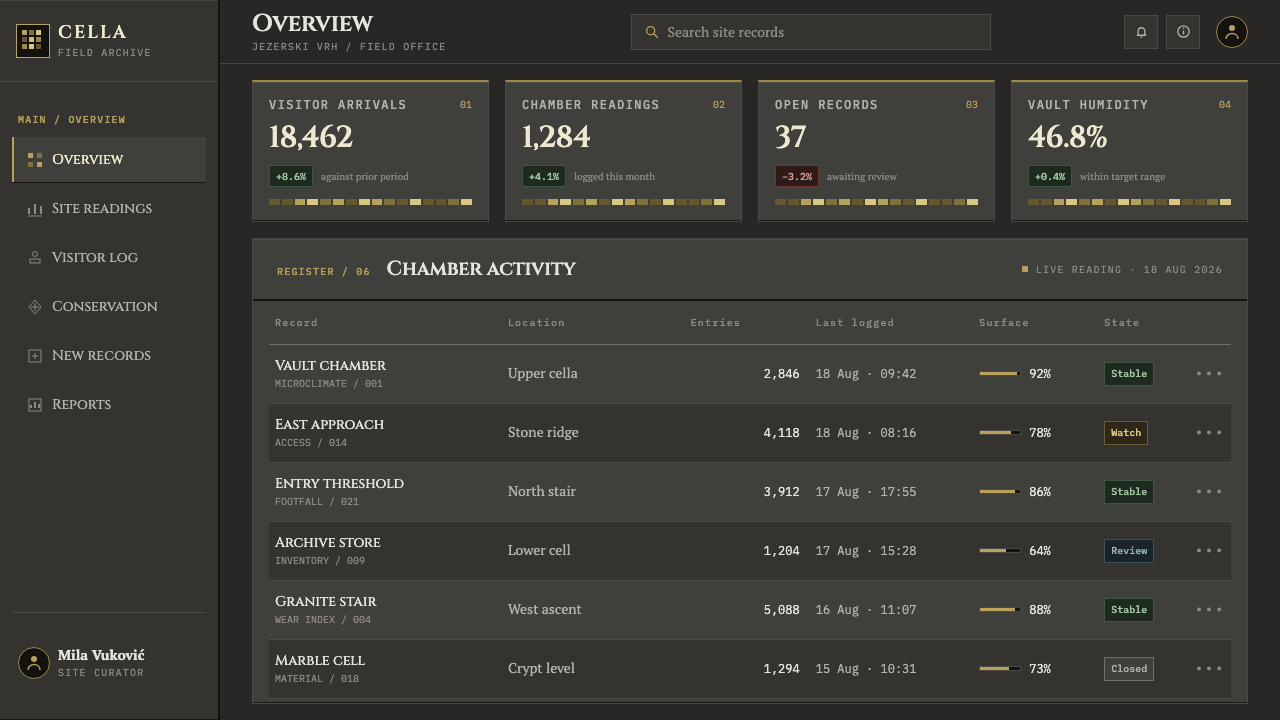
For web interfaces, the style fits landing pages, hero sections, event or launch pages and any context where the user is meant to feel they have arrived somewhere. A pricing page can organise its tiers symmetrically, with the featured tier on the axis and the only gold mosaic accent above it. Dashboards are a harder fit, since the style prizes stillness, but a status or overview screen can use the dark ground and the pale grey for secondary text. Keep corners sharp and spacing tight at the joints.
For editorial and marketing work, it is strong for tributes, historical long reads, institutional reports and premium brands that trade on heritage and substance. Photography works best in monochrome or low-key lighting with a single light direction. Avoid layouts that sprawl; centre the story on the axis, let one image or one headline carry the weight and use gold only for the part of the page that stands for the vault.
The most common mistake is to render the gold as a smooth metallic gradient or a glossy foil. That immediately turns the mausoleum into generic luxury. The gold must be visibly made of squares. A second mistake is breaking the symmetry or rounding the corners, which removes the sense of cut stone. A third is spreading gold across buttons, headings and borders until it stops meaning anything, and a fourth is adding ornament, such as flourishes or decorative frames, to a style whose point is that gravity is the ornament.
Njegoš Mausoleum — FAQ
Is the gold a gradient or a foil effect?
Neither. The gold of the vault is made of more than 200,000 small mosaic squares, and the style insists that it should look that way: discrete units, individually visible, with no smooth sheen and no electroplated gloss. A tiled pattern of small squares, perhaps with slight variation from one to the next, captures it. A continuous metallic gradient does not.
Why does everything have to be symmetrical?
Because the room is. The mausoleum is organised on a single axis from entrance to the seated figure under the eagle, and symmetry is what makes that axis a procession. In a layout, mirrored halves and a centred focal element create the same calm, ceremonial order. Asymmetry is not forbidden in principle, but it quickly dissolves the sense of gravity that the style depends on.
Is this just a black-and-gold luxury theme?
No. Generic black-and-gold styles use glossy black and metallic gold spread across the layout. Here the dark is stone, matte to polished, and the gold is a restricted, mosaic-built field that appears only where the vault would be. The first impression may be similar, but the logic is different: the style is about mass, joints, an axis and one controlled light, not about looking expensive.
Is there a light version of this style?
The system is dark by design, since it takes the interior of a stone chamber as its model. Its pale weathered limestone grey, the tone of the exterior, can be used for lighter surfaces and secondary text, but turning the whole layout pale loses the contrast between dark mass and a small area of gold that carries the style. If you need a light mode, keep the dark stone for key bands and the axis.
Can I use it for a normal product interface?
Yes, in the right places. It suits hero sections, launch pages, award or event pages and ceremonial moments in a product. Dense, tool-like screens are harder, because the style values stillness and a single focal point. A good approach is to use it for the entry points of a product and keep the working screens quieter, borrowing only the dark ground, the pale grey and the sharp corners.
Related design styles
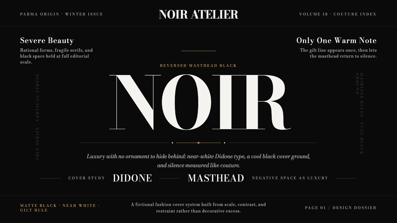 Bodoni Didone Fashion MastheadLuxury as black silence. White Bodoni, tiny coverlines, and one gilt hairline…
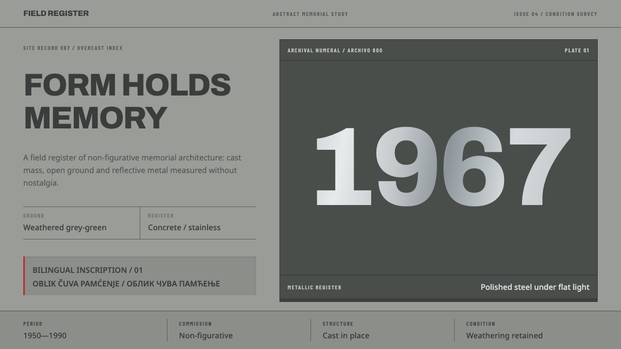 Yugoslav SpomenikMonumentality without figures. Concrete grey-green meets stainless geometry a…
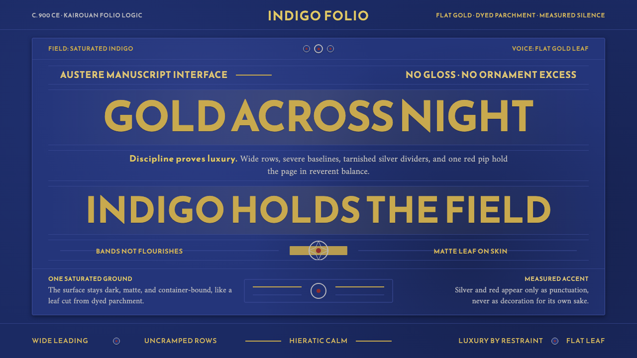 Abbasid Blue QuranLuxury by restraint. Flat gold Kufic bands cross an indigo parchment field.
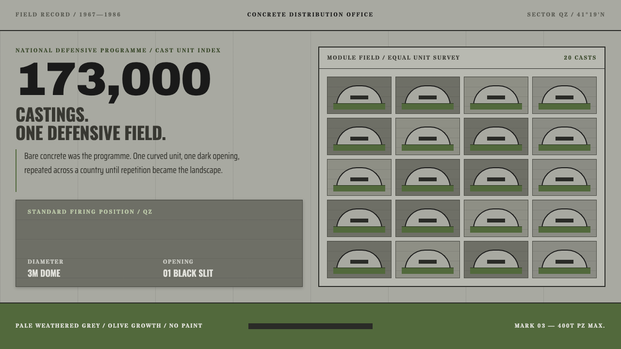 Albanian BunkersRepetition becomes landscape. Olive-and-concrete modules repeat around one bl…
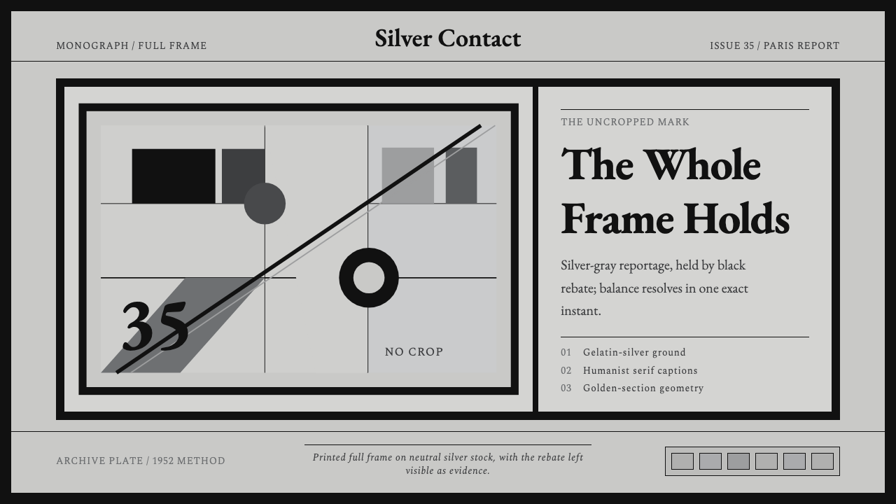 Cartier-Bresson Decisive MomentNever cropped. Silver-gray tonality is locked by a dead-black film rebate.
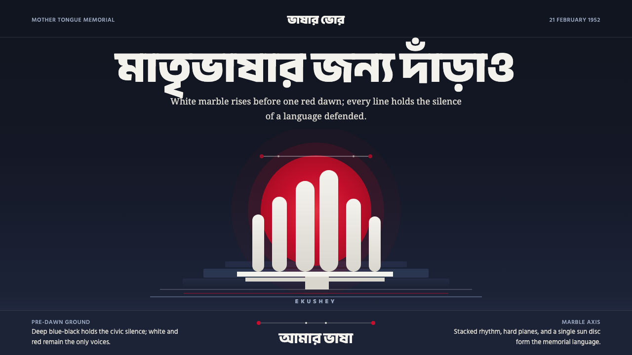 Dhaka Shaheed MinarSolemn before dawn. Marble columns and one red sun hold the page in civic sil…