What is Albanian Bunkers?
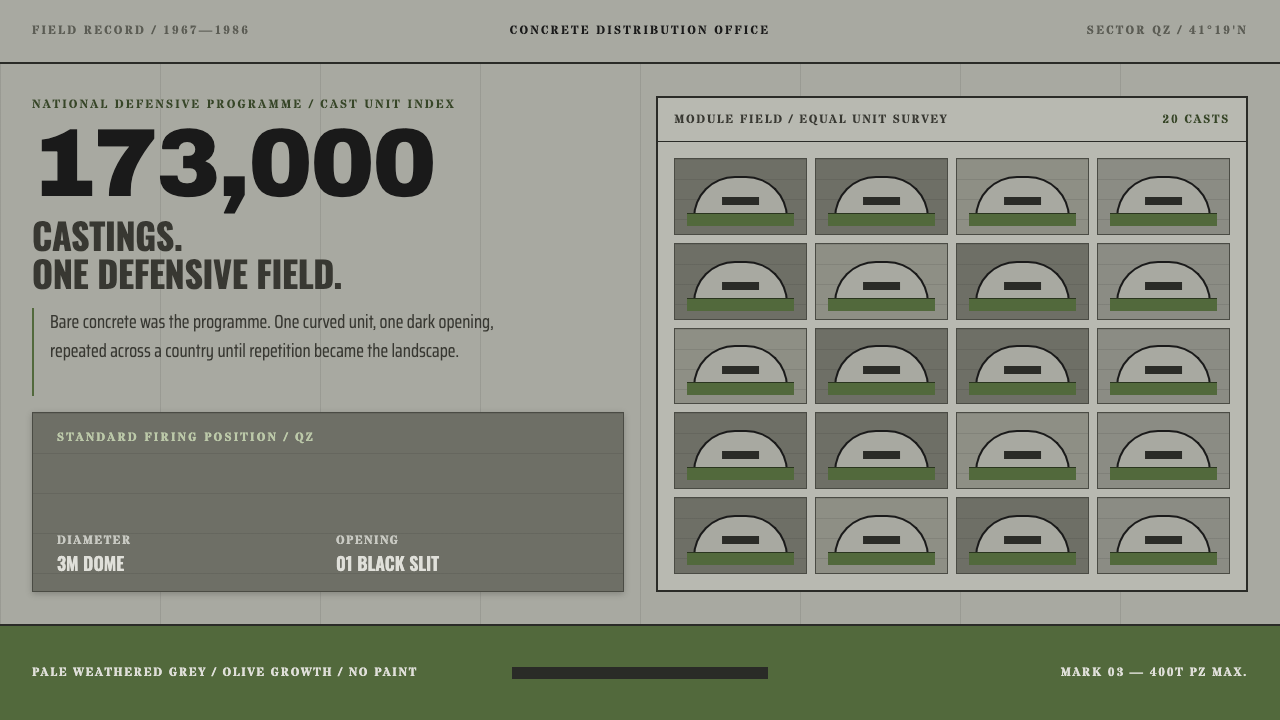
Albanian Bunkers turns repetition into a landscape: roughly 173,000 identical concrete domes, reduced to weathered grey, olive growth and one black slit.
Albanian Bunkers in brief
Albanian Bunkers is a design style drawn from the concrete fortifications that Albania built across its entire territory between 1967 and 1986. Roughly 173,000 of them were poured: on hilltops, on beaches, in farmland, at the ends of city streets. As a visual language it is anything but decorative. It consists of a pale weathered grey ground, olive green growth creeping up the shaded part of each form, one black slit as the only opening, stencilled numbers, and the same module repeating until it reaches the horizon.
The central idea is that repetition is the subject. No single bunker matters; the same shape in every field is the point. Where most design systems ask for variety and a hero element, this one asks a designer to commit to a single module and let the count do the expressive work. Whatever ornament exists is borrowed from the object itself: the grain left by timber formwork, the seams between pours, streaks of rust water running down the wall, and sprayed registration numbers.
The style is as notable for what it declines to do as for what it does. It does not distress surfaces to look old, does not light them dramatically, and does not turn ruins into scenery. The bunkers were never painted, and the system takes them at face value, as built things in their ordinary condition. The overall feeling is heavy, matte and quiet, closer to a survey record than to a travel brochure.
Where does Albanian Bunkers come from?
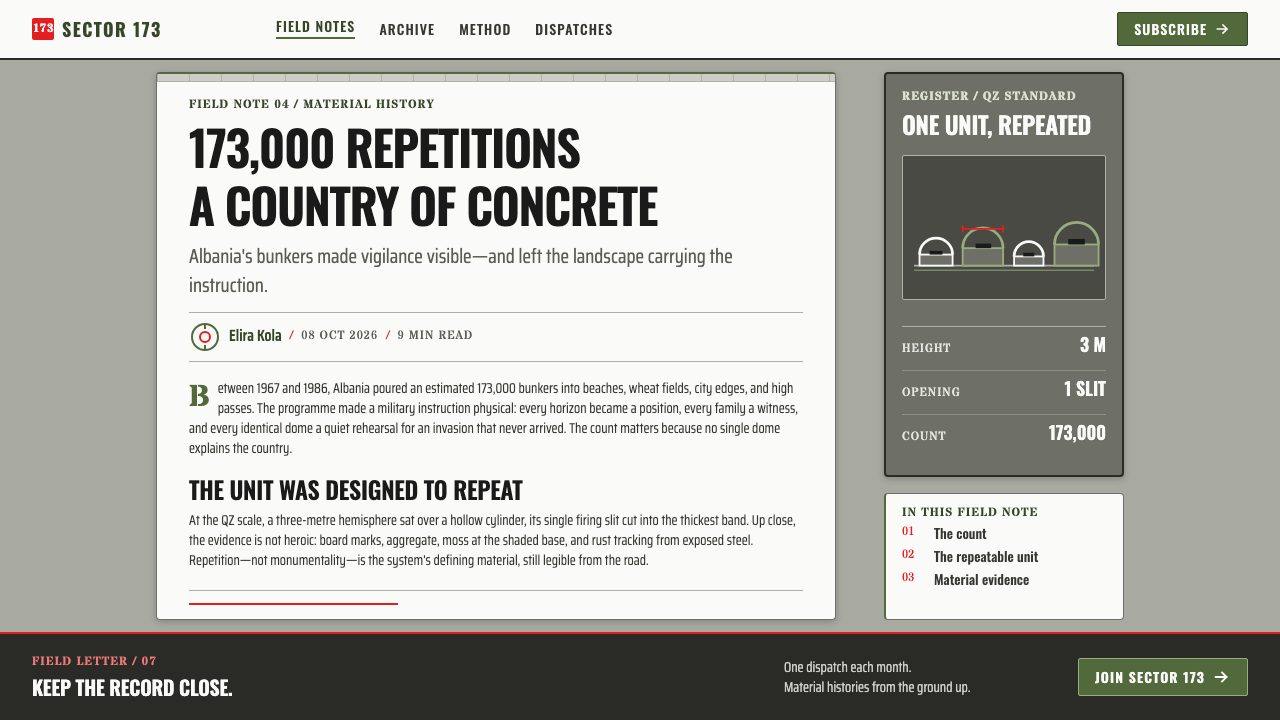
Between 1967 and 1986, under the government of Enver Hoxha, Albania carried out what is usually called its bunkerisation programme. The source material files it under Cold War isolationist defence architecture: a state that sought security by turning its own landscape into a fortification. The numbers explain why the result became a visual style rather than a scattering of buildings. Roughly 173,000 bunkers went up nationwide, from the Adriatic coast to the interior mountains.
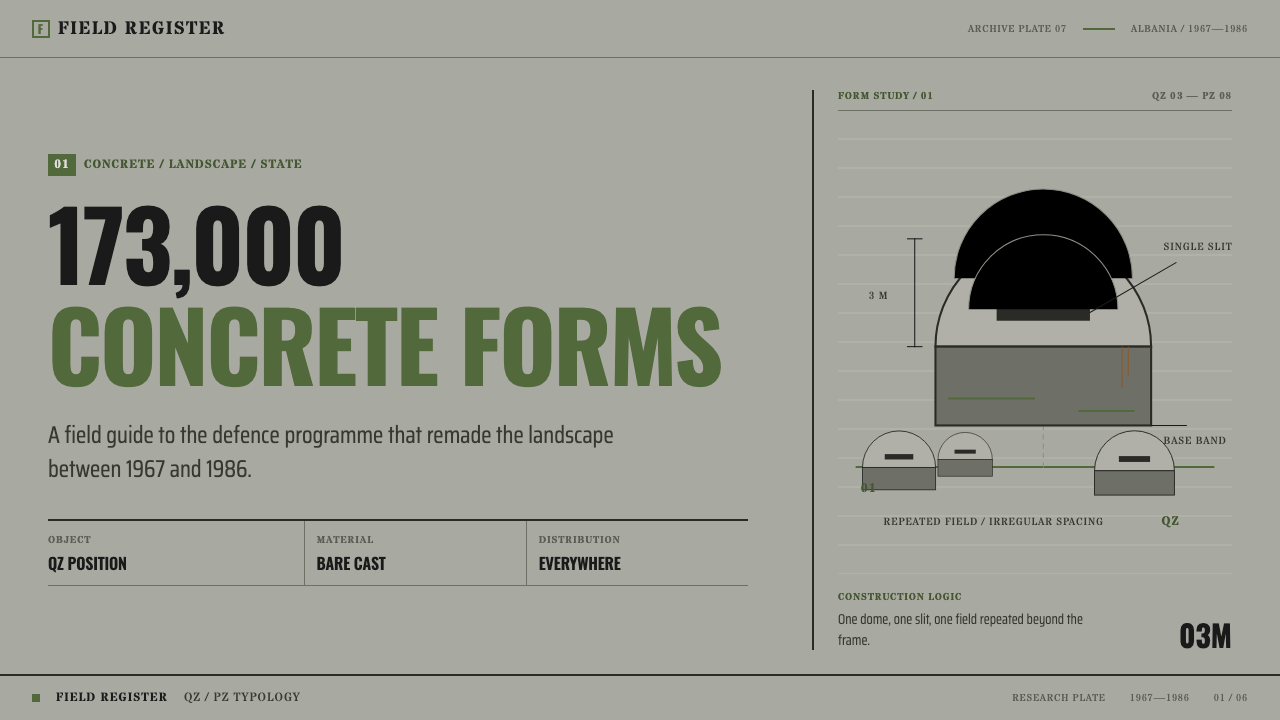
Two standard types did most of the work. The QZ firing position is a hemispherical dome about three metres across with a single slit. The PZ command bunker is larger, eight metres across, and weighs up to 400 tons. The engineer Josif Zagali is credited with giving the top a curved profile so that incoming shells would slide off. In other words, the signature silhouette, a rounded cap with one narrow aperture, was an engineering answer rather than an aesthetic choice, and it was then repeated on a scale that no deliberate stylistic programme could have matched.
The surface history matters just as much. The bunkers were never painted. What a visitor sees today is board-marked concrete, its grain pressed in by timber formwork, faded to a pale grey, with rust water from the reinforcement running down the walls and a film of moss and algae on the shaded lower half. Albanian socialist realism, the state's official cultural idiom of the period, is listed among the style's related movements, yet the bunkers themselves carry no imagery at all. Their only graphic content is administrative: a number sprayed through a stencil.
After the end of communism the bunkers were not erased. Their number and their mass made removal impractical, and a conversation about adaptive reuse took its place: what does a country do with a defensive landscape once nobody is attacking it? Elian Stefa and Gyler Mydyti appear among the key figures associated with the style, which fits that later, reuse-minded way of looking. The style belongs to this second life of the objects. It regards the bunker without nostalgia and without contempt, as a surviving form worth understanding.
What defines the Albanian Bunkers look?
Colour
The ground is a pale, weathered grey, the colour of concrete that has stood outside for decades. Olive green enters only as growth and as military heritage, climbing the shaded third of a form rather than filling it evenly. Black is reserved for a single slit. A faint rust-brown trace may appear as staining, but never as a brand colour. Nothing is saturated, because nothing on the original object ever was.
The Slit
Each bunker has exactly one opening, and in the system it is the only true black on the page. That makes it a precise instrument of focus: one dark void per composition pulls the eye, and adding a second dilutes the whole. The slit also carries the mood of the style, since a narrow horizontal opening reads as watching rather than welcoming.
Repetition
The same module appears again and again: in rows, in grids, in fields that recede toward a horizon. Variation is minimal and deliberate. Scale is created by multiplying a unit rather than by enlarging a hero, so a layout can feel monumental while every individual element stays modest. The count itself, not the single object, is the visual message.
Cast Surface
Surfaces are matte and mineral. The only texture permitted is what the building genuinely has: the faint grain of timber formwork, the horizontal seams between pours, hairline staining. There are no gloss highlights, no gradient lighting and no glassy depth effects. A surface should look cast and then left alone.
Stencil Numbers
Lettering follows the bunker's own habit of identification: blunt, upright numerals and short labels in the manner of a sprayed stencil, where letterforms are cut with small bridges and the voice is administrative rather than expressive. Type is a registration mark, not a headline flourish. Use it sparingly and let it identify things.
Honest Weathering
Weathering is recorded, not manufactured. Growth creeps up from the shaded side because that is where moisture lingers; rust water runs downward because gravity pulls it. The style refuses artificial distressing, vignetting and dramatic light, and it refuses to turn ruins into scenic backdrops. The restraint is both an aesthetic and an ethical position.
Dome and Horizon
The silhouette is a low half-dome sitting on a flat ground line. Compositions favour long horizontals interrupted by that single curved form, so the dome is the only curve in an otherwise orthogonal layout, and it earns attention precisely because everything near it is straight.
Who shaped Albanian Bunkers?
The bunkerisation programme ran under Hoxha's government from 1967 to 1986, which makes him the political name behind the objects. The state's reasoning, security by fortifying every hillside and field, is the reason the module exists at all. The style takes the objects, not the ideology, as its subject: it reproduces the form and leaves out the slogans.
An engineer named in the source for shaping the bunker top as a curve so that shells would be deflected. His contribution is the reason the whole family of forms shares one silhouette: a rounded cap and one slit. For a designer he is a useful reminder that the style's most recognisable shape came from ballistic reasoning rather than taste.
Listed among the key figures associated with the style, within the strand of attention that asks what to do with the bunkers now that their original purpose has ended. That question, rather than the question of how to build them, is the lens the style adopts: the bunker as a surviving material, neither monument nor ruin.
Named alongside Elian Stefa among the key figures. The pairing marks a shift in the bunkers' story from construction to afterlife: not how to put up 173,000 of them, but how a country lives with them. A design system derived from the objects inherits that second question and answers it with restraint.
How do you use Albanian Bunkers today?
Albanian Bunkers is a style for projects that want weight, seriousness and quiet. It suits subjects where evidence, infrastructure or the passage of time is the content: research, data, architecture, civic reporting, heritage. It is poorly matched to anything that needs playfulness or warmth. The way to use it correctly is to decide on one module and repeat it, to leave exactly one dark opening in each view, and to resist adding colour.
In presentation slides, a cover works best when it is almost empty: a pale grey field, a row or grid of identical dome shapes receding toward a flat horizon line, one black slit as the focal mark, and the title set in a blunt, sturdy sans-serif near the edge. Content slides should be treated as ledgers, with consistent modules, generous grey space and stencil-style numbering for sections. Data slides suit this style especially well because repetition is its native grammar. Unit charts, dot arrays and small-multiple grids, where one marker stands for one thing, are more faithful to the style than a bar or pie that merely changes size.
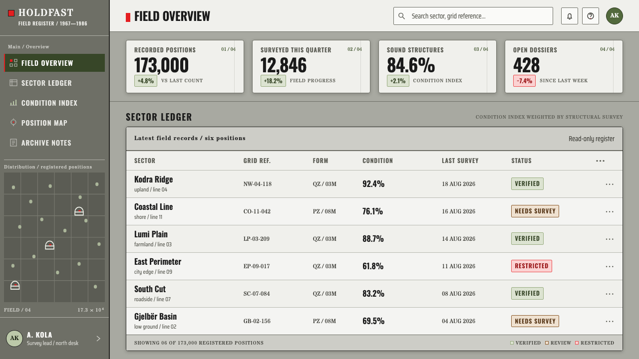
In web interfaces the style fits dashboards, monitoring tools, status pages and documentation. Use a grey ground, reserve olive for healthy or growing states, give black to a single primary action, and keep cards as flat, matte, evenly repeated blocks without drop shadows or glossy highlights. Pricing pages can present tiers as identical modules whose only difference is content, letting the repetition itself communicate fairness. Numbering is a natural navigation device: section and step numbers in a stencil-like voice can replace icons.
For editorial and marketing work the style supports sober long-form: photo essays on infrastructure, annual reports, architecture publications, exhibition identities. Photographs should be neutral, frontal and evenly lit, with no golden hour and no dramatic skies, so that the object is shown as it is, many times over. A contact-sheet arrangement of near-identical images is an apt layout device, and captions can carry the numbering voice of the stencil.
The most common mistake is to treat the style as a mood board for ruins by adding grain overlays, vignettes, artificial rust or cinematic light, which are exactly what the system refuses. A second mistake is to scatter several dark accents or a bright brand colour across the page; the single black slit only works as a focal mark when it stands alone. A third is to vary the module until it stops being a repetition at all.
Albanian Bunkers — FAQ
Is Albanian Bunkers the same as Brutalism?
They are related by material but not by intent. Brutalism is an architectural movement of individual, expressive buildings in raw concrete, each one a sculptural statement. The bunkers are a mass-produced defensive type, one form repeated across a country. This style borrows the bunkers' repetition and their unpainted, weathered surfaces, not the monumental, sculptural gestures associated with Brutalist architecture.
Why is the palette so limited?
Because the system records the object as it stands. The bunkers were never painted, so there is no brand colour to borrow: only weathered grey concrete, olive growth on the shaded side, one black slit and the occasional trace of rust. Any additional hue would be invention rather than observation. The limitation is also what makes the single black opening work as a focal point.
Does the style work in dark mode?
The system is built on a pale ground because the source objects are pale concrete seen in daylight, and the black slit depends on that pale field to read as the only void. A dark inversion loses the logic, since the slit disappears into a dark background. If a dark variant is unavoidable, keep grey as a mid-tone, use dark only in small areas such as footers, and make the slit the one light-edged or lightest element so it still acts as the single focal mark.
Is it appropriate to build a style from a regime's military architecture?
The style takes the objects at face value: no flags, no portraits, no slogans, no heroic imagery. It neither celebrates the programme nor stages its ruins for effect. Its only graphic content is what the bunkers themselves carry, formwork grain, seams, rust streaks and stencilled numbers. Used with the same restraint, it can address infrastructure, memory and reuse without becoming either propaganda or nostalgia.
How many repeated modules does a layout need?
Enough that the module reads as a series rather than as a single object. Two or three look like a deliberate pair; a handful or more, especially in a row or grid that recedes toward a horizon, makes repetition the subject. Beyond that, the decision is about rhythm: keep spacing regular, keep the module identical, and let the count rather than the size of any one element create the sense of scale.
Related design styles
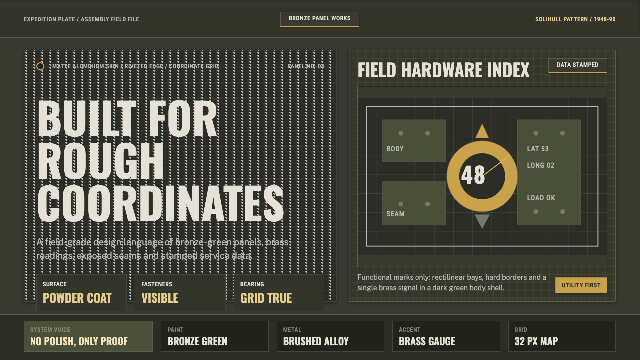 Land Rover DefenderUtility refuses polish. Bronze green panels, rivets and brass grid data do th…
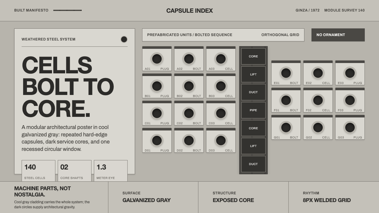 Nakagin Capsule TowerArchitecture as cells. Cool gray modules, dark cores, and porthole circles lo…
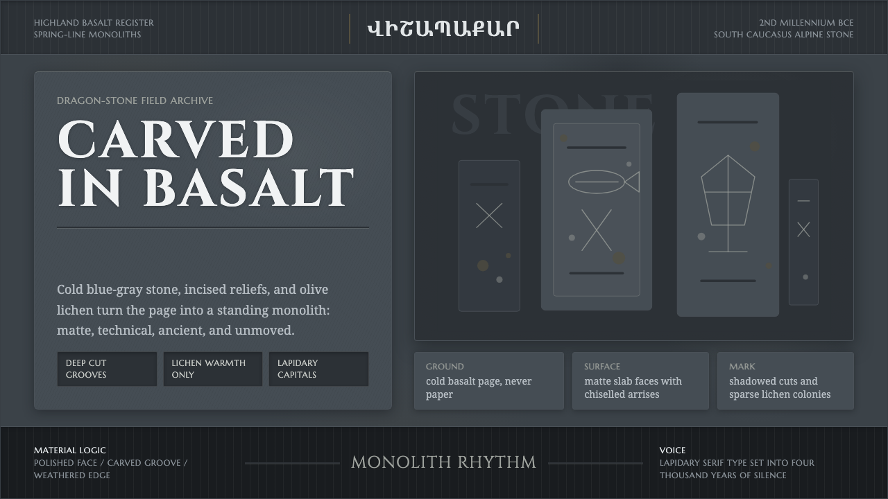 Armenian Vishapakar Dragon StoneAncient, cold, unmoved. Basalt gray slabs, incised grooves, sparse olive lich…
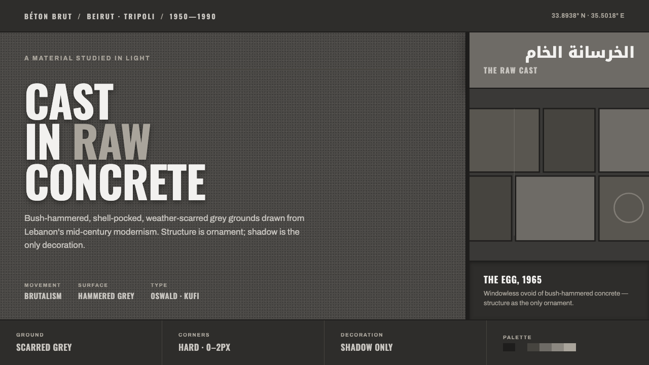 Beirut Brutalist GrayStructure is the only ornament. Scarred bush-hammered grey, monumental Oswald…
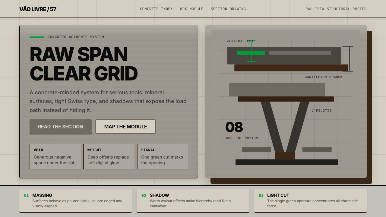 Paulista BrutalismStructural honesty, made heavy. Mineral grays, Inter grids, and walnut cantil…
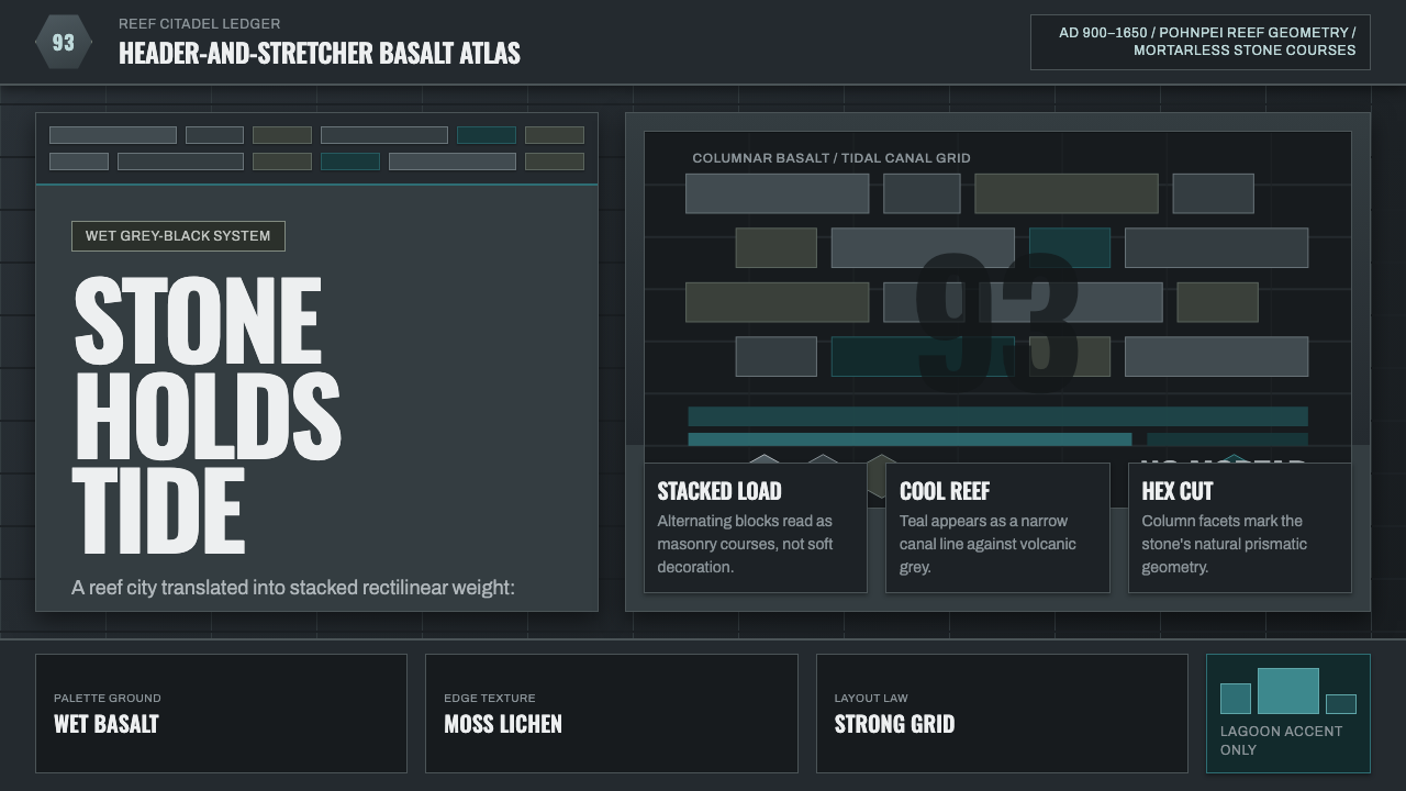 Nan Madol Basalt MegalithStone holds tide. Grey-black basalt grids cut by a narrow lagoon-teal vein.