What is Abbasid Blue Quran?
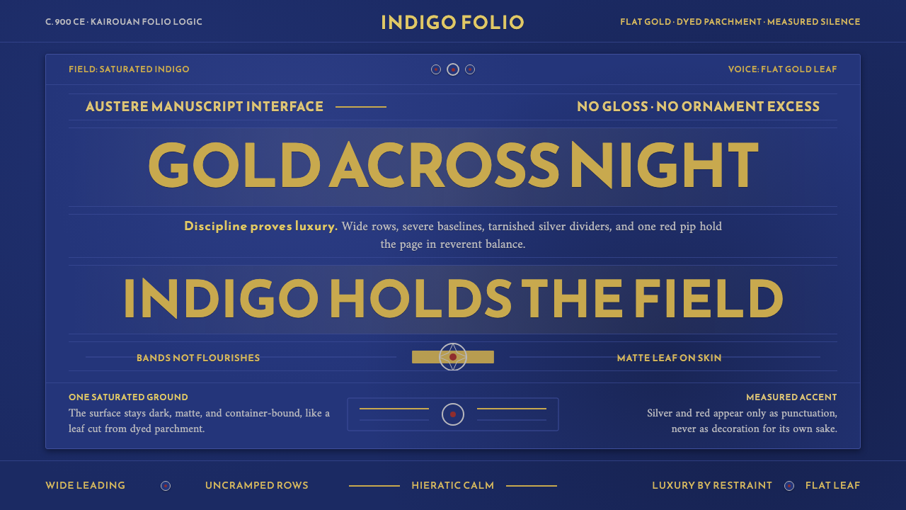
The Abbasid Blue Quran makes luxury feel almost ascetic: gold Kufic bands crossing an indigo field, with every accent earned by restraint.
Abbasid Blue Quran in brief
The Blue Quran is one of the most singular objects in Islamic book arts. Its parchment is dyed a saturated indigo and inscribed in flat gold-leaf Kufic, without diacritical points. Silver rosettes flecked with red punctuate the text. The result is not an illustrated page in the ordinary sense; it is a field of deep blue interrupted by horizontal bands of gold, composed with extraordinary severity.
Its visual authority comes from a narrow hierarchy of materials and marks. Indigo establishes the world, gold carries language, silver marks interruption and order, and red appears only in tiny measured flashes. Nothing competes for attention. The manuscript achieves richness not through accumulation, but through the contrast between a dark ground, luminous writing, and rare ceremonial punctuation.
As a contemporary design language, Abbasid Blue Quran translates this manuscript logic into a dark interface system. Broad, horizontal type should feel calm and deliberate rather than expressive or decorative. Gold is the speaking voice, while silver and red are controlled signals. The atmosphere is hieratic, quiet, and exacting: luxury is proven by discipline, not by visual abundance.
Where does Abbasid Blue Quran come from?
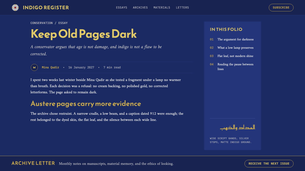
The Blue Quran belongs to the early Kufic Quranic manuscript tradition and to Abbasid book arts. It was made in Kairouan, in Ifriqiya in present-day Tunisia, around 900 CE, during the Abbasid and Aghlabid period. That setting matters because the manuscript is not merely a text-bearing object: its indigo parchment, gold script, and metallic punctuation make the page itself a complete ceremonial surface.
The commission is associated with the Great Mosque of Kairouan, while the work is attributed to Aghlabid court scribes. Within the approved account, these two references define its institutional character. The manuscript emerges from courtly scribal practice and a major religious commission, joining careful writing, material splendor, and a highly controlled visual order.
Early Kufic provides the manuscript’s essential graphic behavior. The writing reads as broad horizontal bands rather than as a flowing, highly ornamented texture. Flat gold leaf reinforces that quality: the script appears laid across the indigo surface with clarity and weight. The absence of diacritical points intensifies the page’s reduction, leaving form, spacing, and luminous contrast to carry much of the visual experience.
Its historical force lies in how few elements are needed. Indigo parchment creates depth without pictorial scene or illusion. Gold Kufic establishes the primary rhythm. Silver rosettes, touched with red, introduce measured moments of division. For contemporary use, the lesson is not to imitate a manuscript as decoration, but to understand how restricted means can make hierarchy, reverence, and material confidence visible.
What defines the Abbasid Blue Quran look?
Indigo Ground
Indigo is the governing field, not a background chosen for mood alone. It creates the manuscript’s night-like depth and gives gold writing its authority. In a derived interface, the dark field should remain broad, stable, and uninterrupted so that every lighter mark feels deliberate rather than merely legible.
Gold Kufic Bands
Flat gold-leaf Kufic is the primary visual event. Its broad horizontal movement makes language appear architectural: a sequence of luminous bands crossing the page. Use type as a disciplined line of meaning, with generous breathing room and a firm horizontal presence, rather than as an ornamental flourish.
Restricted Metallic Hierarchy
Gold speaks first, silver appears second, and red is reserved for the smallest moments of emphasis. This is a hierarchy of scarcity. Metallic brightness is effective because it is not distributed everywhere; each accent retains ceremonial force by remaining rare and subordinate to the text.
Unpointed Script
The lack of diacritical points is central to the manuscript’s severe reduction. It removes a layer of visible activity and lets the gold letterforms, spacing, and page rhythm dominate. A contemporary interpretation should likewise avoid unnecessary micro-detail, badges, and competing annotations.
Rosette Punctuation
Silver rosettes flecked with red punctuate rather than decorate. They create pauses in a long horizontal reading field and give division a ceremonial quality. Their role is closer to a precise marker in a system than to a pattern intended to fill empty space.
Hieratic Calm
The mood is hieratic and calm because the page refuses visual chatter. There is no need for texture, pictorial scene, or a crowded variety of treatments. Space, line, and measured contrast create a form of luxury that feels formal, composed, and almost severe.
Who shaped Abbasid Blue Quran?
The Blue Quran is associated with Aghlabid court scribes. Their role identifies the manuscript with a courtly writing practice in which text, material treatment, and page order are inseparable. In this visual system, writing is not applied after the surface is made; it is the element that gives the surface its governing structure.
The manuscript is associated with a commission for the Great Mosque of Kairouan. That connection frames its visual restraint as ceremonial rather than merely minimal. The dark parchment and luminous script produce an object intended to hold attention through reverence, order, and material presence.
The early Kufic Quranic manuscript tradition supplies the style’s broad, horizontal graphic language. It makes the written line feel spatial and structural, allowing the page to be organized through bands, intervals, and controlled interruption instead of through illustrative narrative or dense ornament.
Abbasid book arts provide the wider artistic frame for the Blue Quran. Within that frame, the manuscript demonstrates how a book can become a total visual environment: the ground, writing, metallic accents, and pauses all operate as parts of one disciplined system.
How do you use Abbasid Blue Quran today?
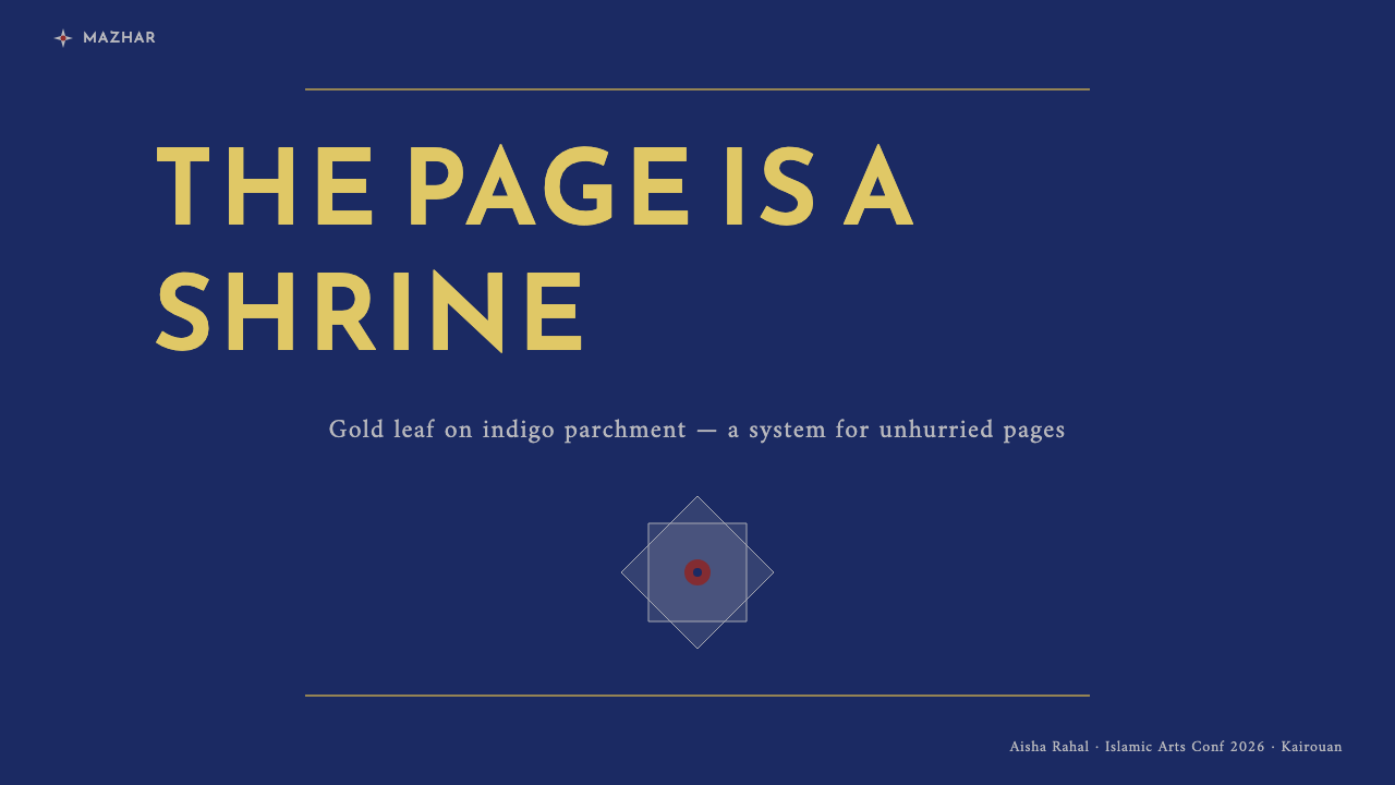
For presentation covers, use the style as a single ceremonial gesture. Let an indigo field carry one broad line of gold-toned title text, with a restrained silver divider or rosette-like marker if division is needed. Avoid filling the cover with imagery or multiple competing claims. The strongest result resembles a page that has been prepared for reading, not a promotional poster searching for attention.
For presentation content and data pages, preserve the horizontal manuscript logic. Organize information in wide bands, with one primary line of argument and quieter supporting text beneath or beside it. Charts should behave like measured inscriptions: a dark field, a luminous principal series, and occasional silver or red marks for exceptions, comparison, or interruption. Do not turn every data category into a new accent.
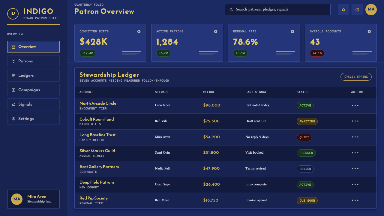
For web interfaces, this language suits dashboards, analytical views, and pricing surfaces that need calm authority. Use a deep indigo ground as the stable environment, make primary labels and essential values gold-led, and reserve silver for secondary structure. Red should signal only consequential attention. Components should feel broad, quiet, and carefully spaced, with hierarchy created by line, grouping, and contrast rather than by decorative frames.
For editorial and marketing work, think in terms of a manuscript page rather than a luxury advertisement. A long-form layout can open with a gold headline on indigo, then continue with horizontal text bands and rare rosette-like section markers. Marketing sections can alternate between immersive dark fields and quieter reading areas, but the metallic palette must remain controlled. The visual promise is composed confidence, not spectacle.
The common mistake is to mistake the Blue Quran for permission to add gold effects everywhere. Its character depends on scarcity: gold is powerful because it carries the text, silver because it marks a pause, and red because it appears so rarely. Overusing metallic treatments, adding elaborate texture, or crowding the field with ornamental motifs destroys the hierarchy that makes the source so memorable.
Abbasid Blue Quran — FAQ
Is this style simply dark luxury design?
No. Dark luxury design often relies on abundance, sheen, texture, and conspicuous display. The Abbasid Blue Quran works through the opposite discipline: an indigo field, gold Kufic writing, and rare silver-red punctuation. Its luxury comes from reduction, control, and the importance assigned to each visible mark.
How should gold be used in a contemporary interface?
Treat gold as the voice of the system, not as a general decorative coating. It is most convincing on the primary title, the most important value, or the key line a reader must retain. Keep surrounding information quieter so the gold retains the role that gold Kufic plays against the indigo parchment.
What role do silver rosettes and red flecks play?
They are punctuation. Silver rosettes divide and organize the field, while red supplies a tiny flash of distinction within that marker. In a digital translation, use equivalent accents for meaningful separation, exception, or confirmation, not as repeated decoration attached to every card or heading.
Does the style require literal Kufic type?
No. The transferable principle is the graphic behavior described by the manuscript: wide horizontal lines, generous spacing, unornamented forms, and a clear relationship between luminous text and dark ground. Literal imitation is less important than preserving this disciplined rhythm and avoiding ornamental excess.
Where does this aesthetic work best?
It is strongest where calm authority, careful reading, and restrained hierarchy are useful: presentation covers and data pages, analytical dashboards, pricing views, premium editorial work, and focused marketing pages. It is less suitable when a product depends on playful abundance, dense visual variety, or constant low-priority alerts.
Related design styles
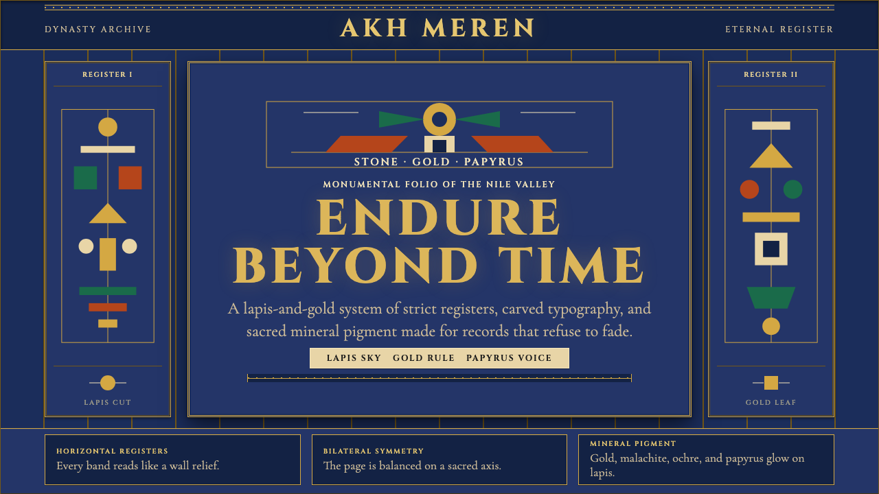 Egyptian PharaonicRegal permanence. Gold rules and Cinzel capitals carve papyrus registers into…
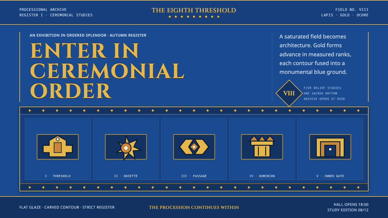 Babylonian Ishtar GateMonumental by procession. Lapis brick, gold registers, and carved capitals ho…
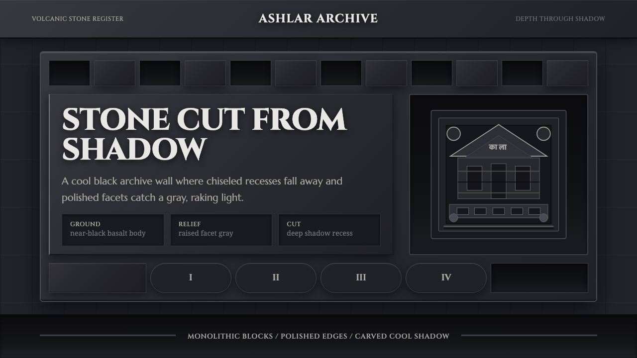 Deccan Basalt TempleMonumental shadow, carved. Near-black basalt, Cinzel capitals, and relief gri…
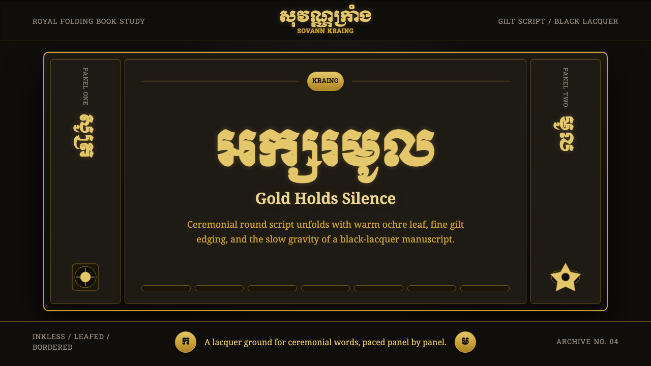 Khmer Aksar MulCeremony held in gold. Moul type glows on black lacquer with panel-by-panel g…
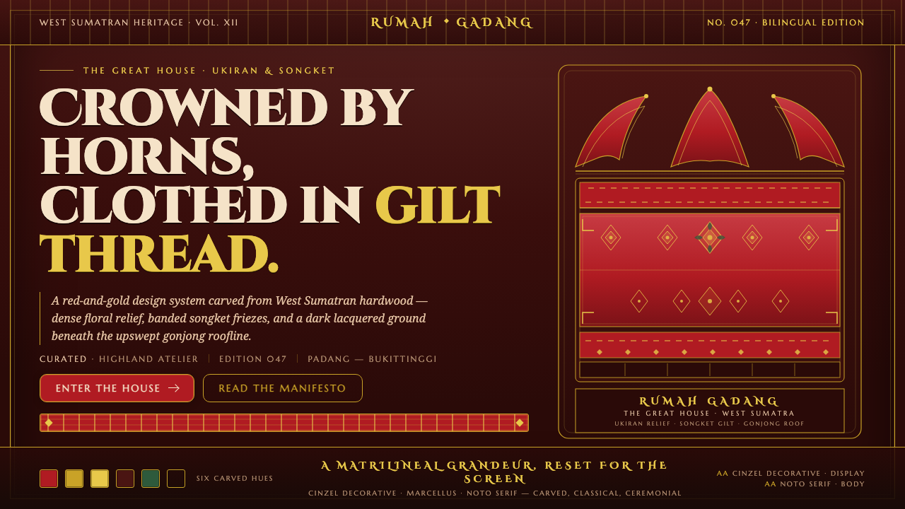 Minangkabau Rumah GadangMatrilineal grandeur, carved. Red-gilt ukiran relief on dark lacquered wood u…
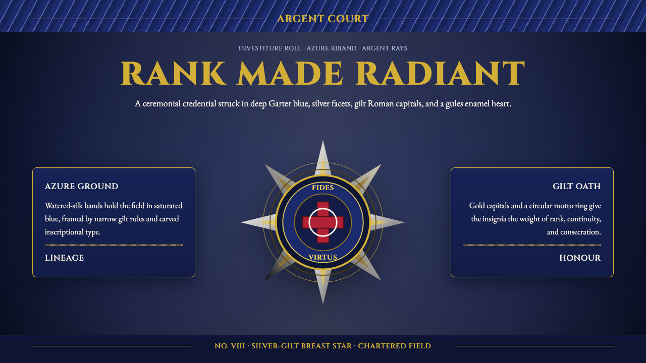 Order of Chivalry StarCeremony made metal. Garter blue, gilt Cinzel, and argent rays form a ranked…