What is Babylonian Ishtar Gate?
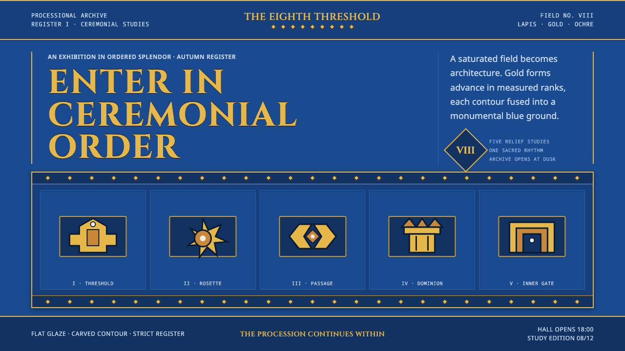
The Ishtar Gate turns procession into a visual system: lapis-blue mass, gold relief, and strict ceremonial repetition carrying every screen element forward.
Babylonian Ishtar Gate in brief
The Babylonian Ishtar Gate style draws from the monumental entrance built around 575 BCE under Nebuchadnezzar II. Its defining image is a vast wall of cobalt-blue glazed brick, made to evoke lapis lazuli, crossed by ordered animal processions in gold and brown glaze. Aurochs, mushhushshu dragons, and lions do not appear as isolated decoration. They advance across the surface as a civic and sacred rhythm.
On screen, the style translates that architectural gravity into a dark lapis ground, ochre and gold accents, imposing display typography, and tightly controlled ornament. The composition should feel fused rather than assembled: broad fields hold the page together, borders frame important zones, and repeated motifs establish direction. The eye is not invited to wander freely; it is guided through a ceremonial route.
This is not a texture-heavy fantasy of antiquity. Its power comes from flatness, saturation, and order. Decorative elements are treated like relief set into a wall: bold, bounded, and repetitive. The result is suitable for work that needs imperial scale, cultural ceremony, or a sense that information has been inscribed rather than casually placed.
Where does Babylonian Ishtar Gate come from?
The Ishtar Gate belonged to inner Babylon and served as the eighth gate into the city. Built around 575 BCE during the Neo-Babylonian Empire, it stood at the threshold of a sacred processional way. That function matters to the style: this was architecture for passage, arrival, and public ceremony, not a private decorative interior.
Nebuchadnezzar II commissioned the gate as a monumental surface of glazed brick. Its cobalt-blue field imitated lapis lazuli, while gold and brown glazed relief animals created contrast without breaking the wall into separate visual fragments. The blue does not act as a background in the modern, passive sense. It is the dominant material field from which every figure emerges.
The animal registers establish the gate's central compositional lesson. Lions, aurochs, and mushhushshu dragons are repeated in ordered sequence, giving the architecture both movement and discipline. Repetition here is not filler. It creates an imperial cadence, making the wall feel longer, more continuous, and more authoritative than an image built around one isolated emblem.
German archaeologist Robert Koldewey is connected to the gate's later recovery, and a reconstruction was installed at Berlin's Pergamon Museum in 1930. That reconstructed presence helped preserve the visual memory of blue glazed mass, raised animal forms, and ceremonial borders. Contemporary design references should retain this logic of monumental registers rather than reducing the source to a generic dark-blue palette.
What defines the Babylonian Ishtar Gate look?
Lapis Field
The visual foundation is a deep, saturated blue field that reads as glazed material rather than empty space. It should occupy broad, uninterrupted areas and make lighter elements feel embedded in a single monumental surface. Avoid atmospheric variation or soft illumination; the field needs the conviction of fired brick.
Gold Relief
Gold and ochre accents should feel raised, inlaid, or impressed against the blue ground. Use them for emblems, key labels, borders, and ceremonial markers, not as a general highlight color spread everywhere. Their scarcity gives them the authority of relief work rather than the shine of interface decoration.
Processional Repetition
Repeated forms are arranged in registers, following a clear horizontal or vertical route. A motif should appear as part of a sequence, never as a random scatter of symbols. The effect is deliberate forward motion: each recurrence confirms the rhythm and strengthens the sense of a larger wall continuing beyond the visible frame.
Carved Imperial Type
Display type should be upright, weighty, and ceremonial, with the impression of lettering cut into an architectural face. Capitals suit titles, seals, and section markers because they create a formal, inscribed presence. Keep supporting text quieter and more regular so that the principal words retain their role as monumental declarations.
Rosette and Palm Borders
Borders are structural registers, not incidental trims. Rosette and palm-derived motifs can mark transitions, contain a panel, or separate a title from its surrounding field. Keep them aligned, repeated, and flat. Their job is to establish a ceremonial threshold, never to add loose ornamental sparkle.
Fused Monumentality
Every part should appear attached to the same architectural order. Cards, illustrations, and labels should not float independently or rely on soft depth to separate themselves. Use framed fields, relief-like contrast, and disciplined spacing so the interface reads as one constructed facade with different inscriptions set into it.

Who shaped Babylonian Ishtar Gate?
Nebuchadnezzar II commissioned the Ishtar Gate around 575 BCE. In this design language, his role is inseparable from monumentality: the gate is not merely a decorated wall but an imperial threshold built to make procession, order, and sacred arrival visible.
Robert Koldewey is associated with the later recovery of the Ishtar Gate. His connection to the reconstruction matters because it carried the gate's distinctive visual memory into the modern museum: blue glazed mass, animal relief, and ordered ornament understood as an architectural system.
The gate itself is the essential reference figure. As the eighth entrance to inner Babylon and the beginning of a sacred processional way, it supplies the style's governing metaphor: information should be encountered through sequence, framed passage, and ceremonial emphasis rather than through casual visual accumulation.
How do you use Babylonian Ishtar Gate today?
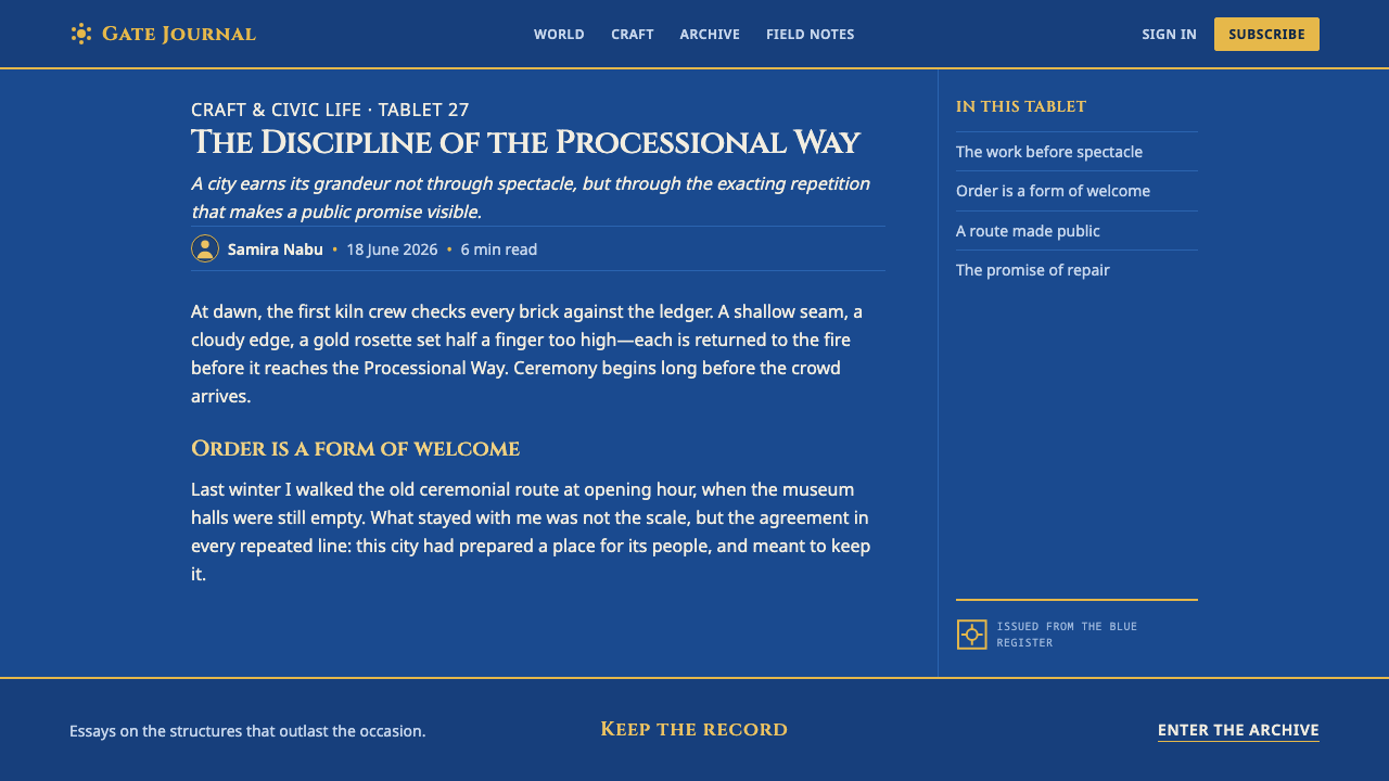
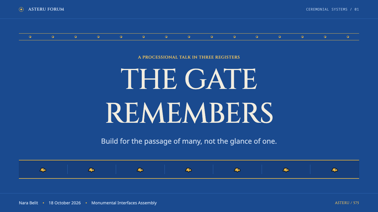
For presentation covers, build a single dark lapis field and give the title the status of an inscription. A gold or ochre emblem, animal silhouette, or border register can anchor one edge, while the title occupies a calm opposing field. Resist filling the cover with many references; one processional motif and one commanding title create more authority than a collage of ancient-looking details.
For content and data slides, use the processional principle as an information structure. Repeated labels, chapter markers, or chart groups can advance along one clear axis. Treat charts as relief panels: keep their forms flat, preserve a dominant blue ground, and use gold-toned emphasis only for the value or category that must carry ceremonial importance. Supporting information should remain restrained enough to let the main register lead.
For web interfaces, the style works especially well for dashboards, collections, member spaces, and pricing pages that benefit from a feeling of permanence. Establish broad blue surfaces, strong framed panels, and consistent border motifs around high-value sections. Navigation should read like a route through gates and registers, with a small set of persistent markers instead of a crowded field of competing controls.
For editorial and marketing pages, use the style to create a sequence of proclamations. Begin with a monumental title zone, then move through sections divided by decorative registers or animal-inspired silhouettes. Feature stories, cultural launches, and premium product narratives can use the palette to signal gravity, but body copy must remain legible and calm. The ornament should frame the reading experience, not compete with it.
The common mistake is to treat Babylonian influence as an excuse for arbitrary gold decoration on a dark background. That loses the source's discipline. The Ishtar Gate depends on a dominant glazed field, limited relief contrast, aligned processions, and borders with a clear structural role. If every object gleams, floats, or uses a different motif, the result becomes generic luxury rather than ceremonial architecture.
Babylonian Ishtar Gate — FAQ
Is this style simply dark luxury design?
No. Dark blue and gold can suggest luxury, but the Ishtar Gate reference is defined more specifically by glazed architectural mass and processional order. A successful application feels ceremonial because its accents are disciplined, its motifs repeat in registers, and its composition resembles a threshold or wall. Luxury without that structure is a different visual language.
Can the animal motifs be used as loose decorative icons?
They work best as part of an ordered sequence. The gate's lions, aurochs, and mushhushshu dragons gain force through recurrence across the blue surface. In contemporary work, use a silhouette or simplified relief-like form along a border, section, or route. A scattered collection of animals weakens the processional logic that makes the reference distinctive.
How should typography behave in this system?
Typography should feel inscribed and hierarchical. Use imposing capital-led display text for titles, names, and key declarations, then let supporting text become quieter and more regular. The goal is not to imitate archaeological lettering literally. It is to make important words feel fixed into a larger architectural order.
Does the style require historical illustration?
No. The structural vocabulary matters more than literal reconstruction. A screen can evoke the Ishtar Gate through a blue glazed field, limited gold relief contrast, framed registers, and repeated directional forms without depicting the original gate. Literal imagery is useful only when it serves the story rather than replacing composition.
Where does this style struggle?
It struggles where the product needs casual friendliness, rapid visual improvisation, or a soft domestic tone. The monumental field and ceremonial rhythm can make small everyday tasks feel over-signified. It is strongest when a product needs to communicate legacy, collectibility, formal membership, cultural programming, or a carefully staged journey through information.
Related design styles
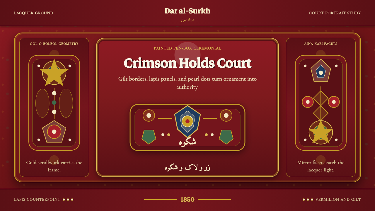 Qajar PersiaOpulence commands. Lacquer red, gilt borders, pearl dots, and lapis geometry.
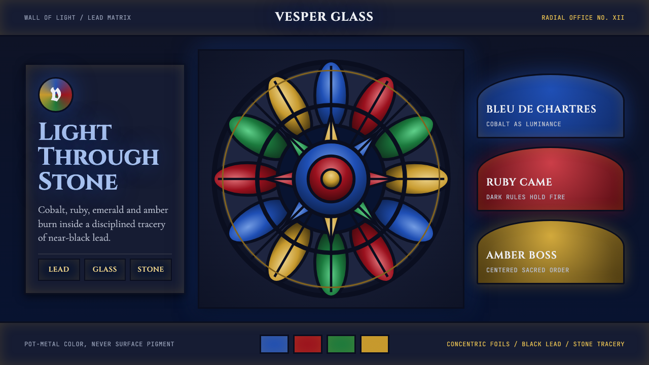 Gothic Rose WindowDarkness becomes light. Cobalt glass, ruby foils and black lead form a radial…
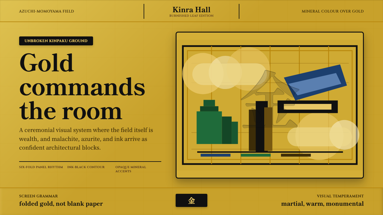 Momoyama Gold ScreenGold is the ground. Panel seams, ink contours, and mineral blocks make the fi…
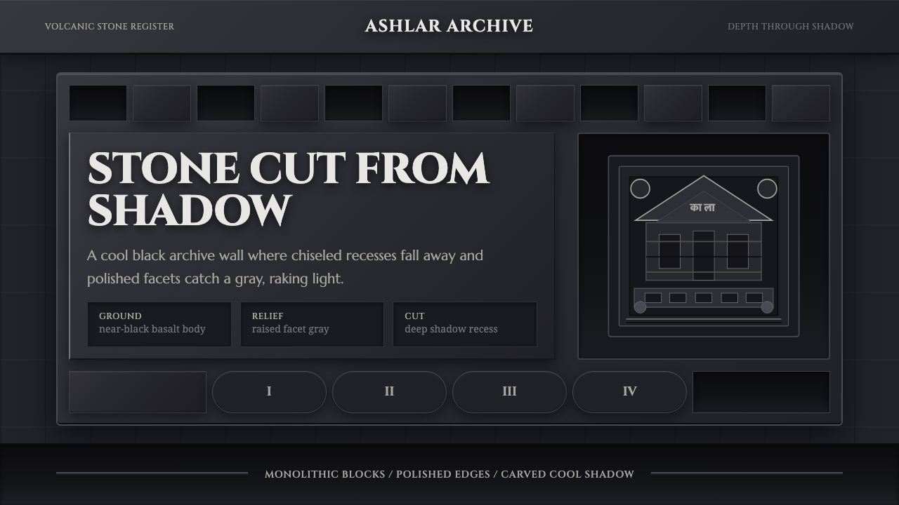 Deccan Basalt TempleMonumental shadow, carved. Near-black basalt, Cinzel capitals, and relief gri…
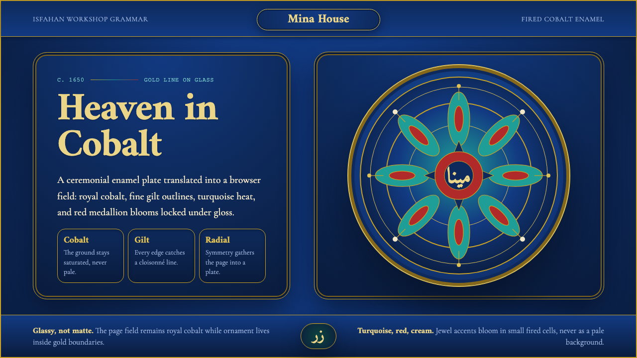 Isfahan Minakari EnamelJewel-bright ceremony. Cobalt enamel, gold cloisonné lines, and radial blooms…
 Minangkabau Rumah GadangMatrilineal grandeur, carved. Red-gilt ukiran relief on dark lacquered wood u…