What is James Bond 007 (1962)?
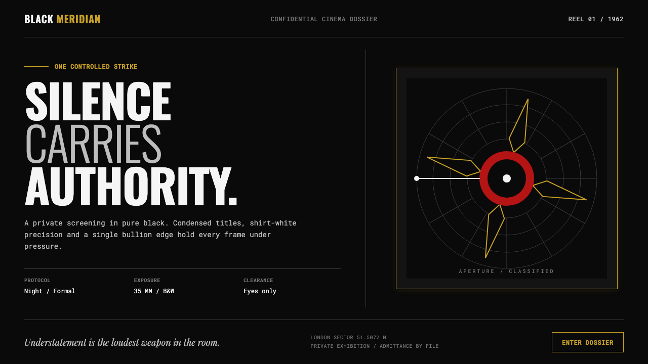
James Bond 007 turns restraint into spectacle: black as atmosphere, condensed white type as command, and gold as the single flash that proves authority.
James Bond 007 (1962) in brief
James Bond 007, as established with Dr. No in 1962, is a dark graphic language built from pure black fields, white highlights, sharp silhouettes, circular targets, rifled spirals, and title cards that arrive with mechanical certainty. Its visual logic is not luxurious through accumulation. It is luxurious through selection: a tuxedo disappearing into night, a shirt front catching the eye, a single gold accent interrupting an otherwise monochrome world.
Maurice Binder’s gunbarrel sequence supplies the central image system. A white dot crosses blackness, enters the concentric geometry of a rifled bore, and resolves in red. The movement establishes a visual grammar of aim, pursuit, exposure, and consequence. Circles are never merely decorative; they frame a target or pull the viewer toward a point of danger. Spirals imply machinery and controlled force.
The style belongs to 1960s title-sequence graphic design, Swiss-influenced film typography, and spy-thriller modernism. It is high contrast without becoming noisy. Each element appears cut, placed, and locked into position, as though the frame were an engineered device. Sentiment is withheld. Softness, diffusion, and visual clutter would weaken the effect; the drama comes from precision, silence, and decisive interruption.
Where does James Bond 007 (1962) come from?
The visual identity emerged in the early James Bond films made between 1962 and 1967, with Dr. No, From Russia with Love, and Goldfinger forming its defining early run. Set within the production world of London and Pinewood Studios, the style gave a spy thriller a recognisable visual entrance before plot, dialogue, or character exposition had begun. It made danger legible as a graphic event.
Maurice Binder codified this entrance through the gunbarrel sequence. Its white point, black field, rifled circles, and final red bloom condense the atmosphere of the series into a brief visual ritual. The sequence does not ease the audience into the film. It places the viewer immediately inside a viewfinder, where looking and being seen are inseparable.
The wider language developed alongside 1960s title-sequence graphic design and Swiss-influenced film typography. These influences favor direct communication, strong contrast, clean alignment, and type that behaves as image rather than as explanatory furniture. In the Bond context, that discipline acquires a colder, more theatrical charge: words become evidence, instructions, or a signature.
Maurice Binder, Robert Brownjohn, Ken Adam, Terence Young, and Ian Fleming are the key figures associated with the source material for this era. Together they define a useful frame for reading the aesthetic: graphic titles, cinematic modernism, the controlled world of espionage, and a tone in which elegance is never separated from threat.
What defines the James Bond 007 (1962) look?
Black as Atmosphere
Black is not a neutral background. It is the night, the void around the target, and the surface against which every decision becomes visible. Large uninterrupted black areas create secrecy and authority. They also make restraint possible: one white detail or one metallic accent can carry the entire frame.
Condensed White Type
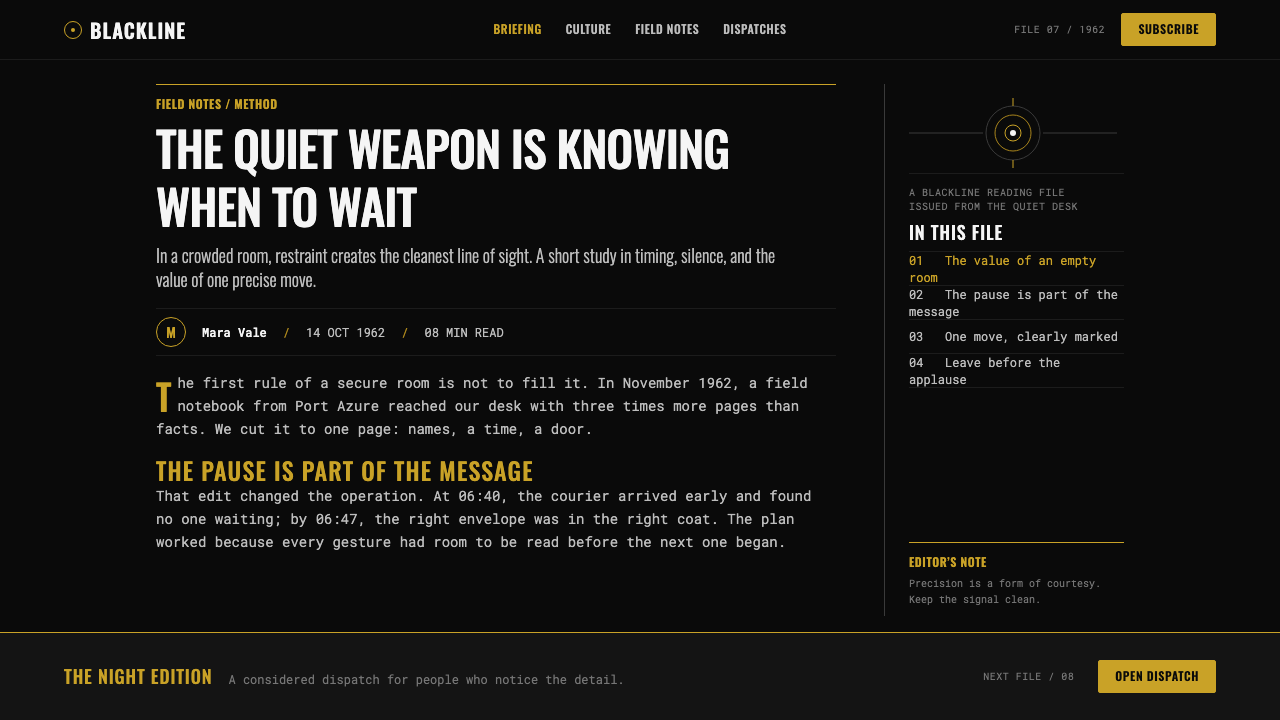
Typography is bright, condensed, and emphatic against the dark field. It should feel compressed into purpose rather than expanded for decoration. Titles command attention through contrast, narrowness, and placement. The letterforms behave like an official signal: concise, legible, and slightly severe.
Gunbarrel Geometry
Dots, rings, and rifled spirals form the signature geometry. The white dot introduces motion; concentric forms turn movement into a line of sight; the bore pattern gives that line a mechanical edge. Use circular forms as framing devices, targets, apertures, or transitions, never as generic decoration.
Silhouette and Highlight
The tuxedo silhouette is strongest when it nearly merges with its surroundings. A shirt-white highlight, a clean collar line, or a sharply lit profile supplies just enough information to identify the figure. This is an aesthetic of selective revelation: the image withholds more than it describes, and that withholding creates poise.
One Gold Strike
Gold functions as a precise interruption, not a decorative wash. Against black and white, it signals value, ceremony, status, or a moment of controlled excess. Its force depends on scarcity. When gold spreads across the composition, it loses the sharpness that makes it feel like a tailored cufflink or a sudden flash of metal.
Hard Cuts and No Sentiment
Forms should snap into place. Edges remain clear, transitions feel cut rather than softened, and red appears as a dramatic bloom rather than a sentimental atmosphere. The visual rhythm resembles a chambered mechanism: pause, alignment, release. Any effect that feels hazy, tender, or casually ornamental dilutes the spy-thriller tension.
Who shaped James Bond 007 (1962)?
Binder is central to the style because his gunbarrel sequence codified its most enduring visual ritual. The travelling white dot, rifled black geometry, and red resolution establish a compressed vocabulary of pursuit, exposure, and danger before the film’s narrative begins.
Brownjohn is named among the key figures of the early Bond visual world. His presence situates the aesthetic within the era’s title-sequence graphic design, where typography, image, and motion could carry the film’s attitude before conventional storytelling took over.
Adam is a key figure in the source material’s London and Pinewood frame. He helps locate the style in a designed cinematic world where modernism is not abstract decoration, but part of the controlled, high-stakes atmosphere of espionage.
Young belongs to the founding period of the early film cycle. His inclusion underscores that the Bond look is cinematic as well as graphic: tuxedo, darkness, composure, and threat must read as one coordinated screen presence rather than as isolated design motifs.
Fleming is listed among the key figures behind the source material’s world. Within this design language, the name anchors the spy-thriller context that makes understatement meaningful: elegance is never passive, because every polished surface may conceal a weapon, a target, or a decision.
How do you use James Bond 007 (1962) today?
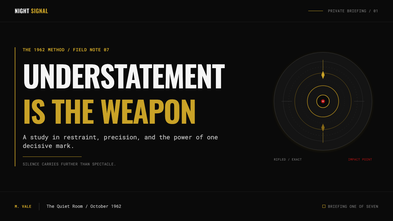
For presentation covers, begin with an almost empty black field. Place a condensed white title with enough surrounding silence to make it feel inevitable, then introduce one circular sightline, a cropped silhouette, or a single gold accent. Keep the composition off-center and deliberate. The cover should suggest that the deck has entered the room before the speaker has.
Content slides should use the same discipline without turning every page into a poster. Establish a stable dark ground, let white type carry the reading task, and use thin graphic dividers, circles, or cropped imagery only when they clarify sequence or hierarchy. For data slides, treat charts as intelligence displays: allow a restrained white structure, reserve red for consequence or exception, and let gold indicate the one signal that deserves priority.
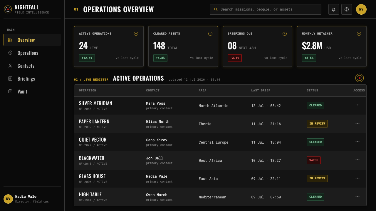
For web interfaces, this language suits dashboards, analytical tools, premium pricing pages, and controlled onboarding moments. Black surfaces can make navigation and status information feel deliberate when white labels remain clear and accents are rare. Circular indicators work well for focus, progress, or selected states; they should not become a field of unrelated badges. The interface must remain readable before it becomes cinematic.
For editorial and marketing work, use the style to create campaign-like focus. A dark opening section, a precise typographic headline, and a tightly cropped image can introduce a product with confidence. Alternate silence with moments of visual impact rather than adding decorative detail to every section. The common mistake is confusing Bond restraint with generic luxury. Excessive gold, glossy ornament, soft atmospheric effects, or too many red accents turn calibrated menace into costume.
James Bond 007 (1962) — FAQ
Is this style simply a luxury black-and-gold look?
No. Gold is important precisely because it is scarce, while black and white carry most of the composition. The defining quality is controlled contrast: dark field, sharp type, selective highlight, and an atmosphere of surveillance or consequence. A layout covered in gold may look expensive, but it does not retain the disciplined tension of early Bond graphics.
How should red be used?
Use red as an event rather than a background mood. The gunbarrel sequence ends in a red bloom, so red naturally communicates impact, exposure, warning, or decisive change. It is strongest when it interrupts a black-and-white composition at one meaningful point. Repeating it across every label or control removes its narrative force.
Can the style work without a gunbarrel reference?
Yes. The gunbarrel is a compact expression of the system, not the only permitted motif. You can preserve the style through black space, condensed white typography, selective silhouette, circular focus, hard-edged transitions, and a rare gold or red interruption. The important point is that every graphic device should imply direction, scrutiny, or controlled force.
Where does this aesthetic struggle?
It struggles where warmth, playfulness, abundance, or sensory softness are central to the message. A product about care, community, or casual discovery may find the black field and severe typography too distant. It works best when the product genuinely benefits from confidence, secrecy, precision, or high-stakes focus; otherwise the visual attitude can overwhelm the content.
Related design styles
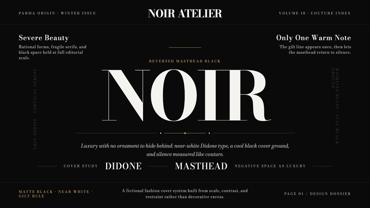 Bodoni Didone Fashion MastheadLuxury as black silence. White Bodoni, tiny coverlines, and one gilt hairline…
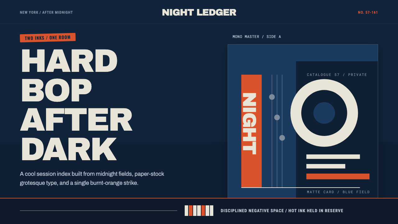 Blue Note JazzCool intelligence, printed flat. Midnight blue, paper type, and one burnt-ora…
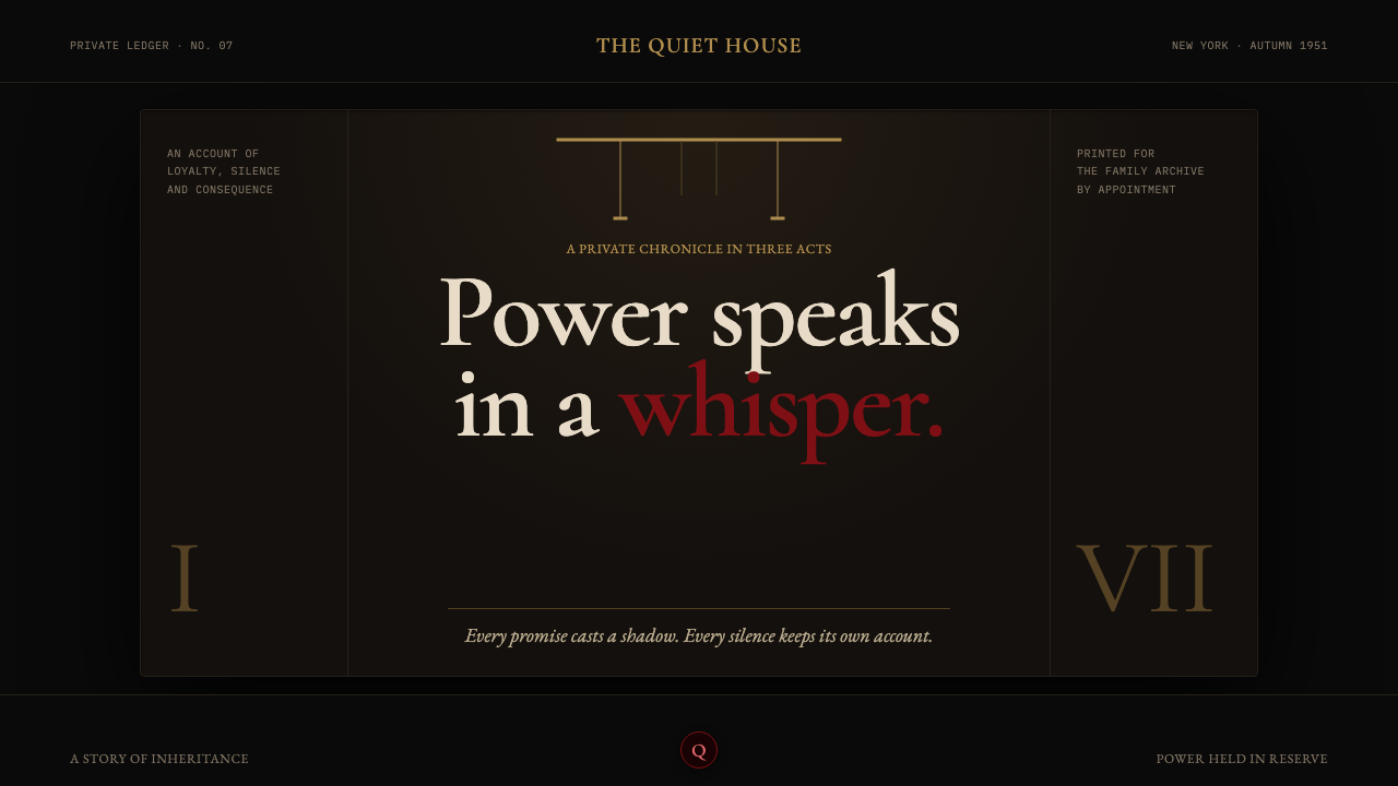 The Godfather (1972)Quiet authority becomes menace. Near-black shadow, brass rules, and one oxblo…
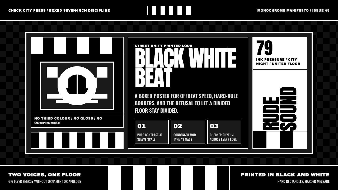 2 Tone SkaContrast as manifesto. White Anton type locks into a near-black checkerboard…
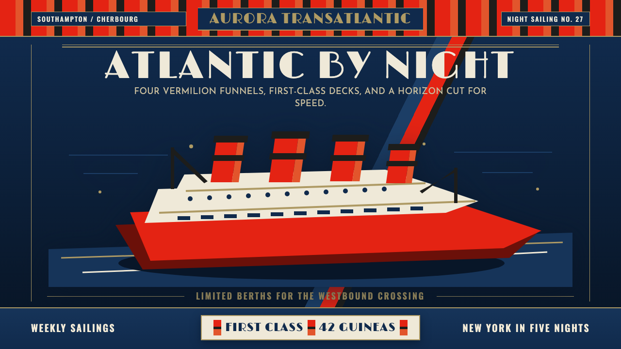 Cunard Liner PosterOceanic grandeur. Vermilion funnels, teak-gold caps, and a marine-blue poster…
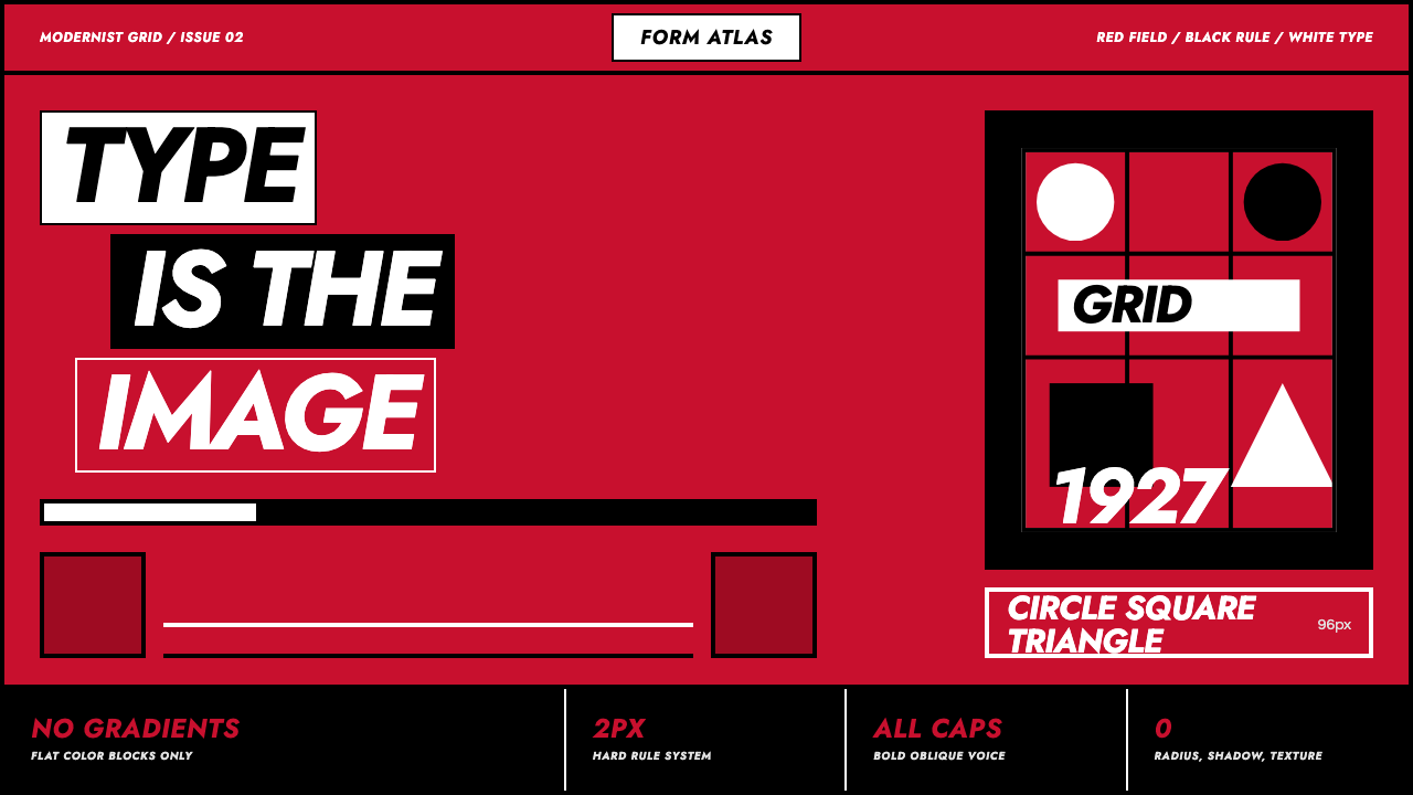 Futura Geometric PosterType becomes image. Red grid, white oblique Jost, black rules at poster scale.