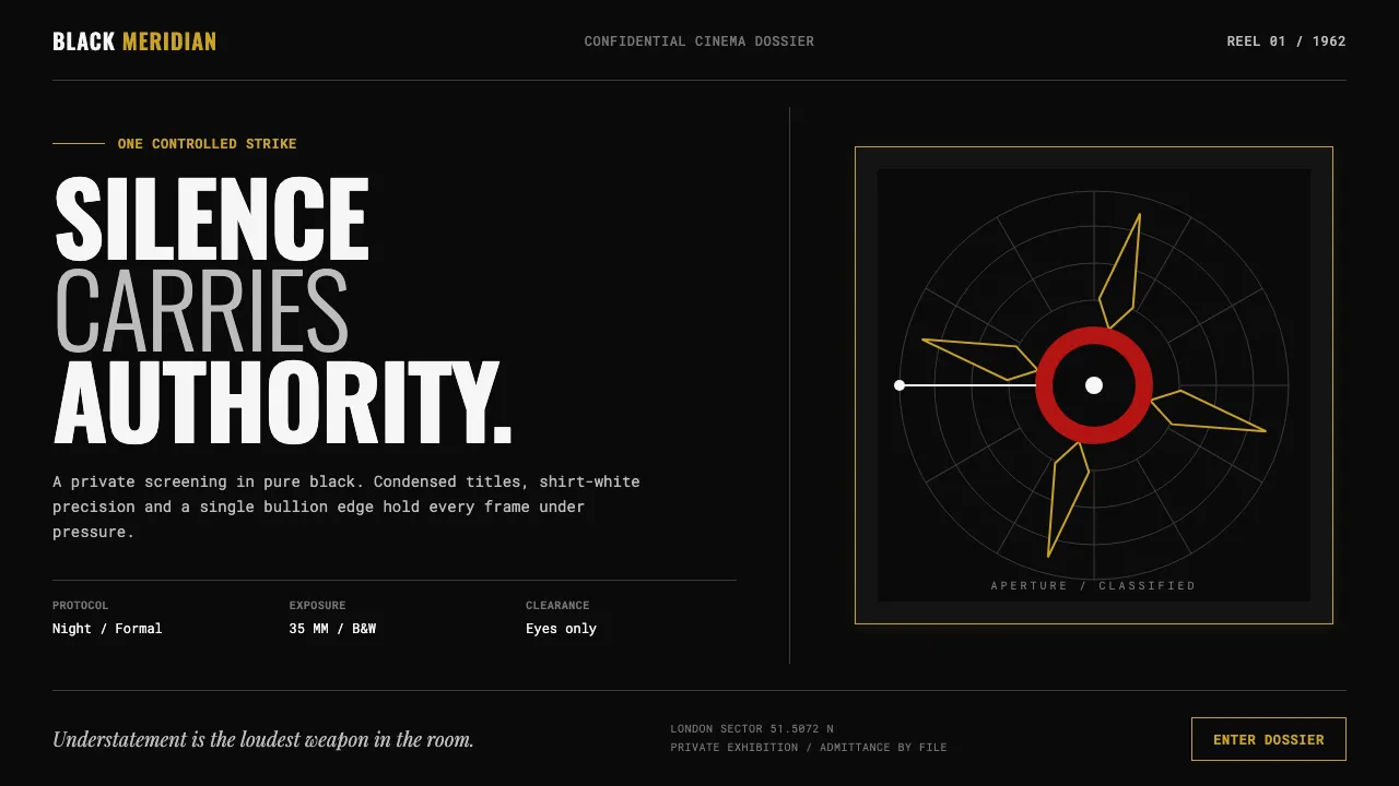
About James Bond 007 (1962)
Born with Dr. No in 1962 and codified by Maurice Binder's gunbarrel, this is monochrome as attitude: a white dot travelling across pure black, spiralling into rifled bore-lines, then blooming red. A black tuxedo against a black night, one shirt-white highlight, one strike of gold.
Everything is graphic, weaponised, high-contrast — dots, spirals, silhouettes, and title cards that snap into place like a slide fired into a chamber. No gradients of sentiment, no soft edges. The composition is as cut and deliberate as a Savile Row lapel: understatement is the loudest weapon in the room.
- Origin
- London / Pinewood Studios, England
- Era
- 1962–1967 (peak: Dr. No 1962, From Russia with Love 1963, Goldfinger 1964)
- Key figures
- Maurice Binder · Robert Brownjohn · Ken Adam · Terence Young · Ian Fleming
- Movements
- 1960s title-sequence graphic design · Swiss-influenced film typography · spy-thriller modernism
James Bond 007 (1962) design spec
Colors
Typography
The other 11 sections — buttons, cards, spacing, motion, techniques and more — open once you unlock. Download the DESIGN.md or send it to your AI in one click. Unlock once, yours forever.
Sign up nowStyles similar to James Bond 007 (1962)
Also inspired by film, games & music, with a close feel.
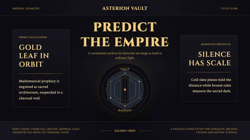 Foundation (Apple TV+ 2021)Sacred empire in shadow. Cinzel capitals and gold geometry float on cosmic charcoal.
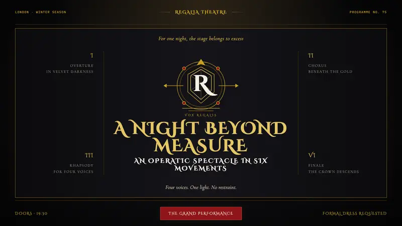 Queen — Bohemian Rhapsody (1975)Rock assumes the crown. Engraved gold, Roman capitals and a lone spotlight rule the black stage.
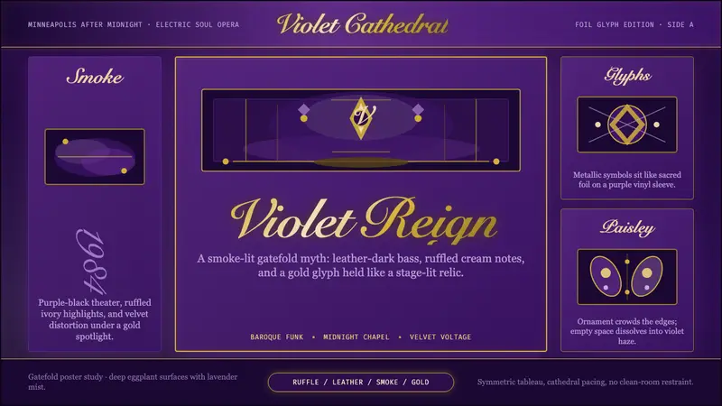 Prince — Purple Rain (1984)Decadence turns electric. Eggplant violet, gold foil glyphs, and smoky symmetry stage the myth.
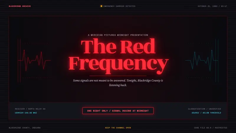 Stranger Things (1983)Red light breaks the void. A spurred serif blooms through VHS static and cold cyan interference.