What is The Godfather (1972)?
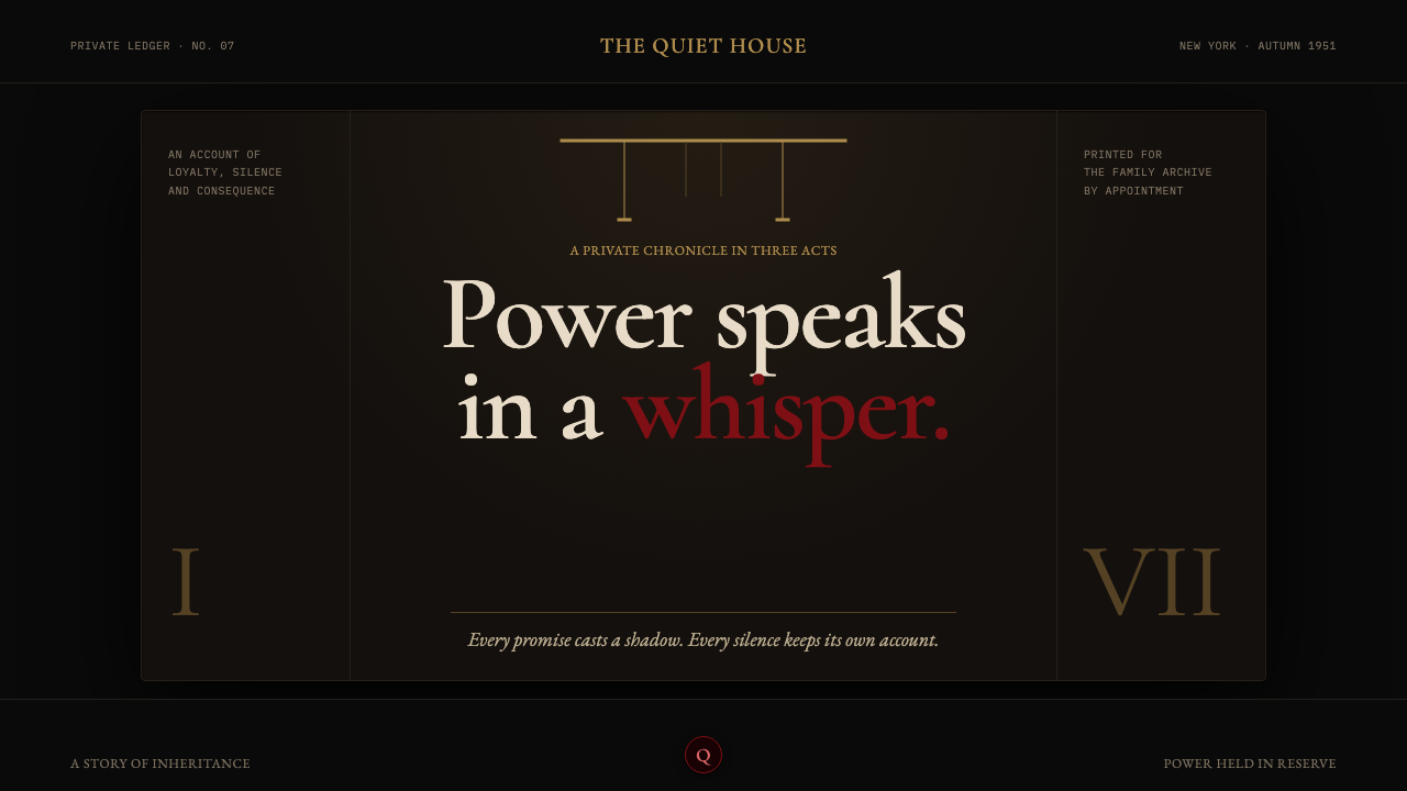
The Godfather turns darkness into authority: a near-black field, a warm brass glint, and one oxblood decision held until it matters.
The Godfather (1972) in brief
The Godfather is a dark editorial design language drawn from Francis Ford Coppola’s 1972 film and S. Neil Fujita’s marionette-strings book jacket. Its atmosphere is ceremonial rather than theatrical: darkness dominates, warmth appears in tightly controlled pools, and a single red accent introduces consequence. The result should feel composed, private, and difficult to interrupt.
The system treats negative space as shadow rather than vacant surface. Large unbroken dark areas create pressure around a headline, an image, or a short statement. Content does not compete for attention; it waits to be noticed. A brass-toned line, a restrained rule, or a pale text block can establish order without weakening the darkness around it.
Its central principle is withheld power. High-contrast serif typography gives language the gravity of a formal declaration, while near-black grounds suppress visual noise. The oxblood accent is never decoration. It marks the one action, warning, selection, or rupture that must carry narrative weight. When every element is emphatic, the style fails; silence is the system’s strongest component.
Where does The Godfather (1972) come from?
The reference point spans Mario Puzo’s 1969 novel and Coppola’s 1972 film, whose story world depicts New York and Corleone, Sicily between 1945 and 1955. That span matters to the visual language: it places family ritual, private rooms, public consequence, and old-world memory in the same frame. The design system should therefore feel historically conscious without becoming a period costume.
The film belongs to American cinema and is associated here with New Hollywood, chiaroscuro cinematography, and the American operatic crime epic. These are useful structural cues rather than surface motifs. New Hollywood suggests a serious, authored visual world; chiaroscuro supplies the logic of selective revelation; the operatic scale gives even small details an air of ceremony and consequence.
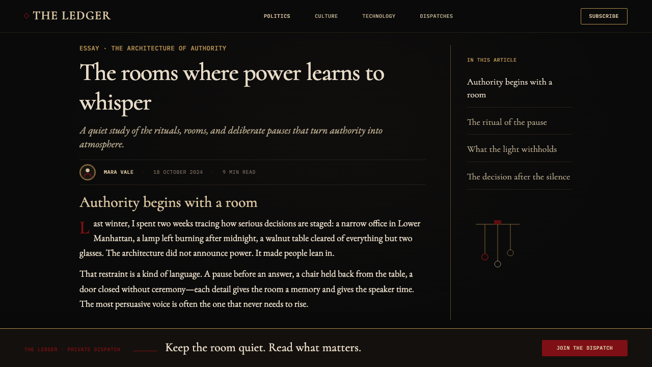
Gordon Willis’s interiors were lit so deeply underexposed that critics called him the Prince of Darkness. This is the visual source for the style’s near-total blackness. Faces, type, rules, and objects should seem to emerge from darkness only where necessary, as though illumination were limited and deliberately placed rather than evenly distributed across a page.
S. Neil Fujita’s marionette-strings book jacket contributes the second essential image: control made visible through a sparse, ominous graphic gesture. Alongside Coppola, Puzo, Willis, and Nino Rota, Fujita anchors a system in which hierarchy is never casual. Every line may suggest connection, constraint, or command; every red interruption must feel earned.
What defines the The Godfather (1972) look?
Darkness as Structure
Near-black is not a backdrop added after the layout is complete; it is the layout’s governing field. Let darkness carry the largest visual mass, then reveal only the text, image edge, or rule needed for orientation. Empty dark areas should feel deliberate and inhabited, like a room in which important information remains just beyond the lamp’s reach.
Brass-Lamp Warmth
Warm brass tones appear as small islands of visibility within the dark. Use them for restrained rules, fine metadata, a selected indicator, or a quiet dividing edge. Their purpose is not luxury for its own sake. They imitate the limited warmth of a lamp, giving the eye a place to pause before it returns to shadow.
Oxblood Accent
The red accent is a controlled breach in the system. Reserve it for one decisive state: a critical action, a dangerous threshold, a pivotal editorial phrase, or a single symbolic object. It should read as a stain, rose, seal, or warning against the dark. Repeating it broadly turns menace into decoration and removes its authority.
Funereal Serif Type
Typography should be formal, high-contrast, and unhurried. A serif headline can carry ceremonial weight when it is given generous darkness around it; supporting text should remain calm and highly legible rather than ornate. Let hierarchy come from scale, placement, and restraint. The voice is a private declaration, never a shouted campaign.
Rules and Restraint
Fine brass rules and sparse dividers organize the page like boundaries in a private office. They should align content, separate a name from a statement, or hold a small block in place. Avoid decorative frames, elaborate flourishes, and repeated motifs. A line matters because it is rare, straight, and accountable to the composition.
Selective Revelation
Images should not explain everything at once. Favor fragments, cropped details, silhouettes, partial faces, and objects caught by a limited warm light. The visual narrative gains force from what remains obscured. A full, evenly illuminated scene weakens the theme because it removes the tension between knowledge and concealment.

Who shaped The Godfather (1972)?
Coppola is the director named as the source of the 1972 film reference. In this design system, his film supplies the overarching visual gravity: private darkness, formal restraint, and a sense that each frame carries consequences beyond what is spoken.
Puzo’s 1969 novel establishes the earlier literary point in the theme’s timeline. Its presence keeps the visual approach from becoming film-still imitation alone: the system should also work for long-form reading, titles, chapter-like divisions, and language that arrives with measured authority.
Willis is the cinematographer whose deeply underexposed interiors earned the description Prince of Darkness. His contribution is the style’s lighting logic: darkness is active visual material, and warm illumination is most effective when it reveals only a fragment of the scene.
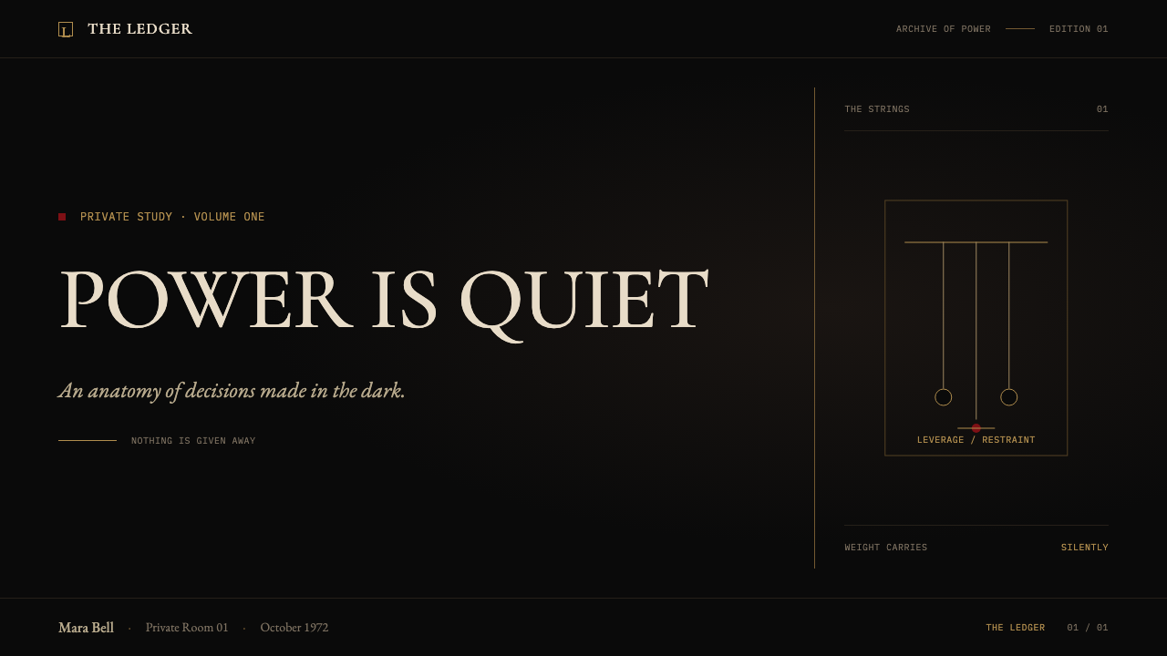
Fujita’s marionette-strings book jacket provides a graphic counterpart to the film’s shadow. It suggests that a sparse line can carry narrative pressure. Within the system, lines are not ornaments; they can imply control, hierarchy, unseen connection, or an action set in motion.
Rota is named among the theme’s key figures. His inclusion reinforces the operatic dimension of the American crime epic: compositions should have pacing, recurrence, and emotional control, allowing a small repeated visual cue to feel more consequential than a crowded collection of effects.
How do you use The Godfather (1972) today?
For presentation covers, begin with a large field of darkness and one clearly placed declaration. A restrained serif title can sit beside a cropped image, a brass rule, or a small oxblood mark, but the cover should preserve substantial shadow around the focal point. The aim is not to summarize the presentation; it is to establish authority before the first content slide appears.
For content slides, use the darkness to create disciplined reading order. Set one main statement, a small supporting block, and only the structural lines needed to separate them. Keep warm brass details secondary and let pale text carry the information. The slide should feel like a composed briefing: sparse, legible, and resistant to distraction.
For data slides, translate charts into a hierarchy of revelation. Use muted structural marks for context, allow the main measure to emerge clearly, and reserve oxblood for the exceptional figure or decision point. Do not make every series equally bright. A restrained chart lets the audience identify the important movement before encountering the explanation.
For web interfaces, this approach suits dashboards, account areas, pricing pages, and editorial tools where seriousness and hierarchy are useful. Panels should feel like zones emerging from a shared dark room, not like a pile of floating cards. Brass rules can guide scanning, while the red accent remains attached to one consequential action or state rather than ordinary navigation.
For editorial and marketing work, use the style for launch stories, premium reports, invitations, and narrative landing pages that benefit from suspense. Pair a sparse headline with a close crop or silhouetted object, then let long dark intervals pace the reading experience. The common mistake is confusing darkness with clutter: adding many red controls, gold ornaments, dramatic images, and dense copy creates melodrama. The authentic effect comes from choosing less and withholding more.
The Godfather (1972) — FAQ
Is this style simply a black-and-red luxury look?
No. The dark field, brass warmth, and oxblood accent are meaningful only when they establish hierarchy and withheld information. Luxury styling often adds gleaming detail everywhere; The Godfather system does the opposite. It makes a small warm rule or red interruption consequential by surrounding it with restraint.
Can the oxblood accent be used for every call to action?
It should not. The accent works because it is scarce and attached to consequence. Use quieter pale or brass-toned treatments for ordinary actions, then reserve oxblood for the action, warning, or editorial turn that genuinely changes the reader’s situation. Repetition makes it visually ordinary.
How should imagery be handled in this system?
Treat imagery as selective evidence rather than complete explanation. A fragment, silhouette, partial face, close object, or image edge entering darkness is more appropriate than a fully illuminated scene. The image should preserve uncertainty and leave room for the typography and shadow to carry part of the story.
Does the style work for data-heavy dashboards?
Yes, if readability remains primary. The dark field can reduce distraction and make a key measure prominent, but dense tables and charts still need clear labels, dependable contrast, and calm structure. Brass rules should organize rather than decorate, while oxblood should identify an exception instead of becoming a second data palette.
What most often makes a Godfather-inspired layout feel inauthentic?
Overstatement. Too many warm highlights, too much red, busy ornamental framing, and uniformly dramatic imagery turn quiet menace into spectacle. Return to the governing idea: darkness holds most of the page, warmth is limited, and one decisive accent has more power than a crowd of visual effects.
Related design styles
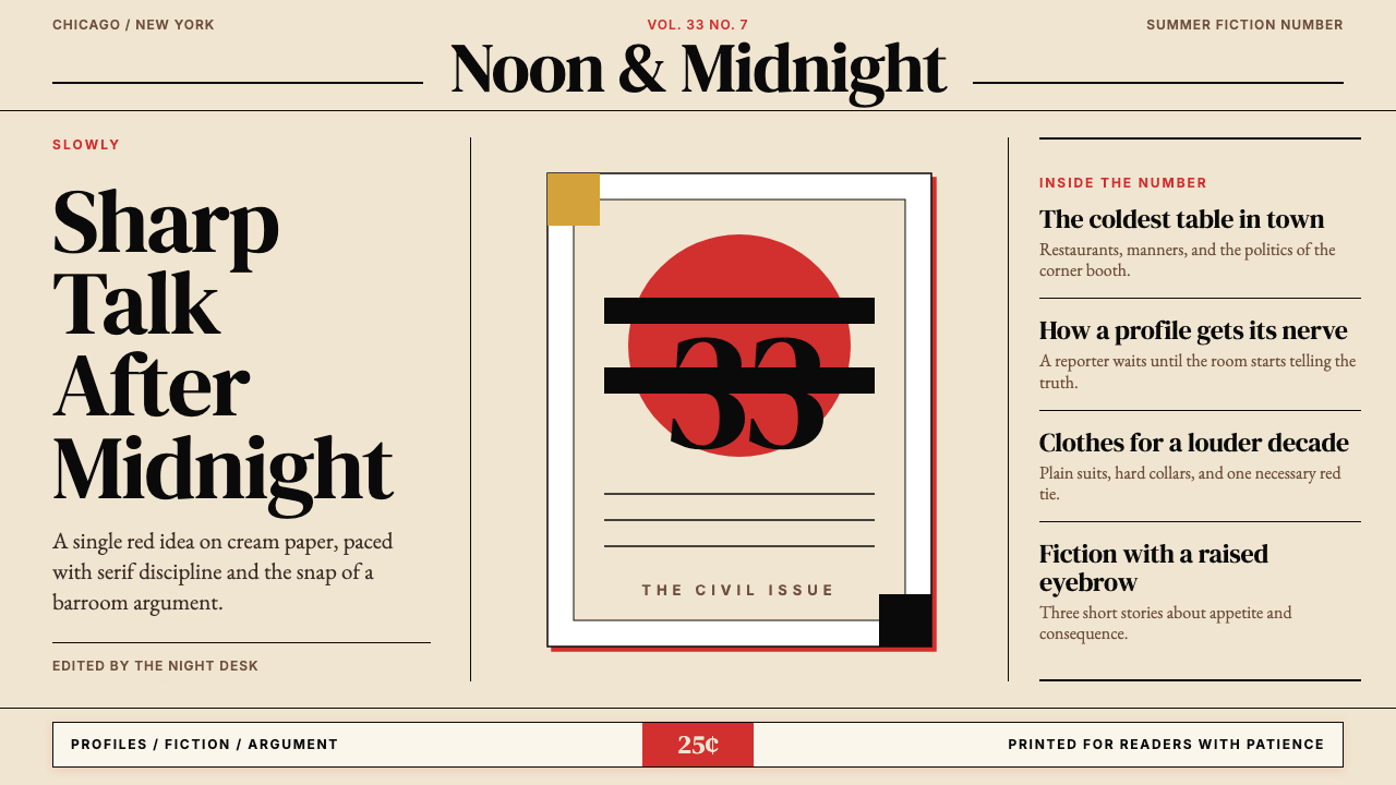 Esquire MagazineConceptual punch on paper. Cream stock, black hairlines, and one saturated re…
 Om Kalthoum Record SleeveOpulence pressed into cardboard. Struck gold Aref Ruqaa on aubergine, rosette…
 Rolling Stone MagazineCounterculture gets editorial weight. Cream paper, lipstick red script, serif…
 Cuban Malecón 1960 PosterPublic voice in flat ink. Turquoise wall, cream stock, brick red and cobalt b…
 Film Noir ChiaroscuroLight is the crime. Silver serif cards, blind stripes, and grain carve drama…
 James Bond 007 (1962)Understatement carries authority. Pure black, condensed white type and one pr…