What is Om Kalthoum Record Sleeve?
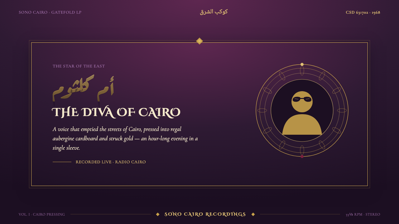
Om Kalthoum Record Sleeve presses the grandeur of Cairo’s radio age into a dark gatefold cover: aubergine cardboard, struck-gold Aref Ruqaa, rosette borders, and a diva held at the center like a treasured broadcast.
Om Kalthoum Record Sleeve in brief
Om Kalthoum Record Sleeve is a visual system drawn from the Sono Cairo gatefold LP covers that carried Umm Kulthum’s voice across the Arab world. Its character is immediately material: deep regal aubergine establishes the field, gold display Arabic lettering supplies ceremonial brilliance, and repeating rosette medallions turn the border into a frame of honor. The cover does not merely package a recording. It presents the record as an occasion.
At the center sits the image of Umm Kulthum, the singer known as the Star of the East, often identified through her signature cat-eye sunglasses. The portrait is not treated as a casual photograph or an interchangeable promotional asset. It is the visual anchor around which lettering, ornament, and generous dark space organize themselves. The result feels intimate and monumental at once: a beloved voice made physically present through cardboard, ink, gold, and enclosure.
The style belongs to the golden age of Arabic music recording and to mid-century LP cover design, but it does not depend on nostalgia alone. Its power comes from a disciplined contrast between restraint and abundance. The aubergine ground remains calm and unbroken; gold is reserved for names, titles, and ceremonial marks; the rosette motif repeats with purpose rather than filling every available surface. Warmth comes from density, sheen, and reverence, not from casual decoration.
Where does Om Kalthoum Record Sleeve come from?
The reference point is Cairo in the 1960s, a period identified here with the golden age of radio-era Arab music. In that context, the LP sleeve had to do more than identify an artist and title. It had to carry a voice beyond the moment of broadcast and make that voice recognizable in shops, homes, and personal collections. The Sono Cairo gatefold cover became a fitting format for this task: a broad cardboard surface able to hold portraiture, display lettering, ornament, and the sense that music deserved a formal threshold.
Umm Kulthum, who lived from 1904 to 1975, is the cultural center of the reference. Her image gives the sleeve its emotional gravity, while the surrounding design gives that image a public, almost ceremonial setting. The cat-eye sunglasses are especially important because they condense recognition into silhouette and attitude. A cover built around such an image can be lavish without becoming anonymous: the visual richness always returns the eye to the singer.
Sono Cairo provides the recording-world context for the design language. The source image is not a generic idea of Middle Eastern ornament; it is specifically a revival of Sono Cairo LP packaging from Cairo. That distinction matters. The gatefold construction, dark cardboard ground, struck-gold Arabic display lettering, and medallion border work as a coherent record-cover vocabulary. Their purpose is to dignify music and preserve its presence, rather than to apply regional signifiers as free-floating surface detail.
The style also sits at the meeting point of three named currents: golden-age Arabic music recording, mid-century LP cover design, and radio-era Arabic display lettering. Each contributes something distinct. Recording culture supplies the central performer and the object’s collectible status. LP design supplies the large, frontal field and the enclosing gatefold format. Display lettering supplies the commanding rhythm of Arabic script. Together they create a sleeve whose visual opulence is inseparable from the act of listening.
What defines the Om Kalthoum Record Sleeve look?
Aubergine Ground
A deep, regal aubergine establishes the entire atmosphere. It is neither a neutral backdrop nor a fashionable dark mode substitute. It behaves like dyed cardboard in low light: warm, dense, and absorbing. The field should remain visually calm enough for gold lettering and portraiture to feel precious. Cream grounds and cool-color alternatives weaken the particular gravity of this system.
Struck-Gold Lettering
Gold is the sleeve’s principal gesture of opulence. Used with Aref Ruqaa display Arabic, it reads as inscription rather than ordinary interface text. The lettering should feel pressed, stamped, or ceremonially placed on the surface, with enough surrounding darkness to let its rhythm carry authority. Gold works best when it names, announces, or dedicates; spreading it across every text element turns ceremony into glare.
Rosette Medallion Border
Rosette medallions create enclosure without relying on a plain ruled frame. Their repetition gives the edge a measured pulse, making the sleeve feel crafted and held together. The border is not independent decoration: it directs attention inward, supports the central portrait, and gives the gatefold a ceremonial perimeter. Keep its rhythm legible. When the motif becomes too dense or too varied, it loses its role as a frame.
Central Diva Portrait
The image of Umm Kulthum is the cover’s point of concentration. Her signature cat-eye sunglasses give the portrait a distinctive, immediately recognizable character, but the composition should preserve dignity over novelty. Frame the figure rather than crowding it with type. The portrait may be surrounded by ornament and lettering, yet it should remain the quiet authority from which the other elements take their permission.
Radio-Era Display Rhythm
The typography is expansive and performative. Arabic display lettering is not only read; it is seen as gesture, cadence, and public address. Titles and names should occupy the surface with confidence, using the script’s flow to counterbalance the stillness of the portrait and the regularity of the rosettes. Supporting text must recede. The hierarchy depends on the contrast between a commanding inscription and quieter factual information.
Gatefold Materiality
This style should retain the logic of a physical gatefold LP even when translated to screens. It favors broad fields, formal framing, and the impression of layers that open rather than panels that merely stack. The feeling is tactile and archival: opulence pressed into cardboard, not luxury simulated through glossy digital effects. Surfaces should feel printed, embossed, or carefully assembled, while remaining coherent with the dark, warm record-sleeve world.

Who shaped Om Kalthoum Record Sleeve?
Umm Kulthum, known here as the Star of the East, is the essential presence in the sleeve’s visual world. Her recordings are the reason for the object, and her portrait gives the design its center of gravity. The cat-eye sunglasses associated with her image make a particularly effective visual signature: elegant, memorable, and strong enough to hold its place amid gold lettering and ornamental borders.
Sono Cairo is the recording-label reference behind the revived gatefold LP cover language. Its importance is contextual as much as visual: it ties the palette, lettering, portrait treatment, and package format to Cairo’s radio-era music culture. Referencing Sono Cairo means preserving the coherence of a record sleeve, rather than borrowing isolated motifs detached from music, place, and material form.
The gatefold LP cover is the format that makes this visual abundance feel necessary rather than excessive. Its cardboard expanse accommodates a central singer, large display Arabic, and an ornamental perimeter without reducing any one element to a small badge. It also establishes the sleeve as a container with an inside and outside, reinforcing the sense that the listener is entering a prepared cultural space.
How do you use Om Kalthoum Record Sleeve today?
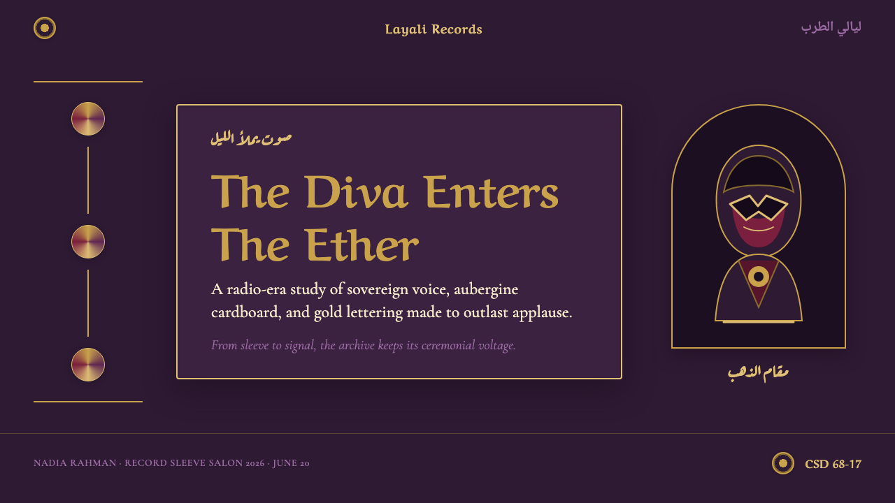
For presentation covers, use the sleeve’s ceremonial hierarchy rather than attempting to reproduce a record cover literally. Let an aubergine field establish the mood, use a struck-gold display title as the principal inscription, and place one hero portrait or emblem in a composed central position. A restrained rosette perimeter can signal occasion and frame the title. The cover should feel like an invitation into a performance, archive, or cultural program.
For presentation content and data slides, translate the visual language into clear editorial zones. Keep explanatory copy quiet against the dark ground, reserve gold for section names and decisive figures, and use medallion forms to mark recurring categories or milestones. Charts should remain legible first; the style enters through framing, hierarchy, and a warm dark atmosphere rather than through ornamental overlays on every bar or label.
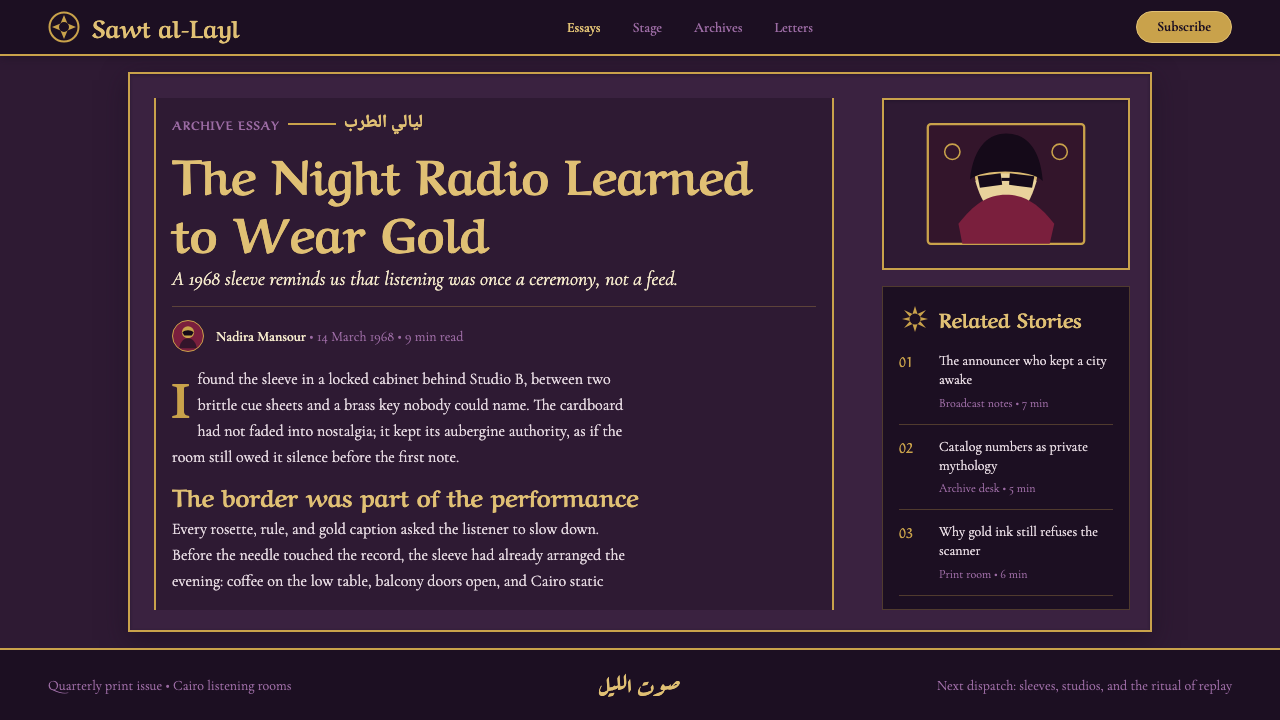
For web interfaces, this approach is especially suited to music archives, cultural collections, membership spaces, event programs, and premium editorial dashboards. A dark aubergine environment can give navigation and content a unified sense of enclosure. Gold display lettering works best for page titles, featured releases, or selected states, while practical labels remain calm and readable. Rosette motifs belong at boundaries, empty states, section markers, or collectible details, not beside every control.
For editorial and marketing work, treat the system as an art direction for reverence and anticipation. Long-form pages can open with a centered portrait and ceremonial title, then move into quieter text fields framed by occasional medallion dividers. Campaigns benefit from the contrast between deep aubergine expanses and gold announcements. The visual promise should be cultural richness and attention, not generic luxury.
The common mistake is to confuse ornate with crowded. This style needs a dominant dark field, a clear central subject, and gold that appears meaningful because it is limited. Adding unrelated cool colors, pale cream surfaces, glossy decorative effects, or many competing ornaments breaks the radio-era atmosphere. The strongest application lets the rosettes frame, lets the lettering announce, and lets the portrait command the room.
Om Kalthoum Record Sleeve — FAQ
Is this style simply a generic Middle Eastern luxury look?
No. Its reference is specific: Sono Cairo gatefold LP covers for Umm Kulthum in Cairo’s radio-era Arabic music culture. The aubergine ground, struck-gold display Arabic, rosette medallion border, and central diva portrait work because they belong to one record-sleeve system. Removing that cultural and material context turns the style into disconnected ornament rather than a meaningful visual language.
Can the sleeve language work without a portrait of Umm Kulthum?
It can, but the replacement needs comparable symbolic weight. A featured performer, a cultural emblem, or a title composition can occupy the center, provided the surrounding lettering and border clearly treat it as the object of honor. What should not happen is the removal of the center altogether. The system relies on a composed relationship between a focal presence, ceremonial type, and enclosing ornament.
Why are cream backgrounds and cool colors unsuitable here?
The approved reference deliberately avoids cream and cool-color treatments in order to preserve a dark, warm, regal atmosphere. Aubergine gives gold its depth and makes the portrait feel enclosed by the materiality of the sleeve. A pale or cool field shifts the mood toward a different visual tradition, reducing the sense of radio-era opulence pressed into cardboard.
How should ornament be controlled in a contemporary layout?
Give ornament a job. Rosette medallions can establish a border, mark a section, or turn a recurring detail into a collectible sign. They should not compete with every headline, button, chart, and image. Contemporary use succeeds when the ornament preserves the sleeve’s sense of enclosure and ceremony while typography and information remain easy to follow.
Related design styles
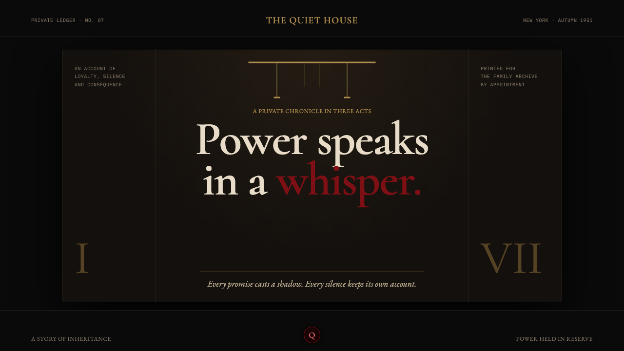 The Godfather (1972)Quiet authority becomes menace. Near-black shadow, brass rules, and one oxblo…
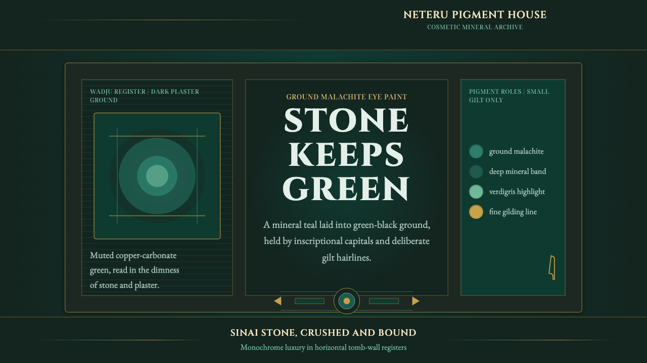 Egyptian Malachite PigmentGrave mineral green. Muted malachite bands on green-black stone, cut by fine…
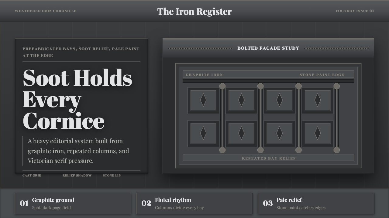 Cast Iron SoHo FacadesIron remembers the city. Graphite bays, Didone type, and pale stone-paint edg…
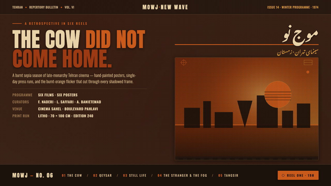 Iranian New Wave PosterPre-revolution Tehran cinema, burnt. Grainy ochre duotone over dark sepia, st…
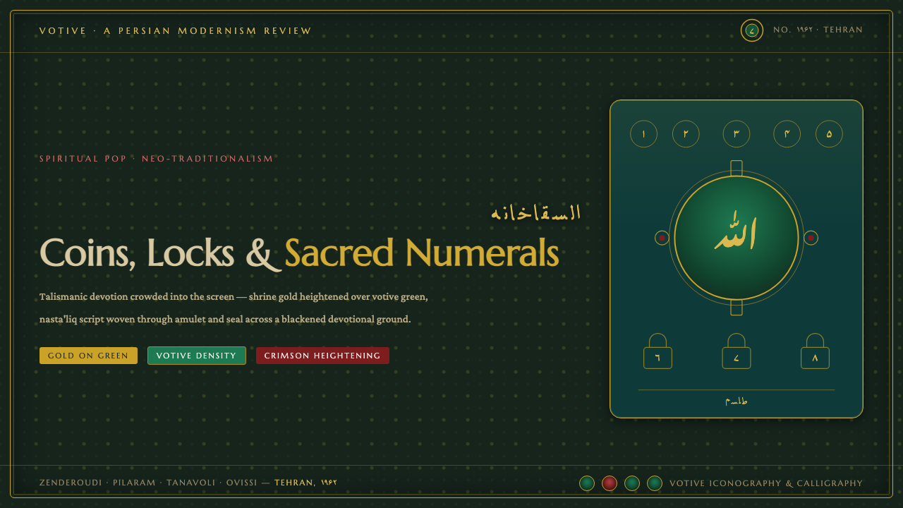 Saqqakhaneh MovementSpiritual Pop with a shrine pulse. Coins, locks and nasta'liq in gold over bl…
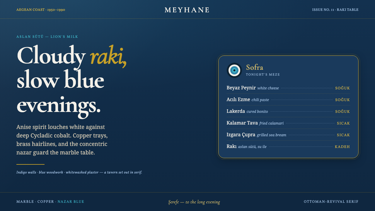 Turkish Meyhane Raki TableThe slow Aegean tavern, in serif. Raki off-white on deep Cycladic indigo, bra…