What is Egyptian Malachite Pigment?
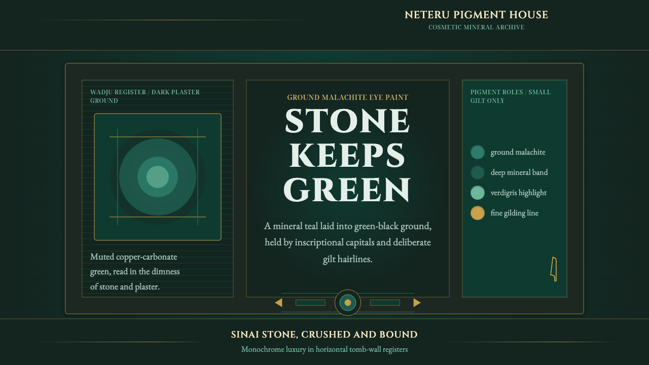
Egyptian Malachite Pigment turns mineral green into an atmosphere of burial stone, banded color, inscriptional gravity, and restrained gold.
Egyptian Malachite Pigment in brief
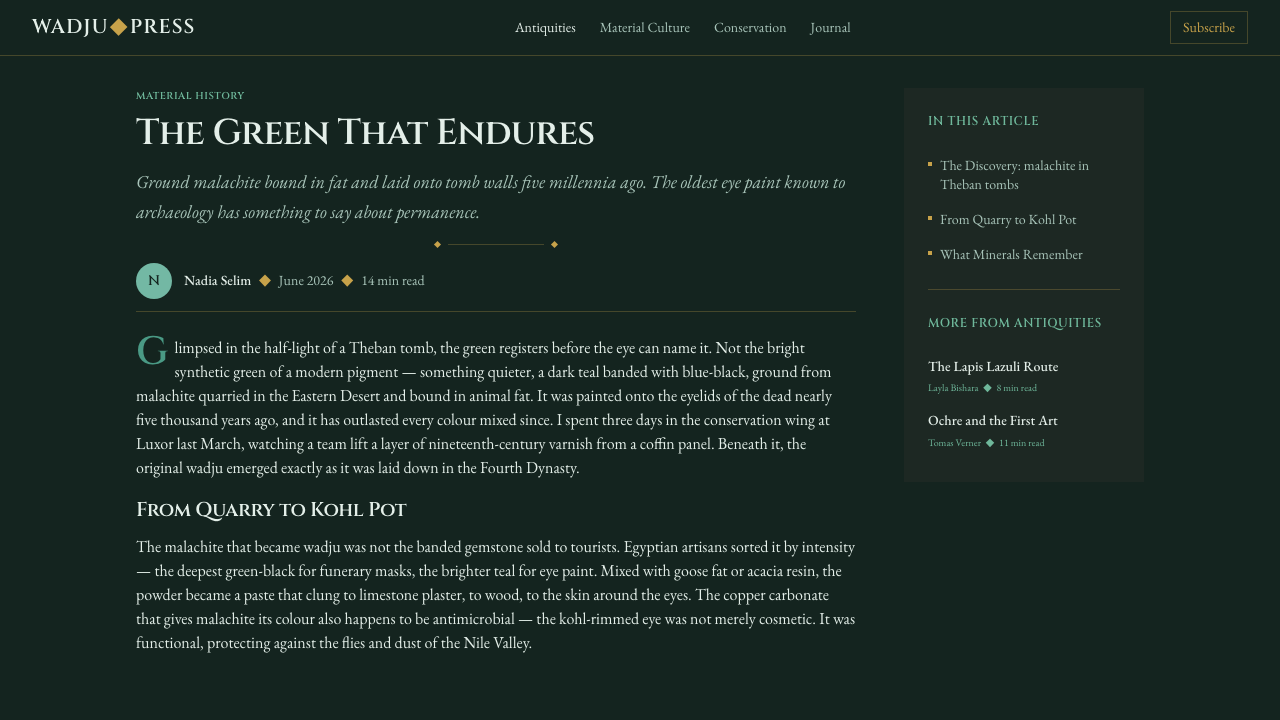
Egyptian Malachite Pigment is a dark visual style derived from ancient Egyptian wadju, a green pigment made by grinding malachite. This copper-carbonate mineral was used both as eye paint and as color on tomb-wall plaster. Mixed with fat for cosmetic use, it could be drawn along the eyelid in a manner comparable to kohl. Its historical identity therefore joins the intimacy of bodily adornment with the permanence and ceremony of painted burial spaces.
The defining green is muted, mineral, and visibly banded. It moves between teal-green and shadowed stone tones rather than approaching the electric intensity of the synthetic dye that later borrowed the malachite name. Deep green-black supplies the ground, while quieter malachite bands create internal movement. Fine gilt lines provide measured illumination without turning the composition into a display of luxury.
This is not a clean white-gallery interpretation of antiquity. The pigment is imagined as it would be encountered against dense stone and plaster, enclosed by inscriptional serif forms and narrow golden divisions. The result feels archaeological but not dusty, ceremonial but not theatrical: a design language built from mineral substance, darkness, disciplined marking, and the controlled visibility of precious detail.
Where does Egyptian Malachite Pigment come from?
The source of the style lies in ancient Egyptian wadju, ground malachite whose green came from copper carbonate. Its history extends from Predynastic through Pharaonic Egypt, placing it within a long material tradition rather than a single reign, workshop, or decorative fashion. Malachite reached Egyptian practice from mineral-bearing regions including Sinai and the Eastern Desert, linking the finished pigment to landscapes of stone, extraction, and transport.
Cosmetic grinders transformed the mineral into a usable substance. Their work stands behind the intimate form of wadju: pigment bound in fat and stroked along the eyelid like kohl. Grinding was not merely preparation for an image; it converted patterned stone into a color that could be carried, mixed, and applied to the body. The style retains that transformation by allowing its green to feel granular, compressed, and bodily rather than polished into anonymous digital brightness.
Tomb painters carried the same mineral family of color into architectural settings, applying green pigment to plastered walls. In that context, green no longer belonged only to the scale of the face. It participated in a larger field shaped by masonry, wall divisions, painted surfaces, and the solemn enclosure of the tomb. The design system follows this spatial reading: malachite does not float as an isolated accent but settles into a dark stone-like environment.
Scribes and gilding traditions contribute the style's secondary language. Inscriptional serif forms suggest words cut, painted, or formally placed within an enduring surface, while fine gilt lines introduce a precious counterpoint to the grave green. These elements do not compete with the pigment. Writing supplies authority and sequence; gold supplies distinction and controlled light. Together with the work of grinders and painters, they form a visual lineage based on preparing, marking, framing, and preserving surfaces.
What defines the Egyptian Malachite Pigment look?
Mineral Green
The principal green is subdued and earthy, combining teal undertones with the density of ground stone. It should appear deposited rather than emitted, as though color has been worked from mineral matter and pressed into plaster. Brilliant synthetic green breaks the historical logic because it replaces material depth with luminous intensity.
Banded Variation
Malachite is represented through restrained bands rather than a perfectly uniform field. Adjacent greens shift gently between cooler teal, muted mineral color, and near-black shadow. The bands should read as natural formation or accumulated pigment, not as a decorative rainbow, a glossy gradient, or a conspicuous special effect.
Green-Black Ground
The ground is a deep green-black that recalls stone without imitating a polished countertop. It gives the malachite room to emerge quietly and makes pale text or gilt marks feel embedded in darkness. Pure black can appear too absolute; the faint green cast keeps the background related to the pigment.
Inscriptional Typography
Serif letterforms carry the authority of inscription and formal record. They should feel deliberate, composed, and durable rather than literary or ornamental. Headings may stand with ceremonial stillness, while body text remains calm and highly readable. Flourishes that imitate exotic antiquity reduce the style to costume.
Fine Gilt Lines
Gold appears chiefly as a narrow framing, ruling, or inscriptional device. Its purpose is to divide, register, and dignify content while introducing a small amount of reflected warmth. Broad golden surfaces overwhelm the mineral green; fine lines preserve the sense that precious material is being allocated with care.
Solemn Surface
Depth comes from layered darkness, mineral banding, and the contrast between matte stone and restrained gilt detail. Soft atmospheric effects are unnecessary. The surface should feel closed, weighty, and enduring, suitable for concentrated viewing rather than casual visual noise. Emptiness functions as silence around an inscription.

Who shaped Egyptian Malachite Pigment?
Cosmetic grinders made malachite usable by reducing mineral stone to pigment. Their role anchors the style in physical preparation: crushing, refining, mixing, and converting a patterned substance into color for the eyelid. A faithful interpretation therefore preserves evidence of mineral origin instead of presenting green as an abstract screen color.
Tomb painters extended mineral green from cosmetic scale to plastered architectural surfaces. Their work provides the model for broad dark grounds, contained color fields, and compositions that feel inseparable from walls and stone. Within this style, content should appear placed upon a lasting surface rather than temporarily hovering above it.
Scribes represent the ordering power of inscription within the visual system. Their presence is expressed through formal typography, measured alignment, and lines that organize reading without becoming ornamental borders. The scribal contribution prevents mineral texture from becoming merely atmospheric: language, hierarchy, and deliberate placement remain central.
How do you use Egyptian Malachite Pigment today?
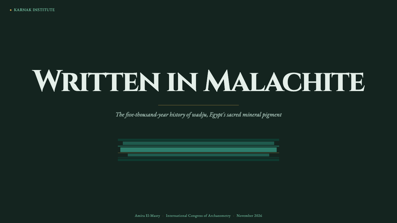
For presentation covers, use the green-black field as an enveloping ground, then introduce one broad malachite band or contained mineral panel behind an inscriptional title. A fine gilt rule can establish the frame or lead the eye toward a subtitle. The cover should feel like an entrance into a chamber, with limited elements and deliberate silence.
Content slides work best as ordered surfaces. Keep text in calm blocks, use serif headings to establish ceremonial hierarchy, and let narrow gold lines separate arguments, captions, or sections. Mineral texture should remain peripheral or contained so that reading stays effortless. On data slides, use related muted greens to distinguish series and reserve gold for a selected result, threshold, or key annotation.
For dashboards and pricing interfaces, the style offers authority and concentration. Deep green-black panels can define the workspace, while restrained malachite states identify active navigation, progress, or category differences. Pricing tiers should be separated by rules and typographic hierarchy rather than excessive card effects. Gold is most effective when it marks the recommended choice or a genuinely important status.
Editorial and marketing layouts benefit from the tension between archaeological weight and refined luxury. Long-form articles can use inscriptional headings, narrow gilt dividers, and mineral bands around quotations or chapter openings. Campaign pages should alternate dense dark passages with quieter malachite fields, allowing product imagery and calls to action to appear as carefully placed exhibits rather than a stream of competing promotions.
The common mistake is turning the theme into generic emerald luxury. Bright jewel green, glossy stone imitation, abundant gold, and pseudo-ancient ornament erase the specific identity of ground malachite. Begin with grave darkness and muted banding, then add gold sparingly. If every border shines and every surface resembles polished jewelry, the material history has been replaced by spectacle.
Egyptian Malachite Pigment — FAQ
Is Egyptian Malachite Pigment simply an emerald luxury style?
No. Its green is muted, banded, and grounded in copper-carbonate mineral rather than brilliant gemstone color. The governing atmosphere is grave stone and painted plaster, not a jewelry showroom. Gold belongs as a fine gilded line or precise marker. Luxury may be perceived, but it emerges from scarcity and restraint rather than shine.
Why should the green remain muted?
Because real malachite pigment is a subdued, banded teal-green. Electric green belongs to the later synthetic dye that borrowed the mineral's name, not to the ancient material described here. Muting the color also allows its relationship with green-black stone, plaster, formal lettering, and gilt lines to remain coherent.
Can the style use a light background?
A light field is possible for a limited inset, document, or plaster-like panel, but it should not become the default atmosphere. The system is defined by muted malachite seen against deep green-black stone. If the entire composition moves onto clean white, the pigment loses its spatial gravity and begins to resemble an isolated color sample.
How much gold should appear?
Only enough to frame, divide, or identify something important. Fine gilt lines suit headings, selected states, section boundaries, and key annotations because they introduce warmth without displacing the mineral green. Large golden fields change the emphasis from pigment and inscription to opulence, weakening the style's solemn character.
What imagery fits the theme?
Imagery should reinforce mineral, cosmetic, plaster, inscriptional, or stone associations already present in the source. Tight crops, quiet surfaces, and controlled framing fit better than bright scenic photography. Images should feel incorporated into a durable field, with malachite bands or gilt rules establishing their place, rather than appearing as unrelated floating windows.
Related design styles
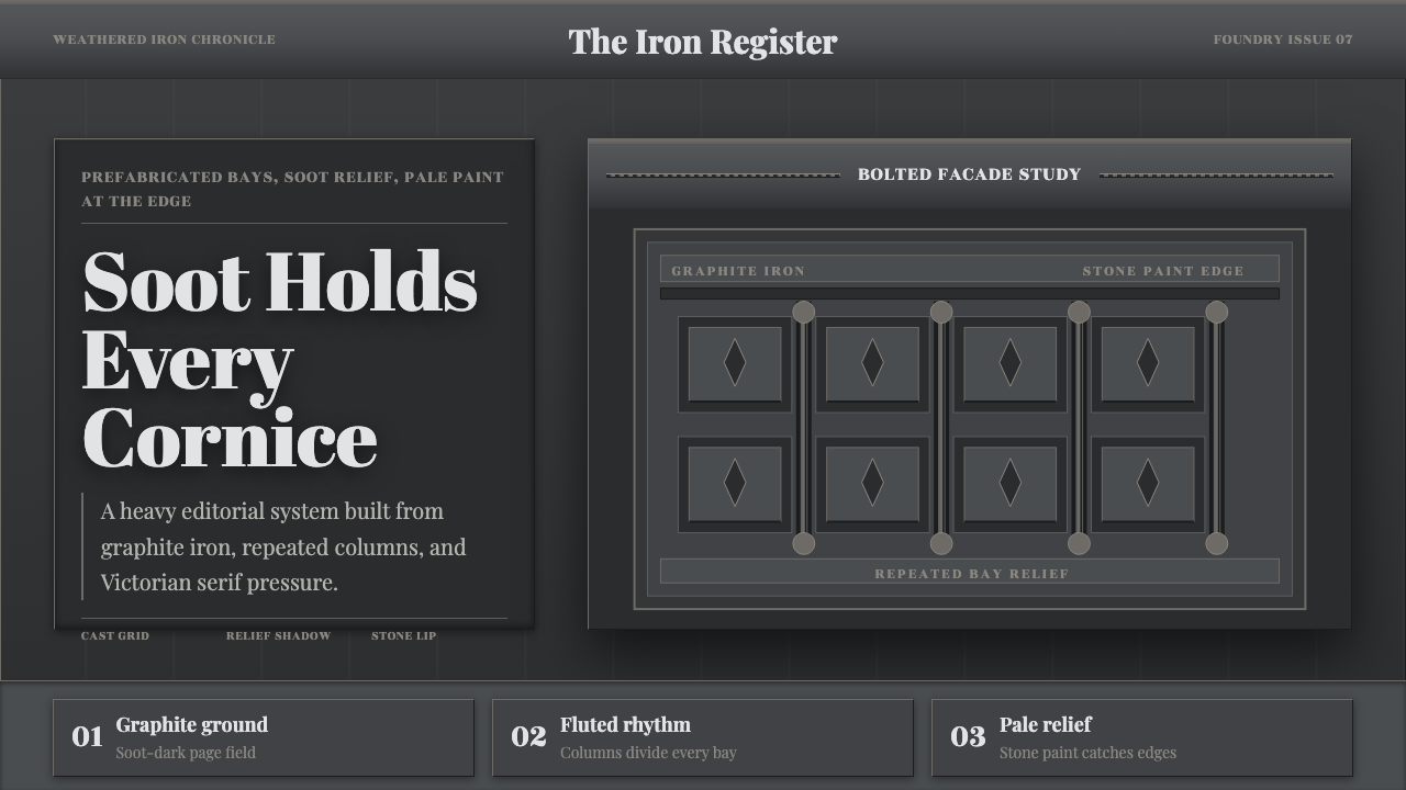 Cast Iron SoHo FacadesIron remembers the city. Graphite bays, Didone type, and pale stone-paint edg…
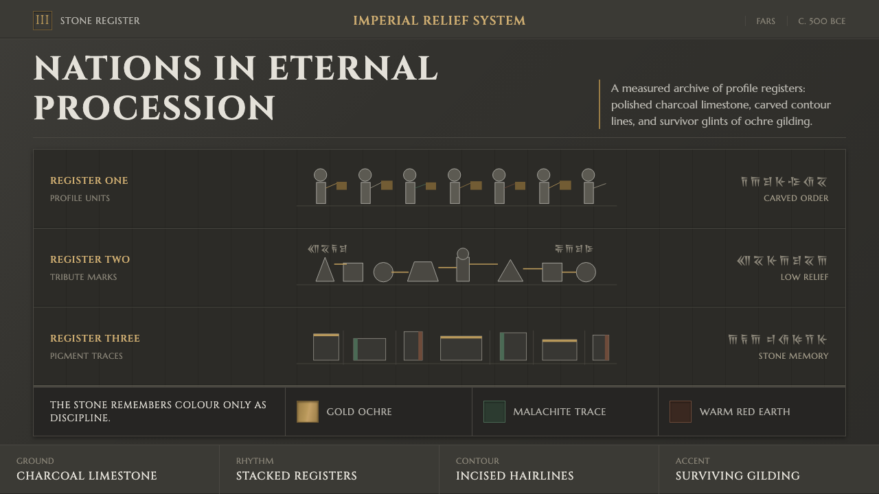 Achaemenid Persepolis ReliefImperial restraint in stone. Charcoal registers carry ochre, green, and red p…
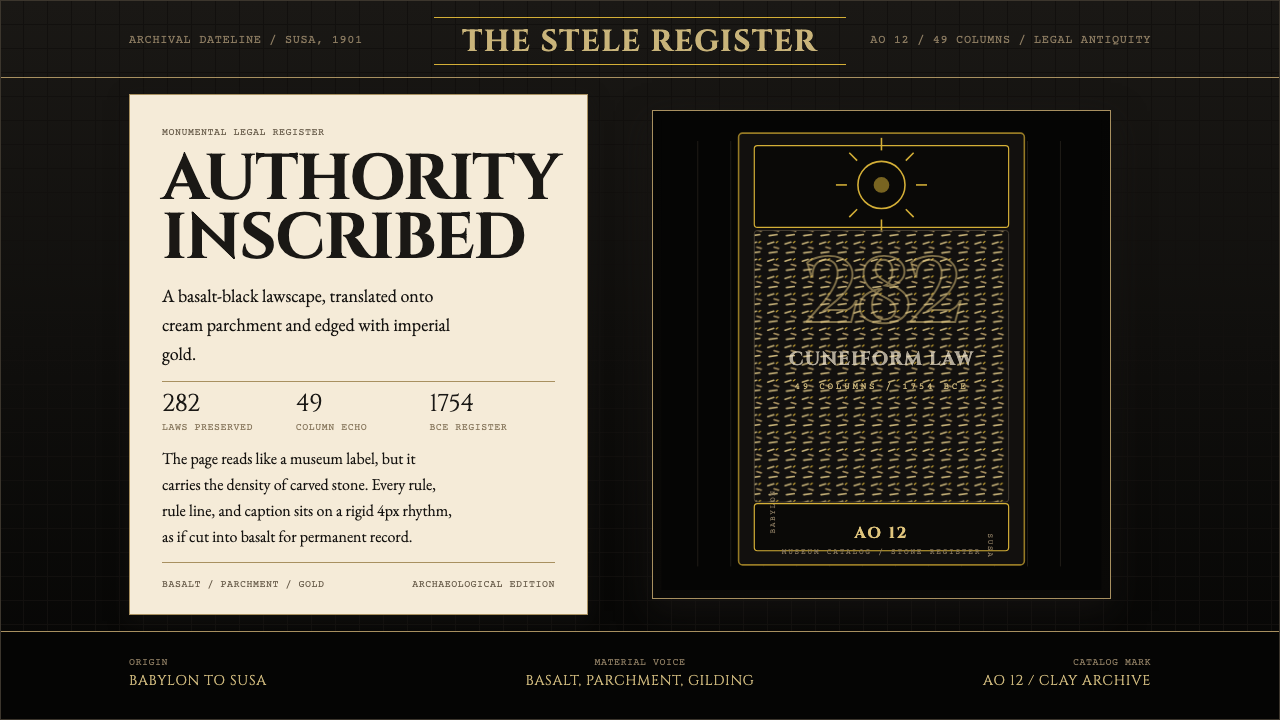 Babylonian Hammurabi SteleAuthority carved in stone. Basalt-black grids, parchment panels, and imperial…
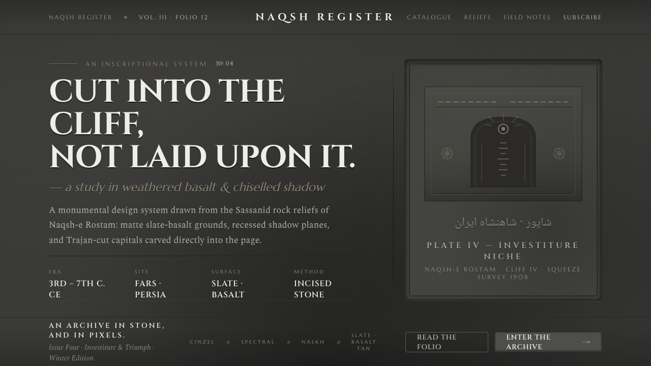 Iranian Dark Stone ReliefCarved into the cliff, not laid upon it. Slate-basalt grays, inset shadows, T…
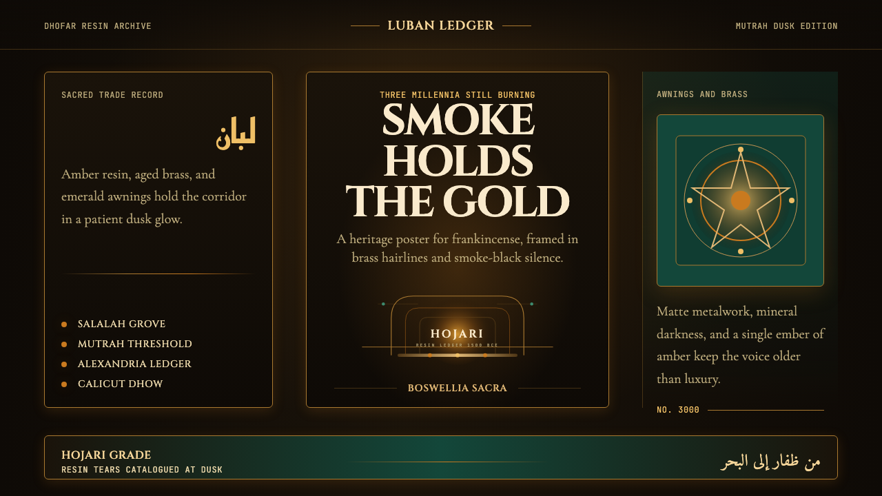 Omani Frankincense Souq AmberAncient trade still glows. Amber smoke, brass frames, and emerald dusk carry…
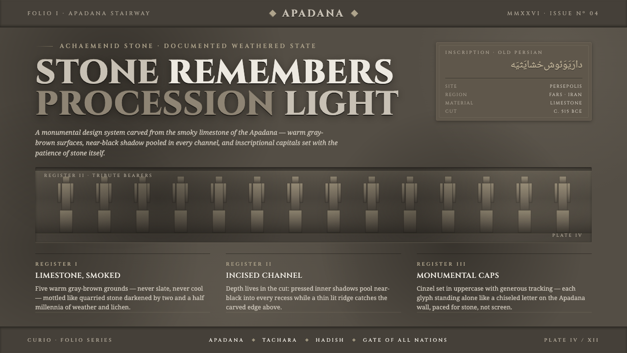 Persian Gray Stone ReliefStone remembers. Smoky weathered limestone, near-black shadow in every channe…