What is Iranian Dark Stone Relief?
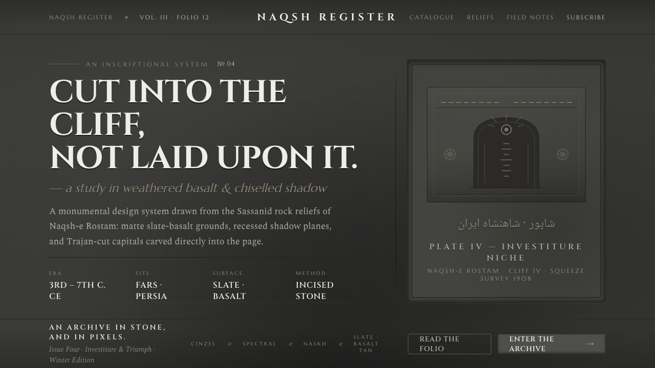
Iranian Dark Stone Relief feels carved into the interface itself — charcoal stone, recessed shadows, weathered gray, and monumental capitals carrying the weight of an ancient cliff.
Iranian Dark Stone Relief in brief
Iranian Dark Stone Relief draws from the carved cliff faces of Naqsh-e Rostam in Fars, where Sassanid sculptors cut investiture and victory scenes directly into natural Persian rock. Its digital expression is dark, matte, and monumental: slate-basalt grays form the ground, while recessed planes and chiseled bands make the interface feel excavated rather than assembled.
The system is defined by the difference between carving and decoration. A panel does not appear to float above the background; it seems cut into it. A divider reads as an inscriptional groove, a card as a hollowed stone plane, and a button as a carefully cut relief whose depth comes from shadow rather than shine. The visual logic is archaeological in mood but disciplined in execution.
Typography completes the illusion. Trajan-style monumental capitals sit like carved inscriptions, with generous breathing room and a deliberate sense of permanence. The palette remains within charcoal-stone and slate-basalt gray, allowing contrast, edge, and depth to establish hierarchy. Nothing needs gloss when the surface already carries weight.
Where does Iranian Dark Stone Relief come from?
The historical source is Naqsh-e Rostam, a monumental cliff site in Fars associated with Persian and Iranian cultural memory. Its reliefs were carved into natural rock rather than applied to a constructed surface. That distinction is essential to the design style: the surface is not a neutral container for imagery, but an active material with its own mass, grain, and resistance.
The relevant visual lineage is Sassanid rock relief, especially the scenes associated with imperial investiture and victory. Shapur I is one of the key figures connected to this material. The relief tradition presents authority through scale, pose, directness, and permanence; it does not depend on delicate ornament or atmospheric effects. The digital adaptation therefore favors monumental structure over decorative richness.
The surviving artifact is not a bright reconstruction of its original appearance. Although the reliefs were once polychrome, what remains is bare slate-basalt gray: weathered, matte, and deeply shadowed. This surviving condition becomes the foundation of the style. Its beauty lies in erosion, incision, and accumulated darkness rather than in restored brilliance.
In contemporary design terms, the system translates carved stone into a complete visual grammar. Backgrounds establish geological weight, typography behaves like inscription, controls occupy recessed planes, and shadows describe cuts in the material. The result is not a literal reproduction of an archaeological site, but a digital language built from the same fundamental idea: form should appear to belong to the surface that carries it.
What defines the Iranian Dark Stone Relief look?
Stone Palette
The palette stays within charcoal-stone, slate-basalt gray, and near-black recesses, with lighter weathered grays used sparingly for legibility. The surface should feel mineral and matte rather than polished. Contrast comes from changes in depth and density, not from a parade of unrelated hues.
Recessed Depth
Depth is expressed through inset shadow planes. Components should feel hollowed from the ground or cut below its surface, with dark edges defining the incision. Soft ambient glow and glossy highlights weaken the material logic because they make objects appear illuminated from outside rather than carved from within.
Inscriptional Bands
Horizontal bands, rules, and labels behave like chiseled inscriptions. They should be firm, measured, and aligned with the larger composition. A band can separate sections, frame a title, or mark status, but it should always feel structural, as though it belongs to the stone rather than being laid over it.
Monumental Capitals
Trajan-style monumental capitals provide the principal typographic voice. Headings should feel ceremonial and carved, while supporting text remains quieter and highly legible. The contrast is created through scale, spacing, and placement; expressive type should be reserved for moments that deserve permanence.
Weathered Flatness
Surfaces are matte, restrained, and visually flat even when the composition suggests depth. The style can imply erosion through tonal variation and irregular edge character, but it should not become a texture showcase. Every mark must support the sense of age, incision, or material resistance.
Imperial Gravity
The overall composition communicates authority through stillness and mass. Large titles, deliberate empty fields, centered or strongly anchored structures, and slow visual transitions make the interface feel ceremonial. The style is strongest when it resists casual playfulness and lets a small number of elements carry the full weight of the page.

Who shaped Iranian Dark Stone Relief?
Shapur I is a key historical figure associated with the Sassanid reliefs of Naqsh-e Rostam. In the design interpretation, his presence represents the style's concern with investiture, victory, and authority made permanent through stone. The reference should be treated as monumental and structural, not as an invitation to add theatrical ornament.
The Sassanid imperial stone carvers provide the system's working metaphor: cutting directly into Persian rock, organizing scenes through relief, and allowing shadow to reveal the incision. Their role in the style is less about individual authorship than about a collective discipline of material, scale, and permanence.
Naqsh-e Rostam is the spatial source of the visual language: a cliff face whose natural surface becomes the ground, frame, and subject of the relief. As a reference, it encourages interfaces with strong anchoring, carved boundaries, and a sense that the content has been uncovered from an existing mass.
How do you use Iranian Dark Stone Relief today?
For presentation slides, use the relief language to make the cover feel like a monumental inscription: a dark stone field, a restrained title in Trajan-style capitals, and one deeply anchored compositional gesture. Content slides should organize information through carved bands, recessed panels, and clear vertical alignment. Data slides benefit from treating charts as relief diagrams, where bars, labels, and axes appear cut into a shared stone plane rather than floating as bright objects.
For web interfaces, the style suits dashboards, archival tools, cultural platforms, and pricing pages that need authority and concentration. Keep navigation quiet, establish strong section boundaries, and use inset states to distinguish active controls from inactive ones. Pricing tiers can be framed as related stone slabs, with hierarchy carried by title scale, inscriptional rules, and depth. The interface should feel stable and deliberate, not glossy or promotional.
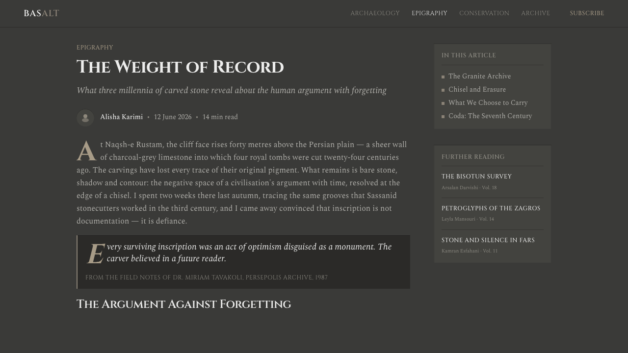
For editorial and marketing work, Iranian Dark Stone Relief supports subjects that benefit from gravity: heritage, architecture, luxury objects, historical research, and institutional storytelling. Long-form pages can pair a narrow reading column with broad dark margins, using engraved-looking section markers to guide the reader. Marketing compositions work best when a single statement is given monumental space, while supporting copy remains secondary and measured.
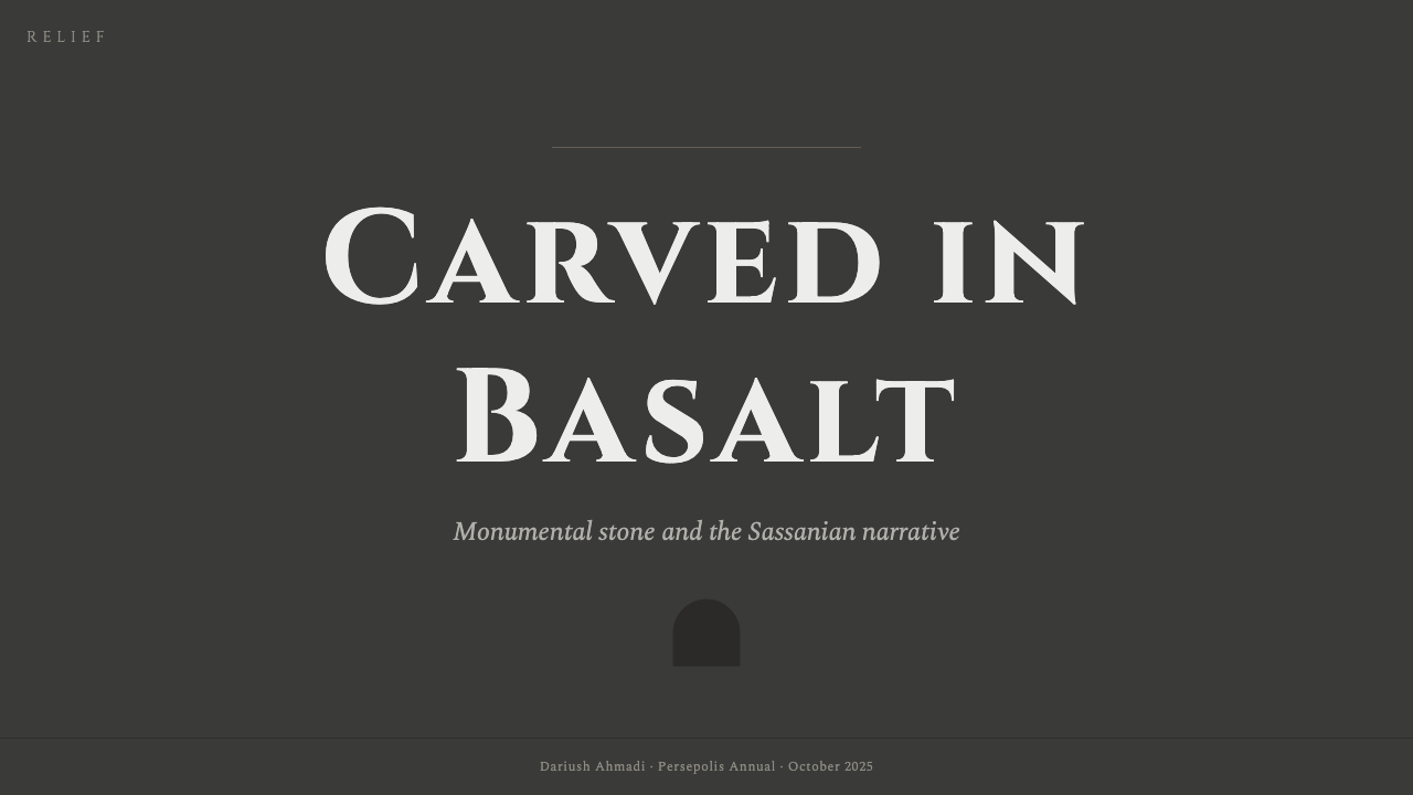
For covers, posters, and campaign openings, let the material do most of the work. A near-black stone ground with one pale carved title can be more powerful than a crowded palette. For content, use repeated bands and recessed groupings to create continuity. For data, maintain a common plane so charts feel like evidence engraved into the same artifact rather than separate decorative widgets.
The common mistake is confusing darkness with the style itself. Simply placing white text on a black background produces a generic dark interface. The defining decisions are material: matte stone rather than flat black, incision rather than elevation, shadow rather than shine, and monumental typography rather than ordinary display text. Adding excessive weathering, ornamental pattern, or dramatic glow turns the system into fantasy scenery and removes its disciplined archaeological weight.
Iranian Dark Stone Relief — FAQ
Is Iranian Dark Stone Relief meant to reproduce a historical monument literally?
No. It is a design interpretation based on the carved cliff faces of Naqsh-e Rostam and the Sassanid tradition of monumental stone relief. The useful lesson is the relationship between surface, incision, shadow, and authority. Literal archaeological motifs are optional; the material logic is essential.
Why are recessed shadows more important than highlights?
Because the system describes forms as cut into stone. Recessed darkness explains the depth of an incision, while a bright highlight suggests a polished object lit from outside. Shadow therefore carries both the visual dimension and the historical metaphor of carving.
Can the style use color beyond stone gray?
The approved visual language is anchored in charcoal-stone and slate-basalt grays because the surviving reliefs are understood through their weathered, bare condition. Color can appear only with restraint and should never overpower the mineral ground. If color becomes the first thing noticed, the carved-stone premise has probably been lost.
How should typography avoid looking like ordinary dark-mode UI text?
Use Trajan-style monumental capitals for the primary voice, give headings deliberate spacing, and treat inscriptional bands as structural anchors. Supporting text should remain calm and legible rather than competing for attention. The distinction comes from ceremonial placement and carved presence, not from making every word oversized.
Where does Iranian Dark Stone Relief work best, and where does it struggle?
It works best where permanence, authority, heritage, or concentrated attention are desired: cultural platforms, archival interfaces, institutional pages, architecture, and research-led products. It struggles when the experience depends on softness, casual warmth, playful energy, or bright sensory richness. Its severity is a strength only when the product has values strong enough to support it.
Related design styles
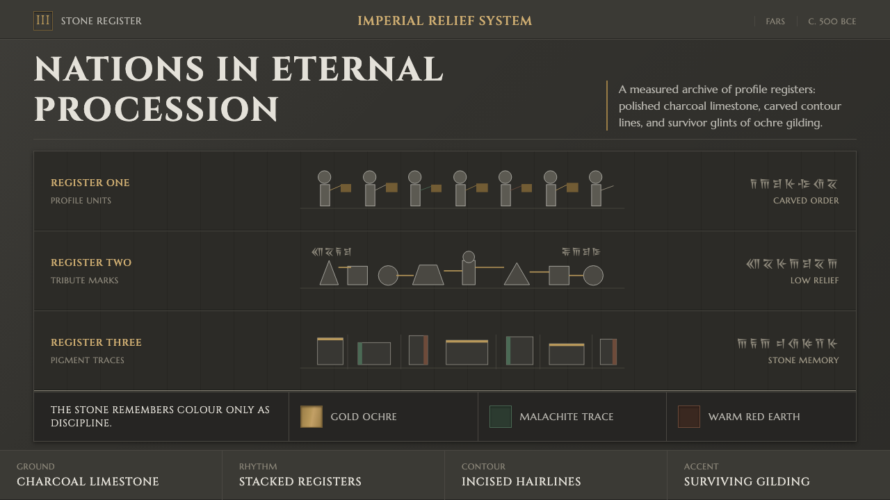 Achaemenid Persepolis ReliefImperial restraint in stone. Charcoal registers carry ochre, green, and red p…
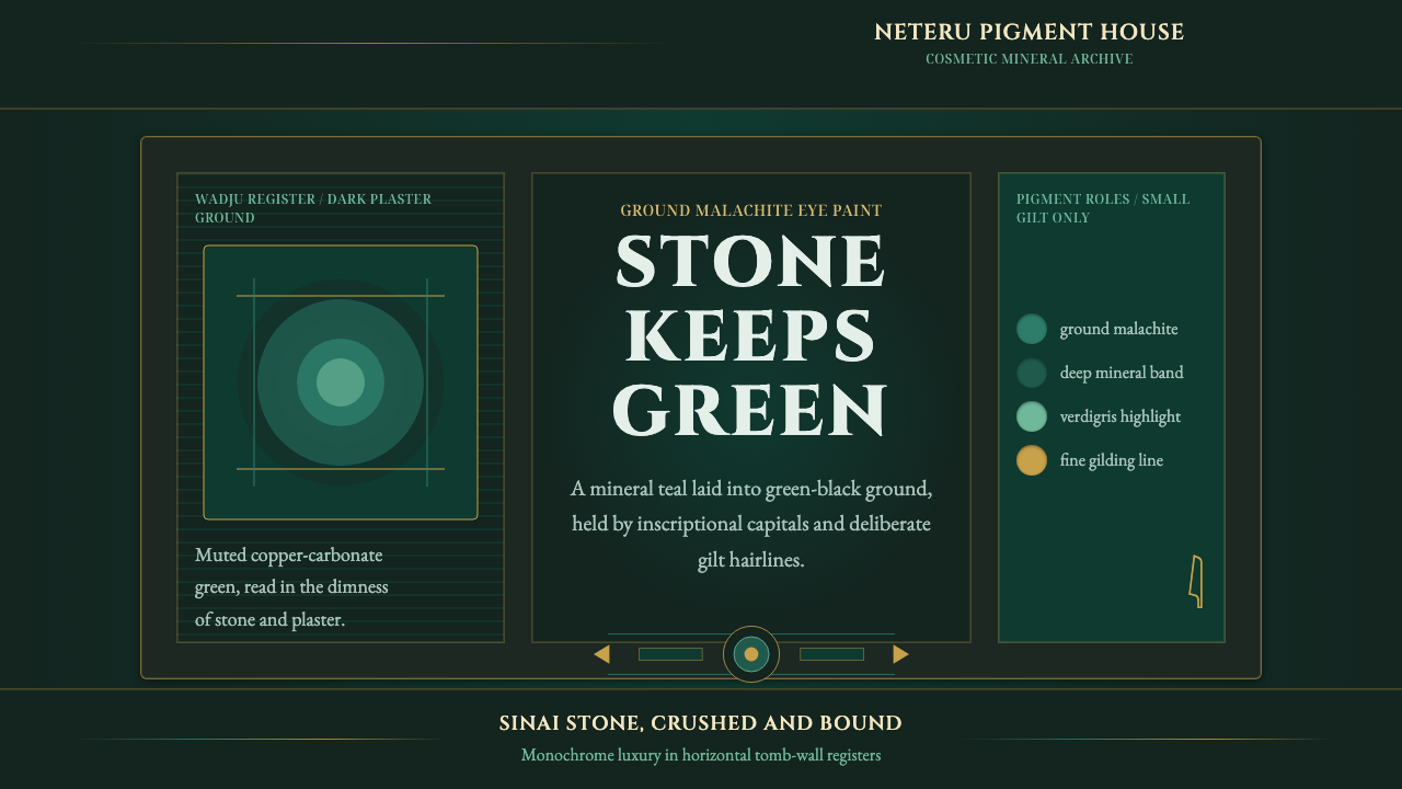 Egyptian Malachite PigmentGrave mineral green. Muted malachite bands on green-black stone, cut by fine…
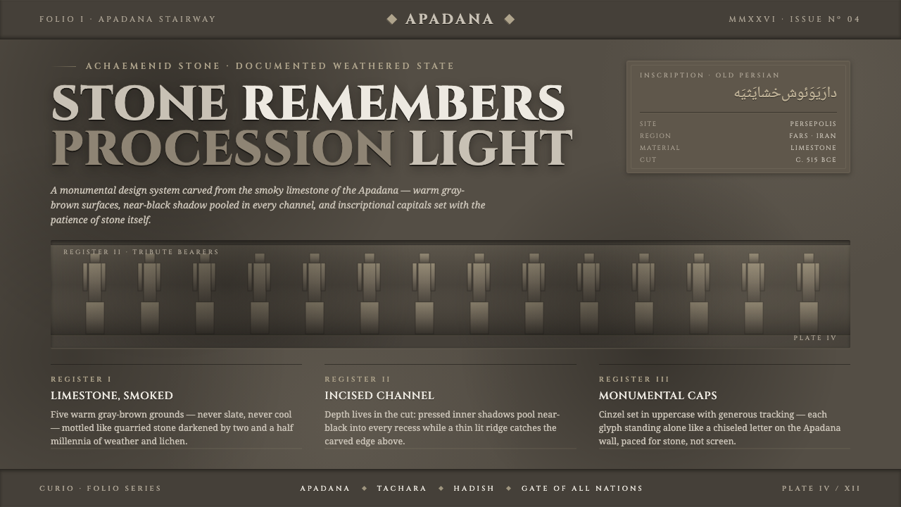 Persian Gray Stone ReliefStone remembers. Smoky weathered limestone, near-black shadow in every channe…
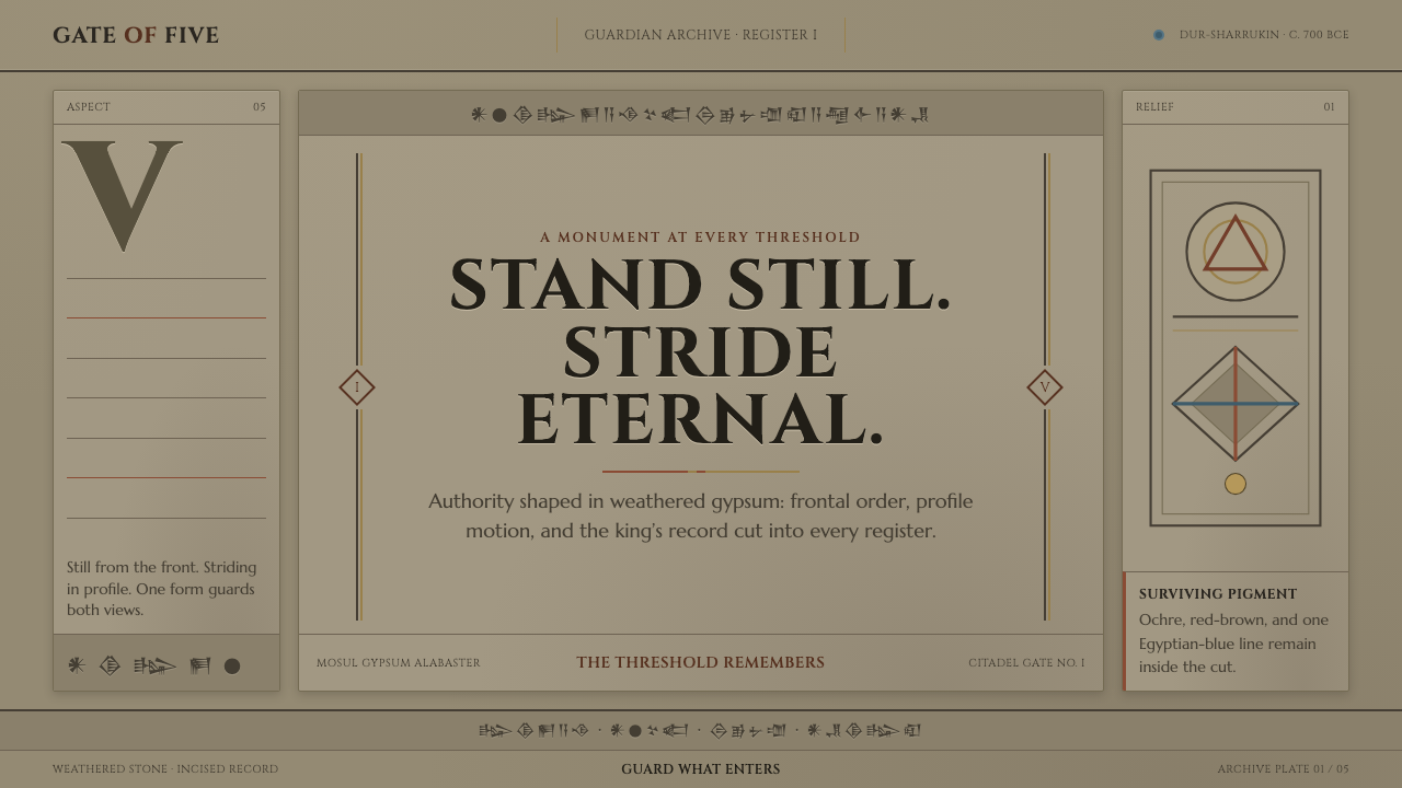 Assyrian Lamassu ReliefAuthority carved into silence. Buff-gray stone, monumental capitals, and cune…
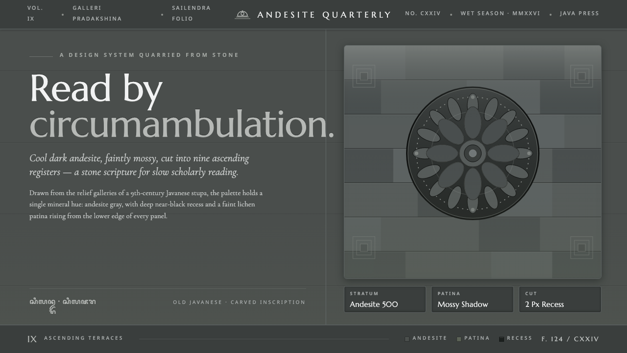 Borobudur Andesite GrayStone read like scripture. Cool andesite gray, near-black recess, mossy patin…
 Cast Iron SoHo FacadesIron remembers the city. Graphite bays, Didone type, and pale stone-paint edg…