What is Cast Iron SoHo Facades?
New York's SoHo blocks are lined with buildings that look carved from stone — underneath the columns and cornices is prefabricated iron, painted and weathered into a single sooty gray.
Cast Iron SoHo Facades in brief
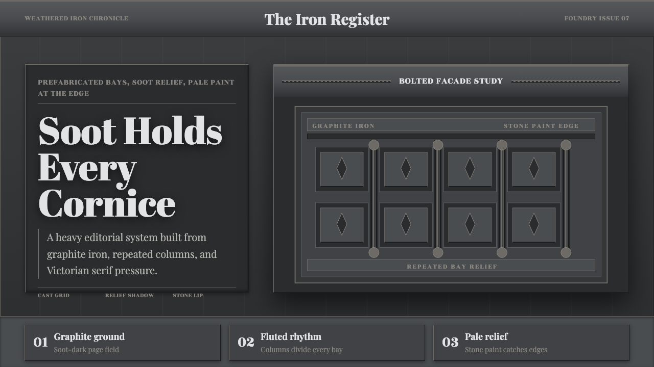
Cast Iron SoHo Facades is a design language built on an architectural sleight of hand: buildings that read as carved stone masonry are, in fact, assembled from prefabricated iron components — columns, cornices, window surrounds, and pediments cast in a foundry mold, bolted to a structural frame, and painted to imitate the palazzo facades of Renaissance Italy. The whole system leans on that trick: rich classical ornament rendered not in stone but in a repeatable industrial material, mass-produced and installed at a fraction of the cost.
The visual signature is a single dominant tone: a soot-darkened, graphite-toned iron-gray that covers columns, bays, and cornices alike, occasionally lifted by a paler, stone-colored highlight along a raised edge or ledge. This is not the bright, fresh paint of a new building — it is the color of over a century of coal smoke and weather settling into the same painted surface, a monochrome that reads as industrial and urban rather than pristine.
Structurally, the defining trait is repetition. A cast-iron facade is built from identical modular bays — the same column, the same arch, the same window surround — repeated across the full width of a building, because that repetition is what made the prefabricated system economical in the first place. Ornament survives as deep, shadowed relief: cast columns, banded cornices, and pedimented window heads that catch raking light and throw hard shadow lines, giving a flat facade real sculptural depth.
Where does Cast Iron SoHo Facades come from?
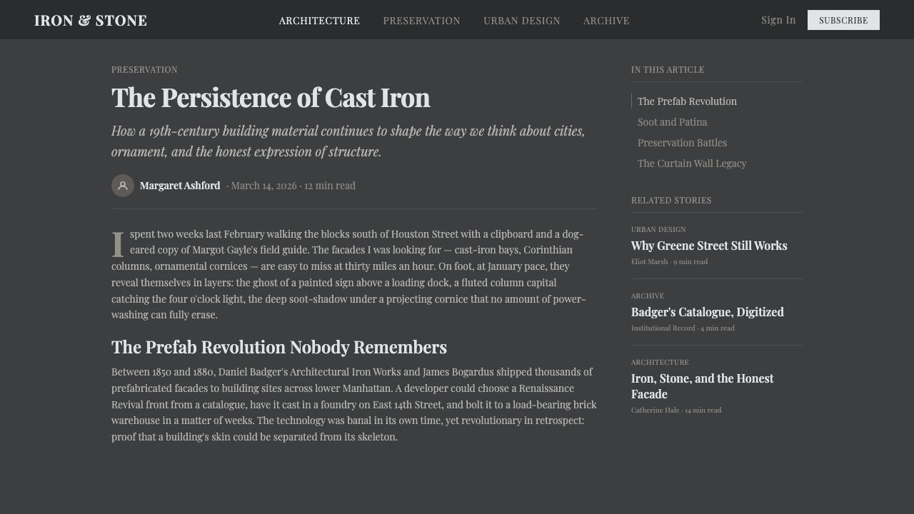
Cast-iron architecture answered a very specific mid-19th-century problem: lower Manhattan's merchants needed large, ornate commercial buildings fast, and traditional carved stone was slow and expensive. Iron offered a shortcut. A foundry could cast a column, a cornice section, or a pediment once, in a reusable mold, and then produce as many identical copies as a building's facade required — components that could be bolted together on site in a fraction of the time a stonemason would need, while still delivering the visual weight of a carved Renaissance palazzo.
James Bogardus, an inventor and manufacturer, patented a self-supporting cast-iron building system in 1850 and built some of the earliest full iron structures in the city, including his own factory. He promoted iron construction aggressively as fast to erect and resistant to fire — a claim that later proved only partly true, since iron softens and buckles under intense heat even though it does not burn, but one that helped popularize the material across American cities in the 1850s and 1860s.
Daniel D. Badger built the business model that turned cast iron into a genuine industry. His Architectural Iron Works produced a published catalog of standardized columns, cornices, arches, and window frames that architects and builders could order like parts from a supplier, choosing a Renaissance-style pediment here or a Neo-Grec cornice there and combining them freely. That catalog logic — mix-and-match classical ornament, mass-produced and interchangeable — is why so many surviving SoHo buildings share the same repertoire of details despite standing on different blocks.
Construction peaked between roughly 1850 and 1880, drawing on several historicist revival styles at once: Italianate facades with round-arched windows and heavy bracketed cornices, formal Renaissance Revival compositions, mansard-associated Second Empire detailing, and, later in the era, the flatter, more angular incised ornament of the Neo-Grec style. As dry-goods and textile wholesalers moved uptown in the early 20th century, many of these buildings emptied out and fell into disrepair; iron's poor performance in real fires accelerated the district's decline. It was decades later, when artists began converting the abandoned loft floors into studios, that the neighborhood's cast-iron stock was recognized as historically significant and protected rather than demolished.
What defines the Cast Iron SoHo Facades look?
Tonality
The system reads in a single dominant tone: a soot-darkened, graphite-leaning iron-gray applied evenly across columns, bays, and cornices. This is not a bright, freshly painted look — it is the settled color of long industrial weathering, occasionally relieved by a paler, stone-colored highlight along a raised molding or ledge where the surface catches more light and less grime.
Modular Repetition
A facade is built from a small set of identical cast components — one column profile, one arch, one window surround — repeated across the full width of the building. This repetition is the direct visual trace of the prefabrication economics behind the style: the same mold poured again and again, then assembled on site like an early form of standardized parts.
Relief & Ornament
Classical architectural ornament — fluted columns, banded cornices, pedimented window heads — survives as deep cast relief rather than flat printed decoration. The ornament has real physical depth, so it catches raking light and throws hard-edged shadow, giving a facade sculptural weight that a purely graphic pattern could never produce.
Cast Display Lettering
Signage lettering from this era favors a high-contrast display serif — a style with pronounced weight difference between the thick strokes and the fine hairline strokes — evoking engraved and cast metal signage rather than a soft, uniform-weight letterform. It reads as formal and industrial at once, suited to a name plate or a building cornice rather than a paragraph of running text.
Material Illusion
The core trick of the style is disguise: iron dressed and painted to read as carved stone at a glance, with the seams between prefabricated panels minimized so the facade presents as a single continuous masonry surface. Authentic applications preserve this ambiguity — the material should feel monumental and stone-like even where the underlying logic is industrial and modular.
Shadow & Depth
Because the ornament is physically raised, light raking across a facade produces graduated bands of shadow beneath every cornice and around every column — a directional, architectural kind of shadow rather than a soft ambient one. This shadow pattern is what makes a flat rendering of the style feel dimensional rather than merely gray.

Who shaped Cast Iron SoHo Facades?
An inventor and manufacturer who patented a self-supporting cast-iron building system in 1850 and erected some of New York's earliest full cast-iron structures, including his own factory. His aggressive promotion of iron as fast to build and fire-resistant helped popularize the material across American cities in the 1850s and 1860s, even though iron's real behavior in fire later complicated that claim.
Founder of the Architectural Iron Works, whose published catalog of standardized cast-iron columns, cornices, and window components let architects order ornament like interchangeable parts. Badger's catalog-driven manufacturing is the reason so many surviving SoHo facades share the same repertoire of classical details across different buildings and blocks.
A later-19th-century revival style, incised with flatter, more angular ornament than earlier historicist facades. Its appearance on SoHo cast-iron buildings marks the tail end of the district's main construction boom and shows how easily the prefabricated iron system absorbed a new decorative vocabulary without changing its underlying modular logic.
The dominant historicist styles cast-iron facades most often imitated — round-arched Italianate windows with heavy bracketed cornices, and more formal Renaissance Revival compositions modeled on Italian palazzo architecture. Cast iron let these labor-intensive stone vocabularies be reproduced at commercial scale and speed.
How do you use Cast Iron SoHo Facades today?
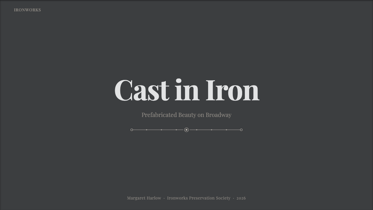
On a presentation cover, this style reads as authoritative and monumental: a large graphite-toned field with a single strong piece of relief-like graphic detail — a column profile, an arch, a repeated bay pattern — anchoring one edge, and the title set in a formal high-contrast display serif. Content slides work best as a repeated modular grid, echoing the bay-and-column logic of the source material: identical framing for each content block, so that consistency itself becomes the visual argument. Data slides can use the same repetition principle directly — identical card or bar treatments stacked across the slide read as a modern version of a repeated cast-iron bay.
For web interfaces, the tonal restraint suits dashboards that need to feel serious and industrial rather than playful: a dark graphite canvas, pale highlights reserved for the data or control that matters most, and card borders treated like the raised molding of a cast panel rather than a soft modern shadow. Pricing pages benefit from the style's inherent hierarchy of repetition — identical plan-card structure across every tier, distinguished only by the pale highlight given to the recommended option, in the same way a cast-iron facade uses uniform bays punctuated by a single more ornate entrance bay.
In editorial and marketing contexts, the style supports a heritage or craftsmanship narrative particularly well — city guides, real-estate features, brand stories rooted in manufacturing or industrial history. A masthead or hero section can use the deep-relief shadow quality to make flat typography feel carved rather than printed, and a repeated architectural motif — a column, an arch — works as a recurring section divider the way a cornice line repeats down a block.
The style also lends itself to any product built around modular, repeatable units — component libraries, catalog systems, architecture or real-estate platforms — because the underlying logic of the source material is literally a catalog of interchangeable parts.
The most common mistake is treating this as generic 'industrial gray' without the modular repetition or the relief-shadow logic that gives it structure. A flat gray palette with soft modern shadows and no repeated ornament reads as an unfinished dark theme rather than the specific architectural discipline of cast iron — the repetition, the raking-light shadow, and the display-serif signage all need to be present together for the style to hold.
Cast Iron SoHo Facades — FAQ
Is this just a dark, industrial gray theme?
No — flat gray is only the surface. What makes the style specific is the modular repetition of identical bays, the deep relief-and-shadow quality of the ornament, and a high-contrast display serif for lettering. A dark gray interface without any of those structural cues reads as a generic dark theme, not this style.
Why does cast-iron architecture look so much like carved stone?
That resemblance was the entire point. Iron could be cast in a mold that reproduced the exact profile of a hand-carved Renaissance column or cornice, then painted to match, letting builders achieve the visual weight of expensive stone masonry at a fraction of the cost and time. The style intentionally preserves that illusion rather than emphasizing the material's industrial origins.
Why is repetition such a core part of the style rather than a limitation?
Repetition was the economic engine of cast-iron construction — a single mold poured many times is what made ornate facades affordable in the first place — and that history is exactly why repetition reads as intentional and structural in the design system, rather than as a lack of variety. Uniform, repeated modules are the signature, not a shortcut to avoid.
What kind of content or product suits this style best?
Anything built from repeatable, modular units — component libraries, catalog or directory products, real-estate and architecture platforms, or brand stories about manufacturing and craftsmanship — suits it naturally, since the source material is literally a catalog of interchangeable parts. It is less suited to content that needs to feel light, organic, or spontaneous.
Does this style require a dark background?
The historical reference is dark by nature — over a century of soot settled into painted iron — so the style is built around a graphite-toned, dark-leaning palette rather than a light one. Pushing it toward a bright, light background loses the weathered, monumental quality that is the whole point of the reference, so a dark-leaning canvas is close to essential here.
Related design styles
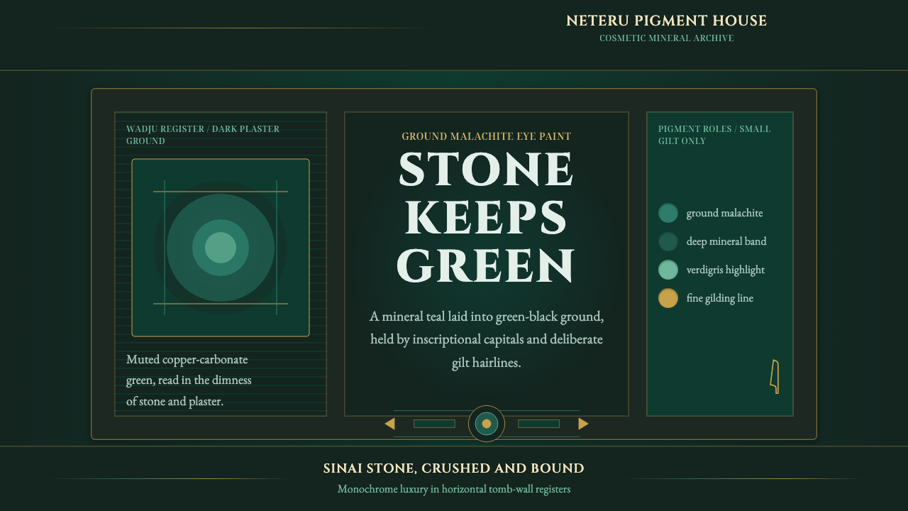 Egyptian Malachite PigmentGrave mineral green. Muted malachite bands on green-black stone, cut by fine…
 Vintage Star ChartScholarly night, gilded. Cinzel caps orbit gold grids and magnitude stars.
 Achaemenid Persepolis ReliefImperial restraint in stone. Charcoal registers carry ochre, green, and red p…
 Babylonian Hammurabi SteleAuthority carved in stone. Basalt-black grids, parchment panels, and imperial…
 Benin Bronze Oba CourtCourt gravity in cast metal. Patinated brass grid, coral red panels, ivory se…
 Bidar Bidriware VesselsSoil-black luxury. Crisp silver medallions and hairline borders cut the warm…