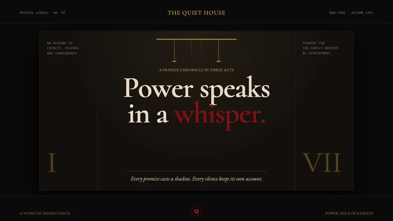
About The Godfather (1972)
A design system built from the visual gravity of Coppola's 1972 film and S. Neil Fujita's marionette-strings book jacket: near-total black, brass-lamp warmth pooling in small islands, and a single oxblood rose bleeding through the dark. Gordon Willis lit the interiors so underexposed that critics called him the Prince of Darkness. This inherits that restraint — funereal high-contrast serifs, negative space rendered as shadow rather than emptiness, and blood-red reserved for one decisive accent. Nothing is loud. The power is in what's withheld.
- Origin
- American cinema; Sicilian-American New York and Corleone, Sicily
- Era
- 1969 (Puzo novel) → 1972 (film); depicting 1945–1955 New York
- Key figures
- Francis Ford Coppola · Mario Puzo · Gordon Willis · S. Neil Fujita · Nino Rota
- Movements
- New Hollywood · chiaroscuro cinematography · American operatic crime epic
The Godfather (1972) design spec
Colors
Typography
The other 11 sections — buttons, cards, spacing, motion, techniques and more — open once you unlock. Download the DESIGN.md or send it to your AI in one click. Unlock once, yours forever.
Sign up nowStyles similar to The Godfather (1972)
Also inspired by film, games & music, with a close feel.
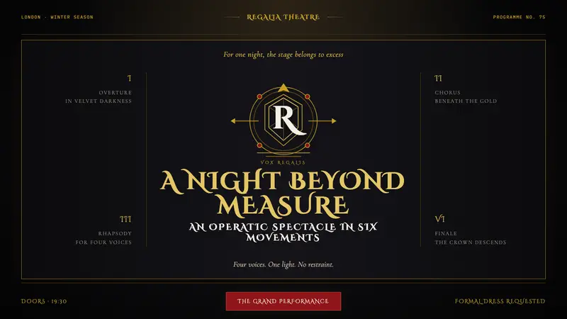 Queen — Bohemian Rhapsody (1975)Rock assumes the crown. Engraved gold, Roman capitals and a lone spotlight rule the black stage.
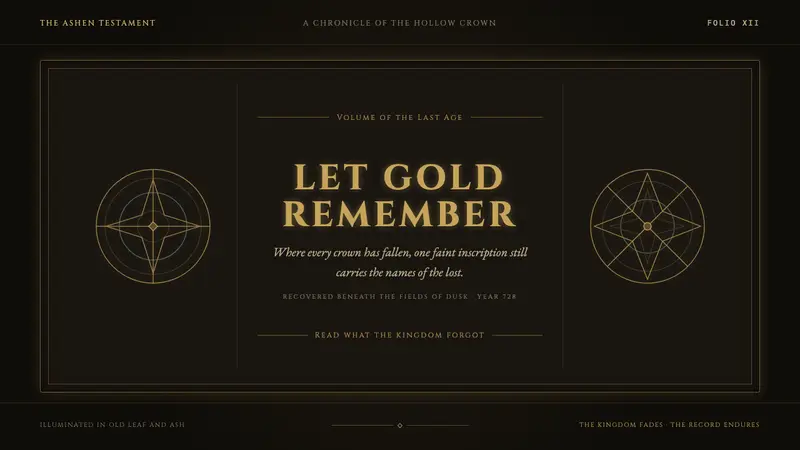 Elden Ring (2022)A kingdom mourns in gilt. Aged gold hairlines and Roman capitals glow in warm darkness.
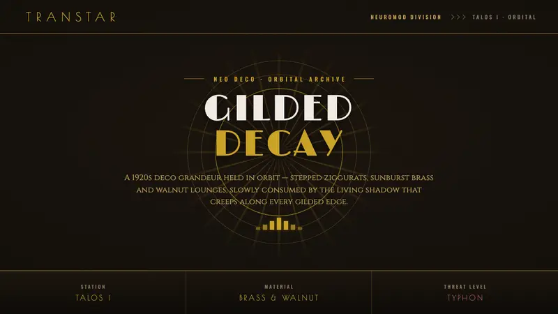 Prey (2017)Luxurious horror in orbit. Gold Deco sunbursts glint out of near-black Typhon ooze, engraved type.
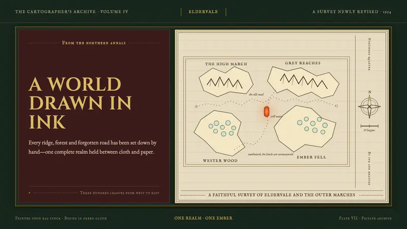 Tolkien Middle-earth (1954)A whole world held in ink. Gilt type and vellum cartography glow against bottle-green cloth.