What is OS UI Humanist?
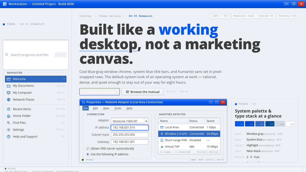
OS UI Humanist turns the remembered desktop into a design language: window-gray surfaces, system-blue chrome, humanist sans-serif text, and the calm precision of a computer built to work.
OS UI Humanist in brief
OS UI Humanist distills the standard-issue look of a North American desktop operating system from the era spanning 1995 to 2010. Its reference points are Windows XP Luna and the Vista and Windows 7 Aero chrome: cool bluish-gray window surfaces, confident system blue title bars, crisp humanist sans-serif text, and white input wells that appear to float inside a larger screen-gray environment.
This is system-default design rather than brand-campaign design. The interface communicates through nesting and convention: a title bar establishes the window, a toolbar establishes available actions, and the content area establishes the work itself. Thin separators, restrained borders, and aligned controls make the hierarchy legible before color or decoration has to explain it.
The mood is rational, clean, and quietly familiar. Elements feel pixel-snapped even when the underlying product is contemporary; corners, baselines, icons, labels, and controls appear deliberately aligned. The style carries the memory of a working desktop, where menus, windows, pointers, and task-oriented panels were not metaphors layered onto a brand but the operating environment itself.
Where does OS UI Humanist come from?
The system looks back to the North American desktop operating-system culture that took shape between 1995 and 2010, with Microsoft in Redmond, Washington, as its central reference. This was the WIMP desktop-GUI world of windows, icons, menus, and pointers, where the screen was organized as a stable work surface and interface conventions were learned through repeated everyday use.
Windows XP Luna, shipped in 2001, supplied the warmer and more approachable side of the vocabulary: a cool window ground, emphatic blue chrome, clear title bars, and controls that visibly belonged to a desktop shell. The Luna visual-design group is therefore part of the system’s origin story, representing an interface language that made the computer feel legible and available rather than austere.
Vista and Windows 7 Aero extended that vocabulary toward translucency and layered depth. Aero introduced a more polished chrome while retaining the same basic logic of window framing, toolbar nesting, and task-oriented content areas. The result belongs to a broader movement from skeuomorphic interface cues toward flatter digital surfaces, without abandoning the visual signals that tell users what is a frame, what is a control, and what is content.
The era also established humanist-sans system typography as a defining part of the desktop voice. The Segoe UI default-font switch in 2006–07 marks an important point in that development, and Steve Matteson is the named type-design figure associated with this typographic side of the system. Together with the Microsoft Windows shell team and the Aero visual-design group, these contributors define a design culture in which typography, chrome, and operating conventions are treated as one coordinated environment.
What defines the OS UI Humanist look?
Window Surface
The base is a cool bluish gray, closer to a dependable work surface than a decorative canvas. White content wells and pale panels sit within it as readable zones, creating a clear distinction between the desktop environment and the document, form, or task inside the window. The background should feel present but quiet.
System-Blue Chrome
System blue belongs to title bars, active navigation, Start-menu-like surfaces, and other signals of application or operating-system authority. It is confident rather than ornamental. Used selectively, it tells the user where the active frame begins and which action or destination currently has priority.
Humanist Sans
Typography is crisp, open, and built for sustained interface reading. Humanist sans-serif forms soften the mechanical strictness of a purely geometric grotesk while keeping labels compact and controls immediately legible. Hierarchy comes from scale, weight, placement, and framing; expressive type treatments are unnecessary when the system is well organized.
Nested Chrome
The interface is organized from outer frame to inner work area: title bar, toolbar, secondary controls, then content. Each band has a recognizable role and a modest visual boundary. This nesting creates the feeling of a real desktop application, where actions belong to the window and information belongs to the document or task.
Pixel Alignment
Alignment is part of the personality, not merely a technical afterthought. Text, separators, icons, controls, and panel edges should share a disciplined rhythm and meet one another cleanly. The result is a surface that feels dependable because nothing appears accidentally shifted, softened, or allowed to drift between layers.
Measured Depth
Aero-like depth may appear through translucency, gloss, or layered framing, but it must remain subordinate to function. Depth explains which surface is active and which surface sits behind it; it does not turn every panel into a visual effect. The ideal balance remembers the skeuomorphic past while allowing the interface to move toward flatter, calmer surfaces.
Who shaped OS UI Humanist?
The shell team represents the operating-system layer that made windows, menus, pointers, task areas, and application chrome feel like one coherent environment. Its contribution is less a single signature object than a shared grammar of dependable framing, readable nesting, and familiar desktop behavior.
Steve Matteson is the named type-design figure in this system’s origin story. His place in the visual language is expressed through the humanist sans voice and the Segoe UI default-font switch of 2006–07, when system typography became an especially visible part of the desktop environment.
The Luna visual-design group embodies the Windows XP side of the reference: approachable blue chrome, cool window surfaces, and an interface that makes the desktop feel welcoming while remaining task-oriented. Its language is the more familiar, optimistic half of the system’s historical memory.
The Aero visual-design group represents the later movement toward translucent, layered chrome. Its contribution is not simply gloss; it is the attempt to add depth and polish while preserving the desktop’s underlying order of frame, toolbar, control, and content.
How do you use OS UI Humanist today?
OS UI Humanist transfers best when the product needs to feel operational, legible, and trustworthy. Start with the hierarchy of a working window: establish the frame, separate actions from content, use system blue to mark active authority, and reserve white surfaces for areas that invite reading or input. The style succeeds when users understand where they are and what they can do before they notice the aesthetic reference.
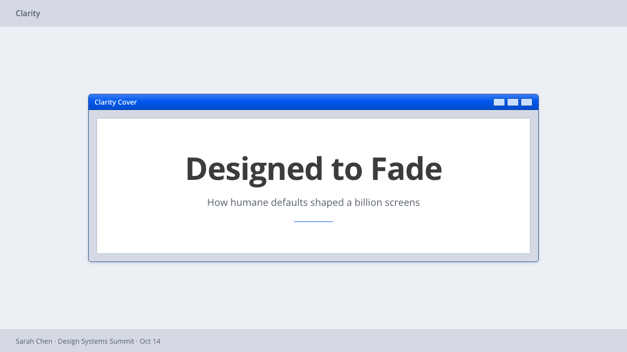
For presentation slides, the cover can resemble a quiet application welcome screen: a cool window-gray field, a strong blue title region, and a humanist sans title placed with deliberate alignment. Content slides should use clear bands for heading, toolbar-like metadata, and the main information area. Data slides benefit from panel framing and restrained separators, allowing charts, labels, and annotations to read like an organized desktop utility rather than a promotional poster.
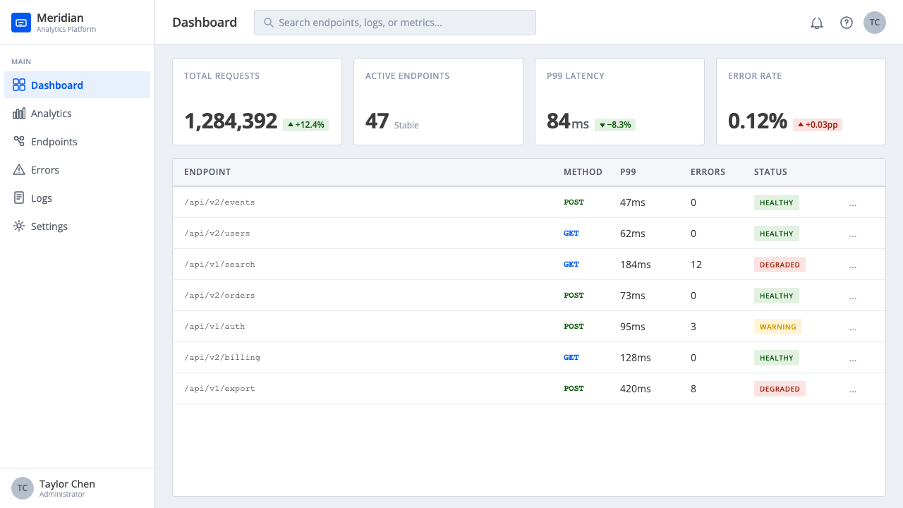
For web interfaces, the style is naturally suited to dashboards, administration tools, and pricing pages. Use a calm gray environment for the page, white wells for cards and forms, and blue for active tabs, selected plans, primary actions, or the current navigation path. A dashboard should make its nesting visible: global shell, section controls, task panel, then data. Pricing pages can use window-like plan panels whose differences are communicated through labels and active states rather than decorative color variety.
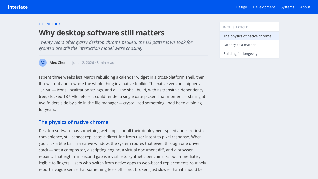
For editorial and marketing work, the system can frame information as a sequence of practical documents or utility screens. An article may use a restrained gray reading environment, white text panels, blue section markers, and thin rules that behave like interface separators. Marketing pages should emphasize usefulness and product clarity: screenshots, specifications, comparisons, and calls to action can be presented as parts of a coherent desktop rather than surrounded by theatrical effects.
The common mistake is turning the reference into generic retro decoration. Excessive gloss, random bevels, nostalgic icons, or blue applied to every surface weaken the system because they erase hierarchy. Another mistake is flattening everything into undifferentiated cards. Preserve the distinction between chrome and content, keep typography humanist and readable, align elements carefully, and let depth explain structure instead of performing nostalgia.
OS UI Humanist — FAQ
Is OS UI Humanist simply a retro Windows theme?
No. Windows XP Luna and Vista or Windows 7 Aero are its historical references, but the system is defined by transferable relationships: gray as the working ground, blue as active system authority, humanist sans typography, nested chrome, white input surfaces, and disciplined alignment. A contemporary product can use those relationships without copying old icons or reproducing a specific operating-system screenshot.
How much Aero-like translucency should be used?
Use it only when it clarifies layering or active state. Translucency can distinguish a frame from the surface behind it, but it should not make text, controls, or content compete with a decorative effect. The system works best when Aero depth remains subordinate to the underlying desktop order and can coexist with the later movement toward flatter surfaces.
Can this style work on a dark background?
It can be adapted, but dark surfaces move it away from its defining light desktop environment. The approved reference is built around cool window gray, white wells, and blue chrome, so a dark treatment should preserve the same separation between frame, controls, and content. If darkness becomes the dominant visual idea, the result may read as a different interface language rather than OS UI Humanist.
What makes the typography humanist rather than merely sans-serif?
The distinction is in the voice and reading behavior. Humanist sans-serif typography stays clean and compact enough for controls, but its forms retain an open, approachable rhythm rather than feeling purely mechanical or geometric. In this system, type is part of the operating environment: labels, headings, menus, and content should all feel related, clear, and designed for sustained use.
Where does OS UI Humanist struggle?
It struggles when a product depends on luxury, organic warmth, sensory richness, or highly expressive brand personality. Its values are operational clarity, familiarity, and orderly function. That makes it strong for dashboards, tools, forms, pricing, and educational interfaces, but potentially cold when the experience needs to feel handmade, intimate, atmospheric, or deliberately detached from computer conventions.
Related design styles
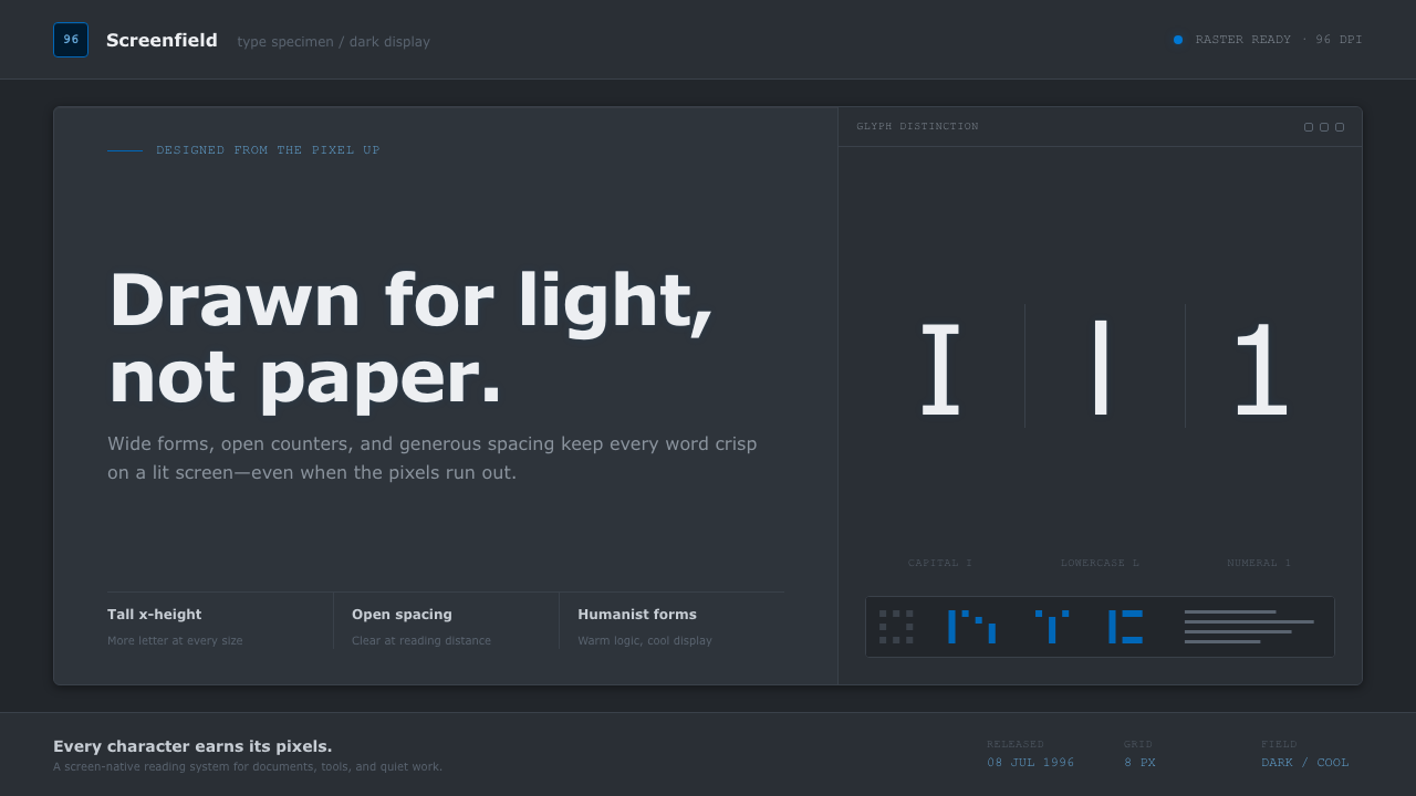 Verdana Screen SansBorn digital, built for clarity. Wide humanist letters glow in cool grey on a…
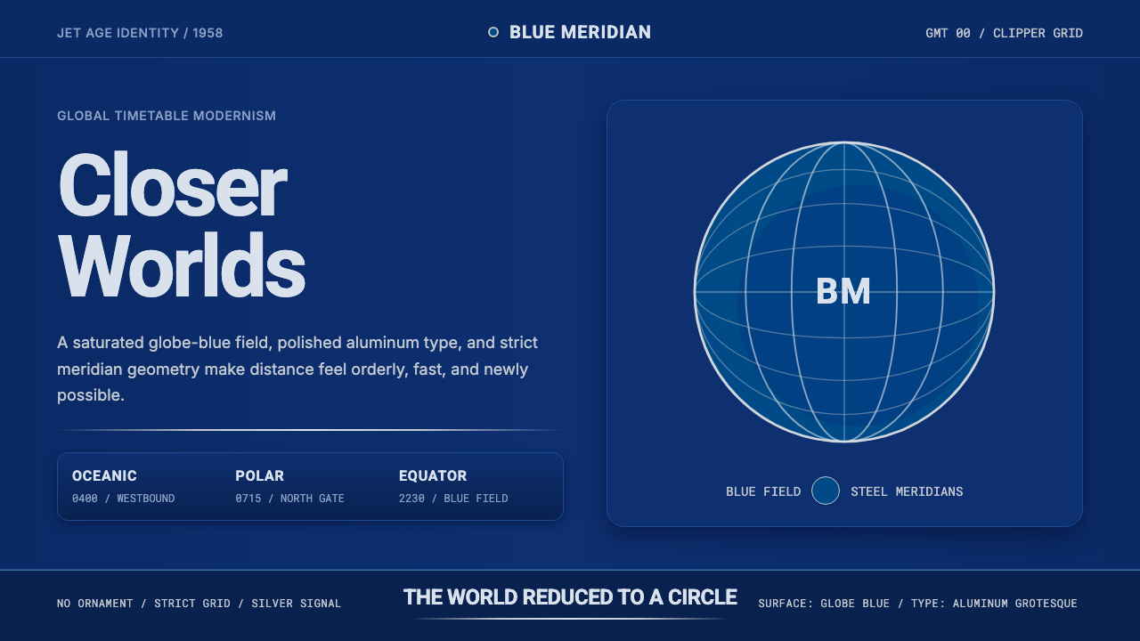 Pan Am Jet AgeJet-age confidence. Globe-blue field, steel type, meridian circle on a strict…
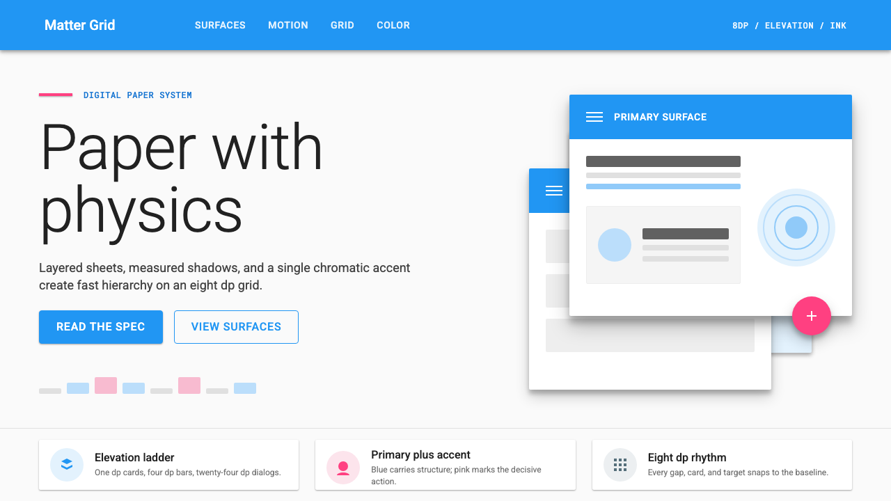 Material Design 1.0Depth made flat usable. Blue app bars, pink FABs, 8dp grids, and crisp paper…
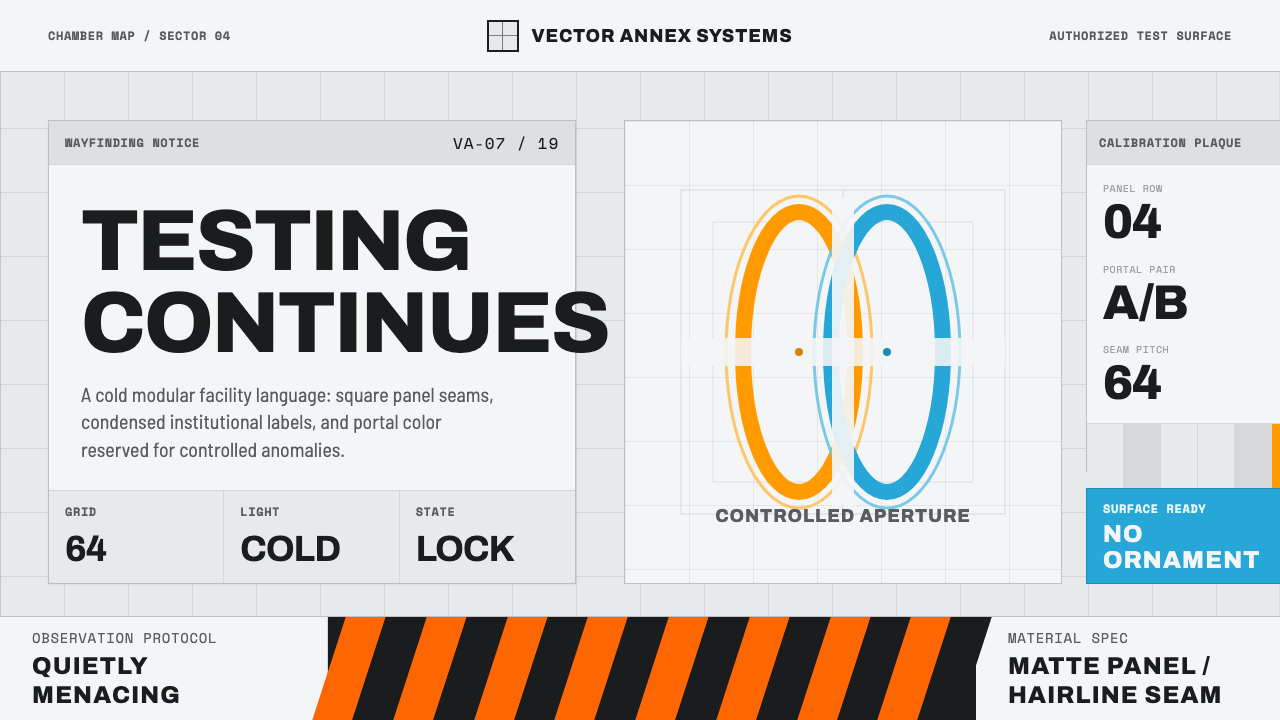 Aperture ScienceSterile authority. Cool panel seams, Archivo signage, and sparse orange-blue…
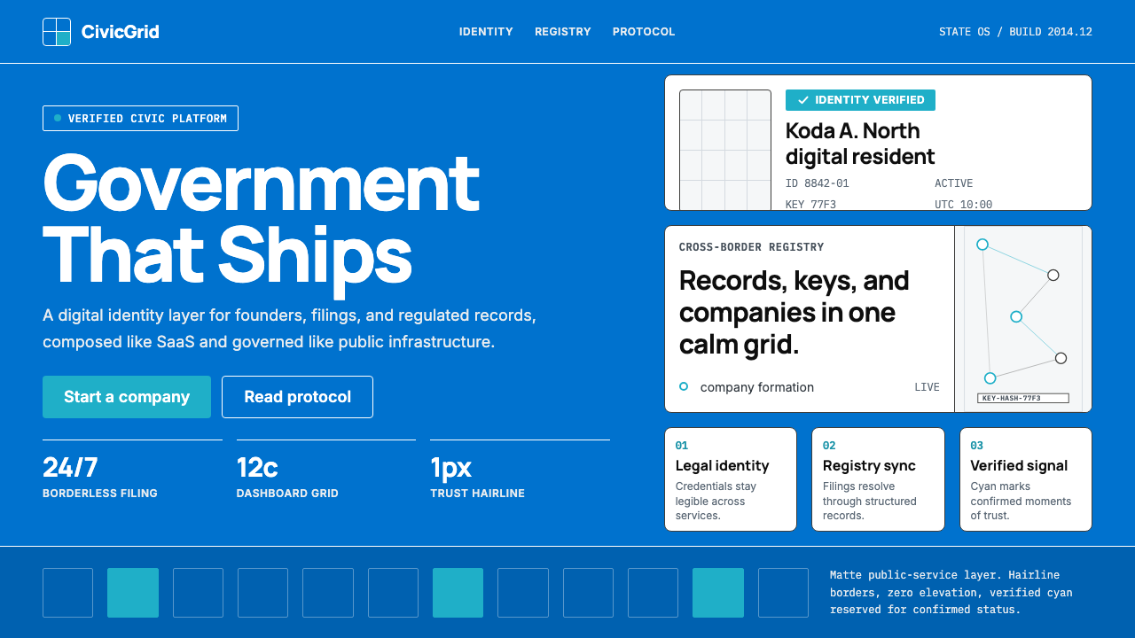 Estonia e-Residency Digital (2014)Trust without weight. Cornflower blue, 12-column grids, and cyan verified sig…
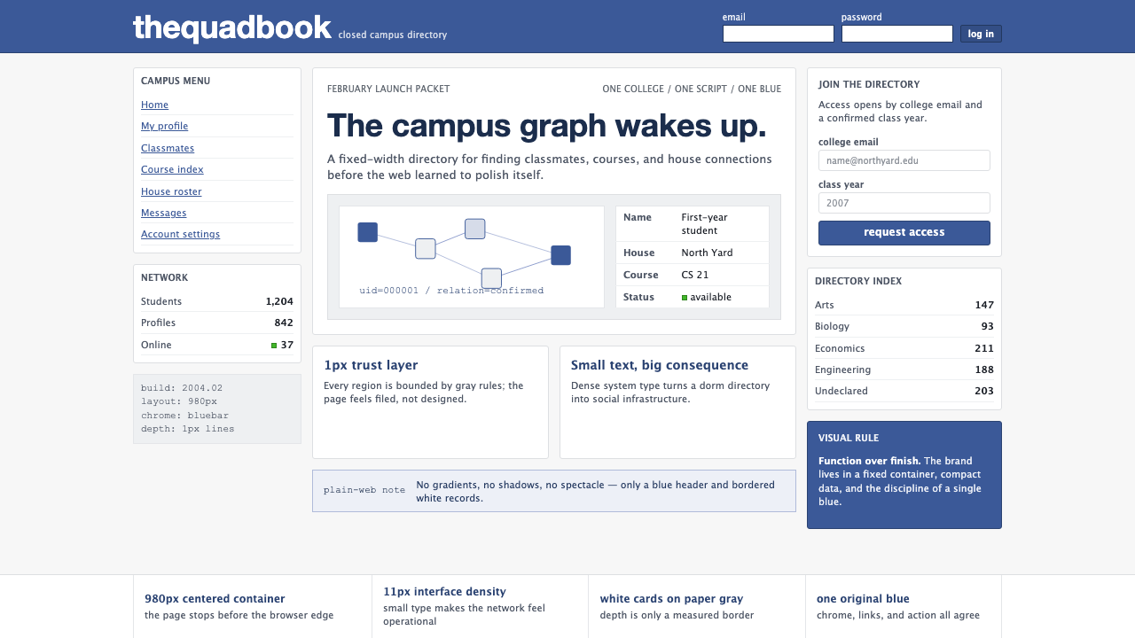 Facebook 2004Dorm-web austerity. Original blue, 980px grid, 1px borders, tiny Lucida Grand…