What is BlackBerry?
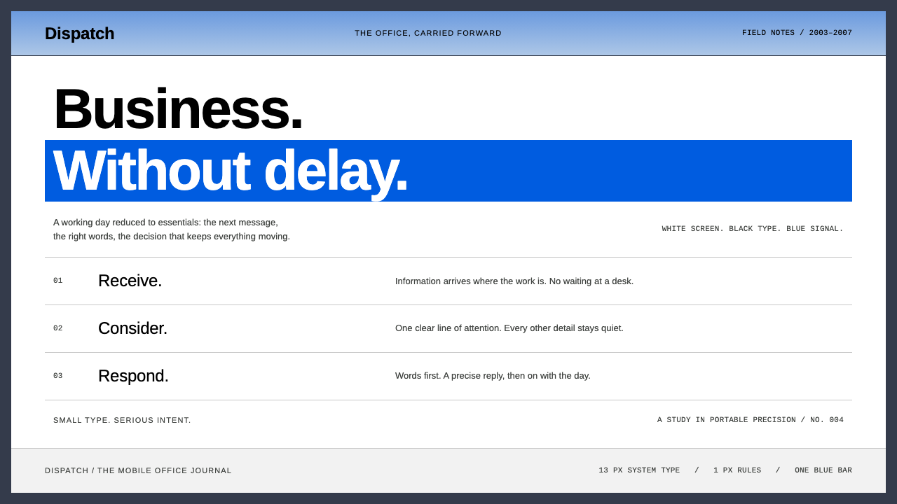
BlackBerry is the business handheld rendered as an interface: white list screens, small black type, fine row rules and one solid blue bar marking exactly one selected item.
BlackBerry in brief
The BlackBerry style comes from the mobile devices sold by Research In Motion, a company based in Waterloo, Ontario, in the years between 2003 and 2007. These handsets were built for one job above all: reading and answering email quickly, away from a desk. The screen was a small, bright rectangle above a physical keyboard, and the interface was designed around that constraint.
Visually, the look is a white list screen. Small black system type sits in tidy rows separated by thin rules. The currently selected row is covered by a solid blue bar that runs edge to edge, and there is only ever one such bar. Menus are narrow boxes with a thin border, and there are few icons and no gestures, because everything is driven by a scroll wheel at the side of the device and later a trackball.
Around the screen, the hardware itself is part of the picture: a slate graphite body, rows of small oval keys, and a red light that blinked when new mail arrived. As a design system, BlackBerry captures that dense, precise, restrained office feel, a sense that the device exists to get through your inbox.

Where does BlackBerry come from?
The company was led by Mike Lazaridis and Jim Balsillie, who together built Research In Motion into a leader in what was then called push email. Instead of making users check a server, the device received messages as they arrived, and the combination of that service with a small keyboard created a new kind of working habit: the mobile office.
Colour BlackBerry models such as the 7230 and 7290 arrived in 2003 and 2004. The 8700, released in 2005, refined the form, and the Pearl, the 8800 and the Curve in 2006 and 2007 pushed the family toward a broader audience. Throughout this period the interface kept its identity: a list of text rows, a single highlighted item and a menu key that opened a short, plain menu of actions.
The surrounding culture mattered as much as the screen. Business users carried a BlackBerry in the jacket pocket, shared PIN codes for the instant messaging service called BBM and glanced at the red light to see if something had come in. The habit became so strong that the nickname CrackBerry appeared. The device came to stand for a certain kind of busy, always-reachable professional life.
Aesthetically, BlackBerry belongs to the final years before touchscreen smartphones. Interfaces were designed for physical selection, with a cursor moving through rows, rather than for direct touch. That is why the style is so tidy: every row is a possible target, and the highlight bar makes the current target unmistakable. Today it reads as a precise period piece that trades decoration for speed.
What defines the BlackBerry look?
The single blue selection bar
One saturated blue bar spans the full width of the selected row, with white text on top. It is the only strong colour on the screen, and since there is always exactly one, focus is never ambiguous.
White list screens
The ground is plain white, and content is arranged as a vertical list. There are no cards, tiles or large images. The structure is a single column that you scroll through one row at a time.
Dense, small black type
Text is set small and black in a clean sans-serif, with tight leading so that many rows fit on a small screen. It is written for scanning: sender, subject and time are packed in without decoration.
Thin ruled rows
Each row is separated from the next by a hairline rule in pale grey. The rules give the list its rhythm and make the structure legible without using boxes or fills.
Narrow bordered menus
Pop-up menus are small rectangles with a thin dark border, listing short verbs one under another. They look like hardware menus rather than floating cards, and have no shadow or rounding.
Graphite hardware framing
The screen is surrounded by a dark slate-grey body and rows of small oval keys. In a web layout, this becomes a deep graphite frame or header that holds the white content area like a device would.

Who shaped BlackBerry?
Co-leader of Research In Motion in Waterloo, Ontario, and a central figure behind the BlackBerry line.
Co-leader of Research In Motion, associated with growing the push-email business and the mobile office.
How do you use BlackBerry today?
In slides, BlackBerry works well for talks about productivity, enterprise software, communication tools or mobile history. A white slide with a short, ruled list and a single blue bar behind the key item makes the point instantly: this is the one that matters. For data slides, use tables with thin grey rules, black text and a single blue row for the highlighted figure, instead of coloured bars and gradients.
On the web, the style suits inboxes, ticket queues, admin consoles, CRM lists, logistics dashboards and any interface where people triage a long list. Keep rows short and evenly spaced, let one selected row take the blue bar, and make keyboard navigation feel first-class. Menus should stay narrow, with a thin border and plain labels. The result will feel fast and trustworthy.
In editorial and marketing work, it fits articles about the early smartphone era, nostalgic product campaigns and corporate communication with a no-nonsense tone. A page that looks like a mail list, with a headline row selected in blue, can be a witty and effective layout.
It also works as a quiet, professional palette for internal tools, where the aim is fast scanning and few distractions. The graphite frame gives these tools a feeling of a dependable instrument.
The most common mistake is to put more than one highlight on the screen. The power of the style comes from the single blue bar; if three rows are blue, focus is lost. The second mistake is to add touch-era decoration such as large rounded cards, soft shadows and big icons. They contradict the dense, precise logic of the original.

BlackBerry — FAQ
What is the BlackBerry design style?
It is the interface look of BlackBerry handhelds in the mid-2000s: white list screens, small black type, thin row rules, narrow bordered menus and a single solid blue selection bar, framed by a graphite device body.
Which period does it represent?
Mainly 2003 to 2007, from the colour 7230 and 7290 models, through the 8700 in 2005, to the Pearl, 8800 and Curve in 2006 and 2007, before touchscreen smartphones took over.
Why is there only one highlighted row?
Because the original was operated with a scroll wheel and later a trackball, which move a single cursor through a list. A single highlight made the current target unmistakable, and the style preserves that clarity.
Which projects suit this style?
Email and ticket interfaces, admin consoles, internal tools, data-heavy dashboards, productivity talks and nostalgia pieces about early smartphones. It is a poor fit for image-driven or highly emotional brands.
Can it work on a touchscreen?
Yes, as long as you keep touch targets comfortable. Preserve the single highlight and the ruled-row structure, but give rows enough height to tap, and avoid shrinking text so far that it becomes hard to read.
Related design styles
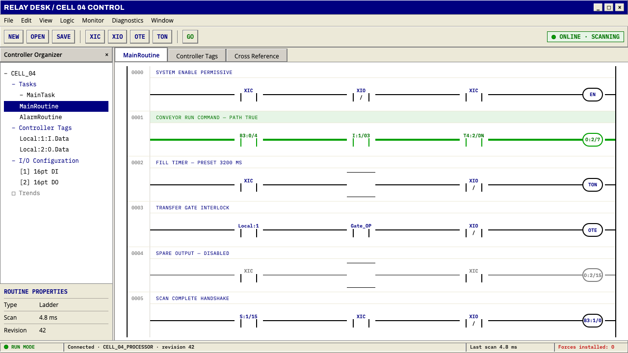 PLC Ladder LogicLogic made visible. Black rails and navy mnemonics turn green wherever the ci…
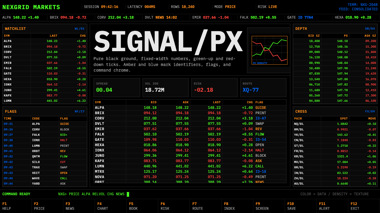 Financial Terminal MonoMaximum signal per pixel. Pure black, IBM Plex Mono, green-red ticks, amber-b…
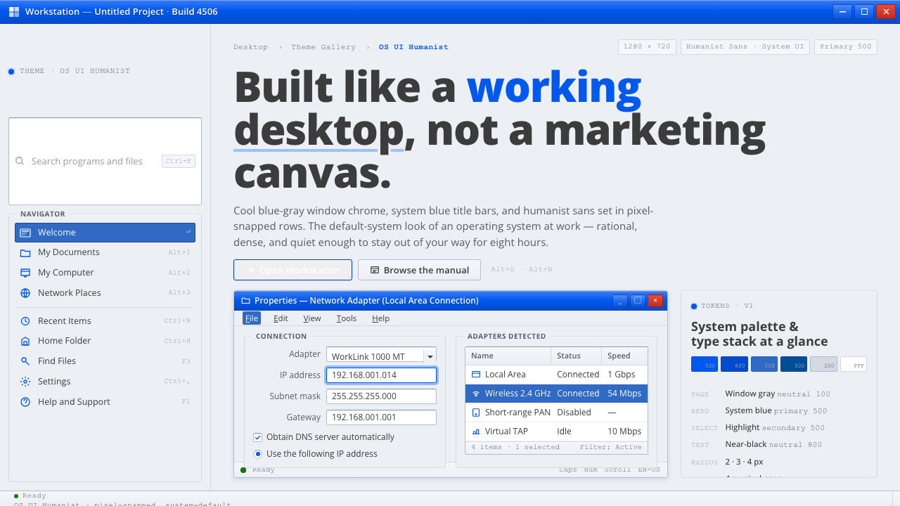 OS UI HumanistBuilt like a working desktop, not a brand. Window-gray ground, system-blue ch…
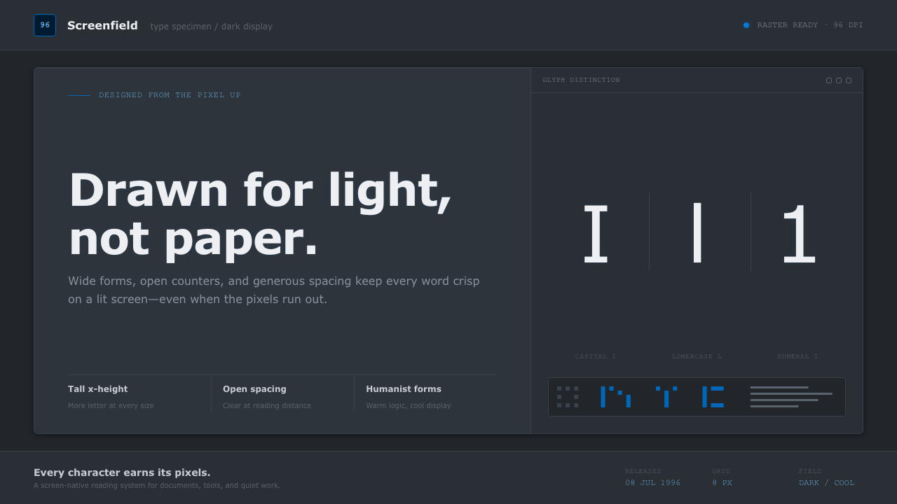 Verdana Screen SansBorn digital, built for clarity. Wide humanist letters glow in cool grey on a…
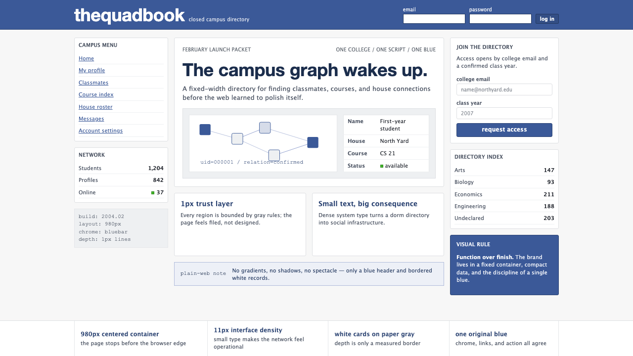 Facebook 2004Dorm-web austerity. Original blue, 980px grid, 1px borders, tiny Lucida Grand…
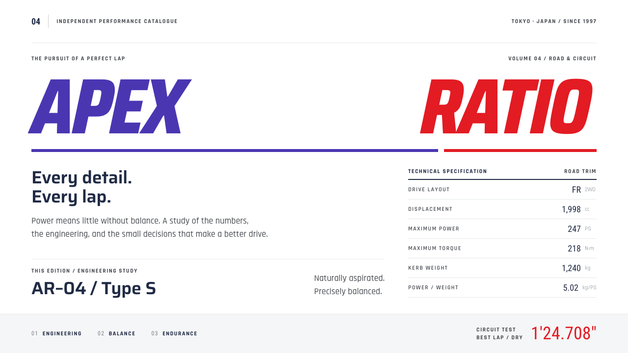 Gran TurismoPrecision without noise. Slanted violet-red type and hairline spec rows on sh…