What is Gran Turismo?
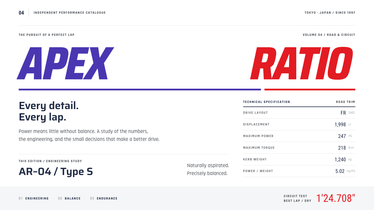
Gran Turismo made a video game menu feel like a dealer's catalogue: showroom white, hairline spec rows, slanted violet and red lettering, and numbers that all line up.
Gran Turismo in brief
Gran Turismo is the interface language of Polyphony Digital's driving simulator, which launched in Japan in December 1997 under the tagline The Real Driving Simulator. As a design style it is defined by calm precision. The menus read like a car dealer's catalogue, with licence tests, manufacturer showrooms, used-car lots and a full specification sheet for every vehicle.
The style follows this clean-menu line through to Gran Turismo 4 on PlayStation 2. A white ground carries navy specification values, a violet-blue G paired with a red T, rectangular map tiles and data rows separated by hairline rules. The slanted lettering adds a sense of speed, but it is held in check by a rigorous, almost technical layout, in which every number lines up.
Its appeal is the pleasure of order. Instead of flashing and shouting, the interface lets the information speak, and it assumes the user cares about details. The result is a style that feels like a well-printed product manual: restrained, knowledgeable and trustworthy, with just enough energy in its italic forms to remind you that it is about cars.

Where does Gran Turismo come from?
The original game was released for the PlayStation in Japan in December 1997 and was developed by Polyphony Digital in Tokyo. At the time, racing games were mostly arcade-like, with bright, noisy menus. Gran Turismo took a different path, treating cars as objects of knowledge and collection. Players earned licences, browsed dealerships by manufacturer, bought used cars and tuned them, and the interface had to support that sense of a considered, almost bureaucratic journey through car culture.
The visual language grew out of late-1990s Japanese car-magazine publishing. Those magazines were dense with specification tables, cutaway photographs and carefully aligned data, and they treated technical details as a pleasure rather than a burden. The game's menus borrow this approach: pages feel edited and printed rather than programmed, and information is arranged to be compared across rows and columns.
It also belongs to the world of Sony PlayStation-era product design, in which clean, light, confident interfaces were used to suggest sophistication and a break from the loud look of earlier console games. The name simulation-first game UI is a good description of the philosophy. The interface is there to serve the simulation, so it avoids gimmicks, uses a quiet palette and puts accuracy first.
By the time of Gran Turismo 4 on PlayStation 2, the style had matured: the daytime map menu spread across white, the photo mode was laid out like a magazine spread, and the data rows were thoroughly refined. Kazunori Yamauchi is the figure most closely associated with the series, and Masahiro Andoh and Isamu Ohira are also named in the source material among its key figures. Together the work defined a quiet, adult look for a game genre that could easily have been loud.
What defines the Gran Turismo look?
Showroom white
The ground is a clean, bright white, like the floor and walls of a dealership. It lets cars, photographs and data stand out without competing with a background, and it gives the interface an air of calm professionalism. White space is used generously, which makes even dense information feel organized.
Navy specification values
Numbers and values are set in a deep navy rather than pure black. This softens the page slightly while keeping strong contrast, and it gives data a distinct voice that feels technical and trustworthy. Labels sit in a lighter tone, so the eye reads value first and description second.
Violet-blue and red lettering
The identity pairs a violet-blue G with a red T, set in slanted forms that imply forward motion. These two colors are used sparingly, mainly for the brand mark and key titles. Their restraint is what keeps the look refined: the speed is suggested rather than shouted.
Hairline-ruled data rows
Specifications are laid out in rows divided by very thin rules, with labels on one side and values aligned on the other. The structure echoes a printed spec sheet, and it lets users compare vehicles line by line. The thinness of the rules keeps the structure visible without making the page feel heavy.
Rectangular map tiles
The daytime map menu is built from clean rectangular tiles, each representing a destination such as a showroom, a licence centre or a used-car lot. The tiles form a simple, tidy grid that reads like a town plan. They make navigation feel orderly and give the interface its sense of being a place to browse.
Magazine-like precision
Photographs, captions and numbers are arranged with the care of a car-magazine spread. Alignment is strict, margins are even, and every element has a clear relationship with the next. The overall impression is one of editing: nothing is accidental, and the user is treated as an enthusiast who appreciates detail.

Who shaped Gran Turismo?
The creator most closely associated with the Gran Turismo series and its Tokyo studio, Polyphony Digital. His insistence on treating driving as a serious simulation and cars as objects of knowledge underlies the cataloguing, spec-driven interface that this style captures.
Named in the source material among the key figures connected with the game's design. His name belongs to the group of people who shaped the look of the Polyphony Digital interfaces from the PlayStation era onward.
Also named in the source material as a key figure. Together with the other named people, he is part of the team associated with the series' disciplined, clean-menu look that continued through the PlayStation 2 era.
The Tokyo studio that developed Gran Turismo, with the original game released on PlayStation in December 1997. The studio's culture of detail and its closeness to Japanese car-magazine publishing explain why its menus feel like printed catalogues rather than typical game screens.
How do you use Gran Turismo today?
For slide decks, the style suits product catalogues, technical briefings, automotive and engineering presentations, and any deck that compares items across attributes. A cover can be a white page with a small violet-blue and red mark and a single title. Content slides work best as hairline-ruled tables with navy values, and image slides can be arranged like a magazine spread with a short caption beneath each photograph.
In web interfaces and dashboards, the style excels at dense but calm information design. Product detail pages, comparison tables, configurators, inventory lists and settings screens all benefit from rows separated by fine rules, aligned values and a restrained palette. The rectangular tile grid works for navigation or category pickers, and pricing pages can present plans as spec sheets, with rows listing what each includes.
For editorial and marketing work, it fits reviews, buyer's guides, brand catalogues, automotive and hardware marketing, and any content that benefits from an informed, adult tone. Because it relies on precision rather than excitement, it builds credibility with audiences who value accuracy. Print-style layouts with strict alignment and quiet color accents translate easily from screen to brochure.
Precision is the whole point, so alignment must be flawless. Keep the columns consistent, align numbers carefully and use the same spacing everywhere. Reserve the violet-blue and red for the identity mark and key titles, and let navy carry most of the text. Slanted lettering should be used sparingly, as an accent that hints at speed, not as a default for all text.
The most common mistake is to add noise. Bright backgrounds, heavy shadows, gradients and decorative icons ruin the showroom calm and make the data harder to read. Another mistake is to let the slanted type spread everywhere, which undermines the contrast between quiet data and the occasional gesture of speed. A third is poor alignment: in a style built on order, a misaligned column is immediately visible and makes the whole page look careless.

Gran Turismo — FAQ
What is the Gran Turismo design style?
It is the clean, catalogue-like interface language of Polyphony Digital's driving simulator. It uses a white ground, navy specification values, a violet-blue G with a red T in slanted lettering, rectangular map tiles and hairline-ruled data rows, producing a precise, calm look.
Where does the style come from?
It comes from Gran Turismo, which launched on PlayStation in Japan in December 1997, with the style following the clean-menu line through to Gran Turismo 4 on PlayStation 2. It draws on late-1990s Japanese car-magazine publishing, Sony PlayStation-era product design and the simulation-first approach to game interfaces.
Which kinds of products suit it?
It suits product catalogues, comparison tools, configurators, dashboards, automotive and hardware content, and any interface that must present a lot of specific data clearly. It is less suited to playful or emotional brands, because its strength is calm precision rather than personality.
How should I use the slanted lettering?
Use it sparingly, for the identity mark and a few key titles, where it hints at speed. Keep body text and data in upright, quiet type so the contrast works. If everything slants, the sense of motion disappears and the page loses its precision.
What makes it feel authentic?
Strict alignment, white space, hairline rules and a restrained palette. Treat each page like a printed spec sheet: labels and values in consistent columns, navy for numbers, and the violet-blue and red kept for the brand mark. When every number lines up, the style feels right.
Related design styles
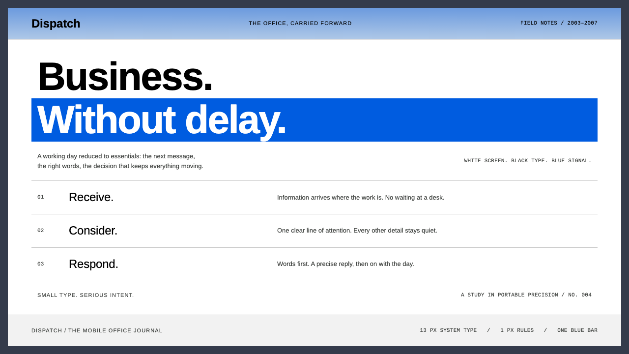 BlackBerryPortable precision. Dense black Arimo, white ruled rows and one decisive blue…
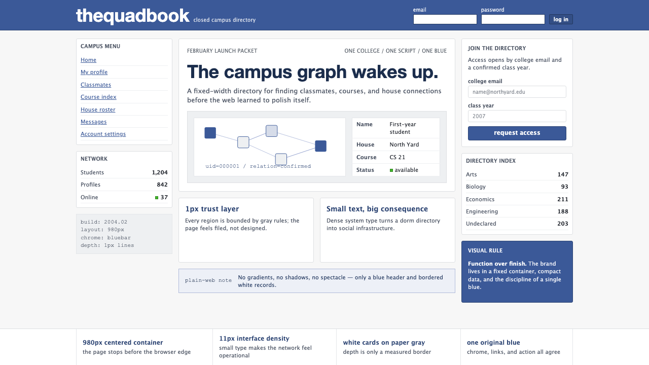 Facebook 2004Dorm-web austerity. Original blue, 980px grid, 1px borders, tiny Lucida Grand…
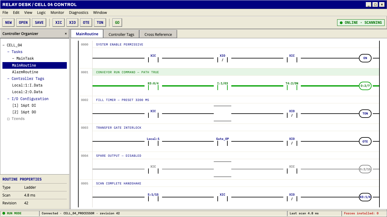 PLC Ladder LogicLogic made visible. Black rails and navy mnemonics turn green wherever the ci…
 craigslistNothing designed, everything findable. Blue underlined links and a purple ser…
 Financial Terminal MonoMaximum signal per pixel. Pure black, IBM Plex Mono, green-red ticks, amber-b…
 OS UI HumanistBuilt like a working desktop, not a brand. Window-gray ground, system-blue ch…