What is craigslist?
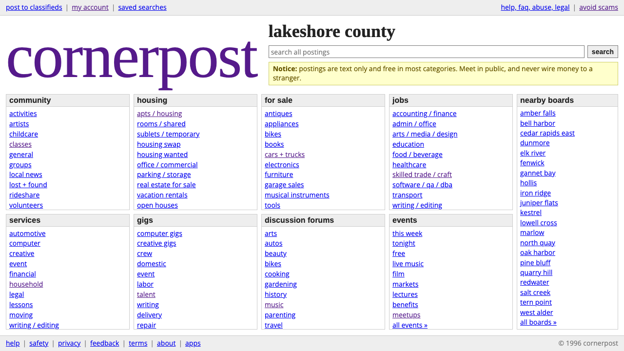
craigslist is the web's best-known proof that a page can be almost entirely undesigned and still be the easiest place to find what you came for.
craigslist in brief
The craigslist look is the visual language of plain HTML in the browser-default tradition: a white page, links in the familiar browser blue with their underlines intact, a wordmark set in purple Times, and content packed into dense columns of text links that sit inside thin grey boxes. It began in 1995 as an events email list in San Francisco, moved to the web as craigslist.org in 1996, and then went on to become the best-known classifieds board on the internet without ever receiving a real redesign.
What defines the style is not a set of decorations but a set of refusals. There are no photographs in the interface chrome, no shadows, no rounded corners, no gradients, and no weight in the type beyond regular and bold. Hierarchy is carried by position, by the grouping of links under short headings, and by the simple fact that everything is a link. The page behaves like a directory or an index rather than like a brand experience.
Seen as a design system, it is a lesson in what survives when you remove everything optional. Information density comes first, links are always recognisable as links, type stays small enough that a lot fits on one screen, and the page loads and scans the same way it did decades ago. The result reads as honest and slightly stubborn, and that reputation is part of why people trust it.

Where does craigslist come from?
craigslist began in 1995 as Craig Newmark's events email list in San Francisco. It was a way of passing along local happenings to friends, built with no ambition to be a platform and no design brief at all. The medium was email, and email has no layout; the list was text, in order, and people read it because it was useful. That origin explains the aesthetic better than any theory does: the site never had a moment where someone decided to look plain, because plain was simply what the thing was made of.
In 1996 the list became craigslist.org, and the web version inherited the same attitude. At the time, a page without any styling at all looked exactly like this: default white background, default blue links, default type. What is unusual is not that the site started that way, since almost every early page did, but that it stayed that way through the 2000s and 2010s while the rest of the web moved through skeuomorphism, glossy gradients, flat design, and card layouts. The layout remained largely unchanged across those decades.
The movements this style belongs to are named plainly in its background: Web 1.0 plain HTML, browser-default styling, and community classified ads. The first two describe a technical condition, a period when the browser itself was the designer. The third describes a social one, a kind of local bulletin board where the point is the listing and not the frame around it. Together they produce an interface that treats the visitor as someone with a task rather than as an audience.
Craig Newmark started the list, and Jim Buckmaster is the other name associated with the long stewardship of the site. The consistency of the product over so many years is usually read as a deliberate policy of leaving a working thing alone. Whether you admire it as restraint or dismiss it as neglect, the effect on the visual language is the same: a design that has become a recognisable style precisely because it never changed.
What defines the craigslist look?
Color
The ground is plain white and nearly everything else is black text and browser-default link blue. The single deliberate flourish is the purple of the wordmark, which stands alone as the only brand colour on the page. Grey appears only as a quiet outline. Colour is used to signal function, so blue means a link and nothing else, and there is no accent palette competing for attention.
Typography
Body type is small, default, and unpretentious, and the only variation in weight is regular against bold. The wordmark is set in a serif, Times, which gives the top corner a slightly old-fashioned, bookish personality against the otherwise utilitarian sans-style text. There is no typographic scale to speak of: headings are simply bold, and links keep their underlines so they cannot be mistaken for anything else.
Layout
Content is arranged in dense columns of links, grouped under short headings and enclosed in thin grey boxes. The columns fill the page edge to edge in a way that favours scanning over breathing room. Whitespace exists mainly to separate groups, not to make the page feel spacious, and the boxes act as the only structural device.
Imagery
The system uses no images in its interface. There are no hero photos, no illustrations, no icons dressing up the categories. Every category is simply its name as text. This keeps pages light, makes every item equally easy to reach, and avoids the question of which category deserves a picture.
Surface and shape
There are no shadows, no rounded corners, and no gradients. Boxes have square corners and a hairline outline in grey, and that is the whole vocabulary of surface. Depth is never simulated, so nothing appears to float, press, or glow; the page is flat in the most literal sense, a sheet of paper with ink on it.
Density and tone
Information density is the organising value. The tone is neutral, practical, and a little dry, with no marketing voice and no promotional banners. It treats the visitor as an adult with a task. The effect is a page that feels trustworthy because it clearly is not trying to sell the interface itself.

Who shaped craigslist?
Newmark started craigslist in 1995 as an events email list in San Francisco, passing along local happenings to friends. The medium he began with, a text email, set the character of everything that followed: ordered, useful, and unconcerned with appearance. The web edition carried that same sensibility forward under the name craigslist.org from 1996.
Buckmaster is the second name tied to the site's long run, during which the layout stayed largely unchanged through the 2000s and 2010s. His association with that continuity makes him part of the story of why the plain-HTML look became an enduring style rather than a passing stage.
How do you use craigslist today?
On slides, the craigslist system suits decks that want to feel candid and unmarketed. A cover can be a white slide with a single purple serif title and nothing else. Content slides work as plain lists of underlined blue items under bold headings, which makes it a natural fit for talks about marketplaces, the early web, or software that deliberately avoids polish. Data slides can use simple tables with thin grey rules, and the absence of decoration lets the numbers carry the argument.
In web interfaces, the style fits directories, listing boards, internal tools, documentation indexes, and anything where users arrive with a task and want to scan. A dashboard in this idiom would use dense lists, small type, square grey boxes, and links that look like links. Pricing or comparison pages can be treated as tables of text, which can read as refreshingly transparent when the product competes against heavily styled rivals.
In editorial and marketing work, it is best used as a deliberate stance rather than a default. Brands that want to signal honesty, anti-polish, or a no-frills attitude can borrow the white ground, default blue links, and the single purple serif wordmark. It also works well as a parody or homage layer, where the recognisability of the look does a lot of the communicative work by itself.
The most common mistake is to add polish in the name of improvement. Rounded corners, soft shadows, hero images, or a custom icon set quickly turn the system into a generic modern template, and the point of the style disappears. A second mistake is to make the page sparse: this is a dense system, and a lot of whitespace around a few links contradicts its logic. A third is to remove link underlines or recolour links, which breaks the most important rule of the system, that links always look like links.
A good test is whether the page would still work if the stylesheet failed to load. If the answer is yes, you are probably close to the spirit of the original. Keep type small, keep weights to regular and bold, keep the boxes square and grey, and let the content do the designing.

craigslist — FAQ
Why does craigslist look so plain?
Because it began as a 1995 events email list and moved to the web in 1996 in essentially the form the browser would show an unstyled page. It never went through a redesign, so the default look became its permanent look. The plainness is both a historical accident and, over time, a kept choice.
What colors does the craigslist style use?
A white page, black text, browser-default blue for links, thin grey outlines for boxes, and one purple for the serif wordmark. That is essentially the whole palette, and each colour has a single job.
Is this the same as brutalist web design?
No, though they overlap in being unpolished. Brutalist web design usually makes a visible aesthetic statement with bold or jarring choices. The craigslist look makes no statement; it simply uses browser defaults, dense links, and thin grey boxes in the name of function. Its power comes from neutrality, not confrontation.
Can I use this style for a modern product?
Yes, if the product is genuinely about finding things quickly: directories, listing sites, internal tools, and indexes. Keep the density, the underlined links, and the square grey boxes. Avoid adding imagery, shadows, or rounded corners, which would undo what makes it distinctive.
Related design styles
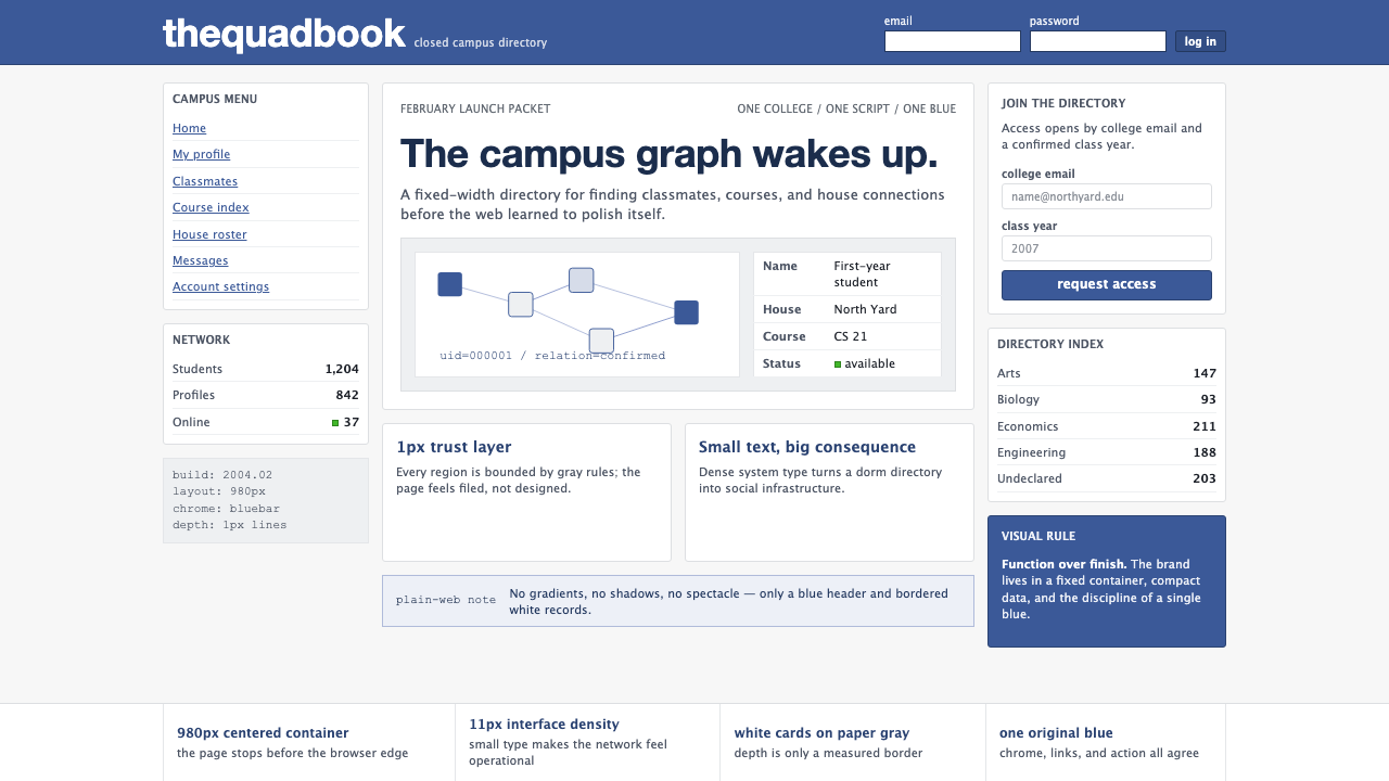 Facebook 2004Dorm-web austerity. Original blue, 980px grid, 1px borders, tiny Lucida Grand…
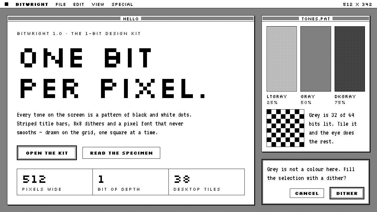 Macintosh 1984One bit per pixel, no grey. Black on white, striped title bars, dither fills…
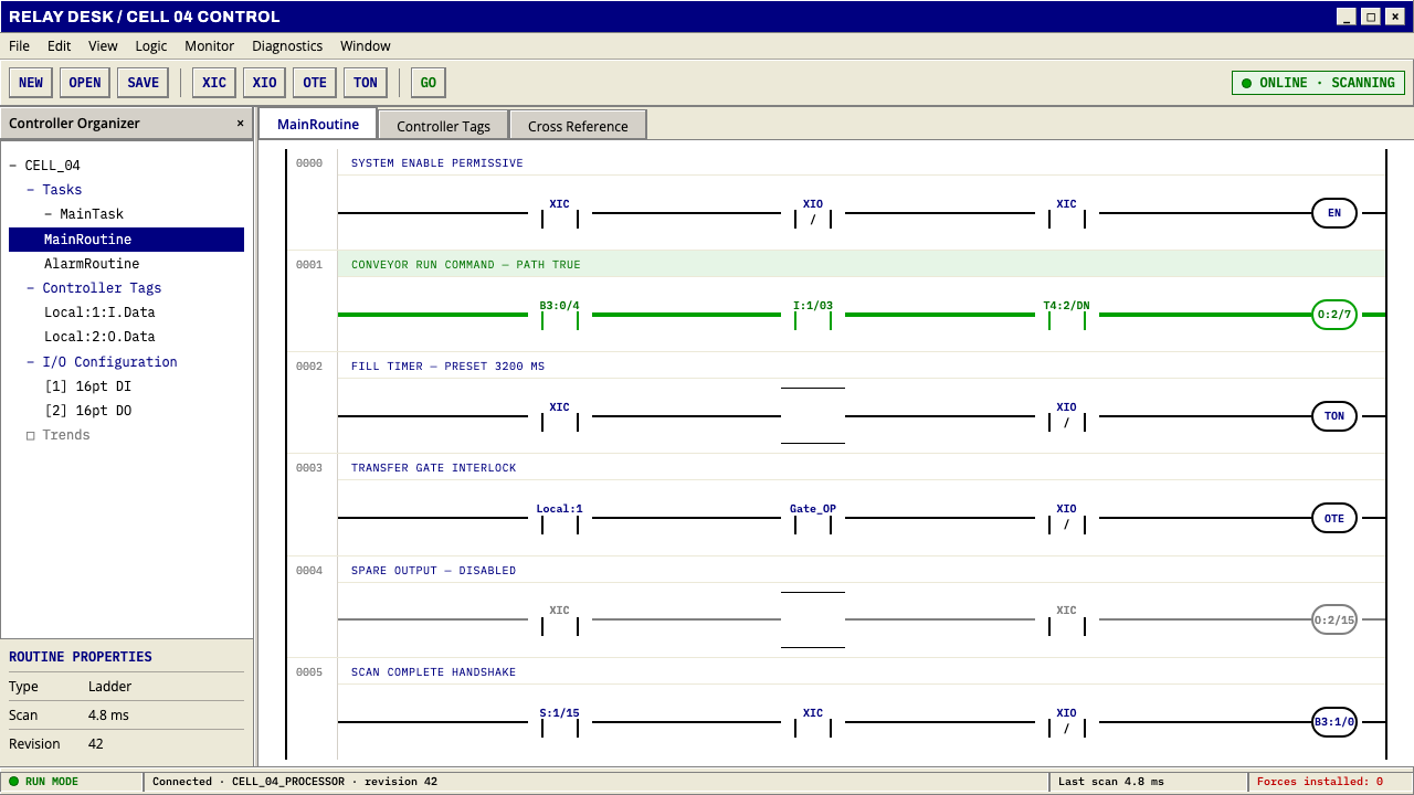 PLC Ladder LogicLogic made visible. Black rails and navy mnemonics turn green wherever the ci…
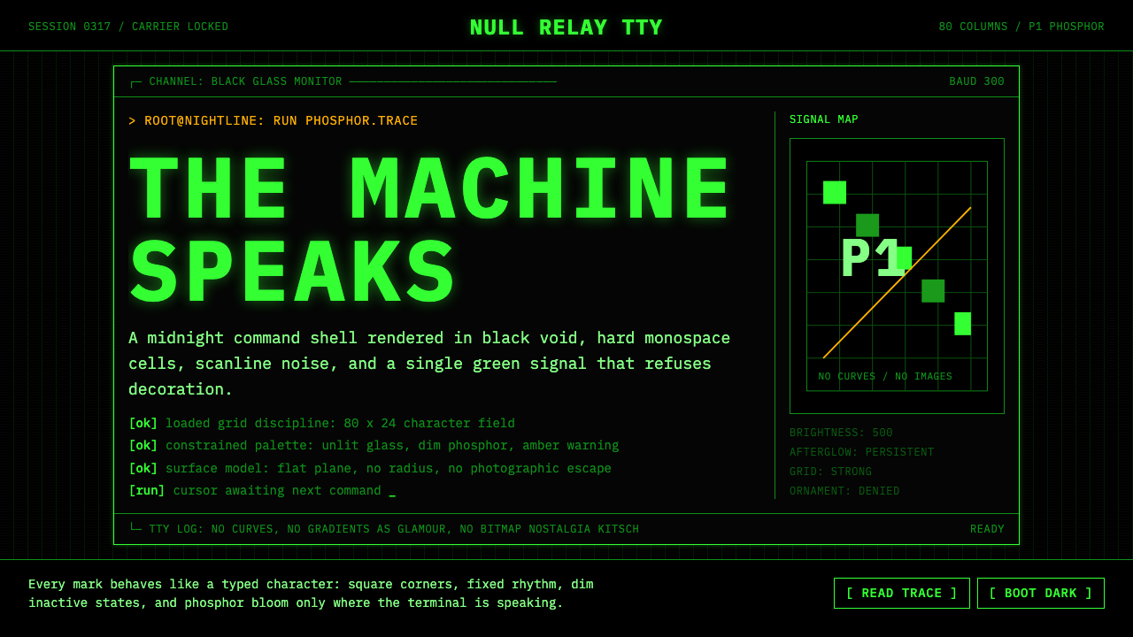 CLI Hacker Phosphor Green (1985)Pure terminal myth. Black glass, P1 green mono type, scanlines, and rigid 80-…
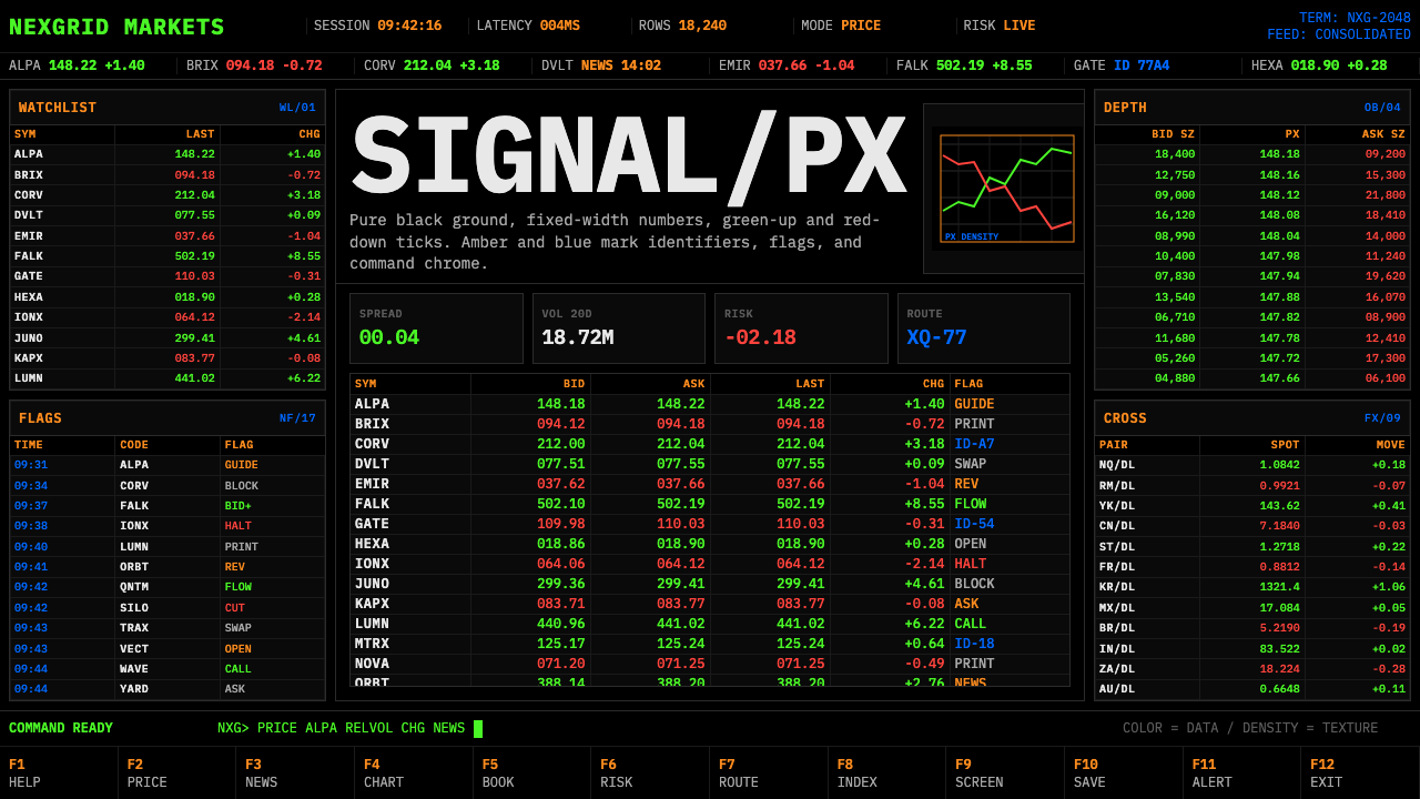 Financial Terminal MonoMaximum signal per pixel. Pure black, IBM Plex Mono, green-red ticks, amber-b…
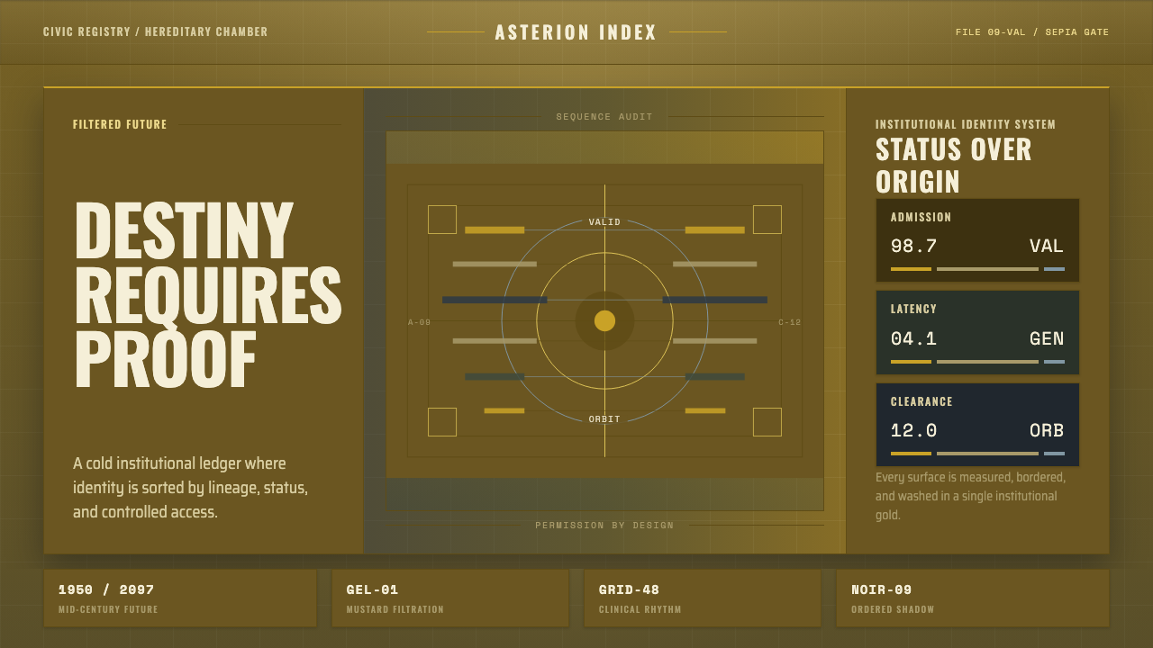 Gattaca Retro-FutureInstitutional gloom, made exact. Mustard-gold wash, condensed caps, hairline…