What is Gattaca Retro-Future?
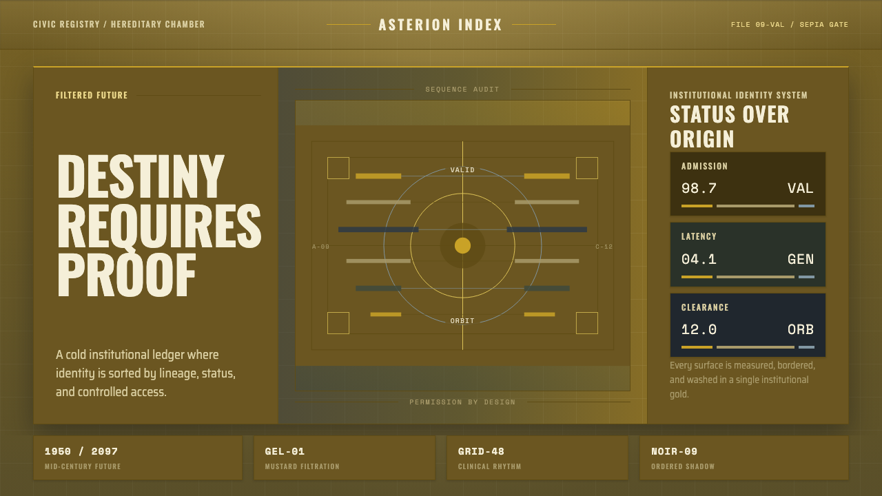
Gattaca imagined a future built from the past — a genetically ordered society dressed entirely in mid-century modernism, then drowned in a single relentless mustard-gold haze.
Gattaca Retro-Future in brief
Gattaca Retro-Future is the visual language of Andrew Niccol's 1997 science-fiction film, built from a deliberate contradiction: a story about genetic engineering and a coming biological aristocracy, told entirely through the architecture and material culture of the 1950s. There are no glowing screens, no chrome curves, no visible technology of any kind. The future is imagined as a return — cool, ordered, and finished decades ago.
The defining move is cinematographic rather than architectural. Every frame is passed through a heavy, consistent gel filtration that saturates the image in a warm, aged, monochrome-leaning wash — the color of old film stock left in a drawer too long. This is not a lighting choice applied per scene; it is a totalizing filter that unifies the entire visual world under one mood, so that costume, set, and location all read as pieces of the same institution.
Underneath the color wash sits a rigorously geometric, symmetrical design system inherited from mid-century modernist architecture — long colonnades, repeated structural bays, hard planes of concrete and glass. The two registers work together: the architecture supplies the order, the filtration supplies the dread. The result reads simultaneously as elegant and clinical, aspirational and cold — a society that has perfected its surfaces and hidden its cruelty inside them.
Where does Gattaca Retro-Future come from?
Gattaca was written and directed by Andrew Niccol and released in 1997, set in an unspecified near future where genetic selection at birth has become the norm and a person's DNA — read instantly from a drop of blood or a stray eyelash — determines employment, insurance, and social standing. The film's central tension, between a naturally conceived 'invalid' and the genetically optimized elite around him, is carried almost entirely by design rather than exposition: the world simply looks like a place where imperfection has been engineered out.
The visual strategy was a deliberate rejection of standard science-fiction futurism. Rather than invent a new architectural vocabulary of screens, neon, and sleek plastics, production designer Jan Roelfs and Niccol chose to shoot largely on real mid-century modernist buildings and dress them with period-appropriate cars, suits, and furniture. The effect suggests a civilization so confident in its genetic order that it never needed to reinvent its own aesthetics — the future simply inherited the past's most rational architecture and kept it running.
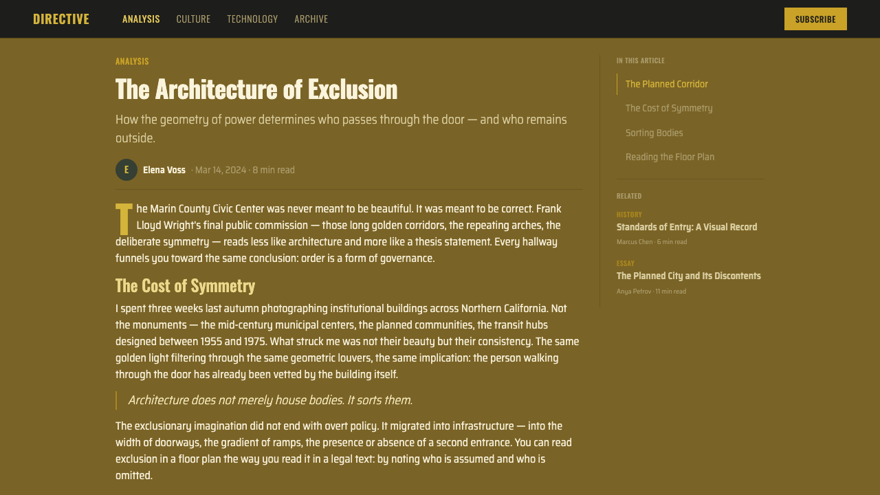
The film's single most important location is the Marin County Civic Center in California, designed by Frank Lloyd Wright and completed in the early 1960s — a building of long arched spans, repeating circular skylights, and a monumental, almost governmental symmetry. Cast as the headquarters of the Gattaca Corporation, its real-world grandeur required no invention; the camera simply found the eugenic-cold order already built into Wright's architecture and let it stand in for institutional power.
Over this architecture, cinematographer Sławomir Idziak — a Polish director of photography known for dense, painterly color filtration in his earlier European work — laid the film's signature look: heavy gel filters that push every scene toward a narrow, saturated band of gold, amber, and desaturated shadow. The result is often compared to aged Kodachrome film, and it does more narrative work than any single set piece: it tells the audience, wordlessly, that this world has already decided who belongs in it.
What defines the Gattaca Retro-Future look?
Color
The palette lives almost entirely inside a single warm, desaturated wash — a mustard-gold haze that sits over every surface like sepia left slightly too long in the developer. There is no true white and no clean primary color anywhere in frame; even skin tones and shirt fabrics are pulled toward the same amber register. This is a monochrome-leaning system built from tone and value rather than hue variety, and it is what makes the world feel institutional rather than simply old-fashioned.
Typography
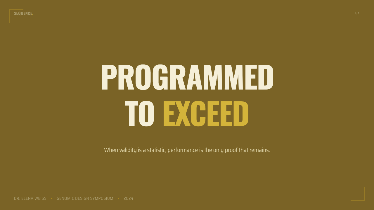
Lettering throughout the world is condensed, upright, and set in all capitals — the register of mid-century corporate signage and government stenciling rather than anything overtly futuristic. Letterforms are narrow and tightly spaced, giving even simple labels a compressed, official weight. There is no informal or rounded lettering anywhere; every inscribed surface reads as institutional issue.
Geometry and Symmetry
Compositions favor long, repeating structural bays — colonnades, arched openings, ranks of identical windows — arranged with a symmetry so exact it borders on the ceremonial. Figures are frequently shot small within these vast repeating structures, emphasizing the individual's insignificance against the built order. Curves, where they appear, are perfect arcs and circles rather than organic forms; nothing in the geometry looks accidental.
Grid
Interiors and exteriors alike are organized on a strict, visible modular grid — floor tiles, ceiling coffers, window mullions, and desk arrangements all repeat at the same interval, reinforcing the sense of a system with no room for variance. Hairline divisions recur constantly: thin structural lines separating equal bays, equal desks, equal doors. The grid itself becomes a metaphor for the genetic sorting the story is about.
Material and Surface
Surfaces are hard, cool, and non-reflective in the conventional science-fiction sense — poured concrete, dressed stone, brushed and dulled metal, heavy wool suiting. Nothing gleams or glows; nothing is transparent or plastic. The materials are entirely period-authentic mid-century ones, which is precisely what makes the setting feel like an inherited future rather than an invented one.
Light and Shadow
Lighting is directional and hard-edged, frequently raking across colonnades to throw long, regular bars of shadow across floors and walls — the shadow pattern itself becomes a second grid layered over the architecture. Interiors favor deep, controlled pools of light against large areas of shade, rather than even, shadowless illumination. The overall effect is dramatic and formal rather than naturalistic.
Restraint and Absence of Ornament
There is no decorative detailing anywhere in the system — no applied pattern, no consumer branding clutter, no visible technology interface design. What reads as futuristic is entirely the absence of the present's visual noise: no screens, no cables, no logos competing for attention. The restraint is total, and it is this emptiness, layered under the gold wash, that gives the style its particular chill.

Who shaped Gattaca Retro-Future?
Niccol wrote and directed Gattaca, his feature debut, and conceived the film's central visual conceit: a genetically stratified future rendered entirely through mid-century modernist design rather than invented technology. His insistence on shooting real period architecture instead of building science-fiction sets is what gives the film's world its distinctive, restrained authority.
Idziak served as the film's cinematographer and is the primary author of its signature look — the heavy, unifying gel filtration that pushes every frame toward a warm, aged monochrome wash. A Polish director of photography with a background in dense, painterly color work from earlier European cinema, he treated color filtration not as scene-by-scene mood lighting but as a totalizing visual law applied across the entire film.
Roelfs was the film's production designer, responsible for translating the mid-century modernist concept into practical locations, sets, and dressing. His work selecting and adapting real period architecture — rather than constructing an invented futurism — is central to the style's credibility and its inherited-future quality.
Wright was the architect of the Marin County Civic Center, completed in the early 1960s and used in the film as the headquarters of the Gattaca Corporation. Though Wright had no connection to the film itself, his building's long arched colonnades, repeating circular skylights, and monumental symmetry supply the architectural backbone that the entire visual style is built around.
How do you use Gattaca Retro-Future today?
Gattaca Retro-Future transfers well to any context that wants to suggest quiet institutional authority — or its darker cousin, institutional control — without resorting to conventional futuristic or corporate cliché. Applying it correctly means committing to the single unifying color wash first and treating everything else, geometry included, as subordinate to it; a layout that keeps the geometric symmetry but skips the tonal unity will read as generic mid-century pastiche rather than this specific style.
For presentation covers, the style is powerful when a single large architectural or geometric motif — an arch, a repeating colonnade silhouette, a grid of identical circles — sits under a condensed, all-capitals title, the whole frame pulled toward the same warm, muted tone. Content slides should keep text blocks narrow and rigidly aligned to a repeating grid, echoing the architecture's equal bays; data visualizations suit this style particularly well when bars or columns are rendered as identical, evenly spaced verticals, reinforcing the sense of uniform, engineered order rather than organic variance.
For web interfaces, the style suits dashboards and pricing pages that want to project institutional trust and precision rather than warmth — a system where every tier or every data column repeats with exact, unvarying spacing, and where the overall color field stays inside one warm, restrained tone rather than introducing bright accent colors. Cards and panels should favor hard, directional shadows over soft ambient ones, echoing the raking light through colonnades, and navigation labels read best condensed and capitalized rather than in a conversational lowercase voice.
For editorial and marketing work, the style is well suited to features about surveillance, bureaucracy, genetics, or any narrative built on the tension between polished surface and hidden control — a long-form article can use the tonal wash as a full-bleed background treatment behind section breaks, with condensed capital headers marking each division like signage. Marketing pages benefit from restraint: one dominant tonal field, one architectural or geometric hero image, and text kept sparse enough that the mood itself does most of the persuading.
The most common mistake in applying this style is treating it as generic sepia nostalgia — warming an image's white balance without also imposing the strict geometric symmetry and grid discipline that give the look its institutional edge. Sepia alone reads as old photographs; sepia plus rigorous, repeating architectural order reads as Gattaca. The second most common mistake is over-decorating: any added ornament, bright accent color, or visible modern technology breaks the illusion of an inherited, unchanging future and should be removed rather than balanced against.
Gattaca Retro-Future — FAQ
Is Gattaca Retro-Future the same as general mid-century modernism?
They share an architectural vocabulary but diverge sharply in mood. Mid-century modernism as a broader style tends toward optimism — bright, airy, and forward-looking, often paired with clean primary accents. Gattaca Retro-Future takes the same geometric, symmetrical architectural bones and pushes them through a heavy, unifying color filtration that reads as institutional and faintly menacing rather than optimistic. The architecture is borrowed; the dread is added entirely through the tonal treatment layered on top of it.
Why does this style avoid bright or varied colors so completely?
Because color variety implies choice, individuality, and change over time — all things the story's genetically sorted society has engineered away. A single, unbroken tonal wash suggests a world frozen at one moment and never revised, an institution so total it has no need to differentiate its surfaces. Introducing bright or varied color would suggest vitality and unpredictability, which works directly against the mood of a perfected, closed system.
Can this style work in a bright, high-key layout instead of a dark one?
It can, and much of the film itself is not literally dark — many scenes are lit brightly within the gold wash rather than shrouded in shadow. What matters is not overall brightness but tonal narrowness: whether the layout is high-key or low-key, every value in the frame should sit inside the same warm, restrained color band rather than spanning a full, varied palette. A bright layout that keeps this narrow tonal discipline will still read as the style; a bright layout with scattered accent colors will not.
How should photography or imagery be treated in this style?
Imagery should be treated as if shot through the same gel filtration as the rest of the system — pulled toward the same warm, aged tone rather than left at natural color balance, and composed with the same preference for symmetry and repeating structure seen in the architecture. Figures are often placed small within a large, ordered frame rather than in tight, expressive close-up, which reinforces the individual's subordination to the built system around them.
What kinds of products or brands should avoid this style?
The style struggles wherever warmth, spontaneity, or approachability are the priority — children's products, casual consumer apps, wellness or hospitality brands, anything meant to feel welcoming rather than authoritative. Its restrained, monochrome-leaning wash and rigid symmetry can also read as cold or faintly ominous in contexts that need to build immediate emotional trust, so it is best reserved for products and narratives where quiet institutional authority, precision, or an undercurrent of control is the intended effect rather than a liability.
Related design styles
 Cursor IDEAI-first code editor. Pure dark surfaces, off-white text, electric blue reser…
 Fly.io Edge-Compute PurpleEdge-cloud with discipline. Electric purple nodes, Inter type, and terminal b…
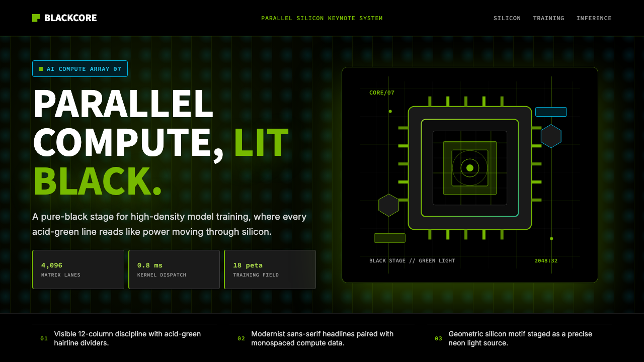 NVIDIA GPU Green-BlackPure black turns compute theatrical. Acid green hairlines and chip geometry s…
 Resend 2024Clean code becomes brand. Pure black, JetBrains Mono, and one green delivered…
 Vercel 2024Developer luxury by subtraction. Pure black, white Inter, rigid grid, triangu…
 Aperture ScienceSterile authority. Cool panel seams, Archivo signage, and sparse orange-blue…