What is Macintosh 1984?
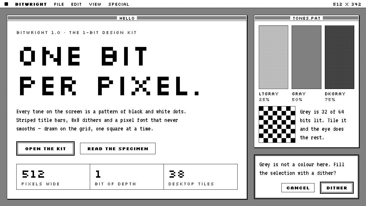
The 1984 Macintosh drew its whole world with one bit per pixel: black on white, no grey in the hardware, and every tone you remember built out of patterns.
Macintosh 1984 in brief
Macintosh 1984 is the visual language of the first Apple Macintosh, which went on sale in January 1984 with a nine-inch screen that could show each pixel as black or white and nothing in between. Everything on that screen, the desktop, the windows, the menu bar, the pointer, the icons and every letter, was drawn from that single choice. As a design style it means white window interiors inside thin black frames, striped title bars, capital letters snapped to a pixel grid, small hand-drawn icons with a sense of humour, and shadows reduced to the narrowest edge a screen could show.
The central discipline is the absence of grey. The hardware could not produce it, so every tone that looks grey to a modern eye is actually a pattern of black and white pixels: the textured desktop, the dimmed menu item, the shaded scroll bar. The constraint turned out to be a source of character rather than a limit. A pattern has texture, it reads as deliberate, and it can be recognised at a glance, whereas a smooth, soft grey would have been a betrayal of the medium.
At the same time the style is warm. The interface was made for people who had never used a computer, and its icons, a smiling computer, a trash can, a wristwatch and a bomb, borrow from everyday life and from a sense of play. The overall effect is clean and historical but also slightly mischievous, which is why the look is still reached for when a product wants to seem honest, friendly and a little nostalgic.

Where does Macintosh 1984 come from?
The Macintosh did not invent the graphical interface, but it was the machine that made it feel human. The ideas of windows, icons, menus and a pointer, often shortened to WIMP, had been developed at the Xerox research laboratory in Palo Alto, and Apple had already tried a version of them on the expensive Lisa in 1983. The Macintosh was the attempt to bring that vocabulary to an ordinary desk, in a compact all-in-one case with a small built-in screen. It reached the public in January 1984, famously announced by a television commercial that framed the machine as a break from grey corporate computing.
The look was made by constraint. The screen measured 512 by 342 pixels, and each pixel was a single bit of memory, either on or off. There was no room in the hardware for tone, so tone had to be invented in software. Bill Atkinson wrote QuickDraw, the graphics library that drew lines, ovals, rounded rectangles, text and regions of pattern on that bitmap, including the small repeating patterns, each only eight pixels square, that fill areas to simulate shades of grey. Atkinson also wrote MacPaint and devised a method of dithering photographs into scattered black and white dots that carries his name to this day. Between them, hardware and software gave the Macintosh a distinct visual grammar: pure black, pure white, and patterns in between.
Susan Kare gave that grammar a face. A sculptor and graphic artist who had never designed for a screen, she joined Apple in 1982 at the invitation of her old friend Andy Hertzfeld, who needed someone to draw icons and letters for the new machine. She worked on gridded paper, filling in squares one at a time, and has often compared the craft to mosaic and needlepoint. From that came the smiling Macintosh that greeted users at start-up, the trash can, the paintbrush, the pointing hand, the wristwatch that signalled waiting, the bomb that signalled a crash, and the looped-square symbol on the command key, adapted from a sign used in Sweden to mark places of interest. She also drew the system's typefaces, naming them after world cities, among them Chicago, Geneva and New York. Chicago became the voice of the menus and title bars.
The style outlived its hardware. Colour arrived, screens grew and later systems smoothed every edge, but the original black and white Macintosh remained the reference for what a friendly interface could look like when it had nothing but pixels to work with. Kare went on to design for NeXT, Microsoft, where she drew the playing cards for the Solitaire game in Windows 3.0, and many others, and her icons continue to be treated as a standard of economy. As a design system, Macintosh 1984 keeps the original discipline: no colour, no smooth grey, no decoration that is not a decision made one pixel at a time.
What defines the Macintosh 1984 look?
One-Bit Monochrome
Every pixel is black or white. There is no colour, no transparency, no smooth blending and no anti-aliasing. Edges are stair-stepped and honest, and diagonals show the grid they were drawn on. This is not a retro filter laid over a modern layout; it is a strict palette of two, within which all hierarchy and mood must be found.
Dither as Grey
Every tone between black and white is a pattern: a fine checkerboard for the desktop, sparse dots for a disabled menu item, diagonal hatching for a shaded bar. Patterns have rhythm and a hand-made feel, and they scale in whole steps. A flat, soft grey is the single most anachronistic thing one can add to this style.
Window Chrome
A window is a white field inside a thin black frame. The active window wears a title bar of fine horizontal stripes with its name centred on a white patch, and a small close box sits at one corner. A narrow offset shadow falls to the lower right, a single step wide. Inactive windows lose their stripes and go quiet. The whole frame is built from rules, and nothing in it is decorative.
Pixel-Grid Type
Letters are bitmaps, drawn to snap to the pixel grid. Chicago-style capitals have chunky, even stems and a friendly, slightly rounded rhythm, and they read as confident at small sizes. Type is set in whole-pixel steps with no smoothing and no subtle tracking. Bitmap type shines in labels, menus and short headings; long paragraphs in it become tiring, so it is used with restraint.
Icon Craft
Icons are drawn on a small square grid, with every pixel a deliberate choice. They rely on plain objects: a folder, a sheet of paper with a folded corner, a trash can, a wristwatch, a pointing hand. Outlines are bold, interior detail is sparing, and a little personality, a wink or a frown, goes a long way. A good icon in this style could be recognised after being photocopied twice.
Hard Edges, One-Step Shadow
Corners are either square or rounded by the smallest step the grid allows, as on buttons and window outlines. Shadows are never blurred: they are a single offset edge, a solid line where depth is suggested, or nothing at all. Depth is a matter of overlap and ordering, not of light simulation. The page feels like a stack of paper cards on a desk.
Inverted Selection
When something is selected or pressed, black and white swap places. A highlighted menu item becomes white text on black; a pressed button inverts. This is the system's only state language, and it works because it needs no extra colour. Hover, focus and active states can all be built this way, each as a simple reversal rather than a new tint.

Who shaped Macintosh 1984?
Kare drew the Macintosh's original icons and typefaces on gridded paper, one square at a time. Her work, from the smiling start-up Mac to the trash can and the pointing hand, taught a generation that a few dozen pixels could express warmth, humour and clarity at once. She went on to design for other companies, and is widely regarded as a founding figure of interface iconography.
Atkinson wrote QuickDraw, the graphics engine that drew every line, shape, letter and pattern on the original Macintosh screen, and created MacPaint, the program that showed ordinary users what a bitmap could do. His dithering method for converting photographs to black and white is still named after him. Much of the Macintosh's visual grammar, including its pattern fills, rests on his engineering.
Hertzfeld was a software engineer on the original Macintosh team and a key author of its system software. He was also the old friend who brought Kare to Apple, asking an artist with no screen experience to draw the icons and letters. That act of recruitment shaped the machine as much as any line of code.
How do you use Macintosh 1984 today?
Macintosh 1984 is best used when a product wants to feel honest, human and a little nostalgic: developer tools, indie software, educational products, digital exhibitions, museums of technology and anything that benefits from the idea that a computer is a friendly object. Its great strength is that the constraints do the design work. If everything is black or white, there is little to argue about.
For presentations, a cover can be a white page with a thin black frame like a window, a striped title bar and one hand-drawn pixel icon at the centre. Content slides are windows, with each idea in its own frame and the title bar carrying the heading. Data slides are where the style is most inventive: charts distinguish series by pattern, with dots, hatching and checkerboards, rather than by colour, which makes them legible in print, on a projector and for viewers with colour-vision differences.
For web interfaces, treat panels as windows, with titled bars on dashboards and tiers on pricing pages as separate frames. Buttons are outlined, small-cornered rectangles that invert on hover and press. Keep layouts on a whole-pixel grid and scale artwork by whole multiples only, so lines stay sharp. Use the bitmap face for labels and headings and pair it with something calm for long reading, as paragraph-length bitmap type grows tiring fast. No gradients, no soft shadows and no transparency.
For editorial and marketing work, the style fits zines, retrospectives, launch pages for small tools and anything with the feel of a printed manual. Photographs should be converted to dithered black and white, which is a recognisable look of its own. Icon sets drawn in the same grid can carry a site, replacing stock illustration with something that has a personality and a maker.
The most common mistake is to treat the style as a skin: a pixel font and a beige background laid over an otherwise modern layout. The logic of the system is the constraint, so smooth grey, blurred shadows, rounded pills and soft transparency all break it at once. A second mistake is scaling pixel artwork by a fractional amount so the lines blur. A third is overusing the bitmap face in body copy, where it hurts reading.

Macintosh 1984 — FAQ
Is this the same as 8-bit pixel art?
No. Eight-bit game art usually works with a small palette of colours, while this style is strictly one bit: black and white, nothing else. It is also an interface language rather than an illustration language, with windows, menu bars, title bars and icon conventions, not sprites and tile maps. The two share a love of the grid, but they are different disciplines.
Why do the greys look like dots up close?
Because they are patterns, not greys. The original screen could only turn pixels on or off, so shades were simulated with repeating arrangements of black and white dots, a technique called dithering. The eye blends them into a tone at normal viewing distance. In the style, that texture is a feature to keep, since it is what separates it from a simple grey-and-white wireframe.
Can I add a colour accent?
The authentic style has none, and its power comes from that. If a product needs a signal colour for errors or primary actions, use a single one sparingly and keep everything else in black, white and pattern. The moment a second or third colour appears, the system stops looking like the original machine and starts looking like a modern interface in costume.
Is the style accessible?
In several ways, yes. Pure black on white gives the strongest possible contrast, and pattern-based charts remain legible to people with colour-vision differences. The risks are small bitmap type, which can be hard to read at low resolution or in long passages, and very fine dither patterns, which shimmer on some screens. Use whole-number scaling, keep text blocks short and give body copy a calmer face.
Where does the style struggle?
It struggles with photography-heavy pages, luxury or high-polish brands, and long-form reading. Its charm lies in being plain and a little playful, which can feel wrong for contexts that depend on gloss or prestige. It also asks for discipline from everyone who touches it: a single smooth gradient is enough to break the spell.
Related design styles
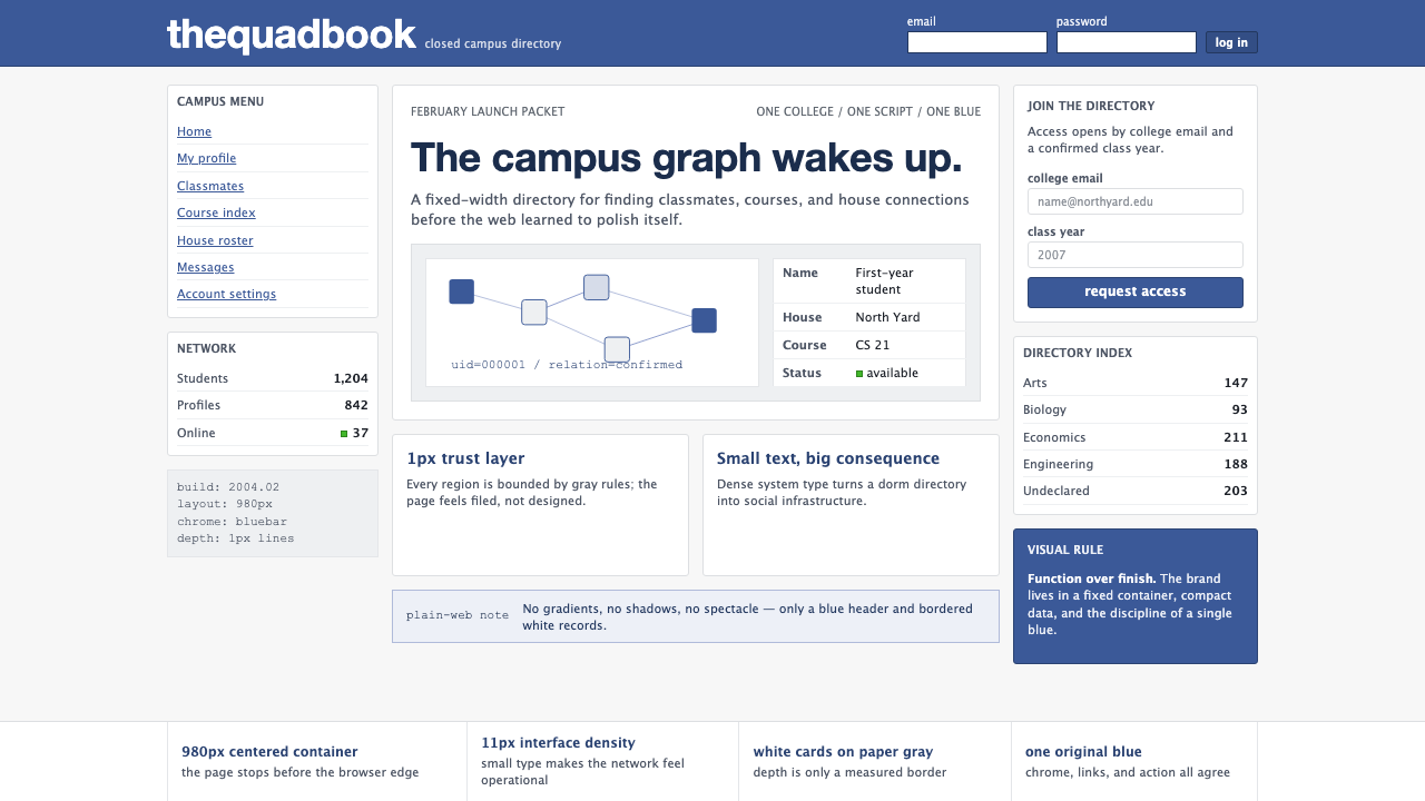 Facebook 2004Dorm-web austerity. Original blue, 980px grid, 1px borders, tiny Lucida Grand…
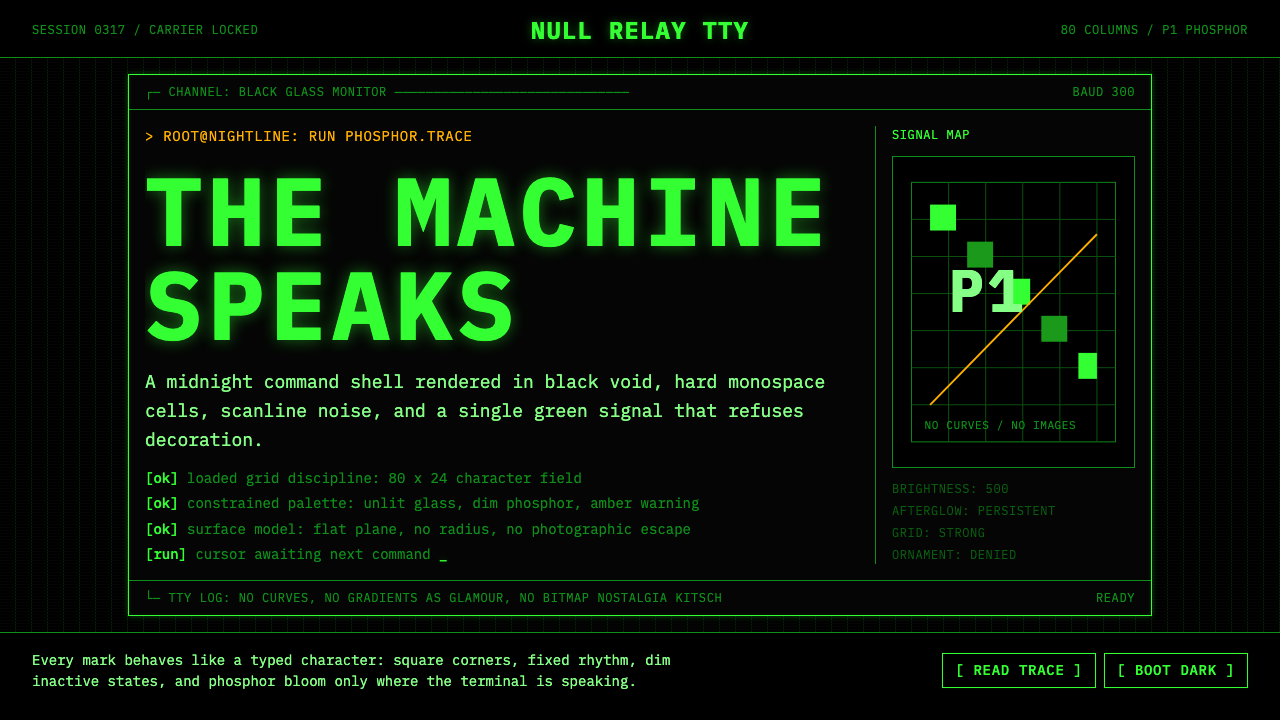 CLI Hacker Phosphor Green (1985)Pure terminal myth. Black glass, P1 green mono type, scanlines, and rigid 80-…
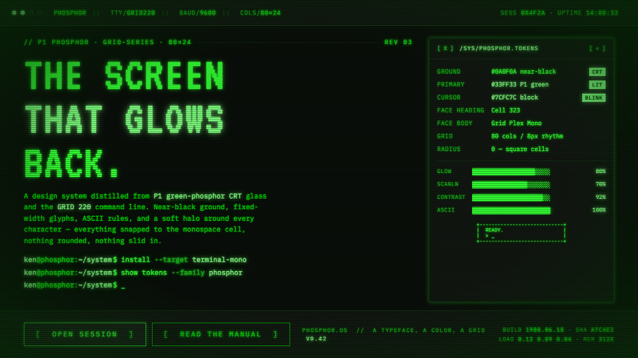 Unix Terminal MonoNear-black CRT glass that glows back. P1 phosphor green, VT323 mono, ASCII ru…
 Yahoo! 1995Directory-era optimism. Purple table bars, yellow NEW badges, blue underlined…
 Handheld LCD GameConstraint is the charm. Olive LCD grid, black segment ink, tight molded beze…
 NASA Worm Logo (1975)Engineering reaches orbit. Black void, worm red, mono telemetry, and aluminum…