What is NASA Worm Logo (1975)?什么是 NASA Worm Logo (1975)?
A single red wordmark against infinite black — the NASA Worm logo of 1975 made aerospace modernism the face of human ambition at the frontier of space.一个红色字标悬浮于无尽黑暗之中——1975年的NASA蠕虫标志,让航天现代主义成为人类在宇宙边疆最具象的视觉语言。
NASA Worm Logo (1975) in briefNASA Worm Logo (1975) 速览
The NASA Worm is the informal name for the logotype created in 1975 by graphic designers Richard Danne and Bruce Blackburn under the Federal Design Improvement Program. It replaced the agency's previous emblem — a dense, illustrative roundel known as the 'meatball' — with a single custom wordmark: the letters N-A-S-A rendered in a rounded, flowing sans-serif form, unified by continuous curved strokes and set in a deep, authoritative red. The result is not merely a logo but a complete visual identity system built for government authority at planetary scale.NASA蠕虫标志(The Worm)是平面设计师Richard Danne与Bruce Blackburn于1975年在联邦设计改进计划(Federal Design Improvement Program)框架下创作的字标标识。它取代了此前被称为「肉丸」(meatball)的繁复图形徽章,以一个定制字标代之:N-A-S-A四个字母以圆润连贯的无衬线形态书写,笔画之间以连续曲线相接,整体呈现一种深沉而权威的红色。它不只是一个标志,而是一套专为政府机构在星际尺度上使用而建立的完整视觉识别系统。
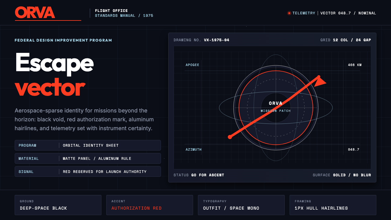
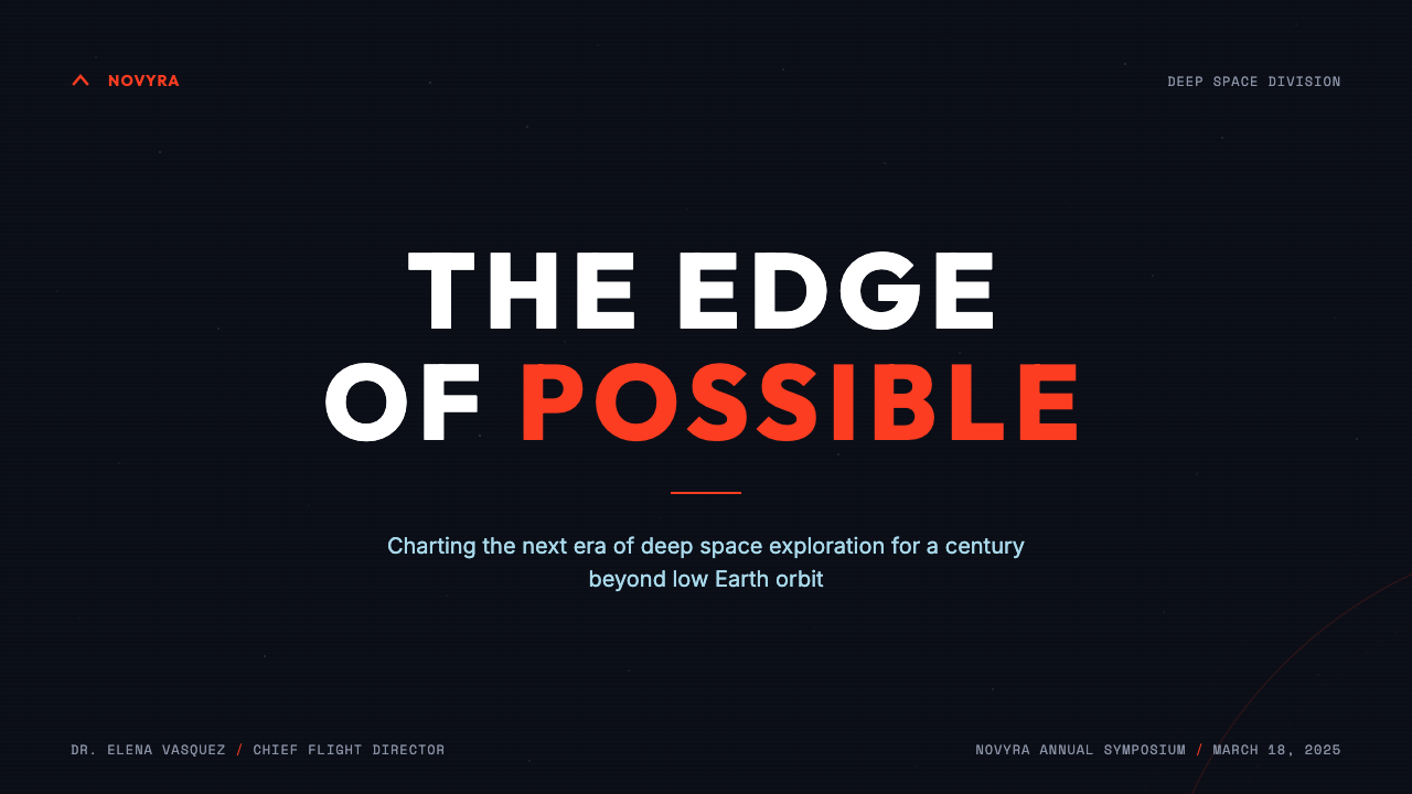
The visual language of the Worm system is aerospace-spare. A deep black ground evokes the void of space and serves as the canvas against which all other elements register. NASA red — a warm, saturated crimson that reads with confidence across any surface from a spacecraft hull to a printed document — functions as the sole accent color. Technical white carries informational text and readout panels, while an understated aluminum gray occupies structural borders, data panels, and the implied surfaces of spacecraft geometry. The system refuses embellishment: no gradient, no texture, no decorative element that cannot be justified by information.蠕虫系统的视觉语言是航天级的克制。深黑底面如同太空虚空,是其他一切元素得以显现的画布。NASA红——一种饱满温暖的深红,无论印在航天器外壳还是纸质文件上都以同等力度传达信息——是整套系统中唯一的强调色。技术白承载信息文字与读数面板,低调的铝合金灰则出现于结构边框、数据面板和航天器几何体的暗示性表面。整套系统拒绝一切点缀:没有渐变,没有纹理,没有任何无法以信息功能为正当理由的装饰元素。
Retired in 1992 in favor of a return to the meatball emblem, the Worm nonetheless achieved a kind of immortality. Its 2020 revival on the SpaceX Crew Dragon — the first crewed commercial launch to the International Space Station — reintroduced it to a generation that had never seen it in active service. Today the Worm occupies an unusual cultural position: a piece of government graphic design from the mid-1970s that reads as perpetually contemporary, as comfortable on a mission patch as on a streetwear release.蠕虫标志于1992年退役,重新让位于肉丸徽章,却以另一种方式获得了永生。2020年,它随SpaceX载人龙飞船——第一次载人商业发射至国际空间站——重回公众视野,将这一标志引入了从未见过它活跃服役的新一代。如今,蠕虫标志占据着一个罕见的文化位置:一件诞生于1970年代中期的政府平面设计作品,却读来永远当代,任务徽章上如是,街头服饰联名上亦如是。
See the NASA Worm Logo (1975) design system查看 NASA Worm Logo (1975) 完整设计系统
Where does NASA Worm Logo (1975) come from?NASA Worm Logo (1975) 从何而来?
The origins of the Worm lie in a federal initiative that had nothing to do with rockets. In the late 1960s and early 1970s, the United States government recognized that its visual communications — spanning hundreds of agencies, departments, and programs — were a chaotic patchwork of inconsistent insignia, typefaces, and color schemes. The Federal Design Improvement Program, launched under the Nixon administration and championed by the National Endowment for the Arts, set out to bring professional graphic design standards to federal institutions. NASA, as the most prominent and visually ambitious of all federal agencies, became a flagship case.蠕虫标志的起源与火箭无关,它诞生于一项联邦改革倡议。1960年代末至70年代初,美国联邦政府意识到,其跨越数百个机构、部门与项目的视觉传播体系,是一片由不一致徽章、字体与色彩拼凑而成的混乱图景。由尼克松政府发起、由国家艺术基金会推动的「联邦设计改进计划」,旨在将专业平面设计标准引入联邦机构。NASA作为所有联邦机构中最具知名度和视觉野心的一个,成为这一计划的旗舰案例。
The contract for NASA's new visual identity went to Danne & Blackburn, a New York design firm. Richard Danne and Bruce Blackburn were practitioners of American corporate modernism — the mid-century tradition, descended partly from Bauhaus principles and partly from the Swiss International Style, that had given major corporations like IBM and American Airlines their clean, systematic visual identities in the 1950s and 1960s. For NASA, they produced a comprehensive standards manual — the NASA Graphics Standards Manual, published in 1976 — that specified every application of the identity, from vehicle markings on the Space Shuttle to letterhead and signage. The manual is a masterpiece of systematic design thinking and was itself rediscovered and republished by fans and designers decades later.NASA新视觉识别的合约由纽约设计公司Danne & Blackburn承接。Richard Danne与Bruce Blackburn是美国企业现代主义的实践者——这一诞生于二十世纪中叶、部分源自包豪斯原则、部分源自瑞士国际主义风格的传统,在1950至60年代为IBM、美国航空等大型企业打造了简洁、系统化的视觉身份。他们为NASA制作了一套完整的标准手册——1976年出版的《NASA图形标准手册》——详细规范了该识别系统在航天飞机机体标识、信纸、标牌等每一种应用场景中的使用方式。这本手册本身就是系统化设计思维的杰作,数十年后被设计师和爱好者重新发现并出版复刻。
The Worm wordmark itself was a radical departure from the meatball, which had been designed in 1959 by NASA engineer James Modarelli and was rich with symbolic elements: a sphere, stars, a chevron, an orbital ellipse. Danne and Blackburn stripped all of that away. Their new logotype was strictly typographic — no illustration, no symbols, no representational elements whatsoever. The letterforms they designed share a family of curves: the C-shaped bowl of the A, the open rounded terminals of the N, the flowing S all participate in a continuous visual rhythm. The letters were custom-drawn, not adapted from any existing typeface, making the Worm unique in the truest sense.蠕虫字标本身是对肉丸徽章的根本性背离。肉丸由NASA工程师James Modarelli于1959年设计,富含象征元素:球体、星星、V形纹章、轨道椭圆。Danne和Blackburn将这一切剥离殆尽。他们的新字标是纯粹字体性的——没有插图,没有符号,没有任何具象元素。他们设计的字母形态共享一套曲线家族:A的C形碗状结构、N的开放圆润终端、流动的S,共同参与一种连续的视觉韵律。这些字母是全新定制绘制的,并非改编自任何现有字体,使蠕虫在最本质的意义上具有唯一性。
The broader cultural moment mattered. The mid-1970s were years of American institutional ambivalence — the Vietnam War had ended, Watergate had eroded public trust in government, and the Apollo program, the defining achievement that had given NASA its cultural prestige, was over. The Space Shuttle program was underway but had not yet launched. Against this backdrop, a clean, confident, forward-looking identity was not a neutral aesthetic choice — it was an argument that American public institutions could still project competence and vision. The Worm, intentionally or not, carries that argument in every application, from the side of a launch vehicle to the cover of a mission report.更宏观的文化时刻同样重要。1970年代中期是美国机构信心动摇的年代——越南战争已经结束,水门事件侵蚀了公众对政府的信任,而曾经奠定NASA文化声誉的阿波罗计划也已落幕。航天飞机计划正在推进,却尚未完成首次发射。在这一背景下,一套干净、自信、面向未来的视觉标识并非中性的美学选择——它是一个论点:美国公共机构仍然能够投射出能力与愿景。蠕虫标志,无论有意无意,在它的每一种应用中都携带着这个论点,从运载火箭的箭体到任务报告的封面,莫不如此。
What defines the NASA Worm Logo (1975) look?NASA Worm Logo (1975) 的视觉特征是什么?
Color System色彩系统
The Worm palette is built on three values, each assigned a specific role. Deep, near-total black functions as the ground — evoking the void of space and ensuring maximum contrast for every overlaid element. NASA red, a warm and fully saturated crimson, is the identity color: it appears on the wordmark itself and on primary accent elements. Technical white carries all informational content — readout text, data labels, body copy — and registers cleanly against the black ground. Aluminum gray, cooler and more neutral than white, is reserved for structural elements, borders, and secondary panels. The system never deviates from these four values and never introduces a fifth.蠕虫色板建立在三个角色分明的色值上。深邃、近乎纯粹的黑色作为底面——唤起太空虚空,并为所有叠加元素提供最大对比度。NASA红,一种温暖、完全饱和的深红,是身份色:出现在字标本身及主要强调元素上。技术白承载所有信息内容——读数文字、数据标签、正文——并在黑色底面上清晰呈现。铝合金灰,比白色更冷、更中性,专属于结构元素、边框和次级面板。整套系统从不偏离这四个色值,也从不引入第五种颜色。
Wordmark and Custom Letterforms字标与定制字形
The Worm's letterforms are bespoke — drawn specifically for NASA and not based on any pre-existing typeface. The design principle is continuity of curve: each letter's strokes share the same radius family, so the letters feel like they belong to a single unbroken gesture rather than four separate characters. Notoriously, the crossbar of the A is omitted — its role is implied by the shape of the surrounding letterforms — and the letters share connected terminals where possible, creating a flowing, almost calligraphic quality entirely at odds with the mechanical nature of the aerospace industry it represents. This tension between the organic letterform and the industrial context is a defining quality of the design.蠕虫的字母形态是专为NASA定制绘制的,并非基于任何既有字体。其设计原则是曲线的连贯性:每个字母的笔画共享同一弧度家族,因此四个字母感觉像是来自一个不间断的手势,而非四个独立字符。著名的是,字母A的横笔被省略——其作用由周围字母的形态暗示——字母之间在可能之处共享相连的终端,创造出一种流动的、近乎书法式的品质,与它所代表的航空航天工业的机械性质形成强烈反差。这种有机字形与工业语境之间的张力,是这一设计的决定性气质。
Information Hierarchy信息层级
The Worm system organizes information in strict, horizontally-structured bands. The dominant element — the wordmark or mission designation — occupies the widest and most prominent zone. Secondary identifiers, mission names, and program titles sit in a clearly subordinate band, typically rendered in the monospaced typeface associated with telemetry and technical documentation. Tertiary metadata fills the narrowest registers. This banding approach echoes the instrument panels and readout displays of aerospace hardware: information is parceled into discrete channels, and nothing bleeds between channels. Vertical relationships are functional; decorative white space does not exist.蠕虫系统以严格的水平带状结构组织信息。主导元素——字标或任务代号——占据最宽阔、最显著的区域。次级标识、任务名称和项目标题置于明显从属的区带,通常以与遥测和技术文档相关联的等宽字体呈现。三级元数据填充最窄的区域。这种带状方式与航天硬件的仪器面板和读数显示器形成呼应:信息被分配至独立通道,通道之间无渗漏。垂直关系是功能性的,装饰性留白不存在。
Monospaced Telemetry Type等宽遥测字体
Alongside the Worm wordmark, the standards system specifies a monospaced typeface for all supplementary text. Monospaced type — in which every character occupies an equal horizontal measure — is the typographic language of data terminals, flight computer printouts, and mission documentation. Its presence in the visual system serves a double function: practical, because technical data is genuinely easier to scan and align in monospaced columns; and semiotic, because it signals the register of scientific instrumentation rather than commercial advertising. Every line of secondary text feels like a data readout, lending the system an air of operational authority.在蠕虫字标之外,该标准系统为所有辅助文字规定了等宽字体。等宽字体——每个字符占据相等水平宽度的字体——是数据终端、飞行计算机打印输出和任务文档的字体语言。它在视觉系统中承担双重功能:实用层面,技术数据在等宽列中确实更易于扫读和对齐;符号层面,它传达的是科学仪器而非商业广告的语境。每一行次级文字都像是一条数据读数,赋予整套系统一种操作权威感。
Geometric Support Elements几何辅助元素
Beyond the wordmark, the Worm system employs a vocabulary of hard geometric forms. Circles appear as mission patch containers — the circular patch is itself a convention of the American space program — and as structural framing devices. Horizontal rules separate information zones with the precision of engineering drawings. Thin rectangular panels, evocative of instrument-readout strips, hold secondary data. These elements are always rendered at the full value of their assigned color — no tints, no screen values, no semi-transparency. A red circle is fully red; a white rule is fully white. The system's geometry is binary: present or absent, never intermediate.在字标之外,蠕虫系统使用了一套硬朗几何形态的词汇。圆形作为任务徽章的容器出现——圆形徽章本身是美国太空计划的惯例——也作为结构性框架元素使用。水平线条以工程图纸般的精度分隔信息区域。细长矩形面板,令人联想到仪器读数条,用于承载次级数据。这些元素始终以其指定颜色的完整色值呈现——没有色调变化,没有透明度,没有半透明处理。红色圆形是充分的红;白色线条是充分的白。系统的几何是二元的:存在或缺席,从不中间。
Dark Ground and Spatial Depth暗色底面与空间深度
The canonical presentation of the Worm system is on a near-total black field. This is not merely aesthetic preference — it is a deliberate evocation of the operational environment: outer space. Light elements placed against absolute darkness do not simply have contrast; they appear to float, to occupy a void. This spatial reading transforms the informational elements into luminous objects — the red wordmark glows the way a star glows, the white type reads the way an instrument panel reads in a darkened cockpit. The black ground is the system's most powerful and most frequently underestimated design decision.蠕虫系统的标准呈现方式是以近乎纯粹的黑色为底面。这不仅仅是美学偏好——它是对操作环境的刻意唤起:外太空。置于绝对黑暗之上的明亮元素不只是具有对比度;它们看起来是在漂浮,在虚空中占据位置。这种空间性解读将信息元素转化为发光体——红色字标如同星体发光,白色文字如同黑暗驾驶舱中的仪表板读数。黑色底面是这套系统中最有力量、也最常被低估的设计决策。
Restraint and System Completeness克制与系统完整性
The Worm system is remarkable not only for what it contains but for what it refuses. In an era when space exploration was regularly depicted with starburst graphics, lens flares, photorealistic spacecraft illustrations, and patriotic iconography, the standards manual excluded every one of these conventions. No photography was integrated into the identity. No stars or celestial objects appeared as decorative elements. No gradients softened the transition between ground and figure. The restraint is absolute and deliberate. This discipline is also what makes the system scalable across five decades: every visual trend that the Worm refused has dated; the Worm itself has not.蠕虫系统的卓越之处不仅在于它包含了什么,更在于它拒绝了什么。在一个太空探索通常以星爆图形、镜头光晕、写实宇宙飞船插图和爱国图腾加以呈现的年代,该标准手册将所有这些惯例一概排除。没有摄影图像被整合进身份系统。没有星体或天体作为装饰元素出现。没有渐变柔化底面与图形之间的过渡。这种克制是绝对的,也是刻意的。而这种自律正是使这套系统在五十年跨度中保持有效的原因:蠕虫拒绝的每一种视觉潮流都已经过时;蠕虫本身没有。

See the NASA Worm Logo (1975) design system查看 NASA Worm Logo (1975) 完整设计系统
Who shaped NASA Worm Logo (1975)?谁塑造了 NASA Worm Logo (1975)?
Richard Danne was the principal designer at Danne & Blackburn who led the NASA identity project from conception through the publication of the 1976 Graphics Standards Manual. A committed advocate of American corporate modernism, Danne believed that government institutions deserved the same level of systematic, professional design as the private sector's most sophisticated clients. His work on the NASA identity was recognized in 1976 with the Presidential Award for Design Excellence. Decades later, Danne remained a vocal defender of the Worm, publicly opposing its 1992 retirement and writing and speaking at length about the reasoning behind every element of the system's design.Richard Danne是Danne & Blackburn的主设计师,从构思到1976年《图形标准手册》出版,全程主导了NASA视觉识别项目。作为美国企业现代主义的坚定实践者,Danne相信政府机构理应获得与私营部门最精尖客户同等水平的系统化、专业化设计。他在NASA标识项目上的工作于1976年荣获总统设计卓越奖。数十年后,Danne仍是蠕虫标志的大声捍卫者,公开反对1992年的退役决定,并就系统中每个元素背后的设计逻辑留下了详尽的文字与演讲记录。
Bruce Blackburn brought to the NASA project a background in systematic corporate identity work. Before the NASA commission, Blackburn had developed identity systems for major institutions and understood the operational demands of a mark that must work at every scale — from a spacecraft decal to a printed envelope — and across every reproduction method available in the 1970s, from offset printing to painted application on metal surfaces. His contribution to the Worm was the rigorous standards thinking that made the identity reproducible without degradation, a requirement that became especially important when the Worm was applied to the Space Shuttle fleet.Bruce Blackburn为NASA项目带来了系统性企业标识工作的深厚背景。在接手NASA委托之前,Blackburn已为多个大型机构建立过标识系统,深知一个标记在每种尺寸——从航天器贴花到印刷信封——以及1970年代所有可用复制方式——从胶版印刷到金属表面喷涂——下都能有效工作所需的操作要求。他对蠕虫标志的贡献,是使标识可以在不失真的情况下复制的严格标准化思维,而这一要求在蠕虫应用于航天飞机机队时变得尤为重要。
James Webb served as NASA Administrator from 1961 to 1968, presiding over the Mercury and Gemini programs and the early Apollo missions that culminated in the Moon landing. Though he left before the Worm was designed, Webb's tenure established the institutional culture that made the Danne & Blackburn commission possible: a belief that NASA's public-facing communications should match the agency's scientific and engineering ambitions. Webb championed the Arts and Artifacts program, using NASA imagery for public education and cultural engagement, and set the precedent that NASA's visual presence was a form of institutional argument, not merely bureaucratic housekeeping.James Webb于1961至1968年担任NASA局长,主持了水星计划、双子座计划及最终登月的阿波罗早期任务。尽管他在蠕虫设计之前已离任,Webb任期所确立的机构文化,是使Danne & Blackburn委托成为可能的土壤:一种相信NASA的公众传播应当与机构的科学和工程抱负相称的信念。Webb支持艺术与文物计划,将NASA影像用于公众教育与文化参与,并确立了先例:NASA的视觉存在是一种机构论点的形式,而非单纯的行政事务。
Not a person but an institutional force, the Federal Design Improvement Program (FDIP) was a government initiative of the early 1970s, supported by the National Endowment for the Arts, that brought professional designers into federal agencies to improve the quality of government visual communications. The program commissioned identity systems for dozens of agencies and produced design standards that applied to everything from transit signage to printed forms. NASA was its most prominent commission, and the Worm its most enduring artifact. The FDIP represents a rare moment when the United States federal government treated graphic design as a matter of public service quality rather than an administrative overhead.这不是一个人,而是一股制度性力量。联邦设计改进计划(FDIP)是1970年代初的政府倡议,由国家艺术基金会支持,旨在将专业设计师引入联邦机构以提升政府视觉传播的质量。该计划为数十个机构委托制作了标识系统,并制定了涵盖公交标识到印刷表格的设计标准。NASA是其中最具分量的委托,蠕虫标志是其最持久的成果。FDIP代表了美国联邦政府将平面设计视为公共服务质量问题、而非行政开销的一个罕见时刻。
The Worm's second life began not with a formal institutional decision but with grassroots design advocacy. Christopher Moody, a NASA designer, and a small internal team spent years making the case for the Worm's revival as a companion mark to the meatball rather than a replacement. Their argument succeeded: when NASA announced the 2020 Commercial Crew launch on the SpaceX Crew Dragon, the Worm appeared on the launch vehicle for the first time in nearly three decades. The revival was a cultural event reported far beyond the aerospace press, underscoring how thoroughly the Worm had escaped its original institutional context to become a free-standing icon of a particular vision of the future.蠕虫标志的第二次生命,并非始于正式的机构决策,而是源于草根设计倡导。NASA设计师Christopher Moody与一个小型内部团队多年来坚持推动蠕虫作为肉丸徽章的伴随标识(而非替代品)复活。他们的努力最终成功:当NASA宣布2020年SpaceX载人龙飞船商业载人发射时,蠕虫标志睽违近三十年后重新出现在运载火箭上。这次复活成为一个文化事件,其报道范围远超航天领域媒体,充分说明蠕虫标志早已脱离其原始机构语境,成为一种对特定未来愿景的独立图腾。
How do you use NASA Worm Logo (1975) today?今天怎么用 NASA Worm Logo (1975)?
The NASA Worm system is one of the most directly applicable historical identities for contemporary design work, because its underlying logic — dark ground, single accent color, geometric information hierarchy, and absolute restraint — maps cleanly onto modern digital interfaces, presentation decks, and editorial layouts. Applying it well, however, requires resisting the temptation to treat it as a retro space aesthetic and instead understanding it as a functional system built around operational authority.NASA蠕虫系统是当代设计实践中最可直接应用的历史标识之一,因为其底层逻辑——暗色底面、单一强调色、几何信息层级与绝对克制——与现代数字界面、演示文稿和编辑版面之间存在清晰的映射关系。然而,正确应用它需要抵制将其视为复古太空美学的诱惑,转而将其理解为一套以操作权威为核心建立的功能性系统。
For presentation slides, the Worm system works with particular force on both cover and content pages. A cover slide benefits from the full canonical treatment: a near-total black field, the subject name or title rendered in a warm red wordmark-style typeface positioned in the upper or lower third, and any subtitle or date set in monospaced type that reads like a mission designation. Content slides should treat the dark background as an instrument panel: information is organized into clear horizontal bands, each with a defined role — heading, body text, supporting data — and nothing migrates between bands. Data slides gain exceptional clarity in this system: charts and graphs rendered in red, white, and gray against black read like aerospace telemetry, lending technical content an air of scientific authority.在演示文稿中,蠕虫系统在封面页与内容页上都具有特别强的表现力。封面幻灯片适合完整的标准化处理:近乎纯粹的黑色底面,主题名称或标题以温暖红色字标风格字体置于上三分之一或下三分之一处,副标题或日期以等宽字体呈现,读来如同任务代号。内容页应将深色背景视为仪器面板:信息被组织进清晰的水平带区,每个带区承担明确角色——标题、正文、支撑数据——带区之间无越界。数据页在这套系统中获得卓越的清晰度:以红、白、灰在黑底上呈现的图表,读来如同航天遥测数据,赋予技术内容一种科学权威感。
For web user interfaces and dashboards, the Worm system is particularly effective when the product needs to project competence and authority. A canonical application uses an absolutely dark background, red for primary interactive elements and active states, white for all body and label text, and gray for borders, containers, and secondary UI elements. Avoid simulated depth: no soft drop shadows, no blurred backgrounds, no glass-morphism effects. Hard borders and flat fills are consistent with the system's logic. Navigation elements should be typographic and horizontally banded, with active states signaled by a color shift rather than a shape change. Pricing pages and tier comparisons work especially well, as the system's banding naturally organizes comparative information.对于网页用户界面和仪表板,蠕虫系统在产品需要投射能力与权威时尤为有效。标准化应用使用绝对深色背景,红色用于主要交互元素和活跃状态,白色用于所有正文和标签文字,灰色用于边框、容器和次级界面元素。避免模拟深度:没有柔和投影,没有模糊背景,没有玻璃拟态效果。硬边框和平面填充与系统逻辑一致。导航元素应当是字体性的、水平带状分布的,活跃状态以颜色变化而非形状变化来传达。定价页面和等级对比特别适合这套系统,因为其带状结构天然地组织了比较信息。
For editorial and marketing work, the style supports extreme information density without visual chaos. A publication layout in this system uses the dark field for feature sections — full-bleed opener pages, pullquote treatments, section dividers — while reserving a white-ground variant for long body text to maintain readability. Marketing pages can deploy the full drama of the dark system: alternating full-width content blocks between the canonical dark treatment and an inverted near-white ground, with red used consistently for calls to action, hover states, and primary buttons. Headline type should feel custom and authoritative — a geometric or humanist sans with enough weight to hold at large sizes — while body and supporting text should be set in a neutral, readable face at a size that suggests technical documentation rather than consumer advertising copy.对于编辑与营销内容,这种风格支持极高的信息密度而不产生视觉混乱。在这套系统中,出版版面将深色底面用于特色区块——全出血开篇页、引言处理、章节分隔——同时保留白色底面变体供长篇正文使用以维持可读性。营销页面可以充分运用深色系统的戏剧性:在标准深色处理与反转近白底面之间交替的全宽内容块,以红色一贯用于行动号召、悬停状态和主要按钮。标题字体应当感觉定制化而权威——一个几何或人文主义无衬线体,字重足以在大尺寸下稳定——而正文和辅助文字应设置为中性、易读的字体,字号以暗示技术文档而非消费广告的氛围呈现。
A critical mistake when applying the Worm aesthetic is adding visual elements the original system refused: starfields, lens flares, nebula textures, or any photographic space imagery. These additions feel redundant — the black ground already reads as space — and immediately mark the work as a pastiche rather than a principled application. A second common error is introducing additional accent colors beyond the red-white-gray triad. The Worm's power comes precisely from its refusal to use more than one expressive color. A third error is softening the geometry: introducing rounded corners on panels, blurred dividers, or gradient fills destroys the instrument-panel logic that gives the system its authority. When in doubt, add less.应用蠕虫美学时最关键的错误,是添加原始系统拒绝的视觉元素:星空、镜头光晕、星云纹理或任何摄影宇宙图像。这些添加显得多余——黑色底面本身已传达太空感——并立刻将作品标记为仿制而非原则性应用。第二个常见错误是在红-白-灰三元色之外引入额外强调色。蠕虫的力量恰恰来自它拒绝使用超过一种表达性颜色。第三个错误是软化几何:为面板引入圆角、模糊分割线或渐变填充,会破坏赋予系统权威感的仪表板逻辑。有疑虑时,减少而非增加。
See the NASA Worm Logo (1975) design system查看 NASA Worm Logo (1975) 完整设计系统
NASA Worm Logo (1975) — FAQNASA Worm Logo (1975) · 常见问题
Why was the Worm retired in 1992, and why was it revived in 2020?蠕虫标志为何在1992年退役,又为何在2020年复活?
The 1992 retirement was partly political and partly institutional. NASA Administrator Richard Truly and associate administrator for public affairs, among others, had reservations about a logotype that lacked the symbolic richness of the meatball — its planets, stars, and trajectory lines told a story about what NASA did; the Worm simply said a name. The meatball was also more recognizable to a general public that had grown up with it. The 2020 revival on the SpaceX Crew Dragon was a deliberate signal — NASA was entering a new era of commercial partnership and wanted a mark that read as forward-looking and modern rather than institutional and historical. The Worm, paradoxically, had become the more contemporary of the two marks precisely because of the decades it spent retired.1992年的退役有一部分政治原因,也有一部分机构原因。NASA局长Richard Truly等人对一个缺乏肉丸徽章象征丰富性的字标持保留态度——肉丸的星球、星星和轨迹线讲述了NASA做什么的故事;蠕虫只是说出了一个名字。肉丸对于随它成长的公众而言也更为熟悉。2020年在SpaceX载人龙飞船上的复活是一个刻意的信号——NASA正进入商业合作的新时代,希望有一个读来面向未来、现代感强的标识,而非制度性和历史性的。蠕虫,具有讽刺意味地,恰恰因为退役的那些岁月,反而成为两个标识中更具当代感的那一个。
Is the Worm actually a typeface I can use, or is it purely a custom logo?蠕虫标志实际上是一种我可以使用的字体,还是纯粹的定制标志?
The Worm wordmark was entirely custom-drawn and was never released as a typeface. Several typefaces have been designed in tribute to its aesthetic — featuring similarly rounded, flowing letterforms with connected terminals — but none of these are the Worm itself. For work in the NASA Worm system, the closest authentic approach is to use the wordmark only in its approved form for the logotype element, and to select a separate geometric or humanist sans-serif for all accompanying text. The supplementary type does not need to mimic the Worm's curves; it should complement them through contrast — more upright, more conventional — and through restraint of color and size.蠕虫字标是完全定制绘制的,从未作为字体发布。一些字体设计向其美学致敬——具有类似圆润流动的字母形态和相连终端——但这些都不是蠕虫本身。在蠕虫风格的设计工作中,最接近正宗的方式是将字标仅以其标准形式用于主标识元素,并为所有附随文字选择单独的几何或人文主义无衬线字体。辅助字体不需要模仿蠕虫的曲线;它应当通过对比来补充它——更竖直、更常规——并通过色彩和尺寸的克制来配合整体系统。
Can the Worm system work on a white or light background?蠕虫系统可以在白色或浅色背景上使用吗?
It can, but the light-ground version sacrifices the system's most powerful quality. Against white, the red wordmark remains effective — it carries authority and warmth — but the spatial reading of elements floating in a void is lost entirely. The light variant also makes the information-banding structure harder to maintain, because the boundary between content zones must be drawn with rules and typography alone rather than with the contrast between dark panels and darker voids. Where a light ground is necessary — long-form body text, printed materials requiring white paper, certain web contexts — treat it as a pragmatic accommodation rather than a design preference, and preserve as much of the dark treatment as possible for headlines, feature sections, and primary navigation.可以,但浅色底面版本牺牲了系统最强大的品质。在白色背景上,红色字标仍然有效——它传达权威与温暖——但元素在虚空中漂浮的空间性解读完全消失了。浅色变体也使信息带状结构更难维持,因为内容区域之间的边界只能通过线条和字体来绘制,而不能借助深色面板与更深色虚空之间的对比。在必须使用浅色底面的情况下——长篇正文、需要白纸的印刷材料、某些网页场景——将其视为务实的妥协而非设计偏好,并尽可能为标题、特色区块和主要导航保留深色处理。
How does the Worm system relate to other Space Age design aesthetics?蠕虫系统与其他太空时代设计美学有何关联?
The Worm occupies a specific and narrow position within the broader Space Age aesthetic family. It shares the era's preference for sans-serif type and geometric clarity, but it deliberately rejects the more exuberant visual conventions of Space Age popular culture — the starburst patterns, the chrome gradients, the retro-futurist optimism that characterized everything from American diner design to science-fiction film titles of the same period. The Worm is closer in spirit to the European institutional modernism of the same era — the systematic identity programs of German and Swiss corporations, the Otl Aicher signage system for the 1972 Munich Olympics — than to the American pop version of the space future. It is Space Age stripped of nostalgia and optimism, reduced to authority.蠕虫在更广泛的太空时代美学家族中占据一个特定而狭窄的位置。它与同时代美学共享无衬线字体和几何清晰的偏好,但刻意拒绝了太空时代流行文化中更为奔放的视觉惯例——星爆图案、铬金属渐变、充斥于同时期美国餐厅设计到科幻片标题中的复古未来主义乐观主义。蠕虫在精神上更接近同时代的欧洲机构现代主义——德国和瑞士企业的系统化标识计划、Otl Aicher为1972年慕尼黑奥运会设计的标识系统——而非美国流行版本的太空未来。它是剥去了怀旧与乐观的太空时代,被简化为权威本身。
What makes the Worm feel contemporary rather than dated?是什么让蠕虫标志感觉当代而非过时?
Several factors work together. First, the Worm refused every design trend of its own era — no decorative elements that would later look dated, no visual conventions borrowed from popular culture, no color choices driven by fashion. This principled refusal means the system has no period tells: nothing in it signals 1975 specifically. Second, the system's values — dark ground, single saturated accent, monospaced technical type, geometric structure — happen to align with conventions that contemporary digital design independently rediscovered, particularly in developer tools, technical dashboards, and the dark-mode interfaces that became dominant in the 2010s and 2020s. The Worm did not predict these trends; it arrived at the same formal solutions through different reasoning. Third, the emotional register of the system — authority, competence, ambition without ego — is timeless in a way that warmth, playfulness, or irony are not.多重因素共同作用。首先,蠕虫拒绝了自身时代的每一种设计潮流——没有后来会显得过时的装饰元素,没有从流行文化借用的视觉惯例,没有由时尚驱动的色彩选择。这种有原则的拒绝意味着系统没有时代印记:其中没有任何元素特别指向1975年。其次,系统的核心价值——暗色底面、单一饱和强调色、等宽技术字体、几何结构——恰好与当代数字设计独立重新发现的惯例相吻合,尤其是开发者工具、技术仪表板以及在2010至2020年代成为主流的深色模式界面。蠕虫并非预见了这些趋势;它通过不同的推理路径抵达了相同的形式解答。第三,系统的情感基调——权威、能力、无关自我的野心——以一种温暖、活泼或讽刺永远无法企及的方式超越时间。
Related design styles相关设计风格
 Cursor IDEAI-first code editor. Pure dark surfaces, off-white text, electric blue reser…以 AI 为核心的代码编辑器:近乎纯黑背景、柔白文字、唯一的电光蓝色专为 AI…
 Resend 2024Clean code becomes brand. Pure black, JetBrains Mono, and one green delivered…品牌像 clean code:纯黑、JetBrains Mono、唯一送达绿。
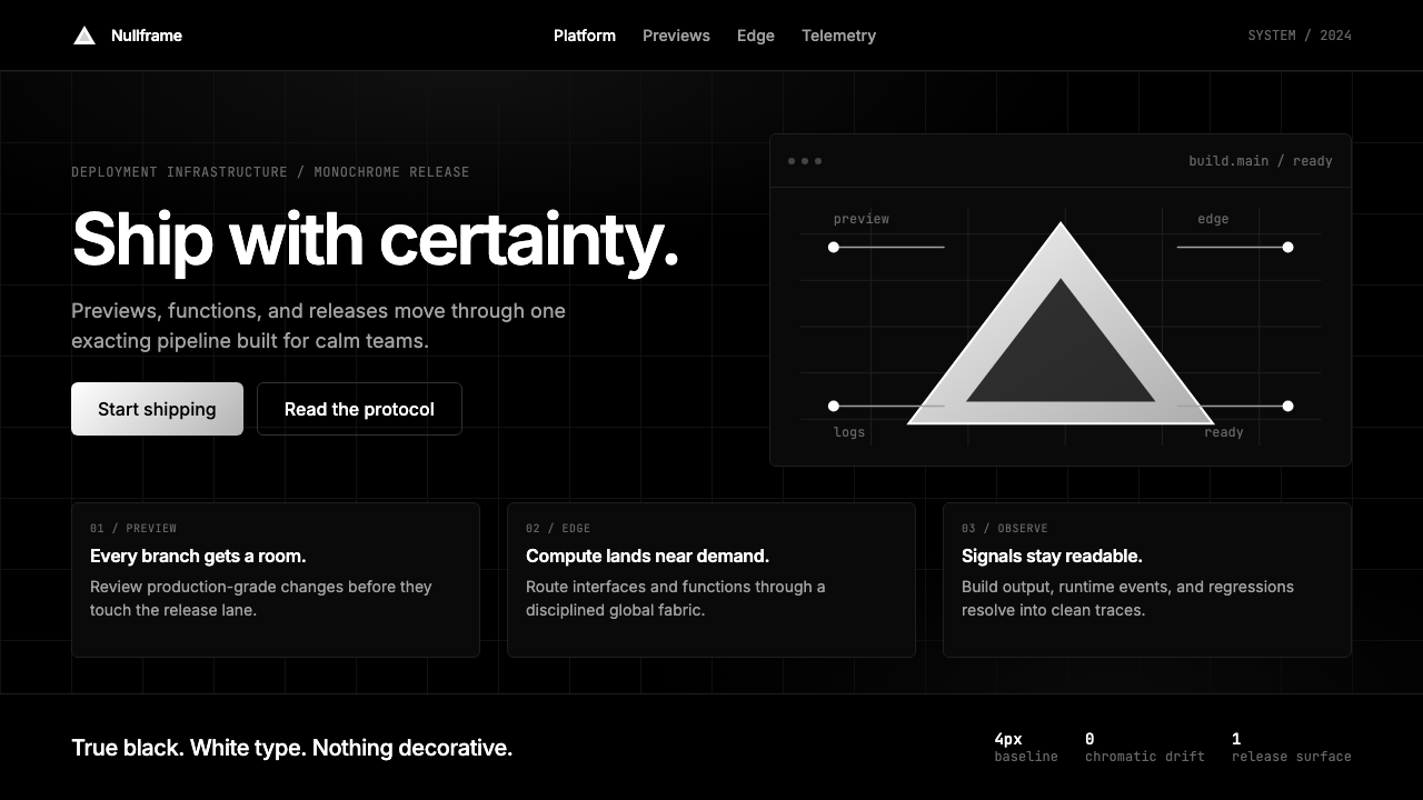 Vercel 2024Developer luxury by subtraction. Pure black, white Inter, rigid grid, triangu…以删减塑造开发者奢侈感:纯黑白、Inter 字体与刚性网格构成三角发布符号。
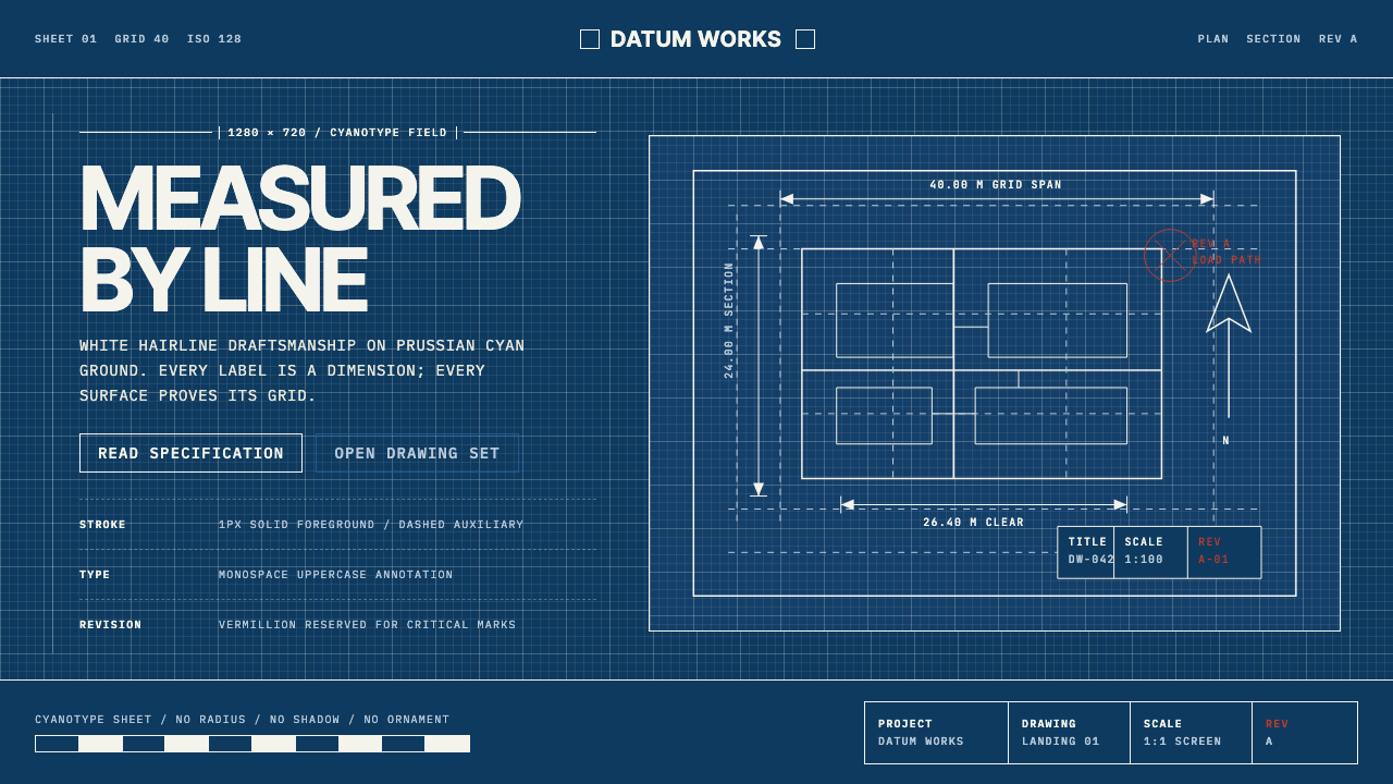 Architectural BlueprintMeasurement, not mood. Prussian cyan grid with white hairlines and vermillion…测量,不造情绪。普鲁士青网格、白色发丝线与朱砂修订标记。
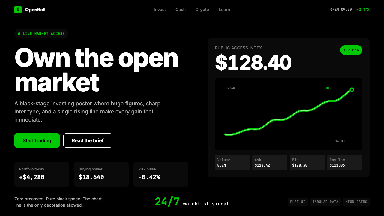 Robinhood 2023Markets feel immediate. Pure black, Inter numbers, and one neon-green line do…市场触手可及:纯黑底、Inter 数字与霓虹绿曲线完成表达。
 2001 — A Space OdysseyAbsolute restraint. Black void, white monolith geometry, one HAL-red signal.绝对克制:黑色虚空、白色巨石几何、唯一的 HAL 红信号。