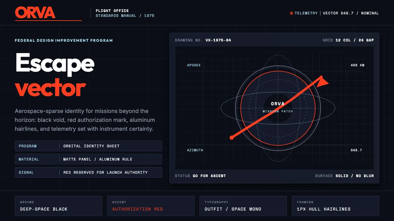
About NASA Worm Logo (1975)
NASA's 1975 "worm" logotype by Richard Danne and Bruce Blackburn replaced the agency's painterly "meatball" with a single custom wordmark — a rounded sans-serif in NASA red, set against the infinite black of space. It was commissioned under the Federal Design Improvement Program as the institutional face of American space exploration.
The system is aerospace-sparse: deep-space black ground, NASA red accents, technical white readouts, and aluminum gray for spacecraft-hull panels. Every element — from mission-patch circles to monospaced telemetry — carries the authority of government engineering at the frontier of human ambition. Retired in 1992, the worm was revived for SpaceX Crew Dragon in 2020 and now feels perpetually contemporary.
- Origin
- Washington D.C. / Kennedy Space Center / Jet Propulsion Laboratory, USA
- Era
- 1975 (designed by Danne & Blackburn); retired 1992; revived on SpaceX Crew Dragon 2020
- Key figures
- Richard Danne · Bruce Blackburn · James Webb
- Movements
- Federal Design Improvement Program · American corporate modernism · Space Age visual culture
NASA Worm Logo (1975) design spec
Colors
Typography
The other 11 sections — buttons, cards, spacing, motion, techniques and more — open once you unlock. Download the DESIGN.md or send it to your AI in one click. Unlock once, yours forever.
Sign up nowStyles similar to NASA Worm Logo (1975)
Also inspired by brands & products, with a close feel.
 Linear 2024Precision down to the millisecond. Near-black, indigo-violet accents, Inter Display, no decoration.
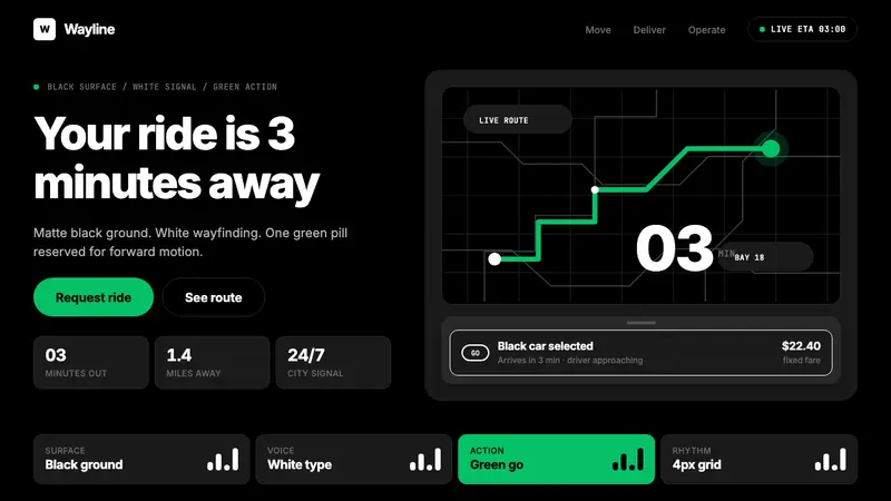 Uber 2024Motion made severe. Black surfaces, white Inter, one green pill turns the whole system on.
 Resend 2024Clean code becomes brand. Pure black, JetBrains Mono, and one green delivered signal.
 Dark Mode UICalm night interfaces. Charcoal layers rise by overlay lightness, not shadow.