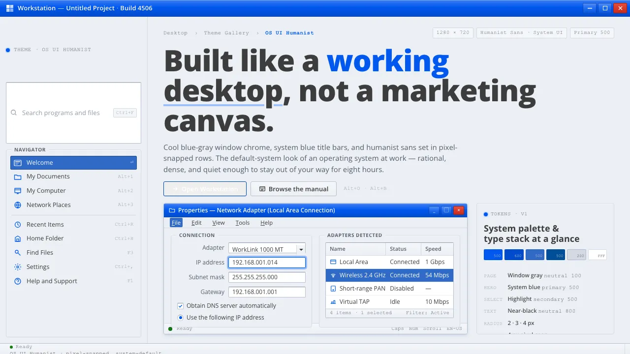
About OS UI Humanist
This system distills the standard-issue look of a North-American desktop operating system circa 1995–2010 — the Windows XP Luna theme and Vista/7 Aero chrome that taught millions what a "computer screen" looks like. A cool bluish-gray window surface, a confident system blue for title bars and the Start menu, and crisp humanist sans-serif text define the mood.
It is rational, clean, and system-default rather than a brand campaign: pixel-snapped layouts, clear nesting of title bar to toolbar to content, hairline separators, and white input wells set against the screen-gray ground.
- Origin
- North America (Microsoft, Redmond, Washington)
- Era
- 1990–2010 (XP Luna shipped 2001; Vista Aero + Segoe UI default-font switch 2006–07)
- Key figures
- Microsoft Windows shell team · Steve Matteson · Luna visual-design group · Aero visual-design group
- Movements
- Humanist-sans system typography · Skeuomorphic-to-flat transition · WIMP desktop-GUI conventions
OS UI Humanist design spec
Colors
Typography
The other 11 sections — buttons, cards, spacing, motion, techniques and more — open once you unlock. Download the DESIGN.md or send it to your AI in one click. Unlock once, yours forever.
Sign up nowStyles similar to OS UI Humanist
Also inspired by brands & products, with a close feel.
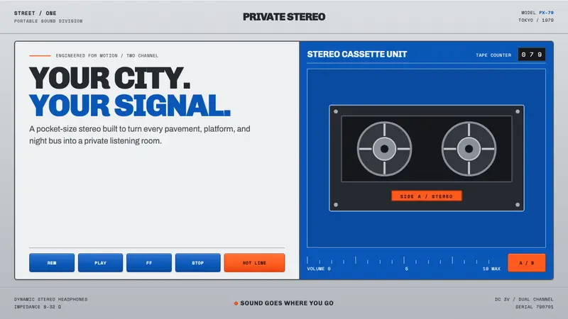 Sony Walkman (1979)The street turns private. Cobalt panels, silver grain and orange controls make sound portable.
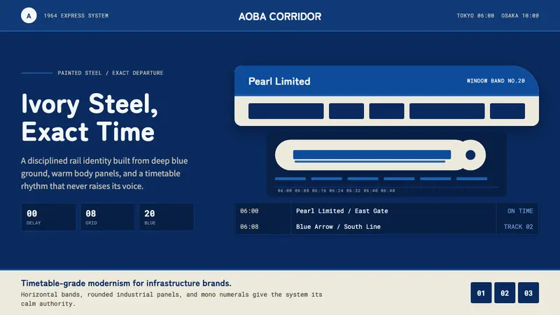 Shinkansen BulletTimetable authority. Ivory steel bands and Bullet Blue grids move with exact restraint.
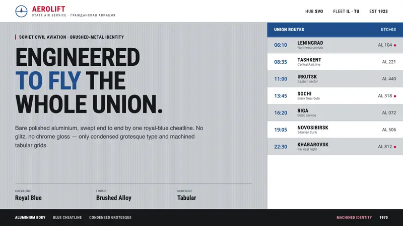 Aeroflot Soviet AirlineEngineered restraint rules. Silver ground, royal-blue cheatlines, and flat grotesque type set order.
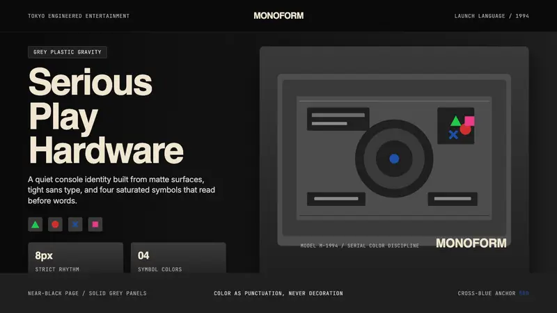 PlayStation (1994 Original)Quiet power, engineered. Grey plastic and four saturated symbols punctuate tight sans type.