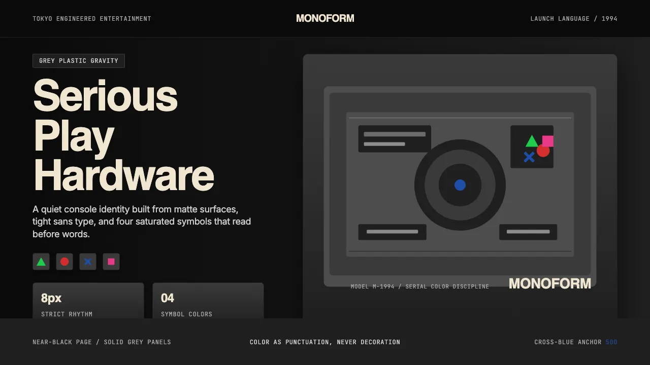
About PlayStation (1994 Original)
PlayStation's 1994 identity froze a single gesture into gaming history: a grey plastic console, a quartet of saturated symbol colors — green triangle, red circle, blue cross, pink square — and Helvetica set tight. Sony refused the cartoon swagger of its rivals; instead it shipped a tool, photographed like industrial equipment, sold like consumer electronics.
Thirty years on, the system still reads as confident, populist, and unmistakably engineered. The four-symbol logo is a wordless globe — pictographic, hue-discipline as branding — and the grey-plastic chassis is the proof of seriousness. Everything else is restraint: tight letter-spacing, dark surfaces, color used like punctuation, not decoration.
- Origin
- Tokyo, Japan (Sony HQ); global gaming-console market
- Era
- 1994 launch (PS1); brand-identity continuous through PS5 (2020); 4-symbol logo unchanged 30+ years
- Key figures
- Ken Kutaragi · Manabu Sakamoto · Sony Interactive Entertainment
- Movements
- 1990s console gaming · Japanese tech modernism
PlayStation (1994 Original) design spec
Colors
Typography
The other 11 sections — buttons, cards, spacing, motion, techniques and more — open once you unlock. Download the DESIGN.md or send it to your AI in one click. Unlock once, yours forever.
Sign up nowStyles similar to PlayStation (1994 Original)
Also inspired by brands & products, with a close feel.
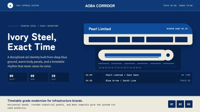 Shinkansen BulletTimetable authority. Ivory steel bands and Bullet Blue grids move with exact restraint.
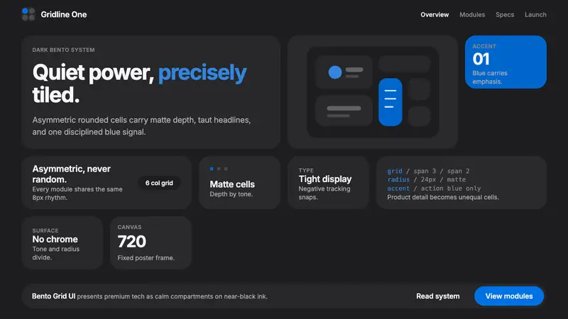 Bento Grid UIPremium tech, calmly compartmentalized. Near-black bento tiles and one Action Blue cue.
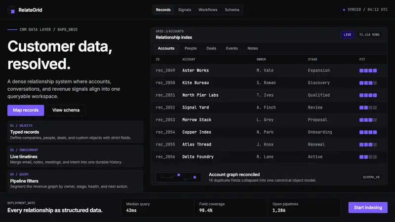 Attio CRMCRM stripped to its data layer. Single-pixel borders, monospaced IDs, violet as the only accent.
 Linear 2024Precision down to the millisecond. Near-black, indigo-violet accents, Inter Display, no decoration.