What is PlayStation (1994 Original)?什么是 PlayStation (1994 Original)?
PlayStation's 1994 identity proved that a game console could be sold like industrial equipment — grey plastic, four saturated symbols, and Helvetica set tight.PlayStation 1994 年的视觉身份证明了一件事:游戏机可以像工业设备一样销售——灰塑外壳、四色符号,加上紧排的 Helvetica。
PlayStation (1994 Original) in briefPlayStation (1994 Original) 速览
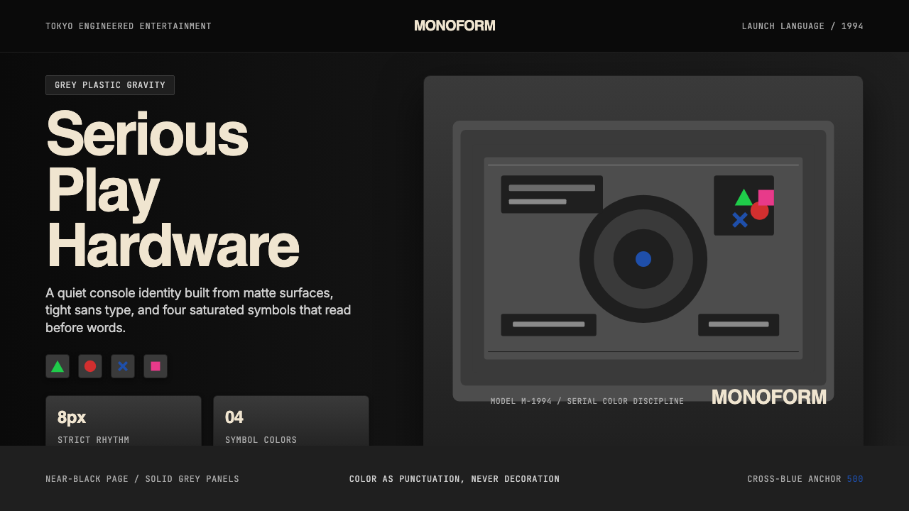
PlayStation (1994 Original) is the visual identity system launched by Sony Interactive Entertainment in December 1994 alongside the first PlayStation console. Its grammar is austere: a dark or neutral grey chassis treated as a consumer-electronics product, a quartet of saturated geometric symbols — green triangle, red circle, blue cross, pink square — used as the controller's face buttons and as a wordless logo, and sans-serif typography set with unusually tight letter-spacing. Together these elements formed a brand language that refused every convention of 1990s gaming.PlayStation(1994 年初代)是索尼互动娱乐于 1994 年 12 月随第一代 PlayStation 游戏机一同推出的视觉识别系统。其语法极为克制:将暗色或中性灰色外壳作为消费电子产品对待,以四个高饱和度几何符号——绿三角、红圆、蓝叉、粉方——同时作为手柄面部按键和无文字标志,并以字距异常紧凑的无衬线字体排版。这些元素共同构成了一套拒绝 1990 年代游戏界全部惯例的品牌语言。
Where rival consoles leaned on speed lines, cartoon mascots, and aggressive chromatic contrast, Sony positioned PlayStation as a serious machine for adults. The photography in launch campaigns treated the hardware the way industrial catalogues treat precision instruments — straight-on, lit without drama, on plain backgrounds. Color appeared not as atmosphere but as labeling: each of the four symbols was assigned a distinct saturated hue, creating a pictographic system that communicated across language barriers without requiring a single word.当竞争对手的游戏机依靠速度线、卡通吉祥物和激进的色彩对比时,索尼将 PlayStation 定位为面向成人的严肃机器。发布活动的摄影将硬件当作工业目录里的精密仪器来呈现——正面直拍、无戏剧性打光、素净背景。色彩在此不作为氛围存在,而作为标注存在:四个符号各被赋予独特的饱和色相,形成一套可跨越语言障碍传达信息、无需任何文字的图像系统。
Thirty years on, the system is essentially unchanged. The four-symbol mark remains one of the most recognized logos on earth, and the restrained grey-dark-color vocabulary has influenced a generation of consumer-electronics and gaming brands that aspire to confident, tool-like authority. PlayStation did not borrow this seriousness from the world of professional equipment — it engineered it from scratch, using color, form, and type as precision components.三十年过去,这套系统几乎原封未动。四色符号标志依然是全球辨识度最高的商标之一,而克制的灰-暗-色彩词汇则影响了一整代消费电子和游戏品牌——凡是渴望那种自信、工具感权威的品牌,都可以在 PlayStation 身上找到影子。PlayStation 并非从专业设备领域借来这种严肃性,而是从零开始将色彩、形态与字体作为精密零件加以工程化。
See the PlayStation (1994 Original) design system查看 PlayStation (1994 Original) 完整设计系统
Where does PlayStation (1994 Original) come from?PlayStation (1994 Original) 从何而来?
The first PlayStation launched in Japan on December 3, 1994, the product of a development program led by Ken Kutaragi, a Sony engineer who had championed digital audio technology inside the company since the late 1980s. Kutaragi's original vision — hatched from a famously troubled collaboration with Nintendo on a CD-ROM add-on that was ultimately cancelled — was to build a machine powerful enough to render three-dimensional polygon graphics in real time, a capability that no home console had yet delivered convincingly. The technical ambition shaped the identity: a product this serious required a visual register to match.第一代 PlayStation 于 1994 年 12 月 3 日在日本发售,是由久多良木健主导的开发项目的成果。久多良木健是一位自 1980 年代末便在索尼内部力推数字音频技术的工程师。他最初的构想——源于一段广为人知的与任天堂合作开发 CD-ROM 附加设备的曲折经历,该项目最终遭到取消——是打造一台强大到足以实时渲染三维多边形图形的机器,这是当时尚无家用主机能令人信服地实现的能力。这种技术野心塑造了视觉身份:如此严肃的产品需要与之匹配的视觉格调。
The design of the console's physical form was handled internally at Sony, with art director Manabu Sakamoto credited as a key figure in the identity work. The team's decision to photograph the hardware in a style borrowed from Sony's professional audio and video equipment catalogues — stark, precise, product-forward — was deliberate. Sony's corporate design language at the time was already one of the most disciplined in consumer electronics, characterized by neutral greys, minimal surface texture, and type used as engineering annotation rather than as marketing decoration. PlayStation extended that language into gaming rather than inventing something new.主机的物理形态设计由索尼内部完成,艺术总监坂本学被认为是视觉识别工作的核心人物。团队决定借用索尼专业音视频设备目录的风格来拍摄硬件——简洁、精准、以产品为主体——这是刻意为之。索尼当时的企业设计语言已是消费电子领域最为自律的之一,以中性灰色、极简表面肌理和作为工程注解而非营销装饰的字体为特征。PlayStation 将这套语言延伸进游戏领域,而非另起炉灶。
The four controller symbols — triangle, circle, cross, and square — were assigned color by Sakamoto's team using a logic that was both pragmatic and symbolic. Each shape needed a distinct hue for button identification, but the hues also carried intended associations: the green triangle pointed toward a viewpoint or perspective, the red circle represented a confirmation or 'yes' (in the Japanese cultural context where a circle denotes correctness), the blue cross suggested a directional or cursor function, and the pink square implied a document or surface. Whether players consciously registered these associations mattered less than the system's visual coherence: four shapes, four colors, one palette that never felt arbitrary.手柄上的四个符号——三角、圆、叉、方——由坂本的团队以兼顾实用与象征的逻辑赋予色彩。每种形状需要独特的色相以便按键识别,但色相同时也承载着预设的联想:绿色三角暗示视点或透视方向,红色圆形在日本文化语境中代表确认或「正确」(圆圈在日语中象征对的),蓝色叉形暗示方向或光标功能,粉色方形则隐含文件或平面的意象。玩家是否有意识地感知这些联想,其重要性远不及这套系统的视觉连贯性:四种形态,四种色彩,一套从不显得随意的色板。
The original PlayStation identity launched at a moment when Japanese consumer-electronics brands — Sony, Panasonic, Sharp — were at the apex of their global cultural authority. The aesthetic choices made in 1994 drew from that context: the confidence to use restraint when competitors were shouting, the trust that adult consumers would read seriousness as an asset rather than a liability, and the industrial-design tradition of treating a product's physical form as its primary communication. The identity has outlasted two subsequent decades of gaming-console visual inflation — the aggressive chrome treatments, the glowing LED accents, the motion-blur logotypes — because it was never playing that game.初代 PlayStation 的视觉身份推出之时,日本消费电子品牌——索尼、松下、夏普——正处于其全球文化权威的顶点。1994 年的美学选择正是从这一背景中汲取力量:在竞争对手大声喧哗时选择克制的底气,相信成年消费者会将严肃感视为资产而非负债的信任,以及将产品物理形态作为首要传播媒介的工业设计传统。这套视觉身份历经此后二十年游戏主机视觉通货膨胀的洗礼——侵略性的镀铬处理、发光 LED 点缀、运动模糊字标——依然屹立不倒,因为它从未参与那场竞赛。
What defines the PlayStation (1994 Original) look?PlayStation (1994 Original) 的视觉特征是什么?
Symbol System符号系统
The four geometric symbols — triangle, circle, cross, square — are the identity's load-bearing structure. Each is rendered at a consistent weight and scale relative to one another, and each is assigned a single saturated color that appears nowhere else in the palette. The symbols function simultaneously as button labels, as a wordless brand mark, and as a pictographic globe — four languages collapsed into four shapes. No text is required for recognition.四个几何符号——三角、圆、叉、方——是这套视觉身份的承重结构。每个符号以相对统一的笔画粗细和尺寸呈现,各自被赋予一种在色板其他地方不再出现的高饱和色彩。这些符号同时充当按键标签、无文字品牌标志和图像性全球标志——四种语言浓缩为四种形态。识别不需要任何文字。
Restrained Color Logic克制的色彩逻辑
Outside the four symbol colors, the palette is deliberately narrow: neutral and dark greys dominate the hardware and most branded surfaces, with the saturated symbol hues reserved for use as punctuation — present only where they carry meaning, absent everywhere else. Color is not mood; it is information. This economy makes each appearance of the four colors load-bearing and instantly significant, rather than decorative or atmospheric.在四个符号色彩之外,色板被刻意压缩:中性灰与暗灰主导硬件和大多数品牌界面,高饱和的符号色相被保留为标点符号式的用法——仅在承载意义之处出现,在其他地方缺席。色彩不是氛围,而是信息。这种节约使四色的每次出现都具有承重意义并立即引人注目,而非装饰性或氛围性的存在。
Industrial Neutrality工业中性感
The console's physical form and its photographic presentation borrow the aesthetic vocabulary of professional electronics: neutral grey over black, smooth matte surfaces without decorative texture, and an absence of visual styling that would date the object to a particular cultural moment. The hardware reads as tool before it reads as toy — a deliberate inversion of every gaming-console visual convention of its era.主机的物理形态及其摄影呈现方式借用了专业电子设备的美学词汇:中性灰覆于黑色之上,光滑亚光表面不带任何装饰性肌理,没有任何会将这件物品定位于特定文化时刻的视觉造型处理。这件硬件首先读作工具,其次才是玩具——对其时代所有游戏主机视觉惯例的刻意颠覆。
Tight, Functional Typography紧凑而实用的字体排印
The identity uses a single clean sans-serif typeface set with notably compressed letter-spacing, particularly in the wordmark and product labeling. Type is treated as engineering annotation — marking, identifying, specifying — rather than as expressive or decorative material. Scale contrast does the organizational work: product names are large and spare, technical specifications are small and dense, and nothing in between serves as decoration.这套视觉身份使用单一简洁的无衬线字体,字距被明显压缩,在文字标志和产品标注中尤为突出。字体被当作工程注解处理——标记、识别、规格说明——而非表达性或装饰性材料。尺寸对比承担组织功能:产品名称大而简洁,技术规格小而密集,两者之间不存在任何装饰性内容。
Dark Surface Confidence深色表面的自信
Where most gaming brands of the 1990s defaulted to white or bright backgrounds to signal energy and accessibility, PlayStation adopted dark grounds as its primary canvas — both in hardware and in marketing. Dark surfaces connote seriousness, premium positioning, and nocturnal focus. They make the four saturated symbol colors simultaneously more vivid and more controlled, because saturation reads differently against darkness than against light.1990 年代大多数游戏品牌以白色或明亮背景作为默认选择来传达活力与易亲近感,PlayStation 则将深色底面作为其主要画布——无论是在硬件还是在营销材料中。深色表面意味着严肃性、高端定位和夜间专注感。深色底面使四种饱和的符号色彩同时显得更生动又更可控,因为饱和度在暗背景下与在亮背景下的读取方式截然不同。
Pictographic Global Reach图像性全球传播力
The symbol system was engineered for language-agnostic communication from the start. A player who cannot read Japanese, English, or any other language can still learn and recall which button is which because the shapes and colors are distinct and consistent across every market, every product generation, and every communication touchpoint. This pictographic universality is not accidental — it reflects a deliberate decision to treat the symbols as a visual language rather than a labeling convention.符号系统从一开始便被设计为语言无关的传达工具。不懂日语、英语或任何其他语言的玩家,依然可以学会并记住每个按键,因为形态和色彩在每一个市场、每一代产品、每一个传播触点上都保持鲜明而一致。这种图像性普遍传播力并非偶然——它反映了一个刻意的决定:将符号视为视觉语言,而非标注惯例。
Restraint as Brand Authority克制即品牌权威
Every element in the 1994 PlayStation identity system does exactly one thing and nothing more. The grey is not styled; the symbols are not shadowed or beveled; the type is not stretched or decorated; the photography is not retouched into drama. This total restraint functions as a brand argument: we did not need to shout because the product speaks for itself. In markets saturated with visual noise, restraint is a form of confidence, and confidence is a form of authority.1994 年 PlayStation 视觉身份系统中的每一个元素都恰好只做一件事。灰色没有被造型处理;符号没有被添加投影或斜面;字体没有被拉伸或装饰;摄影没有被修成戏剧效果。这种彻底的克制作为一种品牌论证起作用:我们不需要大声喧哗,因为产品本身会说话。在视觉噪音饱和的市场中,克制是一种自信的形式,而自信是一种权威的形式。

See the PlayStation (1994 Original) design system查看 PlayStation (1994 Original) 完整设计系统
Who shaped PlayStation (1994 Original)?谁塑造了 PlayStation (1994 Original)?
Kutaragi is the engineer most responsible for PlayStation's existence. He championed digital sound chip technology inside Sony in the late 1980s, negotiated the original SNES sound chip deal with Nintendo, and then — after that partnership collapsed — led the internal effort to build a standalone console. His insistence on three-dimensional polygon rendering as the machine's core capability set the technical ambition that the identity's seriousness had to match. He remained the driving force behind PlayStation hardware through the PS3 era and holds the informal title 'Father of PlayStation'.久多良木健是对 PlayStation 的存在贡献最大的工程师。他在 1980 年代末于索尼内部力推数字音频芯片技术,谈成了最初的超级任天堂音频芯片合作协议,此后在合作关系破裂后主导了内部开发独立主机的工作。他对三维多边形渲染作为机器核心能力的坚持,设定了视觉身份的严肃性所必须匹配的技术野心。他在 PS3 时代之前一直是 PlayStation 硬件的核心驱动力,并持有「PlayStation 之父」的非正式称号。
Sakamoto is the art director credited with designing the four-symbol color assignment — triangle in green, circle in red, cross in blue, square in pink — and with establishing the visual language that placed the symbols at the center of the brand. His decisions about which hue to assign to which shape, and the logic behind those assignments (each color carrying an intended associative meaning), gave the identity its most durable and most-copied element. The symbol system he designed in 1994 remains unchanged on PlayStation hardware released thirty years later.坂本学是负责设计四色符号配色方案的艺术总监——绿三角、红圆、蓝叉、粉方——并建立了以符号为品牌核心的视觉语言。他关于将哪种色相赋予哪种形态的决定,以及这些决定背后的逻辑(每种色彩承载着预设的联想意义),赋予了这套视觉身份其最持久、最被模仿的元素。他在 1994 年设计的符号系统在三十年后发布的 PlayStation 硬件上依然原封未动。
SIE is the corporate entity that has stewarded the PlayStation identity for three decades without substantively altering its foundational elements. The four-symbol logo, the grey-and-dark palette, and the sans-serif tight-set wordmark have survived five hardware generations, multiple corporate reorganizations, and the rise and fall of several competing visual trends in consumer electronics. SIE's institutional commitment to the 1994 identity is itself a design statement — it demonstrates that a visual system built on structural rather than stylistic logic can remain coherent and contemporary across an unusually long lifespan.索尼互动娱乐(SIE)是在三十年间守护 PlayStation 视觉身份、且未对其基础元素做出实质性改动的企业主体。四色符号标志、灰-暗色色板和紧凑无衬线文字标志,历经五代硬件更迭、多次企业重组,以及消费电子领域数种视觉潮流的兴衰,依然完整保留。SIE 对 1994 年视觉身份的机构性承诺本身就是一种设计声明——它证明了一套建立在结构性而非风格性逻辑之上的视觉系统,能够在异常漫长的生命周期中保持连贯性与当代感。
As Sony's president and later chairman during the PlayStation era, Ohga was the executive who gave Kutaragi the organizational cover to pursue the PlayStation project after the Nintendo CD-ROM collaboration collapsed. A trained musician with unusually strong aesthetic sensibility for a corporate executive, Ohga's support for product design that took itself seriously — that positioned Sony hardware as precision instruments rather than mass-market toys — created the cultural conditions inside Sony that made the PlayStation's restrained identity possible.作为 PlayStation 时代索尼的社长、后来的会长,大贺典雄是在任天堂 CD-ROM 合作破裂后为久多良木健提供组织庇护、支持其推进 PlayStation 项目的高管。大贺是一位受过专业训练的音乐家,具有企业高管中罕见的强烈美学感受力。他支持认真对待自身的产品设计——将索尼硬件定位为精密仪器而非大众玩具——在索尼内部创造了文化条件,使 PlayStation 那套克制的视觉身份成为可能。
How do you use PlayStation (1994 Original) today?今天怎么用 PlayStation (1994 Original)?
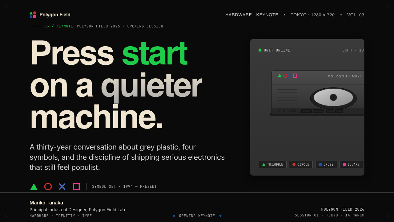
PlayStation (1994 Original) translates well into contemporary design work because its principles are structural: dark grounds, saturated symbol-colors used as punctuation, neutral grey as the primary surface, and sans-serif type at tight spacing. Applying it correctly requires understanding that this is a system of restraint — every choice is a reduction, not an addition. Adding texture, gradients, or decorative elements does not make the style richer; it destroys the logic that makes it work.PlayStation(1994 年初代)能够很好地移植到当代设计实践中,因为其原则是结构性的:深色底面、作为标点符号使用的高饱和符号色彩、作为主要表面的中性灰,以及紧字距无衬线字体。正确应用它需要理解这是一套克制的系统——每个选择都是削减,而非添加。加入肌理、渐变或装饰元素并不能使风格更丰富,反而会摧毁使它运转的逻辑。
For presentation slides, the style excels at establishing authority on cover pages and maintaining clarity on content pages. A cover built in this language typically anchors on a dark or near-black ground, with a single large geometric symbol or symbol-derived shape in one of the four saturated colors holding a corner or center. The title sits in tight sans-serif type at large scale against the dark ground, with a wordmark or session identifier in small type at the opposite corner. Content slides treat the grid strictly: one organizing visual per slide, type hierarchies established by scale alone, and color used only where it signals a specific piece of information — a data point, a call to action, a category marker. Data visualizations in this style are clean and diagrammatic: bars and segments take the four symbol colors as their categorical palette, and chart furniture is minimal.在演示文稿中,这种风格在封面建立权威感、在内容页保持清晰度方面表现出色。以这种语言构建的封面通常以深色或近黑色底面为基础,以四种饱和色之一的单个大型几何符号或符号衍生形态占据一角或中心。标题以大尺寸紧凑无衬线字体置于深色底面上,文字标志或场次标识以小字体置于对角。内容页严格遵守网格:每张幻灯片一个组织性视觉元素,字体层级仅以尺寸区分,色彩仅在表达特定信息时使用——数据点、行动号召或类别标记。这种风格的数据可视化简洁而具示意图风格:条形和扇形以四种符号色彩作为分类色板,图表辅助元素减至最少。
For web interfaces, the vocabulary maps directly onto dashboards, admin panels, and pricing pages where scannability and authority matter more than warmth. The approach begins with a dark or deeply neutral ground, a single sans-serif typeface at multiple weights, and color reserved for interactive states and status indicators. Card components should have hard or no shadows — the soft-shadow convention of contemporary UI does not belong here. Navigation should be typographic rather than icon-driven, and the four symbol colors can serve as a tier-differentiation system on pricing pages, where their natural distinctiveness does exactly the work that category color is supposed to do.对于网页界面,这套词汇直接对应仪表板、管理面板和定价页面——在这些场景中,可扫描性和权威感比温暖感更重要。方法从深色或深度中性底面开始,配以单一无衬线字体的多个字重,色彩保留给交互状态和状态指示器。卡片组件应有硬边投影或无投影——当代 UI 的软阴影惯例在此不适用。导航应以字体为主导而非图标驱动,四种符号色彩可在定价页面上充当等级区分系统,其天然的鲜明区分度恰好完成了类别色彩应当完成的工作。
For editorial and marketing work, the style's most direct analogue is the product-launch announcement: a full-field dark background, a large product image treated without styling or glow, tight sans-serif type for the headline, and one of the four colors used as the sole accent — on a date, a product name, or a call to action. The absence of supporting imagery or atmospheric gradients is intentional. The style also works for long-form editorial when the dark ground is exchanged for a neutral grey field, with the four colors appearing only in pull quotes, section markers, or data labels.对于编辑和营销内容,这种风格最直接的类比是产品发布公告:全幅深色背景、无造型处理或光晕的大型产品图像、标题用紧凑无衬线字体,以及四种色彩之一作为唯一强调色——用于日期、产品名称或行动号召。缺少支持性图像或氛围渐变是刻意为之。当深色底面被换成中性灰底面时,这种风格也适用于长篇编辑内容,四种色彩仅出现在引用段落、段落标记或数据标签上。
A common mistake when working in this vocabulary is treating the four symbol colors as a general palette available for broad decorative use. In the original system, each color appears once — on its assigned symbol — and is largely absent from everything else. Applying two or more of the symbol colors simultaneously to non-symbol elements dissolves the punctuation logic and produces a palette that looks festive rather than serious. The correct restraint is to select one of the four colors as the single accent for a given piece of work, use it exclusively for load-bearing information, and leave the rest of the surface to the dark or grey ground and black-or-white type.使用这套词汇时最常见的错误,是将四种符号色彩视为可供广泛装饰性使用的通用色板。在原始系统中,每种色彩出现一次——在其对应的符号上——在其他地方基本缺席。将两种或多种符号色彩同时应用于非符号元素,会消解标点符号逻辑,产生看起来喜庆而非严肃的色板。正确的克制是:为特定作品选择四种色彩之一作为单一强调色,专用于承重信息,将表面的其余部分留给深色或灰色底面以及黑色或白色字体。
See the PlayStation (1994 Original) design system查看 PlayStation (1994 Original) 完整设计系统
PlayStation (1994 Original) — FAQPlayStation (1994 Original) · 常见问题
Is the PlayStation style minimalism?PlayStation 风格属于极简主义吗?
It shares minimalism's preference for reduction and its rejection of decoration, but it is not minimalism in the contemporary sense — which tends toward warmth, soft neutrals, and organic imperfection. The PlayStation identity is closer to industrial modernism: reduction in service of function and authority rather than in service of calm or approachability. The four saturated symbol colors, in particular, are not minimalist — they are precise and bold. The style's restraint comes from discipline, not from aesthetic diffidence.它与极简主义共享对削减的偏好和对装饰的拒绝,但并非当代意义上的极简主义——后者倾向于温暖感、柔和中性色和有机的不完美感。PlayStation 的视觉身份更接近工业现代主义:削减服务于功能和权威,而非服务于平静或亲近感。四种高饱和符号色彩尤其不属于极简主义范畴——它们是精确而大胆的。这种风格的克制来自自律,而非美学上的犹豫。
Can the four symbol colors be used freely in work inspired by this style?在受这种风格启发的作品中,可以自由使用四种符号色彩吗?
No — the most important structural rule is that the four colors function as a set of distinct signals, not as a general palette. In the original system, each color appears once and carries one meaning. Applying multiple symbol colors simultaneously to decorative or atmospheric elements destroys the punctuation logic and produces work that reads as PlayStation-themed rather than PlayStation-principled. The correct approach is to select one color as the sole accent for a given piece and reserve the others entirely.不可以——最重要的结构性规则是:四种色彩作为一组独特信号运作,而非作为通用色板。在原始系统中,每种色彩出现一次并承载一种意义。将多种符号色彩同时应用于装饰性或氛围性元素,会摧毁标点符号逻辑,产生看起来只是有「PlayStation 主题」而非体现「PlayStation 原则」的作品。正确的做法是为特定作品选择一种色彩作为唯一强调色,将其他色彩完全保留。
How does this style differ from generic dark-mode UI design?这种风格与通用暗色模式 UI 设计有何不同?
Generic dark-mode UI typically softens darkness with subtle gradients, layered card surfaces at multiple grey values, and soft ambient shadows — it creates depth through visual layering. The PlayStation vocabulary does the opposite: surfaces are flat, shadows are absent or hard, and the dark ground is a decision rather than an atmospheric effect. The four saturated colors appear as deliberate, load-bearing punctuation rather than as accent tones that could be swapped out for any other saturated hue. The result reads as engineered and authoritative rather than as comfortable and immersive.通用暗色模式 UI 通常用细微渐变、多个灰度层次的叠层卡片表面和柔和环境阴影来软化暗色——通过视觉分层制造深度感。PlayStation 词汇则恰恰相反:表面是平的,阴影缺席或为硬边,深色底面是一个决定而非氛围效果。四种饱和色彩作为刻意的、承重的标点符号出现,而非可以被任何其他饱和色相替换的强调调性。结果读起来是被工程化的、权威的,而非舒适的、沉浸式的。
Does the style work for products aimed at warmth or playfulness?这种风格适合以温暖感或趣味性为诉求的产品吗?
It does not. The PlayStation identity was engineered to position a gaming product as serious adult equipment, and its visual grammar encodes that seriousness at every level — dark grounds, neutral greys, tight type, color used as information rather than mood. Applying it to products where warmth, organic texture, or emotional approachability are design goals produces a mismatch between visual language and product intent. The style is best understood as a tool for authority and confidence, not for hospitality or charm.不适合。PlayStation 视觉身份被工程化为将一款游戏产品定位为严肃的成人设备,其视觉语法在每个层面都编码了这种严肃性——深色底面、中性灰色、紧凑字体、色彩作为信息而非氛围使用。将其应用于以温暖感、有机质感或情感亲近性为设计目标的产品,会在视觉语言与产品意图之间产生错位。这种风格最好被理解为权威感和自信感的工具,而非好客感或魅力感的工具。
Why has the PlayStation identity remained unchanged for thirty years when most brands refresh regularly?为什么大多数品牌定期更新视觉形象,而 PlayStation 的视觉身份却三十年未变?
Because the identity was built on structural logic rather than on stylistic trends. Most brand identities that age poorly are anchored in the visual conventions of their launch era — gradients, bevels, type trends, color fashions that pass. The PlayStation symbols are geometric primitives that predate any particular style movement, and the four-color system is a communication logic rather than an aesthetic preference. A system built to communicate meaning rather than to signal contemporaneity does not need to be updated when tastes change — it only needs to be executed with the same discipline that produced it.因为这套视觉身份建立在结构性逻辑之上,而非建立在风格潮流之上。大多数老化不佳的品牌视觉形象,都锚定在其发布时代的视觉惯例上——渐变、斜面、字体潮流、会过时的流行色。PlayStation 的符号是几何基本形,早于任何特定风格运动而存在;四色系统是一套传达逻辑,而非一种美学偏好。一套为传达意义而非为彰显当代感而建立的系统,在品味变迁时无需更新——它只需要以产生它的同等自律来执行。
Related design styles相关设计风格
 Akira Neo-TokyoNight moves fast. Firebrick trails cut crushed black, teal grids, and condens…黑夜疾驰。砖红光轨切开墨黑、青蓝网格与压缩招牌。
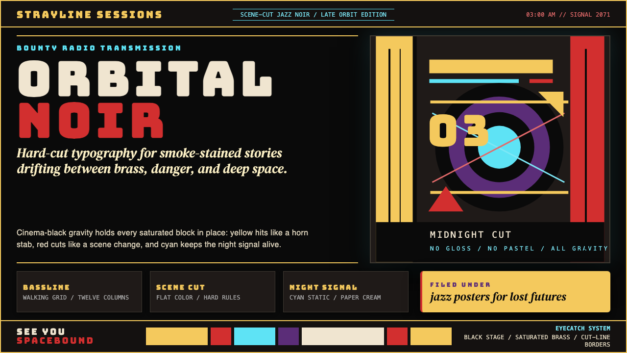 Cowboy Bebop Jazz-NoirCool at 3 AM. Bungee type, jazz yellow, red cuts, and cyan rules hit deep bla…凌晨三点的酷:黑底上 Bungee 字、爵士黄、红切线与青色规则。
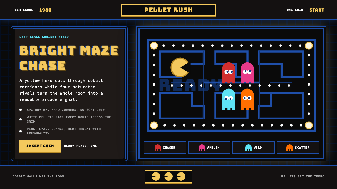 Pac-Man (Namco 1980)Arcade joy burns bright. Yellow disc, cobalt maze, and four ghost hues snap o…街机欢愉高亮燃烧:黄圆、钴蓝迷宫与四色幽灵在黑底上跳动。
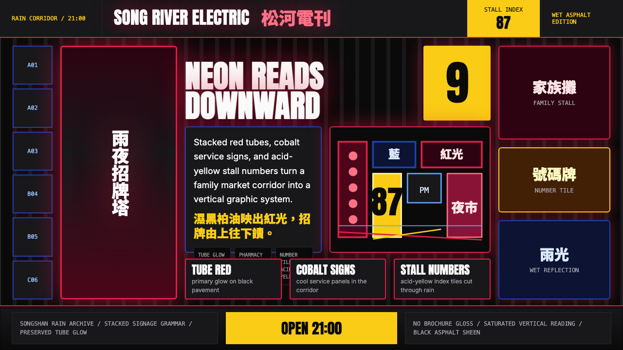 Taiwanese Raohe Night Market NeonTaipei night reads vertically. Neon red, cobalt panels, and acid-yellow numbe…台北夜色垂直閱讀:霓虹紅、鈷藍看板與酸黃號碼疊在濕黑地面。
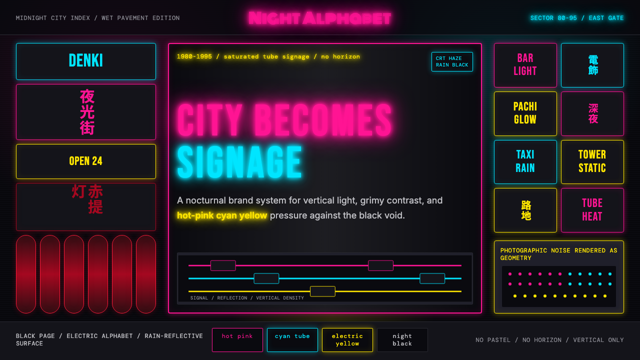 Tokyo Shinjuku Neon (1980)Night turns into alphabet. Hot pink, cyan, and yellow stack as glowing vertic…夜晚化作文字。热粉、青蓝、电黄垂直堆成霓虹峡谷。