Design style guide设计风格指南
What is Obsidian Knowledge Graph?什么是 Obsidian Knowledge Graph?
Obsidian's knowledge graph turned a tool for thinking into a visual philosophy — deep matte black, pulsing purple nodes, and the quiet conviction that ideas should be seen as constellations, not lists.Obsidian 的知识图谱将一款思考工具变成了一种视觉哲学——深邃的哑光黑,跳动的紫色节点,以及「想法应当被看作星座而非列表」的安静信念。
Obsidian Knowledge Graph in briefObsidian Knowledge Graph 速览
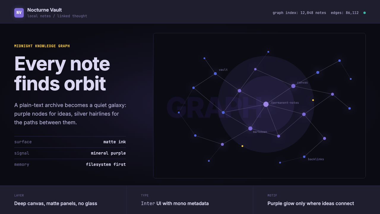
Obsidian Knowledge Graph is the visual and interaction language developed by and around the Obsidian note-taking application, released in 2020. Its most iconic element is the interactive graph view: a dark canvas scattered with colored nodes representing individual notes, connected by hairline edges that represent links between them. Together, these form a living map of a user's accumulated thought — a galaxy of ideas rendered in software.Obsidian 知识图谱是围绕 2020 年发布的 Obsidian 笔记应用所发展出的视觉与交互语言。其最具标志性的元素是可交互的图谱视图:深色画布上散布着代表各条笔记的彩色节点,节点之间由细如发丝的边线相连,象征着笔记间的链接关系。这些元素共同构成了用户积累思维的实时地图——一个由软件渲染的思想星系。
The design system extends far beyond the graph itself. It encompasses a matte dark interface, a dominant purple accent, a disciplined typographic hierarchy, and a strong ethic of restraint. Nothing decorates for decoration's sake. Every visual element serves the goal of helping a user move through dense textual and conceptual material with as little friction as possible. The aesthetic carries the values of its community: local-first, privacy-minded, deeply literate, and slightly monastic.这套设计体系远不止于图谱本身。它涵盖了哑光深色界面、主导性的紫色强调、严谨的字体层级,以及强烈的克制伦理。没有任何元素是为了装饰而存在的。每一个视觉元素都服务于同一目标:帮助用户以尽可能少的摩擦穿行于密集的文字与概念材料之中。这种美学承载着其社区的价值观:本地优先、注重隐私、深度阅读,以及略带修道院气质的专注感。
Because Obsidian is infinitely customizable through its CSS snippet system and a rich ecosystem of community themes, the Obsidian aesthetic exists in many variations. But the canonical visual identity — dark background, purple nodes, silver edges, monospaced code blocks, and sparse chrome — has become recognizable enough to stand as a design language in its own right, shorthand for the broader world of networked personal knowledge management.由于 Obsidian 通过 CSS 片段系统和丰富的社区主题生态实现了近乎无限的定制,Obsidian 美学存在于众多变体之中。但其标准视觉标识——深色背景、紫色节点、银色边线、等宽代码块、稀疏的界面框架——已足够清晰,足以作为一套独立的设计语言,成为更广泛的网状个人知识管理世界的视觉代名词。
See the Obsidian Knowledge Graph design system →查看 Obsidian Knowledge Graph 完整设计系统 →
Where does Obsidian Knowledge Graph come from?Obsidian Knowledge Graph 从何而来?
Obsidian was created by Shida Li and Erica Xu, a two-person team distributed between Toronto and the Netherlands. It launched in public beta in May 2020 — when the personal knowledge management space was electrified by the Zettelkasten concept, a note-linking method developed by German sociologist Niklas Luhmann and rediscovered by a generation of productivity writers. Roam Research had just demonstrated that networked, bidirectionally linked notes could feel like a different way of thinking. Obsidian arrived as the local-first, privacy-respecting alternative: your notes live in plain Markdown files on your own device, not on someone else's server.Obsidian 由李仕达(Shida Li)和徐一芃(Erica Xu)创建,这支两人团队分布于多伦多与荷兰之间。应用于 2020 年 5 月进入公开测试——彼时,个人知识管理领域正因「卡片盒笔记法」(Zettelkasten)而充满电流。这套笔记链接方法由德国社会学家尼克拉斯·卢曼发展,被一代生产力写作者重新发现。Roam Research 刚刚证明了网状、双向链接的笔记可以像一种根本不同的思考方式一样运转。Obsidian 随之作为本地优先、尊重隐私的替代品出现:你的笔记以纯 Markdown 文件的形式存放在你自己的设备上,而非他人的服务器。
The visual identity was never the result of a formal brand exercise. It emerged from the values baked into the product. The dark interface made long reading and writing sessions easier on the eyes. Purple — long associated in computing culture with mystery, creativity, and focused nocturnal work — became the accent almost inevitably. The name reinforced the palette: obsidian is a volcanic glass, deep black with slight iridescence, sometimes showing a purple or green sheen in certain light. The mineral gave the tool its character before any design decision was consciously made.这款应用的视觉标识从未经历正式的品牌塑造过程,而是从产品所蕴含的价值观中自然生长出来。深色界面让长时间的阅读与写作对眼睛更为友好。紫色——在计算机文化中长期与神秘感、创造力以及某种专注的夜间工作状态相关联——几乎不可避免地成为了强调色。应用本身的名字更强化了这一色彩逻辑:黑曜石是一种天然火山玻璃,呈深黑色,带有轻微的彩虹光晕,依光线角度有时透出紫色或绿色光泽。这种矿物在任何一个设计决策被有意识地作出之前,就已赋予了这款工具它的性格。
The knowledge graph view, which visualizes note connections as a node-edge diagram rendered with WebGL, was not a late feature — it was a founding metaphor. The graph made visible what Luhmann's physical slip-box had only implied: that knowledge is not hierarchical but associative, not a tree but a web. Seeing your notes as a constellation gave users a genuinely new experience of intellectual ownership. The graph became the tool's most-shared screenshot and the visual anchor of its entire identity.将笔记间连接关系可视化为交互式节点-边图的知识图谱视图,以 WebGL 渲染,并非一项晚期功能——它是一个奠基性隐喻。图谱使卢曼的实体卡片盒所隐含的东西变得清晰可见:知识不是层级结构而是联想结构,不是树形而是网状。将自己的笔记看作星座,给用户带来了一种真正崭新的知识所有感。图谱视图成为这款工具被分享最多的截图,以及其整体身份的视觉锚点。
As Obsidian's community grew to hundreds of thousands of daily users by its 1.0 release in 2022, a rich ecosystem of designers built custom themes. Kepano (Steph Ango), who joined as CEO that year, had developed Minimal — one of the most influential community themes — pushing the aesthetic toward a cleaner, more editorial sensibility while retaining dark-mode discipline. Eleanor Konik, a prominent community writer and educator, helped articulate the intellectual culture — the practices, vocabulary, and ethos — that gave the aesthetic its meaning. When Canvas launched in 2023, the design language was mature enough to absorb new affordances without losing its coherence.随着 Obsidian 社区的成长——在 2022 年底 1.0 版本发布时,每日用户已达数十万——一个丰富的设计师生态系统开始构建自定义主题。Kepano(Steph Ango)于 2022 年加入 Obsidian 担任 CEO,此前他已开发了 Minimal——社区中最具影响力的主题之一,在保留核心深色模式纪律的同时,将美学推向了更简洁、更具编辑感的方向。社区知名写作者与教育者 Eleanor Konik 帮助阐明了围绕这款工具的智识文化——那些实践方式、词汇体系与行事伦理——正是它们赋予了这套美学以意义。到 2023 年 Obsidian Canvas 推出(在同一视觉系统内提供无限白板功能)时,这套设计语言已足够成熟,能够吸收新的功能维度而不失其连贯性。
What defines the Obsidian Knowledge Graph look?Obsidian Knowledge Graph 的视觉特征是什么?
The Dark Ground深色底面
The Obsidian interface is built on a deep, nearly-black matte surface that reads more as the absence of light than as a color — not a cool slate or neutral charcoal but something with a very slight warmth, as if the darkness has absorbed years of thought. This ground is not a stylistic choice grafted onto the tool; it is the environment in which the entire visual system breathes. Text, nodes, and interface elements float on it like objects in space, given luminosity by contrast alone.Obsidian 界面建立在一个深邃、近乎全黑的哑光底面之上,它读来更像光线的缺席而非一种颜色。它不是冷调板岩色,也不是中性木炭色——它带有极轻微的暖意,仿佛这片黑暗本身已吸收了多年的思考。这个底面并非嫁接到工具上的风格选择;它是整套视觉系统赖以呼吸的环境。文字、节点与界面元素在其上漂浮,如同太空中的物体,仅凭对比度获得发光感。
Purple Nodes and Silver Edges紫色节点与银色边线
The knowledge graph's visual vocabulary is spare and precise. Notes appear as circular nodes, glowing softly in the dominant purple against the dark field. Links between notes become hairline silver edges — near-invisible except where they cluster, forming visible constellations around densely connected ideas. Color within the graph carries structural meaning: the default purple signals ordinary notes, while orphan notes, tags, and attachment types may appear in differentiated tints. The overall impression is astronomical — a star map of one mind.知识图谱的视觉词汇简约而精确。笔记以圆形节点的形式出现,在深色底面上以主导性的紫色发出柔和光芒。笔记之间的链接化为细如发丝的银色边线——几乎隐形,直到它们在高密度连接的想法周围聚集,形成清晰可见的星座。图谱中的色彩承载结构性意义:默认紫色标示普通笔记,而孤立笔记、标签与附件类型则可能以差异化的色调呈现。整体观感如同天文图——一张某个心智的星象地图。
Typographic Restraint字体排印的克制
The interface text lives at the quiet end of the typographic spectrum — rendered in a clean, humanist sans-serif for prose and a monospaced face for code and technical content. The two voices are distinct but harmonious: prose flows softly against the dark ground, while code blocks step forward with the structured clarity of a terminal. There are no expressive display typefaces, no decorative lettering, no headline fonts performing drama. Hierarchy is built from weight, size, and color alone, with muted tones for interface chrome and full-brightness reserved for actual content.界面文字栖居于字体排印光谱的安静一端——正文以干净的人文主义无衬线字体渲染,代码与技术内容则使用等宽字体。两种声音截然不同却相互协调:正文在深色底面上柔和流动,代码块则以终端般的结构清晰度向前一步。没有表现性展示字体,没有装饰性字母造型,没有演绎戏剧感的标题字体。层级仅凭字重、字号与色彩构建,界面框架使用消隐色调,实际内容才保留全亮度。
Structural Minimalism结构性极简
Obsidian's chrome is reduced to the absolute minimum needed to orient a user within the system. Sidebars collapse. Toolbars disappear in focus mode. The writing surface expands to fill available space. What remains visible is not decoration but navigation infrastructure — file trees, tab bars, status indicators — each rendered at low visual weight so that the content itself commands attention. This is not the performed minimalism of a marketing page; it is the functional minimalism of a working environment where the tool should be nearly invisible.Obsidian 的界面框架被精简至使用户能够在系统中定向所必需的绝对最小量。侧边栏可以折叠,工具栏在专注模式下消失,写作区域扩展以填充可用空间。保持可见的不是装饰,而是导航基础设施——文件树、标签栏、状态指示器——每一项都以低视觉权重渲染,让内容本身统领注意力。这不是营销页面的表演性极简;这是工作环境中的功能性极简,工具本身理应接近隐形。
Depth Through Luminosity通过发光感营造深度
Rather than simulating physical depth through shadows and gradients, Obsidian creates a sense of space through luminous contrast alone. The graph nodes appear to glow because they are rendered at full color saturation against a near-black ground — the contrast itself implies depth. Hover states add a subtle brightening; active elements pulse. The experience is less like using a flat interface and more like peering into illuminated circuitry — depth implied by light, not by geometry.Obsidian 并非通过阴影与渐变来模拟物理深度,而是单凭发光对比度营造空间感。图谱节点之所以看起来在发光,是因为它们在近黑底面上以完整的色彩饱和度渲染——这种对比本身就暗示了深度。悬停状态带来轻微的亮度提升,激活元素微微脉动。使用体验不像是在操作一个平面界面,更像是在凝视被照亮的电路——深度由光线暗示,而非由几何结构呈现。
Markdown Proximity与 Markdown 的亲近感
The visual language of Obsidian is never far from the raw material it processes: Markdown text. Even in rendered reading view, the formatting decisions feel close to the source — heading scales are clear but not theatrical, horizontal rules are plain dividers, blockquotes are simply indented with a vertical bar. The aesthetic refuses to paper over the text structure with elaborate visual chrome. This proximity to the plain-text substrate is both a philosophical statement and a practical advantage: notes look like notes, not like designed documents.Obsidian 的视觉语言从未远离它所处理的原始材料:Markdown 文本。即便在渲染后的阅读视图中,格式决策也感觉贴近源头——标题层级清晰但不戏剧化,水平分割线是朴素的分隔符,引用块只是以竖线缩进。这套美学拒绝用精密的视觉框架遮盖文本结构。对纯文本基底的这种亲近感既是哲学声明,也是实用优势:笔记看起来就像笔记,而不是设计过的文档。
Community Theme Vocabulary社区主题词汇
Because Obsidian exposes its entire visual layer to CSS customization, a shared aesthetic vocabulary has emerged across hundreds of community themes. Even themes that depart from the default dark purple — shifting to warm sepia or bright academic whites — tend to retain certain commitments: minimal chrome, typographic hierarchy over decoration, code blocks as distinct objects, and a graph view legible as a spatial representation. The diversity of themes exists within a recognizable family of design values.由于 Obsidian 将其整个视觉层开放给 CSS 自定义,一套共同的美学词汇在数百个社区主题中逐渐形成。即便是与默认深色紫调相去甚远的主题——转向温暖的棕褐色调、明亮的学术白,或高对比度无障碍模式——也往往保留了某些结构性承诺:精简的界面框架、以字体层级代替装饰、作为独立对象阅读的代码块,以及保持作为空间表征可读性的图谱视图。主题的多样性存在于一个可识别的设计价值家族之中。
See the Obsidian Knowledge Graph design system →查看 Obsidian Knowledge Graph 完整设计系统 →
Who shaped Obsidian Knowledge Graph?谁塑造了 Obsidian Knowledge Graph?
Shida Li co-founded Obsidian and serves as its primary developer, responsible for the core architecture — the WebGL graph renderer, the plugin API, and the live preview editor — that makes the design system technically possible. His engineering decisions have direct design consequences: building the graph with WebGL rather than SVG allows thousands of nodes to render fluidly, which is why the graph view feels like a living organism rather than a static diagram. Li has maintained Obsidian's independence and local-first commitment throughout the application's growth.李仕达共同创立了 Obsidian,并担任其主要开发者,负责核心架构——包括 WebGL 图谱渲染器、插件 API 以及实时预览编辑器——正是这些技术使整套设计系统成为可能。他的工程决策带有设计后果:选择用 WebGL 而非 SVG 构建图谱,使数千个节点能够流畅渲染,这正是图谱视图感觉像一个活的有机体而非静态图表的原因。李仕达在应用成长全程维护了 Obsidian 的独立性与本地优先承诺。
Erica Xu co-founded Obsidian alongside Shida Li, contributing to product direction and the community culture that grew around the tool. The two-person founding structure — lean, independent, profitable without venture capital — has itself become part of the tool's identity and has shaped the aesthetic ethos: a product built to last by people who use it, for people who use it, without the scaling pressure that would compromise its disciplined restraint.徐一芃与李仕达共同创立了 Obsidian,参与了产品方向以及围绕它成长的社区文化的塑造。Obsidian 两人创始团队的结构——精简、独立、无需风险投资即可盈利——本身已成为这款工具身份的一部分,并直接塑造了其美学伦理:一款由使用者为使用者打造、旨在长存的产品,免于那些会损害其自律克制的规模化压力。
Steph Ango, known as kepano, developed the Minimal theme — one of the most widely installed community themes — before joining Obsidian as CEO in 2022. Minimal demonstrated that the dark-matte-purple visual system could be refined toward a lighter, more editorial sensibility without losing structural integrity. As CEO, Ango writes publicly about local-first principles, file-over-app philosophy, and software longevity. His influence has pushed Obsidian's aesthetic toward greater clarity and reduced visual noise.Steph Ango,在 Obsidian 社区中以 kepano 为人所知,在 2022 年加入 Obsidian 担任 CEO 之前,开发了 Minimal 主题——社区中安装量最广的主题之一。Minimal 证明了深哑光紫色视觉系统可以在不失结构完整性的情况下,向更轻盈、更具编辑感的方向精炼。担任 CEO 以来,Ango 持续塑造着产品的设计方向,公开撰文阐述本地优先原则、「文件优先于应用」的哲学以及软件的长久性。他的影响推动了 Obsidian 美学向更高清晰度、更低视觉噪音的方向发展。
Eleanor Konik is a historian and educator who became one of Obsidian's most influential community voices, writing about note-taking practice, Zettelkasten methodology, and the intellectual culture around the tool. Her work established a scholarly register for the community — a tone that values depth and genuine curiosity over productivity performance. This culture has shaped the tool's aesthetic: an interface that respects the weight of serious thought rather than gamifying or trivializing it.Eleanor Konik 是一位历史学家和教育工作者,她成为了 Obsidian 社区最具影响力的声音之一,大量撰写关于笔记实践、卡片盒方法论以及围绕这款工具形成的智识文化的文章。她的工作帮助确立了 Obsidian 社区的文学与学术基调——一种将深度、精确与真正的好奇心置于生产力表演之上的音调。这种智识文化反过来塑造了这款工具的美学:一个尊重严肃思考之重量的界面,而非将其游戏化或轻薄化。
Though Luhmann died in 1998, decades before Obsidian existed, his intellectual legacy is inseparable from the tool's visual identity. Luhmann was a German sociologist who produced an extraordinary body of work with the help of a physical card-index — the Zettelkasten — containing over ninety thousand handwritten notes linked by reference numbers. Its networked, non-hierarchical structure is the direct intellectual ancestor of Obsidian's graph. Without Luhmann, there is no graph metaphor; without the graph metaphor, there is no Obsidian visual identity.尽管卢曼于 1998 年逝世,早于 Obsidian 诞生数十年,但他的思想遗产与这款工具的存在及视觉标识不可分割。卢曼是一位德国社会学家,借助一套实体卡片索引系统——卡片盒(Zettelkasten)——留下了体量惊人的学术著作,那套系统中存有逾九万张以参考编号相互链接的手写卡片。卡片盒的网状、非层级结构是 Obsidian 图谱的直接思想祖先。没有卢曼,就没有图谱隐喻;没有图谱隐喻,就没有 Obsidian 的视觉标识。
How do you use Obsidian Knowledge Graph today?今天怎么用 Obsidian Knowledge Graph?
The Obsidian aesthetic is transferable to any context where the user is engaged in serious, sustained intellectual or technical work — and where the interface should communicate that seriousness without becoming oppressive. It is a style for the long session, the deep dive, the working environment designed to disappear. Applied correctly, it tells the user: this is a place where real thinking happens.Obsidian 美学极易迁移到任何用户从事严肃、持续的智识或技术工作的场景——以及那些界面应当传递这种严肃感而不至于令人压抑的场合。它不是一种用于第一印象或休闲互动的风格,而是一种为长时工作、深度投入、设计为接近隐形的工作环境而生的风格。正确应用时,它向用户传达:这是一个真实思考发生的地方。
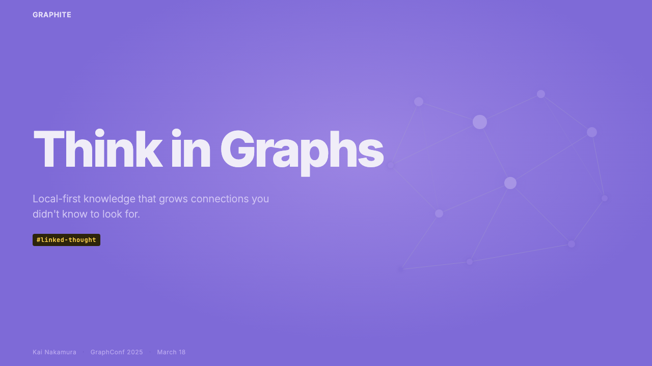
For presentation slides, the style works well for technical talks and developer-facing content. A cover slide benefits from the deep dark ground with a single luminous element — a graph visualization, a glowing title in the signature purple, or a sparse node diagram — centered against near-darkness. Content slides should minimize chrome: no decorative borders, no background gradients. Text hierarchies are built through scale and the contrast between the accent and neutral tones. Code blocks step forward as distinct, monospaced objects. Data slides can lean into the graph metaphor — network diagrams and relational visualizations feel native rather than imported.在演示文稿中,Obsidian 语言对技术演讲、研究报告和面向开发者的内容格外有效。封面页得益于深色底面与单一发光元素的组合——一幅图谱可视化、一个以标志性紫色发光的标题,或一张稀疏的节点图——置于近乎黑暗的背景中央。内容页应尽量减少界面框架:无装饰性边框,无背景渐变,无剪贴画图标。文字层级完全通过尺度以及主色强调与中性色调之间的区分来构建。代码块作为独特的等宽对象进入视野,以微妙的背景差异加以区分。数据页可以倾向于图谱隐喻——网络图、连接图与关系可视化在这里感觉是原生的,而非外来移植。
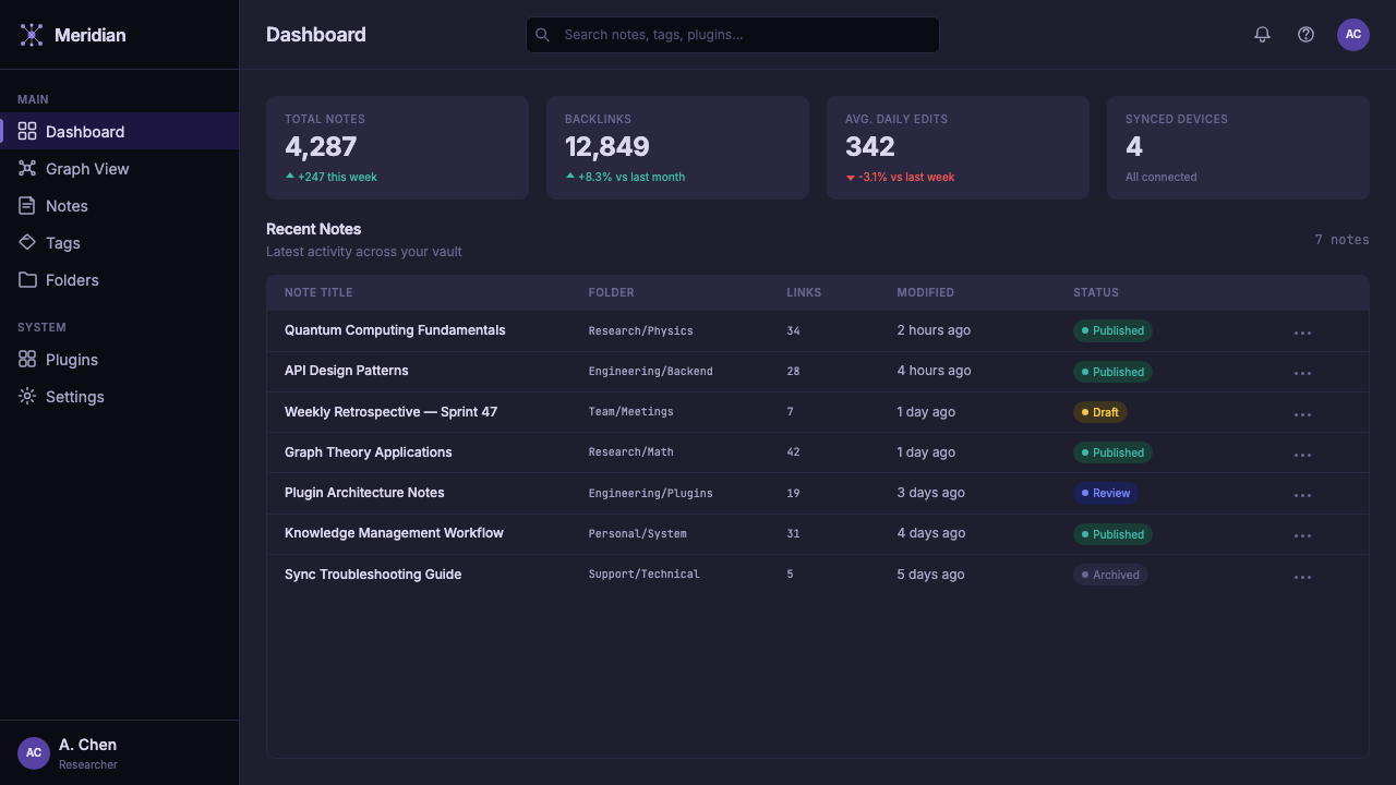
For web interfaces, the style is best suited to developer tools, documentation sites, knowledge bases, and productivity dashboards. The approach: deep background, a restrained purple accent for interactive elements and active states, monospaced text wherever code appears, and a typographic system that prioritizes reading clarity. Sidebar navigation should feel like a file tree — hierarchical but unadorned. Cards differentiate by luminosity rather than by border or color variety.对于网页界面,这种风格最适合开发者工具、文档站点、知识库和生产力仪表板。方法是一致的:深色背景,对交互元素和激活状态保持克制但存在感的紫色强调,凡出现代码或结构化数据之处均使用等宽文本,以及一套将阅读清晰度置于视觉表现力之上的字体系统。侧边栏导航应有文件树的感觉——有层级但无装饰。卡片组件(若使用)应通过亮度而非边框或色彩多样性来区分。
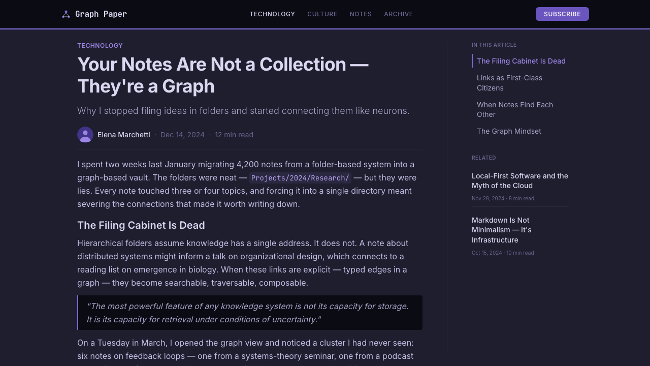
For editorial and marketing contexts, a technical blog or documentation page benefits from the dark-ground approach when targeting developer audiences who associate it with seriousness. The purple accent, used sparingly, signals intellectual identity rather than consumer branding. Long-form layouts should prioritize reading comfort: generous line spacing and a typographic rhythm that rewards slow reading. Visuals, when they appear, are functional — diagrams, graphs, screenshots — never decorative.在编辑与营销场景中,Obsidian 美学可以有选择地应用。以开发者为目标受众时,技术博客或文档营销页面从深色底面的处理方式中获益,因为这部分受众将其与严肃性和工匠精神相关联。紫色强调,谨慎使用,传递的是智识身份认同而非消费品牌感。这套系统中的长文章版面应优先考虑阅读舒适度:充裕的行距,舒适的行宽,以及奖励慢读而非略读的字体节奏。装饰性图像基本缺席;当视觉出现时,它们是功能性的——图表、关系图、截图——而非氛围性的。
A common mistake is confusing darkness with density. Authentic Obsidian-derived interfaces are generous with empty space — the dark ground needs room to breathe the way night sky needs horizon. Equally common is over-extending the purple accent, treating it as a brand color to be broadly applied rather than a luminous signal reserved for what genuinely demands attention. The purple earns its authority by being rare: one or two elements per composition — the active link, the key data point, the anchoring heading. Everything else recedes into the dark ground.应用这套美学时,一个常见的错误是将深色与厚重混淆。深色不意味着密集或杂乱。真正源自 Obsidian 的界面对空白是慷慨的——深色底面需要呼吸的空间,正如夜空需要地平线。同样常见的错误是过度延伸紫色强调,将其当作一种可以广泛铺开的品牌色,而非保留给真正需要注意力的发光信号。紫色的权威性来自于它的稀少。每一个构图中只在一到两个元素上使用它——激活链接、关键数据点、锚定视野的标题——让其余元素退入深色底面。
See the Obsidian Knowledge Graph design system →查看 Obsidian Knowledge Graph 完整设计系统 →
Obsidian Knowledge Graph — FAQObsidian Knowledge Graph · 常见问题
Is the Obsidian aesthetic only suitable for dark-mode interfaces?Obsidian 美学只适用于深色模式界面吗?
The canonical Obsidian aesthetic is dark-mode-first — the knowledge graph depends on its near-black ground, since nodes can only glow against darkness. But the underlying principles translate to light mode more readily than the surface suggests. A light-mode Obsidian-derived interface retains the same typographic restraint, the same minimal chrome, the same structural use of the purple accent. What changes is the direction of contrast: where the dark version glows outward from a dark field, the light version recedes toward a quiet white or off-white ground. Both work; dark communicates focus and intensity, light communicates openness and accessibility.Obsidian 的标准美学以深色模式为主,知识图谱尤其依赖其近黑底面的视觉逻辑——节点只能在黑暗中发光。然而,其底层原则比表面外观所暗示的更易迁移到浅色模式。浅色模式的 Obsidian 衍生界面保留了同样的字体排印克制、同样精简的界面框架、同样对紫色强调的结构性使用,以及同样将阅读清晰度置于装饰之上的承诺。改变的是对比关系的方向:深色版本从深色底面向外发光,浅色版本向内退向安静的白色或近白色底面。两者均可行;它们承载略有不同的情绪基调,深色传递专注与强度,浅色传递开放与可及性。
How does Obsidian's purple differ from other purple-accented design systems?Obsidian 的紫色与其他以紫色为强调的设计系统有何不同?
Obsidian's purple sits at the intersection of violet and indigo — a hue associated with the mineral the app is named for and with a long history of purple signaling intellectual depth, mystery, and prestige in both Western and East Asian visual traditions. Crucially, it functions as a single luminous signal, not a brand color varied across surfaces. It appears where things glow — active nodes in the graph, active links in the editor, interactive highlights. Other purple-accented systems — analytics tools, creative suites, social platforms — use purple more broadly as a marker of modernity. Obsidian's purple is more restrained, more nocturnal, specifically tied to the experience of thought made visible.Obsidian 的紫色处于紫罗兰与靛青的交汇点——这一色相既与应用命名所源的矿物有关联,也与紫色在西方及东亚视觉传统中长期代表的智识深度、神秘感与高贵感有关。关键在于,这种紫色被用作单一的发光信号,而非跨越各个界面元素的品牌色。它出现在发光的地方——图谱中的激活节点、编辑器中的激活链接、交互性高亮。竞争性的紫色强调系统——分析工具、创意软件套件、某些社交平台——往往将紫色作为现代感或创意感的标记,更广泛地铺开。Obsidian 的紫色更为克制、更具夜间气质,更具体地与思维被可见化的体验绑定在一起。
Why does the knowledge graph work as a navigational metaphor rather than just a visual feature?为什么知识图谱作为导航隐喻有效,而不仅仅是一个视觉功能?
The graph view works as a navigational metaphor because it maps spatial intuition onto conceptual structure. Human memory is partially spatial — we remember ideas in terms of where we encountered them and what was nearby. The knowledge graph externalizes this quality, giving users a view of their notes that reflects how memory actually works rather than how filing systems are organized. Navigating by proximity and density — moving toward clusters of densely connected nodes — is cognitively natural. The visual design reinforces this: scattered luminous nodes against the dark ground are explicitly astronomical, activating spatial and navigational associations of looking at a night sky.图谱视图作为导航隐喻有效,是因为它将空间直觉映射到概念结构上。人类记忆部分是空间性的——我们以遭遇想法的地点和周边事物来记忆想法。知识图谱将这种空间品质外在化,给用户提供了一种按照记忆实际运作方式而非文件系统通常组织方式来观看自己笔记的视角。通过邻近性与密度导航——向密集连接节点的聚集区移动——在认知上是自然的。视觉设计强化了这一点:深色底面上散布的发光节点明确具有天文意象,激活了凝视夜空的空间与导航联想。
What kinds of products should avoid the Obsidian aesthetic?哪些类型的产品应当避免使用 Obsidian 美学?
The aesthetic does not suit contexts where warmth, playfulness, or sensory richness are primary values. Consumer products in food, children's education, wellness, and social networking rely on organic textures, friendly illustration, and warm palettes that invite rather than concentrate. The restraint that reads as depth in a knowledge tool reads as coldness in an onboarding flow welcoming first-time users. The dark-ground system also requires careful implementation for accessibility — pure dark backgrounds can cause halation for some users. Brands needing to communicate openness, joy, or broad approachability will find the nocturnal intensity of this palette working against them.Obsidian 美学不适合那些以温暖感、趣味性或感官丰富性为主要价值的场景。食品、儿童教育、健康与社交网络等类别的产品,依赖有机质感、友好插图与温暖色调。在知识工具中传递深度的克制,在旨在迎接初次用户的引导流程中会传递出冷漠感。深色底面系统在无障碍实施上也需要谨慎——纯深色背景可能对某些用户造成光晕。需要传递开放性、喜悦感或大众亲和力的品牌,会发现这套调色板的夜间强度正在对抗其传播目标。
How does the Obsidian aesthetic relate to the history of dark-mode interfaces?Obsidian 美学与深色模式界面的历史有何关联?
Early CRT terminals displayed phosphorescent text on dark screens out of technical necessity, not aesthetic intent. Hacker culture and science fiction later romanticized this into a cultural association: dark interfaces meant technical mastery. As mainstream software shifted to light backgrounds, dark mode became a marker of professional tools — code editors, mixing software, video suites — where extended screen time made low-luminance environments preferable. Obsidian inherits this tradition but gives it new meaning: the darkness is not about terminal nostalgia but about creating an environment where ideas, rendered as glowing nodes against a dark field, feel genuinely weighted and present. The aesthetic arrives at darkness through meaning rather than habit.早期 CRT 终端在深色屏幕上显示荧光文字出于技术必然而非美学选择。黑客文化与科幻小说后来将其浪漫化为一种文化联想:深色界面意味着技术精通。随着主流软件转向浅色背景,深色模式成为专业工具的标志——代码编辑器、混音软件、视频套件——因为长时间使用屏幕使低亮度环境在实践上更为可取。Obsidian 继承了这一传统,但赋予了它新意义:这里的黑暗不是关于终端怀旧,而是关于创造一个让想法——以深色底面上的发光节点呈现——感觉真实有分量的环境。这套美学通过意义而非习惯抵达了黑暗。
Related design styles相关设计风格
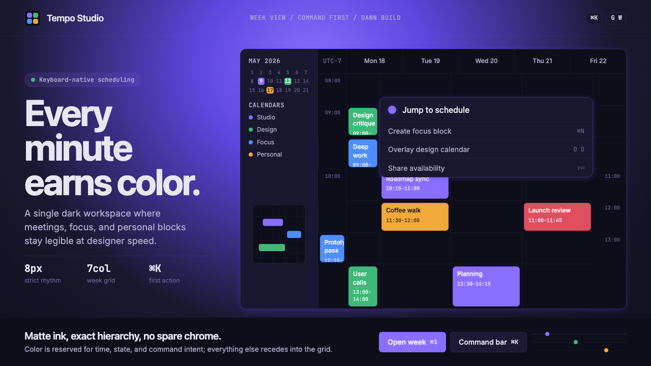 Cron CalendarDesigner-tech restraint. Purple wash, ink grid, mono shortcuts, surgical even…设计师科技的克制:紫色光晕、墨色网格、等宽快捷键与精准色块。
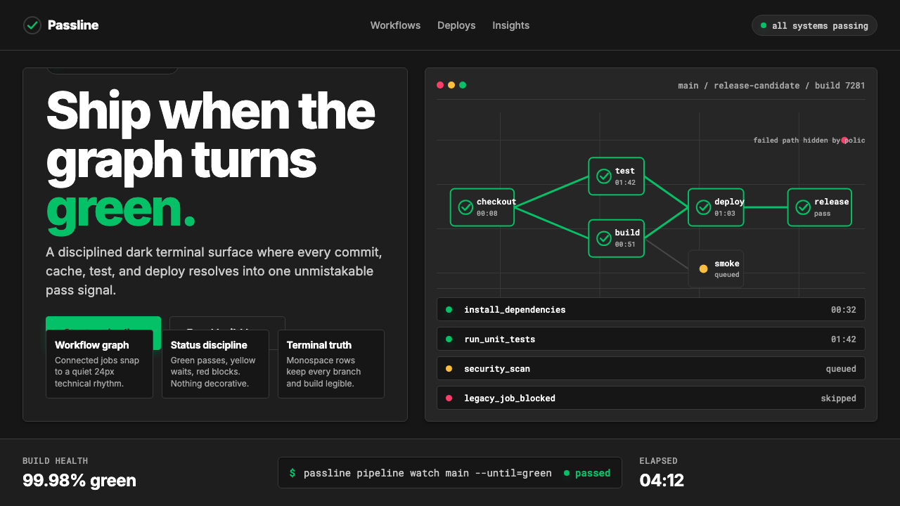 CircleCI Pipeline-GreenConfidence goes green. Emerald status lines cut through terminal-black pipeli…信心变绿。翠绿状态线切过终端黑流水线网格。
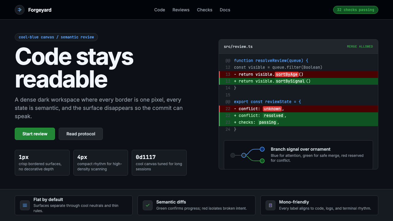 GitHub DarkCode-first darkness. Cool-blue canvas, 1px borders, green/red diff lines.代码优先的暗色:冷蓝画布、1px边框、绿红diff线。
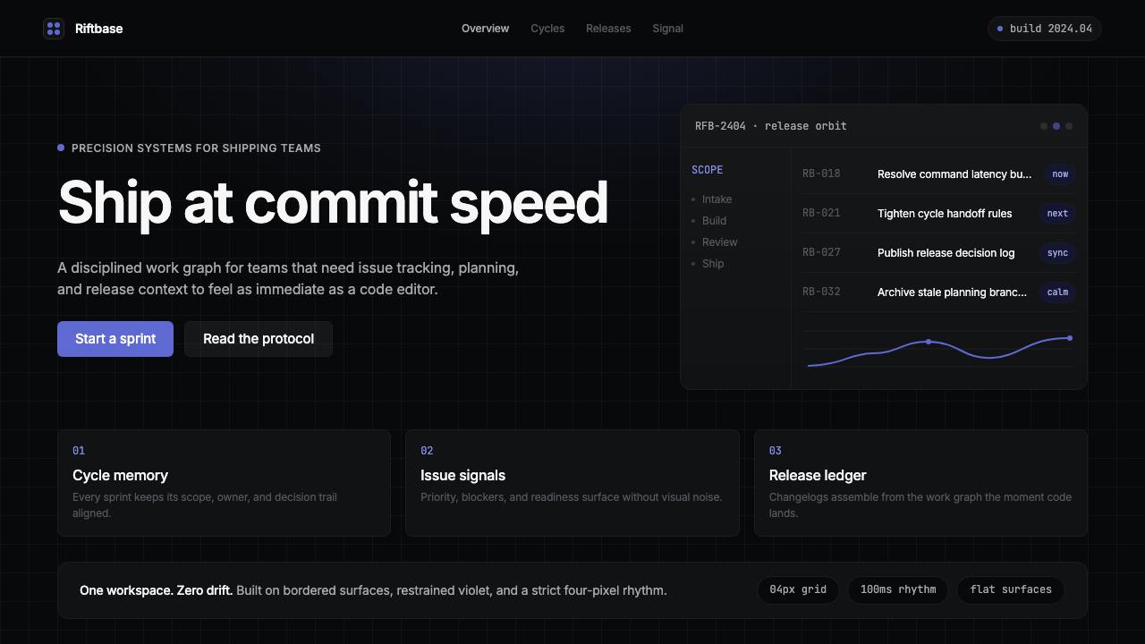 Linear 2024Precision down to the millisecond. Near-black, indigo-violet accents, Inter D…开发者工具美学的标杆:近乎纯黑、克制靛紫点缀、Inter Display 字体…
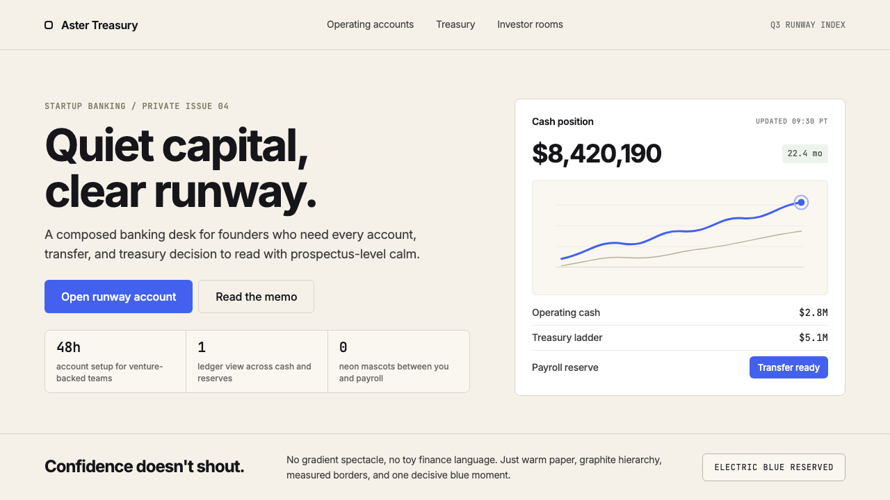 Mercury BankQuiet precision wins. Cream paper, charcoal Inter, and one electric-blue spar…安静精确胜出:奶油纸底、炭灰 Inter 与一抹电光蓝建立信任。
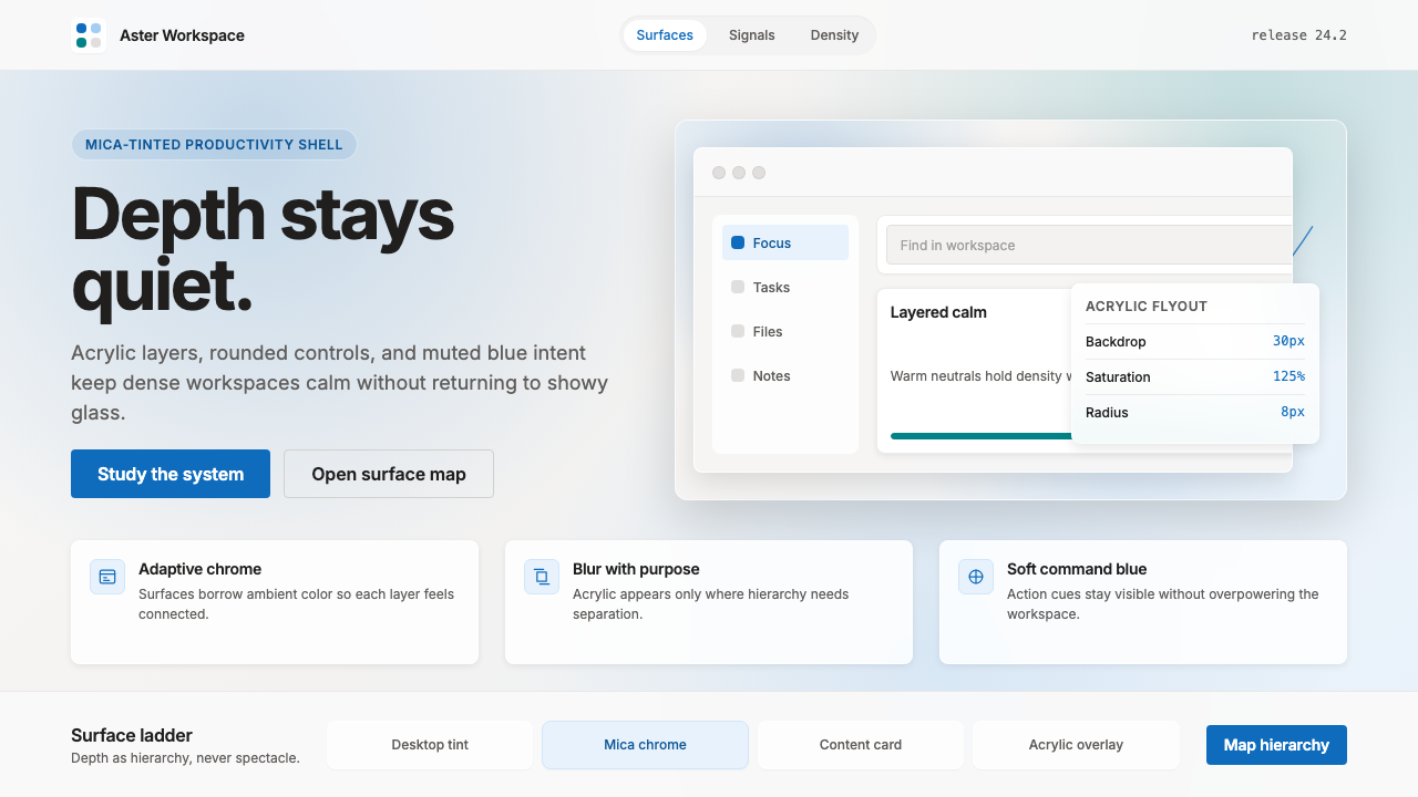 Microsoft Fluent 2Disciplined translucency. Warm Mica neutrals, acrylic blur, and muted blue cr…有纪律的半透明:暖 Mica 中性色、亚克力模糊与低调蓝营造沉稳层次。