What is Zoom Meeting Blue?什么是 Zoom Meeting Blue?
Zoom Meeting Blue turned a single saturated cobalt into the universal visual shorthand for remote work — and in doing so, quietly set a new standard for enterprise-friendly digital design.Zoom Meeting Blue 用一个饱和钴蓝定义了远程办公的视觉语言,悄然为企业级数字设计树立了新标准。
Zoom Meeting Blue in briefZoom Meeting Blue 速览
Zoom Meeting Blue is the visual identity system of Zoom Video Communications — the platform that, during the global pandemic of 2020, became the default venue for work, school, medicine, and social life for hundreds of millions of people simultaneously. At the center of that system is a single dominant hue: a saturated, luminous electric cobalt that reads instantly on any screen at any size. Paired with pure white backgrounds, deep slate-grey type, and the iconic white video-camera silhouette set inside a blue rounded square, the palette is spare, confident, and globally legible without translation.Zoom Meeting Blue 是 Zoom 视频通讯公司的视觉识别体系——2020 年全球疫情期间,这个平台一跃成为数亿人同时用于工作、上课、就医与社交的默认场所。整套体系的核心是一个主导色:饱和度极高、明亮的电子钴蓝,在任何屏幕的任何尺寸下都能被即刻识别。配合纯白底面、深石板灰文字,以及那个嵌在蓝色圆角方块里的白色摄像机轮廓 logo,这套色板简洁、自信,无需翻译即可全球通用。
The style is best understood as disciplined enterprise modernism. It borrows from the long tradition of tech-company sans-serif minimalism but adds a specific warmth through its choice of blue — not the cold navy of legacy banking, not the pale cyan of social media, but a fully saturated mid-range cobalt that feels simultaneously professional and approachable. White space is generous; rounded corners on interactive elements soften the interface without surrendering authority; shadows are restrained to the point of near-absence. The overall effect is a system that communicates 'this works' before a user reads a single word.这种风格最准确的定位是有纪律的企业现代主义。它借鉴了科技公司无衬线极简设计的长期传统,但通过蓝色的选择加入了独特的温度——不是传统银行业的冷海军蓝,不是社交媒体的浅青蓝,而是一种充分饱和的中段钴蓝,兼具专业感与亲和力。留白慷慨;交互元素的圆角在不失权威的前提下软化了界面;阴影克制到近乎缺席。整体效果是一套在用户读到任何文字之前就已传达出「这东西管用」的系统。
What distinguishes Zoom Meeting Blue from other enterprise palettes is its singular focus. Many tech platforms hedge with a family of supporting tints and accent colors. Zoom commits to one. That discipline — one dominant color, one clear background, one type texture — is what makes the brand instantly recognizable even as a thumbnail or favicon, and what made it so effectively sticky during the years when the platform's name became a verb.Zoom Meeting Blue 区别于其他企业色板的关键在于它的单一专注。许多科技平台以一系列辅助色调和强调色来对冲风险,Zoom 只押注一个。这种纪律——一个主导色、一个清晰背景、一种字体质感——正是这个品牌即便在缩略图或网站图标大小下也能被即刻识别的原因,也是在平台名称成为动词的那些年里,它能如此深入人心的原因。
See the Zoom Meeting Blue design system查看 Zoom Meeting Blue 完整设计系统
Where does Zoom Meeting Blue come from?Zoom Meeting Blue 从何而来?
Zoom Video Communications was founded in 2011 by Eric Yuan, a former Cisco WebEx engineer who had grown frustrated with the complexity and unreliability of existing video-conferencing tools. Yuan, who had emigrated from China to the United States in 1997, spent years at Cisco before deciding that the market needed a product built from the ground up for ease of use rather than enterprise feature density. The company launched its first product in 2013, went public on the Nasdaq in April 2019, and within months of listing had begun to attract serious attention as a genuinely simpler alternative to entrenched competitors like WebEx, Skype, and Microsoft Lync.Zoom 视频通讯由袁征(Eric Yuan)创立于 2011 年。袁征曾任职于思科 WebEx,因对既有视频会议工具的复杂与不可靠感到失望而萌生创业念头。1997 年从中国移居美国后,他在思科工作多年,最终决定市场需要一款从头开始、以易用性而非企业功能密度为本的产品。公司于 2013 年推出第一款产品,2019 年 4 月在纳斯达克上市,上市后数月便开始以明显更简洁的使用体验吸引市场注意,被视为 WebEx、Skype 和微软 Lync 等老牌竞争对手的真实替代选项。
The platform's visual identity prior to 2020 was functional but unremarkable — a competent enterprise software look in line with the conventions of its era. The pandemic changed everything. Between January and April 2020, daily meeting participants on Zoom grew from roughly ten million to over three hundred million. The platform was suddenly not just a business tool but a cultural institution, and its visual language — that cobalt blue, those rounded tiles of faces in a grid — became among the most-recognized imagery of the entire pandemic period. The in-house brand team's subsequent visual refresh, which sharpened and codified what had been a looser system, represented one of the most consequential corporate design moments of the early 2020s.2020 年之前,这个平台的视觉形象称得上实用,但并无特别之处——一套符合那个时代惯例的合格企业软件外观。疫情改变了一切。从 2020 年 1 月到 4 月,Zoom 日均会议参与者从约一千万增长到超过三亿。这个平台突然间不只是一个商业工具,而是一个文化机构,它的视觉语言——那个钴蓝色、那些网格里的面孔瓷砖——成为整个疫情时期最广为人知的图像之一。内部品牌团队随后对一套此前较为松散的体系进行了强化与规范化,这一视觉刷新成为 2020 年代初最具影响力的企业设计时刻之一。
The choice of an electric, fully saturated cobalt as the brand's anchor was neither arbitrary nor accidental. Blue has long been the dominant hue of enterprise and institutional trust — from IBM's canonical 'Big Blue' to the blues of PayPal, Facebook, and LinkedIn — but the specific shade Zoom settled on is warmer and more energetic than the muted corporate blues that preceded it. It reads clearly on screens across the full range of display technologies, from a dim laptop in a home office to a bright conference room monitor, which was a practical consideration given that the platform needed to function identically across wildly varying lighting conditions.选择充分饱和的电子钴蓝作为品牌锚点,既非随意也非偶然。蓝色长期以来是企业与机构信赖感的主导色——从 IBM 标志性的「Big Blue」到 PayPal、Facebook、LinkedIn 的各种蓝——但 Zoom 最终确定的那个特定色调比它的前辈们更温暖、更有能量。从家庭办公室里昏暗的笔记本屏幕到明亮的会议室显示器,它在全范围的显示技术下都能清晰呈现,而这恰好是一个需要在千变万化的光线条件下表现一致的平台所必须考量的实际因素。
The rounded square containing the camera icon — a form now as recognizable as any major technology logo — reflects a broader shift in interface design that Zoom's identity both absorbed and helped accelerate. The move away from hard corners toward soft radii in digital product design began in earnest in the mid-2010s with iOS and Material Design, and Zoom's application of that principle to its mark gave the brand a distinctly contemporary feel without sacrificing the solidity that enterprise customers expected. By the time the pandemic made the platform ubiquitous, the rounded square had already begun to feel like the natural container shape for all things digital and communicative.包含摄像机图标的圆角方块——一个如今已与任何主要科技 logo 一样具有辨识度的形态——折射出 Zoom 品牌形象所吸纳并助力加速的一次更广泛的界面设计转变。数字产品设计从硬角向柔和圆角的迁移,在 2010 年代中期随着 iOS 和 Material Design 的普及而正式展开,Zoom 将这一原则应用于其标志,赋予品牌一种鲜明的当代感,同时没有牺牲企业客户所期待的稳固感。到疫情将这个平台带向无处不在之时,圆角方块已开始自然地成为一切数字与通信事物的标准容器形态。
What defines the Zoom Meeting Blue look?Zoom Meeting Blue 的视觉特征是什么?
Color Discipline色彩纪律
The system is built around a single dominant hue — a saturated, luminous electric cobalt — used consistently across all brand surfaces: buttons, icons, illustrations, and marketing imagery. Secondary surfaces rely on pure white and a deep, near-neutral slate for body text. No competing accent colors dilute the primary; when additional tones appear, they are desaturated tints of the same blue family used for hover states or background washes, never independent hues vying for attention.整套体系围绕一个主导色构建——饱和度极高、明亮的电子钴蓝——统一应用于所有品牌界面:按钮、图标、插图和营销图像。次级界面依赖纯白和用于正文的深度近中性石板灰。没有竞争性的强调色稀释主色;当额外色调出现时,它们是同一蓝色家族的去饱和变体,用于悬停状态或背景底色,而非争夺注意力的独立色相。
Rounded Corner Vocabulary圆角词汇
Rounded corners appear consistently across every interactive and structural element: the brand mark, buttons, card containers, input fields, and the signature video-tile grid. The radius is intentionally generous — soft enough to read as friendly and contemporary, but not so extreme as to undermine the professional structure of the layout. This consistent radius creates a unified tactile language: everything in the system feels as though it belongs to the same family of objects.圆角一致地出现在所有交互性和结构性元素上:品牌标志、按钮、卡片容器、输入框,以及标志性的视频瓷砖网格。圆角幅度刻意做得慷慨——柔和到足以传递友好与当代感,但又不至于过度而破坏版面的专业结构。这种一致的圆角创造出统一的触觉语言:体系中的每个元素都让人感到属于同一对象家族。
White Space and Breathing Room留白与呼吸空间
Generous white space is one of the defining properties of the Zoom visual system. Marketing pages, product interfaces, and presentation templates all share a characteristic openness: content elements are never crowded together, section breaks are clearly delineated by space rather than decorative rules, and the overall impression is of a layout that is confident enough not to fill every available pixel. This spaciousness reinforces trust — it signals that the product has nothing to hide.慷慨的留白是 Zoom 视觉体系最具定义性的特征之一。营销页面、产品界面和演示模板都共享一种特有的开放感:内容元素从不拥挤堆叠,段落分隔由空间而非装饰性规则清晰界定,整体印象是一套自信到不必填满每个像素的版面。这种开阔感强化了信任感——它传递出产品无所隐藏的信号。
Clean Sans-Serif Typography简洁无衬线字体排印
The type system favors geometric-influenced humanist sans-serifs — letterforms that are rational and precise yet retain enough optical warmth to avoid feeling mechanical. Type hierarchy is achieved through weight contrast and scale rather than through multiple typeface families: a bold display weight for headlines, a regular weight for body and UI labels, with size used to create clear reading paths. There are no serifs, no decorative scripts, and no novelty type treatments.字体体系偏好受几何影响的人文主义无衬线字体——字形理性精准,同时保留足够的视觉温度以避免机械感。字体层级通过字重对比和尺度来实现,而非使用多个字体家族:标题用粗体展示字重,正文和界面标签用常规字重,通过大小创造清晰的阅读路径。没有衬线,没有装饰性手写体,没有任何新奇的字体处理。
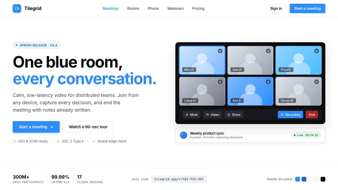
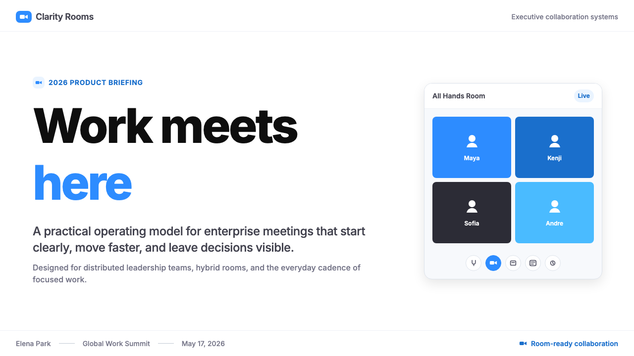
People-in-Grid Imagery网格人像图像
The signature visual motif of the Zoom brand is the grid of faces — a rectangular arrangement of equal-sized participant tiles that became the defining image of remote-era collaboration. In marketing contexts, product mockup photography always features this multi-person grid layout, showing warmly-lit, professionally diverse participants in clean home-office or conference-room environments. The grid tile is itself a design element: it crops the human face to a consistent size and shape, creating a repeatable visual module that is both deeply human and formally systematic.Zoom 品牌最具标志性的视觉母题是人脸网格——一种等尺寸参与者瓷砖的矩形排列,成为远程协作时代的定义性图像。在营销语境中,产品展示摄影总是呈现这种多人网格版式,展示在整洁的家庭办公室或会议室环境中、光线温暖、多元专业的参与者。网格瓷砖本身就是一个设计元素:它将人脸裁剪为统一的大小和形状,创造出一种既深刻人性化又形式系统化的可复用视觉模块。
Restrained Shadow and Elevation克制的阴影与层次
Depth and elevation in the Zoom system are handled with notable restraint. Card components, modals, and floating interface elements use very soft, low-spread shadows that suggest lift without dramatizing it. There are no hard-edged offset shadows, no heavy drop-shadows used for decorative effect, and no simulated three-dimensional surfaces. The result is an interface that feels clean and flat while still having enough spatial hierarchy for users to navigate complex layouts with confidence.Zoom 体系中的深度与层次处理极为克制。卡片组件、模态框和浮动界面元素使用非常柔和、扩散范围极小的阴影,暗示悬浮而不夸张。没有硬边偏移阴影,没有用于装饰效果的厚重投影,没有模拟三维表面。结果是一个感觉简洁平整的界面,同时保有足够的空间层级,让用户能够自信地浏览复杂版面。
Icon Economy图标经济性
Product iconography in the Zoom system follows a stroke-based line style — thin, consistent-weight outlines with rounded terminations that echo the corner language of the broader system. Icons are used functionally and sparingly: for navigation, status indication, and feature identification. They are never used decoratively to fill visual space, and they always appear at sizes where their meaning is unambiguous. The white camera silhouette in the brand mark is the canonical example: a single legible shape that works at any scale.Zoom 体系中的产品图标遵循基于笔触的线条风格——细而重量一致的轮廓线,带有圆形端点,呼应整个体系更宏观的圆角语言。图标的使用在功能上是必要的,且保持克制:用于导航、状态指示和功能识别。它们从不作为装饰性元素填充视觉空间,且总是以含义明确无误的尺寸呈现。品牌标志中的白色摄像机轮廓是典型示例:一个在任何尺寸下都清晰可辨的单一形状。
See the Zoom Meeting Blue design system查看 Zoom Meeting Blue 完整设计系统
Who shaped Zoom Meeting Blue?谁塑造了 Zoom Meeting Blue?
Yuan founded Zoom in 2011 after leaving Cisco, where he had been a key engineer on the WebEx platform. His founding conviction — that video conferencing should be simple enough that anyone could use it without training — drove the product's early design choices and ultimately its brand posture. The clarity and accessibility of the Zoom visual system reflect the same values that Yuan articulated for the product: approachable professional tools that work reliably and do not demand expertise from users. By 2020, Yuan had become one of the most prominent technology executives in the world, a status the brand's visual identity both supported and was shaped by.袁征于 2011 年离开思科后创立了 Zoom,此前他是 WebEx 平台的核心工程师。他的创业信念——视频会议应简单到任何人无需培训即可使用——驱动了产品早期的设计选择,并最终塑造了品牌的整体姿态。Zoom 视觉体系的清晰与易用性,折射出袁征为产品所阐明的同一套价值观:亲和、专业、可靠运行且不要求用户具备专业知识的工具。到 2020 年,袁征已成为全球最具知名度的科技高管之一,而品牌视觉形象既支撑了这一地位,也被它所塑造。
The visual codification of Zoom Meeting Blue as a systematic design language was carried out primarily by Zoom's internal brand and design team, working through the rapid growth of 2019–2021. Faced with the challenge of maintaining visual coherence across a product that was scaling faster than almost any software platform in history, the team produced a tightly defined design system: standardized component libraries, a constrained color palette, typographic rules, and photographic guidelines that could be applied consistently across product interfaces, marketing materials, and partner communications simultaneously.Zoom Meeting Blue 作为系统性设计语言的视觉规范化,主要由 Zoom 内部品牌与设计团队在 2019 至 2021 年的快速增长期间完成。面对以几乎历史上最快速度扩展的产品所带来的视觉一致性挑战,团队建立了一套严格定义的设计系统:标准化组件库、受约束的色板、字体排印规则,以及可同时一致应用于产品界面、营销素材和合作伙伴传播物的摄影指南。
As Zoom's Chief Marketing Officer during the peak growth years, Pelosi oversaw the brand's public-facing evolution at the moment of its greatest cultural impact. Under her leadership, the Zoom brand navigated the transition from respected enterprise software to a global household name — a shift that required the visual identity to become simultaneously more polished and more human. The warmth introduced into Zoom's marketing photography and the emphasis on the people-in-tiles motif as a symbol of connection rather than merely conferencing reflect brand strategic choices made during this period.作为 Zoom 峰值增长年间的首席营销官,佩洛西在品牌文化影响力最大的时刻主导了其面向公众的演变。在她的领导下,Zoom 品牌完成了从受人尊重的企业软件到全球家喻户晓名称的转型——这一转变要求视觉形象同时变得更精致、更人性化。Zoom 营销摄影中引入的温度感,以及将人脸瓷砖母题强调为连接象征而非单纯会议工具的做法,均折射出这一时期的品牌战略选择。
It would be incomplete to discuss the origins of Zoom Meeting Blue without acknowledging the role of the COVID-19 pandemic as a collective design author. The visual grammar of the platform — the cobalt header bar, the grid of face tiles, the raised-hand and muted-microphone icons — was exposed to and internalized by hundreds of millions of people in 2020, creating a shared visual vocabulary at a speed no marketing campaign could have achieved. The pandemic did not design the system, but it embedded it in global visual memory so deeply that the blue is now culturally legible as shorthand for online meeting regardless of context.讨论 Zoom Meeting Blue 的起源,若不承认新冠疫情作为集体设计作者的角色,则是不完整的。平台的视觉语法——钴蓝顶栏、人脸瓷砖网格、举手图标和静音麦克风图标——在 2020 年被数亿人接触并内化,以任何营销活动都无法企及的速度创造出一套共同的视觉词汇。疫情没有设计这套体系,但它将其深深嵌入了全球视觉记忆,使得这个蓝色如今无论在何种语境下都被文化性地解读为在线会议的代名词。
How do you use Zoom Meeting Blue today?今天怎么用 Zoom Meeting Blue?
Zoom Meeting Blue is one of the more practical corporate design languages to adapt for slide decks, both because its palette is already presentation-native and because its structural principles map directly onto the constraints of a slide canvas. For cover slides, the approach is straightforward: a deep cobalt background with reversed white type and the full-bleed confidence of a brand that knows exactly what it is. Alternatively, a white ground with a strong cobalt accent block on one edge creates the same authoritative feel at lower contrast cost. Avoid splitting the cover into symmetrical halves — the style reads better with visual weight concentrated asymmetrically.Zoom Meeting Blue 是最易移植到幻灯片演示的企业设计语言之一,原因在于它的色板本就是演示原生的,其结构原则也直接对应幻灯片画布的约束。封面页的方法直截了当:深钴蓝背景配反白字体,呈现出一个清楚知道自己是谁的品牌的满版自信。或者,白色底面配一侧强劲的钴蓝色块,以更低的对比成本达到同等的权威感。避免将封面切分为对称的两半——这套风格在视觉重量非对称集中时效果更佳。
Content slides in this system should feel open and scannable. Two-column layouts work well: a wider text column on one side, a narrower column for supporting data or callout quotes on the other, separated by generous space rather than a rule. Avoid packing more than three or four ideas per slide; the system's spaciousness is its main communicative asset and compressing it defeats the purpose. For data slides, charts and graphs should be rendered in the cobalt blue family — the primary hue for the leading data series, desaturated blue-grey tones for supporting series. Labels in clean, moderately-weighted sans-serif at a size that is readable from a projected distance.这套体系中的内容页应当感觉开放、易于扫描。双栏版面效果良好:一侧是较宽的文字栏,另一侧是用于辅助数据或引用语的较窄栏,以充裕的留白而非分割线隔开。避免每页塞入超过三四个概念;体系的开阔感是其主要的传播资产,压缩它会适得其反。数据页中,图表应以钴蓝色家族渲染——主色用于主要数据系列,去饱和的蓝灰色调用于辅助系列。标签使用简洁、适中字重的无衬线字体,字号应在投影距离下保持可读。
In web UI contexts, this style is particularly well-suited to dashboard interfaces and pricing or feature-comparison pages. The palette's clarity — high-contrast cobalt against white — makes primary calls to action immediately visible without requiring tricks of size or placement to draw attention. For dashboards, use the cobalt consistently for interactive states, selected states, and primary metrics; use the slate-grey register for secondary information and the white background for breathing room. Rounded card containers with subtle elevation create the characteristic Zoom-adjacent feel; avoid flat borderless cards, which remove the spatial structure that makes the style readable.在网页界面语境中,这种风格尤其适合仪表板界面以及定价或功能对比页面。色板的清晰度——高对比度的钴蓝与白色——使首要行动号召无需借助尺寸或位置技巧就能立即可见。对于仪表板,将钴蓝一致地用于交互状态、选中状态和主要指标;用石板灰系列表达次要信息,以白色背景提供呼吸空间。带有轻微高度感的圆角卡片容器营造出特有的 Zoom 邻近感;避免使用无边框平面卡片,那会消除使这套风格清晰可读的空间结构。
For editorial and marketing applications, the style's most powerful quality is its immediate recognizability. A marketing email, landing page, or social card that leads with the cobalt-on-white palette and the rounded-corner vocabulary will inherit associative equity from the platform's ubiquity — useful if the goal is to signal professional digital collaboration. The people-in-grid motif is available as an imagery strategy: a grid of diverse, warmly-lit participant portraits communicates inclusivity and connection at a glance. In editorial contexts, reserve the cobalt for section markers, pull quotes, and links; use it sparingly enough that each appearance carries emphasis.对于编辑与营销应用,这种风格最强大的特质是其即时可识别性。以钴蓝配白的色板和圆角词汇为主导的营销邮件、落地页或社交卡片,将继承这个平台无处不在所积累的联想价值——如果目标是传递专业数字协作的信号,这一点尤为有用。人脸网格母题可作为图像策略使用:一组多元、光线温暖的参与者肖像网格,一眼传达包容性与连结感。在编辑语境中,将钴蓝保留给段落标记、引文和链接;用得克制,使每次出现都承载强调的分量。
A common mistake when working in this style is over-applying the cobalt — treating it as a background color for large areas of a layout rather than as a foreground accent. In the authentic Zoom visual system, the dominant background is white, and the cobalt functions as a signal color: it marks the most important interactive element, the highest-priority information, or the primary brand moment. Covering large areas of a layout in cobalt dilutes that signaling function and produces something that reads as a generic corporate blue scheme rather than the precise, restrained system it references. Use the blue purposefully; let the white do the structural work.使用这种风格时最常见的错误是过度应用钴蓝——将它当作版面大面积区域的背景色,而非前景强调色。在真实的 Zoom 视觉体系中,主导背景是白色,钴蓝作为信号色发挥作用:标记最重要的交互元素、最高优先级的信息,或主要的品牌时刻。用钴蓝覆盖版面大面积区域会稀释这一信号功能,产生的结果读起来像通用企业蓝方案,而非它所参照的精准、克制的体系。有目的地使用蓝色;让白色承担结构性工作。
See the Zoom Meeting Blue design system查看 Zoom Meeting Blue 完整设计系统
Zoom Meeting Blue — FAQZoom Meeting Blue · 常见问题
Is Zoom Meeting Blue too closely associated with one company to use in other design contexts?Zoom Meeting Blue 与某一公司关联是否过于紧密,以至于难以用于其他设计语境?
The association is real but not necessarily limiting. Saturated cobalt on white with rounded corners is now broadly associated with digital-native professionalism and video-era collaboration, not exclusively with Zoom the company. Designers who apply this palette in adjacent contexts — productivity tools, enterprise SaaS, remote team culture materials — will benefit from the readability and trust equity the palette carries. The risk of confusion arises mainly when the full combination of the dominant cobalt, the rounded-square icon format, and the people-in-grid photography is assembled together. Using two of the three elements without the third gives you the palette's authority without the brand confusion.这种关联是真实存在的,但不一定是限制性的。白底饱和钴蓝配圆角如今已广泛与数字原生专业感和视频协作时代相联系,而非专属于 Zoom 这家公司。在相邻语境中应用这套色板的设计师——生产力工具、企业 SaaS、远程团队文化素材——将受益于色板所承载的可读性和信任价值。混淆风险主要出现在主导钴蓝、圆角方块图标格式和人脸网格摄影三者完整组合在一起时。使用三个元素中的两个而省略第三个,可以获得色板的权威感而不产生品牌混淆。
How does Zoom Meeting Blue differ from other tech-company blues?Zoom Meeting Blue 与其他科技公司的蓝色有何区别?
The critical difference is saturation and warmth. Legacy enterprise blues — the IBM family, the Oracle and SAP tones — tend toward muted, slightly desaturated values that read as sober and institutional. Social media blues — the Facebook and Twitter family — are often mid-range and comparatively flat. Zoom's cobalt is distinctly brighter and more saturated than either, with enough luminosity to function as an action color on a pure white background without needing a darker shade for contrast. This energy is what gives it its contemporary feeling; it belongs to the same visual generation as the bright, saturated interface palettes of mid-2010s mobile design.关键差异在于饱和度和温度。传统企业蓝——IBM 家族、Oracle 和 SAP 的色调——倾向于哑光、略微去饱和的值,读起来稳重而机构化。社交媒体蓝——Facebook 和 Twitter 家族——通常处于中段且相对平淡。Zoom 的钴蓝比两者都明显更亮、更饱和,有足够的明度在纯白背景上作为行动色发挥作用,无需更深的色调来提供对比。这种能量赋予了它当代感;它属于 2010 年代中期移动设计明亮、饱和界面色板的同一视觉世代。
Can this style work for a dark-mode interface?这种风格能用于深色模式界面吗?
Yes, but it requires a deliberate inversion strategy. The canonical Zoom palette is a light-mode system — its clarity depends on the cobalt reading as a foreground color against a white or near-white background. In dark mode, that relationship must be rethought: the cobalt works well as an accent against a very dark, near-black slate background, but it should not fill large areas, since at high saturation over dark grounds it can vibrate visually and become fatiguing. A dark-mode version of this style works best with a very dark background, a slightly desaturated tint of the cobalt for large interactive elements, and the full-saturation cobalt reserved for the single most important call to action per screen.可以,但需要一套刻意的反转策略。标准 Zoom 色板是浅色模式体系——其清晰度依赖于钴蓝作为前景色在白色或近白背景上的呈现。在深色模式中,这种关系必须重新思考:钴蓝在极深的近黑石板灰背景上作为强调色效果良好,但不应占据大面积区域,因为高饱和度在深色底面上可能产生视觉震动并令人疲劳。这种风格的深色模式版本最适合:极深的背景色,对大型交互元素使用略微去饱和的钴蓝变体,将完全饱和的钴蓝保留给每个屏幕中最重要的单一行动号召。
What kinds of products is Zoom Meeting Blue not right for?哪些类型的产品不适合使用 Zoom Meeting Blue?
The style is a poor fit for contexts where warmth, playfulness, sensory richness, or cultural tradition are the primary design values. Consumer wellness apps, children's educational platforms, food and hospitality brands, cultural institutions, and artisan or craft-focused products all require visual vocabularies that the Zoom system's rationalism actively works against. The palette is also poorly suited to luxury contexts, where the understated authority expected of premium brands reads as austere rather than refined when expressed in saturated cobalt. The style is most useful when the product's primary message is capability, clarity, and modern professionalism — and weakest when the message is pleasure, indulgence, or heritage.这种风格不适合以温暖感、趣味性、感官丰富性或文化传统为主要设计价值的语境。消费者健康应用、儿童教育平台、食品与酒店品牌、文化机构,以及手工艺或工匠导向的产品,都需要 Zoom 体系的理性主义所主动抵制的视觉词汇。这套色板也不适合奢侈品语境——在那里,高端品牌所期待的含蓄权威,用饱和钴蓝表达出来会读作朴素而非精炼。这种风格在产品主要信息是能力、清晰度和现代专业感时最为有用,在信息是愉悦、放纵或传承时则最为薄弱。
How should Zoom Meeting Blue handle illustration?Zoom Meeting Blue 风格下应如何处理插画?
The Zoom brand's illustrative language favors clean, flat, geometric character illustrations with limited palette — primarily the cobalt blue, white, and the supporting neutral tones, with occasional use of warm skin-tone ranges for human figures. Illustration is used primarily to explain product concepts or represent abstract ideas like security, collaboration, or connectivity, rather than to create emotional narrative or aesthetic richness. Line weights are consistent; shading is minimal or entirely absent; characters are simplified to readable silhouettes rather than naturalistic figures. The guiding principle is the same as the broader system: illustration should clarify, not decorate.Zoom 品牌的插画语言偏好简洁、平面、几何化的人物插图,配以有限的色板——主要是钴蓝、白色和辅助中性色调,偶尔为人物形象使用温暖的肤色系列。插画主要用于解释产品概念或呈现安全、协作、连结等抽象概念,而非创造情感叙事或审美丰富性。线条粗细一致;阴影处理极简或完全缺席;人物简化为可辨认的轮廓形态,而非写实人物。指导原则与整个体系相同:插画应当澄清,而非装饰。
Related design styles相关设计风格
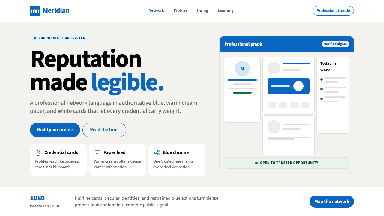 LinkedInCorporate trust, digitized. Authoritative blue frames white cards on warm cre…企业信任数字化:权威蓝框住暖奶油纸面上的白卡。
 Android Bugdroid GreenFriendly tech, reduced to geometry. Vivid green pops from Grey 900 and rounde…友好科技化为几何:明绿从 Grey 900 与圆润字形中跃出。
 AsanaCalm productivity breathes. Cream canvas, lavender panels, coral-blue-yellow…安静生产力会呼吸:奶油画布、薰衣草面板与三色圆点。
 GitLab 2023DevOps in daylight. Tanuki orange-to-purple gradient, Inter, warm enough for…DevOps 走出暗色房间:标志性狸猫橙紫渐变、宽松行高、Inter 字体——…
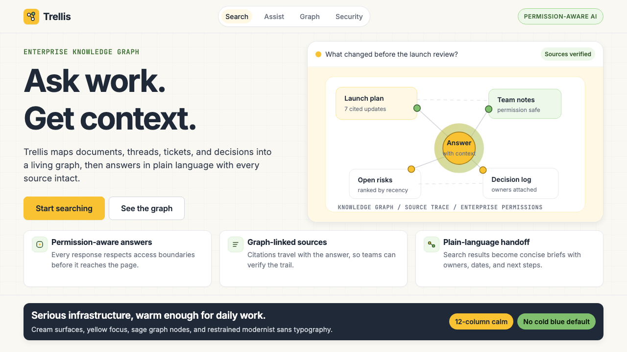 Glean Enterprise-SearchWarm enterprise AI. Cream ground, yellow focus, sage graph nodes, and sans ca…温暖的企业 AI:奶油底、黄焦点、鼠尾草节点与无衬线克制。
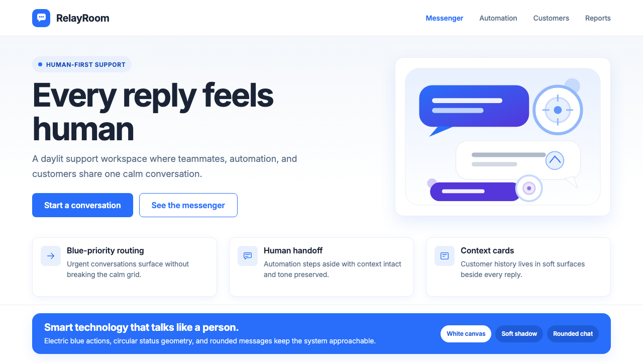 Intercom ModernWarm chat, sharp software. Electric blue bubbles on a daylit white grid.温暖对话,清晰软件。日光白网格托起电光蓝气泡。