What is Apple Liquid Glass 2024?什么是 Apple Liquid Glass 2024?
After a decade of flat design, Apple's Liquid Glass gives depth back its design rights — translucent panels that breathe, shift, and glow as if cut from living crystal.告别十年扁平化,苹果液态玻璃将深度重新还给设计——那些会呼吸、随视角流动、如同活晶体切割而成的半透明面板。
Apple Liquid Glass 2024 in briefApple Liquid Glass 2024 速览
Apple Liquid Glass is the visual design language Apple introduced alongside visionOS and the Apple Vision Pro, first announced in 2023 and shipping in February 2024. At its core, it is a system of translucent, layered surfaces — panels that appear to be made from frosted or polished glass, floating at distinct depths in three-dimensional space. Unlike flat design, which treats the screen as a single plane, Liquid Glass treats the screen as a volume: surfaces stack, light passes through them, and the world behind each panel shimmers and blurs in ways that communicate hierarchy without requiring hard borders or heavy drop shadows.苹果液态玻璃(Apple Liquid Glass)是苹果为 visionOS 和 Apple Vision Pro 构建的视觉设计语言,随 2023 年的发布会亮相,并于 2024 年 2 月正式随设备推出。其核心是一套半透明、多层叠加的界面系统——面板看起来仿佛由磨砂玻璃或抛光水晶制成,在三维空间中以不同深度悬浮。与将屏幕视为单一平面的扁平化设计不同,液态玻璃将屏幕视为一个体积:界面层层叠加,光线穿透其中,每个面板后方的世界以微妙的模糊与闪光方式呈现——无需硬边框或厚重阴影,便已传达出清晰的层级关系。
The aesthetic draws on several convergent influences: Apple's own heritage of translucent and material surfaces stretching back to the candy-gloss Aqua interface of Mac OS X; the glassmorphism trend that swept digital design in the early 2020s; and the visual grammar of cinematic science-fiction interfaces, where floating holographic panels suggest technology that has transcended the physical page. What distinguishes Liquid Glass from generic glassmorphism is its precision and restraint — the backdrop blur is calibrated, the specular highlights move with perspective in a physically plausible way, and the tinting draws from the surrounding environment rather than from a fixed palette.这套美学汇聚了多重影响:苹果自身从 Mac OS X 晶莹剔透的 Aqua 界面延续至今的半透明与材质化传统;2020 年代初席卷数字设计领域的玻璃拟态(glassmorphism)浪潮;以及科幻电影界面的视觉语法——那些悬浮的全息面板暗示着超越物理介质的技术感。液态玻璃区别于普通玻璃拟态的,是其精准与克制:背景模糊经过严格校准,高光反射随视角以物理上可信的方式流动,色调从周围环境中提取而非来自固定色板。
The result is a design vocabulary where surface itself carries meaning. A panel that lets background content show through is signaling its secondary role; a panel that catches a bright specular highlight is announcing a focal point. Depth is not decoration — it is structure. This makes Liquid Glass one of the first mainstream digital design languages to treat the third dimension as a first-class organizational tool rather than a cosmetic flourish applied on top of a flat layout.最终呈现的是一套以界面表面本身作为意义载体的设计语言。一个让背景内容透过的面板在表达自身的次要地位;一个捕捉到明亮高光的面板在宣告焦点所在。深度不是装饰——它是结构。这使液态玻璃成为首批将三维空间作为一等组织工具而非叠加于扁平布局之上的装饰点缀来对待的主流数字设计语言之一。
See the Apple Liquid Glass 2024 design system查看 Apple Liquid Glass 2024 完整设计系统
Where does Apple Liquid Glass 2024 come from?Apple Liquid Glass 2024 从何而来?
The seeds of Liquid Glass were planted long before visionOS. The original Mac OS X Aqua interface, unveiled by Steve Jobs in 2000, introduced digital surfaces that mimicked polished candy and gel — buttons that appeared to have volume, toolbars with visible reflections, a dock that turned surfaces into mirrors. This was unapologetically skeuomorphic: the screen imitated physical materials because that imitation helped users orient themselves in a new paradigm. For over a decade, increasing craft and realism defined Apple's design language.液态玻璃的种子早在 visionOS 出现之前便已埋下。2000 年史蒂夫·乔布斯发布的 Mac OS X Aqua 界面,首次将模仿抛光糖果与凝胶质感的数字表面带入大众视野——按钮具有体积感,工具栏可见反光,Dock 将界面元素变为镜面。这是一种毫无歉意的拟物化:屏幕模仿物理材质,因为这种模仿帮助用户在全新的操作范式中找到方向。此后超过十年,日益精湛的工艺与拟真感定义了苹果的设计语言。
iOS 7 in 2013 reversed that trajectory. Under the design leadership that followed the departure of Scott Forstall, Apple stripped its interfaces back to flat, light, and typographically spare. Color became the organizing tool; depth and material simulation were treated as visual noise. For ten years, this paradigm held across iOS, macOS, and watchOS. The frosted glass effect survived in limited form — Notification Center panels, Control Center overlays, the macOS menu bar — but it was a footnote, not a philosophy.2013 年的 iOS 7 扭转了这一轨迹。在 Scott Forstall 离开后接手的设计领导层将界面剥离至扁平、轻盈、字体为核心的风格。色彩成为组织工具;深度感与材质模拟被视为视觉噪音。这一范式在此后十年间贯穿 iOS、macOS 与 watchOS。磨砂玻璃效果以有限形式留存——通知中心面板、控制中心叠层、macOS 菜单栏——但它只是脚注,而非哲学。
The spatial computing project that became Apple Vision Pro changed the equation fundamentally. A headset worn in the real world cannot use opaque colored panels without occluding the user's physical environment. Surfaces need to be transparent or translucent so that the wearer can still perceive the room around them. This was not purely an aesthetic preference — it was an ergonomic and safety requirement. From that constraint, a new material logic emerged: glass became the default surface not because it looked premium, but because it was the only honest material for a device that sits between the user and the world.后来演变为 Apple Vision Pro 的空间计算项目从根本上改变了这一方程式。一台穿戴于现实世界中的头显设备,无法使用不透明的彩色面板,否则会遮蔽用户的物理环境。界面表面需要透明或半透明,才能让佩戴者仍然感知周围的房间。这不纯粹是美学偏好——它是人体工程学和安全层面的需求。在这一约束之下,一种新的材质逻辑应运而生:玻璃成为默认界面材质,不是因为它看起来高端,而是因为它是唯一诚实的材质——对于一台介于用户与世界之间的设备而言。
The Human Interface team at Apple, led by Alan Dye, developed the Liquid Glass system through visionOS 1.0, refining the physics of how virtual surfaces catch light, how they tint based on the content behind them, and how specular highlights shift as the user's head moves. The language draws explicitly on architectural glass — the way a glass facade on a modern building reads differently at morning versus dusk, reflecting the sky while letting interior light leak through. By the time visionOS shipped publicly in February 2024, Liquid Glass had been polished into a coherent design system with its own rules for layering, tinting, blur radius, and the treatment of content that falls behind a translucent surface.苹果人机界面团队在 Alan Dye 的带领下,通过 visionOS 1.0 的开发历程完善了液态玻璃系统,精炼了虚拟界面捕捉光线的物理规律、基于背后内容进行色调调整的方式,以及随用户头部移动而变化的高光反射逻辑。这套设计语言明确地向建筑玻璃取经——现代建筑的玻璃幕墙在清晨与黄昏呈现出截然不同的面貌,既映照天空又让室内光线渗透而出。到 visionOS 于 2024 年 2 月正式公开发售时,液态玻璃已被打磨为一套连贯的设计系统,拥有属于自己的层叠、着色、模糊程度与透明界面后方内容处理规则。
What defines the Apple Liquid Glass 2024 look?Apple Liquid Glass 2024 的视觉特征是什么?
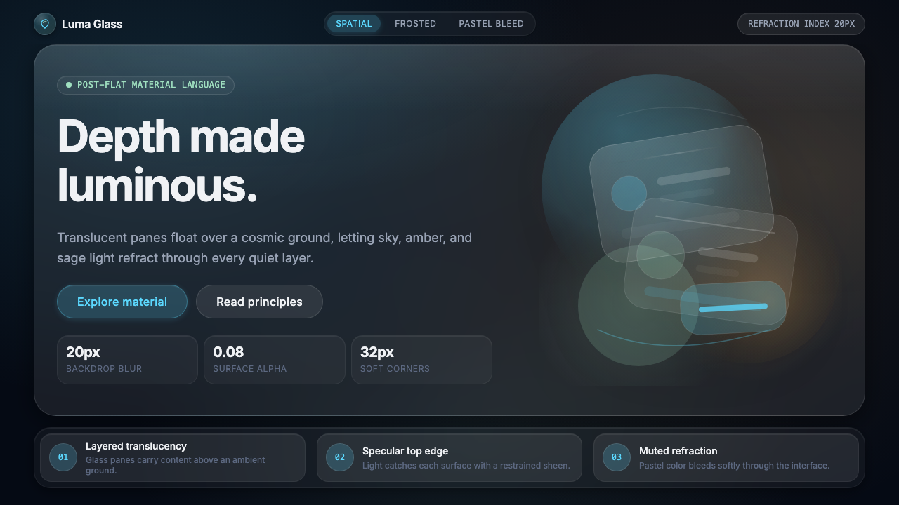
Translucent Surface半透明界面层
The defining material of Liquid Glass is a surface that is neither fully opaque nor fully transparent. It reads as frosted or polished glass — content behind it is visible but softened, the way a face is readable through a pebbled shower screen. The degree of translucency is not uniform across a design; it varies by layer and by the semantic role of each panel. A primary content surface is closer to opaque; a supplemental overlay is closer to transparent. This gradient of opacity communicates hierarchy without requiring color-coded borders.液态玻璃的标志性材质是一种既非完全不透明也非完全透明的界面层。它呈现为磨砂或抛光玻璃的质感——后方内容清晰可见却经过柔化,如同隔着磨砂玻璃看清一张面孔。透明度并非在整个设计中保持一致,而是依据层级与每个面板的语义角色而变化。主要内容层更接近不透明;辅助叠层更接近透明。这种不透明度的渐变在无需彩色边框的情况下传达出清晰的层级关系。
Backdrop Blur背景模糊
Every Liquid Glass panel blurs the content behind it in a manner calibrated to the panel's position in the layer stack. The blur is not applied uniformly — it respects the luminance and saturation of what lies beneath, brightening slightly against dark backgrounds and tinting faintly against vivid ones. The effect is that each panel feels physically real: you instinctively understand that something is behind it and at a different depth, the way you understand there is a street behind a rain-streaked window.每一个液态玻璃面板都会对其后方内容施加模糊效果,模糊程度根据面板在层叠结构中的位置精心校准。这种模糊并非均匀施加——它会感知下方内容的亮度与饱和度,在深色背景上略微提亮,在鲜艳背景上微微染色。效果是每个面板都给人一种物理上真实的感受:你会本能地理解它后方有内容、且处于不同深度,就像你透过雨滴划过的车窗本能地感知到窗外的街道。
Specular Highlights镜面高光
The most distinctive signature of Liquid Glass is the specular highlight — a bright, narrow band of reflected light that appears along one or two edges of a panel, as if catching light from a distant source. Unlike the gradient-style inner glow of skeuomorphic design, Liquid Glass highlights are physically motivated: they shift in position and intensity as the user's viewing angle changes, using the device's motion sensors and eye-tracking to update the reflection in real time. This makes each surface feel alive and responsive rather than painted.液态玻璃最具标志性的特征是镜面高光——一道明亮而细窄的反光带,出现在面板的一或两条边缘,仿佛捕捉到远处光源的反射。不同于拟物化设计中渐变风格的内部发光,液态玻璃的高光有其物理依据:它的位置与强度随用户视角的变化而偏移,利用设备的运动传感器与眼动追踪实时更新反射状态。这让每个界面表面都充满生命感与回应感,而非仅仅是被绘制出来的效果。
Environmental Tinting环境色调取样
Liquid Glass panels are not neutral in color — they tint subtly based on the content they sit above or the environment the device is operating in. A panel floating over a warm sunset photograph picks up a trace of amber; one sitting above a blue gradient acquires a cool undertone. This environmental tinting is gentle enough that it does not overwhelm the panel's readability, but strong enough that the interface feels organically connected to its context rather than pasted on top of it.液态玻璃面板在色彩上并非中性——它们会根据下方的内容或设备所处的环境进行微妙的色调采样。一个悬浮于暖色夕阳照片之上的面板会带上一丝琥珀色;置于蓝色渐变之上的面板则会带有冷调的底色。这种环境色调足够柔和,不会损害面板的可读性,却足以让界面与所在情境产生有机的联结感,而非显得生硬叠加。
Depth Layering深度分层
The Liquid Glass system articulates space through explicit depth layers rather than through color contrast or border weight. Primary content panels sit closest to the viewer; contextual overlays recede; background surfaces anchor the scene. Each layer has a consistent visual treatment — degree of blur, intensity of highlight, thickness of tinting — so that viewers learn to read depth intuitively after brief exposure. This layering system replaces the two-dimensional hierarchy of flat design with a three-dimensional hierarchy that matches the intuitions we carry from the physical world.液态玻璃系统通过明确的深度层级而非色彩对比或边框粗细来表达空间关系。主要内容面板距观察者最近;上下文叠层向后退远;背景界面层锚定整个场景。每一层都有一致的视觉处理方式——模糊程度、高光强度、色调浓淡——使观察者在短暂接触后便能本能地读懂深度信息。这套分层系统以三维层级取代了扁平设计的二维层级,与我们从物理世界中携带的直觉认知相符。
Restrained Color克制的色彩运用
Despite the richness of its material effects, Liquid Glass uses color with considerable restraint. The glass surfaces themselves are largely achromatic — their tinting is borrowed from context rather than asserted from a fixed palette. Intentional color is reserved for interactive elements, status indicators, and brand accents, and even there it tends toward muted pastels rather than saturated primaries. The overall effect is that color feels earned and meaningful rather than decorative, because the glass material handles ambient warmth and coolness while discrete color marks deliberate intent.尽管材质效果丰富,液态玻璃在色彩运用上却相当克制。玻璃界面本身基本保持无彩色状态——其色调从情境中借用,而非从固定色板中强加。有意为之的色彩被保留给可交互元素、状态指示器和品牌强调色,即便在这些场合也倾向于使用柔和的粉彩色调而非饱和的原色。整体效果是色彩显得珍贵而有意义,而非装饰性存在——因为玻璃材质自身承担了环境冷暖感的传递,而离散的色彩标记着刻意的意图。
Motion and Physics运动与物理感
Liquid Glass is inseparable from animation. Panels enter and exit with a spring-physics quality — they do not simply appear or fade, they seem to settle into place as if they have mass and momentum. When a panel is dismissed, it collapses inward with the compliance of real glass retracting rather than a flat shape scaling to zero. Transitions between states respect the direction of spatial depth: a new panel emerges from behind, a dismissed one retreats into the layer beneath. Motion is not decorative in this system — it communicates the logic of the spatial model.液态玻璃与动画密不可分。面板的出入遵循弹簧物理特性——它们不是简单地出现或淡入淡出,而是仿佛具有质量与动量地稳稳落定。面板被关闭时,它以真实玻璃收缩的顺从性向内收拢,而非一个扁平形状单纯地缩至消失。状态之间的过渡遵循空间深度的方向逻辑:新面板从后方浮现而来,被关闭的面板向下层退去。在这套系统中,运动不是装饰——它传达的是空间模型的内在逻辑。
See the Apple Liquid Glass 2024 design system查看 Apple Liquid Glass 2024 完整设计系统
Who shaped Apple Liquid Glass 2024?谁塑造了 Apple Liquid Glass 2024?
Alan Dye has served as Apple's Vice President of Human Interface Design since 2014, overseeing the design evolution from iOS 7's flat language through the material refinements of subsequent years and ultimately to the Liquid Glass system for visionOS. His team's challenge with Liquid Glass was unlike any previous Apple design project: the constraints of a spatial operating system demanded that the entire visual grammar be reconceived around the properties of transparent and semi-transparent surfaces, motion-responsive highlights, and the relationship between digital panels and the physical room behind them. Dye's fingerprints are most visible in the discipline of the system — the way Liquid Glass achieves optical richness while maintaining the legibility that has always defined Apple's approach to interface design.Alan Dye 自 2014 年起担任苹果人机界面设计副总裁,主导了从 iOS 7 扁平化语言,经由此后数年的材质精炼,直至 visionOS 液态玻璃系统的设计演进历程。液态玻璃对他团队的挑战是前所未有的:空间操作系统的约束要求以透明与半透明界面的属性、对运动的高光回应,以及数字面板与其后方物理空间的关系,为整套视觉语法重新奠基。Dye 的烙印在系统的自律性上最为清晰可见——液态玻璃在实现丰富光学效果的同时,维持了始终定义苹果界面设计方式的清晰可读性。
The Apple Human Interface Team is the design organization responsible for the visual and interaction languages of all Apple operating systems. For Liquid Glass, the team's work extended beyond visual specifications into physics simulation — defining how virtual glass surfaces should catch and reflect light, how they should respond to the user's head position via the Vision Pro's sensors, and how they should tint based on the environment. The team also solved the challenge of making Liquid Glass accessible: a surface that communicates through translucency rather than solid color required rethinking contrast and legibility standards for users with visual impairments.苹果人机界面团队是负责苹果所有操作系统视觉与交互语言的设计组织。在液态玻璃项目中,团队的工作延伸至视觉规范之外,深入物理模拟领域——定义虚拟玻璃界面应如何捕捉和反射光线,如何通过 Vision Pro 的传感器响应用户的头部位置,以及如何根据环境进行色调调整。团队还解决了使液态玻璃具备无障碍可访问性的挑战:一种通过半透明而非实心颜色传达信息的界面,需要为视觉障碍用户重新思考对比度与可读性标准。
Though Jony Ive left Apple in 2019, four years before the Vision Pro announcement, his design philosophy casts a long shadow over Liquid Glass. During his tenure, Ive was responsible for both the skeuomorphic peak of early iOS and the flat revolution of iOS 7 — he presided over both poles of the design pendulum that Liquid Glass now swings between. His insistence on materials that are honest to their nature and his attention to how light interacts with physical objects provide the philosophical and aesthetic DNA that Liquid Glass inherits. The way Liquid Glass panels catch light is, in a meaningful sense, a digital expression of the same sensibility that chose aluminum and glass for the iPhone's physical body.尽管 Jony Ive 于 2019 年离开苹果,早于 Vision Pro 发布会整整四年,但他的设计哲学在液态玻璃上留下了深远的影子。在其任期内,Ive 既主导了早期 iOS 拟物化的巅峰时期,也推动了 iOS 7 的扁平化革命——他执掌了液态玻璃所处设计钟摆的两个极端。他对材质诚实性的坚持,以及对光线与物理对象互动方式的敏锐关注,构成了液态玻璃所继承的哲学与美学基因。液态玻璃面板捕捉光线的方式,在某种深刻的意义上,是为 iPhone 实体选择铝与玻璃的同一设计感性的数字表达。
The visionOS platform engineering team worked in close collaboration with the Human Interface designers to translate Liquid Glass from a visual concept into a technical reality. The system's most distinctive behaviors — perspective-correct specular highlights that update at display refresh rates, blur effects that adapt to the luminance of content below, panels that tint from environmental light — required novel rendering solutions. The platform team's work established the foundational APIs and rendering primitives that allow third-party developers to build applications that feel native to the Liquid Glass environment, rather than flat windows awkwardly imported into spatial space.visionOS 平台工程团队与人机界面设计师紧密协作,将液态玻璃从视觉概念转化为技术现实。系统最具标志性的行为——以显示刷新率更新的透视校正镜面高光、适应下方内容亮度的模糊效果、从环境光中取色的面板——均需要全新的渲染解决方案。平台团队的工作建立了基础 API 和渲染原语,使第三方开发者能够构建在液态玻璃环境中感觉原生自然的应用,而非将扁平窗口笨拙地导入空间计算场景中。
How do you use Apple Liquid Glass 2024 today?今天怎么用 Apple Liquid Glass 2024?
Liquid Glass is most natural when applied to design work that lives in layered, depth-rich contexts — spatial interfaces, floating overlay panels, hero sections with vivid background imagery, and any situation where the viewer needs to parse multiple information layers simultaneously. The key principle is that glass surfaces earn their translucency: a panel should be transparent because the content beneath is relevant context, not as mere aesthetic texture. When every surface in a design is translucent, the depth hierarchy collapses and the visual system loses its organizing power.液态玻璃最自然地适用于多层叠加、富有深度感的设计场景——空间界面、浮动叠层面板、搭配鲜明背景图像的主视觉区域,以及任何需要观察者同时解析多个信息层的情境。核心原则是玻璃界面的半透明性应有其意义:一个面板之所以透明,是因为其下方的内容是相关情境,而非单纯作为美学肌理。当设计中每个界面都是半透明的,深度层级便随之坍塌,视觉系统也将失去其组织能力。
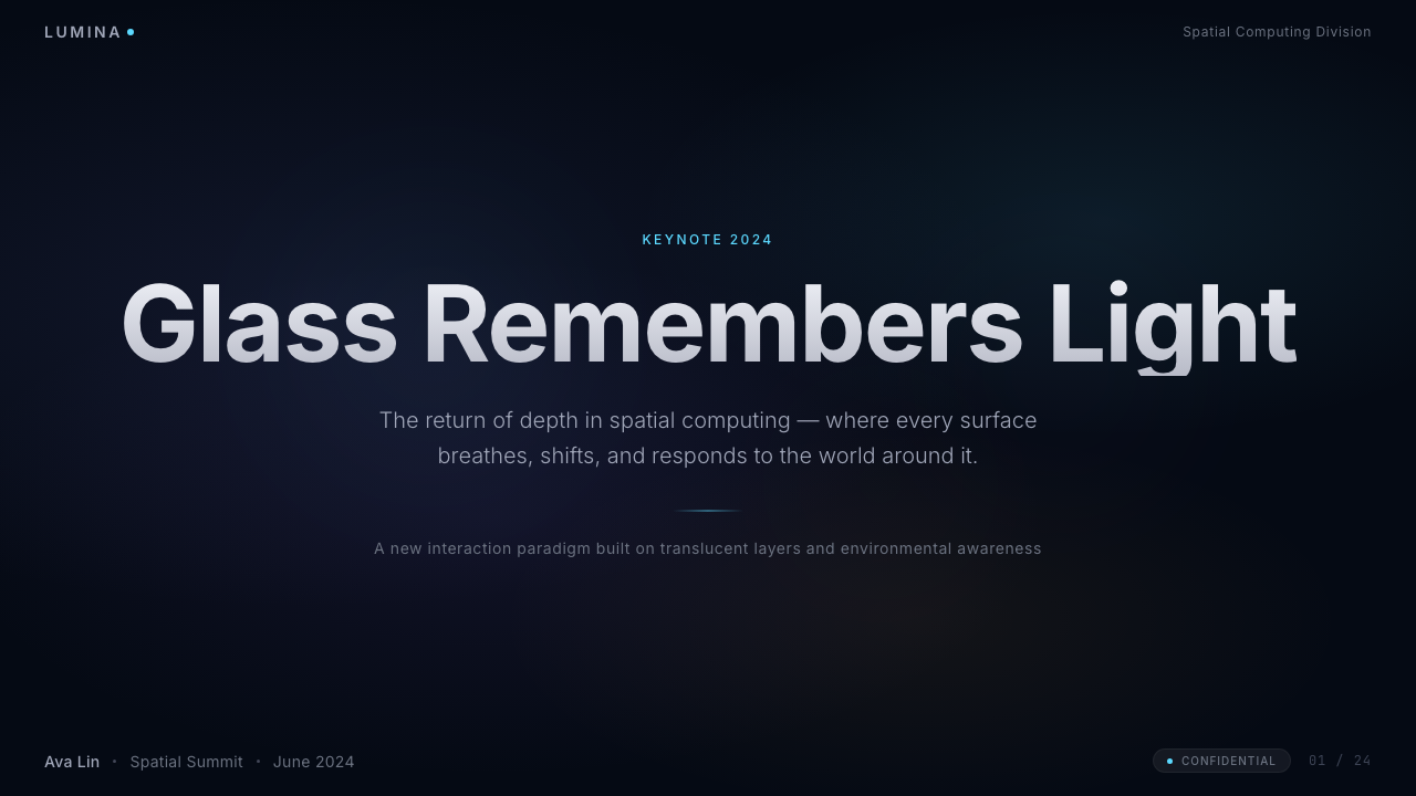
For presentation slides, Liquid Glass works particularly well on cover and transition pages where a single bold image or gradient serves as the backdrop. A frosted panel carrying the title floats above the background, catching a thin specular highlight along its upper edge and letting the image show through with just enough blur to ensure legibility. Content slides should resist the urge to glass every element — instead, reserve the translucent panel treatment for callouts, data annotations, and supplemental information that genuinely sits above the primary layer. Data slides benefit from the depth system: a primary chart occupies the foreground surface while axis labels and annotations appear on a slightly recessed, lighter glass layer behind it.在演示文稿中,液态玻璃特别适合以单一大图或渐变作为背景的封面页与转场页。一个承载标题的磨砂面板悬浮于背景之上,沿上边缘捕捉一道细窄的镜面高光,让图像以恰到好处的模糊程度透过,确保文字可读性。内容页应抵制将每个元素都玻璃化的冲动——而是将半透明面板处理保留给引用语、数据注释,以及真正在主层之上的补充信息。数据页面受益于深度系统:主图表占据前景界面层,坐标轴标签与注释则出现在略微后退、更轻盈的玻璃层之上。
For web interface design — dashboards, pricing pages, product carousels — Liquid Glass introduces a hierarchy that color alone cannot achieve. A navigation bar that blurs the page content behind it communicates its permanent, top-layer status without requiring a heavy solid background. Card components with a light frosted treatment distinguish themselves from the page surface without needing hard drop shadows. Modal dialogs and drawer panels gain their overlay meaning from translucency rather than from dimming overlays. The system works best when backgrounds are rich — vivid gradients, high-quality photography, or dense data visualizations — because the glass has something interesting to refract.对于网页界面设计——仪表板、定价页、产品卡片展示——液态玻璃引入了单纯依靠颜色无法实现的层级感。一条将其后方页面内容模糊化的导航栏,无需深色实心背景便能传达自身常驻最顶层的地位。带有轻度磨砂处理的卡片组件无需硬阴影便与页面背景区分开来。模态对话框与抽屉面板通过半透明性而非遮罩灰化来表达其叠层含义。这套系统在背景内容丰富时效果最佳——鲜艳的渐变、高质量摄影或密集的数据可视化——因为玻璃有值得折射的素材。
In editorial and marketing contexts, Liquid Glass is well-suited to hero sections and feature callouts where depth and dimensionality signal premium quality. A marketing page might use a full-bleed video or animated gradient as its backdrop, with product descriptions and calls to action carried on floating glass panels that shift in blur and highlight as the user scrolls. The style also translates effectively to social card design and digital out-of-home: a vibrant background paired with a luminous frosted text panel reads immediately as a contemporary, high-production aesthetic.在编辑与营销场景中,液态玻璃尤其适合主视觉区域与特性展示模块,在这些场景中深度与立体感传递出高端品质感。一个营销页面可以将全幅视频或动态渐变作为背景,将产品描述与行动号召承载于浮动的玻璃面板之上,随用户滚动时面板的模糊度与高光发生微妙变化。这种风格在社交卡片设计与数字户外广告中同样传达有力:鲜明背景搭配明亮磨砂文字面板,会被第一时间识别为当代高制作水准的美学风格。
The most common mistake when applying Liquid Glass is treating it as a filter — simply adding blur and transparency to every surface regardless of whether depth is doing any organizational work. The result is a design that looks foggy rather than layered, where nothing reads as having a clear depth position. A related mistake is neglecting the specular highlight: without that thin bright edge catching light on one or two sides of a panel, a blurred transparent rectangle is just a tinted box with reduced contrast, not a glass surface. Liquid Glass requires committing to the full material logic — blur, tint, highlight, and physics-aware motion — or it reads as an incomplete gesture rather than a coherent design language.应用液态玻璃时最常见的错误,是将其当作滤镜使用——无论深度是否在发挥组织作用,都为每个界面叠加模糊与透明度。结果是设计看起来雾蒙蒙而非层次分明,没有任何元素显示出清晰的深度位置。一个相关的错误是忽略镜面高光:没有那道细窄的亮边在面板一两条边上捕捉光线,一个模糊的透明矩形不过是一个对比度降低的着色方框,而非玻璃界面。液态玻璃需要完整地承诺这套材质逻辑——模糊、色调、高光与物理感知的动效——否则它只会被读作一个未完成的姿态,而非连贯的设计语言。
See the Apple Liquid Glass 2024 design system查看 Apple Liquid Glass 2024 完整设计系统
Apple Liquid Glass 2024 — FAQApple Liquid Glass 2024 · 常见问题
Is Liquid Glass the same as glassmorphism?液态玻璃和玻璃拟态是同一回事吗?
They share a common vocabulary — both use translucency, backdrop blur, and light-colored strokes on panel edges — but Liquid Glass is more precisely specified and physically motivated. Glassmorphism as a trend was largely decorative: blur and transparency applied as aesthetic choices with arbitrary settings. Liquid Glass adds perspective-correct specular highlights that update with viewing angle, environmental tinting derived from real content rather than fixed palette choices, and a physics layer governing how panels enter, exit, and transition through space. Think of glassmorphism as the visual approximation and Liquid Glass as the fully engineered material system beneath it.两者共享相似的视觉词汇——都使用了半透明、背景模糊以及面板边缘的浅色描边——但液态玻璃的规范更为精确,且有物理依据。玻璃拟态作为一种设计趋势,在很大程度上是装饰性的:以任意参数将模糊和透明度作为美学选择叠加。液态玻璃在此之上增加了随视角更新的透视校正镜面高光、从真实内容而非固定色板中取样的环境色调,以及支配面板出入与空间过渡的物理层。可以这样理解:玻璃拟态是视觉上的近似,液态玻璃则是其背后经过完整工程化的材质系统。
Can Liquid Glass work in contexts without spatial computing hardware?液态玻璃能在没有空间计算硬件的场景中使用吗?
Yes, and it already does. Apple began bringing Liquid Glass principles into iOS and macOS in the years following visionOS's launch, applying the translucent surface treatment to elements like the Dynamic Island, Control Center panels, and widget overlays. On a flat screen, the perspective-shifting specular highlight is approximated through static positioning rather than real-time sensor input, and the environmental tinting responds to on-screen content rather than the physical room. The system loses some of its interactivity but retains its organizational logic — depth through translucency continues to work as a hierarchy signal regardless of the display technology.可以,而且已经在发生。苹果在 visionOS 发布后的数年间开始将液态玻璃原则引入 iOS 和 macOS,将半透明界面处理应用于灵动岛、控制中心面板和小组件叠层等元素。在平面屏幕上,随透视变化的镜面高光通过静态位置来近似模拟,而非依靠实时传感器输入;环境色调则响应屏幕上的内容而非物理房间的光线。系统因此失去了部分交互特性,但保留了其组织逻辑——通过半透明传达的深度感无论在何种显示技术下都持续发挥着层级信号的作用。
How should text be handled on a Liquid Glass surface to ensure readability?在液态玻璃界面上应如何处理文字以保证可读性?
Text on glass presents a genuine legibility challenge because the background content behind the panel is variable and sometimes high-contrast. Liquid Glass addresses this through a combination of approaches: the blur beneath the panel removes high-frequency detail that would compete with letterforms; the slight brightening or darkening of the glass surface relative to its backdrop adds a contrast buffer; and for critical text — primary labels, call-to-action copy, data values — a secondary shadow or a very slight matte treatment behind the text block is permissible. Where Liquid Glass designs fail on legibility, it is usually because the blur radius is insufficient or the panel's opacity has been reduced too aggressively in pursuit of visual transparency.玻璃界面上的文字面临真实的可读性挑战,因为面板后方的背景内容是可变的,有时具有高对比度。液态玻璃通过多种组合方式来应对这一问题:面板下方的模糊消除了会与字形竞争的高频细节;玻璃界面相对于背景的轻微提亮或压暗增加了对比度缓冲;对于关键文字——主要标签、行动号召文案、数据数值——在文字块后方使用次级投影或轻微的亚光处理是允许的。液态玻璃设计在可读性上出现问题,通常是因为模糊程度不足,或为追求视觉透明感而将面板透明度压缩得过于激进。
Is Liquid Glass appropriate for products that are not made by or for Apple?液态玻璃适合非苹果生态的产品使用吗?
The design language is not proprietary in its visual principles — translucency, depth layering, specular highlights, and environmental tinting are available to any designer working in any medium. What belongs specifically to Apple is the implementation in visionOS and the associated APIs. Designers working outside Apple's ecosystem can apply Liquid Glass principles effectively, but they should be aware that the style carries strong Apple brand associations in its most literal application. The further a design moves from the direct visual conventions — combining the glass material with different typographic choices, different motion curves, or different compositional approaches — the more the style becomes a starting point for a distinct language rather than a direct translation of Apple's.这套设计语言在其视觉原则上并非专有——半透明、深度分层、镜面高光与环境色调调取,任何媒介上的任何设计师都可以使用。属于苹果独家的是 visionOS 中的具体实现及其相关 API。在苹果生态之外工作的设计师可以有效地应用液态玻璃原则,但应意识到,在最字面的应用层面,这种风格带有强烈的苹果品牌联想。设计偏离直接视觉惯例的程度越高——将玻璃材质与不同的字体选择、不同的动效曲线或不同的构图方式相结合——这种风格便越成为一种独特语言的起点,而非苹果设计的直接移植。
How does Liquid Glass handle dark mode or low-light environments?液态玻璃如何处理深色模式或低光环境?
Liquid Glass adapts to dark environments by deepening the glass tint rather than inverting it. In a dark context, panels do not flip to white-on-dark in the conventional sense; instead, the glass becomes darker and more reflective, leaning into its mirror-like qualities. Specular highlights become more prominent against a dark background because the contrast ratio between the bright edge and the surrounding dark glass is higher. Environmental tinting also shifts — where a light-mode panel might pick up warm amber from a background, the dark-mode equivalent might pick up a cooler, more luminous version of the same hue. The consistency of the material logic across light and dark modes is one of the more technically demanding aspects of implementing the system correctly.液态玻璃在深色环境中通过加深玻璃色调而非翻转来进行适配。在深色场景中,面板不会以传统方式翻转为深底白字;相反,玻璃变得更深邃、更具反射性,向其镜面般的特质靠拢。镜面高光在深色背景上变得更加突出,因为亮边与周围深色玻璃之间的对比度更高。环境色调同样发生转变——浅色模式下面板可能从背景中吸取温暖的琥珀色,深色模式下的等价效果则可能呈现同一色调更冷、更明亮的版本。在浅色与深色模式之间保持材质逻辑的一致性,是正确实现这套系统技术上最具挑战性的方面之一。
Related design styles相关设计风格
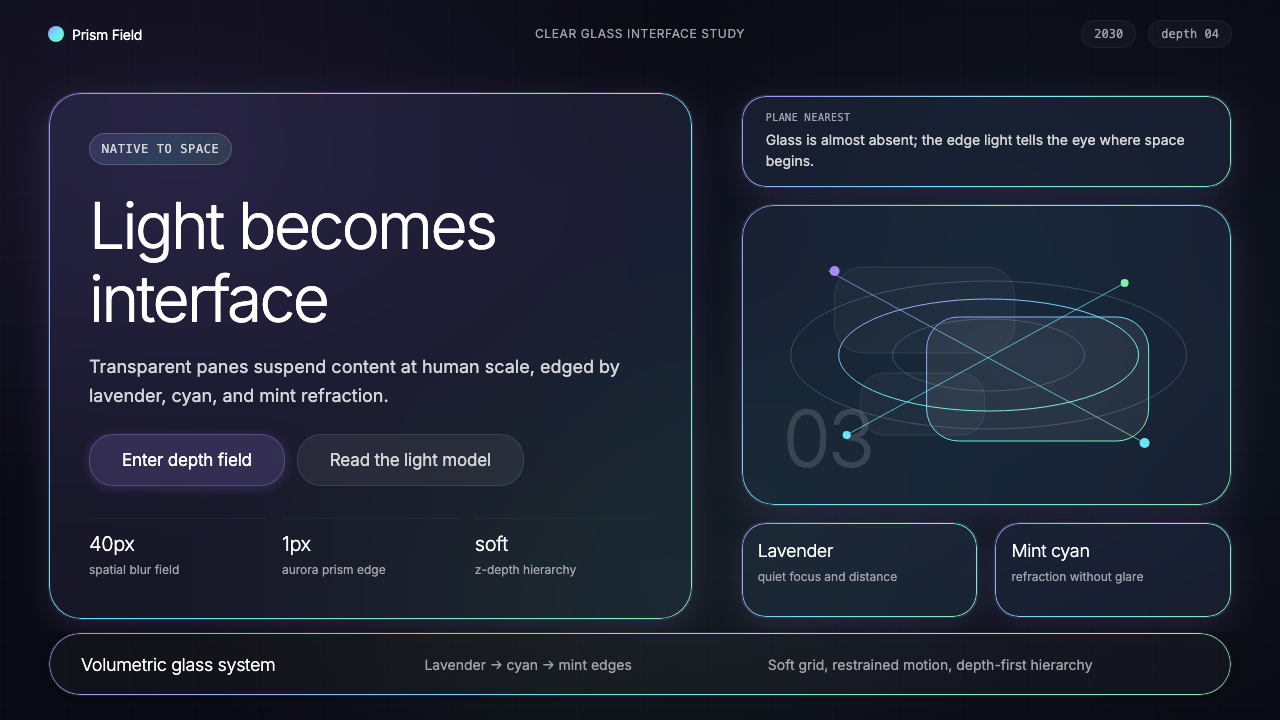 Vision Pro Spatial UI (2030)Structured light, not software. Deep navy glass panels glow with lavender-cya…结构化光感,不像软件。深夜蓝玻璃面板,以薰衣草-青-薄荷边缘发光。
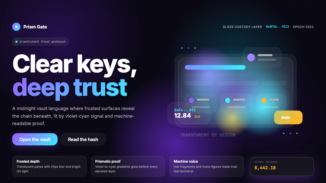 Web3 Glass Morphism (2022)Midnight trust in glass. Onyx, violet-cyan glow, and mono hashes make transpa…午夜玻璃信任:玛瑙黑、紫青辉光与等宽哈希,透明而高级。
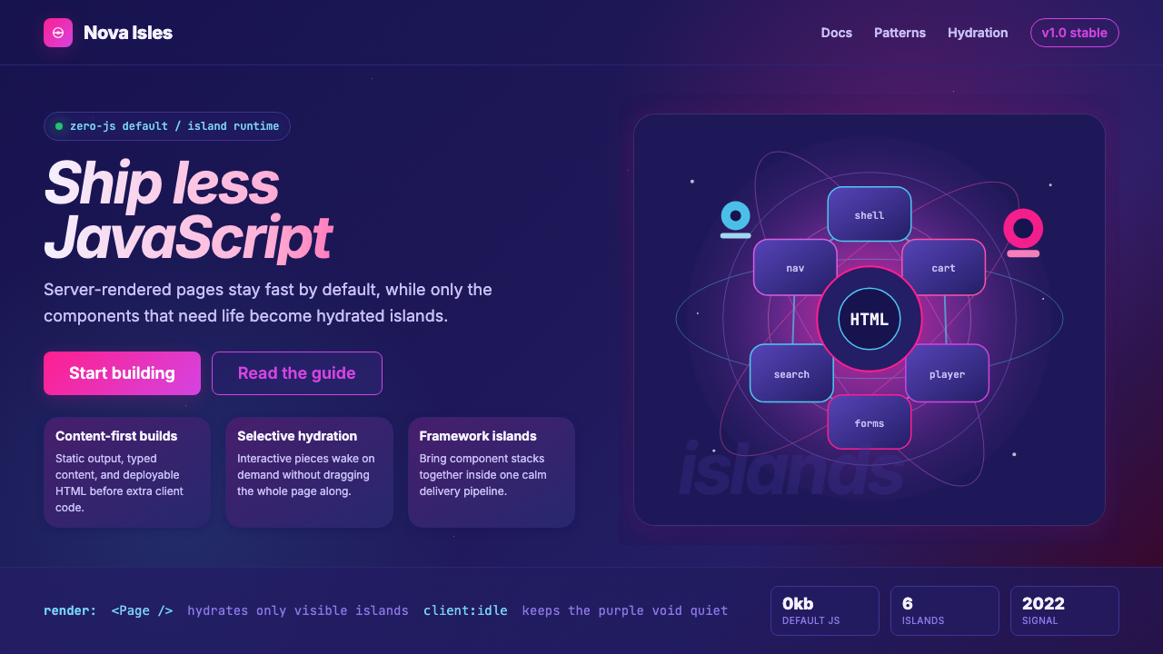 Astro Islands Architecture 2022Warm cosmic devtools. Deep violet, magenta glow, Inter clarity, and island ge…温暖的宇宙开发感:深紫底、洋红光、Inter 字体与岛屿几何。
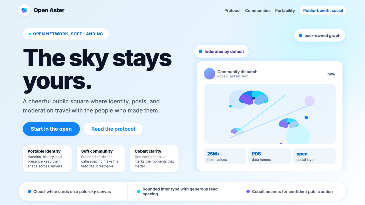 Bluesky AT Protocol 2024Open tech feels warm. Pale sky, cloud cards, Inter, and one cobalt accent car…开放科技也温暖:浅天蓝、云白卡片、Inter 与钴蓝强调。
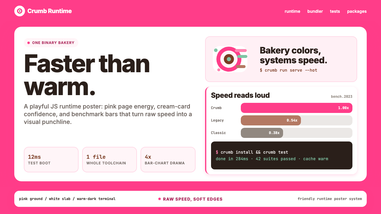 Bun JS Runtime Pink 2023Dev speed gets bakery-bright. Hot pink grounds white slabs, mono bars, and wa…开发速度像烘焙店一样明亮:热粉底、白卡片、等宽基准条与暖黑终端。
 Discord 2024Blurple cozy. Charcoal grounds, illustrated characters — every surface says '…刻意去企业化的语音聊天:blurple 蓝紫、深炭灰底、俏皮插画角色——每个界…