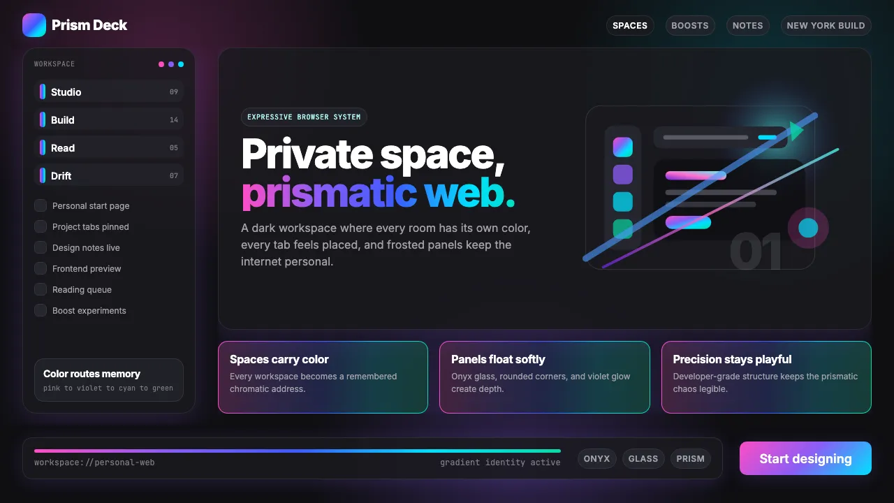
About Arc Browser Prismatic (2023)
Arc Browser reimagined what a browser could feel like — not a neutral viewport but a personal, expressive environment. The Browser Company of New York introduced prismatic gradients (pink → violet → cyan → emerald) as navigational identity, where each Space carries its own chromatic personality.
The result is a dark, holographic aesthetic that feels like opening a fresh workspace at sunrise: gradient ribbons shimmer across onyx surfaces, frosted panels float with soft glow shadows, and rounded geometry softens every edge. It's Williamsburg playfulness meets frontend-dev precision.
- Origin
- New York City, United States
- Era
- 2019 founded; current visual identity ~2022–2024
- Key figures
- Josh Miller · Hursh Agrawal · Nate Parrott · Cassidy Williams
- Movements
- Post-Chrome browser renaissance · 2020s NYC tech-product playfulness · color-as-information-architecture
Arc Browser Prismatic (2023) design spec
Colors
Typography
The other 11 sections — buttons, cards, spacing, motion, techniques and more — open once you unlock. Download the DESIGN.md or send it to your AI in one click. Unlock once, yours forever.
Sign up nowStyles similar to Arc Browser Prismatic (2023)
Also inspired by brands & products, with a close feel.
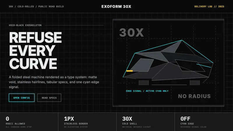 Tesla Cybertruck Stainless (2023)Refusal made material. Void black, stainless hairlines, cyan edges, faceted Inter.
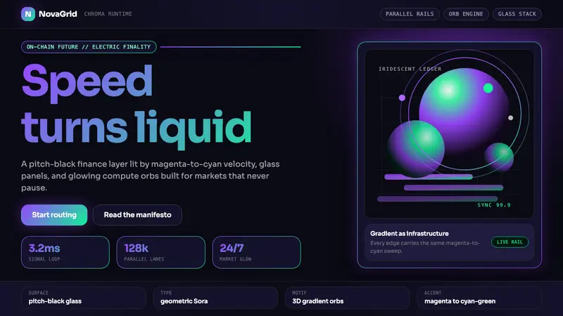 Solana (Magenta Gradient)Fast, black, chromatic. Magenta-to-cyan gradients and 3D orbs make speed glow.
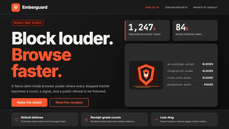 Brave Browser Lion OrangePrivacy gets loud. Lion-orange counters and shield geometry cut through warm charcoal.
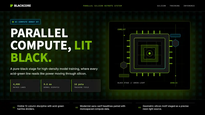 NVIDIA GPU Green-BlackPure black turns compute theatrical. Acid green hairlines and chip geometry stage the glow.