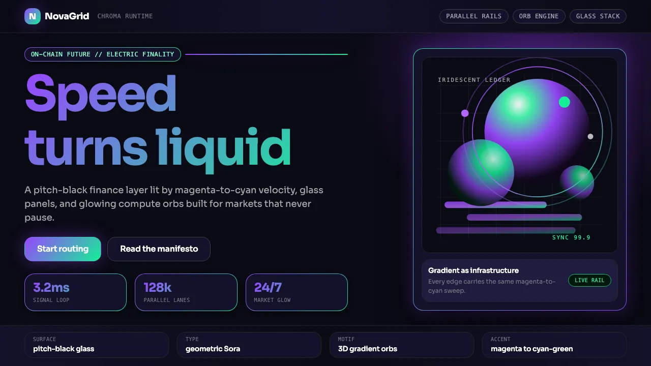
About Solana (Magenta Gradient)
Solana's visual identity is the loudest chromatic statement in crypto — a pitch-black canvas lit by a single, unmistakable gradient that sweeps from magenta through cyan-green. Born from Breakpoint keynote stages and Solana Mobile marketing, the design language communicates speed, on-chain futurism, and aesthetic confidence through 3D-rendered orbs, iridescent surface lighting, and gradient text fills.
Every surface is dark, every accent is gradient, and every glow halo whispers that the future of finance is fast, chromatic, and unapologetically bold. The system draws from Solana Labs in-house work and Buck Studio motion collaborations, refined across four years of conference branding and ecosystem product design.
- Origin
- San Francisco / Geneva (distributed)
- Era
- 2020 launch; visual identity matured 2021–2024 (Breakpoint conferences)
- Key figures
- Anatoly Yakovenko · Raj Gokal · Buck Studio
- Movements
- high-performance L1 blockchain visual identity · crypto chromatic-iridescent aesthetic · post-Ethereum-bear brand reset
Solana (Magenta Gradient) design spec
Colors
Typography
The other 11 sections — buttons, cards, spacing, motion, techniques and more — open once you unlock. Download the DESIGN.md or send it to your AI in one click. Unlock once, yours forever.
Sign up nowStyles similar to Solana (Magenta Gradient)
Also inspired by brands & products, with a close feel.
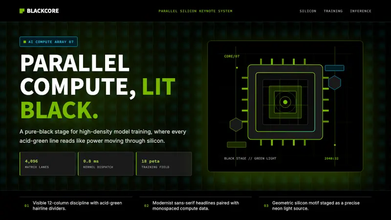 NVIDIA GPU Green-BlackPure black turns compute theatrical. Acid green hairlines and chip geometry stage the glow.
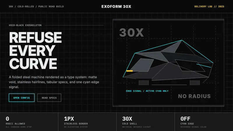 Tesla Cybertruck Stainless (2023)Refusal made material. Void black, stainless hairlines, cyan edges, faceted Inter.
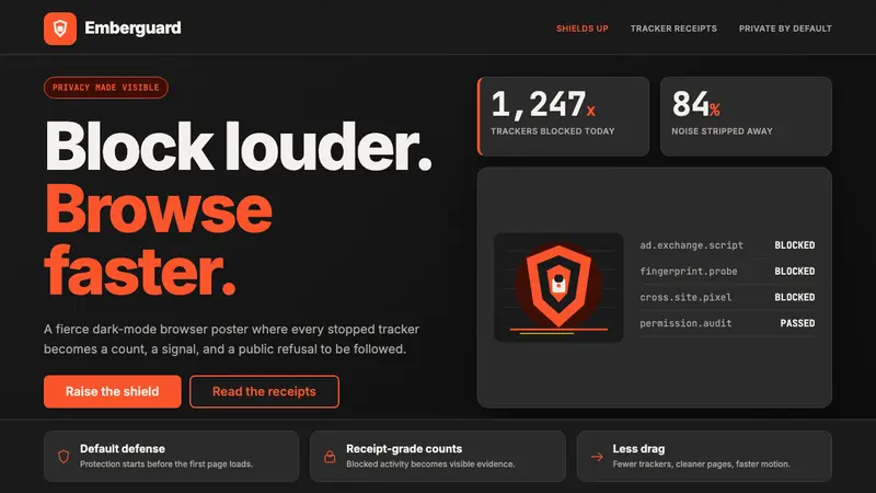 Brave Browser Lion OrangePrivacy gets loud. Lion-orange counters and shield geometry cut through warm charcoal.
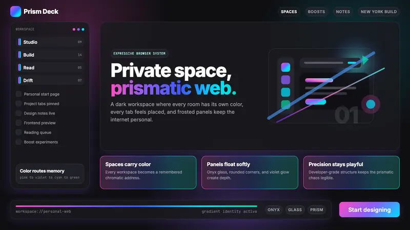 Arc Browser Prismatic (2023)Color is architecture. Pink-violet-cyan ribbons glow over onyx glass and rounded panels.