What is Solana (Magenta Gradient)?什么是 Solana (Magenta Gradient)?
Solana's visual identity is the loudest chromatic statement in crypto — a pitch-black canvas electrified by a gradient that sweeps from deep magenta through vivid cyan-green, where speed itself seems to glow.Solana 的视觉语言是加密世界里最张扬的色彩宣言——漆黑画布上,一道从深洋红横扫至鲜亮青绿的渐变将速度本身点燃成光。
Solana (Magenta Gradient) in briefSolana (Magenta Gradient) 速览
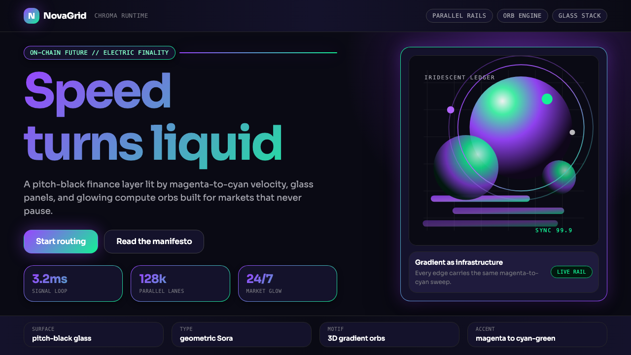
Solana Magenta Gradient is a dark-ground visual identity system built around a single signature gradient — a bold sweep from deep magenta at one pole to vivid cyan-green at the other, deployed across a near-black canvas. Unlike most blockchain visual identities that default to conservative blues and flat logos, Solana committed from early on to chromatic intensity as a brand argument: if speed and throughput are the product, the design should feel fast and luminous.Solana 洋红渐变是一套以深色为基底的视觉识别体系,核心是一道标志性渐变——从深洋红大幅横扫至鲜亮青绿,铺设于近乎纯黑的画布之上。与大多数区块链视觉识别默认保守蓝色和扁平标志不同,Solana 从早期便将色彩强度作为品牌论点:如果速度与吞吐量是产品本身,那么设计就应该传达速度与光亮的感受。
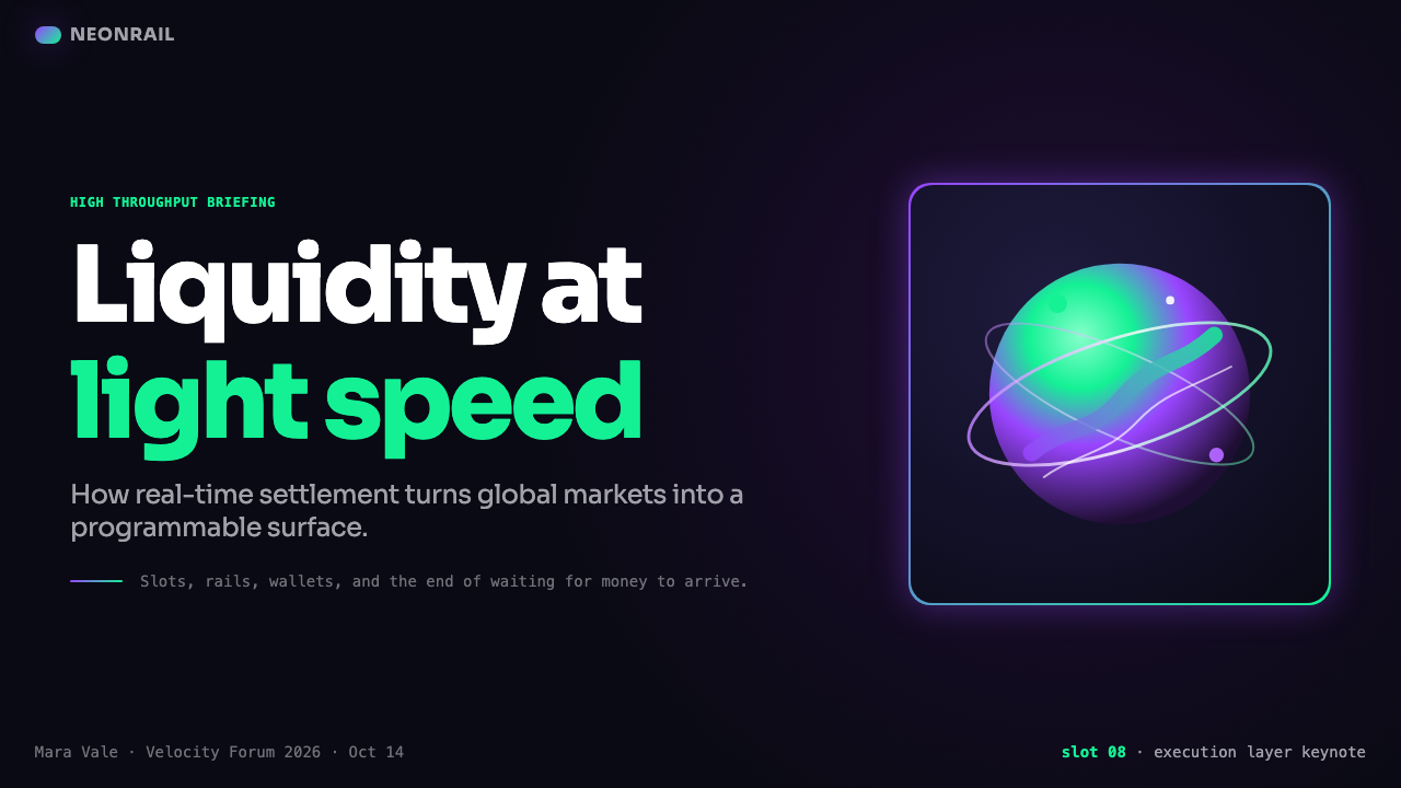
The system's defining elements are its black or near-black foundations, its gradient fills applied to both type and three-dimensional objects, and its use of iridescent halo effects that suggest surfaces alive with energy. Three-dimensional orbs — spherical objects rendered with surface lighting that transitions through the same magenta-to-cyan spectrum — appear throughout conference materials, product launches, and marketing campaigns as the movement's most recognizable signature. These orbs are not decorative flourishes; they function as focal anchors that concentrate the chromatic language into a single, instantly readable form.这套体系的核心元素包括:黑色或近黑色的基底、同时应用于文字与三维物体的渐变填充,以及暗示表面充满能量的虹彩光晕效果。三维球体——以洋红到青绿同一光谱过渡进行表面光照渲染的球形物体——贯穿整个大会材料、产品发布与营销活动,成为这套设计语言最易辨认的符号。这些球体并非装饰性点缀,它们充当视觉焦点,将色彩语言凝聚成一种单一的、瞬间可读的形态。
At its core, the Solana visual system is about controlled contrast: extreme darkness set against extreme luminosity. The black ground absorbs everything around the gradient, making the color appear to radiate rather than merely occupy space. This optical behavior — gradient-as-light-source rather than gradient-as-fill — is what distinguishes the style from superficially similar chromatic aesthetics in adjacent industries.从根本上讲,Solana 视觉体系关乎受控对比:极度黑暗与极度明亮的并置。黑色底面吸收了渐变周围的一切,使色彩呈现出辐射感而非单纯的占据空间感。这种光学行为——渐变作为光源而非填充——正是这种风格区别于相邻行业中表面相似的色彩美学的关键所在。
See the Solana (Magenta Gradient) design system查看 Solana (Magenta Gradient) 完整设计系统
Where does Solana (Magenta Gradient) come from?Solana (Magenta Gradient) 从何而来?
Solana the blockchain launched in March 2020, but its visual identity did not consolidate into the system recognized today until the Breakpoint conference series took shape in 2021 and 2022. The earliest Solana brand materials were relatively restrained — a dark background, a logo, the characteristic gradient applied to wordmarks. It was the demands of large-format keynote staging and conference environments that pushed the design language toward the full chromatic intensity it now carries. When you need a visual system to read from a hundred meters across a convention hall, you need contrast and luminosity at a scale that polite brand guidelines rarely permit.Solana 区块链于2020年3月上线,但其视觉识别直到2021和2022年 Breakpoint 大会系列成形后,才逐渐凝聚成今天为人所知的体系。最早的 Solana 品牌材料相对克制——深色背景、徽标、应用于文字标识的标志性渐变。正是大型主题演讲舞台和大会环境的需求,将这套设计语言推向了它如今承载的完整色彩强度。当一套视觉系统需要在百米之外的展馆对角依然清晰可辨时,对比度与亮度的要求将远超一般品牌规范所允许的边界。
Solana Labs' in-house design team collaborated with Buck Studio — a New York and Los Angeles motion design and visual effects studio known for work with major technology and entertainment clients — to develop the three-dimensional orb language that became the ecosystem's most iconic visual asset. Buck's contribution was the translation of the two-dimensional gradient into rendered three-dimensional form: the orb. This object — simultaneously a planet, a lens, a data node, and a generative art piece — gave the visual system a sculptural center of gravity that flat gradient applications lacked. The partnership produced motion sequences, key art, and brand films that circulated widely within the cryptocurrency community.Solana Labs 内部设计团队与 Buck Studio 合作——这家总部位于纽约和洛杉矶的动态设计与视觉特效工作室,以服务主要科技和娱乐客户著称——共同开发了三维球体语言,使其成为整个生态系统最具标志性的视觉资产。Buck 的贡献在于将二维渐变转化为渲染的三维形态:球体。这个物体——同时是一颗行星、一枚镜头、一个数据节点和一件生成艺术作品——为这套视觉系统提供了扁平渐变应用所缺乏的雕塑性重心。这次合作产出了动态序列、主视觉和品牌影片,在加密货币社群中广泛传播。
The aesthetic draws from several converging influences. The chromatic gradient language had precedents in the vaporwave and synthwave aesthetics that circulated through internet culture in the mid-2010s — both movements used magenta-to-cyan spectrums against dark grounds as shorthand for a kind of retrofuturist technological sublime. Solana absorbed this visual vocabulary but stripped it of its nostalgic irony, deploying the same chromatic range with earnest confidence rather than pastiche. The result was a design language that felt simultaneously familiar to the audience that had grown up with vaporwave imagery and genuinely forward-looking in its application.这套美学汇聚了几条并行的影响脉络。色彩渐变语言在2010年代中期流行于互联网文化的蒸汽波(vaporwave)和合成波(synthwave)美学中有其先例——两种运动都以黑色底面上的洋红到青绿光谱作为一种怀旧未来主义技术崇高的视觉速记。Solana 吸收了这套视觉词汇,但剥离了其中的怀旧讽刺意味,以真诚的自信而非仿作的姿态运用同样的色彩范围。结果是一套设计语言,对于在蒸汽波图像中成长起来的受众既感到熟悉,在应用上又真正具有前瞻性。
The Solana Mobile initiative, which produced the Saga Android device in 2023, extended the visual language into product and packaging design, bringing the dark-ground gradient aesthetic into physical retail contexts for the first time. Conference identity, digital product UI, hardware packaging, and third-party ecosystem applications all converged on the same visual principles through 2022 and 2023, effectively establishing the system as the de facto visual standard for an entire blockchain ecosystem — not just the company that built it. By 2024, the Solana gradient had become shorthand within the cryptocurrency industry for high-performance claims and aspirational consumer positioning.2023年推出 Saga 安卓设备的 Solana Mobile 项目,将这套视觉语言延伸至产品与包装设计,首次将深色底面渐变美学带入实体零售场景。大会视觉识别、数字产品界面、硬件包装和第三方生态应用,在2022和2023年间汇聚于同一套视觉原则,实际上确立了这套体系作为整个区块链生态系统事实标准的地位——而不仅仅是构建它的公司。到2024年,Solana 渐变已在加密货币行业内成为高性能主张和消费者抱负定位的视觉速记。
What defines the Solana (Magenta Gradient) look?Solana (Magenta Gradient) 的视觉特征是什么?
Black Ground黑色底面
Every surface in the system begins from near-total darkness. The background is not simply dark gray or navy — it approaches true black, creating the maximum possible contrast differential with the luminous gradient accents placed against it. This depth of field is non-negotiable: reduce the darkness and the gradient loses its glow quality, becoming a flat color transition rather than a light source. The black ground also ensures that gradient elements — whether text, orbs, or interface components — feel emergent rather than applied, as if lit from within rather than colored from without.这套体系中的每一个表面都从近乎完全的黑暗开始。背景不只是深灰或藏青——它接近真正的纯黑,与置于其上的发光渐变强调色形成最大可能的对比落差。这种深度是不可妥协的:降低暗度,渐变就会失去其光晕品质,变成平面的色彩过渡而非光源。黑色底面还确保了渐变元素——无论是文字、球体还是界面组件——呈现出从内部生长出来的感觉,而非从外部施加色彩。
Magenta-to-Cyan Gradient洋红至青绿渐变
The signature gradient moves from a warm, saturated deep magenta — reminiscent of concentrated neon light — through to a vivid cyan-green that carries connotations of both technological luminescence and biological bioluminescence. The transition is not a simple two-stop ramp; in executed materials it often passes through intermediate purples and teals, giving the spectrum a sense of depth and organic variation. The direction of the gradient matters: horizontal sweeps read as speed and momentum, while radial or spherical gradients suggest depth and dimensionality. Both applications are valid within the system; context determines which is appropriate.这道标志性渐变从温暖、饱和的深洋红——令人联想到浓缩霓虹灯光——过渡至鲜亮的青绿色,后者同时带有技术发光与生物荧光的联想。这种过渡并非简单的两色节点斜坡;在实际执行的材料中,它往往经过中间的紫色和蓝绿色,赋予光谱以深度感和有机变化。渐变的方向至关重要:水平扫过传达速度与动能,而径向或球形渐变则暗示深度与维度感。两种应用方式在这套体系中都成立,具体情境决定哪种更为合适。
3D Rendered Orbs三维渲染球体
The spherical orb is the system's most iconic single element. Rendered with the magenta-to-cyan gradient wrapping its surface and iridescent specular highlights suggesting a glassy or liquid outer skin, the orb appears in keynote presentations, product marketing, and ecosystem art in forms ranging from heroic single objects filling entire screens to constellations of smaller orbs in motion. Its power derives from its combination of mass and luminosity — it appears both heavy and weightless, material and ethereal. The orb translates the otherwise abstract promise of blockchain speed into something tangible enough to hold visual attention across media formats.球形体是这套体系中最具标志性的单一元素。洋红到青绿渐变包裹其表面,虹彩镜面高光暗示玻璃或液态外壳,球体出现于主题演讲、产品营销和生态艺术中,形式从占据整个屏幕的英雄式单体,到多个球体组成的运动星群不等。其力量来自质量与发光性的结合——它既显得厚重又感觉失重,既有物质感又带以太感。球体将区块链速度这一抽象承诺转化为足以跨越媒介格式吸引视觉注意的有形之物。
Gradient Typography渐变文字
Headline type in the system is frequently treated with gradient fills rather than solid colors. This is a meaningful departure from conventional typographic practice, which typically treats color as a uniform property of letterforms. In the Solana system, type becomes a second surface on which the gradient signal can land, connecting the textual content to the larger visual logic of the layout. The technique works because the typefaces selected tend toward the geometric and the bold — letter bodies wide enough to hold the gradient transition visibly across a single character. Fine or narrow letterforms would fragment the gradient and lose the effect.这套体系中的标题文字常以渐变填充而非单色处理。这与传统排版惯例形成有意义的偏离——传统排版通常将颜色视为字形的统一属性。在 Solana 体系中,文字成为渐变信号可以落地的第二个表面,将文字内容与版面更大的视觉逻辑相连接。这种技术之所以有效,是因为所选字体倾向几何且粗重——字母笔画宽度足以在单个字符内清晰呈现渐变过渡。细或窄的字形会打碎渐变并失去效果。
Iridescent Surface Lighting虹彩表面光照
Beyond simple gradients, the system employs iridescent lighting effects — surface treatments that suggest the material changes color as the viewing angle shifts, as seen in oil films, beetle shells, or holographic foils. This quality appears on orbs, on abstract background environments, and occasionally on product photography and interface mockups. The iridescent effect adds temporal dimension to a static image: it implies that the object is alive and responsive, that its appearance would shift in motion. This is a deliberate correspondence with Solana's core performance narrative — the technology is fast and dynamic, and the visual language should feel the same way.超越简单渐变,这套体系还运用虹彩光照效果——一种表面处理,暗示材料会随观看角度变化而改变颜色,如同油膜、甲虫外壳或全息箔纸所呈现的效果。这种品质出现在球体、抽象背景环境中,偶尔也出现在产品摄影和界面模型上。虹彩效果为静态图像增添了时间维度:它暗示对象是活跃且有响应的,其外观在运动中会随之变化。这与 Solana 核心性能叙事形成刻意的对应——技术是快速而动态的,视觉语言也应有同样的感受。
Minimal Type and Generous Space极简文字与充裕留白
Despite the chromatic intensity, the Solana system is restrained in its use of text and compositional density. Layouts tend toward large areas of unbroken black, with gradient elements and type occupying a relatively small portion of the total surface. This restraint serves two purposes: it preserves the visual weight and drama of the gradient by ensuring it is never crowded, and it allows individual chromatic elements to breathe and register cleanly. Body text, when it appears, is set in clean, legible type at high contrast against the dark ground — unadorned and functional, serving as the quiet infrastructure that lets the gradient elements command attention.尽管色彩强度极高,Solana 体系在文字使用和构图密度上却相当克制。版面倾向于大面积未被打断的黑色,渐变元素和文字仅占总面积的相对较小部分。这种克制服务于两个目的:通过确保渐变元素永不拥挤来保留其视觉重量和戏剧性,同时让每一个色彩元素得以呼吸并清晰注册。当正文出现时,以简洁易读的字体在黑色底面上高对比度排布——朴素而实用,作为让渐变元素主导注意力的静默基础设施。
Motion and Glow Halo动态感与辉光光晕
Even in static applications, the system implies motion through compositional direction and the use of soft radiating glow halos around gradient elements. These halos — diffuse light fields that bleed outward from the primary gradient objects into the surrounding black space — reinforce the sense that the design is luminous rather than merely colored. In animated contexts, these properties animate naturally: gradients cycle, orbs rotate, halos pulse. The glow halo is the visual system's equivalent of a photographic long-exposure light trail: it freezes motion as an afterimage, suggesting speed that has just passed or is about to arrive.即使在静态应用中,这套体系也通过构图方向和渐变元素周围柔和辐射光晕的使用暗示动态。这些光晕——从主渐变对象向周围黑色空间向外渗出的漫射光场——强化了设计发光而非单纯着色的感受。在动态语境中,这些特性自然地动起来:渐变循环流动、球体旋转、光晕脉冲。辉光光晕是这套视觉体系相当于摄影长曝光光轨的存在:它将运动冻结为余像,暗示刚刚经过或即将到来的速度。
See the Solana (Magenta Gradient) design system查看 Solana (Magenta Gradient) 完整设计系统
Who shaped Solana (Magenta Gradient)?谁塑造了 Solana (Magenta Gradient)?
Yakovenko co-founded Solana and serves as its CEO. A former Qualcomm engineer, he designed the Proof of History consensus mechanism that underpins Solana's performance claims. While his primary contribution is technical, the brand identity built around Solana has consistently amplified the engineering achievement through visual language — the speed and luminosity of the gradient aesthetic is, in a meaningful sense, a translation of Yakovenko's architectural priorities into a form that non-technical audiences can feel rather than measure. His public profile and conference presentations have shaped the contexts in which the visual system most dramatically performs.亚科文科是 Solana 的联合创始人兼首席执行官。作为前高通工程师,他设计了支撑 Solana 性能主张的历史证明(Proof of History)共识机制。尽管他的主要贡献在技术层面,围绕 Solana 建立的品牌识别始终通过视觉语言放大了这一工程成就——渐变美学的速度与光亮感,在有意义的层面上,是将亚科文科的架构优先级转化为非技术受众可以感受而非度量的形式。他的公众形象与大会演讲塑造了这套视觉体系最具戏剧性表现的场景语境。
Gokal co-founded Solana alongside Yakovenko and has served as the public face of the ecosystem's consumer and cultural strategy. His approach to community building — emphasizing aesthetic quality, cultural credibility, and creative partnerships alongside technical performance — created the conditions under which the Solana design language could evolve into something more ambitious than a conventional corporate brand identity. Gokal's articulation of Solana as a cultural as well as technical movement gave the design team permission to develop a visual system that matched that ambition in chromatic intensity.戈卡尔与亚科文科共同创立了 Solana,并担任生态系统消费者与文化战略的公众代言人。他的社群构建方式——在技术性能之外强调审美品质、文化公信力与创意合作——为 Solana 设计语言创造了演进为比传统企业品牌识别更为宏大的东西的条件。戈卡尔将 Solana 定义为文化运动而非仅仅是技术运动的表述,赋予了设计团队开发一套在色彩强度上与这一抱负相匹配的视觉体系的许可。
Buck is the motion design and creative production studio most closely associated with the development of Solana's three-dimensional visual language. Working with the Solana Labs brand team, Buck translated the two-dimensional gradient identity into the rendered orb and environmental lighting language that became the ecosystem's most recognizable imagery. Buck's technical expertise in three-dimensional rendering and motion graphics, combined with their background in commercial advertising aesthetics, produced the polished, cinematic quality that distinguished Solana's brand materials from the more rough-edged visual communication typical of early cryptocurrency projects. Their influence on the overall system's visual ambition is substantial.Buck 是与 Solana 三维视觉语言开发最为密切相关的动态设计与创意制作工作室。与 Solana Labs 品牌团队合作,Buck 将二维渐变识别转化为渲染球体与环境光照语言,使其成为整个生态系统最具辨识度的视觉图像。Buck 在三维渲染和动态图形方面的技术专长,结合其商业广告美学背景,产出了精致、电影感的品质,使 Solana 的品牌材料区别于早期加密货币项目中更为粗糙的视觉传播。他们对整套体系视觉抱负的影响是实质性的。
The team behind the Saga smartphone — Solana's 2023 hardware product — extended the design language into physical product and retail packaging contexts that most blockchain brands never encounter. Designing for a physical object at consumer retail required translating the screen-native dark-ground gradient into materials, finishes, and packaging structures. The decisions made at this translation point — how to represent the gradient on a physical surface, how to carry the black-ground aesthetic into a box and a device chassis — shaped how the brand handles material applications and informed subsequent ecosystem hardware partnerships and merchandise design.Saga 智能手机背后的团队——Solana 2023年的硬件产品——将这套设计语言延伸至大多数区块链品牌从未涉足的实体产品和零售包装场景。为消费级零售实体产品设计,要求将屏幕原生的黑色底面渐变转化为材料、表面处理和包装结构。在这个转化节点上做出的决策——如何在实体表面呈现渐变、如何将黑色底面美学延续至包装盒和设备机身——塑造了品牌处理材料应用的方式,并对后续的生态系统硬件合作伙伴关系和衍生品设计产生了参照影响。
Solana's annual Breakpoint developer conference, held in locations including Lisbon, Amsterdam, and Singapore, served as the primary stage on which the visual identity was pushed to its most ambitious scale. The demands of conference design — stage lighting, projection, wayfinding, merchandise, and digital backdrops at architectural scale — required the visual system to prove itself across formats that digital brand guidelines rarely test. The creative direction teams responsible for Breakpoint effectively stress-tested and expanded the visual language each year, establishing the design norms that downstream ecosystem participants adopted when building their own Solana-adjacent products and communications.Solana 年度 Breakpoint 开发者大会——举办地包括里斯本、阿姆斯特丹和新加坡——作为视觉识别被推向最宏大规模的主要舞台。大会设计的需求——舞台灯光、投影、导视系统、周边商品和建筑尺度的数字背景——要求这套视觉体系在数字品牌规范很少测试的格式中证明自身。负责 Breakpoint 的创意指导团队每年都有效地对视觉语言进行压力测试和扩展,确立了下游生态系统参与者在构建自己的 Solana 关联产品和传播材料时所采用的设计规范。
How do you use Solana (Magenta Gradient) today?今天怎么用 Solana (Magenta Gradient)?
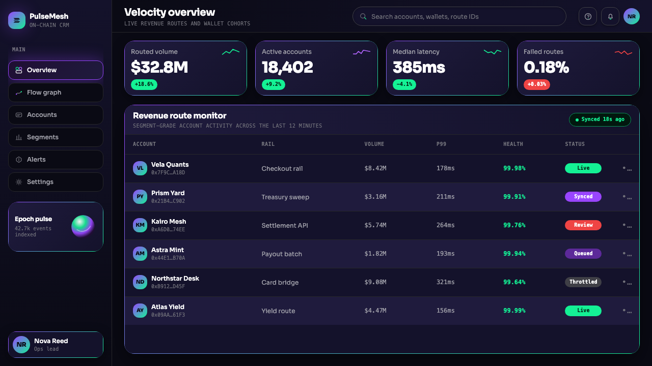
The Solana Magenta Gradient system translates into practical design work most successfully when the dark ground is treated as a non-negotiable foundation rather than a stylistic option. The entire visual logic depends on the luminosity differential between near-black space and chromatic gradient elements. Any significant lightening of the background — moving toward dark gray, dark navy, or dark purple — diminishes this differential and weakens the effect. Begin every layout by committing to a deep, near-black base, and build upward from there.Solana 洋红渐变体系最成功地转化为实际设计工作的前提,是将深色底面作为不可妥协的基础而非风格选项。整套视觉逻辑依赖于近黑空间与色彩渐变元素之间的亮度落差。任何对背景的显著提亮——转向深灰、深藏青或深紫——都会削弱这一落差,降低效果。每个版面都应从深度近黑的基底出发,并在此之上向上构建。
For presentation slides, the style is particularly effective for conference keynotes, product launch decks, and investor materials where visual impact and a sense of technological ambition are strategic goals. Cover slides should feature a large gradient object — an orb, a bold gradient headline, or an abstract environmental form — against expansive black space. The gradient element should occupy a meaningful portion of the composition, not be tucked into a corner. Content slides work best when they maintain the dark ground but reduce the chromatic intensity: white or very light type for body content, with gradient accents reserved for section headers, key statistics, or call-outs. Data visualization on this ground works well in chart formats where the gradient can be used to encode meaning — using the spectrum to represent a performance range or a progression through time adds informational value rather than mere decoration.在演示文稿中,这种风格尤其适合大会主题演讲、产品发布演示和投资人材料,在这些场合视觉冲击力和技术抱负感是战略目标。封面幻灯片应在宽阔的黑色空间中呈现一个大型渐变对象——球体、粗体渐变标题或抽象环境形态。渐变元素应占据构图的重要部分,而非被塞入角落。内容幻灯片在保持深色底面的同时降低色彩强度效果最佳:正文内容用白色或极浅色字体,渐变强调保留给章节标题、关键数据或引用语。在这种底面上的数据可视化,在渐变可用于编码意义的图表格式中效果出色——用光谱表示性能范围或时间进程,增添了信息价值而非单纯的装饰。
For web interfaces and dashboards, the system suits products where a high-performance, premium, or forward-looking positioning is desired. The approach requires discipline: use the dark background consistently across all surfaces, choose a single primary chromatic element per section rather than scattering gradient accents indiscriminately, and ensure that functional interface elements — inputs, tables, navigation — remain highly legible by keeping them in high-contrast light type or neutral tones against the dark ground. Gradient fills should be reserved for interactive states, hero imagery, and tier or status indicators where the visual weight of the effect carries communicative meaning. Pricing pages and feature comparison tables in this style carry a natural premium signal; status dashboards feel live and dynamic.对于网页界面和仪表板,这套体系适合希望呈现高性能、高端或前瞻定位的产品。这种方式需要自律:在所有表面一致使用深色背景,每个区域选择一个主色彩元素而非随意散布渐变强调,并确保功能性界面元素——输入框、表格、导航——通过在深色底面上保持高对比度浅色字体或中性色调来维持高度可读性。渐变填充应保留给交互状态、主视觉图像,以及视觉重量承载传达意义的等级或状态指示器。这种风格的定价页面和功能对比表自然带有溢价信号;状态仪表板感觉活跃而动态。
For editorial, marketing, and social content, the style supports bold single-image formats: a full-bleed dark ground with one gradient element — a headline, a product photograph lit with matching chromatic halo effects, or a three-dimensional rendered object — produces materials with immediate visual authority. Marketing sequences benefit from chromatic consistency: the gradient direction, color temperature, and luminosity level should remain stable across a campaign so that individual pieces read as a family. When placing this style in editorial contexts alongside body text, use a neutral, highly legible typeface for reading text and reserve gradient treatment for display headings only — mixing gradient typography into running text creates legibility problems and diminishes the special-occasion quality that gives gradient type its visual weight.对于编辑、营销和社交内容,这种风格支持大胆的单图像格式:满幅深色底面配以一个渐变元素——一个标题、一张以匹配色彩光晕效果打光的产品照片,或一个三维渲染对象——产出具有即时视觉权威感的材料。营销系列受益于色彩一致性:渐变方向、色温和亮度等级在整个活动中应保持稳定,使各个单件作品呈现出系列感。将这种风格置于带有正文文字的编辑语境时,对阅读性文字使用中性、高可读性字体,渐变处理仅保留给展示标题——将渐变排版混入连续正文会产生可读性问题,并削弱赋予渐变文字视觉重量的特殊场合品质。
A common and damaging mistake when applying this style is over-saturating the gradient or multiplying gradient elements until the design reads as chaotic rather than luminous. The system's power derives from contrast between darkness and concentrated chromatic energy — when gradients appear everywhere simultaneously, that contrast collapses and the layout loses its hierarchy. Similarly, introducing competing chromatic ranges — adding greens that don't connect to the cyan pole, or blues that don't anchor to the magenta pole — breaks the visual coherence that makes the system recognizable. The gradient is a spectrum, not a permission to use all colors. A second common error is applying the aesthetic to light-background layouts in the belief that the gradient alone carries the style; without the black ground, the gradient becomes merely decorative, losing the luminosity that defines the system's character.应用这种风格时一个常见且有害的错误,是过度饱和渐变或增殖渐变元素,直到设计呈现出混乱而非发光的感觉。这套体系的力量来自黑暗与集中色彩能量之间的对比——当渐变同时出现在各处时,这种对比崩溃,版面失去层级。同样,引入竞争性的色彩范围——添加与青绿极不相连的绿色,或与洋红极不相连的蓝色——会破坏使这套体系具有辨识度的视觉连贯性。渐变是一个光谱,而非使用所有颜色的许可。另一个常见错误是相信渐变本身就承载风格,将这套美学应用于浅色背景版面;没有黑色底面,渐变仅仅变得具有装饰性,失去了定义这套体系特征的发光性。
See the Solana (Magenta Gradient) design system查看 Solana (Magenta Gradient) 完整设计系统
Solana (Magenta Gradient) — FAQSolana (Magenta Gradient) · 常见问题
Can the Solana gradient style work on a light background?Solana 渐变风格能用在浅色背景上吗?
Not successfully, in the sense that the defining quality of the style — the luminous glow of the gradient against deep black — does not survive the translation to a light ground. On white or light gray, the magenta-to-cyan gradient becomes a pleasant but unremarkable chromatic decoration. The system depends entirely on the contrast between darkness and concentrated color intensity. A light-background project that wants to reference Solana should instead consider using the gradient sparingly as a single accent against a near-white ground — a gradient headline, a gradient rule line, a gradient icon — while treating the rest of the layout in neutral tones. This is a related aesthetic, not the same one, and should be understood as such.从保留这种风格定义特质的意义上说,不能——渐变在深黑底面上的发光辉光在转译至浅色底面时无法存活。在白色或浅灰色上,洋红到青绿渐变变成了令人愉悦但平淡无奇的色彩装饰。这套体系完全依赖于黑暗与集中色彩强度之间的对比。想要参考 Solana 的浅色背景项目,应考虑将渐变作为单一强调色克制地使用于近白底面——渐变标题、渐变分割线、渐变图标——同时将版面其余部分保持中性色调。这是一种关联美学,而非同一种美学,应当如此理解。
How is this style different from general vaporwave or synthwave aesthetics?这种风格与一般的蒸汽波或合成波美学有何不同?
Vaporwave and synthwave aesthetics share the dark ground and the magenta-to-cyan chromatic range, but their use of these elements is nostalgic and ironic — they quote the visual language of 1980s consumer electronics, Japanese retail, and early desktop computing as a form of cultural commentary. The Solana system removes the nostalgia and irony entirely. There are no retro grid floors, no glitchy text artifacts, no pastel bleed into the background, no cultural reference to past decades. The gradient is deployed with earnest confidence and pointed toward a future-oriented narrative: performance, speed, and on-chain technology. The orb forms are not retrofuturist; they are contemporary three-dimensional rendering. The difference is one of intent — pastiche versus sincerity — and it registers clearly in how finished work reads.蒸汽波和合成波美学共享深色底面和洋红到青绿色彩范围,但它们对这些元素的运用是怀旧且带有反讽意味的——它们引用1980年代消费电子产品、日本零售和早期桌面计算机的视觉语言,作为一种文化评论形式。Solana 体系完全去除了怀旧感与讽刺意味。没有复古网格地板,没有故障文字痕迹,没有粉彩渗入背景,没有对过去十年的文化指涉。渐变以真诚的自信部署,指向面向未来的叙事:性能、速度和链上技术。球体形态不是复古未来主义的;它们是当代三维渲染。差异在于意图——仿作与真诚——这在成品作品的观感上清晰体现。
Is this style appropriate for financial products outside of crypto?这种风格适合加密货币之外的金融产品吗?
The style carries strong crypto-native connotations as of its maturity period (2021–2024), and this association is a double-edged consideration for non-crypto financial applications. For fintech products targeting audiences that view crypto positively — payments technology, digital banking aimed at younger demographics, investment platforms with a technology-forward positioning — the association is an asset: it reads as modern, confident, and technically ambitious. For products targeting more traditional financial audiences, or in regulatory contexts where association with cryptocurrency carries reputational risk, the style would require significant adaptation before it could be safely deployed. The gradient itself can travel; the specific orb forms and some of the chromatic intensity are more closely tied to the crypto-native context.截至其成熟期(2021—2024年),这种风格带有强烈的加密原生联想,对于非加密金融应用而言,这种联想是一把双刃剑。对于面向正面看待加密货币受众的金融科技产品——支付技术、面向年轻人群的数字银行、具有技术前瞻定位的投资平台——这种联想是一项资产:它被解读为现代、自信且技术上有抱负。对于面向更传统金融受众的产品,或在与加密货币的关联带有声誉风险的监管语境中,这种风格在安全部署之前需要进行重大调适。渐变本身可以迁移;特定的球体形态和部分色彩强度则与加密原生语境关联更为紧密。
How should gradient type be used without becoming illegible?如何在不影响可读性的前提下使用渐变文字?
Gradient type legibility depends on three factors: letterform weight, type size, and the luminosity of the gradient relative to the background. Heavy or bold letterforms provide enough interior surface area for the gradient to resolve into a readable color across the character; light or thin letterforms do not. Type size matters similarly — gradient fills on very small type break down into visual noise. The third factor is luminosity: the gradient must be bright enough against the dark ground to maintain contrast for legibility, which means the midtones of the gradient (where it transitions between magenta and cyan) must not dip below the contrast threshold for readable text. A practical rule is to reserve gradient fills for display type and headlines only, and to never apply gradient treatment to body text, captions, or any type intended for sustained reading.渐变文字的可读性取决于三个因素:字形字重、字号大小,以及渐变相对于背景的亮度。粗重字形提供了足够的内部表面积,使渐变能够在字符内部解析为可读色彩;细或纤细字形则做不到。字号大小同样重要——非常小的文字上的渐变填充会分解成视觉噪音。第三个因素是亮度:渐变在深色底面上必须足够明亮以保持可读性所需的对比度,这意味着渐变的中间色调(洋红与青绿之间的过渡区域)不能低于可读文字的对比度阈值。实用原则是:渐变填充仅保留给展示性文字和标题,绝不应用于正文、图注或任何用于持续阅读的文字。
What distinguishes successful three-dimensional orb work in this style from generic CGI?这种风格中成功的三维球体作品与普通 CGI 的区别在哪里?
The difference lies in surface quality, lighting specificity, and compositional restraint. Generic three-dimensional spheres rendered with gradient textures read as stock assets because the lighting is often generic — diffuse, lacking strong directional conviction — and the gradient mapping is mechanical, moving from one color to another without the sense of internal depth that iridescent surface lighting produces. Successful orbs in the Solana tradition have strong specular highlights that suggest a near-glassy or liquid outer surface, subsurface scattering effects that give the object apparent volume rather than shell-like thinness, and lighting that is directionally specific enough to feel like a considered artistic decision rather than a default render setting. Compositionally, the orb should have enough surrounding dark space to breathe — cropped too tightly or crowded by other elements, the form loses its gravitational quality.差异在于表面品质、光照特异性和构图克制。带有渐变纹理的普通三维球体被解读为库存素材,因为光照往往是通用的——漫射、缺乏强烈的方向性确信——而渐变映射是机械的,从一种颜色过渡到另一种,没有虹彩表面光照所产生的内部深度感。Solana 传统中成功的球体具有强烈的镜面高光,暗示近玻璃或液态外表面,次表面散射效果赋予对象明显的体积感而非壳状的单薄,以及方向性足够具体以感觉像是经过深思熟虑的艺术决定而非默认渲染设置的光照。在构图上,球体应有足够的周围深色空间来呼吸——被过度裁切或被其他元素拥挤,形态就会失去其引力般的品质。
Related design styles相关设计风格
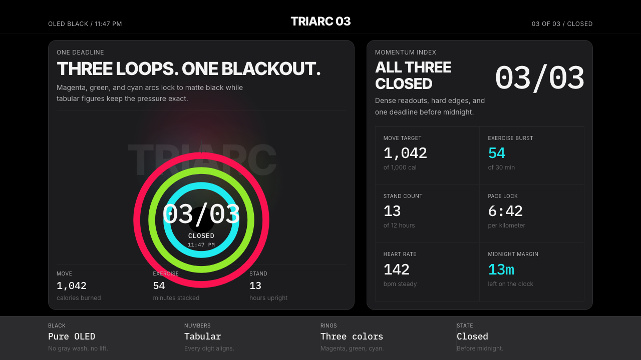 Apple Fitness Rings Closed (2024)Midnight feels exact. Magenta, green, and cyan rings lock onto OLED black.午夜像被校准。洋红、绿、青三环锁在黑底上。
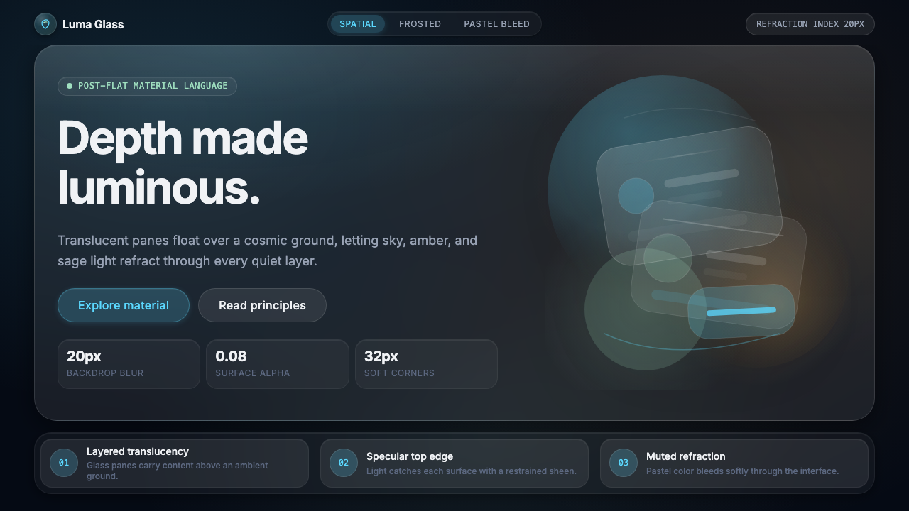 Apple Liquid Glass 2024Skeuomorphism, reborn for spatial. Frosted panels, specular highlights, depth…为空间时代重生的拟物化:磨砂面板、随视角变化的高光、深度本身成为设计材质。
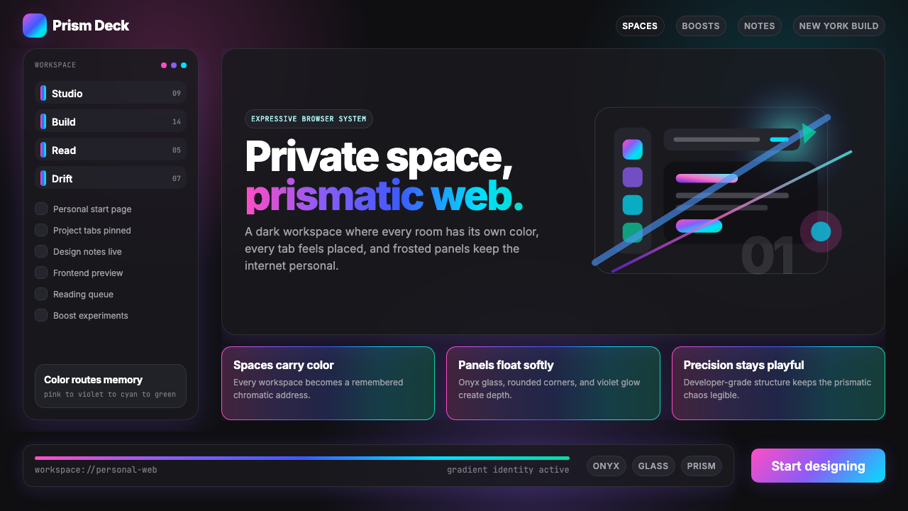 Arc Browser Prismatic (2023)Color is architecture. Pink-violet-cyan ribbons glow over onyx glass and roun…颜色即架构:粉紫青光带浮在黑曜石玻璃面板上。
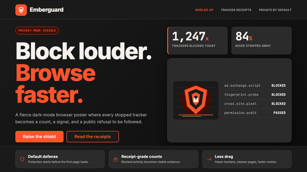 Brave Browser Lion OrangePrivacy gets loud. Lion-orange counters and shield geometry cut through warm…隐私变成宣言:狮橙计数与盾牌几何刺破暖炭黑。
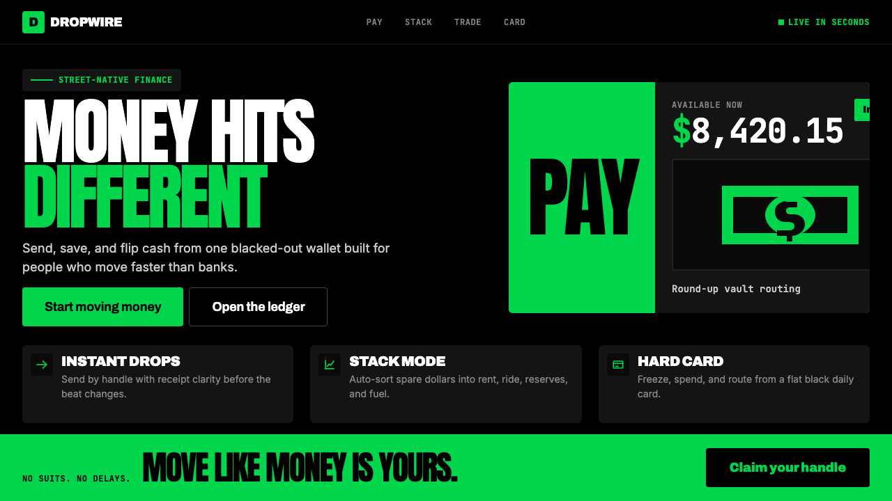 Cash App 2024Fintech that talks like a record label. Pure black, dollar-bill green, type a…像嘻哈厂牌的金融科技:纯黑底色、美钞绿、广告牌尺寸的超粗字体——不再是安全蓝衬…
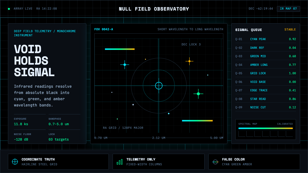 Deep Space ObservatoryTrust the void. Cyan telemetry and amber wavelength bars lock to a steel grid.信任虚空:青色遥测与琥珀波段锁定钢性网格。