What is Taarab Cassette Sleeve?
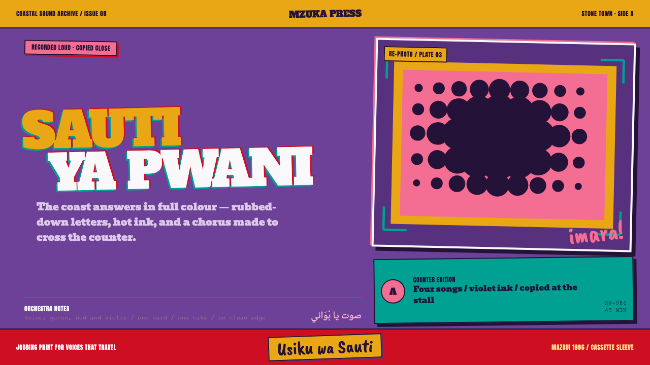
Taarab Cassette Sleeve is printing at full volume: a flat violet field, coarse halftone, whole blocks of hot colour, and slab lettering set slightly crooked because a hand put it there.
Taarab Cassette Sleeve in brief
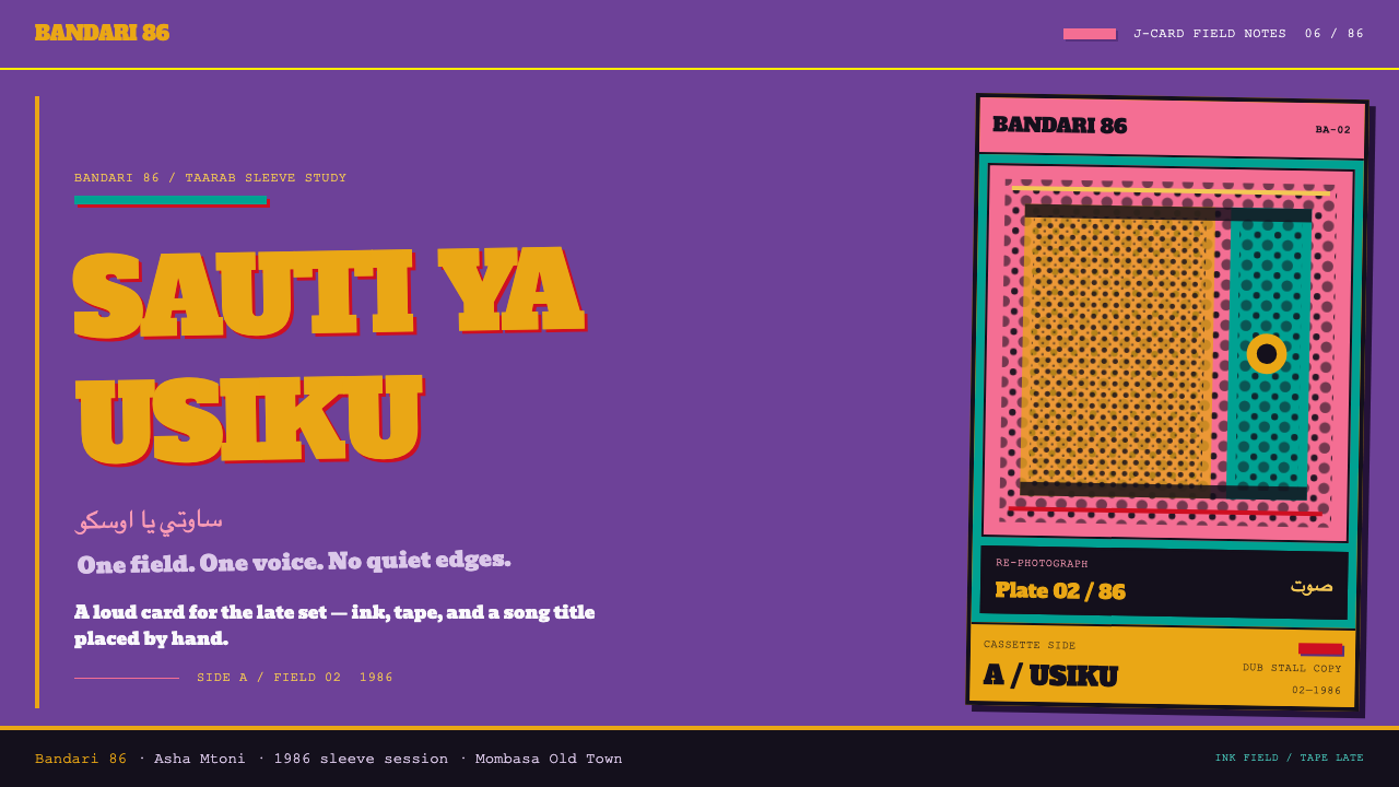
Taarab Cassette Sleeve recreates the J-card — the folded paper insert of a cassette case — as it looked on taarab music from 1980s Zanzibar. It is a deliberately loud, flat and imperfect style: one saturated violet ink laid across the whole card, band portraits re-photographed until they dissolve into coarse halftone, and heavy slab and condensed capital lettering laid over the top.
Its defining principle is that the colour is the paper. The violet is not a backdrop behind the design; it is the card's own ink, the first thing the print job committed to. Marigold, chrome yellow, teal, scarlet and hot pink arrive as whole blocks, not as accents, so the surface reads as a collision of flat colour fields rather than a harmonious palette.
Nothing is centred and nothing is polished. Registration slips, edges misalign, lettering sits askew. These are not flaws to be corrected but the evidence of how the object was made: quickly, cheaply and by hand, with the single purpose of stopping a passer-by at a duplicating stall.
Where does Taarab Cassette Sleeve come from?
Taarab is the sung music of the Swahili coast, most closely associated with Zanzibar's Stone Town. Its name derives from an Arabic word for musical enchantment, and the genre grew through a system of social clubs whose orchestras played for weddings and celebrations. The music blends Arabic, Indian and African elements with Swahili poetry, and its lyrics, often about love and its complications, were a public conversation conducted in song.
The sleeve belongs to a technological shift. Through the 1970s cassettes displaced records on the Swahili coast, and the taarab sleeve peaked in the 1980s. A cassette could be copied by anyone with a deck, so the economy of music moved from pressing plants to dubbing stalls: small stands where tapes were copied and sold to passers-by. The card inside the case was the shopfront. It had to be read at a glance across a crowded street.
The source places the printing and the dubbing in Mombasa's Old Town, on the Kenyan coast, and dates the world of dubbing stalls — and an outfit it calls Mzuri — into the 1990s. The printing was jobbing print: the everyday commercial work of small presses that turned out invitations, handbills, shop signs and cassette cards on thin stock in a single ink. The look comes straight from those constraints. One ink was cheap; a photograph could only survive as a re-photographed halftone; and lettering was whatever the shop had on hand.
Behind the sleeves are the voices they sold. Siti binti Saad, the Zanzibari singer who recorded in the late 1920s and sang in Swahili, is often called the founding voice of recorded taarab; Bi Kidude, whose career spanned much of the twentieth century, became its most visible elder. Scholars such as Werner Graebner have documented the coastal cassette culture, and M.J. Shah appears in the source as a name from the Mombasa trade. The design system keeps the cards in their proper register: commercial objects made by printers and stallholders rather than by designers, whose power comes from being too loud to ignore.
What defines the Taarab Cassette Sleeve look?
The Violet Field
A saturated violet covers the card from edge to edge. It is flat and opaque, the ink of the print job rather than a tint, and it should never be dimmed with overlays or softened into a gradient. Treat it as the paper itself. Everything else sits on or cuts into it, and the page should feel as if there were no white stock underneath.
Whole-Block Colour
Marigold, chrome yellow, teal, scarlet and hot pink come in as complete blocks — a band across the top, a panel behind the title, a corner slab — never as accents or thin details. They sit against the violet with little attempt at harmony, and the collisions are the point. A block of colour should be large enough to be an object in its own right.
Coarse Halftone
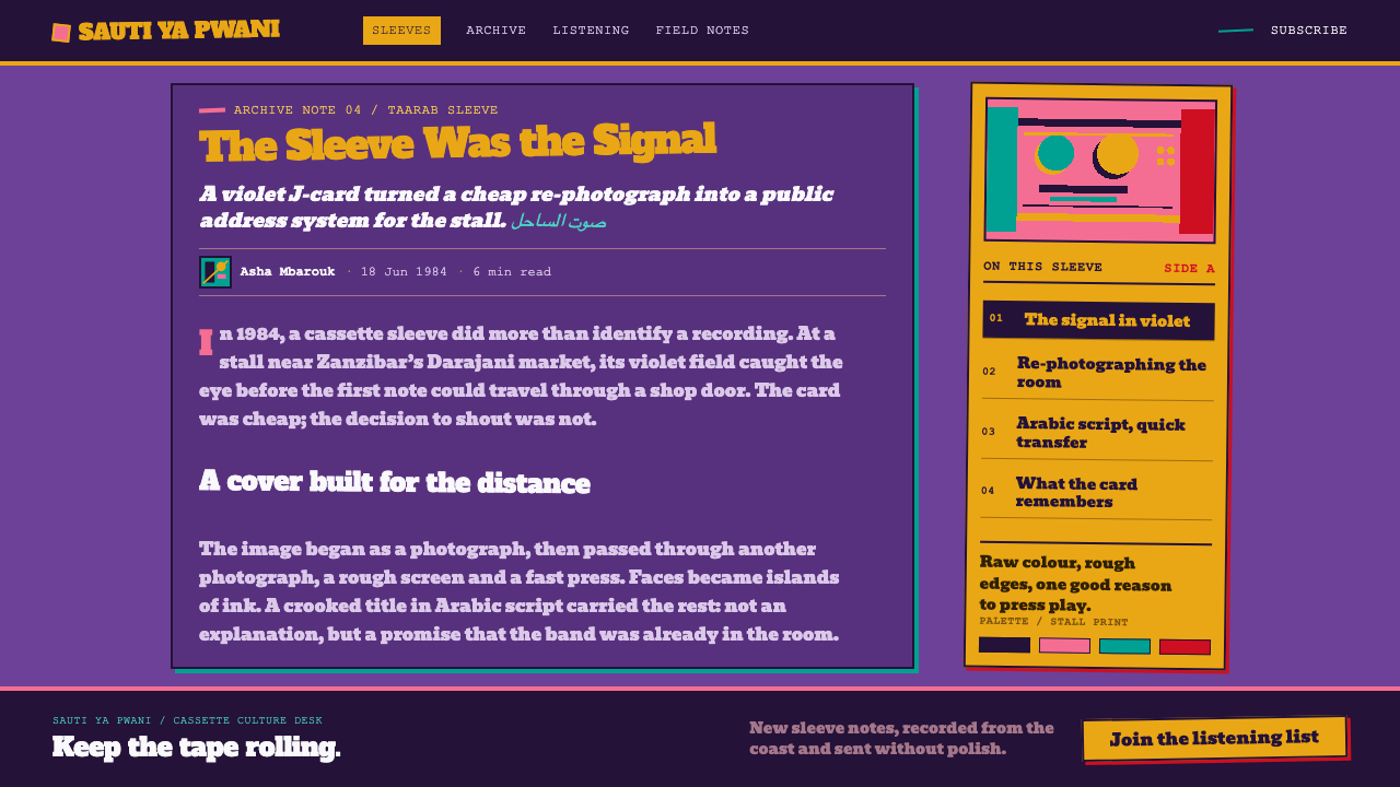
Portraits are photographs copied and re-copied until the tones collapse into a visible dot screen. Faces survive as bold patterns of light and dark with rough edges and lost detail. The roughness is the look: a crisp, high-resolution portrait would contradict the whole idea. Treat the halftone as printed ink in a single colour, not as a filter laid over a clean photograph.
Heavy Slab and Condensed Capitals
Lettering is thick slab serif for names and tall, condensed capitals for titles and secondary lines. It is large, often crowding the edges, and laid slightly askew rather than on a perfect baseline. The look suggests dry-transfer sheets or a marker pen: lettering placed by hand, letter by letter, by someone with a lot to fit on a small card.
Slipping Registration and Off-Centre Layout
Nothing is centred. Colour blocks overshoot or fall short of their edges by a hair, the second ink sits a little off the first, and the composition leans to one side. The slip should read as accident but behave as design: it must never reduce legibility, and the title and the artist's name must remain unmistakable.
Thin Card and Flat Ink
The physical limits of the object are part of the style: thin card, one pass of ink, no finishing. There are no gloss effects, no drop shadows, no depth beyond overlap. Layering is by overprinting flat blocks and cutting one shape into another, so the whole card reads as a single printed sheet.
Who shaped Taarab Cassette Sleeve?
Siti binti Saad was a Zanzibari singer who recorded in the late 1920s, singing in Swahili, and is often described as taarab's founding recorded voice. Her records circulated for generations, and her name is cited in the source as part of the history that later cassette sleeves sold. In design terms she stands for the voice that the loud print exists to carry: the card is a loudspeaker for something that deserves to be heard.
Bi Kidude was a Zanzibari singer whose career spanned much of the twentieth century and who remained a public figure into extreme old age. She performed in taarab and in other coastal traditions, and her image on a cassette cover is exactly the kind of portrait the system's halftone is built to carry: a face that does not need polish to be recognised.
M.J. Shah appears among the source's key figures as a name from the Mombasa trade in recordings and cassette cards. The name is a useful reminder that the sleeve was a commercial object made by shopkeepers, printers and duplicators, and that its aesthetic was a by-product of cost, speed and competition for the attention of passers-by rather than the outcome of an art-directed decision.
Graebner is a scholar of Swahili popular music who has documented the coastal cassette culture and its recordings. His role in the source is that of the documentarian: someone whose work lets later designers see these cards as a coherent visual world rather than as disposable packaging. Citing him is a way of saying that the system rests on research, not on a retro mood.
How do you use Taarab Cassette Sleeve today?
Taarab Cassette Sleeve is a poster style, and it works best when the goal is to be seen and remembered at speed: music, festivals, events, culture and creative brands, and any product that wants to sound as if it were made by people rather than committees. It demands confidence — half-measures read as a mistake rather than as a choice.
For slides, a cover is a full violet field with a single oversized block of marigold or hot pink behind the title and a halftone portrait or image pushed to one side. Content slides can alternate blocks of colour as sections, with the heading in heavy slab or condensed capitals and body text kept short and large. Data slides work best with few, chunky shapes — thick bars as colour blocks, big numerals in slab — and as little small print as possible. The style punishes crowded charts; give each number its own block.
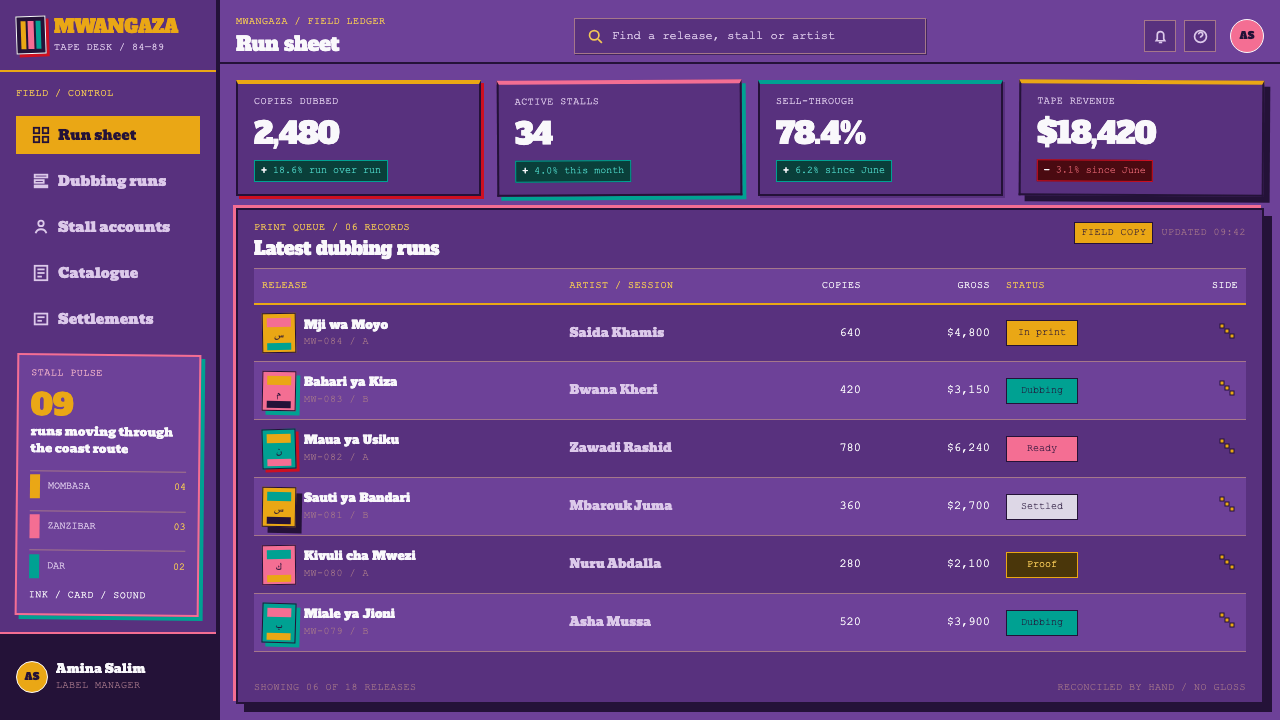
In interfaces, the system suits landing pages, event and ticketing sites, music players and campaign microsites. For dashboards, use the violet as a full-bleed shell and make each panel a flat colour block with large, heavy type; keep tables plain and legible, and confine the misregistration and askew lettering to headers and decorative layers. Pricing pages are natural: each plan becomes a whole block of a different hot colour, with the recommended one the loudest. Keep buttons as flat blocks with heavy labels and no soft shadows.
For editorial and marketing work, the style supports covers, posters, social tiles and playlists. Article headers can be a violet field with a condensed headline and a halftone image; section breaks can be flat colour bands. Copy should match the visual volume: short, direct and a little cheeky. Long-form body text should move to a quiet, plain setting, with the loud treatment reserved for headers and covers.
The most common mistake is making the style tidy: aligning everything perfectly, using soft gradients, adding subtle shadows, or choosing a cleaner photograph. That removes the printing logic that defines it. The opposite mistake is applying the roughness to everything, including body text, forms and data, which hurts legibility. A third is using the palette as accents on a white page; the violet must be the field. Finally, if you reproduce real people or real sleeves, check the rights: the style is a look, not a licence to use anyone's image.
Taarab Cassette Sleeve — FAQ
What is a J-card?
It is the folded paper insert that goes inside a cassette case. It carries the title, artist, track list and artwork. On the Swahili coast of the 1980s it was often printed in a single flat ink on thin stock, and it was the main way a buyer judged a tape before hearing it.
Is the misalignment intentional, and can I use it without hurting usability?
Yes, as long as it stays decorative. Slipped registration, off-centre blocks and slightly crooked lettering belong on covers, headers and display type. Body text, form fields, navigation and data should stay straight and legible. The rule: the loudness lives in the frame, and the information stays readable.
Why violet?
Because the colour was chosen to shout. In a crowded dubbing stall, cards competed for attention at a glance, and a saturated field of ink was the cheapest way to win it. Violet is the system's anchor, treated as the paper itself, with hot colours arriving in blocks against it.
How is this different from a retro or vintage cassette look?
A retro cassette look usually means soft nostalgia: faded colours, film grain, neat typography. This system is the opposite. It is loud, flat and unsentimental because the original cards were new, cheap and meant to be noticed. If your design feels gentle and faded, it is closer to nostalgia than to taarab print.
Where does the style struggle?
It struggles with long reading, precise data and any context that wants calm: legal, medical, financial or wellness content. Its high-saturation fields can tire the eye over many screens, so use the loud treatment on entry points and keep sustained reading in a quieter mode.
Related design styles
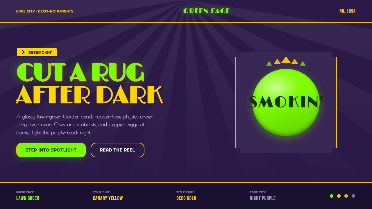 The Mask 1994 Green FaceLoud, theatrical, ssssmokin'. Lawn-green and canary-yellow scream against dec…
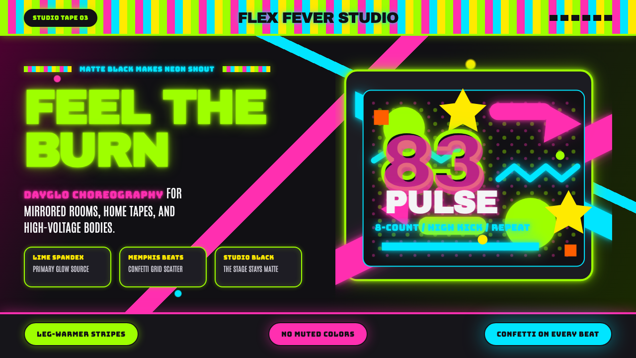 80s Aerobics Fluoro SpandexNeon refuses restraint. Lime spandex, pink-cyan confetti, and black-stage typ…
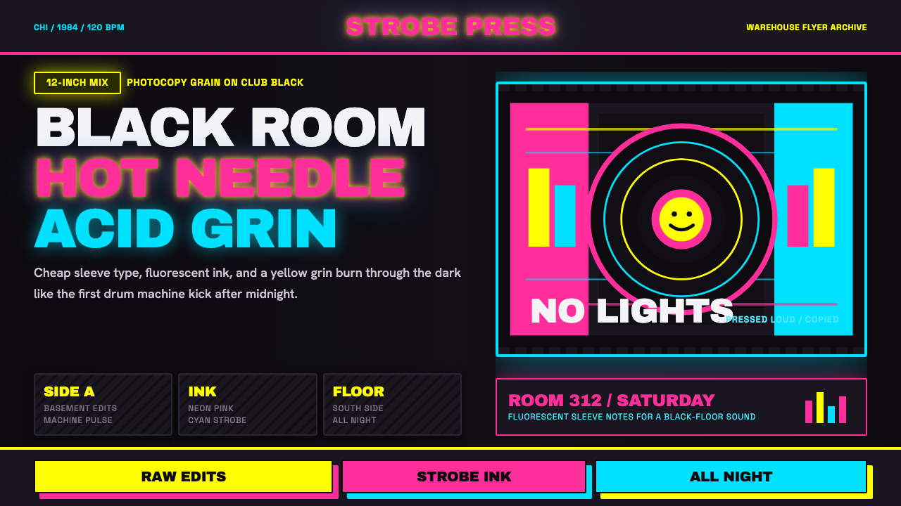 Chicago HouseDarkness starts the track. Neon pink, yellow and cyan hit black like Xerox st…
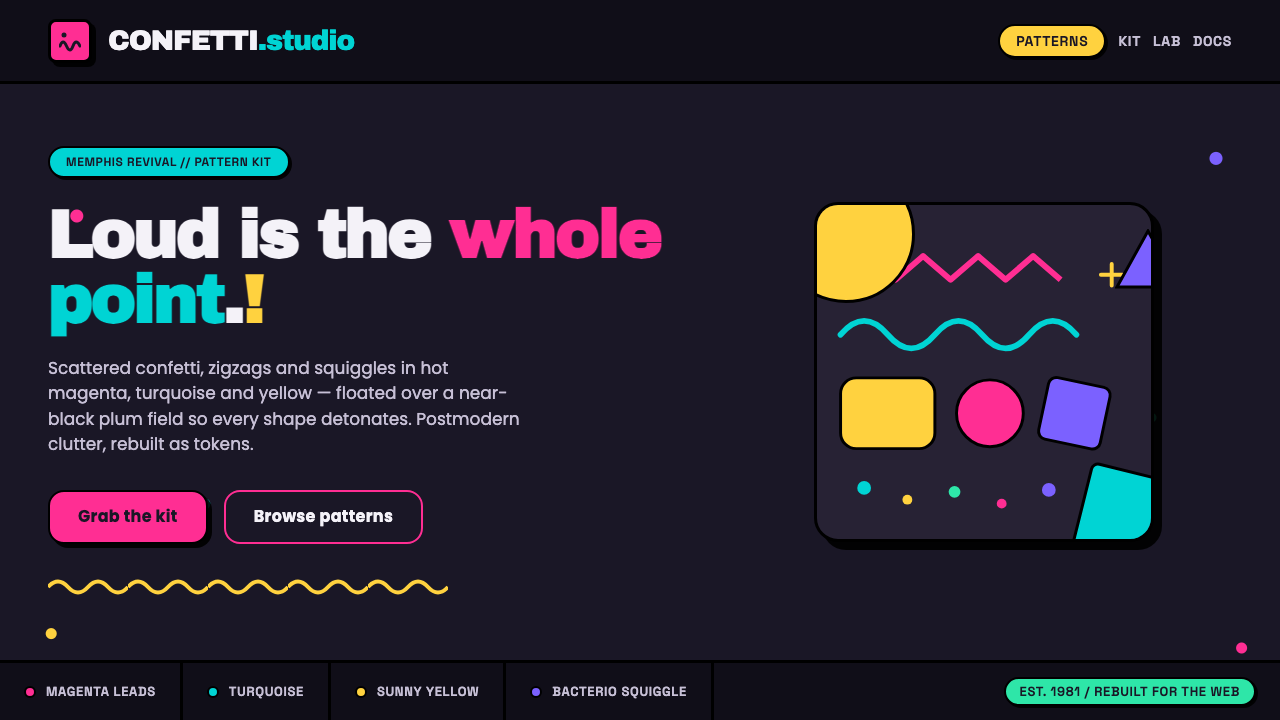 Memphis Web Pattern RevivalLoud is the point. Confetti dots, zigzags and Bacterio squiggles in hot magen…
 Vans Checkerboard (1966)Built to hit hard. Anton type, black-white checkers, one sanctioned red mark.
 Bollywood Neon MumbaiMumbai pop burns bright. Khand stacks glow over night-black, with pink-purple…