About Rolling Stones Tongue (1971)
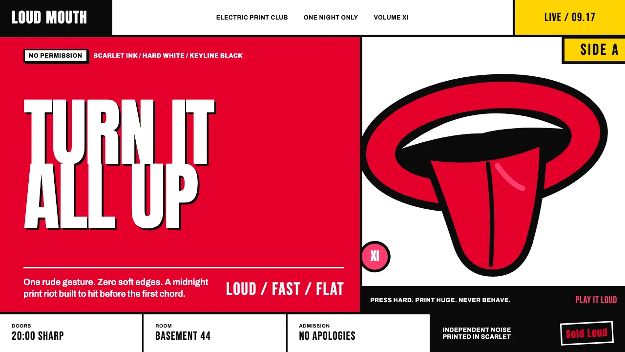
The loudest little logo in rock history: a wet red tongue lolling between two fat scarlet lips, thick black keyline, nothing else. John Pasche drew it for Mick Jagger in 1970, and it hit the world on the inner sleeve of Sticky Fingers in 1971. It has never once looked dated.
The whole system runs on that one gesture — an obscene, grinning splash of vermilion floated on hard white or slammed onto black, oversized until it's rude, cropped until it's a pattern. Flat pop-art swagger with a lick of anti-establishment sneer: no gradients, no gloss, just confident ink doing all the shouting.
- Origin
- London, England
- Era
- 1970–1971 (logo commissioned Aug 1970, debut on Sticky Fingers, April 1971)
- Key figures
- John Pasche · Mick Jagger · Andy Warhol · Craig Braun
- Movements
- British Pop art · glam poster graphics · rock-and-roll branding · anti-establishment counterculture
Rolling Stones Tongue (1971) design spec
Colors
Typography
The other 11 sections — buttons, cards, spacing, motion, techniques and more — open once you unlock. Download the DESIGN.md or send it to your AI in one click. Unlock once, yours forever.
Sign up nowStyles similar to Rolling Stones Tongue (1971)
Also inspired by brands & products, with a close feel.
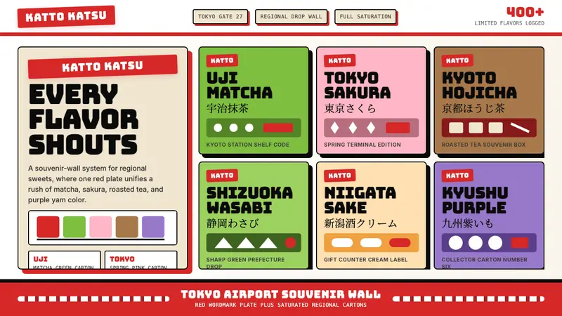 Kit Kat Japan CollectorSouvenir wall joy. Red plates and saturated flavor tiles turn regional sweets into collectibles.
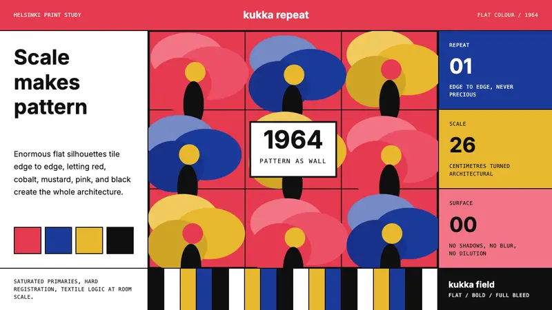 Finnish Marimekko Unikko (1964)Scale becomes pattern. Poppy red, cobalt, mustard, and Inter tile flat silhouettes.
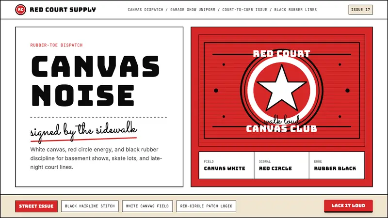 Converse Chuck TaylorPopulist and loud. Saturated red circles, Bungee type, black stitch lines on white canvas.
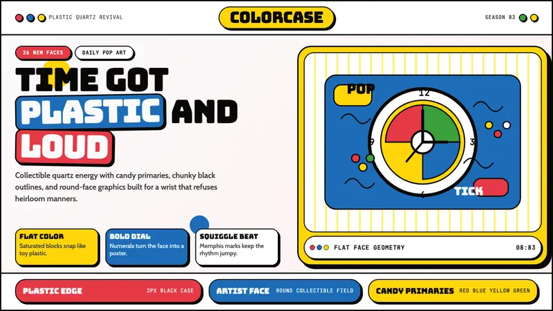 Swatch Watch (1983)Pop plastic optimism. Bungee type, candy primaries, round dials and squiggles snap loud.