What is Belle Époque Paris?
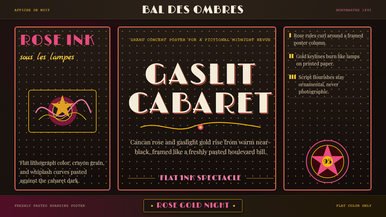
Belle Époque Paris is the gaslit world of Montmartre at its most intoxicating — cancan-rose ink and gaslight gold floating on warm near-black, shaped by the whiplash curves of French Art Nouveau and the bold flat colour fields of the lithographic poster.
Belle Époque Paris in brief
Belle Époque Paris is a design style rooted in the golden age of French poster art, roughly 1871 to 1914 — the period between the Franco-Prussian War and the First World War when Paris led the world in entertainment, fashion, and commercial visual culture. Its visual language takes its cues from the lithographic affiches that covered the city's kiosks and hoardings: bold flat colour fills, ornamental script lettering, sinuous organic line work, and a warm near-black ground that makes rose pinks and amber golds glow as if lit from within.
The style belongs to the broader French Art Nouveau movement but occupies a distinctly popular and commercial register within it. Where Viennese Secession Art Nouveau gravitated toward the geometric and the reserved, Paris chased the curve, the flourish, and the openly pleasurable. Lithography — a printing process that allowed large flat colour fields without the hard outlines of engraving — was the technical engine that made this aesthetic possible at billboard scale, turning the street into an exhibition of colour and movement.
Visually, the style is instantly readable: warm dark grounds set against luminous rose, gold, or amber accents; figures drawn with flowing contour lines that twist and trail into decorative tendrils; lettering that is ornate but never illegible, often set within curved poster panels or framed cartouches. Realism is nowhere; photographic naturalism is entirely absent. Every surface reads like a freshly pasted hoarding advertisement glowing under café-concert gas lamps.
Where does Belle Époque Paris come from?
The term Belle Époque — literally 'Beautiful Era' — was coined retrospectively by those who had lived through it, nostalgically applied after the carnage of the First World War had made the prewar decades seem impossibly radiant. The period it describes, roughly 1871 to 1914, was one of rapid industrialization, bourgeois prosperity, and cultural efflorescence across Western Europe, but Paris was its undisputed capital. Haussmann's renovation of the city in the 1860s had produced wide boulevards, electric street lighting (and before it, gas lamps), and a network of café-concerts, cabarets, and theatrical venues that formed the social fabric of Parisian nightlife.
The great visual engine of the Belle Époque was colour lithography. Jules Chéret, often called the father of the modern poster, pioneered the technique in Paris from the 1860s onward, producing theatrical and commercial affiches of an entirely new kind — large-format, multi-colour, printed on thin paper designed to be pasted up quickly and replaced often. Chéret's cheerful, swirling women — nicknamed 'Chérettes' — embodied the era's appetite for visual pleasure. His prints established the formal grammar that later artists would inherit: the dark ground, the flat lit figures, the emphatic lettering integrated into the composition as a design element rather than a caption.
Henri de Toulouse-Lautrec transformed that grammar in the early 1890s. Working specifically for the cabarets and entertainers of Montmartre — the Moulin Rouge, the Folies Bergère, performers like Aristide Bruant and Jane Avril — Lautrec introduced a rawer, more psychologically acute version of the style. His figures were more angular and caricatural, his compositions more daring in their flat negative space, his colour relationships starker and more expressive. He brought Japanese woodblock printing's influence — the cropped viewpoint, the silhouetted figure, the emphasis on contour over modelling — directly into the commercial poster format.
Alphonse Mucha added a third register: the decorative and the luxuriant. His advertising campaigns for Sarah Bernhardt and later for commercial products like champagne and biscuits introduced the mosaic-like background panels, the halo of Byzantine ornament, and the sinuous figure fully integrated into the decorative field — what became the internationally recognized 'Mucha style' and exported Art Nouveau's vocabulary far beyond France. By 1900, the aesthetic had spread to posters, menus, fashion plates, architectural ironwork, and exhibition pavilions across Europe and into the Americas, carried by reproductions, illustrated journals, and the international exhibition circuit.
What defines the Belle Époque Paris look?
Ground and Colour
The defining colour decision of the style is its ground: a warm near-black — not a cold printer's black but something with brown or sepia warmth — that makes the foreground colours appear to glow under artificial light. Against this ground, the key accent colours are rose-pink and gaslight gold or amber, used in large flat fills without shading or gradation. Secondary accents might include ivory or cream for highlights and muted sage or teal for atmospheric depth. The total palette is narrow — typically three to four colours plus the dark ground — but each colour is deployed at high opacity and large area, giving the impression of visual richness without complexity.
The Whiplash Line
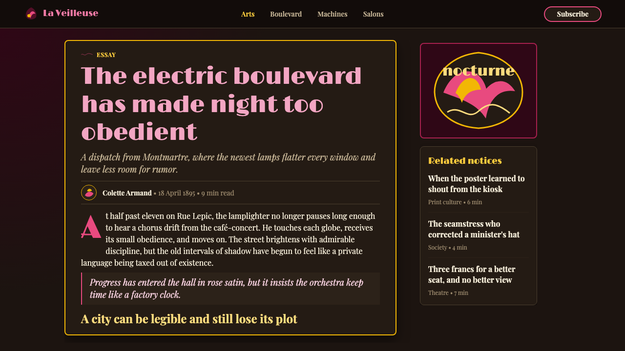
The most recognizable mark of the style is its line quality: long, elastic, asymmetrically curved strokes that accelerate and taper like the crack of a whip. This line — inherited from naturalistic studies of plant stems, hair, and flowing fabric — appears everywhere: in the contours of figures, in the tendrils of decorative borders, in the letterforms of the display type, in the swirling backgrounds of poster compositions. The line never breaks at a right angle; it is always in motion, always curving toward its next destination. In contemporary application this line can appear as an illustration element, a border motif, a background texture of interlocking curves, or a separator between typographic zones.
Flat Lithographic Colour
Belle Époque poster art exploited the technical properties of chromolithography: each colour was laid down as a separate, flat, unmodulated field, with no blending between adjacent tones. The result is an aesthetic of clean colour planes separated by drawn contour lines — closer to stained glass or Japanese woodblock printing than to Western oil painting. Shadows, where they exist, are rendered as separate flat shapes in a darker related tone rather than as gradients. Highlights are either left as bare paper or rendered as a distinct, flat pale tone. This flatness is not a limitation to work around but the visual foundation of the style's boldness and legibility at distance.
Ornamental Typography
Letterforms in Belle Époque design are never neutral containers for information; they are active participants in the visual composition. Display type might be set in a flowing script with calligraphic swashes, in a condensed slab-serif with Art Nouveau terminal flourishes, or in a letter drawn directly into the poster as a hand-lettered element integrated with the illustration. Type is frequently set along curves, enclosed within decorative frames or cartouches, or made to wrap around figural elements. The general approach treats lettering as ornament rather than as a grid-aligned typographic system — the words are part of the picture, not a separate layer above it.
Figure and Silhouette
The human figure — typically female, in motion, often in theatrical or festive dress — is the central subject of Belle Époque poster art. Figures are drawn with a focus on contour and silhouette rather than anatomical accuracy or tonal modelling. The Toulouse-Lautrec approach reduces figures to their most expressive outline, sometimes to the point of caricature; the Mucha approach wraps figures in decorative garments and hair that merge with the background ornament. Both approaches treat the figure as a flat graphic element first and a representation of a person second. In contemporary application, this means that illustrative figure elements should lean into graphic boldness — expressive silhouette, flowing line, minimal internal detail — rather than photographic or painterly realism.
Poster Panel and Frame
Belle Époque compositions are typically contained within a clearly defined poster format — a rectangular field with an implied or explicit frame, often with rounded or elaborately decorated corners. The frame is not a neutral container but an active design element: it may be formed by a decorative border of interlocking organic motifs, by an architectural arch, or by the figures and foliage of the composition itself. Within the frame, composition tends toward a pronounced vertical orientation, reflecting the tall, narrow format of the street poster. Contemporary layouts that invoke the style often benefit from explicitly framing content — a card component with an ornamental border, a section with a curved or decorative rule, a layout where the bounding box is part of the visual statement.
Decorative Background
Unlike styles that treat the background as neutral negative space, Belle Époque design fills it with ornamental activity. Backgrounds in Mucha's work are structured as concentric rings or mosaic panels — geometric at a macro scale but filled with organic botanical detail at a micro scale. In Chéret and Lautrec, backgrounds are simpler but still textured: overlapping crowd figures, splashes of contrasting colour, or atmospheric washes that give the flat ground a sense of depth and movement. The background is always doing something — providing contrast for the figure, establishing the environment, contributing a secondary layer of ornamental pleasure. Dead flat, unrelieved grounds are characteristic of later, stripped-back modernisms, not of this style.
Who shaped Belle Époque Paris?
Toulouse-Lautrec (1864–1901) is the defining artistic intelligence of Belle Époque Montmartre. Despite his aristocratic background, he spent his adult life embedded in the cabarets and dance halls of the Butte Montmartre, producing lithographic posters for the Moulin Rouge, the Divan Japonais, and individual performers including Jane Avril, Yvette Guilbert, and Aristide Bruant. His poster style was revolutionary: he combined the flat colour fields of Japanese woodblock printing with a caricaturist's eye for psychological essence, producing images that were simultaneously decorative and incisive. His work shifted the cultural status of the commercial poster from trade ephemera to collected art object, and his compositions — the cropped viewpoint, the silhouetted figure against a luminous ground, the expressive contour line — remain the most cited visual references for the style.
Chéret (1836–1932) is often called the father of the modern poster. He learned chromolithography in London and returned to Paris in 1866 to establish a print shop that would over the next three decades produce over a thousand large-format advertising posters. His technical mastery of the lithographic press allowed him to achieve an unprecedented range of colour, with transparent overlapping inks producing subtle intermediate tones within an essentially flat colour system. His compositions — bright figures in joyful motion against luminous grounds, always suggesting festivity and pleasure — established the tonal and compositional baseline from which Lautrec and Mucha would diverge. The French government awarded him the Legion of Honour in 1890 in recognition of the poster's new cultural significance.
Mucha (1860–1939) was a Czech artist working in Paris who became famous overnight in 1894 when he was handed an emergency commission to design a poster for Sarah Bernhardt's production of Gismonda. His distinctive style — elongated female figures surrounded by Byzantine-influenced halos and mosaic-like decorative panels, integrated into compositions of extraordinary ornamental density — immediately attracted commercial clients seeking the association of luxury and cultural sophistication. His campaigns for champagne, biscuits, cigarette papers, and department stores made his style the most internationally recognized commercial Art Nouveau aesthetic. Mucha himself was ambivalent about his decorative work, considering it secondary to his nationalist historical paintings, but his poster compositions remain the popular global image of Belle Époque visual culture.
Jane Avril (1868–1943) was a dancer and performer at the Moulin Rouge who became one of Toulouse-Lautrec's most frequent subjects and, unusually for a performer of her era, an active collaborator in the construction of her own public image. Lautrec produced multiple posters and prints of Avril, and she understood intuitively how the graphic distillation of her dancing style — the raised leg, the swirling skirt, the contained intensity of her expression — could function as both advertisement and art. Her relationship with Lautrec represents the Belle Époque poster at its most sophisticated: a working partnership between performer, artist, and printer in which the commercial and the artistic were genuinely inseparable.
Bruant (1851–1925) was a singer, songwriter, and cabaret owner who performed and ran Le Chat Noir and later his own club, Le Mirliton, in Montmartre. His persona — black cape, red scarf, wide-brimmed hat, the songs of working-class Paris — became the subject of Lautrec's most iconic poster images. The bold silhouette of Bruant as rendered by Lautrec, his figure reduced to a graphic of black mass and red accent against a warm ground, is one of the most reproduced images of the period and demonstrates how Belle Époque poster art achieved its effects not through detailed representation but through the graphic reduction of personality to its most essential visual terms.
How do you use Belle Époque Paris today?
Belle Époque Paris is a high-impact style that works best when it is used with conviction rather than restraint. Its visual vocabulary — the warm dark ground, the luminous colour accents, the organic curving line, the ornamental letterforms — is specific enough that partial or tentative application tends to read as incoherent. The single most important decision when applying the style is committing to the ground colour: a warm near-black or very deep sepia-inflected tone is what makes the accent colours glow, and substituting a conventional dark navy or neutral charcoal will produce results that feel like generic dark-mode design rather than anything recognizably Belle Époque.
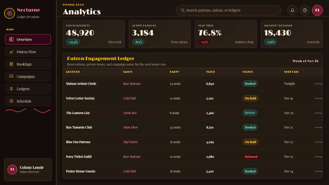
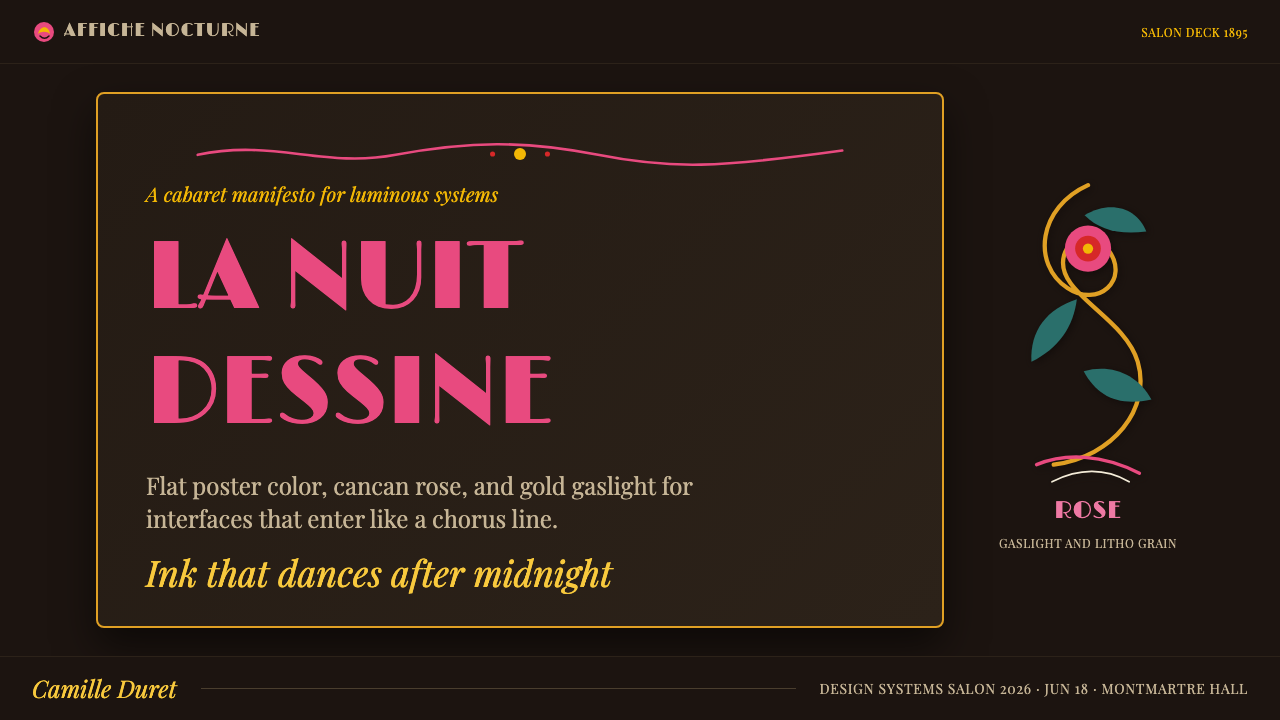
For presentation slides, the style works most powerfully in contexts where theatrical impact is desirable — entertainment, arts and culture, hospitality, heritage brands. A cover slide benefits from the poster-composition approach: a single dominant figure or silhouette in the centre field, flanked by decorative border elements, with the title set in an ornamental display font that curves or arches across the composition. Content slides should be treated as broadsheets rather than grids — wide margins, generous leading, a single decorative rule or ornamental initial to mark section openings. Data slides in this style work best when the data is sparse and the visual treatment amplifies a single dominant finding; the aesthetic does not suit dense information grids.
For web interfaces and marketing pages, the style has natural affinity with entertainment booking platforms, cultural event promotion, luxury food and beverage brands, and heritage or artisanal product storytelling. Full-width hero sections work especially well with illustrated or ornamental backgrounds in the Belle Époque manner. Navigation should be typographic and restrained — the ornament belongs in the content zones, not in the wayfinding. Avoid using the style's decorative density uniformly across an entire interface; reserve the most elaborate treatments for hero and feature sections, and simplify the surrounding utility areas to avoid visual fatigue.
For editorial and print-derived work, the style is most itself: rich decorative borders, pull quotes set in flowing scripts, section openers illustrated with ornamental vignettes, running feet incorporating small decorative motifs. Magazine covers, event programs, exhibition catalogues, and seasonal promotional materials all support the style's full decorative register. For packaging and branding, the style suits products that want to invoke artisanal heritage, Parisian provenance, or festive occasion — wine, champagne, confectionery, fragrance, theatrical merchandise.
The most common mistake when applying Belle Époque Paris is treating it as a colour palette and missing the line. Adding rose and gold to a dark background produces a vaguely vintage effect; adding the whiplash curve — in borders, in illustrated motifs, in the letterforms themselves — is what actually activates the style. A secondary mistake is over-ornamenting: authentic Belle Époque compositions are rich but not cluttered. Chéret and Lautrec achieved their effects through bold simplification, not through accumulation. In contemporary application, restraint in the number of decorative elements, combined with boldness in the scale and quality of each, will almost always produce better results than adding more detail.
Belle Époque Paris — FAQ
How is Belle Époque Paris different from Art Nouveau generally?
Art Nouveau was an international movement with distinct regional inflections — the geometric abstraction of the Vienna Secession, the naturalistic intricacy of Belgian Art Nouveau, the restrained linear elegance of the Glasgow School. Belle Époque Paris is a specific sub-tradition within French Art Nouveau, defined by its commercial poster context, its warm dark grounds and lithographic colour fields, and the particular personalities of Chéret, Lautrec, and Mucha. It is more populist and entertainment-oriented than most Art Nouveau variants, less concerned with architecture and applied crafts, and more aligned with theatrical spectacle and street-level visual culture. If you apply Viennese Secession principles — the geometric grid, the fine ornamental line, the restrained palette — you are doing a different thing, even though both fall under the Art Nouveau umbrella.
Does the style work on light backgrounds, or is the dark ground essential?
The dark ground is not cosmetically optional — it is structural. The entire colour logic of the Belle Époque poster depends on the warm near-black as the base from which accent colours emerge. On a light background, rose-pink and gold lose their incandescent quality and become simply decorative tones without the glow effect that defines the style. A light-background adaptation is possible — Mucha's decorative panels sometimes use cream or ivory grounds — but it shifts the register considerably toward a softer, more pastel-adjacent aesthetic that feels more Victorian than Montmartre. If you need to work on a light ground, lean into cream or warm ivory rather than white, use the ornamental line work and frame vocabulary as your primary style markers, and accept that you are working in a lighter variant rather than the canonical version.
Can the Belle Époque style work for digital interfaces, or is it too ornamental?
It can work in digital contexts, but it requires selective application rather than wholesale transposition. The full ornamental density of a Mucha poster — interlocking borders, mosaic backgrounds, integrated lettering — becomes extremely difficult to navigate as a UI. The practical approach is to use the style at two levels: the decorative level (hero sections, splash pages, loading screens, onboarding illustrations, seasonal campaigns) can carry the full visual vocabulary; the functional level (navigation, forms, data display, utility components) should be stripped back to the style's colour and line quality, using the warm dark ground and accent colours to maintain atmosphere while reducing ornamental complexity. The style is also well-suited to interactive experiences designed for single-sitting engagement — invitations, event microsites, cultural institution landing pages — where the user is expected to spend time with the aesthetic rather than move through it quickly.
What typefaces work with Belle Époque Paris without looking like a costume?
The risk with typeface selection is leaning too hard into explicit period-signalling — heavily ornamented Victorian display faces or clichéd Art Nouveau letterforms that immediately read as pastiche rather than confident contemporary homage. More effective approaches use display type that has organic flow and warmth without being overtly period-specific: serif faces with high contrast between thick and thin strokes and slightly bracketed or calligraphic serifs; transitional or old-style serifs with visible pen-angle ancestry; contemporary geometric serifs that incorporate subtle organic inflections. For body text, a legible old-style serif keeps the period warmth without competing with the decorative elements. Where the style truly calls for ornamental display lettering — headlines, poster-style event graphics — commissioning or selecting genuinely good hand-lettered or calligraphic work is preferable to relying on off-the-shelf novelty fonts, which almost always read as approximate rather than authentic.
Is Belle Époque Paris suitable for brands that want to be taken seriously, or does it only work for entertainment?
The association with entertainment and pleasure is intrinsic to the style's history, but it does not limit it to entertainment brands. The style carries strong associations with craft quality, cultural sophistication, and Parisian provenance — all of which are valuable in luxury goods, fine dining, cultural institutions, heritage hospitality, premium beverage, and artisanal food categories. In these contexts, the style signals connoisseurship and occasion without irony. Where it struggles is in contexts where rational authority is the dominant desired value — financial services, enterprise software, medical or scientific communication — because the aesthetic is fundamentally expressive and pleasurable rather than analytical and neutral. Used in these contexts it risks reading as frivolous. The deciding question is whether the brand's relationship with its audience is primarily about pleasure, occasion, and cultural identity, or primarily about trust, efficiency, and professional authority.
Related design styles
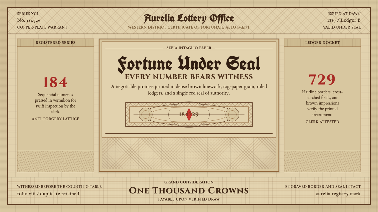 Engraved Lottery TicketLegal gravity in sepia. Guilloche borders, blackletter type, and a vermilion…
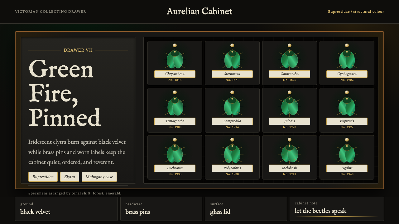 Beetle Specimen CabinetGreen burns in darkness. Emerald elytra grids glow under brass keylines and b…
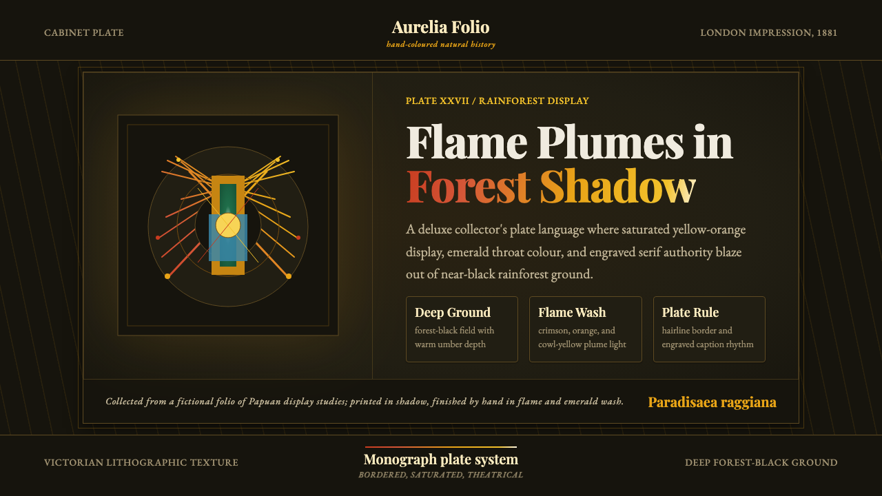 Bird of Paradise MonographTheatrical plate-book darkness. Flame plumes blaze from a bordered forest-bla…
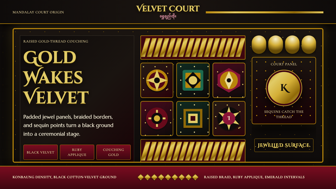 Burmese Kalaga TapestryVelvet becomes theater. Black ground, gold-thread borders, ruby and emerald p…
 Dutch Tulip ManiaSpeculation burns in shadow. Flame red petals, violet stripes, gold frames on…
 Greek Vase Attic (500 BC)Archaeological severity. Jet-black glaze, terracotta bands, and meander borde…