What is Engraved Lottery Ticket?
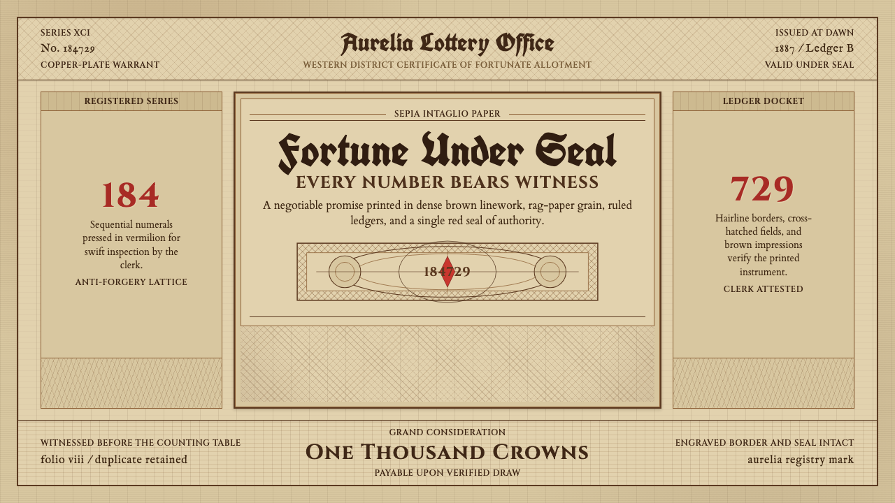
Engraved Lottery Ticket revives the copper-plate world of nineteenth-century bonds and share certificates — dense line-engraving, allegorical goddesses, and the quiet authority of paper meant to be trusted with money.
Engraved Lottery Ticket in brief
Engraved Lottery Ticket is not a lottery ticket in the modern sense of a scratch-off slip — it is the visual language of the ornate, engine-turned securities that European printers produced for bonds, shares, and lottery draws throughout the 1800s. The style borrows its authority from the same craft that once made banknotes and stock certificates counterfeit-resistant: fine intaglio line work cut by hand into a copper or steel plate, then printed under enormous pressure so the ink sits slightly raised off the paper.
Everything about it signals permanence and legal weight. The ground is never a clean white — it reads as aged, oxidized paper, the color of a document that has survived in a drawer for a century. Borders are built from tight, repeating geometric line patterns rather than drawn ornament; corners carry elaborate cartouches; a serial number marches across the top or bottom in a size disproportionate to everything else on the page, because in a real certificate that number was the only thing standing between a legitimate document and a forgery.
The overall effect is maximalist by modern standards but never chaotic — every dense passage of line work is doing a job, either decorative filler that resists photographic reproduction or symbolic figuration that reassures the holder their paper represents something real: liberty, fortune, commerce, the state itself, usually rendered as a classical goddess in flowing drapery.
Where does Engraved Lottery Ticket come from?
The style descends from intaglio engraving, a printmaking method far older than the securities industry that eventually made it famous. Intaglio — cutting a design into a hard surface so ink collects in the grooves rather than sitting on the surface — had been used for fine art printmaking since the fifteenth century. What changed in the eighteenth and nineteenth centuries was its adoption by banks, treasuries, and lottery administrators, who needed a printing method ordinary counterfeiters could not easily replicate.
The technical breakthrough that defined the look was the geometric lathe, perfected in the early 1800s, which could cut mathematically precise, interlocking spiral and wave patterns — what engravers called guilloche — with a consistency no human hand could match freehand. A forger could hire a skilled engraver to copy a portrait with effort, but reproducing a guilloche lattice required owning an identical machine. This is why guilloche patterns became the signature border and background treatment of banknotes, bonds, and lottery paper across Western Europe: it was security technology before it was decoration.
Alongside the anti-counterfeiting lattice work, engravers borrowed a figurative vocabulary from academic Neoclassicism — allegorical goddesses representing abstract civic virtues, a tradition already well established in public sculpture and history painting. Liberty, Fortune, Commerce, and Industry appear again and again on this paper, robed and reclining in poses lifted directly from classical statuary, because a company or a state issuing a financial instrument wanted the same visual gravity that a courthouse frieze or a coin carried.
This entire tradition eventually produced its own collecting hobby: scripophily, the collection of historic stock and bond certificates as objects in their own right, once the underlying companies had gone defunct or been absorbed. The certificates that survive today — ornate, sepia-toned, stamped with wax-red seals — are the direct visual source for this style; they are prized less for the debt they once represented and more for the sheer density of engraving craft compressed into a single sheet of paper.
What defines the Engraved Lottery Ticket look?
Color
The palette lives almost entirely in sepia and aged parchment-brown, never in clean white or cream. Every ground reads as paper that has oxidized over decades: warm, slightly uneven, faintly yellowed at the edges. Ink is a single dark tone — the deep sepia-black of intaglio printing — used for the entire dense line structure, with a small, deliberate accent of vermilion reserved for a wax-seal motif. There is no multicolor palette to speak of; the richness comes entirely from how much ink-density variation a single hue can produce.
Line Engraving
The defining texture is dense cross-hatching: fine parallel or intersecting lines that build up tone the way a pencil shading does, but with mechanical regularity. Darker areas are achieved not by heavier ink but by tighter, more overlapping line spacing — the same optical trick used in etching and engraving for centuries. This line work covers backgrounds, drapery, shading on figures, and border fill alike, giving every surface a woven, almost fabric-like density rather than a flat printed color.
Guilloche Borders
Borders are built from continuous, interlocking geometric lattices — spirals, waves, and rosette patterns cut with lathe-like precision. Unlike hand-drawn ornament, guilloche work is rigidly repetitive and mathematically regular; its visual signature is a kind of hypnotic, moiré-like density that looks machine-perfect because it originally was. This lattice frames the entire composition and often reappears as a background fill behind the central figures, doing double duty as both decoration and anti-counterfeiting texture.
Allegorical Figures
Central to most compositions is at least one classical female figure in flowing drapery, posed in the manner of academic Neoclassical painting and sculpture — reclining, gesturing toward a symbol of her virtue, crowned with laurel or holding an attribute like a caduceus or a cornucopia. These figures stand for abstractions: Liberty, Fortune, Commerce, Industry. They are rendered in the same fine line-engraving technique as everything else, so the figure emerges from tone and hatching rather than flat outline and fill.
Serial Numbers and Cartouches
A large sequential serial number, set in a scale disproportionate to the rest of the composition, is a near-universal feature — a legacy of the certificate's original function as a uniquely identifiable, non-duplicable document. Corners and edges carry ornate cartouches: framed medallion-like enclosures, often housing a monogram, a small vignette, or additional lattice work, that give the border rhythm and mark the composition's structural anchor points the way a formal seal would on a legal document.
Blackletter and Period Serifs
Titling typically mixes two registers: a heavy blackletter or Gothic display face for the primary title or the issuing institution's name, evoking legal and ecclesiastical authority, paired with a formal, high-contrast serif for secondary text — denominations, dates, clauses. Letterforms are often flourished, with hand-drawn swashes and decorative terminals that a modern typeface would strip away. The overall typographic voice is archival and declarative, closer to a legal proclamation than to modern advertising type.
Vermilion Seal Accent
Against the otherwise monochrome sepia field, a small wax-seal motif rendered in vermilion is the style's single deliberate color accent — a stamped or embossed-looking red-orange disc, often bearing a monogram or emblem, placed near a signature line or the document's lower edge. Its rarity is the point: because the rest of the composition withholds color entirely, this one mark reads as an act of authentication, exactly as a real wax seal once did on the original paper.

Who shaped Engraved Lottery Ticket?
Formed in 1858 through the merger of several rival New York security printers, American Bank Note Company became the dominant American producer of engraved currency, bonds, and stock certificates through the nineteenth and twentieth centuries. Its house style — dense guilloche lattices, allegorical vignettes, and elaborate typographic titling — effectively standardized the look that this style now revives, because so much of the surviving scripophily material in circulation today passed through its presses.
A London-based security printer active from the mid-nineteenth century, Waterlow and Sons produced banknotes, bonds, and postage stamps for governments across the British Empire and beyond, becoming one of the most prolific European sources of engraved financial paper. Its engravers worked in the same guilloche-and-allegory vocabulary common to the era, and its output supplied much of what later became prized scripophily material from colonial and Commonwealth issuers.
Better remembered today for his memoirs, Casanova was also, briefly, a key administrator involved in establishing the French royal lottery in the 1750s — an early instance of the state-run lottery apparatus whose printed tickets and bonds this style ultimately draws from. His involvement is a reminder that the lottery-and-securities printing tradition sat at the intersection of state finance, adventurism, and a nascent culture of mass gambling long before the engraving technology itself matured.
An American inventor who emigrated to England in the 1810s, Perkins developed transfer-engraving and hardened-steel printing plate techniques that made it possible to reproduce fine intaglio work at production scale without the plate wearing down — a direct technical ancestor of the geometric-lathe guilloche machinery that followed. His innovations are part of why nineteenth-century securities printing could achieve the density of line work this style is defined by, at a volume large enough to actually circulate as currency and bonds.
How do you use Engraved Lottery Ticket today?
Applying this style well means treating engraving density as the whole point, not as background texture to be minimized. It rewards contexts where the audience is meant to slow down and feel a document has weight — the opposite instinct from modern flat-design minimalism, which strips ornament away. Used well, it reads as ceremonial and trustworthy; used carelessly, as old-fashioned clutter.
For presentation cover slides, the style works as a full-bleed treatment: a sepia ground, a guilloche border framing the slide, and a single allegorical vignette or emblem positioned where a logo would normally sit, with the title set in blackletter or heavy period serif. Content and data slides should pull back the density considerably — reserve the hatching and lattice work for a header band or corner ornament, and let body content sit on a calmer, lightly aged ground so text stays legible; a data slide can render its central figure as if stamped into the same sepia register, echoing the certificate's own numeric focal point.
For web UI, the aesthetic is best suited to dashboards and pricing pages that want to signal institutional gravity — a wealth platform, a certificate-of-authenticity product, an archive or membership site trading on prestige. Guilloche patterns work as subtle repeating border or divider treatments rather than covering entire backgrounds, since a UI has to remain scannable in a way a ceremonial document does not; the vermilion seal accent translates well as a single confirmation or premium-tier marker, used exactly once per view so it retains its authenticating weight.
For editorial and marketing work, the style is a natural fit for anything trading on heritage, provenance, or exclusivity — long-form brand history pieces, limited-edition product drops, certificate-style membership cards, or invitations. A full-page treatment with an allegorical figure as hero image, a blackletter masthead, and a guilloche rule separating sections can carry an entire landing page; marketing use benefits from leaning into the ceremonial tone rather than softening it, since the whole appeal of the style is that it looks like something worth keeping.
The most common mistake is treating the guilloche and hatching patterns as a single decorative texture to scatter anywhere, which flattens the style into generic ‘old paper’ pastiche. Authentic use keeps the lattice work structural — confined to borders, seals, and figure shading — and never lets it compete with the serial-number-scale hierarchy or the single vermilion accent; diluting the palette with additional colors, or softening the aged-paper ground toward clean white, breaks the illusion of an object that has actually survived a century.
Engraved Lottery Ticket — FAQ
Is this style based on real lottery tickets, or is it more general than that?
It draws on a broader family of nineteenth-century engraved financial paper, of which lottery tickets are one member alongside bonds and stock certificates. All of them were printed by the same security-printing houses, using the same guilloche and intaglio techniques, for the same underlying reason: to make a valuable piece of paper hard to counterfeit. The name emphasizes the lottery ticket because it is the most immediately evocative example, but the visual vocabulary is really that of the scripophily tradition as a whole.
Why is the background always brownish instead of white?
The aged, parchment-brown ground is doing historical work: it signals that the object being depicted is old, has been handled, and has survived. A clean white ground would read as a modern reproduction rather than an artifact with a history. The color also mimics the specific way period rag paper oxidizes over decades — an even, warm darkening rather than yellowing at random spots — which is part of why the style avoids stark white entirely, even in its lightest passages.
What is guilloche, and why does it matter so much to this look?
Guilloche is a family of intricate, mathematically regular patterns — interlocking spirals, waves, and rosettes — originally cut by a geometric lathe rather than drawn by hand. It matters because it was invented specifically as anti-counterfeiting technology: its precision was, for over a century, effectively impossible to forge without owning an identical machine. That history is what gives the pattern its authority in this style — it isn't decoration chosen for its look alone, it is decoration that originally meant 'this document can be trusted.'
How much red or other color can I use before it stops looking authentic?
Very little, and that restraint is the point. Authentic pieces in this tradition are monochrome sepia with a single small vermilion accent reserved for a wax-seal motif — never a second or third hue layered in for variety. Introducing additional colors, or letting the red spread beyond a small seal-sized mark, immediately reads as a modern illustration borrowing the motifs rather than a genuine period reproduction. If a design needs more color signaling than that, it is better served by a different style than by stretching this one past its palette.
What kinds of products or brands does this style suit, and which should avoid it?
It suits anything that benefits from a sense of heritage, authenticity, or ceremony — certificates, memberships, wealth or estate products, archival and history-themed content, limited-edition releases, and invitations. It struggles anywhere a product needs to feel fast, casual, or contemporary: consumer apps aimed at quick daily use, youth-oriented products, or anything where the density of line work would slow down scanning and comprehension. Because the style's whole appeal rests on looking like an object that has survived a century, forcing it onto a context that wants to feel brand-new or effortless undercuts the very thing that makes it work.
Related design styles
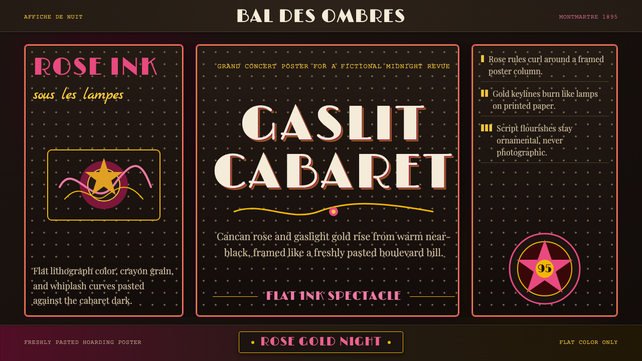 Belle Époque ParisCabaret night glows. Rose ink and gaslight gold curl across warm near-black p…
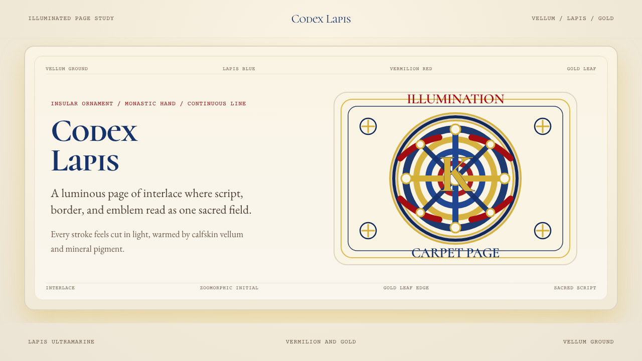 Book of Kells Celtic (800)Sacred and precise. Vellum cream, lapis, vermilion, and gold knotwork.
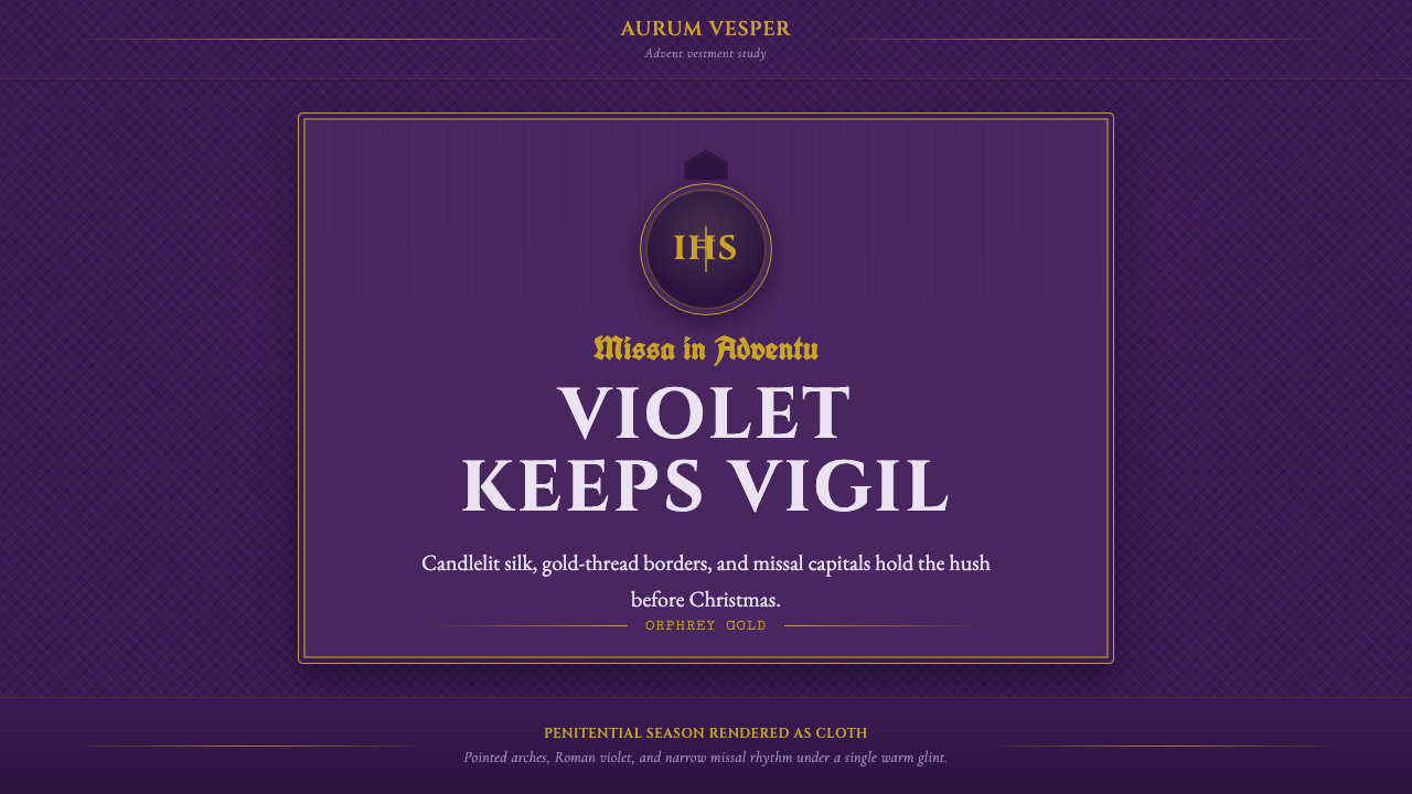 Liturgical Advent VioletReverence in violet. Roman capitals, gold hairlines, and pointed arches glow…
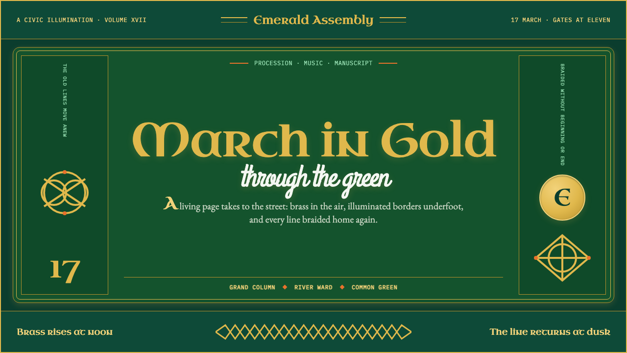 St. Patrick's Day ParadeParade energy, manuscript discipline. Bottle green, gold uncials, and closed-…
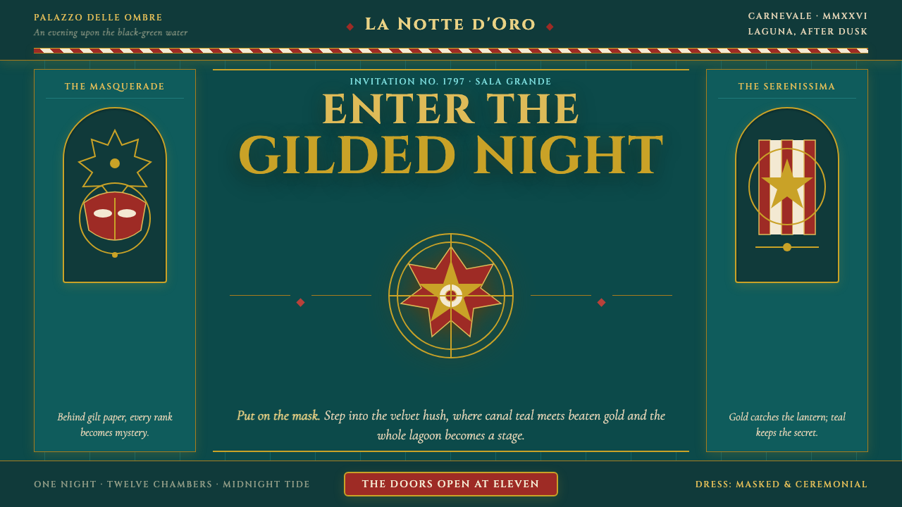 Venice Carnival GondolaThe lagoon becomes a stage. Canal teal, beaten gold and heraldic symmetry con…
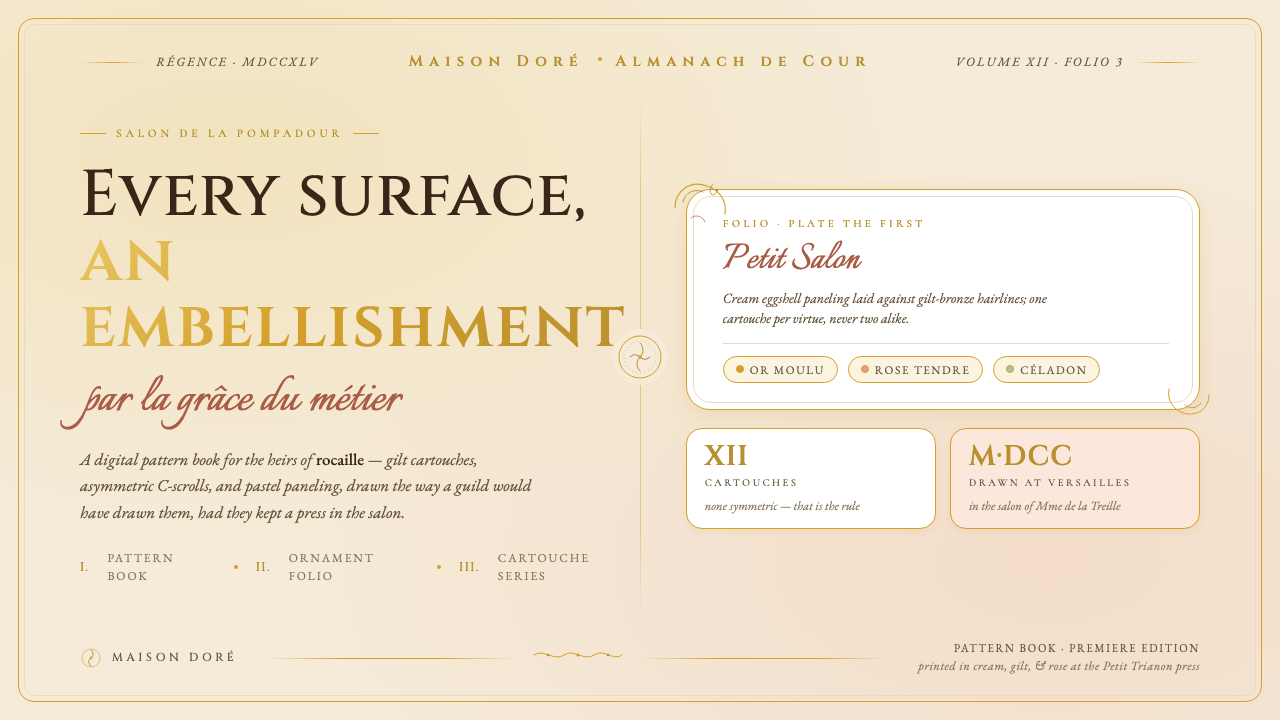 Versailles Rococo OrnamentEvery surface earns an embellishment. Cream paneling, ormolu gilt hairlines,…