What is Gucci Double-G?什么是 Gucci Double-G?
Since 1921, Gucci has proven that maximum ornament, handled with structural discipline, is its own form of luxury authority.自1921年起,Gucci 一再证明:极致的装饰,只要以结构性的纪律驾驭,本身就是一种奢侈品权威。
Gucci Double-G in briefGucci Double-G 速览
Gucci Double-G refers to the complete visual identity system assembled by the Florentine luxury house over its century-long history — centered on the interlocked-GG monogram, the green-red-green webbing stripe, horsebit hardware, and a typographic system anchored by high-contrast serif lettering on cream or forest-green grounds. It is maximalist in conviction: where most modern brand systems subtract until nothing can be removed, the Gucci system layers motif upon motif, trusting that saturation, when disciplined by a coherent palette and recurring symbols, produces grandeur rather than chaos.Gucci 双G(Double-G)指的是这家佛罗伦萨奢侈品牌在一个世纪历史中逐步建立的完整视觉识别体系——以双G互扣字母组合为核心,辅以绿-红-绿三色织带、马衔扣金属配件,以及在奶油或深林绿底色上以高对比度衬线字体构成的排印系统。它在信念上是极繁主义的:当大多数现代品牌系统以减法为纲,不断删减直至无可再减时,Gucci 的体系却将母题层叠于母题之上,相信饱和感只要被一套连贯的色盘与反复出现的符号所约束,就能产生宏伟而非混乱。
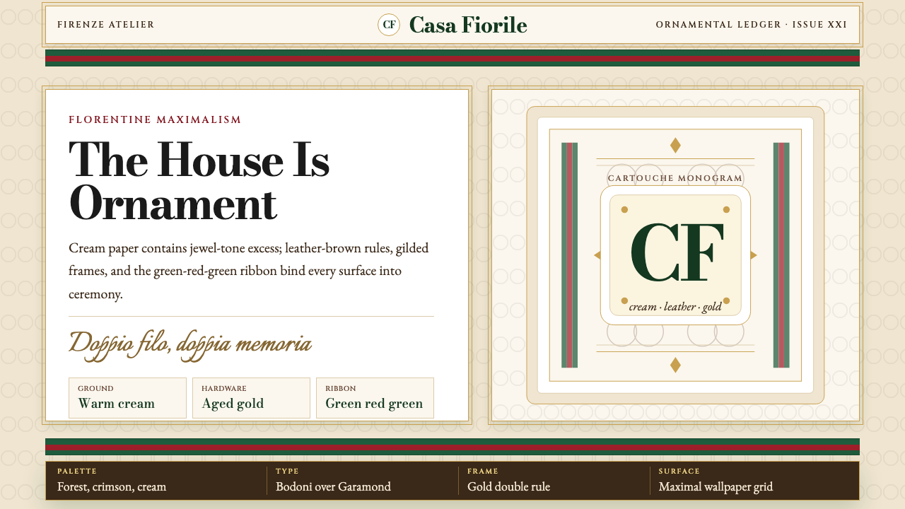
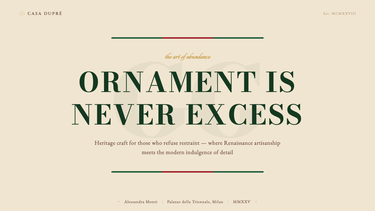
The aesthetic draws on Florence's visual inheritance — Renaissance guild heraldry, Baroque gilt cartouche frames, the jewel-toned brocades of Medici-era textile workshops — and translates those references into a reproducible brand grammar. Cream grounds, deep forest green, and warm red are the structural colors; gold hardware and gilded type add a ceremonial register. The serif typeface used across Gucci communications is high-contrast in the classical Bodoni tradition, with razor-thin hairlines meeting broad strokes, giving even short labels a weighted, monumental quality.这套美学汲取自佛罗伦萨的视觉遗产——文艺复兴行会纹章、巴洛克镀金卡图什边框、美第奇时代纺织工坊的宝石色锦缎——并将这些参照转化为可复制的品牌语法。奶油色、深林绿与暖红是结构性色彩;金色配件与镀金字体叠加了一层仪式感的音域。Gucci 传播物料中使用的衬线字体延续经典 Bodoni 传统的高对比度风格,极纤细的发丝笔画与宽阔笔画相遇,令即便是简短的标签也呈现出厚重的纪念碑感。
Crucially, the system is not arbitrary abundance. The interlocked-GG monogram functions as a geometric anchor in every composition — a bilateral symbol that is both letter and ornamental medallion. The webbing stripe is always green-red-green at a fixed relative proportion, never reordered. These recurring constraints give the maximalism a structural spine, so the eye reads richness rather than noise.关键在于,这套体系并非随意的丰盛。双G互扣字母组合在每一个构图中充当几何锚点——一个既是字母又是装饰性徽章的双向对称符号。织带始终按固定比例呈绿-红-绿排列,顺序从不颠倒。这些反复出现的约束条件赋予了极繁主义一根结构性的脊梁,令眼睛读到的是富丽而非噪音。
See the Gucci Double-G design system查看 Gucci Double-G 完整设计系统
Where does Gucci Double-G come from?Gucci Double-G 从何而来?
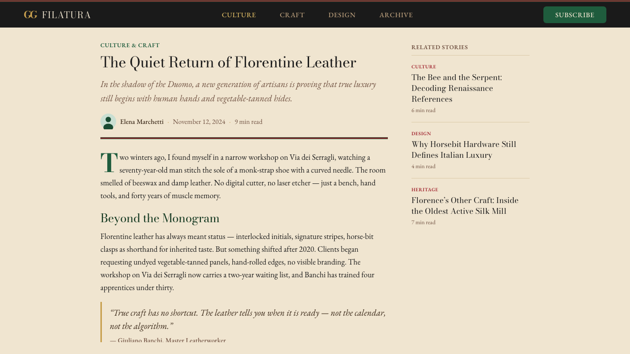
Guccio Gucci opened his leather goods shop in Florence in 1921, after working for years in London — most famously as a luggage porter and lift attendant at the Savoy Hotel, where he observed the traveling habits and material preferences of the European aristocracy at close range. He returned to Florence determined to produce luggage and equestrian accessories of equivalent quality, using the finest Tuscan leatherwork traditions. The earliest Gucci aesthetic was therefore grounded in the vocabulary of the stable and the saddle: the horsebit became the house's first iconic hardware motif, and equestrian browns, tans, and forest greens defined the initial palette.1921年,Guccio Gucci 在佛罗伦萨开设了他的皮具店,此前他在伦敦工作多年——最广为人知的是在萨伏依酒店担任行李员与电梯侍者,在那里他得以近距离观察欧洲贵族的旅行习惯与物质偏好。他回到佛罗伦萨后,决心以托斯卡纳最优质的皮革传统制作同等品质的行李箱与马术配件。因此,最早的 Gucci 美学根植于马厩与马鞍的视觉语汇:马衔扣成为品牌第一个标志性的金属配件母题,马术风格的棕褐、驼色与深林绿构成了最初的色盘。
The green-red-green webbing stripe appeared in the 1950s, when a postwar shortage of leather forced Gucci to experiment with canvas and fabric alternatives. Rather than treating this as a compromise, Aldo Gucci — Guccio's son, who was instrumental in expanding the brand internationally — codified the stripe as a signature element. The specific proportion of green flanking red, and the precise relationship between stripe and ground, became standardized across luggage, belts, and accessories. By the time the leather shortage resolved, the stripe had become so recognizable that removing it was unthinkable.绿-红-绿三色织带出现于1950年代。战后皮革短缺迫使 Gucci 尝试帆布与织物替代材料。Guccio 之子 Aldo Gucci 对品牌的国际扩张贡献卓著,他没有将这一转变视为妥协,而是将织带确立为品牌签名元素,对绿色夹红色的具体比例,以及织带与底色之间的精确关系,在行李箱、腰带与配件上加以标准化。等到皮革短缺问题解决,这条织带已变得如此广为认知,将其移除已是不可想象之事。
The interlocked-GG monogram was formalized in the 1960s as Gucci expanded into ready-to-wear and accessories beyond luggage. The device draws on a tradition of aristocratic monogramming — European royal households had long used interlaced ciphers as marks of ownership and status — and adapts it into a geometric module that tiles seamlessly as a surface pattern. The monogram canvas, typically rendered in warm tan against a darker ground or as a tone-on-tone pattern in cream, became one of the most widely recognized luxury surface treatments of the twentieth century.双G互扣字母组合在1960年代被正式确立,彼时 Gucci 正向成衣与行李箱以外的配件扩张。这一符号借鉴了贵族字母组合的传统——欧洲皇室长久以来使用交织密码作为所有权与地位的标记——并将其改造为可无缝拼贴成表面图案的几何模组。字母组合帆布通常以暖驼色呈现于深色底面,或以奶油色调在同色调图案上呈现,成为二十世纪最广为认知的奢侈品表面处理之一。
The maximalist visual identity reached its most articulate and globally influential expression during Alessandro Michele's tenure as creative director from 2015 to 2022. Michele layered the existing Gucci grammar with additional historical references: Renaissance botanical illustration, Grecian mythology, medieval bestiaries, and 1970s Italian camp. He reintroduced the house's bee and snake motifs, expanded the typographic system to include elaborate gilt lettering, and styled campaigns as staged tableaux drawing on Italian Renaissance painting. The result was a visual system of almost theatrical density — one that revived Gucci's commercial fortunes dramatically and positioned maximalism as a legitimate counter-movement to the spare Scandinavian minimalism that had dominated luxury design for the prior decade. From 2023, Sabato De Sarno has steered the house toward a quieter expression of the same underlying grammar, reducing ornamental density while retaining the core palette and monogram.极繁主义视觉识别在 Alessandro Michele 担任创意总监的2015至2022年间,达到了表达最为清晰、全球影响最为深远的高度。Michele 在既有的 Gucci 语法之上叠加了更多历史参照:文艺复兴植物图谱、希腊神话、中世纪动物寓言集,以及1970年代意大利 camp 风格。他重新引入了品牌的蜜蜂与蛇的母题,扩展了排印系统以容纳精致的镀金字体,并将广告大片设计为汲取意大利文艺复兴绘画的舞台式群像。其结果是一套几乎具有戏剧浓度的视觉体系——它戏剧性地重振了 Gucci 的商业声势,并将极繁主义确立为对应此前十年主导奢侈品设计的斯堪的纳维亚简约风格的合法对立运动。自2023年起,Sabato De Sarno 引领品牌走向同一底层语法的更为安静的表达,降低装饰密度,同时保留核心色盘与字母组合。
What defines the Gucci Double-G look?Gucci Double-G 的视觉特征是什么?
Palette色盘
The canonical Gucci palette organizes itself around three structural colors: cream (the primary ground), forest green (the dominant brand color, used for backgrounds, type, and the outer bands of the webbing stripe), and warm red (used as an accent, most visibly as the center band of the stripe). Gold — present in hardware, type outlines, and pattern repeats — functions as the ceremonial register that elevates every other element. Jewel tones including deep burgundy, sapphire, and rust appear seasonally in product colorways but rarely displace the core three. The palette reads as inherently warm and southern European — saturated enough to feel opulent but never primary-bright.Gucci 的经典色盘围绕三种结构性色彩组织:奶油色(主要底色)、深林绿(主导品牌色,用于背景、文字与织带外侧条带)以及暖红色(用作强调,最直观地呈现为织带中间条带)。金色——存在于金属配件、字体轮廓与图案重复之中——作为仪式性音域,提升其他一切元素。深酒红、宝石蓝与锈色等宝石色调在季节性产品配色中出现,但鲜少取代核心三色。整体色盘呈现出一种本质上温暖的南欧气质——饱和度足以令人感受到富丽,却从不刺目得如同三原色。
Typography字体排印
Gucci's typographic identity is built on high-contrast classical serifs in the Bodoni tradition — letters characterized by an extreme difference between thick strokes and razor-thin hairlines, with perfectly circular bowls and ball terminals that give the letterform an almost sculptural quality. Type is most commonly set in cream against forest green or in forest green against cream, both combinations drawing maximum contrast from the core palette. All-caps settings are favored for brand marks, packaging labels, and editorial headers, where the uniform cap height creates a monumental register. The overall effect is of an engraver's plate brought into print — precise, weighted, aristocratic.Gucci 的排印识别建立于 Bodoni 传统的高对比度古典衬线字体之上——这类字体以粗笔画与极纤细发丝笔画之间的极端对比为特征,字碗完美圆润,球形端点赋予字形近乎雕塑的品质。字体最常见的设置是奶油色置于深林绿底,或深林绿置于奶油色底,两种组合均从核心色盘中提取最大对比度。全大写设置在品牌标识、包装标签与编辑页眉中被广泛使用,统一的大写字高制造出纪念碑式的音域。整体效果仿佛将一块雕版师的铜版带入印刷——精确、有分量、贵族气息浓厚。
The Interlocked-GG Monogram双G互扣字母组合
The interlocked-GG functions simultaneously as letter, ornament, and geometric module. Two uppercase G forms are mirrored and locked together so that each completes the other, producing a bilateral symbol with strong vertical and horizontal axes. As a surface pattern, it tiles seamlessly — the monogram canvas has the visual logic of a classical damask or heraldic repeat, where foreground and background are in constant dialogue. In brand applications the monogram may appear alone as a hardware detail, as an embossed leather texture, or as a large-scale graphic element in editorial layouts. Its bilateral symmetry gives it an inherent authority that makes it effective at both small and monumental scales.双G互扣字母组合同时作为字母、装饰物与几何模组而运作。两个大写G形相互镜像并锁合,使每一个都完成另一个,产生一个具有强烈垂直与水平轴线的双向对称符号。作为表面图案,它可以无缝拼贴——字母组合帆布具有古典锦缎或纹章重复图案的视觉逻辑,前景与背景处于持续的对话之中。在品牌应用中,字母组合可以单独作为金属配件细节出现,也可作为皮革浮雕纹理,或作为编辑版面中的大比例图形元素。其双向对称赋予它内在的权威感,使其在小尺度与纪念碑尺度上都能有效运作。
The Green-Red-Green Webbing Stripe绿-红-绿三色织带
The webbing stripe is Gucci's most immediately legible signal — a fixed sequence of forest green, warm red, and forest green bands at a precise and consistent relative width. It functions as a framing device on luggage and bags, as a standalone decorative band on belts and footwear, and as a graphic element in advertising layouts. The stripe's power comes from its rigidity: the proportions and color order are never varied, so even a narrow glimpse of the green-red-green sequence is sufficient for recognition. In layouts, the stripe typically appears as a horizontal or vertical rule that organizes the composition rather than merely decorates it.织带条纹是 Gucci 最直接可辨识的信号——深林绿、暖红色与深林绿以精确且一贯的相对宽度固定排列的色带序列。它在行李箱与手袋上作为框架元素出现,在腰带与鞋履上作为独立装饰条带出现,也在广告版面中作为图形元素出现。织带的力量来自其刚性:比例与颜色顺序从不变动,因此即便只是瞥见绿-红-绿序列的一小部分,也足以完成识别。在版面中,织带通常作为水平或垂直的规则线出现,组织构图而非仅仅装饰它。
Maximalist Layering极繁主义叠层
Where restrained systems remove elements until the composition is resolved, Gucci's visual logic adds until the field reaches a specific kind of saturation — one where every element reinforces every other. Floral illustration overlaps with monogram canvas; gilt cartouche frames enclose typeset labels; textile patterns appear behind hardware details. The system manages this density through a strict hierarchy: the monogram and stripe are always primary; secondary motifs (bees, snakes, florals, horsebit details) operate at a lower visual weight and never compete with the anchoring elements. The result is a composition that reads as lush rather than cluttered.在克制的系统削减元素直至构图解决之处,Gucci 的视觉逻辑是增加,直至画面达到一种特定的饱和度——其中每一个元素都强化其他每一个元素。花卉插图与字母组合帆布叠加;镀金卡图什边框包围排版标签;纺织图案出现在金属配件细节之后。这套体系通过严格的层级管理这种密度:字母组合与织带始终是主要的;次级母题(蜜蜂、蛇、花卉、马衔扣细节)以较低的视觉重量运作,从不与锚定元素竞争。结果是一种读起来丰饶而非杂乱的构图。
Gold as Ceremony金色即仪式
Gold in the Gucci system is not used for highlights or shimmer effects in the contemporary sense — it is structural and ceremonial. On physical products, polished brass and aged gold-tone hardware (the horsebit, buckles, chain links) serve as load-bearing connective elements. In print and digital applications, gold appears as border lines framing text blocks, as typographic outlines on logotype treatments, and as the ground color of certain label designs. The handling of gold throughout the system evokes guild-era gilding and Florentine manuscript illumination rather than contemporary metallics, grounding the brand in a specific historical register.Gucci 体系中的金色并非当代意义上用于高光或光泽效果——它是结构性的与仪式性的。在实体产品上,抛光黄铜与做旧金色调金属配件(马衔扣、扣环、链节)作为承重连接元素发挥作用。在印刷与数字应用中,金色作为框文字块的边框线出现,作为标识处理的字体轮廓出现,也作为某些标签设计的底色出现。整套体系对金色的处理唤起的是行会时代镀金与佛罗伦萨手稿装饰传统,而非当代金属质感,将品牌根植于一个特定的历史音域之中。
Equestrian Motif Vocabulary马术母题词汇
The house's founding in saddlery and equestrian accessories established a motif vocabulary that persists across all eras of the brand: the horsebit, stirrups, bridle stitching patterns, the double-ring hardware detail. These motifs appear at multiple scales — as functioning hardware on bags and shoes, as embossed surface ornament on leather goods, and as decorative graphic elements in packaging and editorial design. The equestrian reference anchors the brand in a specific social history of European aristocratic leisure, lending the ornamental density a narrative legitimacy. The motifs do not simply decorate — they tell a story about the origin and intended audience of the objects they adorn.品牌在马具与马术配件领域的创立建立了一套跨越品牌各个时代持续存在的母题词汇:马衔扣、马镫、马勒缝线图案、双环金属配件细节。这些母题以多种尺度出现——作为手袋与鞋履上具有功能的金属配件,作为皮革制品上的浮雕表面装饰,以及作为包装与编辑设计中的装饰性图形元素。马术参照将品牌锚定于欧洲贵族休闲的特定社会历史之中,赋予装饰密度以叙事上的合法性。这些母题不仅仅是装饰——它们讲述着关于它们所装饰之物的来源与预期受众的故事。
See the Gucci Double-G design system查看 Gucci Double-G 完整设计系统
Who shaped Gucci Double-G?谁塑造了 Gucci Double-G?
Guccio Gucci (1881–1953) founded the house in Florence in 1921 after years working in London's finest hotels, where proximity to aristocratic travelers shaped his understanding of what luxury luggage and leather goods should be. He established the commitment to Florentine craftsmanship, equestrian aesthetics, and restrained elegance that characterized the brand's first decades. Though he did not live to see the brand's global expansion, the equestrian motifs he introduced — the horsebit above all — remain central to the visual system a century later.Guccio Gucci(1881—1953年)于1921年在佛罗伦萨创立了这个品牌,此前他在伦敦顶级酒店工作多年,与贵族旅客的近距离接触塑造了他对奢侈品行李箱与皮具应有面貌的理解。他确立了品牌最初数十年的基调:对佛罗伦萨手工艺的承诺、马术美学与内敛的优雅。尽管他未能见证品牌的全球扩张,他所引入的马术母题——尤其是马衔扣——在一个世纪后仍是视觉体系的核心。
Aldo Gucci (1905–1990) was the principal architect of the brand's international expansion, opening stores in New York in 1953 and subsequently across major cities worldwide. He codified many of the visual signatures that had emerged organically in the postwar years — including the green-red-green webbing stripe and the GG monogram canvas — into consistent, reproducible brand elements. His tenure established Gucci as a global luxury shorthand and brought the interlocked-GG to international recognition across luggage, handbags, scarves, and accessories.Aldo Gucci(1905—1990年)是品牌国际扩张的主要建筑师,1953年在纽约开店,此后将品牌推向全球主要城市。他将战后岁月中有机形成的众多视觉签名——包括绿-红-绿织带与双G字母组合帆布——整合成一致的、可复制的品牌元素。他任职期间将 Gucci 确立为全球奢侈品的通行符号,并将双G互扣字母组合在行李箱、手袋、丝巾与配件上带入国际视野。
Tom Ford served as creative director from 1994 to 2004, rescuing the brand from near-bankruptcy and repositioning it as a vehicle for a very different kind of Italian luxury — sleek, sexually charged, and modernist rather than ornamental. Ford stripped back much of the heritage maximalism in favor of body-conscious silhouettes and a darker, more minimal palette. His decade at Gucci demonstrated the system's flexibility: even under radical aesthetic revision, the GG monogram and webbing stripe remained constant identifiers, proving their structural durability beyond any single creative vision.Tom Ford 于1994至2004年担任创意总监,将品牌从濒临破产中挽救出来,并将其重新定位为一种截然不同的意大利奢华载体——流线型、充满性感张力,趋向现代主义而非装饰性。Ford 大幅收敛了传承中的极繁主义,转而拥抱修身廓形与更深沉、更极简的色盘。他在 Gucci 的十年展示了这套体系的灵活性:即便在激进的美学改造之下,双G字母组合与织带条纹依然是稳定的识别符号,证明了它们超越任何单一创意愿景的结构耐久性。
Alessandro Michele's tenure as creative director from 2015 to 2022 represents the most complete and globally influential articulation of the Gucci maximalist identity. Michele drew on the full depth of Italian visual history — Renaissance paintings, Florentine goldsmithing, 1970s camp, classical mythology — and wove these references into a coherent visual ecosystem alongside the existing house signatures. He revived the bee and snake as recurring motifs, introduced elaborate gilt lettering into the typographic system, and styled brand imagery as dense, staged tableaux. His approach demonstrated that maximalism is not the absence of discipline but a different kind of discipline — one organized around accumulation, reference, and symbolic density rather than subtraction.Alessandro Michele 于2015至2022年担任创意总监,代表了 Gucci 极繁主义识别最完整、全球影响最深远的表达。Michele 深度汲取意大利视觉历史的全部厚度——文艺复兴绘画、佛罗伦萨金工、1970年代 camp 风格、古典神话——并将这些参照与既有的品牌签名元素编织成一个连贯的视觉生态系统。他复兴了蜜蜂与蛇作为反复出现的母题,将精致的镀金字体引入排印系统,并将品牌视觉呈现设计为密集的、舞台式的群像。他的方式证明了极繁主义并非纪律的缺席,而是一种不同类型的纪律——一种围绕积累、参照与象征密度而非削减组织起来的纪律。
Sabato De Sarno joined Gucci as creative director in 2023, bringing a quieter and more focused interpretation of the house's codes. His direction has emphasized a deeper, more saturated version of Gucci red — quickly nicknamed 'Ancora' — and has reduced the ornamental density of the Michele era in favor of cleaner silhouettes and more restrained layering. De Sarno's approach represents not a rejection of the Gucci visual system but a recalibration: retaining the core palette, monogram, and equestrian motifs while resetting the ornamental register toward something closer to the house's pre-Michele character.Sabato De Sarno 于2023年出任 Gucci 创意总监,带来了对品牌代码更为安静、更为聚焦的诠释。他的方向着重于一种更深沉、更饱和的 Gucci 红色——很快被命名为「Ancora」——并降低了 Michele 时代的装饰密度,转而采用更简洁的廓形与更克制的叠层。De Sarno 的方式不是对 Gucci 视觉体系的否定,而是一次重新校准:保留核心色盘、字母组合与马术母题,同时将装饰音域重置为更接近品牌 Michele 前时期特质的状态。
How do you use Gucci Double-G today?今天怎么用 Gucci Double-G?
Applying the Gucci Double-G system to designed work requires understanding its organizing logic before adding ornament. The system is not an invitation to combine everything at once — it is a disciplined hierarchy in which the monogram and stripe are primary anchors, secondary motifs fill without competing, and the palette holds everything together. The most common failure mode is decorating a layout before establishing its structural bones; the second most common is applying the ornamental density without respecting the palette constraints that keep the density legible.将 Gucci 双G体系应用于设计作品,需要在添加装饰之前先理解其组织逻辑。这套体系不是将所有元素同时叠加的邀请——它是一套有纪律的层级:字母组合与织带是主要锚点,次级母题在不与之竞争的前提下填充画面,色盘将一切联系在一起。最常见的失败模式是在确立版面结构骨骼之前就开始装饰;第二常见的是在不尊重使密度保持清晰可读的色盘约束的情况下应用装饰密度。
For presentation slides, the Gucci system excels at creating a sense of occasion and institutional weight. Cover slides benefit from the deep forest-green ground with cream typeset in high-contrast classical serifs, framed by a narrow gold border rule. The webbing stripe, rendered as a thin horizontal band, can function as a divider between the title and subtitle zones. Content slides work best with cream grounds, forest-green headings, and black body text — using the stripe sparingly as a section marker rather than as decoration on every slide. Data slides should treat charts as architectural objects: warm-red bars against cream grounds, green axis lines, gold data labels. Avoid filling every chart with the full palette simultaneously; let one color lead per slide.在演示文稿中,Gucci 体系擅长创造一种场合感与机构分量。封面幻灯片适合深林绿底色,以高对比度古典衬线字体排印奶油色文字,并以细金色边框线框住。织带条纹以细水平色带呈现,可作为标题与副标题区域之间的分隔线发挥作用。内容幻灯片最适合奶油色底面、深林绿标题与黑色正文——将织带条纹节制地用作章节标记,而非每张幻灯片上的装饰。数据幻灯片应将图表视为建筑性对象:奶油底上的暖红色柱条、绿色坐标轴线、金色数据标签。避免每张图表同时充满完整色盘;让每张幻灯片以一种色彩为主导。
For web interfaces — dashboards, pricing pages, and brand-adjacent editorial — the system translates into a palette-strict component library. Backgrounds alternate between cream and forest green at the section level rather than the component level; cards sit on cream with green or gold border accents; interactive states use warm red as the signal color. The monogram can appear as a watermark-weight texture in background zones or as a prominent mark in hero sections, but it should not compete with content hierarchy. Navigation is typographic, set in a high-contrast serif in cream on green, with the webbing stripe as a bottom border on the top navigation bar.对于网页界面——仪表板、定价页面与品牌相邻的编辑类页面——这套体系转化为一套严格遵守色盘的组件库。背景在章节层级而非组件层级上在奶油色与深林绿之间交替;卡片置于奶油底面,配以绿色或金色边框强调;交互状态使用暖红色作为信号色。字母组合可以水印轻度作为背景区域的纹理出现,或在主视觉区域作为醒目标识出现,但不应与内容层级竞争。导航是字体性的,以高对比度衬线字体在绿色底面上排印奶油色文字,顶部导航栏以织带条纹作为底部边框。
For editorial layouts and marketing materials — print or digital — the Gucci system creates strong information hierarchy through its typographic contrasts. Feature headlines in large, tightly set classical serifs against full-bleed forest-green grounds; subheadings in cream at a smaller scale; body text in a readable complementary face at standard weight on a cream ground. The webbing stripe works as a column rule or footer divider. For marketing pages, the gilt cartouche frame — a rectangular border with corner ornaments — can enclose pullquotes or product callouts, grounding them in the brand's Florentine heritage without requiring photographic imagery.对于编辑版面与营销物料——印刷或数字——Gucci 体系通过排印对比创造强劲的信息层级。特性大标题以大号、紧排古典衬线字体置于全出血深林绿底面;副标题以较小尺度的奶油色呈现;正文以标准字重的可读衬线字体置于奶油底面。织带条纹作为栏目分隔线或页脚分隔线发挥作用。对于营销页面,镀金卡图什边框——一种带角落装饰的矩形边框——可用于包围引语或产品标注,将它们根植于品牌的佛罗伦萨传承,而无需依赖摄影图像。
A common mistake when working with this system is treating the gold as a fill color rather than a structural accent. Gold at large areas reads as gaudy rather than luxurious; its power comes from precision — a thin border rule, an outlined letterform, a small hardware motif. Similarly, the monogram pattern should be used at restrained opacity when deployed as a background texture; at full opacity it overwhelms rather than enriches. Finally, resist the temptation to substitute any green or any red for the specific warm, forest-leaning green and terra-cotta-adjacent red that define the stripe — approximations dissolve the brand signal instantly.使用这套体系时一个常见错误是将金色视为填充色而非结构性强调色。大面积的金色读起来俗气而非奢华;其力量来自精确——细边框线、字体轮廓、小型金属配件母题。同样,字母组合图案作为背景纹理使用时应以克制的不透明度呈现;以完整不透明度使用会令画面不堪重负而非丰富。最后,抵制以任意一种绿色或任意一种红色替代定义织带的那种特定的、偏向林地的暖绿色与近似赤陶的红色的诱惑——近似色会立即消解品牌信号。
See the Gucci Double-G design system查看 Gucci Double-G 完整设计系统
Gucci Double-G — FAQGucci Double-G · 常见问题
Is the Gucci system maximalist in the same way that more-is-more decoration is maximalist?Gucci 的体系是否与「越多越好」的装饰性极繁主义属于同一类型?
Not exactly. The Gucci system is maximalist in the sense that it deploys more visual elements than a restrained modern identity system, but it is not arbitrary in how it does so. The monogram and stripe are fixed anchors; the secondary motifs operate at lower visual weight and never displace the primaries; the palette is tightly constrained to four or five colors across all applications. This is disciplined layering — the visual equivalent of a well-composed Baroque composition, where abundance and structure coexist. True more-is-more decoration lacks this hierarchy: everything competes at equal weight, and the result is noise. The Gucci system avoids noise by insisting that ornament always serve the brand grammar.不完全如此。Gucci 体系的极繁主义体现在它部署的视觉元素多于克制的现代识别体系,但它在做法上并非随意。字母组合与织带是固定的锚点;次级母题以较低的视觉重量运作,从不取代主要元素;色盘在所有应用中被严格约束在四到五种色彩之内。这是有纪律的叠层——视觉上等同于一幅构图精良的巴洛克画作,丰盛与结构在其中共存。真正「越多越好」的装饰缺乏这种层级:所有东西以相同的重量竞争,结果是噪音。Gucci 体系通过坚持装饰始终服务于品牌语法来避免噪音。
Can the Gucci Double-G aesthetic work for brands outside the luxury sector?Gucci 双G美学能否在奢侈品领域之外的品牌中有效运用?
With adaptation, yes — but the system's signals are deeply encoded with specific associations. The high-contrast Bodoni-tradition serif, forest green and cream palette, and monogram logic collectively communicate European luxury heritage, artisanal production, and premium pricing. Any brand borrowing these signals should do so deliberately: the system works for heritage hospitality, premium food and beverage, high-end publishing, or cultural institutions with a historical anchor. It struggles for technology products, health and wellness brands, and anything positioning around accessibility or democratic values — contexts where the aristocratic heritage register reads as exclusionary rather than aspirational.经过改造可以——但这套体系的信号深度编码着特定的联想。高对比度 Bodoni 传统衬线字体、深林绿与奶油色盘,以及字母组合逻辑,共同传递着欧洲奢侈品传承、手工艺生产与高端定价的信息。任何借用这些信号的品牌都应刻意为之:这套体系适用于历史悠久的酒店业、优质食品饮料、高端出版,以及具有历史锚点的文化机构。它在科技产品、健康与养生品牌,以及任何围绕可及性或民主价值观定位的场景中则力不从心——在这些语境中,贵族传承的音域读起来是排他性的而非令人向往的。
How do you distinguish an authentic application of this style from a generic luxury pastiche?如何区分对这种风格的真实应用与通用的奢侈品山寨?
The distinguishing test is whether the ornament has structural logic. In an authentic application, the monogram is a compositional anchor, not a fill texture applied indiscriminately; the stripe organizes the layout rather than merely appears on it; gold delineates rather than floods. In a pastiche, ornamental elements are applied as surface dressing over a layout that would be identical without them. The secondary test is palette precision: the specific warmth and depth of the forest green and the warmth of the red matter enormously — generic greens and reds produce a generic result. A third test is typographic — the high-contrast classical serif at appropriate scale and weight, not a display serif chosen for superficial similarity.区分测试在于装饰是否具有结构逻辑。在真实的应用中,字母组合是构图锚点,而非不加区分地应用的填充纹理;织带组织版面而非仅仅出现于其上;金色勾勒轮廓而非泛滥成灾。在山寨版中,装饰性元素被施加为表面修饰,覆盖在一个没有它们也会完全相同的版面之上。第二个测试是色盘精确性:深林绿的特定温度与深度,以及红色的温度,至关重要——通用的绿色与红色产生通用的结果。第三个测试是排印——以适当尺度与字重呈现的高对比度古典衬线字体,而非因表面相似而选用的展示衬线字体。
Does the system work in dark mode or on dark-ground layouts?这套体系能否在深色模式或深色底面版面中运作?
Yes — and in fact the forest-green-ground version of the Gucci palette is one of the canonical expressions of the system, not a dark inversion. When forest green is the ground, cream becomes the primary typographic color and warm red functions as accent. This version reads as particularly authoritative and ceremonial — closer to the atmosphere of a Florentine boutique interior than the cream-ground version. The challenge in dark-ground applications is gold: at low opacity, gold on green can muddy; it works best as a defined line or outlined form rather than a tonal fill. Black as a ground is less canonical and requires more care — it tends to flatten the warmth that defines the system.可以——事实上,深林绿底面版本的 Gucci 色盘是这套体系的经典表达之一,而非深色反转。当深林绿作为底色时,奶油色成为主要排印色,暖红色发挥强调作用。这一版本读起来格外具有权威感与仪式感——比奶油底面版本更接近佛罗伦萨精品店室内空间的氛围。深色底面应用中的挑战在于金色:低不透明度时,金色在绿色上可能变得浑浊;它作为明确的线条或轮廓形式而非色调填充时效果最佳。黑色作为底色不那么具有经典性,需要更多斟酌——它往往会压平定义这套体系的暖意。
What is the most important single principle for applying this style correctly?正确应用这种风格最重要的单一原则是什么?
Anchor before you ornament. Every Gucci composition — a bag, a campaign image, a packaging label, a slide — begins with a fixed structural element: the monogram, the stripe, or the high-contrast serif logotype. Once the anchor is placed and the ground color is decided, ornament can accumulate around it without producing chaos, because the eye always has a primary point of orientation. Designers who skip the anchor step and begin with decoration find that no amount of correct palette usage or motif selection will produce the system's characteristic sense of organized richness — the composition simply reads as busy. Set the anchor first; the rest will follow.先锚定,后装饰。每一个 Gucci 构图——无论是手袋、广告图像、包装标签还是幻灯片——都始于一个固定的结构性元素:字母组合、织带,或高对比度衬线标识字体。一旦锚点确立、底色决定,装饰便可在其周围积累而不产生混乱,因为眼睛始终拥有一个主要的定向点。跳过锚定步骤、从装饰开始的设计师会发现,无论色盘运用多么正确、母题选择多么准确,都无法产生这套体系特有的有组织的富丽感——构图只会读起来杂乱。先设锚点;其余自会跟随。
Related design styles相关设计风格
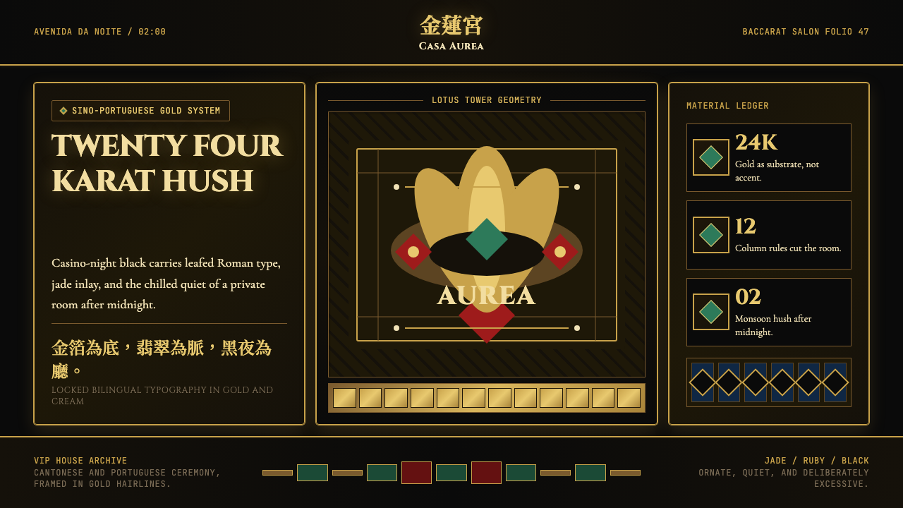 Macau Grand Lisboa Casino GoldGold is the atmosphere. Cinzel type, jade inlay, and 2px rules glow on casino…金色就是空氣。Cinzel字、翡翠鑲嵌與2px金線壓在賭場黑上。
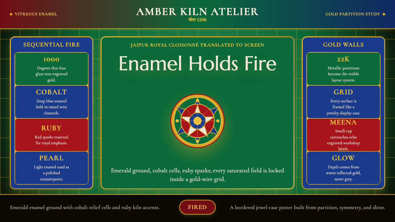 Rajasthani Meenakari EnamelJewel-box intensity. Emerald enamel, cobalt cells, ruby sparks, and gold-wire…珠宝匣般浓烈:翡翠绿、钴蓝与红宝石由金线分格。
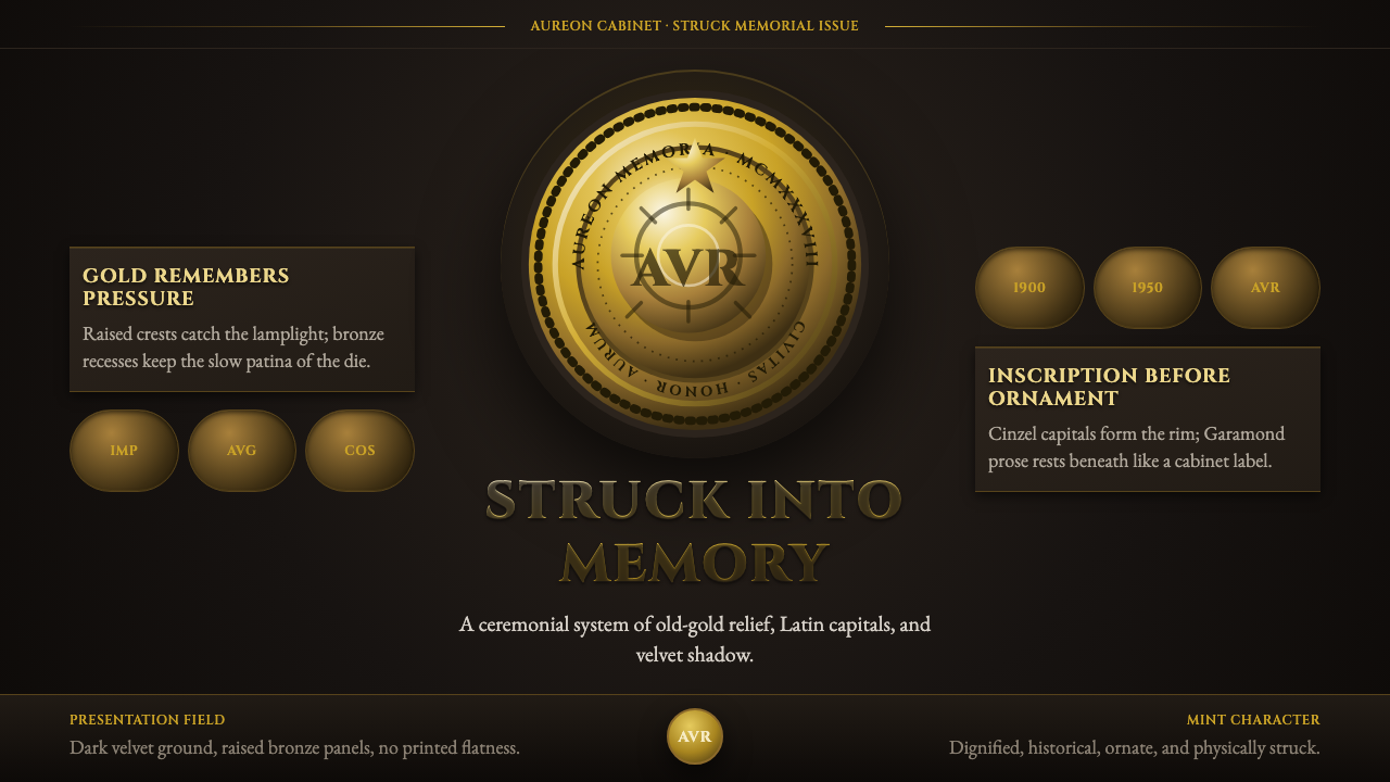 Commemorative CoinAuthority struck in metal. Old-gold relief, denticled rims, and Cinzel capita…权威如金属铸成:旧金浮雕、齿纹币缘与天鹅绒暗场。
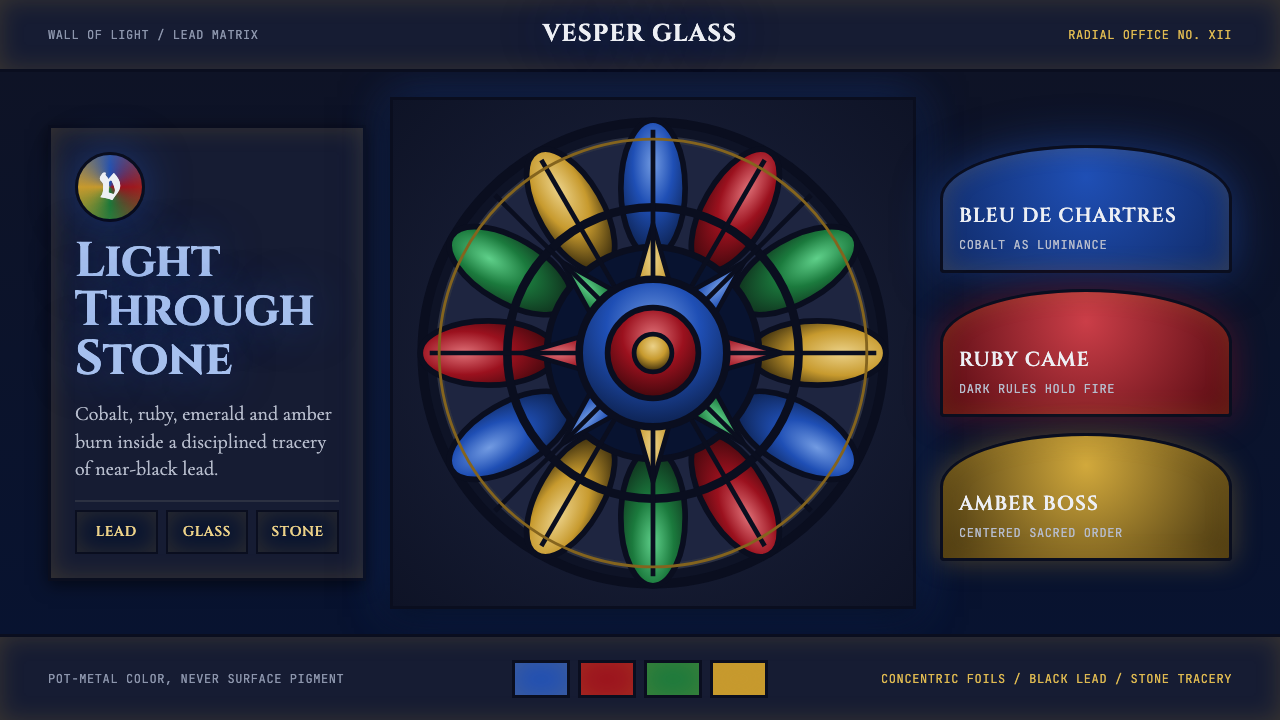 Gothic Rose WindowDarkness becomes light. Cobalt glass, ruby foils and black lead form a radial…黑暗化作光:钴蓝玻璃、红宝石叶瓣与黑铅条组成放射玫瑰窗。
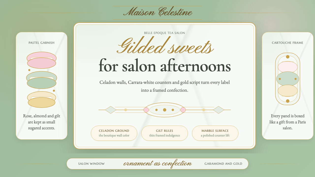 French PâtisserieOrnament is the luxury. Celadon ground, gilt cartouches, Garamond and script…以装饰定义奢华:青瓷绿底、烫金框、加拉蒙与花体字。
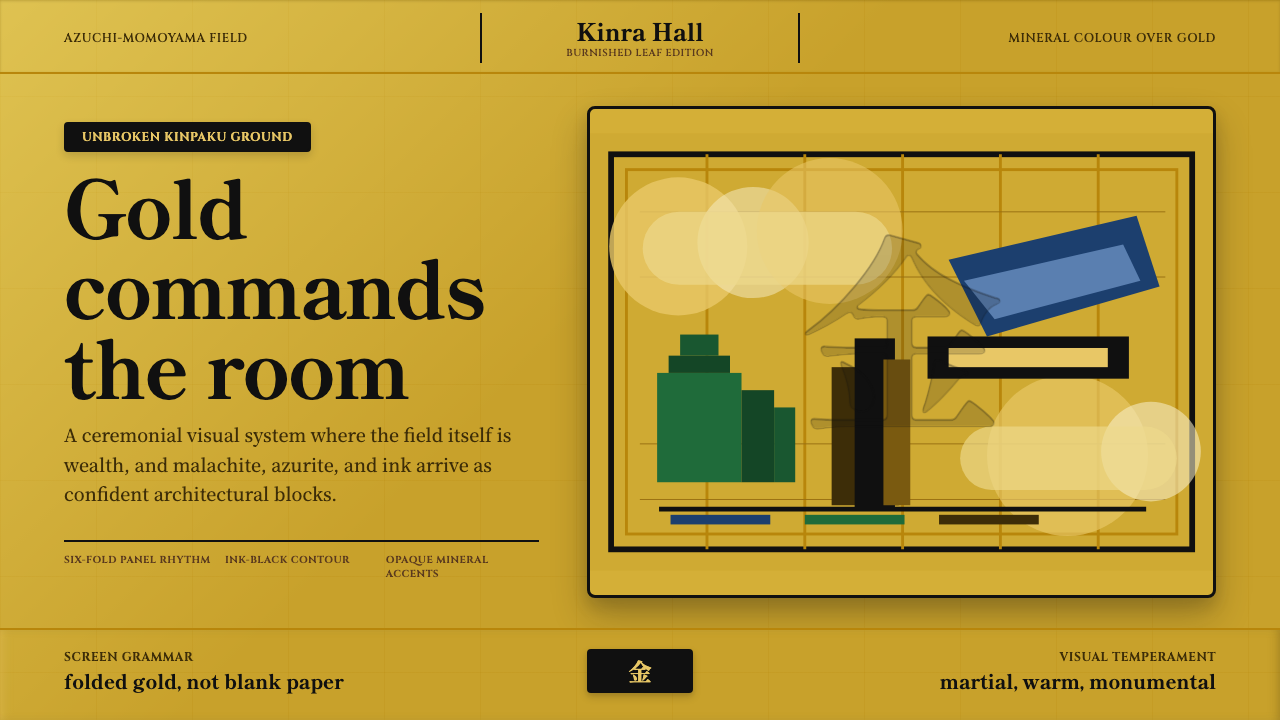 Momoyama Gold ScreenGold is the ground. Panel seams, ink contours, and mineral blocks make the fi…金即底色。屏风折缝、墨线与矿物色块撑起恢宏气场。