What is Macau Grand Lisboa Casino Gold?
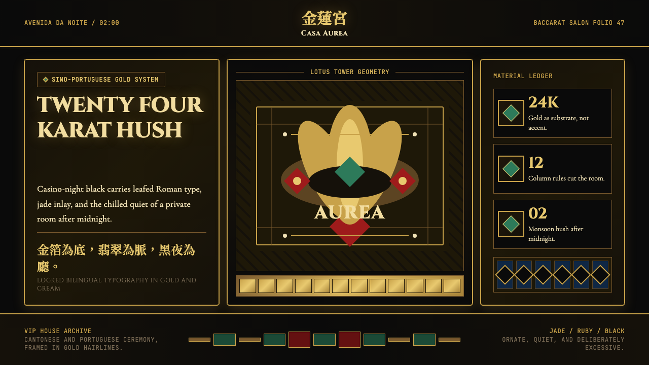
Grand Lisboa Casino Gold is Macau's defining visual language — a maximalist fusion of 24-karat opulence, Sino-Portuguese cultural memory, and the timeless grammar of the high-limit baccarat pit.
Macau Grand Lisboa Casino Gold in brief
Grand Lisboa Casino Gold is the visual system that radiates from Stanley Ho's 47-floor lotus-bud tower on the Macau Peninsula, encoding in colour, texture, and letterform the particular atmosphere of the world's densest gaming district. At its core is a single organising decision: gold is not an accent but the substrate, the ground on which every other visual element rests. Against deep casino black or the muted warmth of polished lacquer, every gilded surface — every ruled line, every bevelled edge — reads as luminous rather than decorative.
The style belongs to a tradition of integrated-resort branding that emerged in the early 2000s as Macau transitioned from a Portuguese colonial backwater into the world's highest-grossing gaming jurisdiction. Where Las Vegas maximalism tends toward theatrical neon and cowboy spectacle, the Grand Lisboa idiom reaches for something older and more specific: the understated gravity of a Cantonese baccarat room in monsoon season, where money moves quietly and surfaces carry grain and warmth rather than flash.
Hybrid identity is the style's structural logic. Portuguese colonial architecture brought azulejo tilework, wrought-iron balustrades, and an ornamental discipline rooted in Catholic ecclesiastical culture. Cantonese gaming culture brought jade as a material signifier of good fortune, lotus-petal silhouettes as architectural and graphic motifs, and bilingual typography — Cantonese and Portuguese side by side — as a visible mark of SJM's long-standing licence holder status. Grand Lisboa Gold synthesises these two inheritances into a visual system that feels neither fully Chinese nor fully European but unmistakably Macanese.
Where does Macau Grand Lisboa Casino Gold come from?
The lineage begins not with the tower but with the original Casino Lisboa, which opened in 1970 as the centrepiece of Stanley Ho Hung-sun's STDM monopoly concession — a gambling licence that the colonial Portuguese administration had granted his syndicate in 1962. For four decades, Lisboa was synonymous with Macau gaming: a low-rise pink building on the Avenida de Lisboa, lacquered in the particular gilt-and-crimson palette that Hong Kong hotel culture of the era associated with prosperity and good fortune. Ho's empire was built on baccarat, and baccarat's high-limit rooms established the aesthetic vocabulary the Grand Lisboa would later formalise.
The Grand Lisboa tower was conceived after Macau's gaming liberalisation in 2002, when the government ended the STDM monopoly and opened the market to international operators, including Las Vegas Sands and Wynn Resorts. Facing suddenly credible competition, Ho's SJM Holdings commissioned a landmark building that would reassert Lisboa's primacy. Architects Dennis Lau and Ng Chun Man designed the tower — completed in 2008 — as a lotus bud rising from a rounded podium, its golden façade studded with 1.2 million LEDs that broadcast the building's luminance across the Pearl River Delta every night. The choice to clad the tower in gold was not merely decorative; it was an assertion of continuity with the original Lisboa's gilt identity and a statement that SJM's Cantonese gaming heritage was the authentic Macanese tradition against which the Las Vegas imports were measured.
The design language of the interior was developed in parallel with the exterior. Pansy Ho, Stanley Ho's daughter and a central figure in SJM's post-liberalisation strategy, oversaw collaborations with international luxury brands and interior specialists to create an environment that fused Portuguese azulejo tilework and wrought-iron detailing with the jade inlay, lacquered ceilings, and baccarat-pit formalism of traditional Cantonese gaming culture. The result was a visual grammar in which gold functioned as the unifying system: tile borders, column capitals, typographic rules, signage frames, and chandelier armatures all shared the same warm gilt register, creating a total environment rather than a decorated room.
The broader movements that shaped the style include the post-handover Macau gaming liberalisation (2002), which forced every incumbent operator to articulate a visual identity distinct enough to compete with international brands; the Sino-Portuguese hybrid architecture that Macau had accumulated over four centuries of colonial rule, preserved in the Pelourinho and the Ruins of St. Paul; and the integrated-resort branding paradigm that Las Vegas pioneered in the 1990s and that Cotai Strip projects extended into a specifically Asian luxury register in the 2000s. Grand Lisboa Gold sits at the intersection of all three: it is a post-colonial brand object, a Chinese luxury statement, and a landmark architecture that happens to double as a signage system visible from thirty kilometres away.
What defines the Macau Grand Lisboa Casino Gold look?
Gold as Ground
In most luxury design systems, gold is an accent — applied selectively to headlines, borders, or call-to-action elements to signal premium value. Grand Lisboa Gold inverts this logic: gold is the field, the background register against which every other element is placed. Deep blacks and lacquer-warm neutrals exist to make gold glow rather than compete with it. This inversion transforms the entire visual system from one that deploys gilt sparingly into one that breathes gold continuously, the way a high-limit room breathes recirculated cool air.
Grain and Warmth
Grand Lisboa's gold is not the flat, computationally precise gold of a gradient swatch. It carries the grain of beaten leaf, the slight unevenness of a surface that has been laid by hand. This textural warmth distinguishes the style from generic 'luxury gold' treatments, which tend toward perfectly smooth surfaces and uniform reflectivity. The grain reads differently at different scales — almost invisible in a small typographic ornament, richly tangible in a large panel or background field — giving the system a material honesty even when rendered in purely digital contexts.
Bilingual Typography in Gold
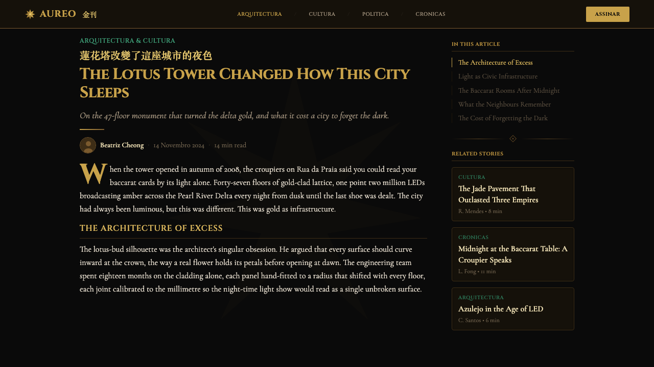
The style's typographic identity is inseparable from its bilingualism. Cantonese and Portuguese appear together on signage, menus, and navigational wayfinding as equals rather than as primary language and translation. The typefaces chosen favour classical cuts with strong vertical stress and visible modulation — letterforms that hold their weight and formality in gilded rendering. Setting type in gold against dark grounds requires that strokes remain legible at a range of sizes, which in practice means avoiding overly thin letterforms or extreme tracking that would cause the gilt to bleed or disappear at small scales.
Lotus and Jade Motifs
Two recurring visual motifs define the style's cultural specificity. The lotus — which gives the Grand Lisboa tower its silhouette — appears as both architectural form and graphic ornament: petal shapes bound panels, tile borders, and ornamental medallions. Jade appears as an inlay material in physical interiors and, in graphic applications, as a muted green-grey accent that sits against gold without competing — the cool of jade against the warmth of beaten gold creates a specific chromatic tension that is culturally coded as auspicious in both Cantonese and broader Chinese visual tradition.
Azulejo Pattern Logic
Portuguese azulejo tilework contributes a specific organisational logic to the style: the tile grid, with its tight interlocking units, its border treatments, and its tradition of geometric and figural repetition. In Grand Lisboa's hybrid system, this grid logic appears in ornamental frames, in the repeat patterns of carpet and wall panel borders, and in the way typographic layouts are subdivided into contained rectangular fields. The azulejo's characteristic blue-and-white palette is suppressed in favour of gold on dark grounds, but the underlying structural discipline — the sense that every surface is a grid of governed units — persists.
Darkness as Amplifier
The style is unambiguously dark: deep casino blacks, lacquered burgundy-adjacent neutrals, and forest-depth backgrounds are the constants against which all gilded elements read. This darkness is not atmospheric in the moody, shadowy sense of gothic or noir aesthetics; it is functional. A dark ground is a neutral that does not compete with gold for luminance — it simply absorbs what gold does not reflect, making every gilded surface appear to emit rather than merely catch light. The practical consequence is that the style reproduces powerfully on screens with high local-contrast capability and on printed materials with deep ink coverage.
Maximalism with Internal Discipline
Grand Lisboa Gold is maximalist in atmosphere but not in structure. The number of decorative elements in any given composition is actually quite limited — a single gold rule, a repeated tile border, a centred medallion, a bilingual label — but each element is worked in depth, with layered texture and material weight, rather than accumulated into density. This is the style's central paradox: it feels rich and total, but its richness comes from depth rather than variety. Imitators frequently misread this and add more elements; the result is clutter rather than opulence.
Who shaped Macau Grand Lisboa Casino Gold?
Ho held the STDM gaming monopoly in Macau from 1962 until liberalisation in 2002 — four decades during which his Lisboa casinos defined what Macanese gaming looked and felt like. He commissioned the Grand Lisboa tower as a direct response to international competition, insisting that SJM's Cantonese gaming heritage was not a liability but a differentiator. The visual system that bears his tower's name is, in a real sense, the formalisation of his lifetime's aesthetic preferences: Cantonese maximalism held together by Portuguese structural discipline.
The Hong Kong architectural partnership responsible for the Grand Lisboa tower's form. Their choice of the lotus bud as the building's organising silhouette was not merely decorative: the lotus is a pan-Asian symbol of purity, fortune, and emergence from difficult ground — a fitting emblem for a gaming house positioning itself against newly arrived international competitors. The tower's golden cladding and LED field were also their decisions, translating the original Lisboa's gilt-and-crimson interior language into an architectural scale visible from across the Pearl River Delta.
Daughter of Stanley Ho and a driving force behind SJM Holdings' post-liberalisation brand strategy. Pansy Ho oversaw the interior development of the Grand Lisboa and its luxury F&B programme, commissioning collaborations that brought international material sophistication into dialogue with the established Cantonese gaming aesthetic. Her stewardship of the brand articulated the hybrid Sino-Portuguese identity more explicitly than the original Lisboa ever had — making the cultural synthesis a deliberate design statement rather than an accumulated historical fact.
The corporate successor to the STDM monopoly and the brand steward of the Grand Lisboa identity. SJM is notable as the only major Macau gaming operator whose ownership and design heritage are primarily Cantonese rather than imported from Las Vegas or Singapore. This distinction gave the Grand Lisboa design language its authority: the style could plausibly claim to be the authentic continuation of Macanese gaming culture precisely because SJM's lineage ran unbroken from 1962 through to the present day.
Not a person but a structural event that gave the Grand Lisboa design language its urgency and its definition. Before 2002, there was no competitive need for SJM to have a coherent visual identity — it had a monopoly. The arrival of Las Vegas Sands, Wynn, and MGM forced every incumbent to articulate what made their brand distinct. The Grand Lisboa tower and its associated design system were the answer SJM's architects and brand directors gave: a visual system that claimed Sino-Portuguese hybridity, Cantonese gaming heritage, and the particular gravity of the original Lisboa as marks of authenticity that newcomers could not replicate.
How do you use Macau Grand Lisboa Casino Gold today?
Grand Lisboa Casino Gold is a high-commitment style: it demands depth, material weight, and tonal consistency across every element of a composition. Applying it correctly begins with accepting that the dark ground is not a background choice but the core structural decision. Everything else — the quality of the gold, the weight of typographic rules, the restrained use of jade-green accents — is calibrated against that deep, absorptive darkness. Attempts to use the style on light or white backgrounds typically produce results that look like generic luxury rather than the specific, atmospheric richness that makes the style distinctive.
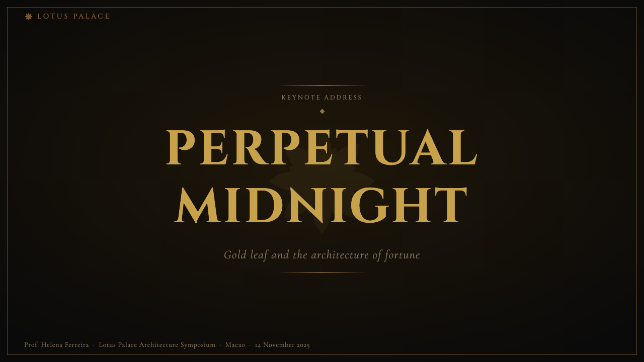
For presentation slides, the style excels on covers and section dividers where full-bleed dark fields can carry maximum impact. A cover built in this idiom uses a single gilded architectural motif — a lotus outline, a tile-border frame, a centred ornamental medallion — against a deep ground, with the title set in a classical weight that holds its legibility in gold against dark. Content slides require restraint: a thin gold rule at the top, a restrained type hierarchy in off-white and gold, and data presented as clean tables or minimal charts rather than illustrated infographics. The style does not suit dense bullet-point slides — its atmospheric weight overwhelms content-heavy layouts.
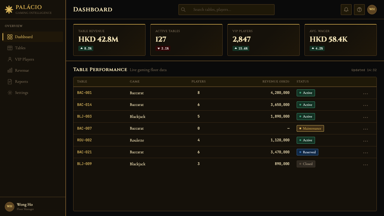
For web and dashboard interfaces, Grand Lisboa Gold reads with authority on dark-mode applications: analytics dashboards, premium membership portals, high-end e-commerce checkout flows. The approach is to set the background to the deepest register of the palette, use gold exclusively for interactive and navigational highlights, and let off-white or muted warm neutrals carry the primary body text. Cards and containers take on a layered quality — slightly lighter than the background ground, with gilded border rules rather than shadows — creating depth through surface differentiation rather than elevation.
For editorial and marketing contexts, the style works best when the channel itself carries cultural specificity: Macau, Hong Kong, or broader Chinese luxury markets where the Sino-Portuguese hybrid read is legible and resonant. A magazine layout in this idiom uses a double-page spread to establish a full-bleed dark field, sets display type in a classical gilded face, and reserves interior pages for narrower measures with gold ornamental rules marking section breaks. Marketing materials — event invitations, packaging, branded gift sets — benefit from the style's material logic: embossed gold on deep lacquer-coloured stock, jade-green as a spot-colour accent, bilingual typography as a visible identity marker.
A common failure mode when applying this style is substituting gold-coloured gradients for the genuine textural warmth the style requires. Smooth, computationally uniform gold reads as generic luxury — the kind of gilded finish found on mass-market packaging — rather than the grain-bearing, depth-carrying gold of beaten leaf or aged lacquer. A related mistake is deploying jade-green too liberally: in the authentic system, jade appears as a subordinate accent that cools and grounds the gold, not as a co-equal colour with independent decorative ambition. Used in excess, the combination tips from ceremonial richness into garish over-decoration.
Macau Grand Lisboa Casino Gold — FAQ
Is Grand Lisboa Gold appropriate for non-gaming luxury brands?
Yes, but the cultural specificity needs to be considered deliberately. The style carries strong associations with Cantonese gaming culture and the Sino-Portuguese hybrid identity of Macau — associations that are assets in contexts where that provenance reads as authentic and aspirational (Chinese luxury hospitality, high-end Asian F&B, premium event design in Greater China) but that may feel incongruous in contexts without that cultural connection. Stripped of its bilingual typography and lotus-and-jade motifs, the style's dark-ground, textural-gold aesthetic is transferable to any premium category; retaining those elements works best when the brand genuinely occupies the Macau-adjacent cultural space.
How does this style differ from generic 'Chinese New Year gold' or generic luxury gold?
Three things separate Grand Lisboa Gold from generic luxury gold treatments. First, darkness: the style's gold is always read against deep, absorptive grounds — never against white or pale backgrounds, which flatten gold into decoration. Second, texture: the grain of beaten leaf rather than the smoothness of a gradient. Third, cultural specificity: the lotus and jade motifs, the bilingual Cantonese-Portuguese typography, and the azulejo structural logic are not interchangeable with other Asian decorative vocabularies. Generic Chinese New Year gold tends toward red-and-gold pairing, symmetrical layouts, and auspicious iconography from mainland Chinese folk tradition. Grand Lisboa Gold is quieter, more Cantonese in its restraint, and rooted in a specifically colonial-and-post-colonial urban identity.
Can the style work in a light-mode digital product?
Only with significant adaptation, and the result will be a considerably diluted version of the style. The style's structural logic depends on dark grounds making gold luminous; on a light ground, gold tends to read as warm beige or ochre — pleasant but not distinctive. If a light-mode application is required, the most viable approach is to use the azulejo grid logic and bilingual typographic discipline as the structural inheritance, deploy gold only in ruled ornamental lines and selected typographic highlights, and substitute jade-green for the majority of the accent work. This produces something in the family of the style rather than the style itself.
What makes the Sino-Portuguese hybrid work visually, and is it replicable?
The hybrid works because the two inheritances operate at different registers of the visual system rather than competing on the same level. Portuguese azulejo contributes structural logic — the grid, the border treatment, the containing frame. Cantonese gaming culture contributes material warmth and atmospheric density — the gold, the jade, the lotus silhouette. Neither displaces the other; they are complementary contributions to different layers of the system. Replicating the hybrid requires understanding this layered logic rather than simply combining European ornament with Chinese motifs, which produces pastiche. The cultural grounding that gives Grand Lisboa Gold its authority — four centuries of actual Sino-Portuguese cohabitation and the specific commercial history of Macanese gaming — cannot be fabricated; it can only be referenced honestly.
How should this style handle data visualisation and charts?
Data visualisation within this style should be treated as an extension of the material logic, not as a neutral technical exercise. Charts and tables work best when they adopt the style's tonal hierarchy: dark background fields, gold for primary data series or key metrics, jade-green or muted warm neutrals for secondary series, and off-white for axis labels and supporting text. Grid lines should be rendered in the faintest gold tone rather than in grey, so they read as part of the surface's material texture rather than as foreign overlays. Decorative embellishment of chart containers — thin gold border rules, a restrained medallion mark at the chart title — is appropriate in editorial or presentation contexts; it should be eliminated in dashboard environments where speed of comprehension is paramount.
Related design styles
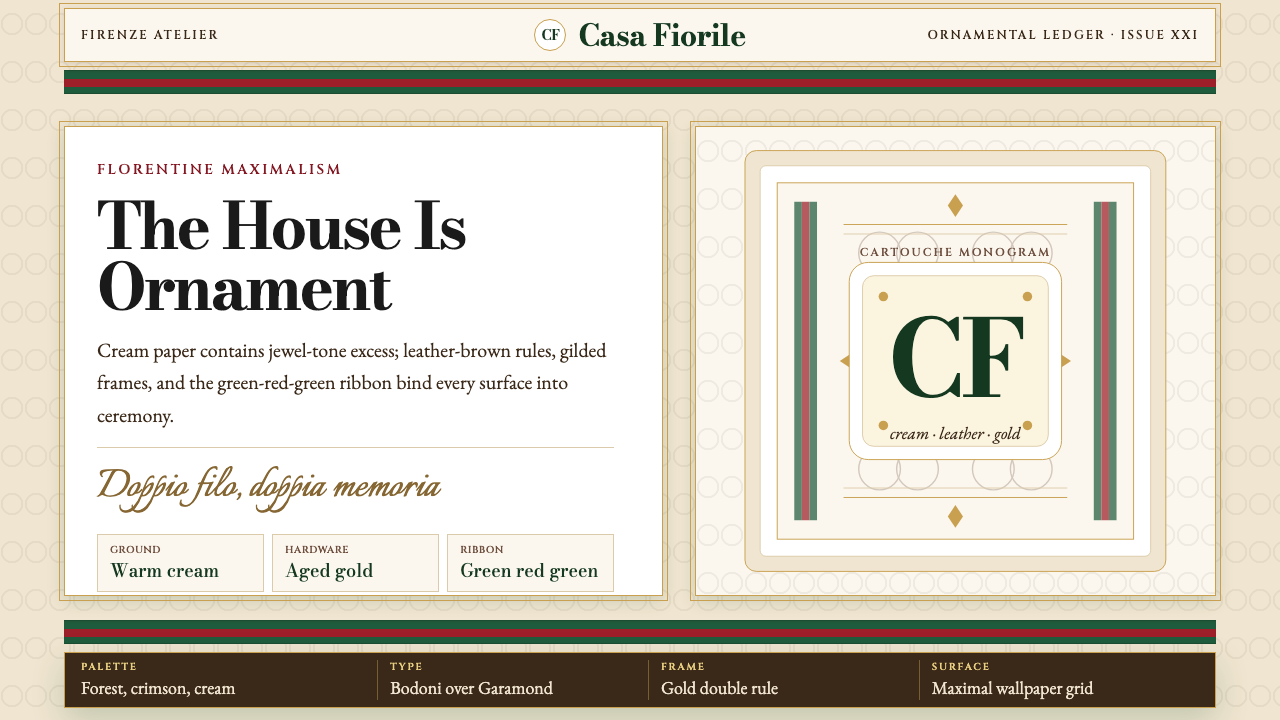 Gucci Double-GOrnament rules here. Bodoni on cream, framed by green-red-green and gold hard…
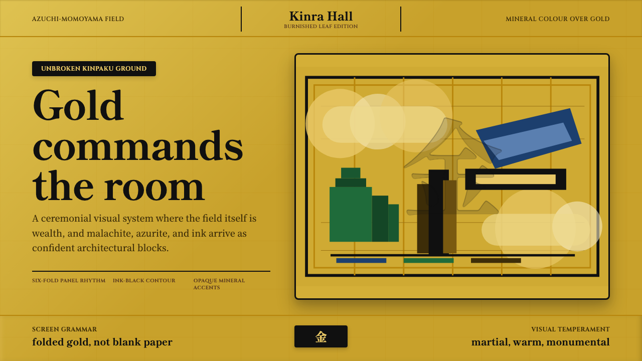 Momoyama Gold ScreenGold is the ground. Panel seams, ink contours, and mineral blocks make the fi…
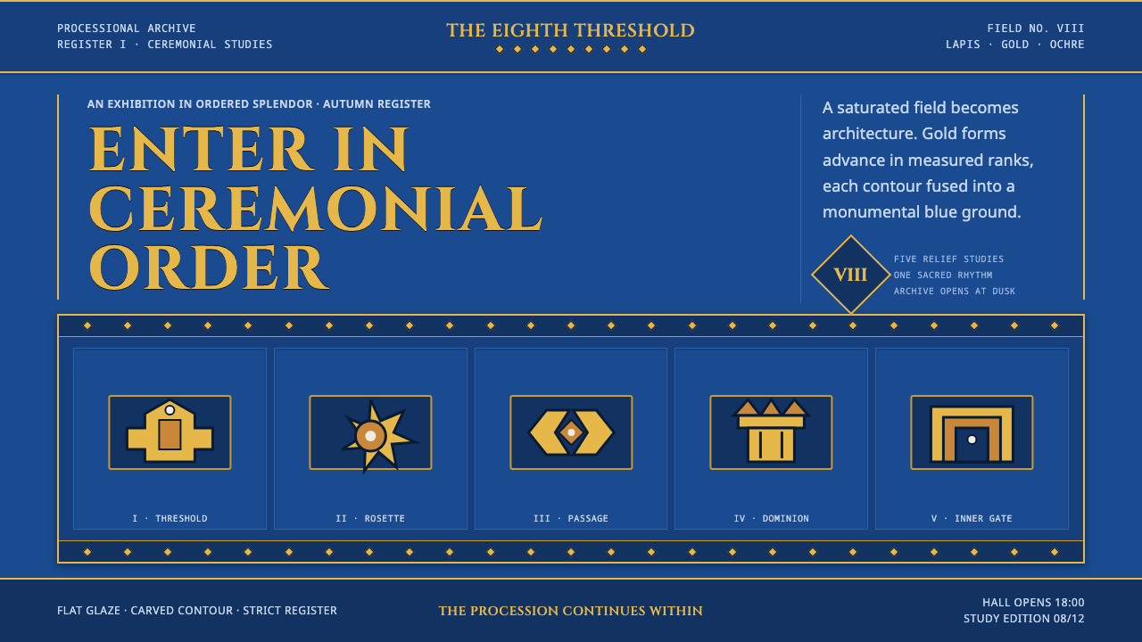 Babylonian Ishtar GateMonumental by procession. Lapis brick, gold registers, and carved capitals ho…
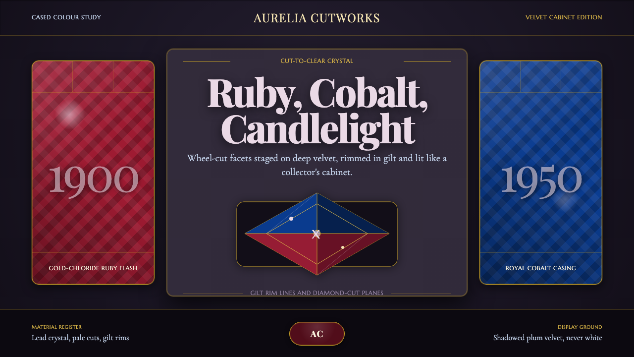 Bohemian Cut CrystalOpulence glows in shadow. Ruby and cobalt facets sit on velvet under gilt rim…
 Commemorative CoinAuthority struck in metal. Old-gold relief, denticled rims, and Cinzel capita…
 Deccan Basalt TempleMonumental shadow, carved. Near-black basalt, Cinzel capitals, and relief gri…