What is Uzbek Samarkand Shah-i-Zinda?
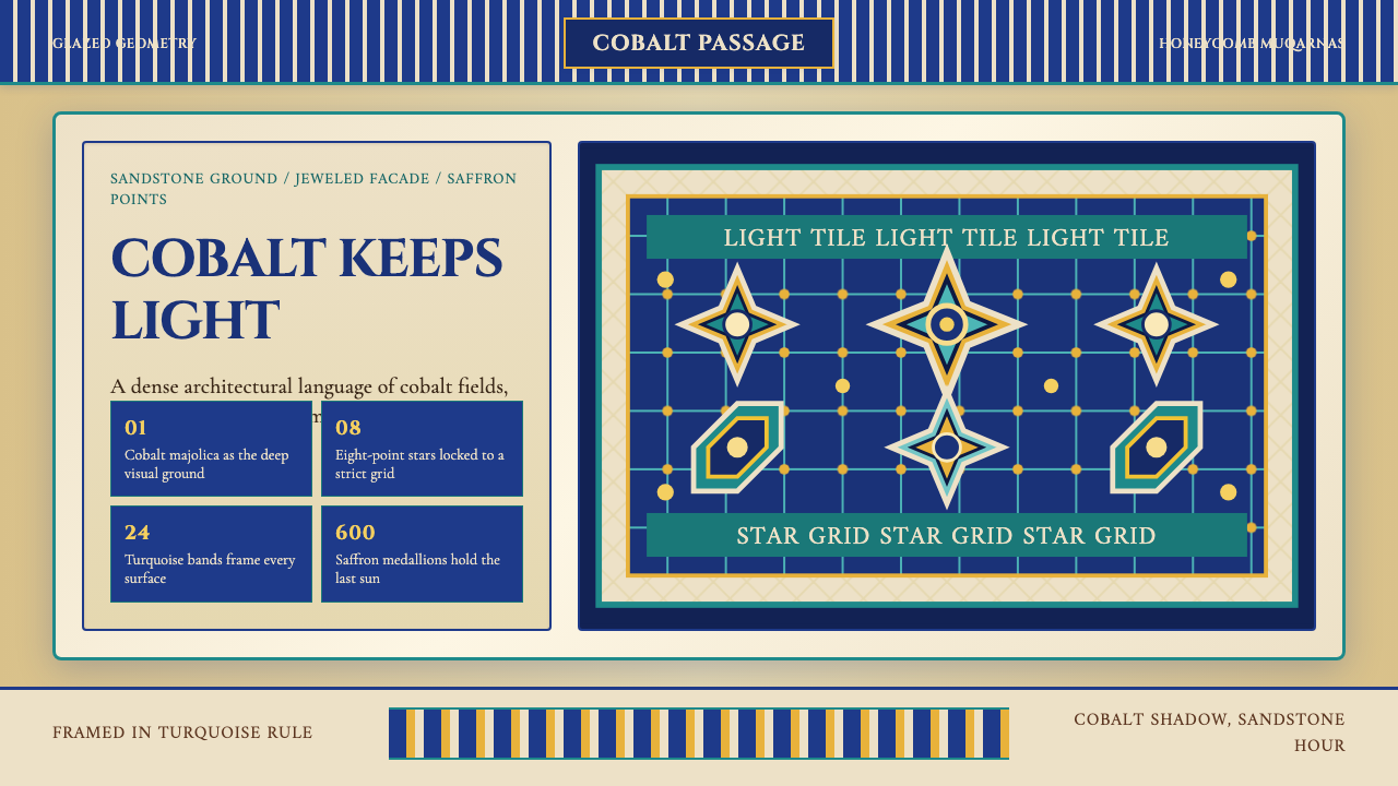
Shah-i-Zinda does not whisper — it blazes. Eleven turquoise-domed mausoleums stacked along the slope of ancient Samarkand form one of humanity's most concentrated displays of glazed tilework, where cobalt grids, honeycomb muqarnas vaults, and saffron medallions have burned against warm sandstone for six centuries without fading.
Uzbek Samarkand Shah-i-Zinda in brief
Uzbek Samarkand Shah-i-Zinda is a design language rooted in the necropolis of the same name: a procession of eleven mausoleums built between the eleventh and fifteenth centuries on the northern slope of Afrasiyab hill in Samarkand. The facades represent the apex of the Persian-Central Asian glazed-tile tradition, where geometry, calligraphy, and color are fused into surfaces of almost hallucinatory richness.
The visual system is defined by three governing forces. First, a tripartite color logic: cobalt blue as the deep structural field, turquoise as the animate middle tone that catches light as the sun moves, and saffron-gold as the accent that marks nodes of sacred or symbolic significance. These three work together the way a musical chord works — remove one, and the whole shifts. Second, an obsessive geometry: interlocking star polygons, arabesque vine scrolls, and muqarnas honeycomb stalactite vaulting fill every available surface without leaving a centimeter of visual silence. Third, a calligraphic authority: bands of Kufic and Naskh script frame and sanctify each facade, turning words into architectural ornament and ornament into words.
Unlike Western classical ornament, which typically sits on top of structure, the tilework of Shah-i-Zinda is the structure — the geometric grids are load-bearing ideas, not surface dressing. The density is not excess; it is completeness. In Timurid aesthetic philosophy, an undecorated surface is an unfinished thought.
Where does Uzbek Samarkand Shah-i-Zinda come from?
The name Shah-i-Zinda means 'the living king' in Persian, and refers to the legend that Kusam ibn Abbas — a cousin of the Prophet Muhammad who brought Islam to Central Asia — did not die but withdrew alive into a well beneath the hill after his martyrdom, where he remains in a state of perpetual sacred wakefulness. This legend made the site one of the holiest pilgrimage destinations in the Islamic world, and successive dynasties built their most magnificent funerary monuments here in order to benefit from proximity to the living saint.
Construction at the site spans eight centuries, but its defining visual character was established during the Timurid dynasty, particularly under Tamerlane (Amir Timur, died 1405) and his grandson Ulugh Beg (died 1449). Tamerlane, having conquered Persia, the Caucasus, and northern India, imported master craftsmen — tilemakers and architects from Tabriz, Kashan, and Isfahan — to Samarkand. These artisans brought with them the mature techniques of Persian glazed tilework: cuerda seca (a wax-resist method that keeps glaze colors from bleeding into each other), mosaic faience (cutting fired tiles into small geometric pieces and reassembling them into larger patterns), and the chemical knowledge required to produce stable cobalt, turquoise, and manganese-derived colors in the kiln.
The facades were built in stages across the fourteenth and fifteenth centuries, each successive patron attempting to surpass the previous generation. The result is not a single architectural vision but a compressed anthology of Timurid aesthetic ambition — a competition frozen in brick and glaze. UNESCO inscribed the wider Samarkand ensemble, including Shah-i-Zinda, on the World Heritage List in 2001, recognizing it as an outstanding example of Islamic architecture and an irreplaceable record of Central Asian artisanal knowledge.
The site survived the twentieth century in fragile condition. Soviet-era restoration campaigns in the 1970s and 1980s stabilized the structures but also replaced some original tilework with modern copies — a source of ongoing scholarly debate. Post-independence Uzbekistan has invested heavily in further restoration, with both local craftsmen trained in historical techniques and international conservation teams working to document and preserve the surviving original material.
What defines the Uzbek Samarkand Shah-i-Zinda look?
Color Trinity
The palette operates as a sacred triad rather than a freely adjustable spectrum. Cobalt blue — deep, saturated, and commanding — functions as the ground that organizes all other elements, comparable in authority to the sky itself. Turquoise sits above cobalt in the scale of radiance: lighter, more alive, it reads differently in morning and afternoon light as the glaze shifts from blue-green to aquamarine. Saffron-gold and warm ochre appear as medallion centers, calligraphic borders, and geometric node markers — always in focused quantities, never as background. This three-color economy means that any surface can be read as a coherent whole even when examined at close range; the colors divide territories rather than blending.
Geometric Interlace
The geometric vocabulary is built from a small set of base polygons — the six-pointed star, the eight-pointed star, the twelve-pointed star — extended through a rule-based interlacing system where lines cross and recross to generate complex secondary patterns from simple inputs. No line terminates arbitrarily; every intersection is governed. The result resembles a mathematical tiling — the kind of structure that can, in principle, extend infinitely across any surface. On facades of finite dimension, the geometry is cropped rather than completed, which gives each wall a sense of being a window onto an infinite field rather than a contained composition.
Muqarnas Stalactite Vaulting
Muqarnas are three-dimensional honeycomb units arranged in descending tiers to transition between a square base and a circular dome — solving an architectural problem through ornamentation so elaborate that the solution becomes the dominant visual experience. At Shah-i-Zinda, muqarnas cells are tiled in cobalt and turquoise, so that portal vaults appear to dissolve into patterned light rather than solid mass. The honeycomb cell — a hexagonal unit nested within larger hexagonal groupings — is the muqarnas geometry reduced to its 2D trace, and it repeats across tile panels, spandrels, and flat surface borders as a unifying motif.
Kufic and Naskh Calligraphy Bands
Text is not separate from ornament — it is one of the primary geometric instruments. Kufic, the earliest formalized Arabic script, is angular and architectural; its letterforms have horizontal and vertical strokes of nearly equal weight, which allows them to be stretched, interlocked, and woven into complex border patterns without losing legibility. Naskh is the cursive counterpart — rounder, more fluid, used for longer Quranic inscriptions where readability over distance matters. On Timurid facades, these script bands run along cornices, frame doorway arches, and ring drum-bases of domes, creating horizontal anchor lines that stabilize the exuberant geometry above and below them.
Surface Completeness
Where Western classical design uses negative space as a compositional tool — allowing the eye to rest — Timurid surface design treats empty space as a problem to be solved rather than a resource to be deployed. Every background area between geometric nodes is itself filled with a secondary arabesque pattern; every arabesque ground holds a tertiary micro-geometric filler. This creates a visual experience of inexhaustible depth: looking more closely at any section reveals another layer of pattern rather than a bare surface. In digital translation, this principle manifests as layered pattern use — a base tile pattern beneath a larger geometric overlay, with accent color concentrating at intersection nodes.
Light and Glaze Interaction
The glazed tile surfaces of Shah-i-Zinda were designed for a specific optical condition: Central Asian sunlight, which is intense, directional, and shifts dramatically in color temperature between dawn and dusk. Turquoise glaze has a particularly strong spectral response to this light — it appears almost teal in morning shadow, vivid aquamarine at noon, and leans toward soft blue-green at the golden hour. Cobalt, by contrast, holds its saturation more consistently across light conditions, providing the stable dark anchor that makes turquoise's variation legible. In digital contexts, this dynamic is approximated by using turquoise at variable opacity or as a highlight layer, while cobalt functions as a consistent structural tone.
Bilateral Symmetry with Focal Asymmetry
Individual facade panels and tile compositions at Shah-i-Zinda are typically bilaterally symmetric — a star polygon at center, mirrored interlace radiating outward in equal arms. But the facades as wholes are not rigidly symmetric: portals are flanked by asymmetric towers or niches, and the procession of mausoleums along the alley is staggered in height and depth rather than aligned. This creates a rhythm between local order and global dynamism: up close, perfect geometric regularity; from a distance, a skyline of varied domes and portals that moves the eye along the path. The design principle translates into a rule for digital application — symmetric components within asymmetric layouts.
Who shaped Uzbek Samarkand Shah-i-Zinda?
Tamerlane built one of the largest empires in world history and used architecture as a deliberate tool of political legitimacy. His campaigns into Persia and the Levant were partly logistical exercises in talent extraction: he brought master craftsmen from Tabriz, Kashan, Isfahan, and Delhi back to Samarkand and set them to transforming his capital into a city that would outshine every place he had conquered. He commissioned mausoleums for relatives and court figures at Shah-i-Zinda, establishing its character as the dynastic necropolis par excellence. His own tomb — the Gur-e-Amir, also in Samarkand — was built at his order but completed by his grandson, with a ribbed turquoise dome that became one of the most influential architectural forms in the Islamic world.
Tamerlane's grandson was one of the most significant astronomers of the medieval world — he built the famous Samarkand Observatory whose measurement of stellar positions was accurate to within fractions of a degree using purely mechanical instruments. His patronage extended to architecture: he commissioned madrasas and mausoleums whose facades reflected a more geometrically disciplined aesthetic than Tamerlane's exuberant maximalism, showing the influence of his scientific training on visual culture. He also completed a madrasah directly facing the Registan square, creating the spatial framework that would make Samarkand's center one of the architectural wonders of the medieval world.
The individual craftsmen who executed Shah-i-Zinda's tilework are mostly anonymous, but they came from the two cities that had developed Persian glazed-tile technique to its highest point: Tabriz in northwestern Iran, a center of cross-cultural craft exchange that absorbed influences from Chinese ceramics and Byzantine gold work; and Kashan in central Iran, which gave its name to the word 'faience' in several European languages (via the Arabic 'qashani') and whose tilemakers had developed the cuerda seca dry-line technique for keeping colors separated in the kiln. Their collective knowledge, transplanted to Samarkand, produced the technical conditions for Shah-i-Zinda's facades.
The sacred legitimacy of the Shah-i-Zinda complex rests entirely on the legend of Kusam ibn Abbas, said to be a cousin of the Prophet Muhammad who brought Islam to the Sogdian people of Central Asia in the seventh century and who, according to tradition, survived his own martyrdom by retreating into a subterranean chamber beneath the hill where he continues to live in immortal wakefulness. The tomb attributed to him at the base of the necropolis is the pilgrimage anchor of the entire site — every subsequent mausoleum was built here to benefit from its baraka (sacred power). The design language of Shah-i-Zinda is therefore inseparable from this layering of sacred time: architecture that is simultaneously tomb, shrine, and living monument.
Saray Mulk Khanym — known popularly as Bibi-Khanym, meaning 'senior wife' — was Tamerlane's primary consort and one of the most politically powerful women in the Timurid world. She commissioned the enormous congregational mosque that bears her name in Samarkand, which for a brief period was among the largest mosques in the Islamic world, and she is associated with several of the female mausoleums in the Shah-i-Zinda complex. Her patronage demonstrates that Timurid architectural production was not exclusively the preserve of male rulers, and the female mausoleums at Shah-i-Zinda — with their distinctive tilework programs — represent a distinct sub-tradition within the site's visual history.
How do you use Uzbek Samarkand Shah-i-Zinda today?
Shah-i-Zinda is a maximalist tradition, and applying it well requires embracing that maximalism with discipline rather than restraint. The style does not work in small doses — a single geometric border on an otherwise bare layout will read as an exotic motif rather than a coherent design system. Commitment to the full logic means building the color trinity (cobalt, turquoise, saffron), the geometric layering, and the calligraphic framing into every significant surface of the work.
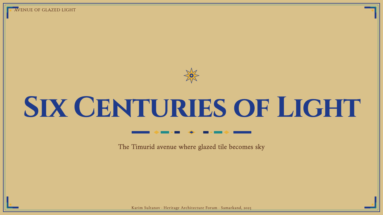
For presentation slides, the system works best when the background itself carries the pattern. A cover slide should use a full cobalt field with a turquoise geometric interlace tiled across it, the title set in a warm cream or gold against this field, with saffron used only for a single accent element — perhaps a star-polygon ornament or a border medallion. Content slides can pull back to a cream or off-white field with cobalt as a section-color bar and turquoise as the chart-fill, reserving geometric borders for section dividers. Data slides benefit from using the star polygon as a structural grid element — a twelve-pointed star as a donut chart base, for example, turns a standard visualization into something distinctly within this aesthetic.
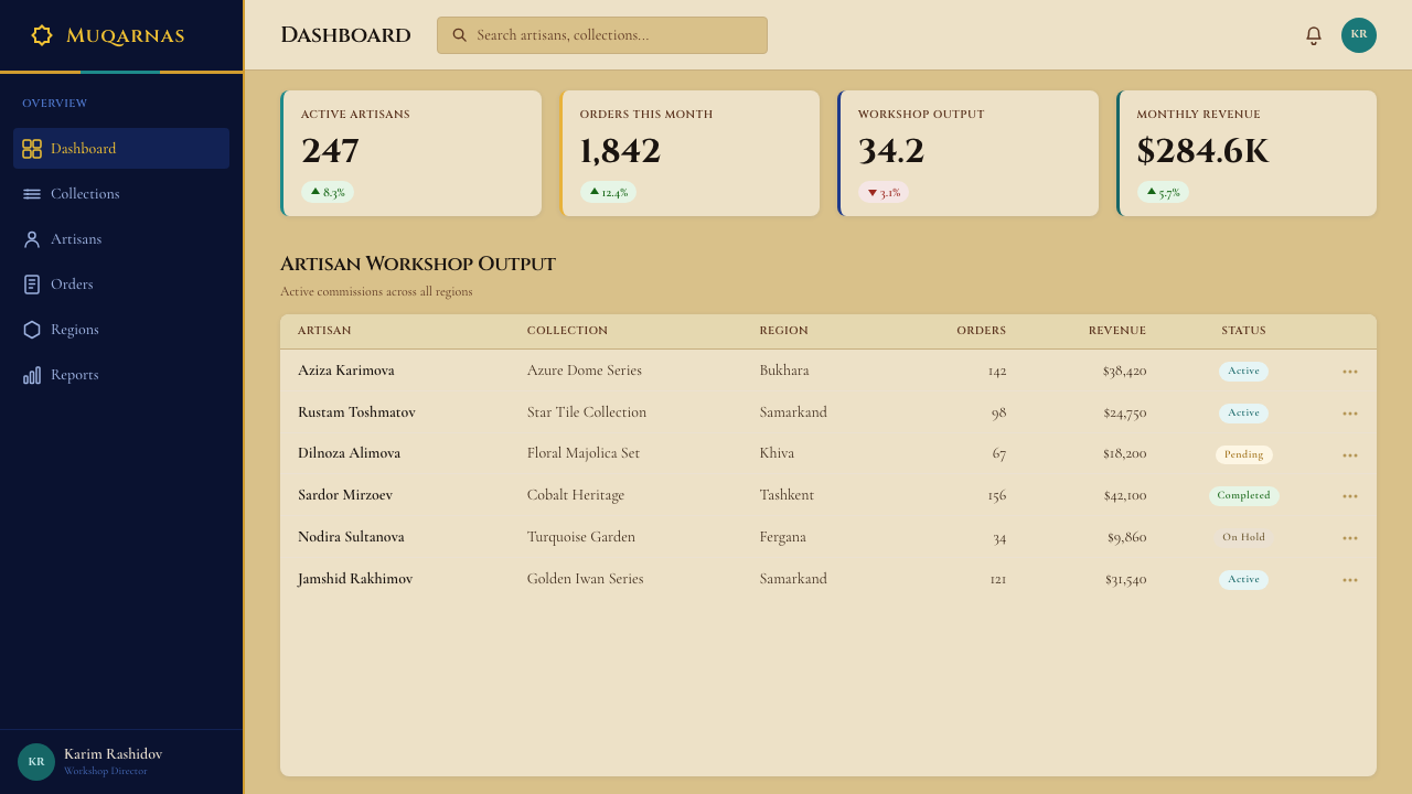
For web UI, this system is well-suited to landing pages, cultural platforms, and luxury e-commerce where richness and heritage are desired values. A dashboard built in this idiom should establish a cobalt header band with turquoise iconography and saffron notification badges, with card bodies in warm off-white patterned with a light geometric tile at reduced opacity. The pattern should never fight legibility — text areas should be clean, with ornament concentrated in headers, footers, and decorative dividers. Navigation labels can be set in a contemporary sans-serif, with the ornament doing the cultural signaling rather than a custom calligraphic typeface, which risks illegibility at small sizes.
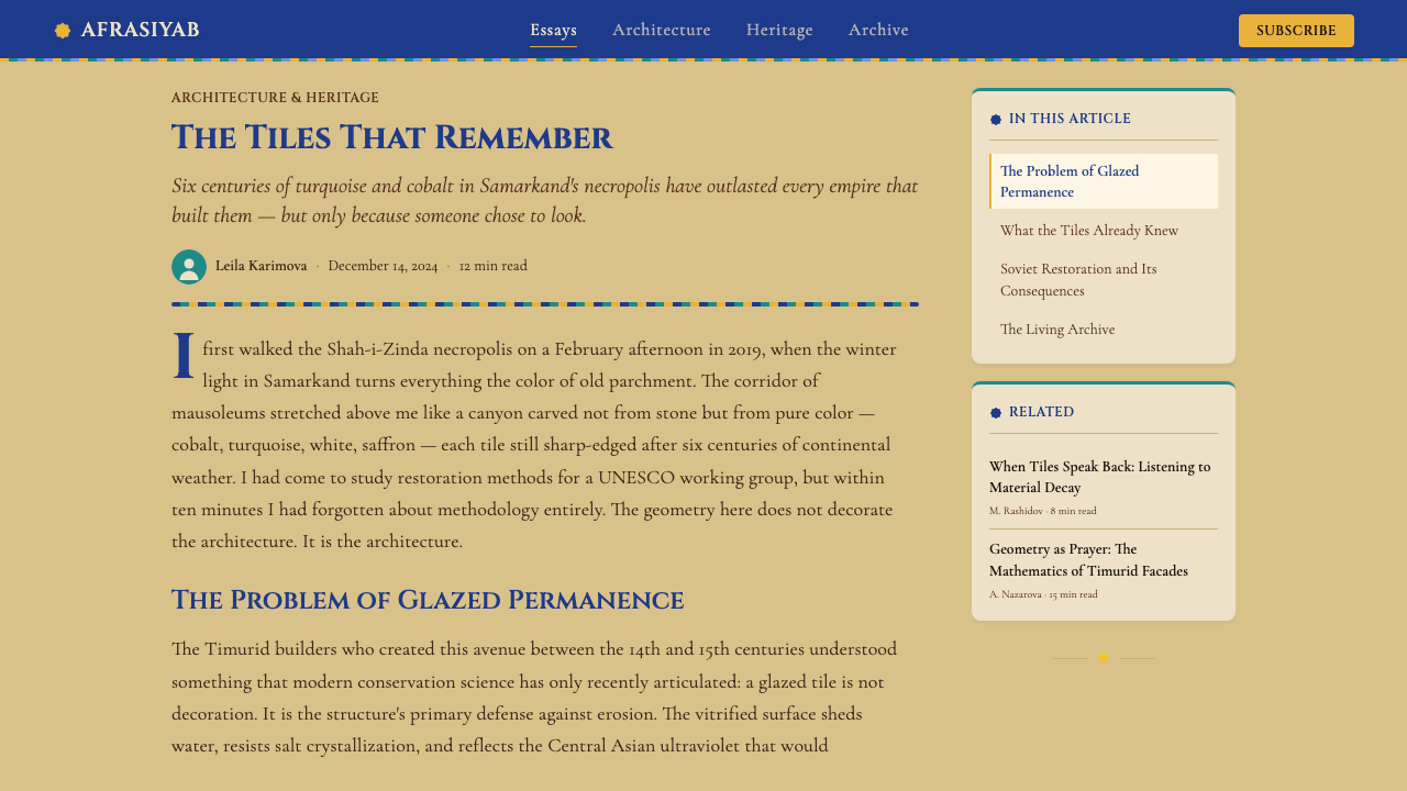
For editorial and marketing work, this style supports full-bleed treatment more naturally than most historical systems. An article header with a cobalt-and-turquoise geometric pattern spanning the full width, broken by the headline in large cream type, achieves exactly the portal-like monumentality that Shah-i-Zinda's facades produce in stone and glaze. Pull quotes can be framed with Kufic-derived geometric borders rather than standard quotation marks. Section breaks can use a horizontal saffron rule or a small star-polygon medallion rather than a plain line.
The most common mistake when working with this style is treating it as a surface layer rather than a structural system. Designers who add a few Islamic geometric borders to an otherwise conventional layout end up with cultural pastiche rather than a coherent design language. The second common mistake is color drift: introducing warm oranges, dusty pinks, or earth tones that read as North African or Middle Eastern in a generic sense but are not part of the Shah-i-Zinda palette. The turquoise must remain turquoise — blue-green, not teal, not seafoam — and the cobalt must remain deep and dominant, not lightened toward sky blue.
Uzbek Samarkand Shah-i-Zinda — FAQ
How is Shah-i-Zinda different from other Islamic geometric traditions, like Moroccan Zellige?
Both traditions use geometric interlace, but their color logic, scale, and surface philosophy differ significantly. Zellige typically works with a much broader color range — terracotta, olive green, ivory, navy, soft yellow — and the patterns are usually lower in height, covering floors and dado panels rather than soaring portal facades. Shah-i-Zinda is more restricted in palette (the cobalt-turquoise-saffron triad is strict) and vastly larger in scale — facades rise to several storeys, and the geometric programs are proportioned to be read from a distance. Moroccan work tends toward warm, earthy warmth; Timurid work tends toward celestial intensity. Both are maximalist, but their idea of maximum is different.
Can this style work for dark-mode or dark-background digital products?
Yes, but the inversion changes the logic of the palette. In the original architecture, cobalt is the dark ground against which turquoise and saffron read as light and luminous. A dark-mode digital translation can use very deep cobalt or near-black as the background, with turquoise as the primary luminous element and saffron as the accent — which is structurally close to the source material. What to avoid is using a generic dark gray or charcoal background, which detaches the palette from its origin and makes the turquoise and saffron read as mere decoration rather than a coherent triad. The background color must participate in the triad.
Is it appropriate to use actual Arabic or Kufic-style text, or is geometric ornament enough?
Geometric ornament alone can carry the aesthetic for most digital applications. The calligraphic bands in the original architecture serve a sacred textual function — they quote Quranic verses and honorific titles — and using decorative pseudo-calligraphy that mimics their visual form without that textual grounding risks being read as culturally insensitive. If the product serves communities for whom Arabic-script text is meaningful, using actual Quranic or classical Persian verse (with appropriate context) is a respectful option. For general-audience products, the safer and more coherent approach is to use the geometric vocabulary fully and leave the calligraphic register to actual readable typography — headlines in a contemporary sans-serif, for example — letting the geometry do the cultural signaling.
What kinds of products or brands should avoid this style?
Any context that requires visual simplicity, clinical neutrality, or speed of comprehension is a poor match. Emergency services, medical interfaces, fintech dashboards built for dense data scanning, and minimal productivity tools should not attempt this system — the visual density will fight legibility and create cognitive load that conflicts with the product's purpose. The style also requires a brand context that can credibly invoke richness, heritage, and cultural depth: luxury goods, cultural institutions, travel and hospitality, high-end editorial. A discount marketplace, a utility app, or any brand positioning itself as radically simple will find the style's maximalism working against it.
How does this style handle typography in a digital context?
The original architecture uses calligraphy as ornament — text and pattern are one thing. In digital products, this integration is difficult to achieve without custom lettering, so the practical approach is to separate the two registers cleanly: let contemporary serif or sans-serif typefaces handle readability, and let geometric ornament handle cultural signaling. Headlines work well in typefaces with classical proportions — broad serifs with strong contrast, or geometric sans-serifs with even stroke weight — set in cream or gold against the cobalt field. What to avoid is using decorative Arabic-inspired display fonts for Latin text: the borrowing rarely convinces and often reads as pastiche. If Arabic text is part of the product, pairing a classical Arabic typeface with a complementary Latin face produces the most authentic result.
Related design styles
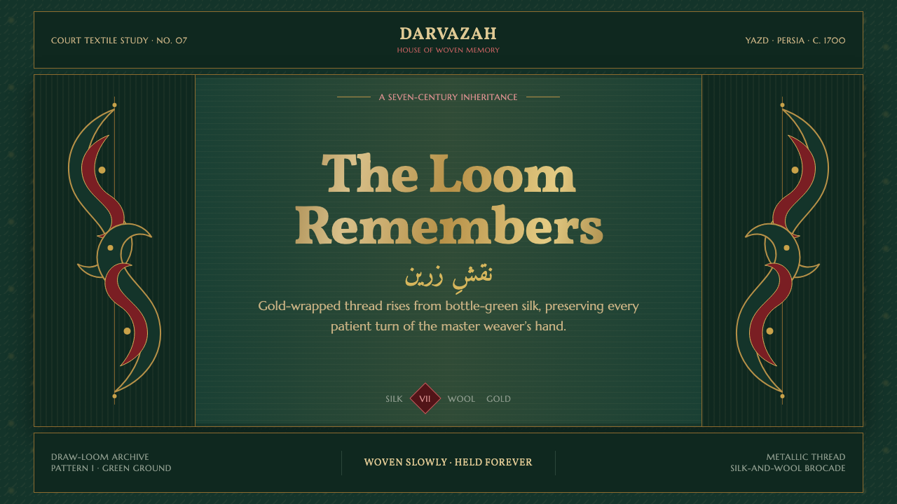 Persian Termeh BotehRoyal brocade, densely alive. Antique-gold boteh climbs across lustrous bottl…
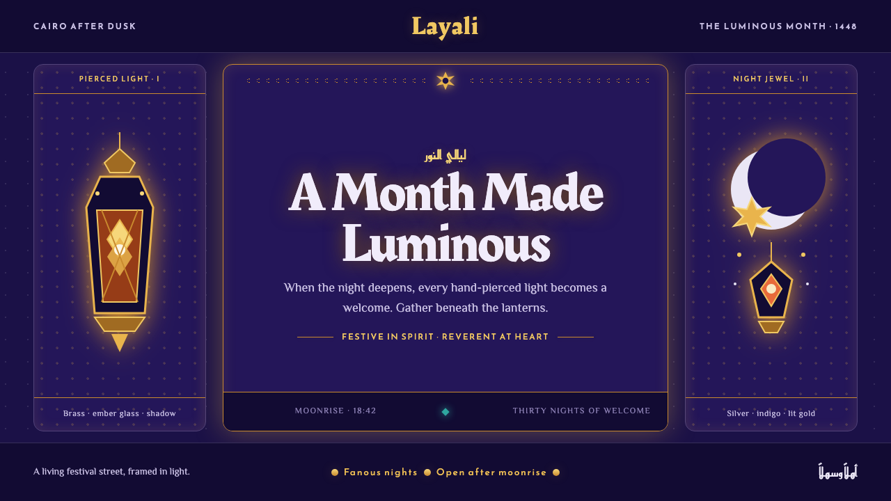 Ramadan Lanterns (Fanous Nights)Night becomes sacred light. Pierced brass and amber glow burn across bottomle…
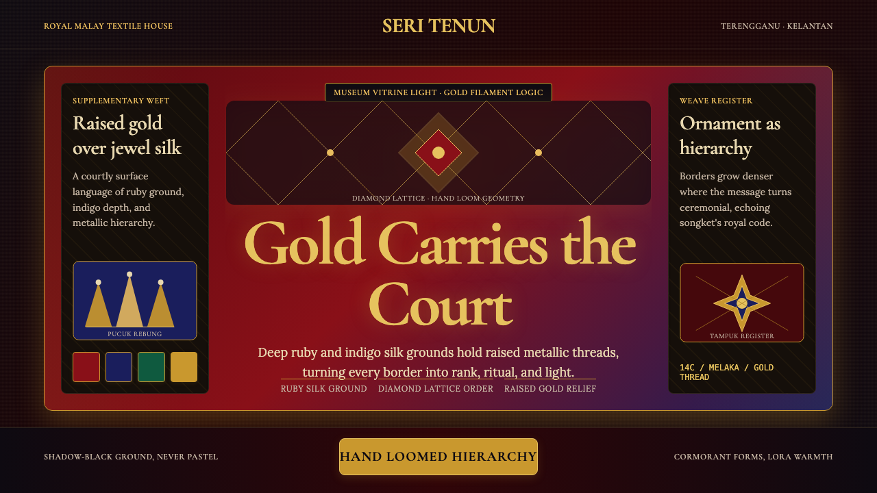 Malaysian Songket (Gold-Thread Weave)Royal textile opulence. Ruby and indigo silk grids lift gold-thread relief.
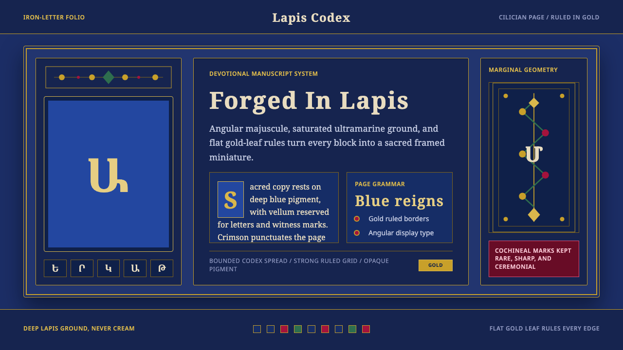 Armenian ErkatʿagirDevotional lapis reigns. Gold rules and angular serif glyphs frame a sacred g…
 Armenian Manuscript FolkloreJewel-dense devotion. Lapis ground, gold uncials, and vermilion arcades fill…
 Badakhshan Lapis LazuliStone as manuscript. Ultramarine field, pyrite flecks, calcite veins, carved…