What is Kufic Square Arabic?什么是 Kufic Square Arabic?
Square Kufic turns Arabic script into pure right-angle geometry — every letter a Tetris-like module locked to a rigid grid, born from centuries of Persian tile craft.方体库法书法将阿拉伯文字化为纯粹的直角几何——每个字母都是锁定于严格网格上的俄罗斯方块式模块,源自数百年波斯瓷砖工艺的传承。
Kufic Square Arabic in briefKufic Square Arabic 速览
Square Kufic, known in Persian as Kufic-e Banna'i or 'bricklayer's Kufic', is a branch of the ancient Kufic script tradition in which every letterform is reconstructed as a right-angle assembly of square modules. Unlike the fluid cursive of everyday Arabic writing, Square Kufic admits no curves, no diagonal strokes, and no decorative flourishes — only horizontal and vertical lines meeting at perfect ninety-degree corners, building characters the way a mason builds a wall: unit by unit, course by course.方体库法书法,波斯语称为『Kufic-e Banna'i』(即『砌砖工库法』),是古老库法体书法传统中的一个分支。在这一体系中,每个字母形态都被重构为方形模块的直角拼合:没有曲线,没有斜向笔画,没有装饰花饰,只有水平线与垂直线以完美的九十度角相交——如同泥瓦匠砌墙,一块一块,一层一层。
The visual result is unlike any other script tradition in the world. Words and phrases dissolve into dense, interlocking geometric lattices that must be read slowly and deliberately, often requiring the eye to trace the negative space between filled modules as much as the filled modules themselves. This ambiguity between figure and ground — where tile and gap are equally active — gives Square Kufic compositions an architectural presence that feels closer to a floor plan or a woven kilim than to a page of text.其视觉效果在世界任何书写传统中都独一无二。词语与短语消融于密集、互锁的几何格网之中,读者必须缓慢而刻意地辨读,往往需要同等关注填充模块之间的负形空间与模块本身。这种图与底之间的模糊性——瓷砖与间隙同等活跃——赋予方体库法构图一种建筑般的存在感,更接近于平面图或编织地毯,而非一页文字。
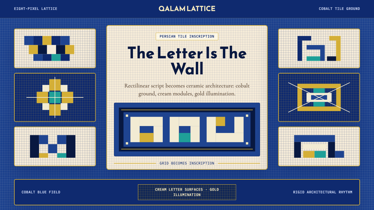
As a contemporary design system, Square Kufic offers a powerful visual vocabulary rooted in Islamic geometric tradition: a cobalt ground that references Persian mosque tilework, cream letterform surfaces that recall unglazed terracotta, gold accent lines that echo the illuminated borders of Timurid manuscripts, and an unwavering grid logic that turns every layout decision into a structural statement. It is a style that does not ornament — it constructs.作为当代设计系统,方体库法提供了一套植根于伊斯兰几何传统的强大视觉语言:参照波斯清真寺彩砖的钴蓝底色,令人联想到无釉陶土的奶油色字形面,呼应帖木儿王朝手抄本金色边框的点缀线条,以及将每个版面决策化为结构陈述的坚定网格逻辑。这是一种不做装饰、只做建构的风格。
See the Kufic Square Arabic design system查看 Kufic Square Arabic 完整设计系统
Where does Kufic Square Arabic come from?Kufic Square Arabic 从何而来?
Kufic script takes its name from the Iraqi city of Kufa, one of the earliest centers of Arabic literacy, where the first angular, horizontal-heavy form of written Arabic emerged in the seventh century. Early Kufic was not a single script but a family of regional hands unified by their rectilinear bias — a sharp contrast to the rounder Naskh script that would eventually dominate book production. By the ninth and tenth centuries, Kufic letterforms were being carved into stone, cast in bronze, and painted onto ceramic surfaces across the Islamic world, functioning as the prestige script for Quranic manuscripts and royal inscriptions.库法体书法得名于伊拉克城市库法——阿拉伯文字最早的中心之一。七世纪时,最早的棱角分明、横向笔画为主的阿拉伯文字书写形态在此出现。早期库法体并非单一书体,而是一组以直线性偏好为共同特征的地区性书写风格,与最终主导书籍生产的圆润纳斯赫体形成鲜明对比。到九、十世纪,库法体字形已被镌刻于石材、铸造于铜器、绘制于陶器之上,遍布伊斯兰世界,成为《古兰经》手抄本与王室铭文的尊贵字体。
Square Kufic as a distinct geometric practice crystallized in eleventh-century Persia, driven by the demands of large-scale architectural inscription. The challenge facing mosque builders was this: how do you inscribe a Quranic phrase around the exterior of a dome, across a portal arch, or over an entire wall surface, when the letters must be legible from a distance, durable in tile, and visually consistent with the surrounding geometric ornament? The answer was to abandon the calligraphic model entirely and rebuild each letterform from the same square tile unit used for the surrounding mosaic. The letter and the tile field became one system.方体库法作为一种独特的几何实践,在十一世纪的波斯得以确立,其动力来自大尺度建筑铭文的需求。清真寺建造者面临的挑战是:当字母必须从远处可读、在瓷砖中耐久,并与周围几何装饰在视觉上保持一致时,如何将《古兰经》的短语铭刻于穹顶外壁、门廊拱券,乃至整面墙面?答案是彻底放弃书法模型,用与周围马赛克相同的方形瓷砖单元重建每个字母形态。字母与瓷砖底面成为同一套系统。
The tradition reached its peak of ambition and refinement during the Timurid period of the thirteenth through fifteenth centuries, when the great mosque complexes of Yazd, Isfahan, Shiraz, and Samarkand were constructed and decorated. In these buildings, Square Kufic inscriptions wrap entire iwans and minarets in continuous textual bands, their cobalt-blue tile letters reading simultaneously as scripture, as architectural ornament, and as geometric pattern. The Alhambra in Granada, built under the Nasrid dynasty in the thirteenth and fourteenth centuries, brought the tradition to Andalusia, where it fused with local Moorish ornamental vocabularies.这一传统在十三至十五世纪的帖木儿王朝时期达到抱负与精炼的顶峰——亚兹德、伊斯法罕、设拉子和撒马尔罕的伟大清真寺建筑群在这一时期建造与装饰。在这些建筑中,方体库法铭文以连续的文字带缠绕整座伊旺与宣礼塔,钴蓝色瓷砖字母同时作为经文、建筑装饰与几何图案被阅读。十三、十四世纪纳斯里德王朝在格拉纳达建造的阿尔罕布拉宫将这一传统带入安达卢西亚,与当地摩尔式装饰语汇相互融合。
After centuries of relative dormancy as a living practice — surviving mainly in architectural preservation and scholarly documentation — Square Kufic underwent a significant revival in the twentieth and twenty-first centuries. Calligraphers and graphic designers working across Iran, the Arab world, and the diaspora began exploring the script's grid-based logic as a framework for contemporary typography. Figures such as Hassan Massoudy, Bahram Shabahang, and Reza Abedini engaged with the geometric tradition not as a nostalgic exercise but as a genuinely structural design system compatible with digital grids and screen-based composition. In this form, Square Kufic entered the vocabulary of contemporary Islamic modernism — a bridge between a millennium of tile craft and the pixel grid of the present.经历数百年作为活态实践的相对沉寂——主要以建筑保护与学术文献的形式留存——方体库法在二十、二十一世纪经历了一次重要复兴。在伊朗、阿拉伯世界及海外侨民社区工作的书法家与平面设计师开始探索这种书体的网格逻辑,将其作为当代排版的框架。哈桑·马苏迪、巴赫拉姆·沙巴汉格、雷扎·阿贝迪尼等人与这一几何传统的对话,不是怀旧的演练,而是将其视为与数字网格和屏幕构图兼容的真正结构性设计系统。方体库法由此进入当代伊斯兰现代主义的词汇——一座连接千年瓷砖工艺与当下像素网格的桥梁。
What defines the Kufic Square Arabic look?Kufic Square Arabic 的视觉特征是什么?
Grid Architecture网格建筑
Every element in Square Kufic — letterform, border, background fill, and negative space — snaps to the same square-module grid. Nothing exists between grid units; nothing spans a fractional increment. This absolute modularity means that the grid itself is the design system: change the module size and the entire composition scales proportionally. The discipline echoes the kashi-kari tilework tradition from which the script emerged, where individual glazed squares were the indivisible atoms of the whole.方体库法中的每个元素——字形、边框、背景填充与负形空间——都锁定于同一方形模块网格。没有任何东西存在于网格单元之间,没有任何东西跨越分数增量。这种绝对的模块化意味着网格本身就是设计系统:改变模块尺寸,整个构图便按比例缩放。这种自律呼应了孕育这种书体的波斯釉砖镶嵌传统——在那里,单块上釉方砖是整体中不可再分的原子。
Color Field色域
The canonical palette is structured around three roles rather than three hues. A deep cobalt blue — saturated and cool, referencing Persian mosque tile — occupies the ground field. A warm cream or unglazed-terracotta tone fills the letterform surfaces, providing luminous contrast without the harshness of pure white against the cobalt. Gold — a thin, linear accent rather than a fill — appears at borders, tile seams, and decorative bands, functioning as the illumination tradition of manuscript culture translated into architectural line.标准色板围绕三种角色而非三种色相构建。浓郁清冷的钴蓝——饱和而冷调,参照波斯清真寺彩砖——占据底面色域。温暖的奶油色或无釉陶土色调填充字形表面,提供明亮对比而无纯白对钴蓝的刺眼感。金色——作为细线条点缀而非填充出现——分布于边框、砖缝与装饰带,是手抄本文化中光彩传统转译为建筑线条的体现。
Right-Angle Letterforms直角字形
In Square Kufic, curves are structurally forbidden. Every letter that would ordinarily contain a circular or diagonal element — the rounded belly of ba, the curved sweep of sad, the descending loop of qaf — must be reinterpreted as a staircase of square modules or an L-shaped right-angle construction. The scribal challenge is to maintain legibility while imposing this constraint: skilled Square Kufic composition preserves enough of the letter's topological identity that a trained eye can decode the text, even when any one letterform might be mistaken for a purely abstract geometric fragment.在方体库法中,曲线从结构上被禁止。每个通常包含圆形或对角线元素的字母——巴字母圆润的腹部、萨德字母的弧形、卡夫字母的下行圆圈——都必须被重新诠释为方形模块的阶梯或L形直角结构。书法的挑战在于:在施加这一约束的同时保持可读性。熟练的方体库法构图保留了足够的字母拓扑特征,使受过训练的眼睛能够解读文本,即便单个字形可能被误认为纯粹的抽象几何片段。
Figure-Ground Ambiguity图底互换
One of the most distinctive perceptual qualities of Square Kufic is the active role of the negative space. Because letters are built from the same module type as the surrounding field, the eye constantly oscillates between reading the filled modules as letters and reading the empty modules as letters. Many compositions are deliberately reversible: the cobalt ground resolves into text when read one way, and the cream letterforms resolve into an independent geometric pattern when the reading logic is reversed. This figure-ground oscillation is not a byproduct but a feature, celebrated in tile compositions where dual readings were understood as an emblem of divine complexity.方体库法最独特的感知特质之一是负形空间的主动角色。由于字母与周围底面使用相同类型的模块构建,眼睛不断地在将填充模块读作字母与将空白模块读作字母之间摇摆。许多构图是刻意可逆的:从一种方式读,钴蓝底面解析为文字;逆转阅读逻辑,奶油色字形则解析为独立的几何图案。这种图底振荡并非副产品,而是一种特性,在瓷砖构图中被称颂为神圣复杂性的象征。
Compositional Density构图密度
Square Kufic compositions are dense by nature: the grid must be packed tightly enough that letters remain identifiable and the overall panel reads as inscription rather than decoration. Unlike open-field calligraphy where generous spacing is a mark of refinement, Square Kufic rewards compression. Skilled compositions fill eighty to ninety percent of the panel surface with active module, leaving the minimum negative space required to distinguish letterforms. This density gives the style its monumental, wall-like quality — a visual weight that anchors rather than floats.方体库法构图天然密集:网格必须足够紧凑,使字母保持可辨识,整体面板读作铭文而非装饰。不同于开阔留白是精炼标志的开放型书法,方体库法奖励压缩。熟练的构图将面板表面百分之八十至九十填充为活跃模块,仅留下区分字形所需的最少负形空间。这种密度赋予这种风格其纪念碑般、如墙壁般的品质——一种锚定而非漂浮的视觉重量。
Symmetry and Rotation对称与旋转
Large-format Square Kufic panels — particularly those designed for square architectural fields such as tile dados and portal spandrels — often employ four-fold rotational symmetry, with the inscription arranged so that the same phrase reads correctly from all four orientations of the panel. This is not merely decorative; it reflects a theological principle that divine text has no privileged direction. In contemporary applications, this rotational logic translates to layouts that can be viewed in multiple orientations without losing structural coherence — a property well-suited to flexible digital formats.大幅方体库法面板——特别是为方形建筑场域(如护墙砖面与门廊拱肩)设计的——常采用四向旋转对称,铭文的排布使同一短语从面板的四个方向均可正确阅读。这不仅仅是装饰性的;它反映了一种神学原则:神圣文本没有特权方向。在当代应用中,这种旋转逻辑转化为可从多个方向观看而不失结构连贯性的版面——这一特性非常适合灵活的数字格式。
Border and Frame Logic边框与框架逻辑
Square Kufic compositions are almost never borderless. The tradition calls for one or more framing bands — typically rendered in the gold accent color — that separate the inscription field from its architectural surround. These borders are themselves part of the grid system, occupying a fixed number of module widths and establishing the outer boundary within which all letterforms must resolve. In digital applications, this border logic translates to contained cards and panels with explicit rule lines rather than floating elements with soft shadows. The frame is structural, not decorative.方体库法构图几乎从不无边框。这一传统要求一条或多条框架带——通常以金色点缀色呈现——将铭文场域与其建筑环境分隔开来。这些边框本身是网格系统的一部分,占据固定数量的模块宽度,并确立所有字形必须在其中解析的外部边界。在数字应用中,这种边框逻辑转化为具有明确规则线的包含式卡片和面板,而非带有柔和阴影的浮动元素。框架是结构性的,而非装饰性的。
See the Kufic Square Arabic design system查看 Kufic Square Arabic 完整设计系统
Who shaped Kufic Square Arabic?谁塑造了 Kufic Square Arabic?
A leading contemporary Iranian calligrapher who has worked extensively with Square Kufic as a living compositional practice rather than an archaeological subject. Abdolali's panels demonstrate how the strict grid constraint of the script can generate compositions that feel simultaneously ancient and rigorously modern — the same modularity that governed eleventh-century tilework governs his ink-on-paper studies. His work has been central to establishing Square Kufic as a serious framework for contemporary Arabic typography beyond architectural restoration.当代伊朗领军书法家,将方体库法作为活态创作实践而非考古课题进行了大量深入研究。阿卜杜拉利的作品展示了这种书体严格的网格约束如何生成同时具有古典感与严格现代感的构图——支配十一世纪瓷砖工艺的同一模块化原则,也支配着他的纸上墨水研究。他的工作对于确立方体库法作为超越建筑修复的当代阿拉伯字体设计严肃框架,居功至伟。
An Iraqi-born calligrapher based in Paris whose career spans traditional Arabic scripts including Kufic and their reinterpretation through contemporary expressive and geometric approaches. Massoudy is notable for engaging with the structural logic of early Kufic forms and translating them into large-format compositions that operate as both text and visual art. His published books on Arabic calligraphy have been foundational texts for designers approaching the Kufic tradition from outside the classical training lineage.出生于伊拉克、定居巴黎的书法家,其职业生涯横跨传统阿拉伯书体(包括库法体)及其通过当代表现与几何方法进行的再诠释。马苏迪以其对早期库法体结构逻辑的深入研究著称,将其转化为同时作为文字与视觉艺术运作的大幅构图。他关于阿拉伯书法的著作,已成为从经典训练传承之外接触库法传统的设计师的奠基性文本。
An Iranian designer and researcher who has worked systematically on the computational and grid-based underpinnings of Square Kufic, documenting the modular rules that govern authentic historical compositions and developing frameworks for applying those rules to contemporary type design and digital layout. Shabahang's contribution is methodological as much as aesthetic: he has made the internal logic of the script legible to designers without classical calligraphy backgrounds, enabling more rigorous and structurally coherent contemporary applications.伊朗设计师与研究者,对方体库法的计算性与网格性基础进行了系统性研究,记录了支配真实历史构图的模块化规则,并开发了将这些规则应用于当代字体设计与数字版面的框架。沙巴汉格的贡献在方法论层面与美学层面同等重要:他使这种书体的内在逻辑对没有经典书法背景的设计师变得可读,从而实现更为严谨且结构连贯的当代应用。
One of the most internationally prominent Iranian graphic designers, whose poster work and book design has brought Islamic geometric typography — including Kufic-derived letterforms — to global design audiences through exhibition and publication. Abedini does not work exclusively in Square Kufic but has engaged with the script's structural logic as part of a broader investigation of how Persian visual culture can generate authentic contemporary design languages without resorting to decorative pastiche. His practice is a model for how historical scripts can be used as structural systems rather than stylistic quotations.国际上最具影响力的伊朗平面设计师之一。他的海报作品与书籍设计通过展览与出版,将伊斯兰几何字体(包括库法体衍生字形)带入全球设计视野。阿贝迪尼并非专门从事方体库法创作,而是将这种书体的结构逻辑作为更广泛探索的一部分——研究波斯视觉文化如何在不诉诸装饰性仿作的情况下生成真实的当代设计语言。他的实践是历史性书体作为结构系统而非风格引语被使用的典范。
The anonymous master builders and tile artisans of the Nasrid dynasty who constructed and decorated the Alhambra complex in Granada between the thirteenth and fourteenth centuries are collectively among the most significant figures in the Square Kufic tradition. The Alhambra's muqarnas ceilings, stucco panels, and tile dados contain some of the most complex and sophisticated Square Kufic compositions ever produced, integrating inscription, geometric ornament, and architectural structure into a single unified surface system. Their work remains the most frequently cited historical reference for contemporary designers working with the style.十三至十四世纪纳斯里德王朝建造和装饰阿尔罕布拉宫建筑群的无名总建筑师与瓷砖工匠群体,共同成为方体库法传统中最重要的历史人物之一。阿尔罕布拉宫的蜂巢穹顶、灰泥面板与护墙砖面包含了迄今产生的最复杂、最精妙的方体库法构图,将铭文、几何装饰与建筑结构整合为单一统一的表面系统。他们的作品至今仍是当代设计师研习这一风格时最常引用的历史参照。
How do you use Kufic Square Arabic today?今天怎么用 Kufic Square Arabic?
Square Kufic is a structurally demanding style to apply well, because its authority comes entirely from grid discipline. The temptation — particularly for designers unfamiliar with the script — is to treat the cobalt-and-gold palette and the geometric motifs as decorative elements that can be layered over an otherwise conventional layout. This produces pastiche. Authentic application requires that the grid governs everything: margins, column widths, spacing between elements, and the proportions of any geometric ornament must all resolve to the same underlying modular unit.方体库法是一种结构上要求严格的风格,因为其权威性完全来自网格纪律。这种诱惑——特别是对不熟悉这种书体的设计师而言——是将钴蓝与金色的色板及几何母题视为可叠加于传统版面之上的装饰元素。这样做产生的是仿作。真实的应用要求网格支配一切:页边距、栏宽、元素间距,以及任何几何装饰的比例,都必须解析为同一底层模块单元。
For presentation slides, Square Kufic works with particular force on cover pages where a single dominant composition — an inscription panel, a geometric border frame, or an abstract grid of interlocking modules — anchors the visual hierarchy. The cobalt ground with cream text creates immediate high contrast that reads well at distance across a conference room. Content slides benefit from the style's border logic: enclose each text block or data panel in a rule-line frame, use the gold accent sparingly at section headers or divider lines, and treat each slide as a contained tile within a larger structural sequence. Data visualizations — bar charts, comparison matrices, flow diagrams — take on a diagrammatic solidity when their containers are drawn in the same ruled-line vocabulary as the surrounding layout.在演示文稿中,方体库法在封面页上具有特别强烈的效果——单一主导构图(铭文面板、几何边框,或互锁模块的抽象格网)锚定视觉层级。钴蓝底色配奶油色文字创造出立即可感的高对比度,在会议室的远处也清晰可读。内容页受益于这种风格的边框逻辑:将每个文本块或数据面板置于规则线框内,在章节标题或分隔线处节制地使用金色点缀,将每张幻灯片视为更大结构序列中的一块包含式瓷砖。数据可视化——柱状图、对比矩阵、流程图——当其容器以与周围版面相同的规则线词汇绘制时,呈现出示意图式的坚实感。
For web interfaces, the style is particularly well-suited to dashboards, pricing pages, and feature comparison tables where the primary task is hierarchy and scannability. Define a strict grid system where every column, gutter, and row height is a multiple of the same base unit. Use the cobalt ground for the navigation bar or sidebar, cream or near-white for content areas, and gold rule lines for horizontal dividers and card borders. Interactive states — hover, active, selected — can be marked by shifting the ground color from cobalt to a slightly lighter or darker variant rather than introducing a new hue. Avoid soft drop shadows entirely; when elevation is required to indicate layering, use a hard-offset shadow in the accent color or the dark cobalt tone.对于网页界面,这种风格特别适合层级与可扫描性为主要任务的仪表板、定价页面与功能对比表格。定义严格的网格系统,使每列、每间距与每行高均为同一基础单元的倍数。将钴蓝底色用于导航栏或侧边栏,奶油色或接近白色用于内容区域,金色规则线用于水平分隔线与卡片边框。交互状态——悬停、激活、选中——可通过将底色从钴蓝转变为略浅或略深的变体来标示,而非引入新色相。完全避免柔和投影;当需要表示层叠的高度感时,使用以强调色或深钴蓝调为颜色的硬边偏移阴影。
For editorial and marketing work, Square Kufic's density and monumentality make it effective for covers, chapter openers, and section dividers where the goal is visual authority rather than narrative flow. A marketing landing page can use the style's tile logic to organize feature blocks: each block sits in a ruled-line container, cobalt and cream alternate as background colors across blocks, and the gold accent appears only at calls to action and key data points. For longer-form editorial layouts, the border-frame logic translates naturally to pull-quote treatments and sidebar callouts — a small ruled rectangle with a gold rule at top and bottom distinguishes editorial asides from main body text without requiring color shifts.对于编辑与营销内容,方体库法的密度与纪念性使其在封面、章节开篇与段落分隔处表现有力——目标是视觉权威感而非叙事流动。营销落地页可以使用这种风格的瓷砖逻辑组织特性区块:每个区块置于规则线容器中,钴蓝与奶油色在各区块间交替作为背景色,金色点缀仅出现于行动号召与关键数据点处。对于较长篇幅的编辑版面,边框逻辑自然转化为引语处理与侧边栏引注——顶部与底部各一条金色规则线的小型规则矩形,使编辑旁注与正文主体区别开来,无需进行色彩转换。
A common and serious mistake when applying Square Kufic is treating the gold accent as a fill color rather than a line color. In the historical tradition, gold appears as a thin illuminating line — a seam between tiles, a border around a panel, a ruled frame — not as large solid areas. When gold is used at area scale, it competes with the cobalt ground for dominance and the three-tone hierarchy collapses. A related mistake is abandoning the grid when dealing with non-geometric content like photography or freeform text: Square Kufic requires that even images be cropped and placed on the grid. A photograph that bleeds to a non-modular edge undermines the entire structural logic of the system.应用方体库法时一个常见且严重的错误,是将金色点缀视为填充色而非线条色。在历史传统中,金色以细薄的照亮线条出现——砖缝、面板边框、规则框架——而非大面积实色区域。当金色以面积尺度使用时,它与钴蓝底色争夺主导权,三色调层级随之崩溃。另一个相关错误是在处理摄影或自由形式文字等非几何内容时放弃网格:方体库法要求即便图像也必须裁切并放置于网格之上。出血至非模块化边缘的照片,会破坏整个系统的结构逻辑。
See the Kufic Square Arabic design system查看 Kufic Square Arabic 完整设计系统
Kufic Square Arabic — FAQKufic Square Arabic · 常见问题
Do I need to use actual Arabic letterforms to apply Square Kufic, or can I use just the geometric aesthetic?应用方体库法时必须使用真实的阿拉伯字形吗,还是可以仅使用其几何美学?
This is the most important question to answer before starting any project in this style. Square Kufic, at its core, is a writing system — the geometric patterns are legible text, not decorative abstraction. Using the grid, color palette, and border logic without actual Arabic script produces a geometric style that references Islamic architecture, but it is not Square Kufic. This distinction matters both aesthetically and ethically: aesthetically, because the figure-ground ambiguity and the density that give the style its power emerge specifically from the letter-tile relationship; ethically, because treating religious Quranic inscriptions as decorative surface risks cultural disrespect. Designers working without Arabic literacy should collaborate with a calligrapher or typographer trained in the tradition, and should be explicit with clients about whether a project uses authentic inscription or geometric reference.这是开始任何方体库法风格项目之前最重要的问题。方体库法从根本上是一套书写系统——几何图案是可阅读的文字,而非装饰性抽象。在没有真实阿拉伯书体的情况下使用网格、色板与边框逻辑,产生的是参照伊斯兰建筑的几何风格,但那不是方体库法。这一区别在美学与伦理两个层面都至关重要:从美学看,赋予这种风格力量的图底模糊性与密度,恰恰来自字母与瓷砖的关系;从伦理看,将宗教性《古兰经》铭文视为装饰表面,可能构成对文化的不尊重。没有阿拉伯文字素养的设计师应与受过传统训练的书法家或字体设计师合作,并向客户明确说明项目使用的是真实铭文还是几何参照。
How does Square Kufic handle legibility when the letterforms are so geometrically abstract?当字形如此几何抽象时,方体库法如何处理可读性?
Legibility in Square Kufic operates differently from conventional typography. In standard scripts, legibility is a function of letterform distinctiveness — each character is identifiable in isolation. In Square Kufic, legibility is contextual and trained: a reader familiar with the script learns to recognize whole words or phrases from their overall grid silhouette rather than parsing individual letters sequentially. For this reason, shorter texts — a divine name, a Quranic phrase of two to five words, a building dedication — are the traditional domain of the script. Very long passages become illegible even to trained readers without extensive spatial context. In contemporary applications, this means Square Kufic is most effective as a headline or identity element rather than as body text, and the content should be kept brief enough that the overall compositional silhouette encodes the meaning.方体库法中的可读性与传统字体排印的运作方式不同。在标准书体中,可读性是字形独特性的函数——每个字符可以孤立辨识。在方体库法中,可读性是上下文性的、需要训练的:熟悉这种书体的读者学会从整体网格轮廓识别完整词语或短语,而非逐个解析字母。因此,较短的文本——神名、两至五个词的《古兰经》短语、建筑献辞——是这种书体的传统领域。即使对受过训练的读者来说,非常长的段落在没有充分空间语境的情况下也会变得难以辨读。在当代应用中,这意味着方体库法作为标题或识别元素最为有效,而非正文,内容应足够简短,使整体构图轮廓能够传递意义。
Can Square Kufic be used in a light or white background context, or does it require the dark cobalt ground?方体库法能用于浅色或白色背景语境吗,还是必须使用深色钴蓝底面?
The cobalt ground is historically canonical but not structurally mandatory. Inversions — cream or white ground with cobalt letterforms — are documented in historical tilework where the surrounding architectural field was light-toned, and they appear in contemporary applications where digital context favors light interfaces. The inversion works well provided the three-role structure is maintained: a dominant ground tone, a contrasting letterform tone, and a third accent tone for borders and seams. What does not work is reducing the system to two tones without the accent, or using the cobalt as an area accent rather than a ground — this undermines the compositional depth that the three-tone hierarchy creates. A light-ground variant can also use deep navy or charcoal instead of cobalt as the letterform color, particularly in contexts where full-saturation cobalt feels too intense for extended reading.钴蓝底面在历史上是标准形态,但在结构上并非强制。反转版本——奶油或白色底面配钴蓝字形——在历史瓷砖工艺中有据可查(当周围建筑底面为浅色调时),并出现在数字语境偏好浅色界面的当代应用中。反转有效的前提是维持三角色结构:主导性底面色调、对比性字形色调,以及边框与砖缝的第三种点缀色调。无效的做法是将系统简化为没有点缀色的双色调,或将钴蓝用作面积点缀而非底面色——这会破坏三色调层级所创造的构图深度。浅色底面变体也可以使用深海军蓝或炭灰代替钴蓝作为字形色,特别是在全饱和钴蓝对于长时间阅读感觉过于强烈的语境中。
What is the difference between Square Kufic and other geometric Islamic patterns like Girih or Arabesque?方体库法与吉里赫、阿拉伯蔓藤花纹等其他伊斯兰几何图案有何区别?
Square Kufic, Girih, and Arabesque are three distinct traditions within the broader field of Islamic geometric art, and conflating them is a common error in Western design writing. Square Kufic is specifically a writing system — its geometric patterns encode Arabic text, and their meaning is semantic and linguistic. Girih is a non-representational geometric tiling tradition, most famously documented in the Darb-i Imam shrine in Isfahan, which generates complex star and polygon patterns from a small set of five tile shapes; it encodes no text and has no linguistic meaning. Arabesque is a curvilinear vegetal ornament tradition — spiral vine scrolls and interlacing foliage — that is antithetical in its formal character to the right-angle rigidity of Square Kufic. In architectural settings, all three traditions often appear together on the same building, occupying different surfaces and performing different roles. In design applications, mixing their visual vocabularies tends to produce incoherence unless the project is explicitly about the coexistence of multiple Islamic ornamental traditions.方体库法、吉里赫与阿拉伯蔓藤花纹是伊斯兰几何艺术这一更广泛领域中三种截然不同的传统,将它们混淆是西方设计写作中的常见错误。方体库法专指一种书写系统——其几何图案编码阿拉伯文字,其意义是语义性的、语言性的。吉里赫是非表意性的几何铺砌传统(以伊斯法罕达尔布-伊-伊玛目神龛最为著名的记录),由五种瓷砖形状的小型集合生成复杂的星形与多边形图案;它不编码文字,没有语言意义。阿拉伯蔓藤花纹是曲线性植物装饰传统——螺旋藤蔓卷曲与交织叶饰——其形式特征与方体库法的直角刚性截然对立。在建筑场景中,三种传统常共同出现于同一建筑,占据不同表面,承担不同功能。在设计应用中,混合这些视觉词汇往往产生不连贯,除非项目明确以多种伊斯兰装饰传统的共存为主题。
Is Square Kufic appropriate for non-Islamic brands and contexts, or does its religious origin make it culturally specific?方体库法适合非伊斯兰品牌和语境使用吗,还是其宗教渊源使其具有文化专属性?
The answer depends on how the style is used and with what content. Square Kufic as a geometric-grid visual system — the cobalt-cream-gold palette, the strict modularity, the border-frame logic — draws on an architectural and aesthetic tradition that has influenced design across cultures for centuries and can be applied in secular contexts with care and transparency. However, using actual Quranic inscriptions as decorative elements for commercial brands outside Islamic religious contexts is a different matter and risks genuine cultural offense. The practical guideline: the visual system is transferable; the specific sacred texts are not. Designers working with brands outside the Islamic tradition who want to reference Square Kufic should work either with abstract geometric compositions that reference the grid logic without using specific inscriptions, or with secular Arabic texts appropriate to the context — and in either case should engage a cultural consultant or calligrapher who can advise on the boundaries of respectful application.答案取决于这种风格如何使用,以及搭配何种内容。方体库法作为几何网格视觉系统——钴蓝、奶油与金色的色板,严格的模块化,边框逻辑——汲取了数百年来跨文化影响设计的建筑与美学传统,在审慎且透明的情况下,可以应用于非宗教语境。然而,将真实的《古兰经》铭文作为商业品牌的装饰元素用于伊斯兰宗教语境之外,则是另一回事,可能引发真实的文化冒犯。实践准则:视觉系统可以移植,特定的神圣文本则不可。希望参照方体库法的非伊斯兰传统品牌设计师,应当使用参照网格逻辑而不使用特定铭文的抽象几何构图,或使用适合其语境的世俗阿拉伯文本——无论哪种情况,都应聘请文化顾问或书法家就尊重性应用的边界提供建议。
Related design styles相关设计风格
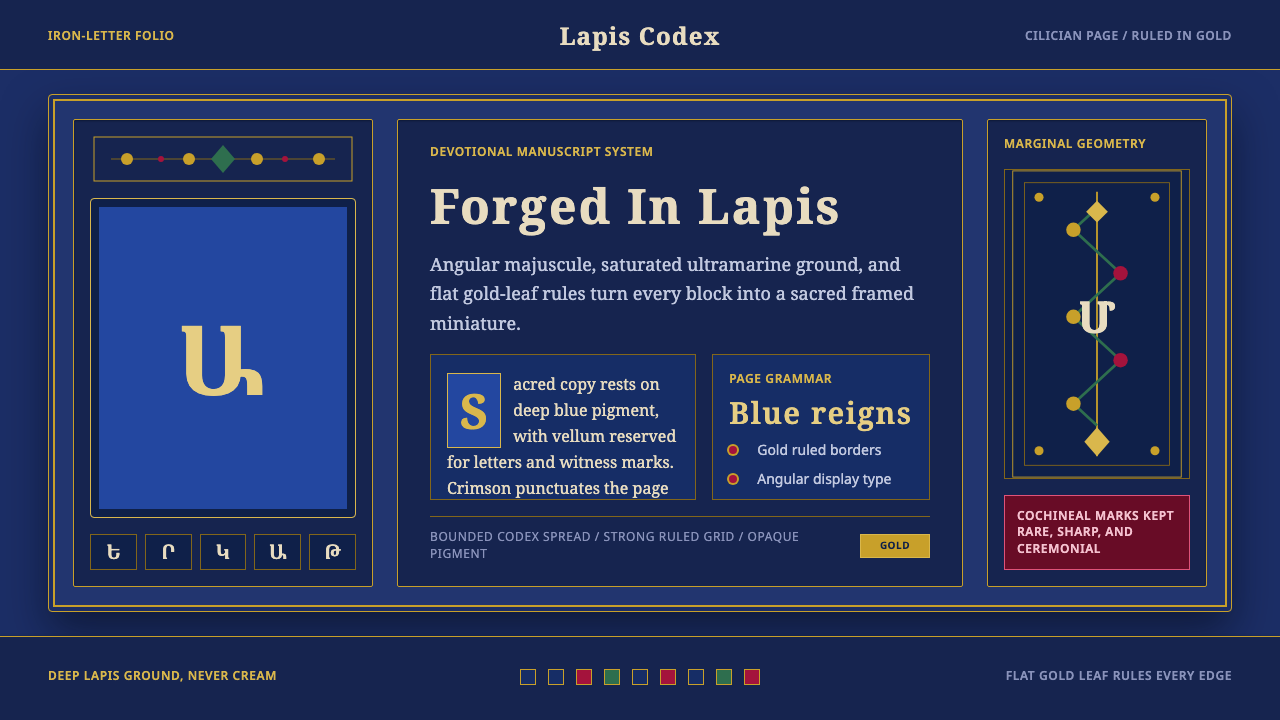 Armenian ErkatʿagirDevotional lapis reigns. Gold rules and angular serif glyphs frame a sacred g…虔敬青金石主宰:金色线框与棱角字形围合神圣网格。
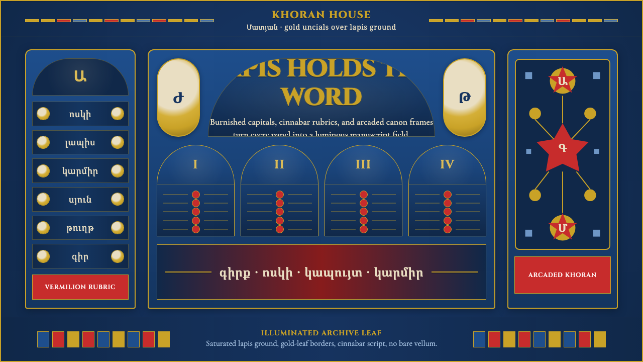 Armenian Manuscript FolkloreJewel-dense devotion. Lapis ground, gold uncials, and vermilion arcades fill…宝石般虔敬。青金石底、金色大写与朱砂拱廊填满画面。
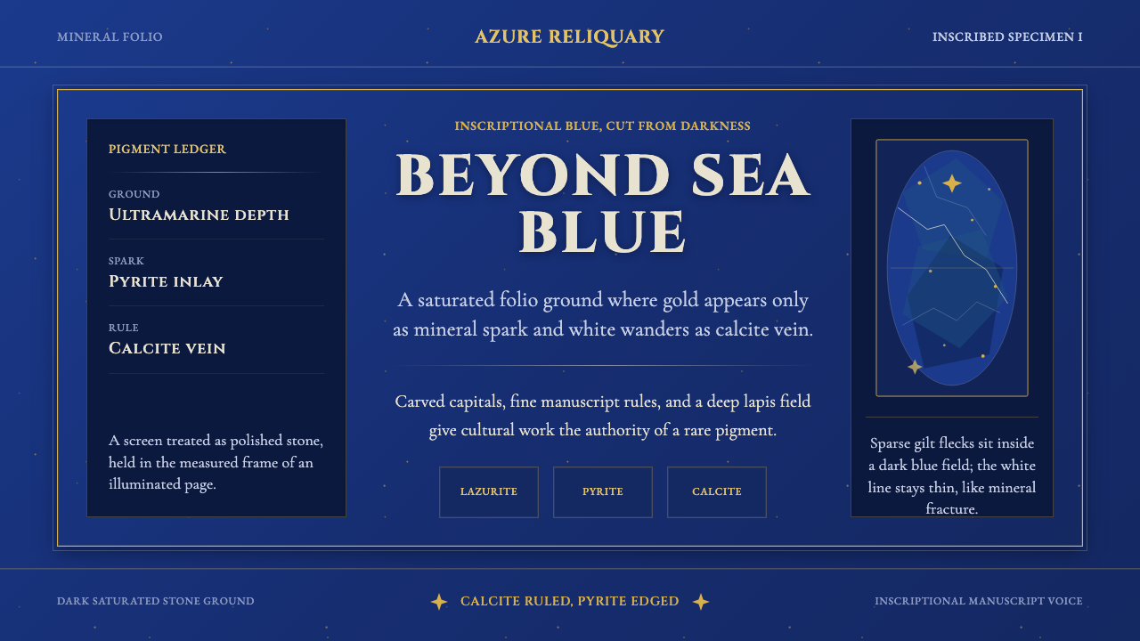 Badakhshan Lapis LazuliStone as manuscript. Ultramarine field, pyrite flecks, calcite veins, carved…以石为页:群青底、黄铁矿金点、方解石纹、铭文大写。
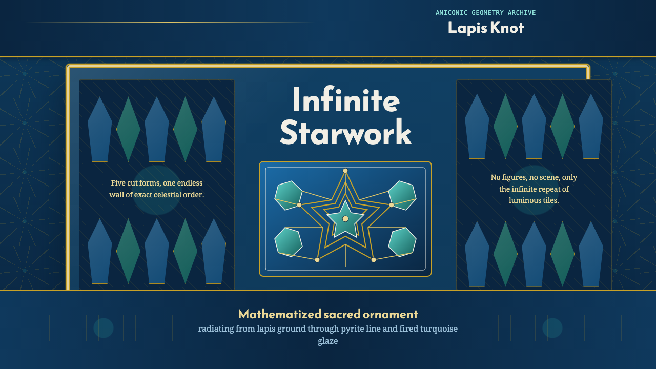
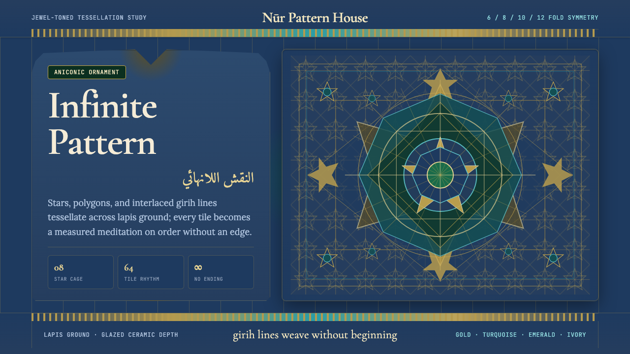 Islamic Geometric ArtInfinite order, fully tiled. Lapis ground with gold girih lines and turquoise…无限秩序,满幅铺陈。青金石底、金色girih线与绿松石星格。
 Islamic Girih TilesSacred geometry glows. Cobalt tile, turquoise stars, and gold strapwork repea…圣性几何发光:钴蓝釉面、绿松石星形与金色编带无尽重复。
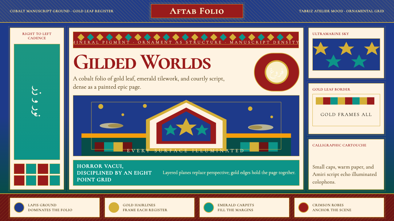 Persian Miniature (Shahnameh era)Manuscript luxury turns maximal. Cobalt ground, gold borders, and Cormorant S…手稿奢华走向极繁。钴蓝底、金边框与Cormorant SC填满每寸。