What is Islamic Girih Tiles?
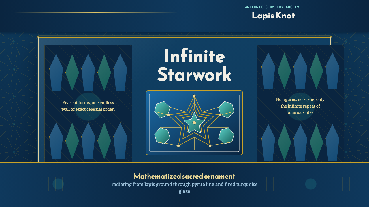
Girih interlocks a handful of tile shapes into star-and-polygon patterns that repeat without end — geometry so exact it reads as devotion.
Islamic Girih Tiles in brief
Girih is the interlaced strapwork ornament found across Islamic architecture — the star-and-polygon tessellations that cover mosque walls, madrasa domes, and palace façades from Isfahan to Samarkand. The word itself means 'knot' in Persian, and the pattern lives up to it: bands of line appear to weave over and under one another in an unbroken lattice, even though every crossing is drawn, not literally woven. Visually, girih reads as radiant repetition — decagons and pentagons locked edge to edge, throwing off ten- and five-pointed stars that seem to radiate outward from every joint.
The system holds because it is built from a small, fixed vocabulary of tile shapes rather than freehand drawing. A handful of underlying polygons — decagons, pentagons, hexagons, elongated bowties — carry edge markings that force them to interlock in only a limited number of legal configurations. Assemble enough of them and the strapwork motif emerges automatically at the seams, extending outward with no visible edge, no obvious starting point, and no repeat that calls attention to itself the way a printed pattern would. It is ornament that behaves like a proof: constrained, exact, and self-consistent at any scale you view it.
Color in girih work is disciplined rather than varied. On the glazed tile surfaces of Persian religious architecture, a deep cobalt blue and a cooler turquoise carry the tessellation itself, while the interlacing bands that cross over them are picked out in gold against a plain white ground. The palette is small on purpose — the pattern's complexity comes from the geometry, not from a wide range of hues, and adding more color would compete with the interlace rather than support it.
Where does Islamic Girih Tiles come from?
Girih patterns matured across the medieval Islamic world, reaching their most refined expression under the Persian Timurid dynasty (1370–1507) and later in Safavid Isfahan (1501–1736). This was a design tradition governed by a religious constraint that shaped its entire visual character: Islamic aniconism discourages figural representation in sacred contexts, so architectural decoration turned instead toward geometry, calligraphy, and vegetal ornament as the primary vehicles for beauty. Girih is geometry pressed into that role — infinitely extensible pattern standing in for the images a church or temple tradition might have used instead.
The craftsmen who produced this work were not abstract theorists; they were master builders and tile-setters organized in guild-like workshops, passing down pattern knowledge as practical shop technique rather than published mathematics. Scholars now generally agree that by the fifteenth century, architects working in Timurid and later Safavid contexts were using actual straightedge-and-compass-derived tile sets — sometimes called girih tiles — as physical or scribed templates: place the tiles, trace the strapwork that emerges at their boundaries, then remove the tiles and glaze or carve only the lines that remain. This let a workshop generate enormously complex patterns without freehand planning an entire wall.
Isfahan under the Safavids became the great showcase for this technique at full architectural scale, particularly in banna'i tilework — a technique in which the glazed brick and tile pattern is integral to the wall's construction rather than applied afterward. The mosques and squares built during Shah Abbas's reign turned entire domes and facades into continuous fields of interlocking geometry, cobalt and turquoise glaze catching light across surfaces that seem, from a distance, to shimmer rather than sit still.
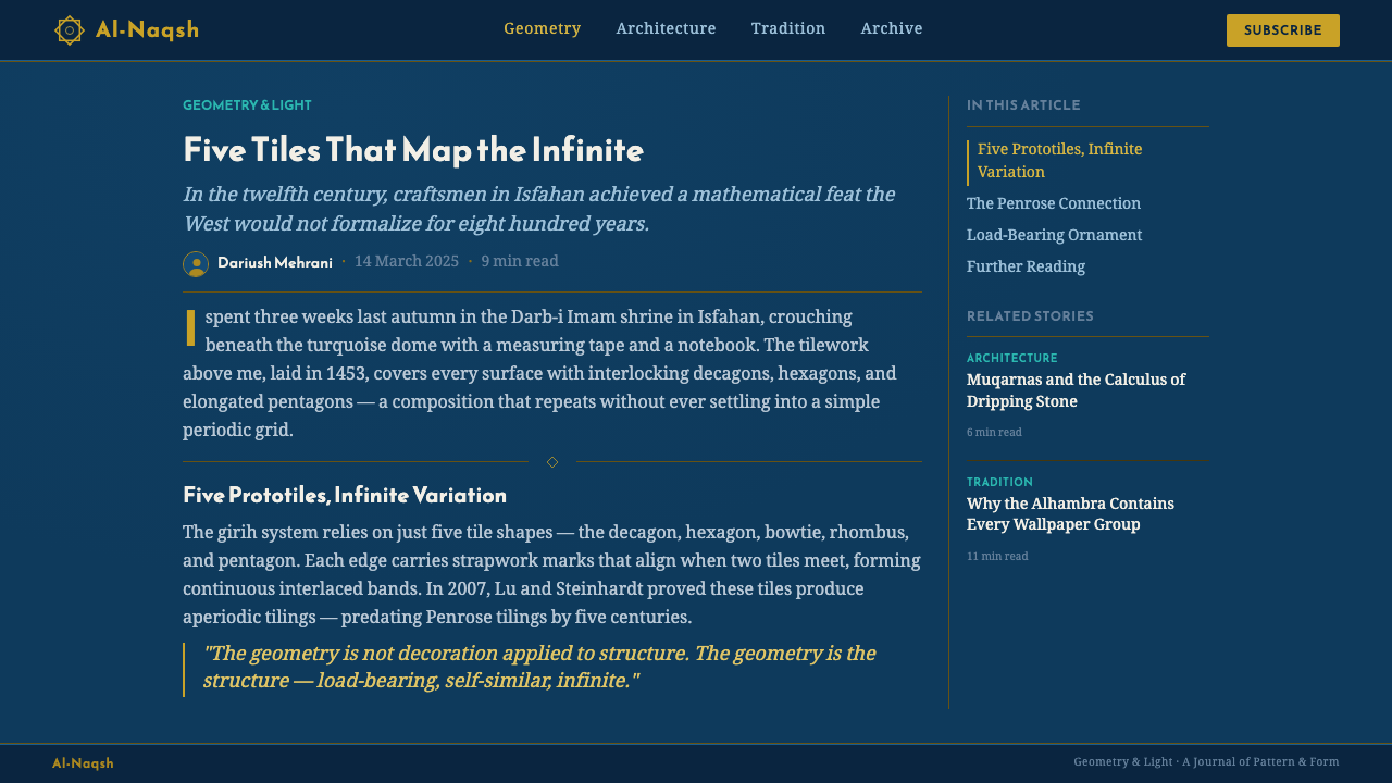
The mathematical sophistication of these patterns has drawn serious modern scholarly attention, most notably a widely cited 2007 study proposing that some fifteenth-century girih tilework at the Darb-i Imam shrine in Isfahan approximates aperiodic tiling principles — patterns that never exactly repeat — closely related to what mathematicians would only formally describe centuries later as Penrose tiling. Whether the original craftsmen thought in those terms or not, the finding underscores what the tradition always showed in practice: this ornament came from people thinking rigorously about how shapes fill a plane, not decorating loosely by eye.
What defines the Islamic Girih Tiles look?
Color
The palette is narrow and specific: a deep, saturated blue in the register of lapis lazuli carries the ground of the tessellation, a cooler, lighter turquoise picks out alternating fields or stars, and a warm metallic gold traces the interlacing strapwork itself, usually against a plain white or pale ground. Nothing else intrudes — no secondary hues, no earth tones. The restriction is what makes the pattern read as luminous rather than busy; every additional color would be one more thing competing with the geometry for attention.
Typography
Girih itself carries no typographic tradition — it is a wall pattern, not a page layout — but adapted design work pairs naturally with the same restraint that governs Islamic calligraphic inscription: a single clear typeface used sparingly, set apart from the pattern rather than laid over it, so ornament and text occupy distinct zones instead of competing for the same field. Text works best treated as an inscription band — a disciplined strip bordering the geometric field, echoing how calligraphic bands historically ran alongside tiled panels rather than through them.
Geometry
The generative vocabulary is a small closed set of polygons — decagons, pentagons, hexagons, and elongated bowtie shapes — each with edge markings that dictate exactly how it may abut its neighbors. From these few pieces, tenfold and fivefold rotational symmetry emerges everywhere: ten-pointed stars at major junctions, five-pointed stars filling secondary gaps, all locked edge to edge with no visible seams. The geometry is additive and rule-bound rather than freely composed — every element is a legal consequence of the tile set, not an artistic improvisation.
Interlace and Strapwork
The defining visual signature is the strapwork itself: a continuous band that appears to weave over and under at every crossing, even though the whole thing is a single drawn or inlaid line running across the tile boundaries. This over-under alternation is what makes the pattern read as woven rather than merely tiled — the eye follows a ribbon rather than a static grid. Getting this right in adapted design means a genuinely continuous line across the whole composition, not scattered disconnected crossing motifs.
Radial Symmetry
Every star node in a girih composition functions as a small radial center, with lines and facets fanning outward in even rotational divisions before locking into the next node's field. This gives the pattern a pulsing quality at close range — each star reads almost like an independent medallion — while the overall composition, viewed from a distance, flattens back into a uniform field. Neither reading cancels the other; the pattern rewards both close inspection and distant viewing.
Surface and Materiality
Historically this pattern was executed in glazed ceramic tile and carved stucco, both materials that hold a hard, reflective, faintly uneven surface rather than a flat printed one. The glaze catches ambient light unevenly across a wall or dome, giving the cobalt and turquoise a slight shimmer that shifts as the viewer moves. Adapted into flat digital work, this history argues for surfaces that feel lightly luminous rather than matte and inert — the pattern was never meant to sit still under one fixed light.
Aniconism and Restraint
No figures, faces, or representational imagery appear anywhere in authentic girih work — this is a foundational constraint, not a stylistic choice made lightly. The absence of the figure is what forced the tradition to develop geometry, calligraphy, and vegetal pattern to such extraordinary sophistication in the first place; ornament had to carry all the expressive weight that figuration carries elsewhere. Any adaptation that introduces representational icons into a girih-derived composition breaks with the tradition's core premise.

Who shaped Islamic Girih Tiles?
Working under the Timurid dynasty (1370–1507) in cities such as Samarkand and Herat, the anonymous architects and pattern-masters of this court tradition are credited with refining girih tiling into a systematic design method rather than an ad hoc craft skill. Timurid monuments show some of the earliest sophisticated uses of the interlocking tile-set approach, setting the foundation Safavid workshops later carried to Isfahan.
The banna'i technique — glazed brick and tile pattern integral to the wall's own construction, developed and perfected by generations of Isfahan craftsmen under Safavid patronage — turned girih from a drawn ornament into an architectural system spanning entire domes and courtyards. These guild artisans worked pattern knowledge into standardized modular units assembled at enormous scale while preserving geometric precision, a genuinely rare combination in any craft tradition.
As Safavid ruler from 1588 to 1629, Shah Abbas I made Isfahan his capital and commissioned the great mosques and public squares that remain the tradition's most celebrated showcase. His building program gave girih tilework its largest, most ambitious canvas, funding workshops and materials to cover entire architectural surfaces in continuous interlocking pattern rather than isolated decorative panels.
A physicist whose 2007 paper (with collaborator Paul J. Steinhardt) in the journal Science analyzed girih tilework at the Darb-i Imam shrine and proposed that certain fifteenth-century patterns approximate aperiodic, Penrose-like tiling principles centuries before those principles were formally described in mathematics. The study brought serious modern scholarly attention to the tradition's mathematical depth and remains the most widely cited analysis of how girih patterns were actually constructed.
How do you use Islamic Girih Tiles today?
Girih transfers into contemporary design work as a structural logic, not just a decorative motif — its value comes from disciplined repetition and exact geometry, and any application should respect that rather than treating it as a busy backdrop pattern to drop behind text.
On presentation cover slides, girih works best as a contained geometric field rather than a full-bleed texture: a single star-and-polygon medallion, rendered in the cobalt-turquoise-gold register, anchored in a corner or behind a title set in clear, restrained type against a plain ground. Content and data slides should use the pattern sparingly as a framing device — a border, a divider, or a background medallion behind a section header — while keeping data visualizations clean and geometric rather than overlaid onto the interlace, where dense strapwork would compete with chart legibility.
For web interfaces, girih-derived motifs suit dashboards and pricing pages as accent geometry rather than dominant texture: a subtle bordered panel, a decorative divider between pricing tiers, or a small radial motif marking a featured plan. Palette discipline matters here — restrict tessellated accents to the blue-turquoise-gold register against a light ground, keep body content and functional UI in plain, high-contrast type, and never let the pattern run under primary readable content where its density would fight legibility.
In editorial and marketing contexts, girih supports a sense of craft, heritage, and precision — well suited to features on architecture, textile, luxury goods, or travel. A pull-quote or section break framed with a girih-derived border communicates considered care without needing photography. Full-bleed marketing banners can use a single large medallion as a hero graphic, but should keep overlaid text in a zone of plain color rather than on the densest part of the interlace.
The most common mistake is treating this style as a generic 'Middle Eastern pattern' texture — tiling a busy geometric wallpaper indiscriminately across a background regardless of scale, or introducing colors and shapes outside the tradition's actual vocabulary. Authentic girih-derived work respects the closed tile-set logic, keeps the palette narrow, and gives the pattern room to stay legible at the scale it's rendered — a shrunken, illegible tessellation reads as generic ornament rather than the precise tradition it actually is.

Islamic Girih Tiles — FAQ
What does 'girih' actually mean, and is it the same as Islamic geometric pattern in general?
Girih means 'knot' in Persian and specifically refers to the interlaced strapwork style of geometric ornament — star-and-polygon tessellations with a woven, over-under band running through them. It is one major branch of the broader Islamic geometric pattern tradition, which also includes other tiling and lattice approaches. What sets girih apart is its generative method: a small set of edge-marked tile shapes whose legal combinations produce the strapwork automatically, rather than a pattern drawn freehand.
Does girih pattern ever actually repeat, or is it truly infinite?
Most historical girih tilework does repeat at some interval, even if the repeat unit is large and not obvious to the eye — the underlying tile set is finite, and finite tile sets arranged on a flat wall will eventually cycle. What makes the pattern feel infinite is that the repeat period is often very long relative to the visible wall surface, and every joint is complex enough that the eye never registers an obvious seam. The 2007 Lu and Steinhardt study is notable precisely because it identified examples that appear to approximate genuinely aperiodic, non-repeating arrangements — a rarer and more remarkable case.
Can girih patterns be adapted for a modern dark-mode or high-contrast interface?
Yes, and the tradition's own dark surfaces support it — glazed cobalt tile grounds are already quite deep in value, so a dark-mode adaptation is a natural extension rather than an inversion. The key is keeping the gold strapwork as the brightest, highest-contrast element against the dark blue-turquoise ground, exactly as it functions on the original tilework, rather than lightening the whole palette evenly. Lose that specific contrast relationship and an adaptation stops reading as girih and starts reading as generic geometric wallpaper.
How is girih different from Moroccan zellige tilework?
Both are Islamic geometric tiling traditions and share a family resemblance, but they developed in different regions with different techniques and emphases. Zellige, from the Maghreb, is built from individually hand-cut, single-color glazed tile pieces assembled like a mosaic, and tends toward a wider range of colors — greens, yellows, browns, blues — arranged in interlocking star patterns. Girih, as practiced in Persia, relies on the tile-set generative method described above, favors the narrower cobalt-turquoise-gold register, and emphasizes the continuous strapwork line rather than the mosaic assembly of separately colored pieces. The two traditions are cousins, not the same style.
Is it appropriate to use girih pattern in purely secular, commercial design work?
The pattern itself is abstract geometry with no figural or religious text content, and it has a long history of use in secular contexts — palaces, public squares, and civic buildings alongside religious ones. Used respectfully, as a genuine geometric system rather than a shallow 'exotic' texture, with attention to the real tile-set logic and the specific palette, it works well as a design language conveying precision, heritage, and craft. What to avoid is flattening it into a vague ornamental stereotype divorced from its actual construction principles, which reads as careless regardless of intent.
Related design styles
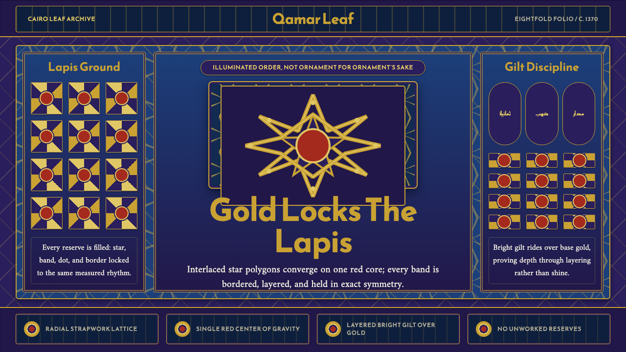 Mamluk Quran IlluminationGilded density rules. Lapis ground, eightfold gold strapwork, and one red cor…
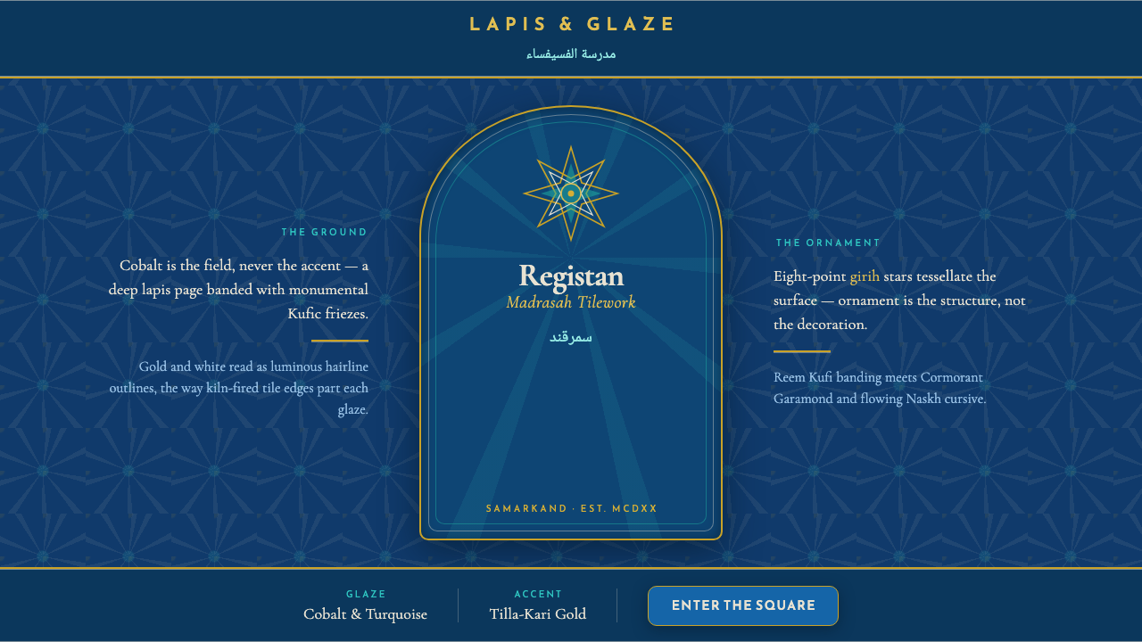 Registan Madrasah TileworkCobalt is the ground, not the accent. Gold girih stars tessellate deep lapis…
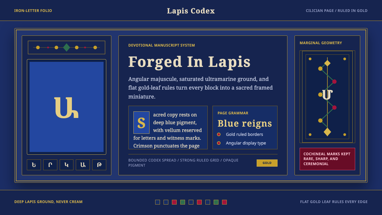 Armenian ErkatʿagirDevotional lapis reigns. Gold rules and angular serif glyphs frame a sacred g…
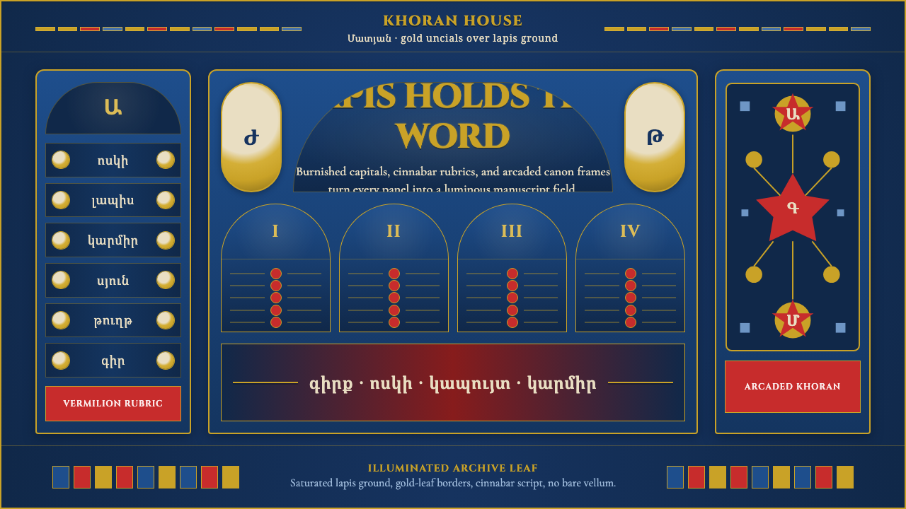 Armenian Manuscript FolkloreJewel-dense devotion. Lapis ground, gold uncials, and vermilion arcades fill…
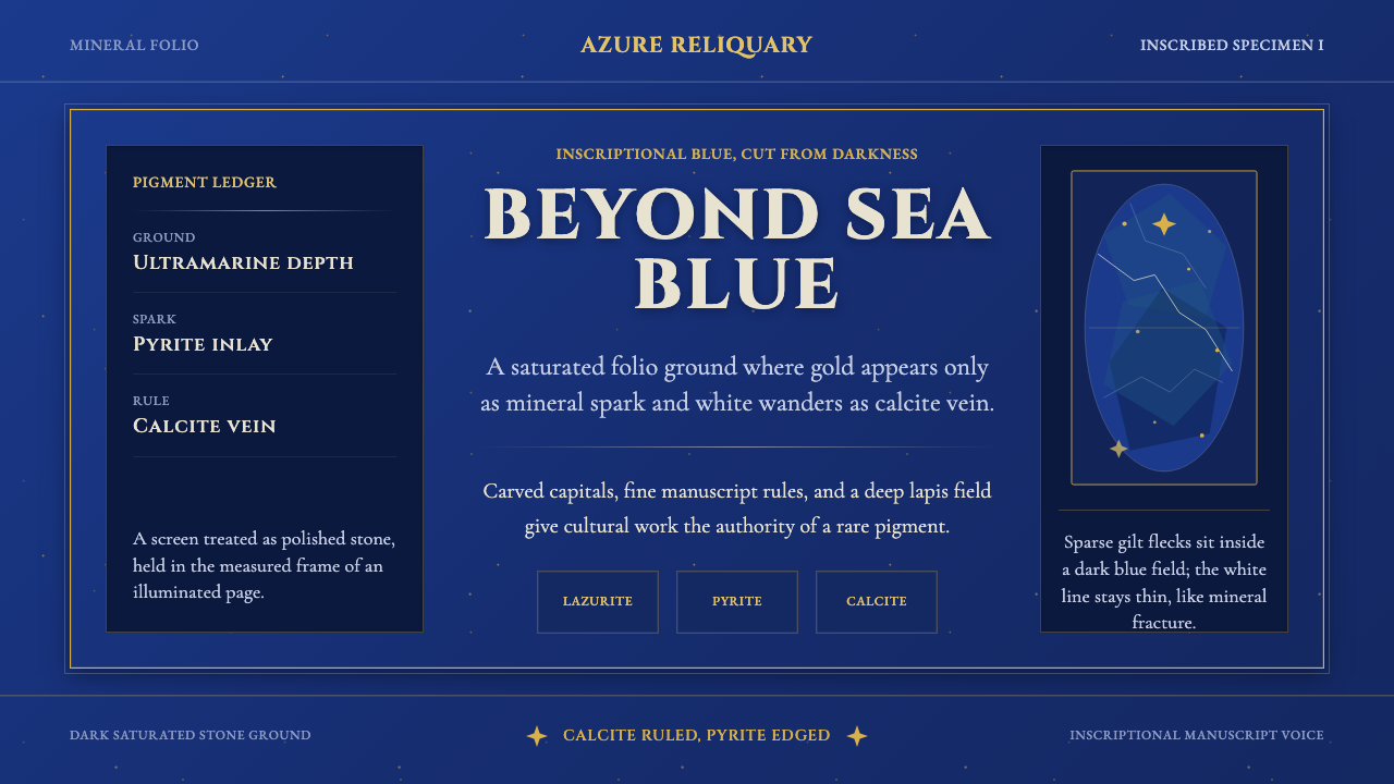 Badakhshan Lapis LazuliStone as manuscript. Ultramarine field, pyrite flecks, calcite veins, carved…
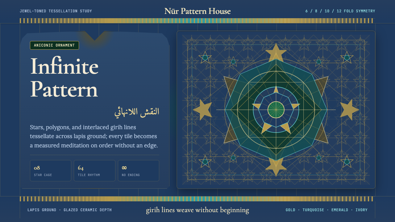 Islamic Geometric ArtInfinite order, fully tiled. Lapis ground with gold girih lines and turquoise…