What is Bridgerton Regency (2020)?
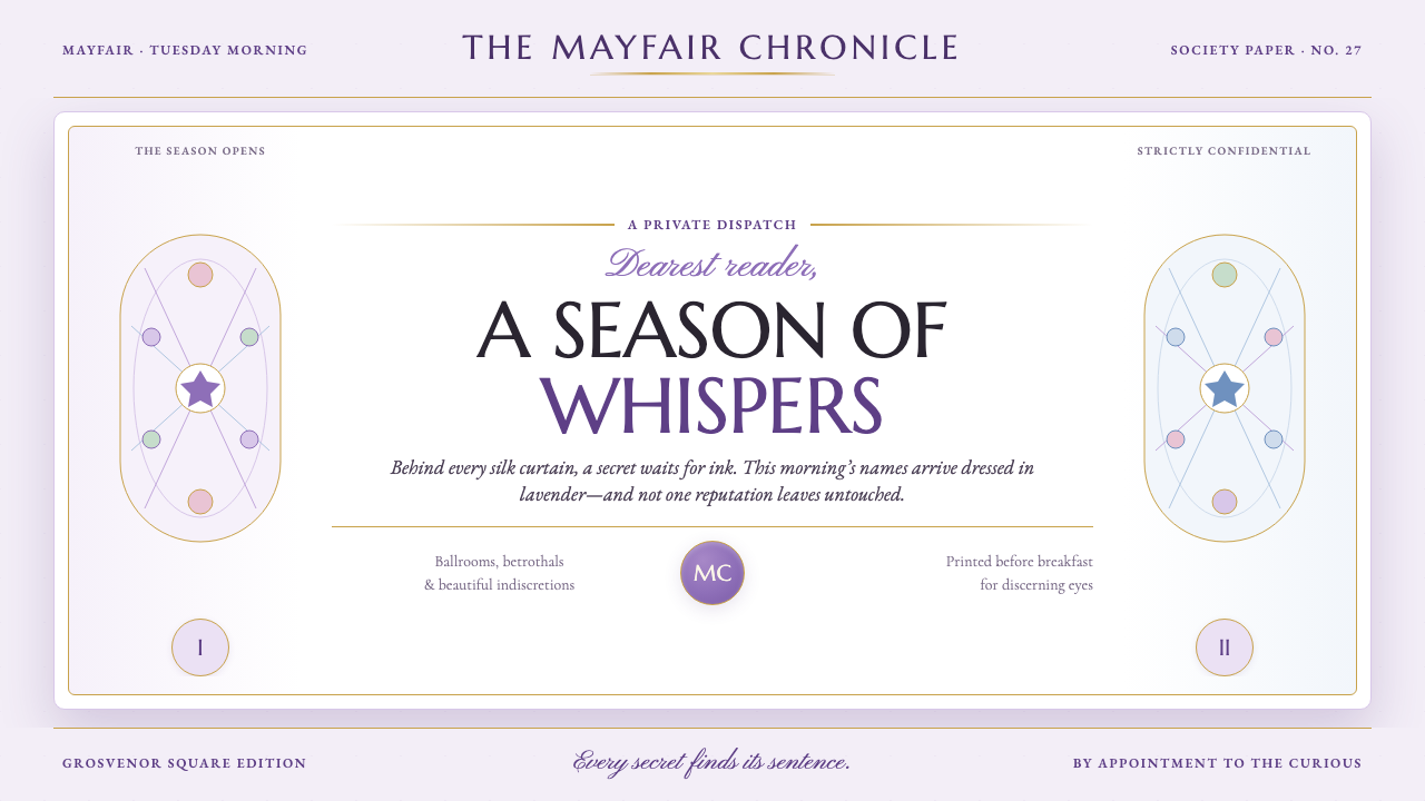
Bridgerton Regency turns the English Regency into a confection of wisteria, gilt candlelight, and black-ink gossip sharp enough to puncture the fantasy.
Bridgerton Regency (2020) in brief
Bridgerton Regency is the visual world of the Netflix series Bridgerton, launched in 2020 and set within an alternate-history English Regency imagined around 1813–1827. Its London is not a documentary recreation of the period. It is a Shondaland fantasy of the ton: silk-filled ballrooms, candlelit rooms, formal invitations, society rituals, and a relentless social gaze gathered around Mayfair and Grosvenor Square. The style treats luxury as theatrical atmosphere rather than museum accuracy.
Its central tension comes from two visual registers that continually interrupt one another. One is floral, pale, soft, and abundant: wisteria, powder blue, lavender-toned grounds, flowers, silk, and candlelit gilt. The other is editorial: dark ink, crisp letterpress character, a broadsheet masthead, and the cutting presence of Lady Whistledown’s scandal sheet. The first register invites immersion; the second supplies judgment. A successful composition lets both remain visible.
The result is neither plain historical revival nor uncomplicated romantic prettiness. Grandeur is always paired with observation. A ballroom can be wrapped in blossoms, but a severe headline or a narrow black rule can make the image feel watched. High-contrast Roman capitals establish public ceremony and hierarchy, while copperplate-like script introduces intimacy, invitation, and private correspondence. Pale wisteria provides the atmosphere that lets gold, ink, and florals perform without becoming visually heavy.
Where does Bridgerton Regency (2020) come from?
The style begins with Bridgerton’s 2020 arrival on Netflix, but its period reference is an alternate-history English Regency rather than a claim of strict reconstruction. The depicted era spans roughly 1813–1827, while the visual setting concentrates its social world in London, especially Grosvenor Square and Mayfair. That distance between contemporary production and historical setting is essential: the style is a revival filtered through modern romance, spectacle, and serial storytelling.
Its listed movements explain the filter. Regency revival supplies the language of formal society, invitations, ballrooms, gilded rooms, and cultivated display. Romance-novel escapism makes that world emotionally generous, favoring softness, floral abundance, and the promise that every room may contain an encounter. Shondaland maximalism prevents the result from becoming quiet antiquarianism; surfaces are expected to feel lush, eventful, and narratively charged.
Lady Whistledown’s scandal sheet gives the style its most important counterweight. Against silk, flowers, and candlelight comes the dry authority of a printed column: black ink, disciplined headlines, sharp typographic contrast, and the implication that every social performance can be recorded and ridiculed. This is why the visual system can accommodate both gilt and severity. Its opulence is not neutral decoration; it is the stage on which reputation becomes precarious.
The source material names Julia Quinn, Shonda Rhimes, Chris Van Dusen, Ellen Mirojnick, and Will Hughes-Jones among the key figures connected to this creative context. Together, those names situate Bridgerton Regency as a screen-born style with literary, dramatic, costume-minded, and image-led dimensions. For designers, the useful lesson is that the aesthetic is an ensemble: type, floral staging, dress-like softness, editorial framing, and social drama must reinforce one another rather than operate as isolated period props.
What defines the Bridgerton Regency (2020) look?
Wisteria Atmosphere
A pale wisteria ground is the style’s emotional field. It is softer than a neutral paper surface yet cool enough to carry dark ink cleanly. Powder-blue sweetness and lavender softness should feel airy, almost sugar-dusted, rather than dense or candy-bright. These tones create the suspended, candlelit calm from which floral detail and editorial severity can emerge.
Floral Opulence
Flowers are not incidental garnish. Wisteria and abundant blooms establish a world in which wealth, courtship, and spectacle appear inseparable. Florals should cluster, drape, frame, or spill with confidence, but remain legible as a theatrical setting for people, text, and ritual. Their purpose is abundance with narrative pressure, not botanical realism for its own sake.
Gilt Candlelight
Gilded detail evokes ballroom light and ceremonial richness. It works best as framing, a glint, or a formal edge that catches the eye without turning every surface into ornament. The desired effect is reflective warmth against cool pastel air: luxury made luminous, not metallic spectacle made loud.
Broadsheet Authority
The sharp letterpress voice is the system’s structural spine. Dark ink, a broadsheet-like masthead, and concise columnar cues introduce social judgment into a romantic setting. This register should feel composed and exacting, as though a beautiful evening has already been converted into evidence for tomorrow’s gossip.
Roman Capitals and Script
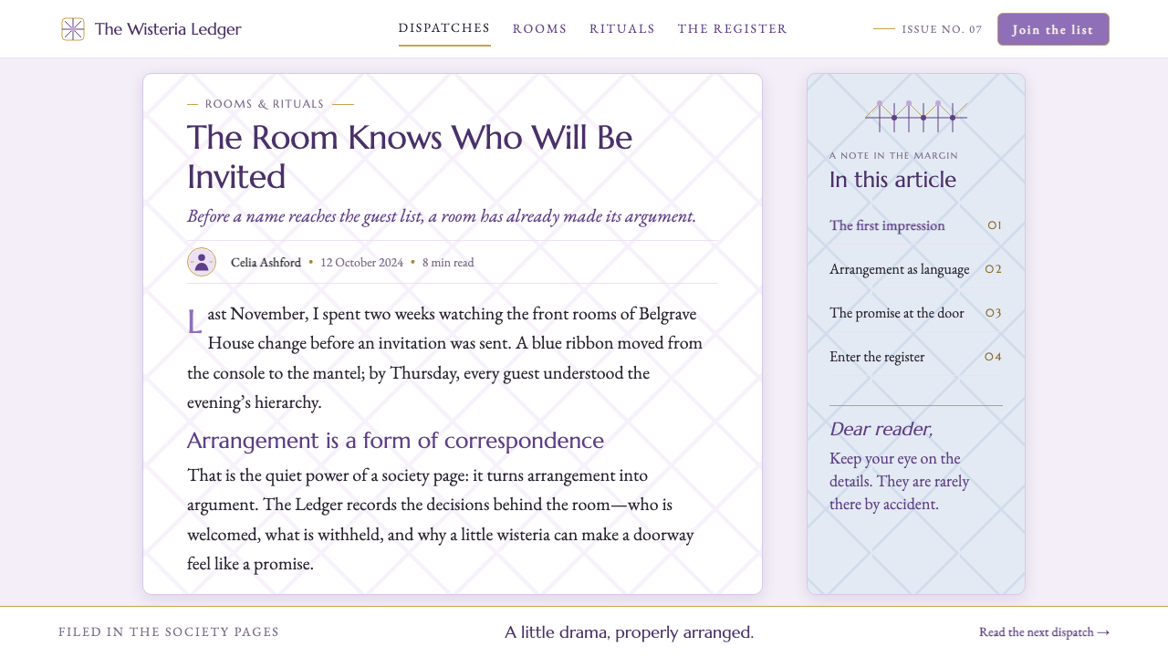
High-contrast Roman capitals carry ceremony, declaration, and public status. Copperplate-like script supplies the answering whisper: a signature, invitation, or intimate aside. Their contrast is dramatic because it divides public performance from private promise. Script should remain a light flourish, never displace the authority of the Roman masthead.
Softness Against Sting
The defining principle is contrast of temperament. Lavender, silk, flowers, and candlelight make the viewer want to linger; black-ink gossip makes lingering feel risky. When the polished surface becomes too sweet, introduce an editorial interruption. When the page becomes too severe, return to floral air, invitation-like softness, or a glint of gilt.

Who shaped Bridgerton Regency (2020)?
Julia Quinn is named among the key figures in the source context for Bridgerton Regency. Her presence anchors the style’s romance-novel escapism: a world organized around courtship, social scrutiny, invitations, and the emotional stakes concealed beneath formal grace.
Shonda Rhimes is listed as a key figure in the source material. Within the style’s stated Shondaland context, her name marks the maximalist impulse: elegance is expected to be dramatic, abundant, and built to hold scandal as well as romance.
Chris Van Dusen appears in the source list of key figures. The style’s screen-based identity depends on the tension he helps represent here: social ritual must read clearly at a glance, while every polished setting remains available for narrative reversal.
Ellen Mirojnick is named among the key figures for the theme. Her placement in this creative constellation reinforces the style’s dress-like logic: softness, ceremony, silhouette, ornament, and status are understood as parts of the same public performance.
Will Hughes-Jones is included in the source material’s key figures. His inclusion helps frame Bridgerton Regency as an image-led system, where candlelight, floral density, pale atmosphere, and editorial contrast must work together in the viewer’s immediate impression.
How do you use Bridgerton Regency (2020) today?
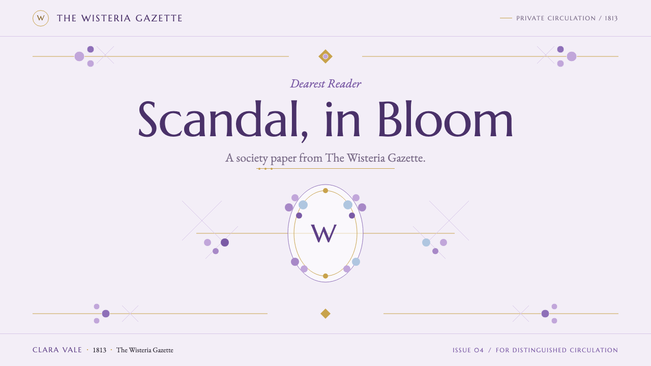
For presentation covers, treat the page as a society announcement with a secret underneath. Let a pale wisteria field or floral setting establish the season, give the title the ceremony of a Roman-capital masthead, and reserve a copperplate-like gesture for a subtitle, signature, or date. A restrained gilt frame can make the cover feel invitational. The point is not to recreate a ballroom literally; it is to make the audience feel that entry has been granted.
On content slides, use the broadsheet register to prevent the theme from dissolving into decoration. Clear headlines, calm body copy, rules, caption-like notes, and deliberate areas of open pale ground create editorial discipline. Floral material belongs at edges, transitions, or moments of emphasis rather than behind every paragraph. For data, let charts retain their analytical clarity, then frame them as society intelligence: a severe heading, an elegant caption, a quiet floral or gilt accent, and a hierarchy that makes the conclusion feel reportable.
For web interfaces, Bridgerton Regency works especially well for editorial hubs, event experiences, membership pages, romance-focused collections, and premium storytelling products. A dashboard can borrow the scandal-sheet logic through prominent section titles, compact summaries, and clear information bands, while pale wisteria atmosphere prevents the interface from feeling punitive. On pricing pages, use ceremonial hierarchy and invitation-like language to make tiers feel like access to a social world, but keep comparison information direct enough to remain trustworthy.
For editorial and marketing work, alternate immersive abundance with editorial interruption. A campaign opening can lead with flowers, soft color, and gilt warmth; the next section can narrow into a dark-ink statement, gossip-like pull quote, or crisp masthead. Invitations, launch pages, seasonal collections, and social graphics benefit from this rhythm because it gives romance a plot. The visual story should move between being seen and being discussed.
The common mistake is treating Bridgerton Regency as generic pastel luxury. Pastels without black-ink discipline become merely sweet; gold without editorial restraint becomes indiscriminate ornament; script used everywhere turns intimacy into noise. Conversely, an all-black newspaper layout loses the perfume, softness, and escapist abundance that distinguish the style. Keep the contrast alive: floral opulence needs a sharp voice, and the sharp voice needs something beautiful to puncture.
Bridgerton Regency (2020) — FAQ
Is Bridgerton Regency historically accurate Regency design?
No. The source material describes an alternate-history English Regency, depicted around 1813–1827, and explicitly frames the result as a Shondaland fantasy of the ton. Its value lies in expressive interpretation: it combines period-coded ceremony, silk ballrooms, invitations, candlelit gilding, and contemporary dramatic abundance rather than functioning as a reconstruction guide.
Why is the black-ink gossip voice so important to the style?
It gives the decorative world a point of view. Lady Whistledown’s scandal sheet introduces crisp letterpress authority into rooms otherwise defined by flowers, silk, pastel air, and gilt. Without that editorial counter-register, the visual language becomes sentimental luxury. The dark printed voice creates the tension between admiration and scrutiny that makes the aesthetic recognizably Bridgerton.
Can the style work without floral imagery?
It can, but it needs to retain floral abundance as an atmospheric idea. Pale wisteria, powder-blue softness, gilded warmth, high-contrast Roman capitals, and a sharp broadsheet cue can still establish the system. In that reduced version, use airy space and invitation-like detail to suggest the missing garden rather than replacing it with unrelated luxury motifs.
Where should copperplate-like script appear?
Use it where the design needs a private or ceremonial whisper: a signature, invitation line, dedication, small note, or transition between editorial sections. The script is most effective when it answers a Roman-capital headline rather than competes with it. Its delicacy works as contrast, not as the main vehicle for dense information.
What makes a contemporary application feel too generic?
The application becomes generic when it borrows only the soft pastel surface and loses the system’s conflict. Bridgerton Regency requires both the luxury of a social season and the judgment of its scandal sheet. If florals, gilt, script, Roman capitals, and editorial ink do not create a dialogue between invitation and exposure, the result may look elegant but will not carry the style’s particular dramatic charge.
Related design styles
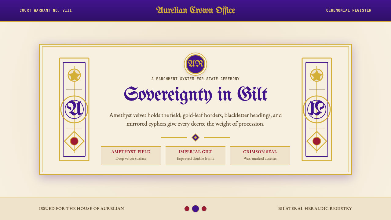 British Royal MonarchyCeremony becomes structure. Amethyst panels, gilt borders, blackletter, mirro…
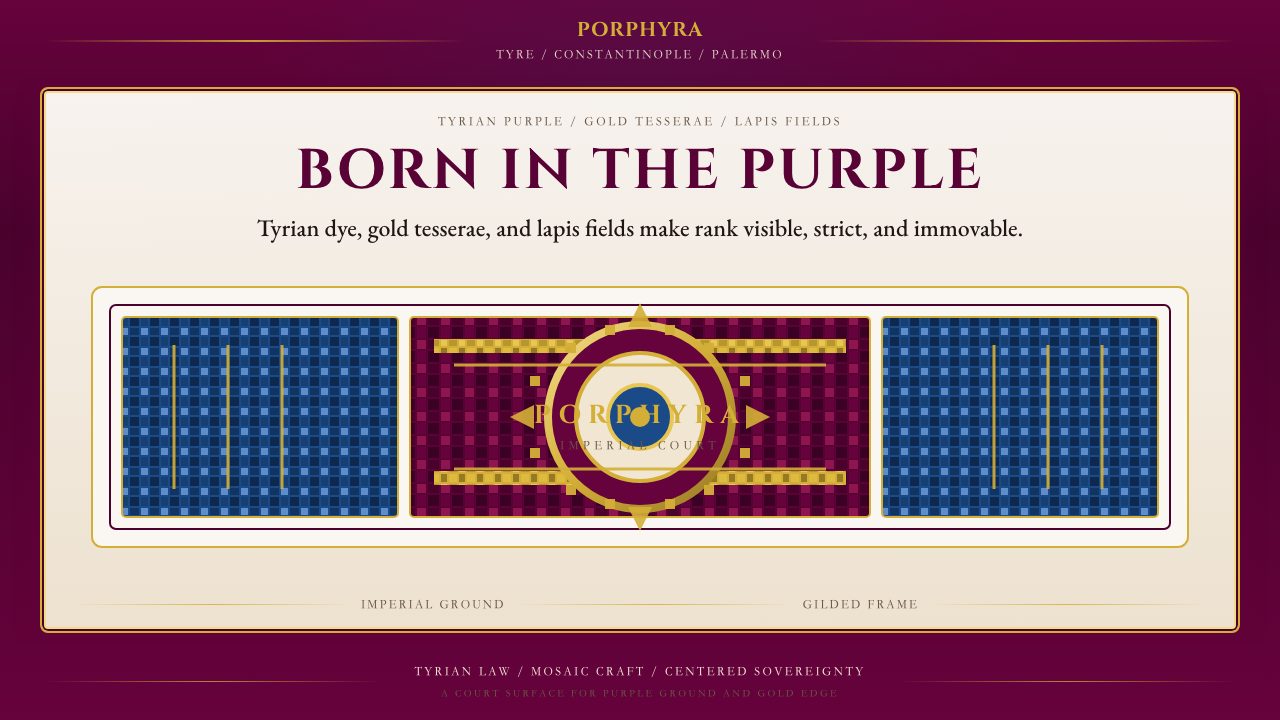 Byzantine Tyrian Purple (Imperial Court)Imperial rank made visible. Tyrian purple, gold tesserae, and centered symmet…
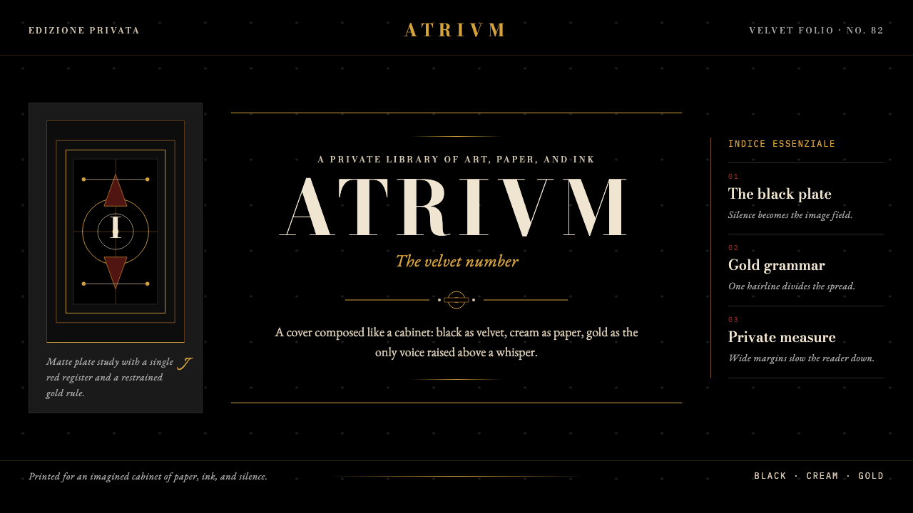 FMR (Franco Maria Ricci)Opulence held in silence. Velvet black, Bodoni serifs, and warm gold hairline…
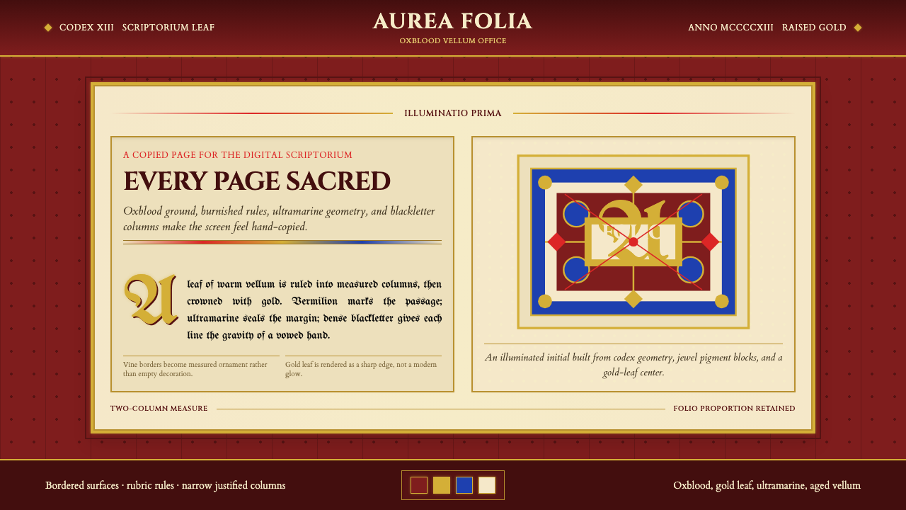 Medieval Illuminated ManuscriptTreats every page as sacred. Oxblood vellum, Cinzel capitals, gold-rule borde…
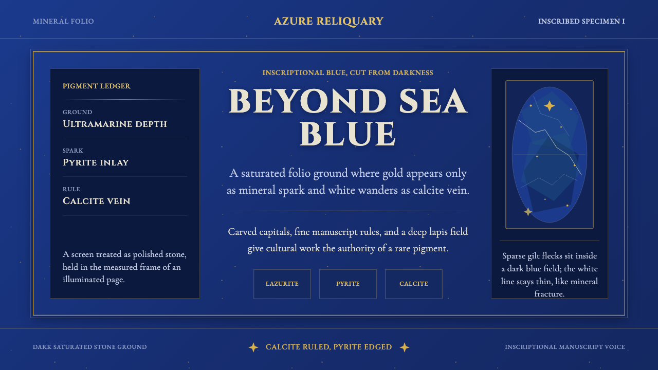 Badakhshan Lapis LazuliStone as manuscript. Ultramarine field, pyrite flecks, calcite veins, carved…
 Champagne MaisonGrandeur without glitter. Cinzel capitals and gold foil rules glow in cellar…