What is Wedgwood Jasperware?
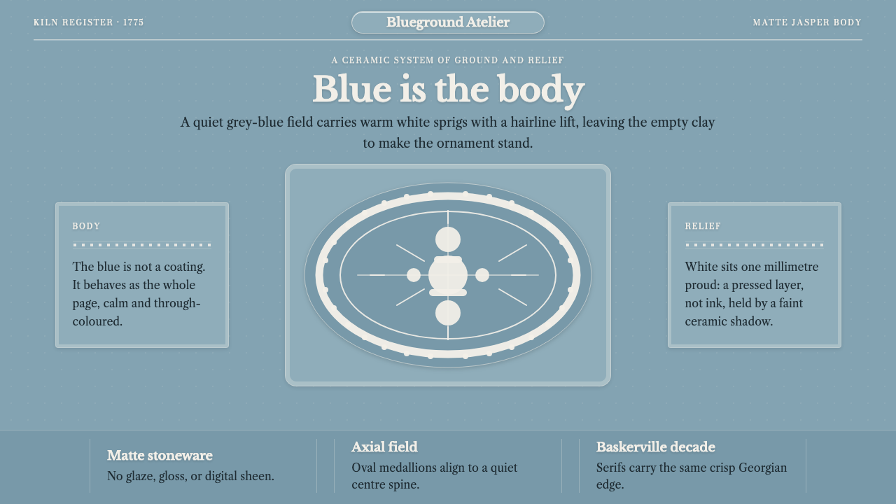
Wedgwood Jasperware is a matte blue-grey clay ground carrying applied white relief — a style built on the idea that colour should be the material itself and ornament should stand on empty space.
Wedgwood Jasperware in brief
Wedgwood Jasperware is the visual language of a ceramic body perfected at Etruria, in Staffordshire, around 1775: an unglazed stoneware that is coloured all the way through, usually a quiet blue-grey, and decorated with crisp white figures that sit just proud of the surface. Its hallmarks are a matte, faintly powdery clay ground, white applied relief in the neoclassical manner — profile portraits and sacrificial scenes — and a typographic voice that belongs to the same eighteenth-century world, the Baskerville serif.
What sets jasper apart from most ceramic decoration is that the ground is never a coating. A glaze sits on top of a pot; jasper's colour runs through the body, so the blue-grey is the material itself. The white, by contrast, is explicitly applied: the reliefs were modelled separately, cast in their own moulds and attached to the body one piece at a time. That division — a structural ground, an added ornament — is the entire grammar of the style. The blue is structure, the white is something laid on, and the empty ground between them does as much work as the figures.
Visually the effect is calm, authoritative and tactile. Surfaces are matte, with no glaze shine, no gradient and no specular highlight. Height is suggested only by a hair's-breadth displacement and the faintest shadow, as if a pale shape had been pressed onto a field of clay. Composition is generous: because relief only reads against the plain surface around it, the style demands large areas of calm emptiness, and crowding it turns it into something else.
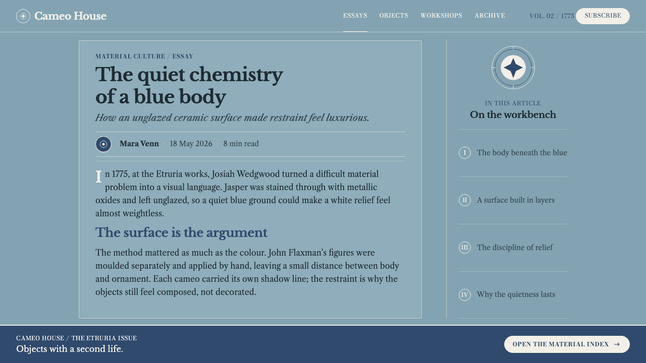
Where does Wedgwood Jasperware come from?
Jasper was not an accident but the outcome of relentless trial. Josiah Wedgwood is recorded as running thousands of experiments before the body was perfected in 1774–75 at his Etruria works in Staffordshire. The recipe drew on barium sulphate and ball clay, fired to an unglazed stoneware that takes colour right through. A tinted body of this kind is hard to achieve: the colour has to survive the fire evenly, and the surface has to be fine enough to hold sharp detail. Even the name of the works announces an antiquarian ambition, since Etruria points back to the ancient Italian world that eighteenth-century Britain was busy rediscovering.
The decoration came from a second craft. Wedgwood handed the reliefs to the sculptor John Flaxman, who modelled them separately from the pot. The figures — neoclassical profiles and sacrificial scenes — were moulded in white and applied to the coloured body as sprigs, one small piece at a time. This is the technical reason the style looks the way it does: the white really is a different layer, with a clean edge where it meets the ground. It also places jasper squarely within British Neoclassicism, the taste that preferred antique profiles, restrained composition and an ideal of order over rococo exuberance.
The tradition has a documented life well beyond its first years. A copy of the Portland Vase followed in 1790, showing that jasper could carry even the most prestigious antique models. A deeper blue, the dark blue dip, is recorded from 1777 until around 1820 and again from 1866 to 1941. Taken together, these dates describe a visual identity stable enough to be revived and remade across two centuries, while the blue-grey, white-relief formula remained its recognisable core. The surrounding world — Georgian ceramics, and the Industrial Enlightenment's habit of testing materials systematically and making them at scale — explains why a craft object could also be a serious industrial product.
John Baskerville completes the picture. The printer whose name the typeface carries was a near-contemporary of Wedgwood, and his refined, high-contrast letterforms share the jasper aesthetic: precise, composed, quietly formal. Curio's system sets type in Baskerville as though the letters were more relief, cut in white from the same clay ground. The result translates a ceramic of the 1770s into a screen-based visual language without breaking its logic: a matte base, an applied white, and plenty of space.
What defines the Wedgwood Jasperware look?
Colour as Body
The ground is a quiet blue-grey, slightly powdery and cool, and it is the colour of the fired clay itself rather than of a coating laid over it. That fact governs everything: the blue is structural, so it behaves like a wall or a field, not like paint. White is the only counter-colour. Where the history of the type introduces a deeper blue, the dark blue dip, the logic holds: a single ground colour, one applied white, nothing else competing.
Matte Clay Surface
Jasper is unglazed, so the surface has the dry, even, faintly velvety look of fired clay rather than the wet shine of glaze. The visual rule that follows is strict: no gloss, no gradient, no specular highlight. Light does not travel across the surface in bands or glows; it simply rests on it. This matte consistency is what gives the style its authority, the sense of a surface that cannot be polished into something flashier.
Applied White Relief
The figures are made separately and attached, which is why they read as a distinct layer with a clean edge where they meet the ground. In design terms that means ornament is always a discrete object placed on the field: a profile, a medallion, a framed scene. It is never a texture that dissolves into the background, and it is never tinted to match the ground. White against blue-grey is the whole contrast.
Height Without Gradient
Because the relief rises only a hair above the ground, depth is communicated with great economy: a very slight offset and the faintest shadow, just enough to separate the applied piece from its field. There are no dramatic drop shadows, no layered elevation scales and no glow. The impression is of a thin pressed shape, not a floating panel, so interface surfaces feel placed rather than lifted.
Baskerville Letterforms
Type is set in Baskerville, the refined eighteenth-century serif, and it is treated as another piece of white relief. Letters have a crisp, high-contrast elegance that suits an era of antique profiles and ordered composition. Headings are set with space around them and a formal, composed rhythm; they never shout. Text on the blue-grey field is white, as though cut from the same applied material as the figures.
Neoclassical Subject Matter
The imagery is drawn from antiquity as eighteenth-century Britain imagined it: profile portraits and sacrificial scenes, composed in a formal, frieze-like manner. Figures are seen in profile, defined mostly by silhouette and edge rather than by modelled shading. For interface work the lesson is structural rather than literal: framed medallions, centred emblems and calm processional arrangements suit the style better than busy photography.
Generous Empty Ground
Relief only reads against plain surroundings, so emptiness is not wasted space but the stage that lets the ornament stand. Compositions leave large calm areas of bare ground, with a few well-placed white elements. Fill the field and the effect collapses; the relief stops looking pressed onto clay and starts looking like clutter on a coloured background.

Who shaped Wedgwood Jasperware?
Josiah Wedgwood is the creator of jasper. Working at his Etruria factory in Staffordshire, he is recorded as running thousands of trials before arriving, in 1774–75, at an unglazed body coloured all the way through. His career joins craft and manufacture: a refined, neoclassical object produced to a standard that could be repeated. That mixture of experiment and polish is what the style still communicates.
John Flaxman is the sculptor to whom Wedgwood handed the reliefs. He modelled the figures separately — neoclassical profiles and sacrificial scenes — and they were then moulded in white and applied to the coloured body as sprigs. His role explains the style's two-part structure: the ground is a material, and the ornament is a drawing in relief, made by a different hand and attached afterwards.
Thomas Bentley is named among the key figures of the Etruria story, as Wedgwood's partner. He stands for the organised, commercial side of jasper's history, a reminder that the style belongs to the Industrial Enlightenment as much as to the history of art: refined objects conceived, tested and made as part of a working enterprise rather than a solitary studio practice.
John Baskerville, the English printer whose name the typeface carries, was a near-contemporary of Wedgwood. His precise, high-contrast letterforms are the typographic counterpart of jasper: composed, crisp and formal. Using Baskerville here is not decoration but a historical match, the same age and the same taste carried in a different medium.
How do you use Wedgwood Jasperware today?
Wedgwood Jasperware suits work that wants calm authority and a sense of craft without ornamental overload. Its strength is the relationship between a quiet field and a few crisp applied elements; applying it well means preserving that relationship rather than merely copying the colour.
For presentation slides, the cover is the style's best moment. Set a large blue-grey field, place the title in white Baskerville with generous space around it, and add a single applied emblem or framed medallion off-centre, treating it as a piece of relief. Content slides should keep that discipline: one idea per slide, a white title, short lines of white text and wide margins. Data slides work when charts are quiet: white lines and shapes on the blue-grey ground, direct labels, no gradient fills and no gridlines competing with the data. Let the empty ground do the framing.
For web interfaces, jasper suits calm dashboards, pricing pages and documentation portals where trust and legibility matter more than excitement. Use the blue-grey as the page and panel ground, white for text and key controls, and a very slight offset with a faint shadow to lift cards and buttons just off the surface. Keep surfaces matte: no glossy gradients on buttons, no glowing hover states, no glass effects. Differences between plans or tiers can be shown with white outlines, applied badges and typographic hierarchy rather than extra hues. Headings and navigation in a refined serif give the whole product the feel of a bound volume.
For editorial and marketing work, the style supports brand stories, heritage products, cultural institutions, publishing and anything that benefits from quiet formality. Article pages can leave a wide margin of empty ground around a serif text column, with applied white rules and small framed emblems as section markers. Marketing pages can alternate large calm fields with a single framed medallion or profile illustration, and repeat one white call-to-action treatment throughout. The restraint is the selling point; do not add photographic collages or busy backgrounds.
The most common mistake is to borrow the blue-grey and ignore the logic. A glossy gradient, a neon accent or a glassy shadow immediately breaks the claim that the colour is the material. The second mistake is crowding: relief needs space, and a page packed edge to edge turns the style into a coloured background with text on top. Finally, avoid adding extra hues for variety. One ground, one applied white and a serif voice make a coherent system; additional colours make it a different one.
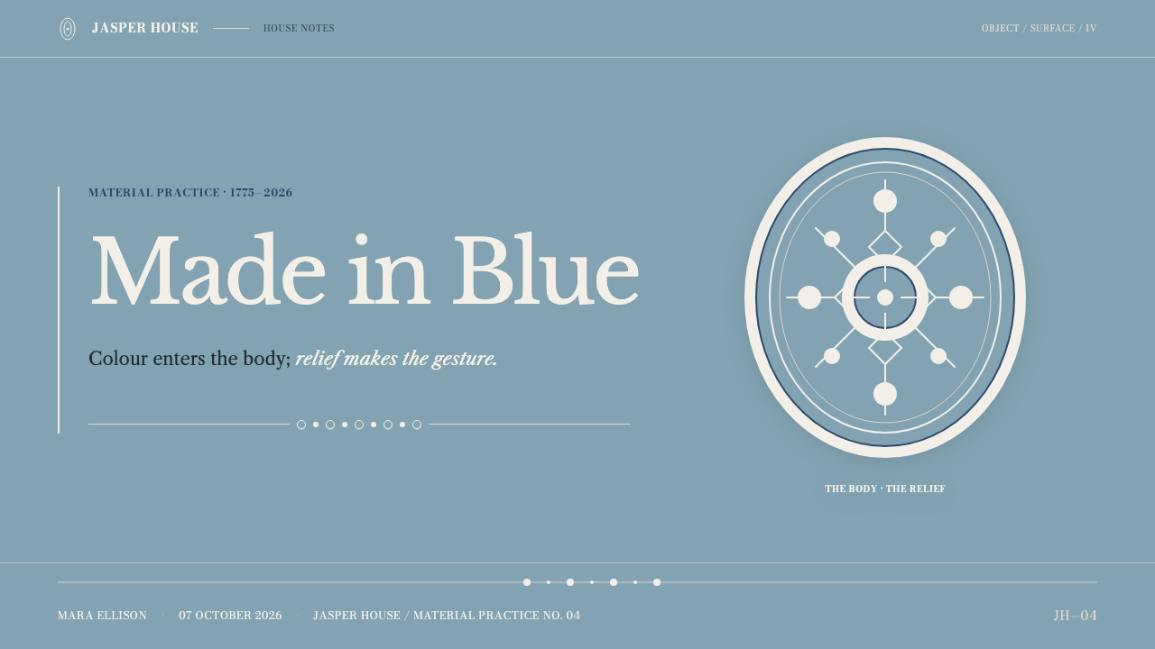
Wedgwood Jasperware — FAQ
Is Wedgwood Jasperware a light or a dark style?
It is a light-to-mid style. The ground is a muted mid-tone blue-grey with white applied on top, so contrast comes from the pale relief against a quiet field rather than from a bright or black background. A deeper variant exists in the history of the material, the dark blue dip, so a darker version is plausible, but the logic stays the same: one ground colour with white applied. Avoid pure black or highly saturated backgrounds, which turn the matte clay quality into a generic dark theme.
Why is the surface always matte?
Because jasper is unglazed. A glaze is a coating that makes a surface shine, whereas jasper takes its colour all the way through its body and keeps a dry, even finish. The matte surface is therefore not a stylistic choice added later; it is the evidence that the colour is the material. Gloss, gradients and highlights would imply a coating and undermine the central idea of the style.
Can I add more colours to the palette?
Sparingly, and with a clear reason. The identity of the style rests on one ground colour and one applied white. If an interface needs status colours, such as success or warning, keep them small, muted and clearly functional, in the form of tiny markers rather than large fields, so that the ground still reads as the single structural colour. Bright accent colours spread across headings, buttons and charts will pull the style away from jasper and toward generic interface design.
How is it different from other neoclassical styles?
Many neoclassical looks lean on marble whiteness, gilding or heavy architectural ornament. Jasperware is quieter and more material: it is defined by a coloured clay ground, a separate applied white layer and almost no ornament beyond the figures themselves. It was also born on ceramic objects, so it works through refinement and spacing rather than monumentality.
What kinds of products does it suit, and where does it struggle?
It suits products that benefit from calm authority: documentation, finance and analysis tools, cultural and heritage brands, publishing, premium consumer goods and educational material. It struggles where energy, playfulness or strong saturation is the point, such as entertainment, children's products or campaigns that need to shout. It also struggles with dense, information-heavy screens, because the style depends on generous empty ground; packing it tightly removes the quality that makes it work.
Related design styles
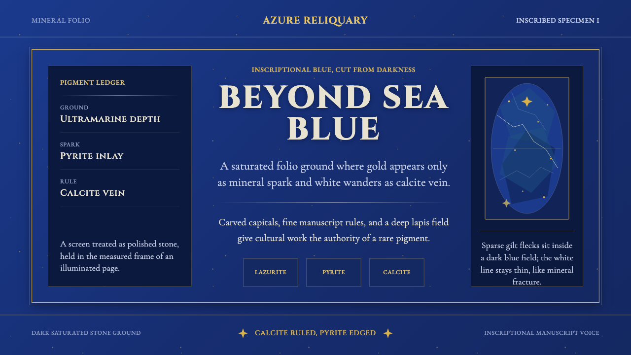 Badakhshan Lapis LazuliStone as manuscript. Ultramarine field, pyrite flecks, calcite veins, carved…
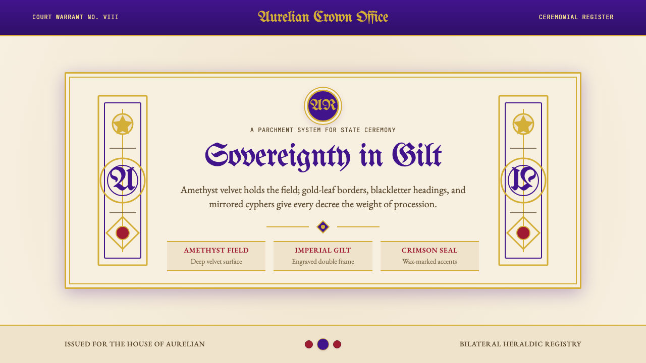 British Royal MonarchyCeremony becomes structure. Amethyst panels, gilt borders, blackletter, mirro…
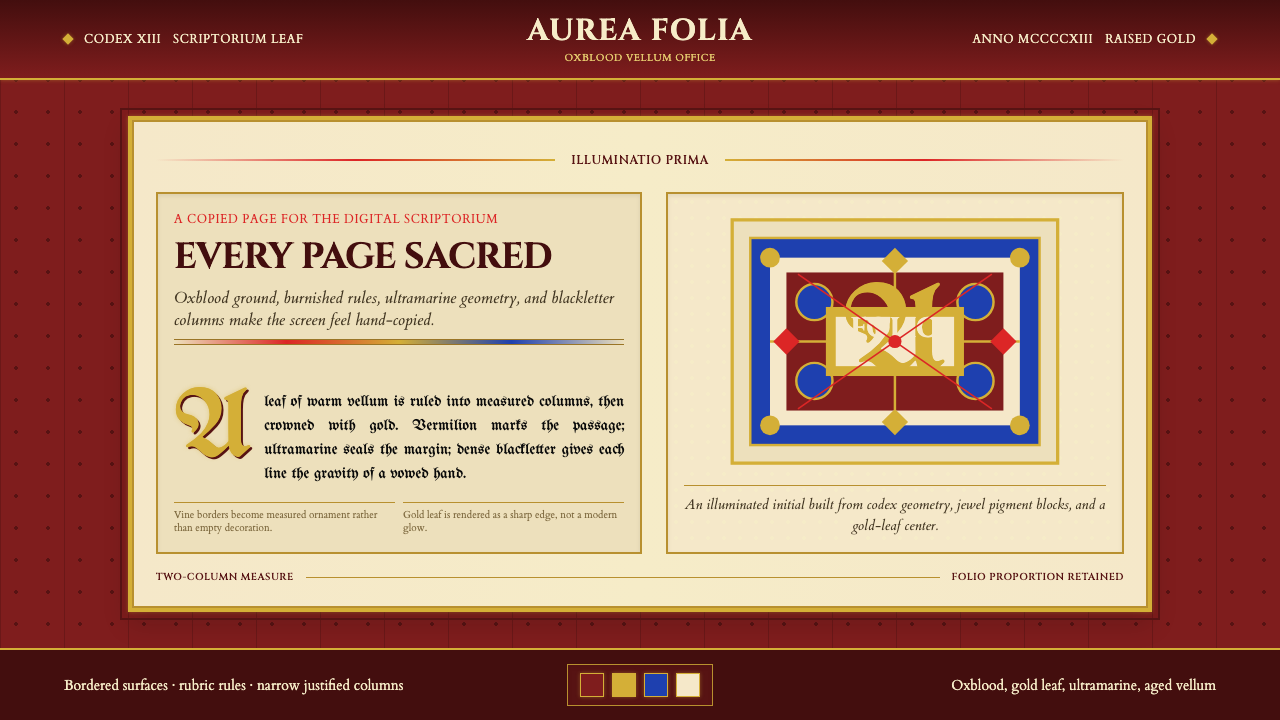 Medieval Illuminated ManuscriptTreats every page as sacred. Oxblood vellum, Cinzel capitals, gold-rule borde…
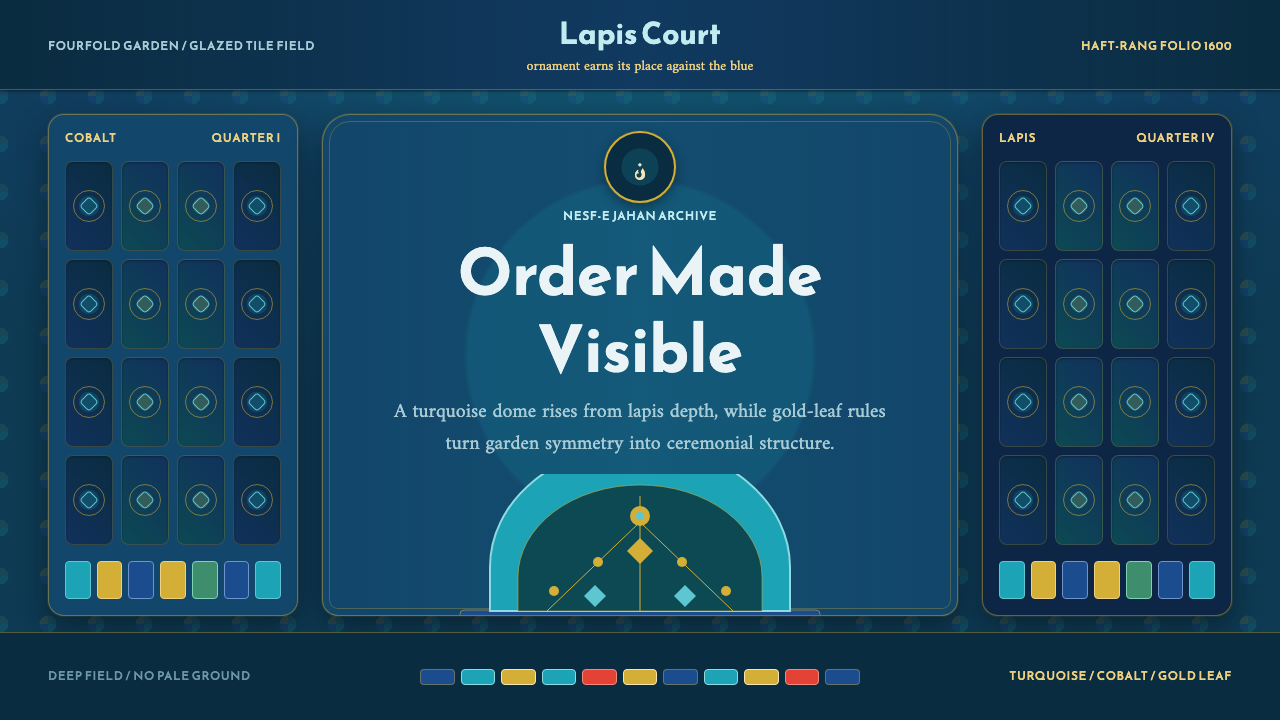 Safavid IsfahanOrnament is order. Turquoise domes and gold rules lock into a deep lapis grid.
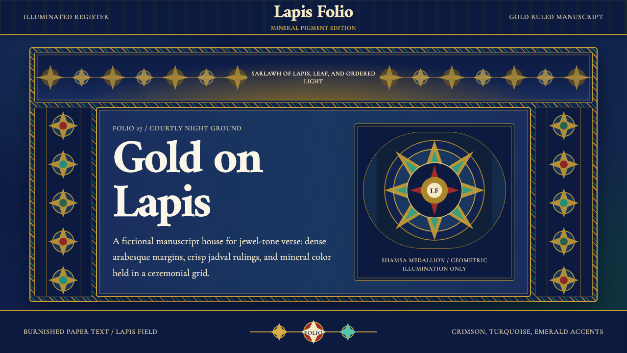 Timurid Manuscript (Herat)Courtly density glows. Lapis ground, Amiri type, and gold jadval geometry hol…
 Byzantine Tyrian Purple (Imperial Court)Imperial rank made visible. Tyrian purple, gold tesserae, and centered symmet…