What is Gaudí Modernisme?
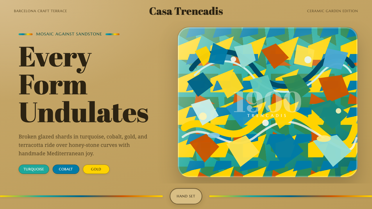
Gaudí Modernisme turned broken tile into a design language — a riot of glazed color poured over rippling, handmade curves.
Gaudí Modernisme in brief
Gaudí Modernisme is the design language of Antoni Gaudí's Barcelona — most famously the trencadís mosaics of Park Güell, where shards of broken glazed ceramic in turquoise, cobalt, and gold are pressed into serpentine benches and biomorphic columns. Nothing in this system is straight or flat. Surfaces ripple, curve back on themselves, and catch light unevenly because they were built by hand out of irregular fragments rather than poured or milled to a uniform finish.
The style belongs to Catalan Modernisme, the regional cousin of Art Nouveau that flourished in Barcelona at the turn of the twentieth century. Where much of European design at the time was moving toward either historical revivalism or the coming austerity of early modernism, Gaudí and his collaborators pushed in the opposite direction: toward nature as the only legitimate source of form, toward craft as the only legitimate method of construction, and toward color as something to be worn boldly rather than restrained.
Visually, the system reads as maximal and joyous. Color arrives in fragments rather than fields — a mosaic logic rather than a paint logic. Structure is never a straight line holding weight in the ordinary way; it is a curve, often a catenary arch, doing the structural work while looking like it grew rather than was engineered. And every surface sits against warm, sun-colored stone, so the ceramic fragments read as jewels set into a body rather than a coating applied on top of one.
Where does Gaudí Modernisme come from?
Catalan Modernisme emerged in Barcelona in the final decades of the nineteenth century and ran roughly from 1888 to the 1910s, cresting well into the 1920s in Gaudí's own late work. It arrived at a moment of intense Catalan cultural assertion: Barcelona was industrializing rapidly, a wealthy new bourgeoisie was looking for a visual identity distinct from Madrid and from the historical revival styles fashionable elsewhere in Europe, and a broader cultural movement — the Renaixença — was reviving Catalan language, literature, and regional pride. Modernisme became the architectural and decorative expression of that pride: a style that could be unmistakably Catalan rather than borrowed from Paris or Vienna.
Antoni Gaudí, born in Reus in 1852 to a family of coppersmiths, is the movement's central figure, and his biography matters to the style: he trained as an architect but thought like a craftsman, spending long stretches on site with masons, ironworkers, and tile-setters rather than directing from a distant studio. He drew his structural vocabulary from nature — tree branches for columns, honeycomb for vaulting, bone for load-bearing curves — and from the mathematics of the catenary curve, the shape a hanging chain makes under its own weight, which he used via actual hanging-chain and weighted-string models to derive the arches and vaults of his buildings. Park Güell, built between 1900 and 1914 as a failed luxury housing development that Barcelona later bought and turned into a public park, is the clearest showcase of this vocabulary: undulating benches, a forest of leaning columns holding up a market hall, and the famous mosaic salamander guarding its entrance stair.
Gaudí rarely worked alone, and the trencadís technique most associated with his name owes a great deal to his close collaborator Josep Maria Jujol, an architect and designer in his own right who joined Gaudí's studio in the early 1900s. Jujol is credited with much of the free, painterly application of broken tile across Park Güell's surfaces, an approach that reportedly grew partly from practical necessity — using shards of broken, discarded ceramic rather than commissioning new tile — and partly from a deliberate choice to let irregularity replace the precision of conventional tilework.
The movement's materials were rooted in place. Montjuïc, the hill overlooking Barcelona's harbor, supplied the honey-toned sandstone that underlies much of Gaudí's masonry, giving Modernisme buildings their warm base tone even before any color is added. Modernisme faded as a dominant style after the 1910s, overtaken across Europe by the rationalism of the coming modern movement, but Gaudí continued in his own idiom — most famously on the Sagrada Família — until his death in 1926, and Park Güell itself was not completed and opened to the public until that same year.
What defines the Gaudí Modernisme look?
Color
Color arrives as glazed ceramic fragments rather than painted fields — turquoise, cobalt blue, and gold are the signature trio, though warm reds, greens, and whites appear as supporting fragments within the same mosaic. Because each tile shard is a broken, irregular piece rather than a uniform swatch, no single patch of color is perfectly flat: adjacent fragments of the same nominal hue still catch light differently depending on their glaze and angle, giving the palette a shimmer that a flat color fill cannot replicate.
Trencadís (Mosaic Tessellation)
Trencadís — literally 'broken' in Catalan — is the technique of covering a curved surface with irregular shards of broken ceramic tile, fitted together like a puzzle rather than laid in a repeating grid. The irregularity is the point: no two fragments are the same shape, seams run at unpredictable angles, and the overall effect reads as improvised and handmade rather than manufactured. This is the single most identifying visual signature of the style and the hardest to fake with uniform materials.
Curvature and the Catenary Line
Straight lines are almost entirely absent. Benches undulate in continuous serpentine curves, columns lean and branch like trunks, and structural arches follow the catenary — the shape a chain naturally forms when it hangs freely under its own weight, then inverted to bear load in compression. This is not curvature applied as decoration on top of a rectilinear structure; the curve is the structure. Everything, from a bench back to a roofline, behaves as though it grew rather than was drafted with a ruler.
Ground Material
Beneath the ceramic, most surfaces sit on warm, honey-toned sandstone — the quarried stone that gives Barcelona's Modernisme buildings their base color even where no mosaic is present. The mosaic reads as an inlay set into this stone body rather than a surface finish sprayed or painted over it, so uncovered stone and covered tile are meant to be seen together, one framing the other, rather than the tile fully concealing what lies beneath.
Biomorphic Form
Columns branch like tree trunks, roof ridges undulate like a dragon's spine, and railings coil like plant tendrils or sea creatures. This system treats organic, living form as more structurally and morally legitimate than geometric abstraction — a direct rejection of the straight-edged rationalism that other design movements of the same era were moving toward. Ornament here is never applied on top of a form; the form itself is already ornamental.
Light and Reflectivity
Glazed ceramic catches and scatters light unevenly across a curved, faceted surface, producing a shimmer that shifts as a viewer moves rather than a flat, constant reflection. Combined with the undulating forms the mosaics are applied to, this means the same surface looks different at different times of day and from different angles — an effect that is inherently physical and difficult to fully translate into a static digital rendering, but worth signaling through varied tonal values within a single color family rather than one flat fill.
Iron and Wrought Detail
Where the mosaic system meets structural metalwork — gates, railings, balconies — the ironwork continues the same organic logic in a different material: forged into leaf shapes, insect-like forms, or coiling tendrils rather than straight bars or geometric lattice. Iron here is treated with the same craft respect as tile, hand-forged rather than mass-extruded, so that even the hardest material in the system still reads as grown rather than manufactured.
Who shaped Gaudí Modernisme?
Gaudí (1852–1926) is the movement's defining architect, trained formally but working like a craftsman on site with masons and tile-setters rather than directing remotely from a studio. He derived his structural forms from nature and from physical models of hanging chains and weighted strings, which he used to calculate catenary arches long before the mathematics could be computed on paper alone. His major works — Park Güell, the Casa Batlló, the Casa Milà, and his unfinished masterwork the Sagrada Família — collectively define the style's vocabulary of curved structure, glazed color, and biomorphic ornament.
Jujol joined Gaudí's studio in the early 1900s as a close collaborator and is widely credited with much of the free, painterly trencadís work at Park Güell — the loose, improvisational application of broken tile that gives the mosaics their unplanned, handmade character. Jujol was also an accomplished architect and designer in his own right, and his individual sensibility — looser, more painterly, and arguably more colorful than Gaudí's — is often cited as the reason Park Güell's mosaic surfaces feel distinct from the more controlled tilework elsewhere in Gaudí's buildings.
Güell was the wealthy Catalan industrialist and Gaudí's principal patron, commissioning Park Güell as a luxury housing development (which failed commercially and was later converted into a public park) along with several other major projects. His patronage gave Gaudí the sustained financial backing and creative latitude to pursue structurally experimental, labor-intensive work — the kind of trencadís-covered, hand-built curved masonry that no ordinary commercial client of the period would have funded.
A contemporary of Gaudí and a major architect of Catalan Modernisme in his own right, Domènech i Montaner designed landmark works including the Palau de la Música Catalana, known for its own extensive use of mosaic, stained glass, and floral ornament. His parallel practice demonstrates that Modernisme was a broader Barcelona movement rather than a single architect's idiosyncrasy, even as Gaudí's work — more biomorphic, more structurally experimental — became its most internationally recognized face.
How do you use Gaudí Modernisme today?
Gaudí Modernisme transfers to contemporary work best when the goal is warmth, craft, and joy rather than restraint — it is one of the most maximal styles in the library, and applying it well means committing to that maximalism rather than diluting it into a pastel accent.
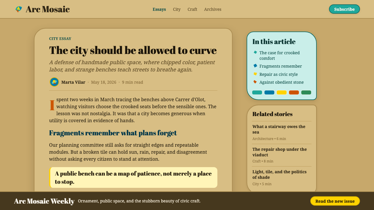
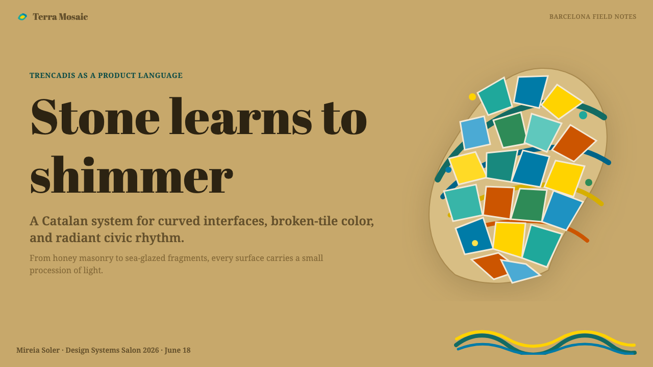
For presentation slides, the style works strongest on cover pages and any content that benefits from visual richness — brand stories, travel and hospitality decks, cultural or lifestyle pitches. A cover can use a mosaic-fragment texture along one edge or corner against a warm stone-toned ground, with the title set plainly so it doesn't compete with the surrounding texture. Data-heavy content slides are the weakest fit for this style in its purest form; where data must appear, keep the chart itself clean and confine the mosaic treatment to a border or background band so the numbers stay legible.
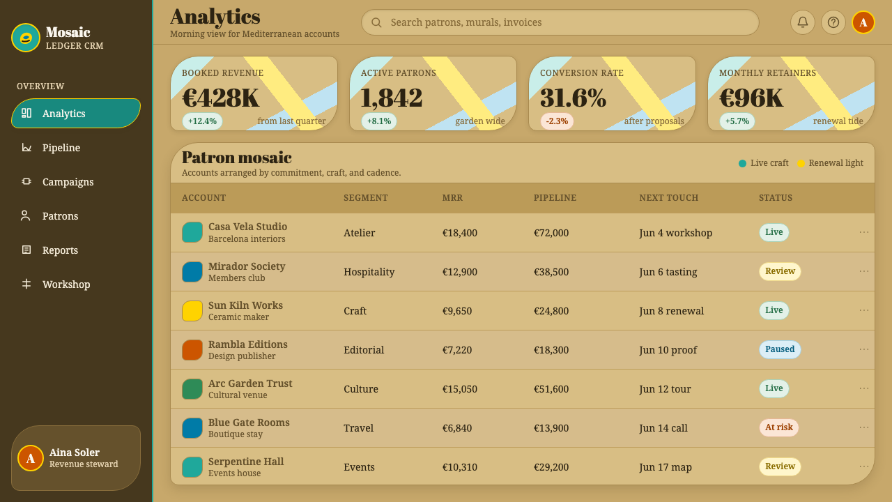
For web UI, the style suits dashboards and pricing pages only if softened deliberately: a warm stone-toned base, generous curvature on cards and buttons instead of hard rectangles, and mosaic-fragment texture reserved for accents — a header band, a badge, a decorative divider — rather than covering functional surfaces where a user needs to read numbers or click precisely. Interactive elements benefit from rounded, organic silhouettes rather than sharp corners, echoing the style's rejection of the straight line, but hit targets should stay clean and uncluttered so the texture doesn't interfere with usability.
For editorial and marketing work, this is where the style is most at home. Full-bleed hero sections, pull quotes framed by fragment-texture borders, and section dividers rendered as undulating rather than straight lines all read as authentically Modernisme. Marketing pages for travel, hospitality, food, craft goods, and cultural institutions particularly benefit from the style's sense of handmade abundance — it signals warmth and specificity in a way that flatter, more geometric styles cannot.
The most common mistake is treating trencadís as a flat, repeating pattern — a printed texture with uniform tile shapes and a regular grid. The style's entire visual logic depends on irregularity: fragments of varied size and shape, seams at unpredictable angles, and tonal variation within a single hue family. A second common mistake is applying the mosaic treatment everywhere at once; the style reads as rich and considered when fragment-texture is concentrated in specific zones against a calmer stone-toned ground, and reads as chaotic and illegible when every surface competes for attention simultaneously.
Gaudí Modernisme — FAQ
Is Gaudí Modernisme the same as Art Nouveau?
They are closely related but distinct. Catalan Modernisme is often described as the Barcelona expression of the broader Art Nouveau movement that swept Europe around the turn of the twentieth century, sharing its interest in organic, plant-inspired form and its rejection of historical revivalism. What sets Gaudí's strand of Modernisme apart is its structural ambition and its craft material: Art Nouveau elsewhere in Europe (Paris, Vienna, Brussels) expressed itself mainly through decorative surface, ironwork, and graphic design, while Gaudí used the same organic vocabulary to solve actual load-bearing structural problems, and layered it with the specifically Catalan technique of broken-tile trencadís mosaic, which has no real equivalent in Parisian or Viennese Art Nouveau.
Can this style work in a dark or low-light layout?
The historic system is fundamentally light-ground — the warm sandstone base and sun-struck glazed tile depend on daylight to read as vivid and joyous. A dark adaptation is possible but changes the character substantially: on a dark ground, the turquoise and cobalt fragments read as jewel-like and lantern-lit rather than sun-warmed, which can work well for evening, nightlife, or luxury contexts, but the warm stone-toned base that anchors the daylight version should not simply be inverted to black — it works better replaced with a deep, warm charcoal or ember tone that still implies warmth rather than a cold, neutral black.
Why does the style avoid straight lines so consistently?
Because Gaudí held that nature — the source he considered the only legitimate model for design — essentially never produces a straight line or a flat, uniform plane; trees branch, bones curve, shells spiral. Choosing curvature was therefore not a decorative preference layered onto an otherwise conventional structure, but a philosophical starting point: if a form was going to be true to its natural model, it had to curve. Practically, this also meant Gaudí frequently derived his structural curves — particularly the catenary arch — from physical models of hanging chains, so the 'natural' curve was often also the structurally optimal one, letting aesthetic and engineering logic reinforce each other rather than compete.
How should trencadís be handled in digital or print reproduction?
The technique should be treated as tessellation with irregular, varied-size fragments and unpredictable seam angles, not as a repeating tile pattern with a fixed module. A useful test is whether the pattern would look identical if rotated 90 degrees or shifted by one tile — genuine trencadís would not, because no two fragments are truly alike, while a manufactured repeating pattern would. Reproductions should also vary tonal value within a single color family (several shades of turquoise, not one flat turquoise) to suggest the shifting reflectivity of glazed ceramic under uneven light, and should be concentrated in defined zones rather than smeared uniformly across every surface.
Does this style suit every kind of product, or are there contexts where it struggles?
It is not universally suited. It excels where warmth, craft, and cultural specificity are desired values: hospitality and travel brands, food and craft goods, cultural and arts institutions, and any product wanting to signal handmade abundance rather than industrial precision. It struggles in contexts that call for cold authority, dense data legibility, or minimalist restraint — enterprise dashboards, financial reporting tools, or technical documentation, where the texture and irregularity that make the style joyous elsewhere would instead compete with a user's need to scan numbers quickly and precisely. As with any maximal style, the discipline is knowing where to leave a surface plain so the mosaic zones retain their impact.
Related design styles
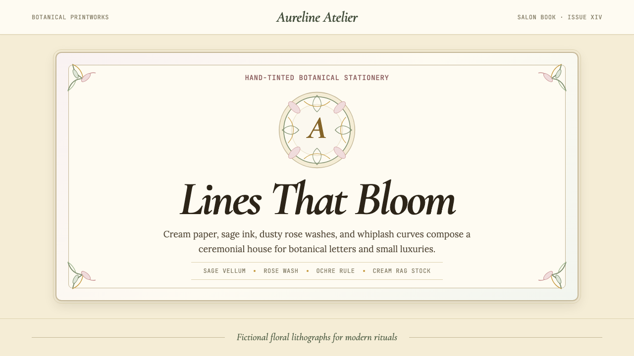 Art Nouveau (Mucha)Mucha's whiplash arabesques. Botanical halos, muted lithograph palette, no ma…
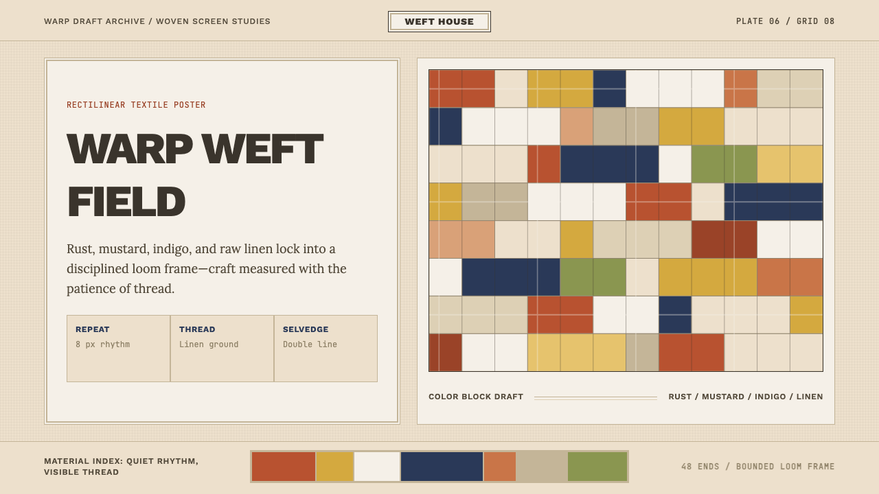 Bauhaus Textile (Anni Albers)Anni Albers' loom as design grid. Modular rust-mustard-indigo blocks, visible…
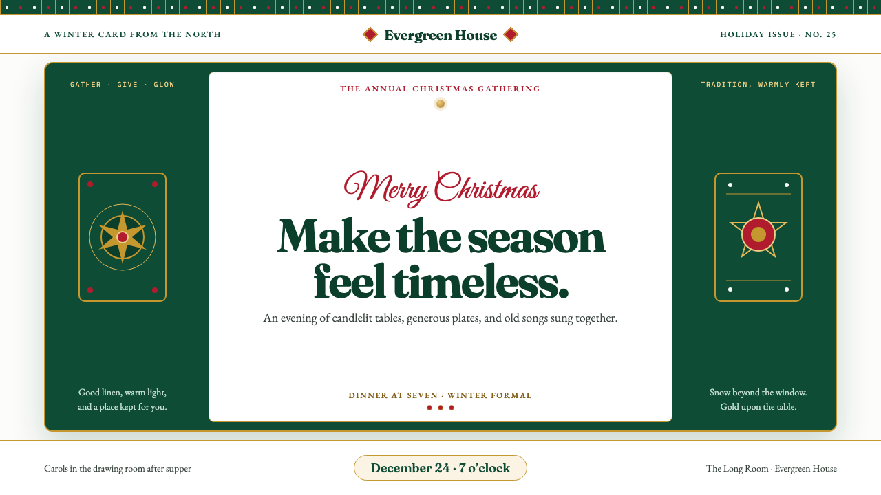 Christmas ClassicTradition glows warmly. Evergreen panels, berry-red notes and burnished-gold…
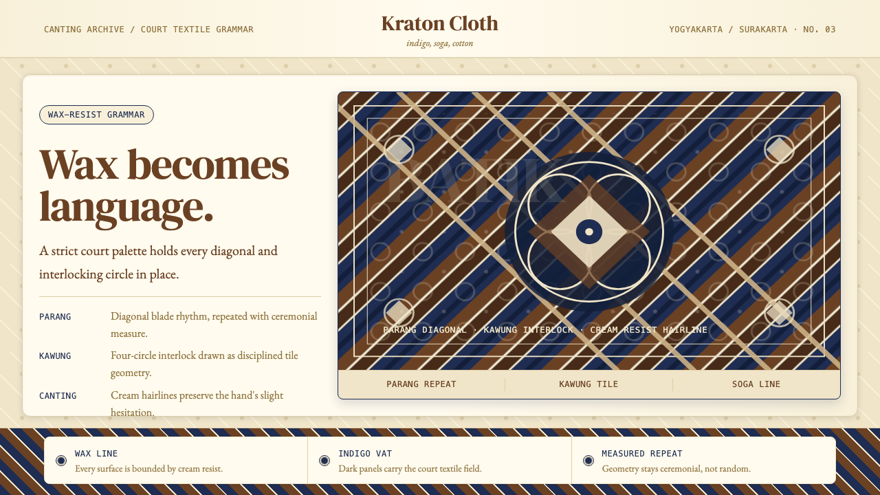 Javanese BatikCeremonial repetition. Indigo, soga, and cream frame a tiled canting motif.
 La Tène Celtic MetalworkMetalwork that still moves. Patina-green relief radiates from a bronze boss,…
 Nanai Amur SpiralCut continuity, never drawn. Dark indigo pairs run across mottled salmon-leat…