What is Conchology Shell Plate?
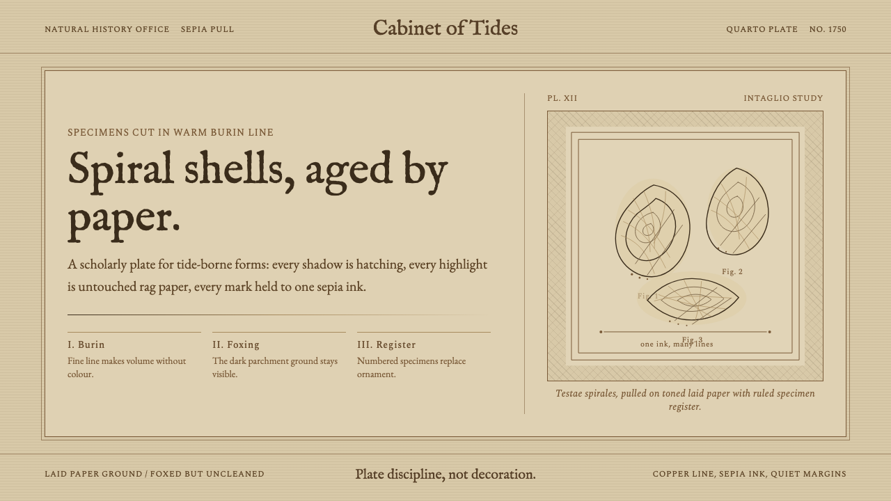
Conchology Shell Plate carries the discipline of the eighteenth-century engraver into the digital age: one ink, a thousand lines, and an aged parchment ground that reads warmer than any freshly mixed color.
Conchology Shell Plate in brief
Conchology Shell Plate is a design system rooted in the great Enlightenment natural-history folios — the shell books of Franz Michael Regenfuss, Antoine-Joseph Dezallier d'Argenville, and Georg Wolfgang Knorr, produced in Nuremberg, Paris, and Copenhagen between roughly 1742 and 1758. In those volumes, craftsmen used a steel burin to cut spiral mollusc forms directly into copper plates, then inked the plates and printed them onto hand-laid rag paper in sepia or warm brown. The result was a discipline of pure line: cross-hatching for deep shadow, stippling for mid-tone relief, and bare paper for the brightest highlight.
What distinguishes this system from a generic sepia aesthetic is the treatment of the paper itself. Two and a half centuries of oxidation have shifted the original off-white sheets to a deep, slightly foxed parchment — and that darkened, mottled ground is the signature. The system does not simulate a fresh cream sheet with a tinted wash; it simulates the sheet as it exists today, after time has acted on it. Warmth comes not from added color but from the paper's own history.
Visually the style is monochrome in the strictest sense: no saturated color enters, no blue-black offset printing, no red for emphasis. Everything is built from the density and direction of implied line work and from the contrast between the warm inked areas and the warm bare ground. The result occupies a narrow tonal band — sepia ink on aged parchment — yet achieves remarkable depth through pure mark-making logic.
Where does Conchology Shell Plate come from?
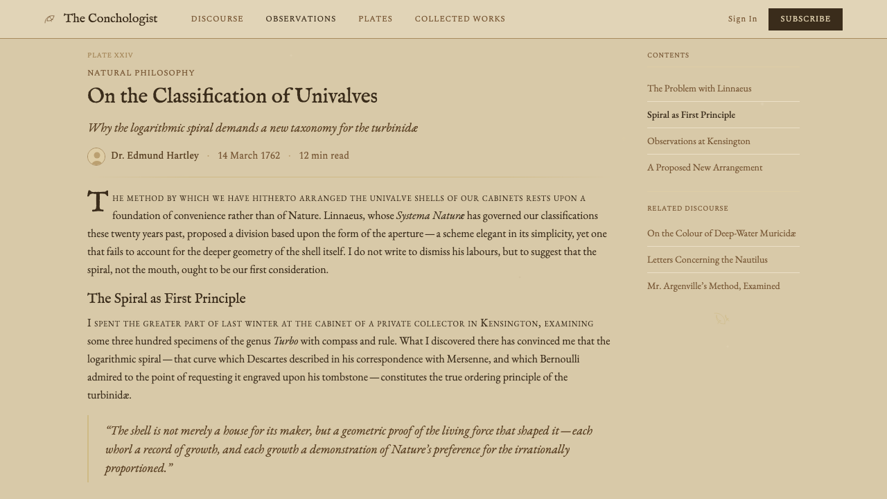
The practice of engraving scientific and natural-history illustrations onto copper plates reached its artistic peak during the mid-eighteenth century, precisely when the Enlightenment's appetite for systematic knowledge of the natural world was most intense. Collectors and scholars across Europe competed to assemble conchological cabinets — ordered arrangements of shells from every ocean — and the books that catalogued these collections were status objects as much as reference works. Publishers hired the most skilled engravers available because the precision of the cut line was understood as inseparable from the credibility of the scientific content.
Franz Michael Regenfuss published his landmark folio Choix de Coquillages et de Crustacés in Copenhagen in 1758, under the patronage of King Frederick V of Denmark. The plates — hand-colored in some copies, left in sepia impression in others — set a standard for the combination of scientific accuracy and aesthetic refinement. Antoine-Joseph Dezallier d'Argenville, a French connoisseur and naturalist, had published his L'Histoire Naturelle Éclaircie two decades earlier in Paris, establishing many of the compositional conventions: the shell centered on the plate, cross-hatched shadow falling consistently to one side, stippled texture conveying the precise surface character of each species. Georg Wolfgang Knorr, a Nuremberg engraver and publisher, produced his multi-volume Vergnügen der Augen und des Gemüths through the 1750s, extending the tradition with particular attention to the ornamental qualities of the shells' spiral geometry.
The physical aging of these prints is as significant to this design system as the original engraving technique. Rag paper from the period was made from cotton and linen fibres rather than wood pulp, making it exceptionally stable — but not immune to oxidation, humidity, and biological foxing over two and a half centuries. The resulting tonal shift from bright white to deep warm ochre is irreversible and unrepeatable. Modern attempts to simulate this through digital means must account for the non-uniformity of the effect: genuine aged paper has local variation, slight unevenness, the ghost of old watermarks, margins where the tone differs from the plate area.
By the nineteenth century, engraving was being rapidly displaced by lithography and later by photographic reproduction. The copper-plate conchology book became a historical artifact, but it was never forgotten. In the twentieth and twenty-first centuries, interest in these folios has grown steadily among collectors, antiquarian booksellers, and designers drawn to their combination of scientific rigour, graphic economy, and the irreplaceable warmth of the aged physical object. The design system Conchology Shell Plate formalizes that visual inheritance as a deployable aesthetic.
What defines the Conchology Shell Plate look?
Ground Tone
The foundational surface is not white or cream but deep aged parchment — a warm ochre with local variation and slight mottling that references two centuries of oxidation. This ground is the warmest value in the palette; everything else is built darker than it. The variation in the ground is deliberate: uniform tinting would read as a filter, not as paper.
Ink and Line Logic
The only active color is sepia — a warm dark brown in the register of iron gall or diluted carbon — used in varying densities to build every tonal value. Shadow areas accumulate line until the ink almost closes; mid-tones are open hatching and stippling; highlights are bare ground. There is no overlay blending, no airbrush softness, no continuous tone outside the implied dot or stroke.
Hatching Grammar
Line direction is not decorative; it follows the form. On a spiral shell, hatching curves with the whorls to reinforce three-dimensional recession. Cross-hatching — a second set of lines running at an angle to the first — intensifies shadow without muddying the form. Stippling appears where shadow meets a textured surface: the granular dot pattern reads simultaneously as tone and as surface quality.
Scientific Composition
The original folios placed each specimen against a plain ground, centered or slightly offset, with enough surrounding space to let the shell read as an isolated scientific subject rather than a decorative element in a scene. This museum-specimen composition is central to the aesthetic: no context, no habitat, no other objects in the field. The shell is the entire subject. Contemporary applications carry this isolation principle into layout — elements are given room to read independently, never crowded.
Typographic Register
The books paired engraved illustrations with letterpress-set text in old-style roman types — the Fell types and their contemporaries: slightly irregular, with high contrast between thick and thin strokes, bracket serifs, and a warmth that reads as handmade even when printed mechanically. Captions and labels were often italic and smaller than the main text, engraved directly onto the plate. The overall typographic tone is antiquarian and unhurried.
Restrained Palette Discipline
Some copies of the great shell folios were hand-colored after printing, adding delicate washes of ochre, rose, and pale blue to the shells themselves. This coloring was always subordinate to the engraved line — a tint, never an opaque fill. The design system in its purest form stays monochrome, but if color is introduced, it must follow this historical precedent: transparent, delicate, never overriding the line structure beneath.
Imperfection as Authenticity
Unlike modernist design systems that aim for machine-perfect repeatability, Conchology Shell Plate values the trace of the hand and the mark of time. Minor inconsistencies in line weight, slight unevenness in the ground tone, the occasional foxing spot — these are not errors to be corrected but signals of authenticity. A design in this system that looks too clean and uniform has misread its source.
Who shaped Conchology Shell Plate?
A German-born engraver who settled in Copenhagen and produced his landmark Choix de Coquillages et de Crustacés in 1758 under royal Danish patronage. Regenfuss was both the draughtsman and the engraver of his plates, giving his work an unusual unity of vision. His compositions established the standard of the isolated specimen on a plain ground, cross-hatched with extraordinary precision to convey the exact surface character — spiny, smooth, ridged, or nacreous — of each shell. The folio was issued in French, the international scientific language of the day, and circulated throughout Europe.
A French connoisseur, gardener, and naturalist whose L'Histoire Naturelle Éclaircie, first published in Paris in 1742, was among the earliest systematic conchological reference works aimed at collectors rather than specialists. D'Argenville employed professional engravers rather than cutting the plates himself, and the slightly variable quality of their work gives his volumes a collaborative, workshop character. His written descriptions of each species were meticulous, and the combination of prose and image established the basic format that subsequent publications refined.
A Nuremberg engraver and publisher who produced the multi-volume Vergnügen der Augen und des Gemüths (Delights of the Eye and Mind) through the 1750s. Knorr's title is telling — he was as interested in the ornamental beauty of shells as in their scientific classification, and his plates lean into the spiral geometries of mollusc forms with particular aesthetic intentionality. His Nuremberg context placed him within the same graphic tradition that produced the great cartographic and scientific engravers of the seventeenth century, and his line work has a crispness and depth that remains technically impressive.
Not a person but the central tool: a small steel rod with a sharpened tip, held in a mushroom-shaped wooden handle, pushed across a polished copper plate to displace metal and incise a groove. The burin's physical properties determine what is and is not possible in this aesthetic. A pushed line swells and tapers with changes in pressure. Curved lines require rotating the plate rather than the tool. The resistance of copper means that a skilled engraver works slowly — a single folio plate might represent weeks of labor — and that every mark is deliberate and committed. There is no erasing a burin line, only burnishing it back.
The substrate, not a person: hand-laid rag paper made from cotton and linen rags, beaten, formed on wire moulds, and pressed into sheets. The wire grid of the mould leaves faint laid lines and chain lines visible when the sheet is held to the light — a characteristic mark of period paper that contemporary aged-parchment simulations must account for. Rag paper's long cellulose fibres give it durability far exceeding modern wood-pulp paper, but its slow oxidation over centuries produces the warm tonal shift — white to ochre to sienna — that defines the aesthetic's ground.
How do you use Conchology Shell Plate today?
Conchology Shell Plate is one of the most contextually specific styles in the Curio library — it rewards applications where the aged-parchment, scholarly-antiquarian register is genuinely appropriate, and it resists applications that force it into a context where the historical tone is incongruous. The style suits heritage brands, natural-history institutions, archival publishing, antiquarian retail, academic lecture materials, and any product that wants to signal depth of knowledge, patience, and time. It does not suit fast-paced consumer technology, sports, or any context where urgency or contemporaneity is a core signal.
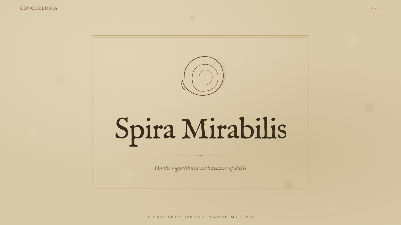
For presentation slides, the style works best when the content itself has a scholarly or curatorial character. A cover slide should establish the parchment ground with confidence — a single engraving-derived illustration element, a title in an old-style serif, generous margins, and very little else. Content slides benefit from the scientific-caption register: narrow body text in a complementary old-style face, section labels in a slightly more upright italic, and any data treated as a specimen — isolated, labeled, and given breathing room. Avoid cramming multiple specimens onto one slide; the historic folios placed one shell per plate for a reason.
For web interfaces, this aesthetic is most credible in contexts with low information density. A product landing page for a naturalist brand, a digital archive of botanical illustration, or a premium membership platform positioning itself around depth and curation can all carry it convincingly. Navigation should be typographic, unhurried, with spacing that implies the user has time to read. The parchment ground should be the default background rather than a feature block; applying it only in highlighted sections reads as a period costume rather than a coherent system.
For editorial and marketing work, the style has strong poster potential when used with restraint. A single shell illustration on a deep parchment ground, accompanied by a headline in a high-contrast old-style roman, communicates scholarship and rarity without any additional decoration. Marketing copy should be longer and more considered than typical ad copy — this aesthetic does not suit punchy slogans. The voice implied by this system is that of the knowledgeable naturalist: precise, unhurried, interested.
The most common mistake when applying Conchology Shell Plate is treating the aged parchment as decoration layered over a modern layout rather than as the structural ground of the entire system. A sans-serif UI with a parchment background is not this style — it is a collision of two incompatible visual logics. The aged-ground quality must pervade everything: the typeface register, the mark-making quality of any illustrations or dividers, the information density, the pace at which the eye is invited to move. Partial application produces pastiche; full commitment produces a coherent and distinctive voice.
Conchology Shell Plate — FAQ
Is this style only for products connected to natural history or science?
Not strictly, but the historical register is strong enough that the connection needs to be genuine or at least metaphorically coherent. The style works wherever depth of knowledge, careful curation, and unhurried attention are brand values — an antiquarian bookshop, a heritage spirits label, a premium archival service, a museum publication, or even a carefully positioned consultancy whose identity is built around expertise accumulated over time. It will feel forced on products whose core promise is speed, convenience, or novelty.
How does the aged-parchment ground work in digital contexts where screens emit light rather than reflect it?
The translation requires care. A genuine aged parchment is warm because it absorbs blue light unevenly — the aging process has selectively affected different wavelengths. On a backlit screen, you are adding light rather than filtering it, so a warm ochre ground at full luminosity can look garish rather than aged. The digital equivalent typically needs to be darker and more desaturated than you might expect from looking at a scan of the original paper. Testing the ground tone in actual screen conditions — not just in a design tool — is essential before committing.
Can I use color photography with this style?
Not without significant treatment. Full-color photography imported into this system will read as an anachronism — a contemporary image placed in an eighteenth-century frame. If photographic imagery is needed, it should be treated to match the system's tonal range: desaturated toward sepia, perhaps with a halftone or engraving-simulation effect applied to echo the cross-hatching grammar of the original plates. The goal is for the image to read as if it might plausibly have been reproduced by the same printing method as the surrounding material.
How strict is the single-ink monochrome rule? What if I need to differentiate categories?
The purest version of the system is strictly monochrome: one sepia ink on one aged-parchment ground. Historical precedent does exist for hand-colored versions — thin washes of ochre, pale rose, or very diluted blue applied over the engraved impression — and this provides a principled expansion. The rule is that any color introduced must behave like a watercolor wash: transparent, delicate, subordinate to the engraved line beneath. Never use opaque fills, never use fully saturated hues, and never introduce more than two or three such tints simultaneously. Beyond that, the system has lost its identity.
What is the difference between this style and a generic 'vintage' or 'retro' aesthetic?
Generic vintage aesthetics borrow period signifiers as decoration — distressed textures, sepia tints, aged-looking typefaces — without committing to the structural logic of any specific historical practice. Conchology Shell Plate is rooted in a very specific printmaking tradition with its own discipline: the line-based tonal system, the scientific-specimen composition, the subordination of color to structure, the pace implied by painstaking manual labor. A vintage filter applied to a modern layout is a costume; this style is a complete visual logic. The difference is visible in the details — the consistency of the hatching grammar, the correctness of the typographic register, the treatment of negative space as the warmest value rather than as empty background.
Related design styles
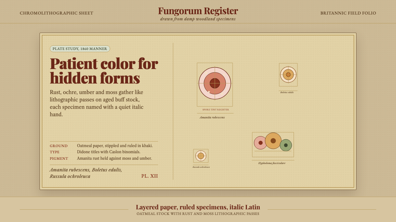 Victorian Mycology PlatePatient field science. Rust and moss specimens sit on stippled buff paper wit…
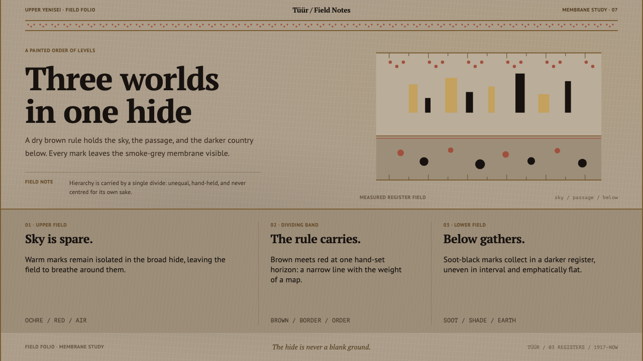 Khakas Shaman DrumA cosmology held by one rule. Smoke-tan hide, ochre marks, and a red-dotted M…
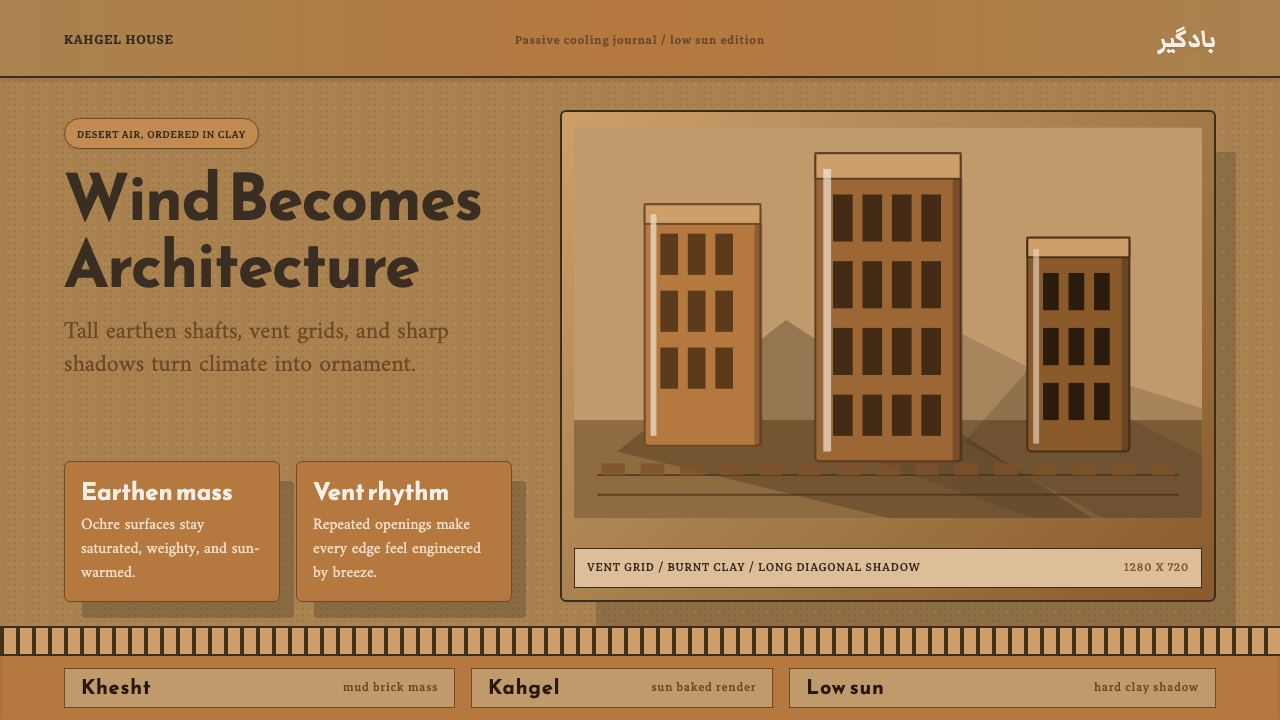 Persian WindcatcherClimate becomes geometry. Adobe ochre, Reem Kufi, vent grids, and hard shadow…
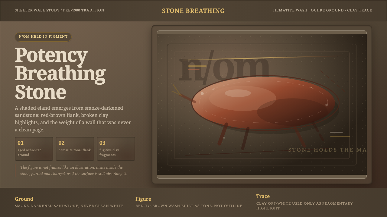 San Rock Art DrakensbergPotency stains the stone. Hematite gradients breathe over smoke-dark sandston…
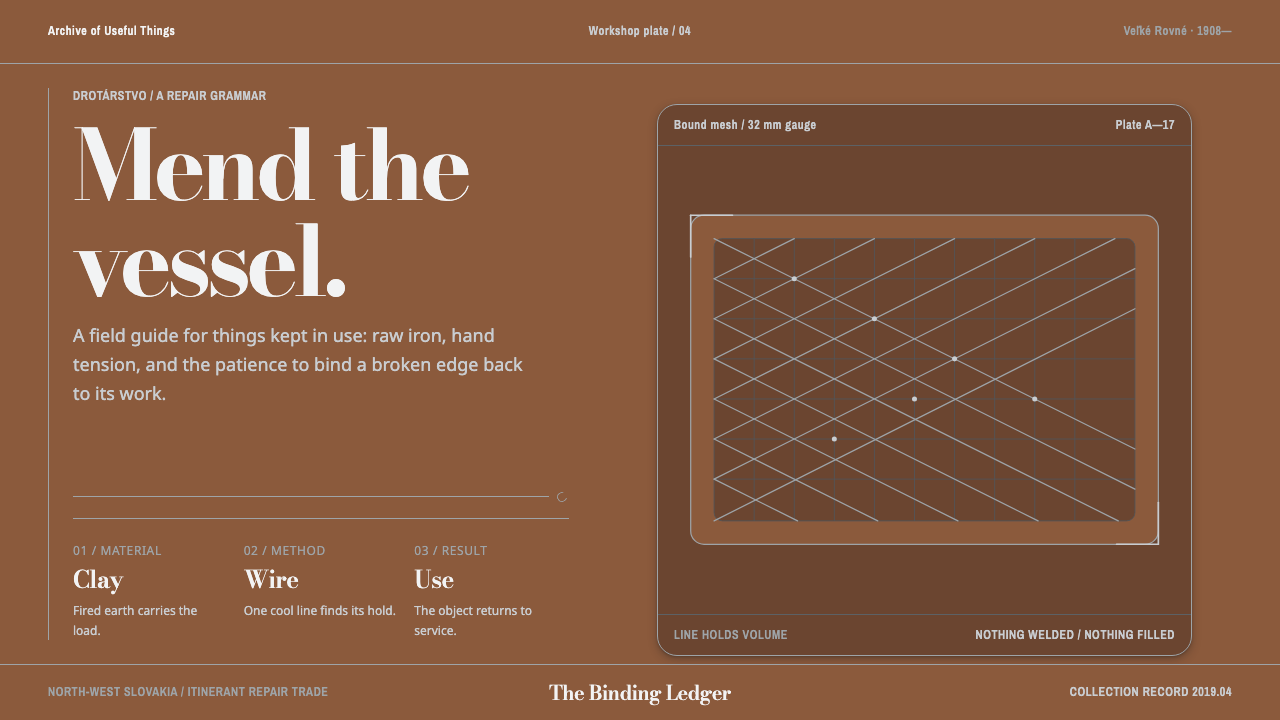 Slovak Drotár WirewareRepair becomes structure. Cold wire mesh binds warm fired clay in a measured…
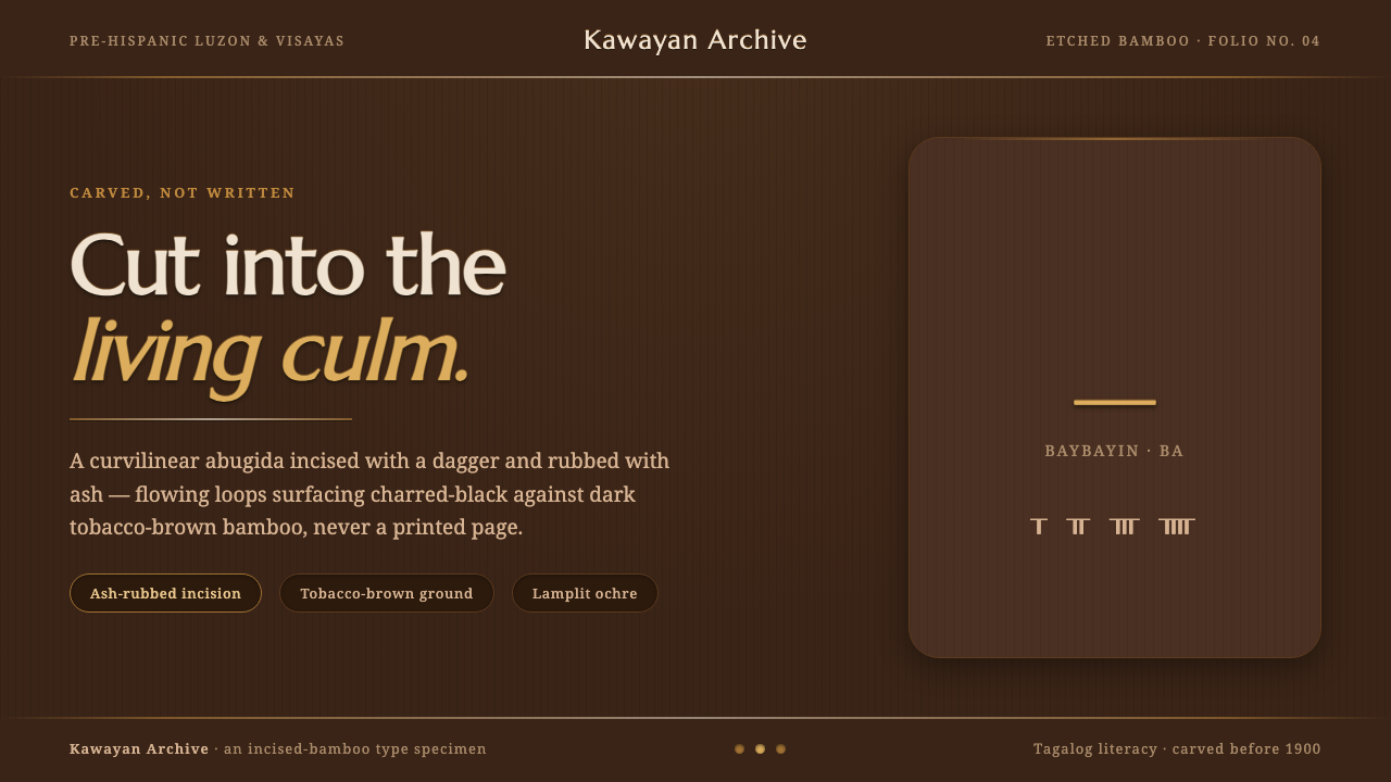 Baybayin ScriptCarved, not written. Curvilinear baybayin ash-rubbed into tobacco-brown bambo…