What is Meiji Japan Note?
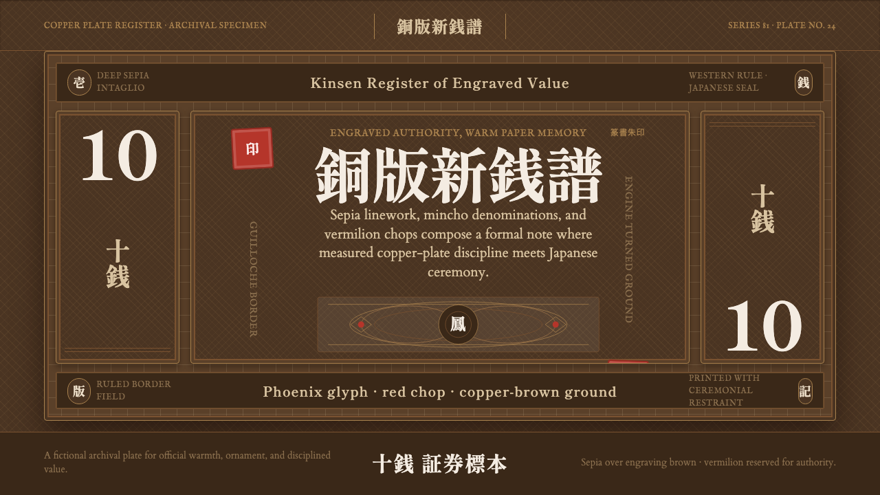
Meiji Japan Note captures the moment Japan's currency learned to speak two languages at once — European copperplate engraving disciplining kanji denominations and a vermilion seal chop.
Meiji Japan Note in brief
Meiji Japan Note is a design language lifted from the earliest banknotes engraved on Japanese soil to a European standard: the 改造紙幣 (reformed paper currency) issued from 1881 by the Meiji government's Imperial Printing Bureau. Its visual signature is instantly legible even to eyes that have never seen a Meiji-era bill — sepia-toned guilloche patterns, dense intaglio cross-hatching, formal mincho (serif) lettering, and a single red seal chop stamped over a warm, aged paper ground.
The style sits at the exact seam between two design traditions rather than blending them into something new. Latin numerals and Western engraving conventions occupy the same field as kanji characters and a red 篆書 (seal-script) chop, and neither tradition is softened to accommodate the other. That refusal to compromise is the point: the note reads as evidence of two systems meeting, not merging.
Where most historical currency design either commits fully to Western academic engraving or to East Asian brush-and-seal convention, Meiji Japan Note holds both at once. The result feels official, dense, and slightly severe — closer to a treaty document or a diploma than a piece of everyday commercial paper — while never losing the warmth of its sepia and brown palette.
Where does Meiji Japan Note come from?
In 1881, the Imperial Printing Bureau of the Meiji government issued the 改造紙幣 (reformed paper currency), Japan's first banknotes engraved domestically to a European technical standard. Before this, Japanese paper money had been printed with older, cruder methods vulnerable to counterfeiting — a serious liability for a government trying to modernize its economy and project stability to foreign trading partners.
The Meiji state's solution was to import expertise directly. Italian master engraver Edoardo Chiossone was brought to Tokyo and given the job of cutting the copper printing plates by hand, applying the full technical vocabulary of European intaglio banknote engraving: fine cross-hatched line work, engine-turned guilloche patterns (the swirling, machine-guided decorative lines used across European currencies and documents to deter forgery), and the dense linear shading that gives engraved portraiture and ornament its characteristic density.
Chiossone did not simply transplant a European design wholesale. He set his European engraving technique to work on distinctly Japanese subject matter — phoenix and dragon motifs drawn from Japanese tradition, kanji denominations, and the red seal chops that had long served as marks of official authority in East Asian documents. The note that resulted is a working artifact of 和洋折衷 (wayō setchū, "Japanese-Western fusion") — not a metaphor or a slogan, but a literal, physical object where both systems are simultaneously legible.
This effort belongs to a broader Meiji-era project: rapidly absorbing Western industrial and administrative technique while retaining the symbols of Japanese state authority. Currency was an unusually visible stage for that project, since every citizen and every foreign trading partner handled it directly. The 改造紙幣 series set a visual template — European engraving discipline in service of Japanese monetary authority — that shaped Japanese banknote design for decades after.
What defines the Meiji Japan Note look?
Color
The palette is earthen and warm rather than crisp or cool: sepia-toned line work sits over a deep engraving-brown ground, with lighter, aged-paper tones carrying denomination fields and open space. There is no pure black-on-white contrast of the kind modern minimalist systems favor — everything reads as if steeped in tea-colored age, with the single exception of one sharp accent.
The Vermilion Seal
A single red seal chop, rendered in 篆書 (seal script), functions as the note's one moment of pure color and its anchor of authority. Everything else on the note is sepia, brown, or aged neutral; the seal alone is saturated red. That restraint is deliberate — a single accent color reads as an official stamp of legitimacy precisely because it does not compete with anything else on the page.
Mincho Typography
Formal mincho lettering — the Japanese serif tradition, structurally related to Chinese Song/Ming typefaces, with clean vertical strokes and pronounced serif-like terminals — carries kanji denominations and official text. It sits alongside Latin lettering set in a Western engraved-currency convention, and the two scripts are given equal formal weight rather than one being treated as primary and the other as translation.
Guilloche and Engine-Turned Pattern
Fine, machine-guided swirling line patterns — the guilloche technique standard to European security printing — fill borders and background fields. These patterns exist for a functional reason (they are extraordinarily difficult to forge by hand) but read visually as dense, hypnotic ornament, giving the whole note a sense of engineered intricacy rather than illustrated decoration.
Intaglio Cross-Hatching
Portraiture, phoenix and dragon motifs, and shaded fields all rely on fine cross-hatched line work rather than solid tone or gradient. Density and darkness are built entirely from line spacing and layering — a technique inherited directly from European engraved currency and print tradition, and one that gives the whole note a tactile, almost woven density under close inspection.
Symmetry and Frame Discipline
The overall composition is formally symmetrical and heavily framed — a bordered field enclosing denomination, motif, and seal, echoing the conventions of both European engraved currency and East Asian official document formats. This is not the asymmetric, negative-space-driven balance found in modern minimalist design; it is a centered, contained formality suited to a document meant to project unquestionable state authority.
Age and Patina
Even in reproduction, the style carries a sense of physical age — warm paper tones that suggest handling, foxing, and a century-plus of archival life rather than a crisp, freshly printed surface. This patina is treated as an asset rather than a flaw: it is what separates an authentically historical register from a merely vintage-styled pastiche.

Who shaped Meiji Japan Note?
Chiossone was the Italian master engraver brought to Tokyo by the Meiji government to hand-cut the copper plates for the 改造紙幣 series. Trained in European academic engraving and banknote security printing, he applied that full technical vocabulary — cross-hatching, guilloche, engraved portraiture — to Japanese subject matter, making him the single figure most responsible for the style's distinctive fusion. His work at the Imperial Printing Bureau extended beyond currency into stamps and official documents, and his engraving conventions shaped Japanese state printing for a generation.
The Imperial Printing Bureau was the Meiji government institution responsible for issuing the 改造紙幣 and for importing the European engraving expertise that made it possible. As a state body, it operated at the intersection of technical modernization and national image-building — its output needed to satisfy both counterfeiting-resistance requirements and the symbolic demands of representing a modernizing state to its own citizens and foreign partners alike.
Rather than a single person, the guilloche and intaglio conventions Chiossone brought to Japan trace back to a broader European lineage of banknote and document security engraving, developed across national printing bureaus and mints through the eighteenth and nineteenth centuries specifically to defeat forgery. This tradition supplied the technical vocabulary — not the subject matter — that Meiji Japan Note repurposes.
How do you use Meiji Japan Note today?
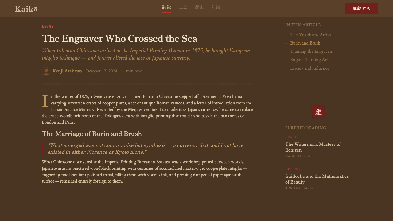
Meiji Japan Note transfers well to any context that wants to project official, unimpeachable authority with a warm rather than clinical register — the opposite emotional register from cold corporate minimalism, but just as formal.
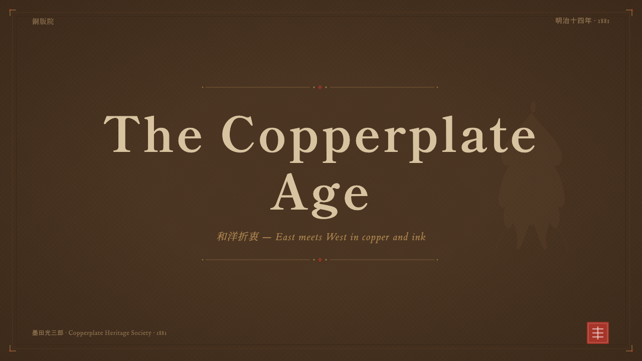
For presentation cover slides, the style rewards restraint around a single focal device: a bordered field, dense fine-line texture in the background, formal serif or mincho-adjacent lettering for the title, and one small red accent mark — a seal-like device, a single highlighted word, a stamp-style badge — placed off-center as the sole point of pure color. Content and data slides should keep that same discipline: dense, fine hairline rules instead of thick modern dividers, sepia-and-brown neutrals for charts and tables, and red reserved exclusively for the single most important number or status flag on the page, never spread across multiple data points.
For web UI dashboards and pricing pages, the style's authority reads well in contexts that want to feel official, audited, or certificate-like — compliance tools, financial or legal products, archival and heritage platforms. Borders should be treated as meaningful frames rather than decorative lines, backgrounds should stay in warm neutral paper tones rather than pure white, and the interface's one accent color should be used the way the seal is used on the original note: sparingly, for confirmation states, official badges, or a single primary action, never as a broad UI color.
For editorial and marketing work, the style suits brand stories about heritage, craft, provenance, or institutional trust — a note about a company's founding history, a certificate of authenticity, a limited-edition product story. Long-form text benefits from a formal, centered or framed masthead treatment up top, generous warm-toned margins, and pull quotes rendered in a seal-like red accent rather than the body's neutral ink. Marketing pages can lean into the density of the guilloche pattern as a background texture for hero sections, provided it stays subtle enough not to fight with foreground type.
A common mistake when applying this style is treating the red seal as a decorative accent color to be scattered liberally through a layout — buttons, links, icons, headers all in the same red. The original note works because the seal is singular: one mark of authority per document. Diluting that scarcity across many elements collapses the very tension that makes the style feel official rather than merely warm-toned. The second common mistake is smoothing out the fine hairline and cross-hatch textures into flat color fills for the sake of modern cleanliness — doing so strips the style of the engraved density that is its entire visual argument.
Meiji Japan Note — FAQ
Is Meiji Japan Note the same as traditional Japanese design (washi, ukiyo-e, etc.)?
No, and the distinction matters. Traditional Japanese design registers — woodblock printing, washi paper craft, ink painting — are native visual systems developed largely independent of Western technique. Meiji Japan Note is instead a fusion artifact: it uses Japanese subject matter (kanji, seal chops, phoenix and dragon motifs) but executes it entirely through imported European engraving technology (intaglio cross-hatching, guilloche patterning). Its density, formality, and cross-hatched shading come from European currency and document engraving, not from any native Japanese print tradition.
Why does the style use only one accent color instead of a richer palette?
Because the single red seal derives its authority precisely from being singular. On the original 改造紙幣, nearly the entire surface is sepia, brown, or aged neutral tone, engraved in fine line work; the vermilion seal chop is the one exception. That scarcity is what makes it read as an official mark rather than a design flourish — a seal that competed with other saturated colors on the page would lose its symbolic weight as a stamp of state authority. Restraint around the accent is the entire mechanism.
Does this style require literal Japanese script (kanji) to work?
Not strictly, but the fusion is weaker without some acknowledgment of the dual-script structure. The style's core visual argument is two formal traditions occupying the same field without either yielding to the other — Latin-adjacent engraved lettering beside kanji or kanji-like formal script, both given equal weight. A version that drops one side entirely (say, using only Western lettering with the guilloche and sepia treatment) still reads as period-engraved currency design, but loses the specific 和洋折衷 tension that gives Meiji Japan Note its identity.
Can this style work in a light, airy layout, or does it always feel dense and formal?
The style's native register is dense and formal — that density (fine line work, guilloche texture, framed symmetry) is not incidental, it is the visual evidence of engraving craftsmanship that gave the original notes their anti-counterfeiting authority. A lighter, airier adaptation is possible for contexts like editorial pull-quotes or small badge elements, where the fine-line texture and seal accent are used sparingly against generous open space. But stretching the style across a fully minimal, low-density layout removes the very quality that makes it recognizable — at that point it becomes a generic vintage or sepia filter rather than an authentic reference to engraved-currency design.
What's the difference between this style and a generic 'vintage paper' or 'sepia photo' aesthetic?
A generic vintage-paper treatment is mostly about color grading — desaturating and warming an otherwise ordinary layout to suggest age. Meiji Japan Note is a specific engraving and printing discipline: fine intaglio cross-hatching that builds all tone and shading from line density, machine-precise guilloche patterning, formal bilingual (Latin-adjacent and kanji or mincho) lettering treated with equal weight, framed symmetrical composition, and a single reserved red accent functioning as an official seal. A layout can be sepia-toned without any of that structural discipline; conversely, the engraving discipline is what makes this style read as an artifact of state authority rather than an Instagram filter.
Related design styles
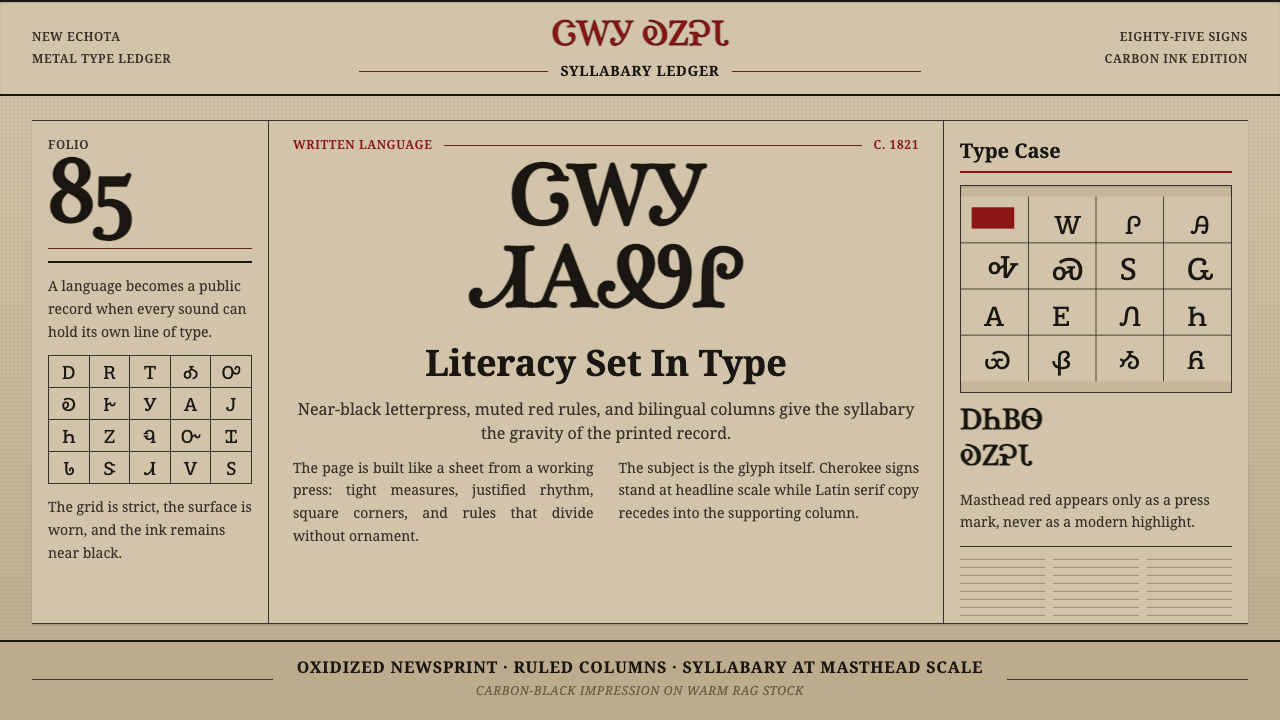 Cherokee SyllabaryLiteracy as inked record. Carbon type, muted red rules, and syllabary on tan…
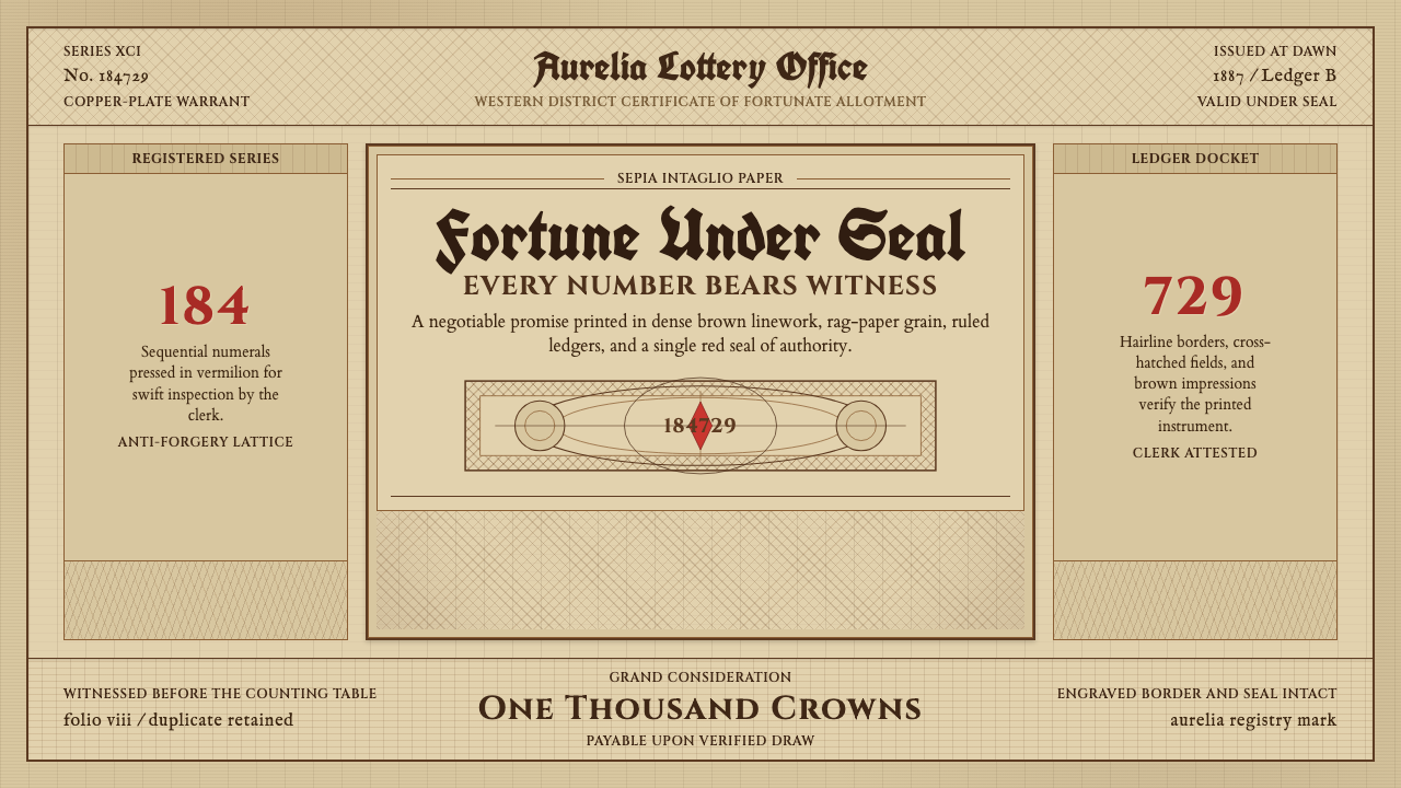 Engraved Lottery TicketLegal gravity in sepia. Guilloche borders, blackletter type, and a vermilion…
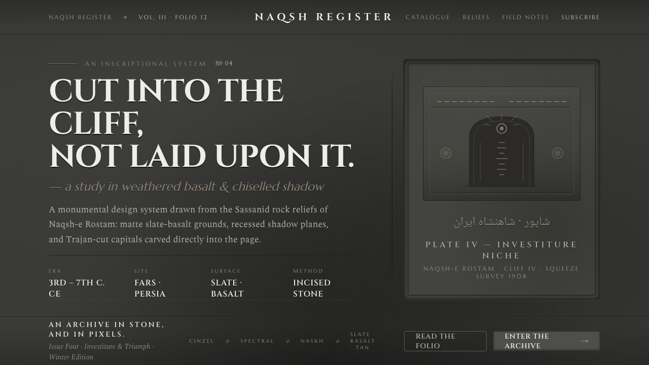 Iranian Dark Stone ReliefCarved into the cliff, not laid upon it. Slate-basalt grays, inset shadows, T…
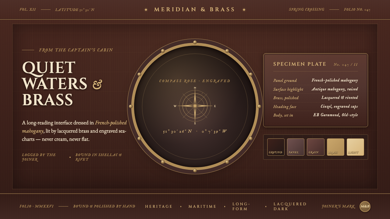 Mahogany Ship CabinPre-1900 maritime luxury. Mahogany panels, brass portholes, Cinzel caps over…
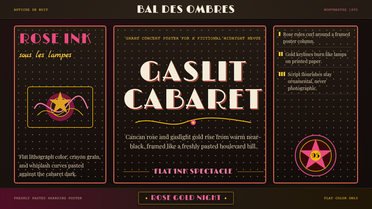 Belle Époque ParisCabaret night glows. Rose ink and gaslight gold curl across warm near-black p…
 Broadsheet LetterpressAuthority in ink. Lampblack serif decks lock into tan paper with strict ruled…