What is Par Avion Air Mail?
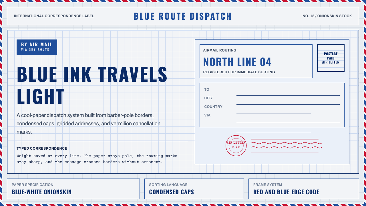
Par Avion is the graphic language of mid-century international airmail — where a postal bureaucracy accidentally invented a design system: cool-blue etiquettes, red-and-blue barber-pole borders, condensed caps, and the crisp geometry of a cancellation postmark, all engineered to be legible across borders and light enough to fly.
Par Avion Air Mail in brief
Par Avion Air Mail is a design style rooted in the visual standards of mid-century international postal service, governed by the Universal Postal Union (UPU). Its defining elements are the PAR AVION / AIR MAIL etiquette — a blue-ground label with white condensed caps — the diagonal red-and-blue stripe border running along envelope edges, and the cool-toned, featherweight aesthetic of onionskin paper. The palette is strictly cool: royal blue, postal vermilion, and near-black navy, never warm sepia or amber.
The style is simultaneously a functional system and an accidental aesthetic. Every element was originally justified by logistics — condensed letterforms saved space on addressing lines, light paper stock reduced postage weight, the distinctive border made airmail envelopes instantly distinguishable from surface-mail in sorting rooms. Taken together, these constraints produced a graphic grammar that is unmistakable: gridded, precise, and cool-toned, with none of the sentimentality that later postal nostalgia would attach to it.
Today, Par Avion sits at the intersection of institutional minimalism and retro-travel romanticism. It carries associations of distance, international transit, bureaucratic exactness, and the romance of physical correspondence in an era before instant communication. Applied thoughtfully, it lends any design the authority of a system that has crossed borders and survived handling — a kind of designed trustworthiness.
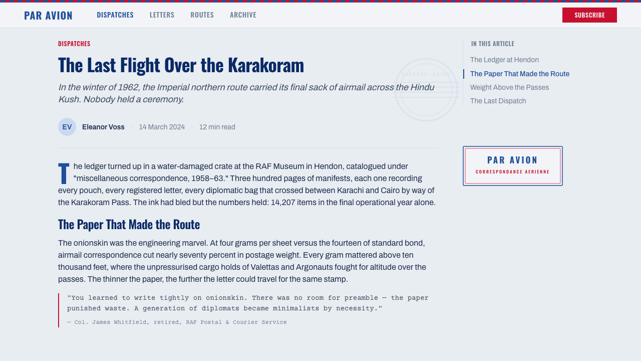
Where does Par Avion Air Mail come from?
The visual conventions of international airmail crystallized during the 1920s and 1930s, as commercial aviation expanded from a military novelty into a viable postal network. The Universal Postal Union, headquartered in Bern since its founding in 1874, established the framework for international postal cooperation, and the airmail etiquette — the blue PAR AVION label — became one of its most recognizable standardized products. By the 1930s, airmail routes connected Europe with North America, South America, and eventually Southeast Asia and Australia, and each route required envelopes that sorting staff in multiple countries could identify instantly, regardless of language.
The red-and-blue barber-pole border, sometimes called the 'airmail chevron,' entered the standard around the same time. Its visual logic was purely functional: solid-color envelopes blended into mail trays, while the bold edge stripe made airmail items stand out at a glance. The diagonal orientation — running at a consistent angle across all four edges — created a kinetic, directional energy that would later be read as romantic and travel-suggestive, but was originally just a sorting convenience. National postal administrations printed their own envelope stocks, but the border pattern was consistent enough across UPU member nations that the look became a globally recognized visual shorthand for overseas correspondence.
The onionskin paper that defined the tactile quality of airmail was a technological response to weight limits. Early transatlantic postal flights carried a weight surcharge significantly higher than surface mail, so correspondents learned to use the thinnest available paper stock — translucent, slightly blue-white, and almost tissue-like — to keep their letters within affordable limits. This paper's cool blue-white tint, combined with the blue etiquette and the cooler inks used in postal printing, gave airmail its characteristic chromatic register: cool, airy, and precise.
The era from roughly 1950 to 1980 represents the visual peak of the Par Avion aesthetic — the period after airmail became accessible to the middle class but before fax, then email, made overseas correspondence routine. During these decades, the genre accumulated its most familiar conventions: circular cancellation postmarks, typewritten addresses, wavy-line obliteration marks, and the layered visual evidence of transit — customs stamps, routing marks, postmaster labels — that made a received airmail envelope look like a document with a history. It is this accumulated documentary quality that contemporary designers working in the style are typically drawing on.
What defines the Par Avion Air Mail look?
Color and Tone
The Par Avion palette is resolutely cool and institutional. The dominant ground is a muted blue-white — the color of onionskin paper held to light — against which royal blue, postal vermilion, and near-black navy operate as primaries. Warm tones are categorically excluded: no sepia, no amber, no ivory yellowed by age. The vermilion used in the style is not a warm red but a postal red — close to pure hue, tipped slightly toward orange, chosen for its visual contrast against blue grounds in artificial lighting. Color in this system carries postal authority rather than emotional warmth.
Typography and Lettering
Condensed all-caps is the defining typographic register of Par Avion. The addressing conventions of international mail required maximum information density in minimum horizontal space, which drove the adoption of narrow, tightly-set uppercase letterforms. Typewriter typefaces appear in body correspondence — monospaced, regular weight, slightly uneven in impression — while routing labels and etiquettes use condensed display caps. Handwritten elements also appear: ink-pen cursive for signatures and personal notes, contrasting with the mechanical formality of typed addresses. The coexistence of these registers — mechanical cap, monospaced roman, and hand script — is part of the style's layered documentary quality.
The Border System
The diagonal red-and-blue border stripe is the single most recognizable element of Par Avion design — instantly legible from across a room, visually kinetic, and structurally bold. The stripes run at a consistent angle, with equal-width bands of red and blue alternating along all four edges of an envelope or document. Contemporary applications can use the border as a full-bleed edge treatment, as a partial accent strip, or as a container edge on card components. The border operates best when kept dense and tight — wide, loosely spaced stripes lose the compressed energy that makes the original so effective.
Postmark and Cancellation Geometry
The cancellation postmark — a circular stamp bearing date, location, and wavy obliteration lines radiating from its edge — is the most archival element in the Par Avion visual vocabulary. Postmarks function as time-stamps and geographic markers simultaneously, and their circular geometry provides an organic counterpoint to the otherwise strictly rectangular world of envelope addressing. Wavy cancellation lines, when they appear separately from the circular stamp, create dense rhythmic textures that carry a strong sense of passage — of documents that have moved through hands and systems. In contemporary design, postmark-derived circular elements and wavy-line patterns are used to add documentary texture without adding narrative illustration.
Grid and Structural Precision
Par Avion layouts are built on an implicit grid inherited from the physical constraints of envelope design: address block in a fixed zone, return address in a fixed corner, etiquette label in a fixed position, stamp area reserved at upper right. These zones never overlap and never round their corners. In contemporary design, this translates to a commitment to hard-edged compartmentalization — distinct rectangular zones with visible or implied separators, no soft boundaries, no blurred regions. The style cannot support amorphous or organic layout structures; everything must be addressable in terms of columns, margins, and stacked horizontal bands.
Documentary Layering
One of the most distinctive qualities of authentic airmail aesthetic is layering — the visual evidence of multiple hands, systems, and transit points. A well-traveled envelope might carry the sender's handwriting, a typewritten label from a shipping office, two or three different postmarks from origin and transit cities, a customs declaration sticker, and a routing notation added by a postal worker. This accumulation of marks, each from a different authority and a slightly different material, creates a richness that is the opposite of designed tidiness. Contemporary design borrows this quality through deliberate collage — overlapping type, stamp-like badges, handwriting-styled elements layered over mechanical type — but restraint is essential: too many layers tip into visual noise.
Material Lightness
The onionskin paper at the center of airmail's tactile identity was chosen entirely for its weight — or rather its absence of weight — but it produced a visual effect that is integral to the style: a slightly translucent, cool blue-white ground with a sense of fragility and preciousness. In digital and print applications, this material quality can be evoked through cool off-white backgrounds, subtle paper-grain textures (used sparingly), and a deliberate avoidance of dense or heavy-feeling surfaces. The style should always feel like it could be folded and sealed — light, capable of transit, built for distance rather than permanence.

Who shaped Par Avion Air Mail?
Founded in 1874 and headquartered in Bern, the UPU is the international body that standardized postal practices across member nations. Its regulations governing airmail — including the specifications for the PAR AVION etiquette, the weight limits that drove onionskin paper adoption, and the handling conventions that led to the barber-pole border — are the true author of the Par Avion visual system. The UPU did not intend to create an aesthetic; it intended to create logistics. The aesthetic is what happened anyway.
The postal authorities of France, the United Kingdom, the United States, Germany, Japan, and other major UPU members each produced their own airmail envelope and etiquette designs within the common standards. The French 'Par Avion' label, the Royal Mail's distinctive treatments, and the USPS airmail envelope graphic traditions each contribute variations on the shared vocabulary. Contemporary designers working in this style often draw on multiple national postal traditions simultaneously, combining them into a generalized 'international airmail' register rather than replicating any single national system.
The major intercontinental airlines of the 1930s through 1960s — Pan American World Airways in the Americas and Imperial Airways / BOAC in the British Commonwealth — developed their own visual systems that ran parallel to and reinforced the postal aesthetic. Pan Am's route maps, timetable graphics, and airmail promotions used the same cool-blue-and-vermilion palette and condensed lettering conventions that the postal services used, and the visual cross-pollination between airline and postal graphics was substantial. The romance of the Par Avion style is partly a romance of these airlines — of Clippers crossing the Pacific and flying boats landing in Southampton Water.
Contemporary art and design's relationship with Par Avion is largely mediated through the airmail envelope as a found object — the actual envelopes, ephemera, and postal artifacts collected by philatelists, vintage enthusiasts, and graphic designers who recognized their documentary and aesthetic value. Designers like Stefan Sagmeister and studios working in retro-travel aesthetics have drawn on these physical artifacts directly, scanning and incorporating actual postmarks, handwriting, and etiquettes into contemporary work. The style's richness in contemporary practice comes substantially from this tradition of treating the historic artifact as primary source rather than reference.
The manual typewriter was the primary instrument for producing the body text of airmail correspondence from roughly 1920 to 1980, and its visual characteristics — monospaced letterforms, slightly variable ink impression, the occasional struck-through correction — are inseparable from the Par Avion aesthetic at the personal correspondence scale. Machines like the Olivetti Lettera 32 and the Hermes 3000 produced correspondence typefaces that mix mechanical regularity with human imprecision in a way that no digital font has perfectly replicated. The presence of typewriter-style text in a Par Avion design immediately signals intimacy and authenticity within the postal framework.
How do you use Par Avion Air Mail today?
Par Avion is a highly specific aesthetic that rewards literal-minded application. Its visual system works because the original constraints that generated it — weight limits, cross-border legibility, postal sorting requirements — were genuinely rigorous. Contemporary applications work best when they treat those constraints as design principles rather than purely as visual references. This means: establishing a strict layout grid that mirrors the compartmentalized zones of envelope design, limiting color to cool-toned choices only, and resisting the temptation to add warmth or softness that would dissolve the institutional chill that gives the style its authority.
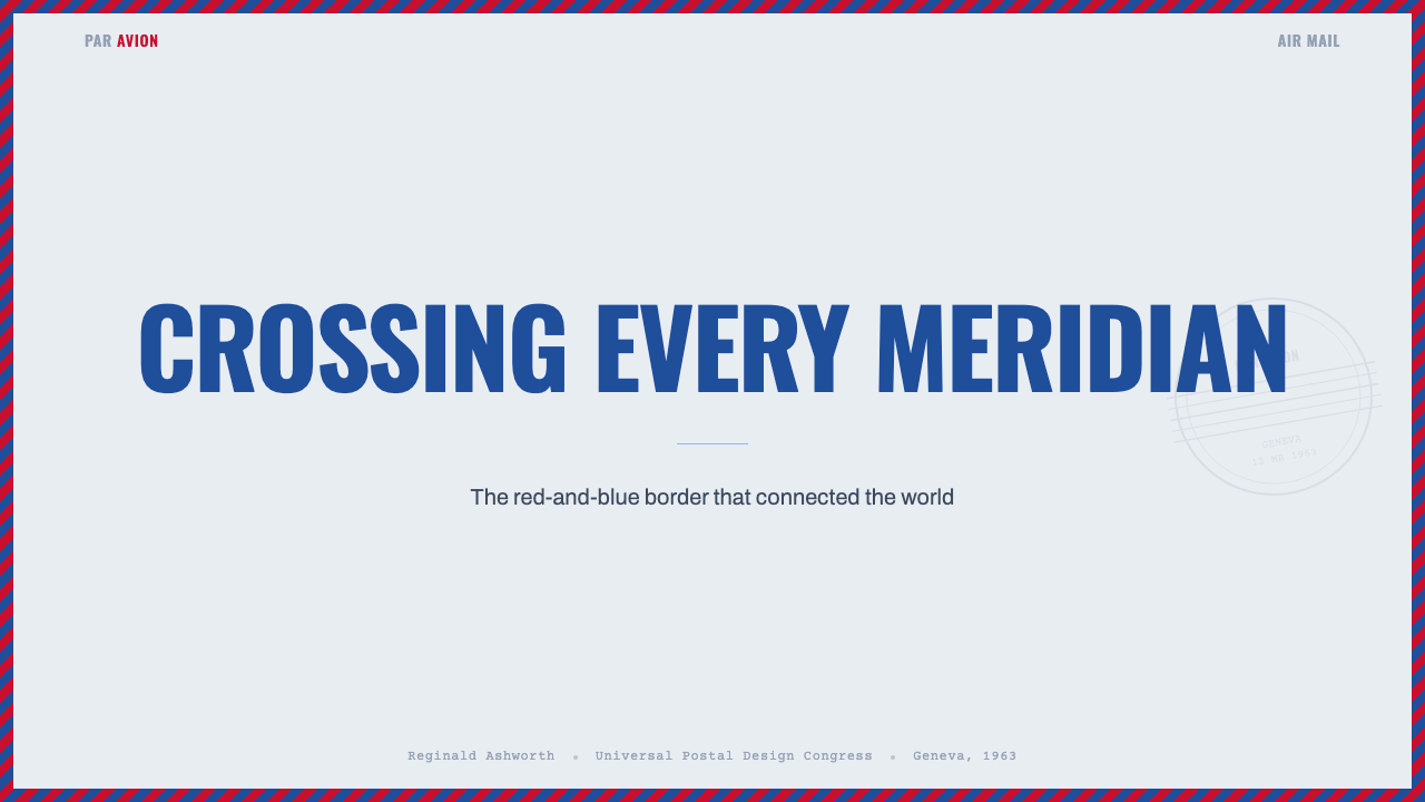
For presentation slides, Par Avion works most naturally on covers and section dividers where the full border treatment can be applied without interfering with dense content. A cover slide benefits from the diagonal stripe border as a full edge treatment, a condensed-caps headline in the style of an etiquette label, and a postmark-derived circular element anchoring a corner. Content slides work better when they adopt the grid discipline and the cool color restraint without trying to replicate every postal artifact — clean compartmentalized layouts with cool off-white grounds and type in navy or near-black will carry the register without becoming costume.
For web and digital product design, Par Avion suits contexts that want to communicate precision, authenticity, and a slight remove from contemporary digital defaults. A portfolio site, a print-on-demand service, a correspondence platform, or a logistics tool can all benefit from the style's bureaucratic cool. Apply it through hard-edged card components with a subtle border rule, a palette limited to cool white grounds and blue-navy text, and condensed-caps labels for metadata and UI controls. Avoid applying it to contexts that require warmth, playfulness, or organic texture — food delivery, children's products, and social applications will fight the style's institutional gravity.
For editorial and marketing work, the style supports layered documentary treatments: combining condensed-caps display type with monospaced body text, introducing postmark-style circular elements as section markers or visual accents, and using the border treatment as a framing device for featured content. Marketing materials in this style should feel like they came out of an international bureau — systematic, authoritative, with an implied weight of institutional backing behind them. The danger in marketing application is over-decoration: the style is inherently layered, but every additional mark must feel like it belongs to the postal system, not like it was added for visual interest.
The most common mistake when applying Par Avion is treating it as a warm nostalgic style rather than a cool institutional one. The airmail aesthetic is frequently romanticized — associated with longing, vintage travel, and pre-digital correspondence — and designers sometimes import that sentiment into their color choices and compositional softness. The result looks more like a vintage travel poster than an airmail envelope. Authentic Par Avion is not warm: its paper is cool blue-white, its inks are cold-toned, its geometry is precise and unsentimental. Warmth is the enemy of the style. If an application starts feeling inviting and cozy, the institutional chill that defines Par Avion has been lost.
Par Avion Air Mail — FAQ
Is Par Avion the same as general vintage travel design?
No, and the distinction matters. General vintage travel design draws on a much broader range of sources — ocean liner posters, railway ephemera, luggage labels, hotel stationery — and typically employs warm palettes, rich illustration, and art deco letterforms. Par Avion is specifically the postal and airmail register, which is institutional rather than promotional. Its color is cool, its geometry is precise rather than decorative, and its typography is functional condensed caps rather than expressive display lettering. When applied correctly, Par Avion looks like it came from a government bureau; vintage travel design looks like it came from a travel agency's marketing department. They are compatible but not interchangeable.
How do I use the diagonal border without it overwhelming the layout?
Scale and placement are everything. The original airmail border was narrow relative to the envelope surface — it framed without dominating. In contemporary applications, keeping the border to a consistent, relatively narrow band along edges (rather than expanding it into a major compositional element) maintains the framing function. Using the border on only one or two edges, rather than all four, is also valid — the diagonal energy reads even from a single stripe along one side. The border should feel like a postal designation, not wallpaper. When it starts to compete with content for visual attention, it has been scaled up too far.
Can Par Avion work in a dark-mode or dark-background design?
With significant caution. The original system was entirely light-ground — the cool blue-white of onionskin paper is central to the style's identity, and dark inversions lose a fundamental quality. That said, a dark version that commits fully to the institutional register can work: a near-black navy ground with cool white type, royal blue structural accents, and vermilion used very sparingly for the border only. The risk is that dark-mode Par Avion starts reading as spy thriller or secret document rather than postal bureaucracy — which is a different aesthetic entirely. A better approach for dark contexts is to use the typographic and grid conventions of Par Avion while choosing a dark navy ground that is still within the cool-blue register, rather than using true black.
How should photography or imagery be handled in Par Avion design?
Sparingly and with strong editorial treatment. The Par Avion visual system is fundamentally typographic and geometric — photography was not part of the original postal artifact language. When photography enters the system, it works best when treated as a stamp or postmark might treat imagery: tightly cropped, placed in a defined rectangular or oval field, and processed with high contrast or a cool-toned duotone treatment rather than in full natural color. Aerial photography — views of cities from above, coastlines, airports — connects naturally to the airmail travel context and can be used to add geographic specificity. Wide-open, warmly lit lifestyle photography is antithetical to the style and will collapse its institutional register instantly.
What makes Par Avion feel dated rather than classic?
Two things primarily: ironic overload and warm contamination. Ironic overload happens when every possible postal artifact is crammed in simultaneously — envelope borders, multiple postmarks, airmail labels, handwriting, wax seal graphics, distressed textures — in a way that signals 'this is a retro theme' rather than 'this is a precise system.' The original was never this self-conscious; it was austere because the logistics demanded austerity. Warm contamination happens when sepia tones, cream-going-to-yellow backgrounds, warm-tinted fonts, or vintage-warm illustration styles are introduced alongside the cool-blue postal palette. The result reads as 'old' rather than 'precise' — it has lost the institutional chill and acquired a kind of antique shop sentimentality that is the opposite of what the style is actually about.
Related design styles
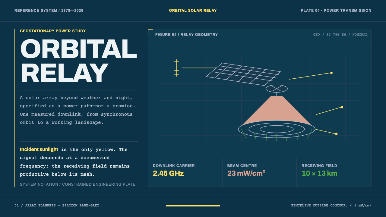 Orbital Solar RelayEngineering, not spectacle. Archivo and typewriter copy map a measured yellow…
 Wartime Ration CouponScarcity made visible. Buff card, red-blue overprint, and perforated grids do…
 Aeroflot Soviet AirlineEngineered restraint rules. Silver ground, royal-blue cheatlines, and flat gr…
 Martini Racing StripesAperitivo elegance at speed. Silver ground, Playfair serif, and a blue-navy-r…
 Microfiche ArchiveRecords as lit frames in a matrix. Cyan-blue back-lit panel, glowing mono typ…
 Shark Jaw & DentitionForensic and strictly greyscale. Bone-white serrated dentition floats on a co…