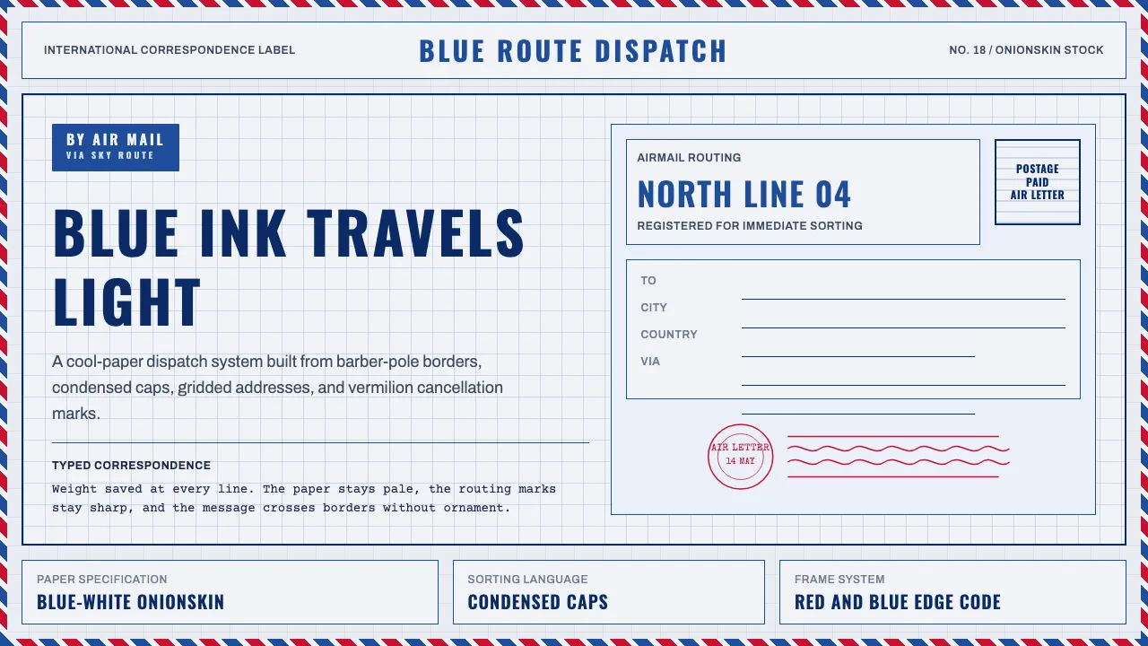
About Par Avion Air Mail
Par Avion is the visual language of mid-century international airmail: the UPU-standard PAR AVION etiquette, the red-and-blue barber-pole envelope edge, and featherweight onionskin paper tinted cool blue-white to shave postage weight. Ink is strictly cool — royal blue, postal vermilion, navy-black — never warm sepia.
Everything is engineered for lightness and legibility across borders: condensed caps for addressing, typewritten correspondence, circular and wavy-line cancellation postmarks, and a crisp gridded layout that never rounds its corners or softens its geometry.
- Origin
- Global / UPU member nations
- Era
- 1950–1990 (UPU airmail etiquette standard era)
- Key figures
- Universal Postal Union (UPU) · national postal administrations
- Movements
- Mid-century postal/transport graphic standards · international correspondence aesthetic
Par Avion Air Mail design spec
Colors
Typography
The other 11 sections — buttons, cards, spacing, motion, techniques and more — open once you unlock. Download the DESIGN.md or send it to your AI in one click. Unlock once, yours forever.
Sign up nowStyles similar to Par Avion Air Mail
Also inspired by print & type, with a close feel.
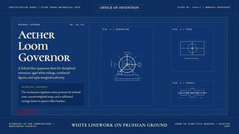 Patent Cyanotype Drawing (1880)Federal authority, chemically printed. Prussian blue gridwork carries aged-white patent lines.
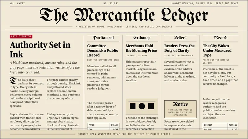 Gothic Blackletter Newspaper Masthead (1700)Authority in ink. Blackletter masthead, cream newsprint, and hairline columns.
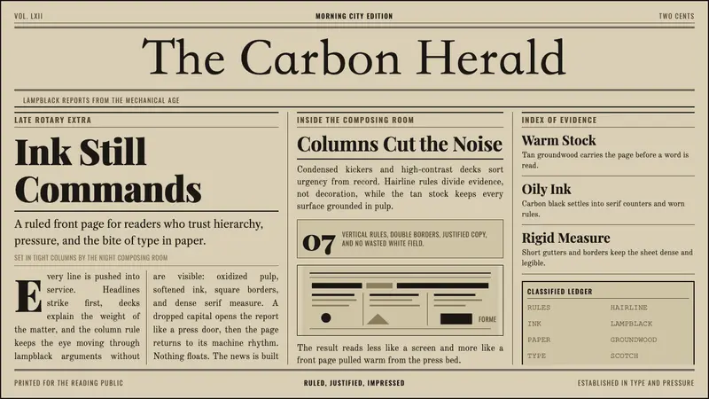 Broadsheet LetterpressAuthority in ink. Lampblack serif decks lock into tan paper with strict ruled columns.
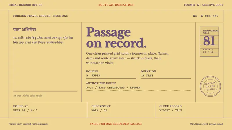 Trekking Permit 1980Order bears the journey. Violet letterpress rules hold typed records and crooked seals.