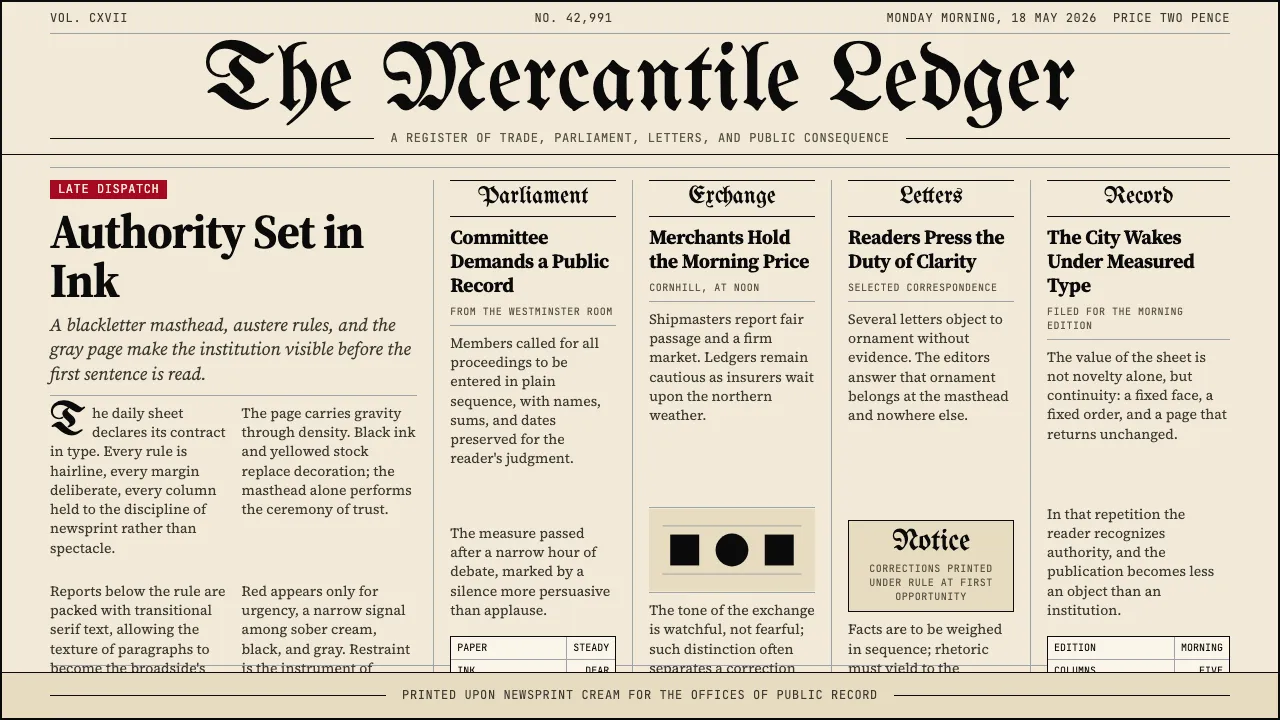
About Gothic Blackletter Newspaper Masthead (1700)
The blackletter newspaper masthead is the longest-running continuous visual identity in Western publishing. From The Times of London (1788) through The New York Times (1857) to today, the dense Gothic display lettering above a hairline rule declares institutional authority — the typeface itself is the contract with the reader. Below it, tightly set columns of transitional serif body text create the characteristic "gray page" of serious broadsheet journalism.
This system captures that specific materiality: yellowed newsprint cream, pure black ink, hairline column dividers, and the formal hierarchy where the masthead is the ornament and everything else is restrained reportage.
Learn more about the Gothic Blackletter Newspaper Masthead (1700) style
- Origin
- London, New York, continental Europe
- Era
- Late 17th-century English broadsides through 2024; NYT masthead 1857
- Key figures
- Henry Jarvis Raymond · Adolph S. Ochs · John Walter (The Times)
- Movements
- Anglo-American broadsheet journalism tradition · Pre-WWII print-newspaper visual identity · Paper-of-record formal aesthetic
Gothic Blackletter Newspaper Masthead (1700) design spec
Colors
Typography
The other 11 sections — buttons, cards, spacing, motion, techniques and more — open once you unlock. Download the DESIGN.md or send it to your AI in one click. Unlock once, yours forever.
Sign up nowStyles similar to Gothic Blackletter Newspaper Masthead (1700)
Also inspired by print & type, with a close feel.
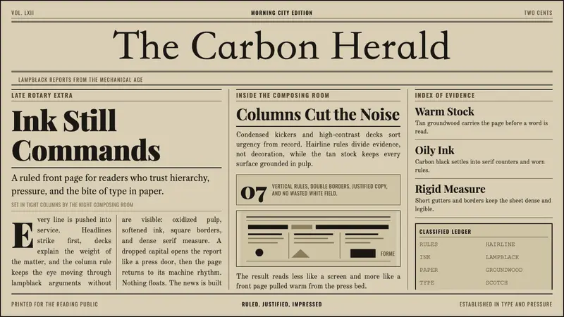 Broadsheet LetterpressAuthority in ink. Lampblack serif decks lock into tan paper with strict ruled columns.
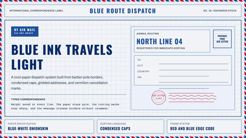 Par Avion Air MailPostal lightness made strict. Onionskin blue, Oswald caps, and red-blue edge stripes.
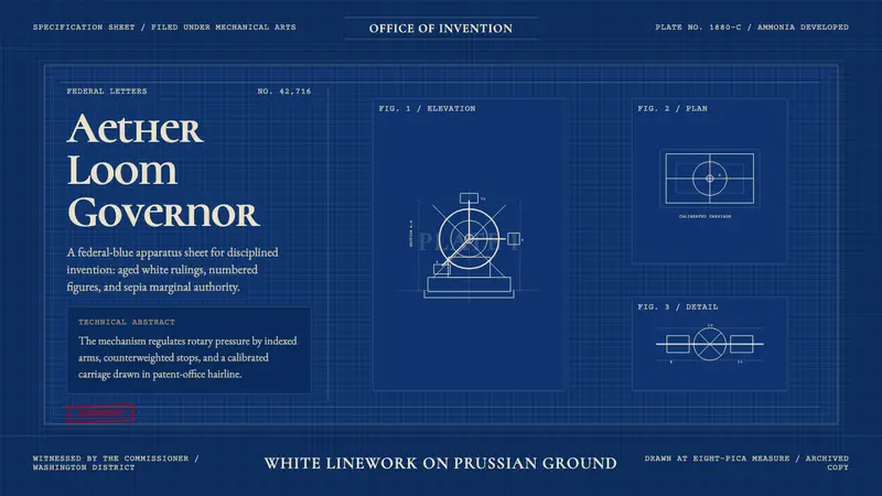 Patent Cyanotype Drawing (1880)Federal authority, chemically printed. Prussian blue gridwork carries aged-white patent lines.
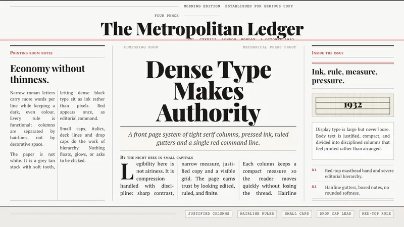 Times New Roman by MorisonAuthority under pressure. Dense black serif columns on grey-tan newsprint, ruled in red.