What is Gothic Blackletter Newspaper Masthead (1700)?什么是 Gothic Blackletter Newspaper Masthead (1700)?
For over three centuries, the dense Gothic script crowning a newspaper's front page has been the most recognized signal of institutional authority in Western print.三个多世纪以来,报纸头版顶端那一行浓密哥特字体,始终是西方印刷品中最广为人知的机构权威信号。
Gothic Blackletter Newspaper Masthead (1700) in briefGothic Blackletter Newspaper Masthead (1700) 速览
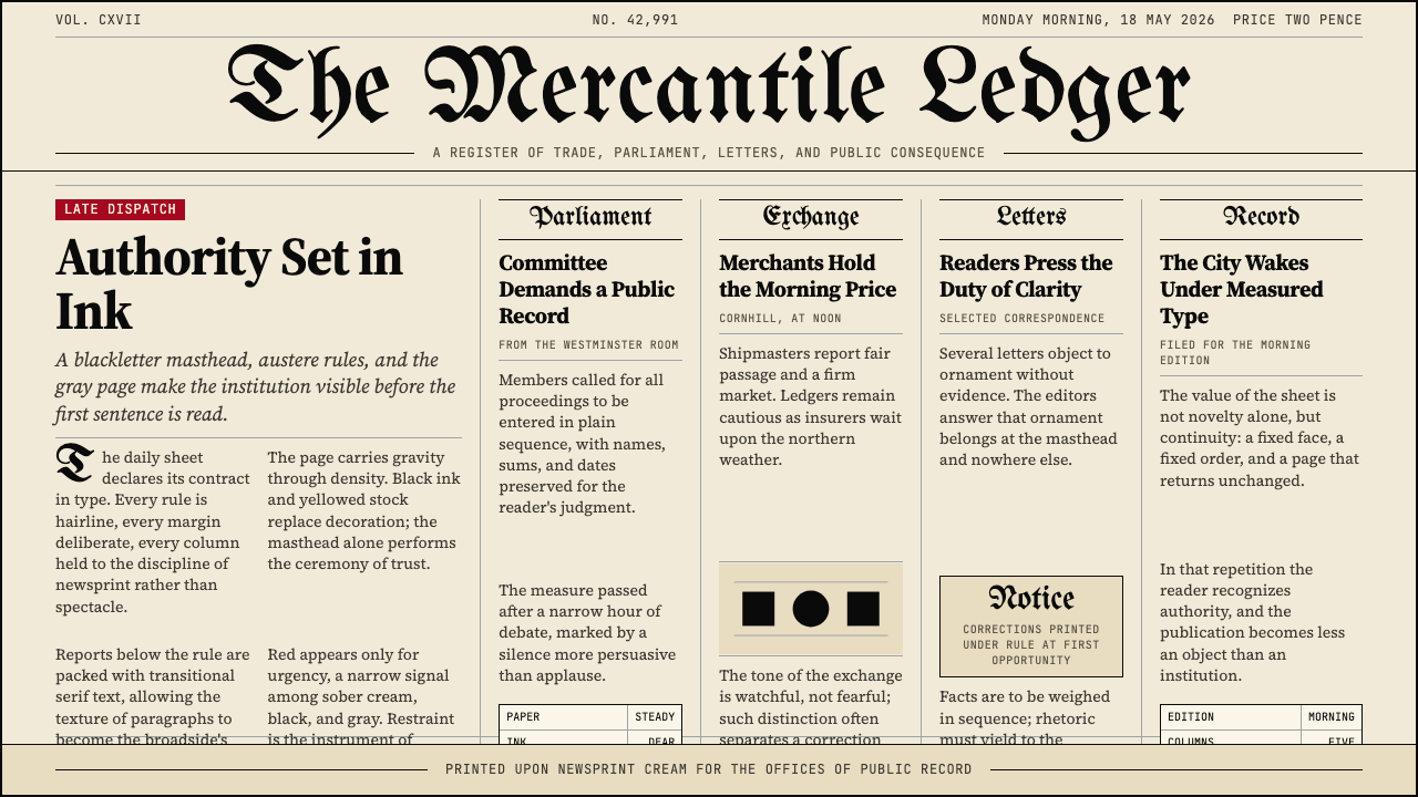
The Gothic Blackletter Newspaper Masthead style draws from the long tradition of dense, angular letterforms used at the very top of broadsheet newspapers from the late seventeenth century onward. The masthead — that single line of towering display type above a fine hairline rule — functions not as decoration but as institutional declaration. The typeface is the institution's signature, its legal identity, and its contract with every reader who picks up the paper.哥特黑体报头风格源于十七世纪末以来大报版面顶端所使用的浓密、有棱角的字体传统。报头——那一行横跨版顶的巨大展示字体,其下是一道纤细如发的横线——不是装饰,而是机构宣告。字体即机构的署名、法律身份,以及与每位拾起这份报纸的读者之间的契约。
Below the masthead, the visual system operates on strict restraint. Tightly set columns of upright transitional serif body text produce what editors historically called the 'gray page': a dense, even field of ink that signals seriousness, thoroughness, and a refusal to pander to the eye. Column rules as fine as a strand of hair divide the page into measured vertical bands. No illustration competes with the text; white space is not a design decision but a consequence of information density.报头之下,整套视觉体系以严格的克制运行。紧密排列的正立过渡衬线体正文构成编辑们历史上所称的「灰色版面」:一片浓密、均匀的油墨原野,传递着严肃、详尽、拒绝取悦视觉的态度。细如发丝的栏线将版面划分为纵向的测量带。没有插图与文字竞争;留白不是设计决定,而是信息密度的结果。
The material palette reinforces the effect. Aged newsprint cream — neither white nor beige but somewhere between — grounds the page. Against it, pure black ink registers with absolute finality. There is no intermediate tone, no graduated wash, no softening. The entire visual world of this style consists of two elements: ink and paper, absence and presence, authority and silence.物质质感强化了这一效果。陈旧新闻纸的奶油色——既非纯白也非米色,而是介于两者之间——托起整个版面。与之相对,纯黑油墨以不容置疑的终结性印落其上。没有中间色调,没有渐变晕染,没有柔化处理。这种风格的全部视觉世界只由两种元素构成:油墨与纸张,缺席与在场,权威与沉默。
Where does Gothic Blackletter Newspaper Masthead (1700) come from?Gothic Blackletter Newspaper Masthead (1700) 从何而来?
The roots of blackletter in newspaper publishing stretch back to the handwritten manuscripts of medieval scriptoria, where German scribes developed the dense, compressed letterforms called textura quadrata — angular strokes packed tightly together to minimize the expensive parchment consumed per page. When Johannes Gutenberg cast his moveable type in the 1450s, he modeled his letterforms on this existing scribal tradition, ensuring that print would inherit the visual authority that blackletter already carried. The first major European newspapers of the early seventeenth century — including the Relation of Strasbourg (1605) and the various Dutch corantos — adopted blackletter display type for their mastheads as a matter of typographic convention, not deliberate stylistic choice.黑体字在报纸出版中的根源可上溯至中世纪抄写室的手写羊皮卷,那里的德国抄写员发展出被称为「正方形纹理体」(textura quadrata)的浓密、压缩字形——紧密堆叠的有棱角笔画,以最小化每页消耗昂贵羊皮纸的面积。当约翰内斯·古腾堡在1450年代铸造活字时,他以这一现有的抄写传统为模型,确保印刷品得以继承黑体字早已承载的视觉权威。十七世纪初欧洲最早的主要报纸——包括斯特拉斯堡的《关系报》(1605年)和各种荷兰时事简报——在报头采用哥特展示字体,这是一种排印惯例,而非刻意的风格选择。
In England, the tradition crystallized around the broadsheet format during the turbulent politics of the seventeenth century. John Walter founded The Times of London in 1785 (initially as The Daily Universal Register), and its Gothic masthead quickly became the visual benchmark against which all serious English-language papers measured themselves. The Times's masthead was not merely decorative; it was the public face of a paper that claimed to speak for the nation's informed classes. Readers recognized the letterforms before they read a single word, and that recognition carried with it all the accumulated authority of the paper's history.在英格兰,这一传统在十七世纪动荡的政治环境中围绕大报格式结晶成形。约翰·沃尔特于1785年创办伦敦《泰晤士报》(最初名为《每日大众纪录报》),其哥特报头迅速成为所有严肃英语报纸衡量自身的视觉基准。《泰晤士报》的报头不仅仅是装饰;它是一份声称代表国家知识阶层发言的报纸的公众面孔。读者在读到任何文字之前便已认出那些字形,而这种认出本身便携带着这份报纸历史所积累的全部权威。
In the United States, Henry Jarvis Raymond co-founded The New York Times in 1851. Under Adolph S. Ochs, who purchased the paper in 1896 and adopted the motto 'All the News That's Fit to Print,' the masthead became a deliberate instrument of positioning. Ochs understood that the blackletter masthead communicated permanence and gravity in a single glance — qualities essential for a paper attempting to distinguish itself from the sensationalist 'yellow journalism' of Hearst and Pulitzer. The Gothic script was, in effect, a typographic argument about what kind of newspaper the Times intended to be.在美国,亨利·贾维斯·雷蒙德于1851年联合创办《纽约时报》。在1896年购入该报并采用「刊登一切适宜刊登的新闻」这一格言的阿道夫·S·奥克斯领导下,报头成为一种刻意的定位工具。奥克斯深知,黑体报头在一瞥之间就能传达永恒性与庄重感——这对一份试图将自身与赫斯特和普利策的耸人听闻「黄色新闻」区别开来的报纸至关重要。哥特字体实际上是一个关于《时报》打算成为何种报纸的排印学论点。
By the early twentieth century, the masthead convention had spread across continental Europe and throughout the British Commonwealth, each paper adapting the basic blackletter structure to its own national typographic traditions. German papers favored the most compressed and angular variants; British papers often introduced slight modulations in stroke weight; American papers tended toward slightly more open letterforms with generous descenders. What remained constant across all these variations was the fundamental visual grammar: dense dark letterforms against a light ground, a fine separating rule, and the implicit claim that this seriousness of presentation guaranteed seriousness of content.到二十世纪初,报头惯例已传播至欧洲大陆和整个英联邦,各国报纸将基本的黑体结构调适于本国排印传统。德国报纸偏好最为压缩和有棱角的变体;英国报纸常在笔画粗细上引入细微调节;美国报纸倾向于字形略为开放、下延笔画充裕的版本。在所有这些变体中始终不变的,是基本的视觉语法:浅色底面上浓密的深色字形,一道纤细的分隔线,以及一种隐含的主张——呈现的严肃性保证了内容的严肃性。
What defines the Gothic Blackletter Newspaper Masthead (1700) look?Gothic Blackletter Newspaper Masthead (1700) 的视觉特征是什么?
Blackletter Display Type黑体展示字体
The masthead letterforms are dense, angular, and highly compressed — strokes packed close together with pronounced serifs that terminate in sharp diamond or wedge shapes. The overall texture of a blackletter word is closer to a woven pattern than to isolated letters; individual characters are almost subordinate to the collective visual weight of the word. This density is not a fault to be corrected but the core property that communicates permanence. A single word set in this manner carries more visual gravity than a full sentence set in any light or transitional face.报头字形浓密、有棱角、高度压缩——笔画紧密堆叠,以锐利的菱形或楔形结尾的衬线显著突出。一个黑体词语的整体质感更接近编织图案而非孤立字母;单个字符几乎从属于整个词语的集体视觉重量。这种密度不是待纠正的缺陷,而是传达永恒性的核心属性。以这种方式排列的单个词语,比任何轻盈或过渡字体排列的完整句子都承载着更多视觉分量。
Cream Newsprint Ground奶油新闻纸底色
The background is not white. It carries the specific warm, slightly yellowed cast of aged newsprint — a tone that reads as earned rather than pristine. This distinction matters enormously: a pure white background would make the system feel clinical or digital; the newsprint cream gives it materiality and age. The warmth also softens the contrast with the black ink just enough to prevent harshness while preserving the fundamental legibility that the style depends upon.底面不是白色。它带有陈旧新闻纸特有的温暖、略微泛黄的色调——一种读来像是经过岁月积淀而非一尘不染的色调。这种区别至关重要:纯白底面会让整个体系显得临床化或数字化;新闻纸奶油色赋予它物质感与年代感。这种暖意也将与黑色油墨的对比微微柔化,足以防止刺眼,同时保留这种风格所依赖的基本易读性。
Hairline Column Rules发丝栏线
Vertical rules between text columns are drawn at the absolute minimum weight that ink and paper can reproduce reliably — barely visible as lines, registered more as a slight interruption in the gray field of text than as a positive mark. Their function is organizational rather than decorative: they guide the eye down each column without asserting a visual presence of their own. Thickening these rules even slightly shifts the character of the layout from broadsheet authority toward something more illustrative or decorative.文字栏之间的竖线以油墨和纸张能可靠再现的绝对最小线宽绘制——几乎作为线条难以察觉,更多被感知为文字灰色原野中的轻微中断,而非一个积极的标记。其功能是组织性而非装饰性:引导视线沿每一栏向下移动,而不主张自身的视觉存在。将这些栏线哪怕稍微加粗,版面的性格便会从大报权威感转向更具插图感或装饰感的方向。
Transitional Serif Body Text过渡衬线体正文
Body text is set in a transitional serif — a category of letterform sitting between the calligraphic old-style faces of the seventeenth century and the high-contrast modern faces that followed. These types have moderate stroke contrast, bracketed serifs, and vertical stress axes that produce even, upright columns of text. Set tightly — minimal leading, tight but not touching letter-spacing — this body text produces the characteristic 'gray page' that is almost as much a texture as a reading surface. The page is designed to be inhabited, not skimmed.正文以过渡衬线体排印——一种字形类别,介于十七世纪的书法体旧式字体与其后的高对比度现代字体之间。这类字体具有适度的笔画对比、有支架的衬线和产生均匀、正立文字栏的竖直重心轴。紧密排列——最小行距、紧凑但不接触的字距——此类正文产生几乎与其说是阅读界面不如说是质感的特征性「灰色版面」。这个页面是为驻留而设计的,不是为浏览。
Ink-on-Paper Contrast纸上油墨的对比
The color relationship is binary: pure black ink against the warm cream ground. There are no grays, no halftones, no tonal gradations in the typographic elements of the system. Where rules appear, they are black. Where type appears, it is black. The entire communicative burden is carried by the presence or absence of ink, by letterform against open field, by compressed stroke against breathing margin. This constraint is not poverty but discipline — the same discipline that makes the masthead's authority legible from across a newsstand.色彩关系是二元的:纯黑油墨对应温暖奶油底面。在这个体系的排印元素中,没有灰色,没有半色调,没有色调渐变。线条出现时是黑色的,字体出现时是黑色的。全部的传达重量由油墨的在场与缺席承担——字形对应开阔底面,压缩笔画对应呼吸留白。这种约束不是匮乏而是纪律——正是这种纪律使报头的权威从书报亭的另一端便清晰可辨。
Formal Typographic Hierarchy正式排印层级
The hierarchy of the broadsheet page is absolute and visible at a glance. The masthead sits at the apex, commanding the full width of the page at a scale that dwarfs everything below. Below it, the dateline and issue information are set at a significantly reduced scale in spaced capitals. Section labels and headline decks step down again. Body text is the base. This strict scalar logic — each level substantially smaller than the one above — means that the reader's eye always knows exactly where it is in the document hierarchy without needing color, icons, or visual devices beyond scale and weight.大报版面的层级是绝对的,一览而知。报头居于顶点,以矮化其下一切内容的尺度横跨版面全幅。其下,日期行与期号信息以间距拉开的大写字母显著缩小排印。栏目标签与标题副题再次降阶。正文是基础。这种严格的比例逻辑——每一层级都大幅小于其上层——意味着读者的眼睛总能在无需色彩、图标或比例与字重之外任何视觉装置的情况下,精确知晓自身在文件层级中的位置。
Structural Restraint结构性克制
Everything in this visual system is earned by function rather than applied for effect. Rules exist because columns need separating. The masthead is large because it must be read first. Margins exist because the eye needs a clear boundary. No element is present for visual richness, personality, or warmth. The style's severity is not coldness — it is the visual equivalent of a formal declaration, where every word chosen is the right word and none is added for comfort. This discipline is what distinguishes authentic broadsheet aesthetics from pastiche that merely uses blackletter fonts.这套视觉体系中的一切都因功能而存在,而非为效果而添加。栏线存在,是因为各栏需要分隔。报头巨大,是因为它必须被首先阅读。页边距存在,是因为眼睛需要清晰的边界。没有任何元素是为视觉丰富性、个性或温情而存在的。这种风格的严肃并非冷漠——它是正式宣告的视觉等价物,其中每一个被选择的词都是正确的词,没有任何词为舒适而添加。这种纪律,是将真正的大报美学与仅仅使用黑体字体的仿作区别开来的所在。
Who shaped Gothic Blackletter Newspaper Masthead (1700)?谁塑造了 Gothic Blackletter Newspaper Masthead (1700)?
John Walter founded The Daily Universal Register in London in 1785, which was renamed The Times of London in 1788. Under Walter and his descendants, the paper established the blackletter masthead as the visual standard for serious English-language journalism. The Times's Gothic masthead — its precise letterforms, the weight of its strokes, its relationship to the hairline rule beneath — became a template that newspapers across Britain, the United States, and the British Commonwealth referenced and adapted for generations. Walter's typographic choices were, in effect, the founding grammar of the broadsheet visual tradition.约翰·沃尔特于1785年在伦敦创办《每日大众纪录报》,该报于1788年更名为伦敦《泰晤士报》。在沃尔特及其后裔的领导下,这份报纸将黑体报头确立为严肃英语新闻业的视觉标准。《泰晤士报》的哥特报头——其精确的字形、笔画的粗细、与其下发丝横线的关系——成为英国、美国和英联邦各地报纸数代人参照和改编的模板。沃尔特的排印选择,实际上是大报视觉传统的奠基语法。
Raymond co-founded The New York Times in 1851 with George Jones, bringing the broadsheet visual conventions established by the London press across the Atlantic. Raymond, who had trained as a journalist under Horace Greeley at the New York Tribune, understood that the Gothic masthead carried social meaning beyond mere identification — it signaled the paper's commitment to political moderation and factual reporting at a moment when American journalism was polarized between sensationalism and partisan advocacy. His editorial and typographic choices helped define the 'paper of record' model that the Times has maintained in various forms to the present day.雷蒙德于1851年与乔治·琼斯联合创办《纽约时报》,将伦敦报业确立的大报视觉惯例带过大西洋。曾在《纽约论坛报》霍勒斯·格里利门下受训的雷蒙德深知,哥特报头所承载的社会意义远不止于识别——在美国新闻业在耸人听闻与党派倡导之间两极分化的时刻,它标志着这份报纸对政治温和与事实报道的承诺。他的编辑与排印选择帮助定义了「记录型报纸」模式,《时报》至今以各种形式维系着这一模式。
Ochs purchased the struggling New York Times in 1896 and transformed it into the authoritative national newspaper it remains today. His decision to maintain and formalize the Gothic blackletter masthead was deliberate and strategic: at a time when William Randolph Hearst and Joseph Pulitzer were deploying sensationalist headlines and dramatic illustrations to sell papers, Ochs used the masthead's visual severity as a competitive differentiator. The motto 'All the News That's Fit to Print' — which Ochs adopted in 1897 — was typeset in the same restrained voice as the masthead itself. Under Ochs, the Times's visual identity became inseparable from its editorial identity.奥克斯于1896年购入陷入困境的《纽约时报》,将其转变为它今天仍是的权威全国性报纸。他维持并正式确立哥特黑体报头的决定是刻意而具有战略性的:在威廉·伦道夫·赫斯特和约瑟夫·普利策以耸人听闻的标题和戏剧性插图来销售报纸的时代,奥克斯将报头的视觉严肃性用作竞争差异化工具。奥克斯于1897年采用的格言「刊登一切适宜刊登的新闻」,以与报头本身相同的克制声调排印。在奥克斯的领导下,《时报》的视觉身份与其编辑身份变得不可分割。
As a printer and publisher in colonial America, Franklin was instrumental in establishing the visual conventions of the American newspaper before the Revolution. His Pennsylvania Gazette, which he acquired in 1729, helped transplant the blackletter masthead tradition from English practice into the American context. Franklin's deep knowledge of typography — gained through his early career as a printer — meant that his editorial decisions were also typographic decisions. The Gazette's measured, legible layout, with its clear hierarchy and restrained use of display type, influenced the visual character of American broadsheet journalism for generations after his direct involvement ended.作为殖民地时期美国的印刷商和出版商,富兰克林在革命前对确立美国报纸的视觉惯例起到了重要作用。他于1729年收购的《宾夕法尼亚公报》帮助将黑体报头传统从英国实践移植入美国语境。富兰克林通过早年印刷生涯积累的深厚排印知识,意味着他的编辑决定同时也是排印决定。《公报》测量得当、易于阅读的版面,以其清晰的层级和克制的展示字体使用,在他直接参与结束后数代间持续影响着美国大报新闻业的视觉性格。
How do you use Gothic Blackletter Newspaper Masthead (1700) today?今天怎么用 Gothic Blackletter Newspaper Masthead (1700)?
The Gothic Blackletter Newspaper Masthead style is one of the few historical visual systems that carries immediate legibility at the semantic level — before users read a single word, the style communicates age, authority, and institutional seriousness. This makes it exceptionally powerful when those associations align with the product's intended positioning, and actively counterproductive when they do not. The first question to ask when considering this style is not 'does this look good?' but 'does my product benefit from being perceived as a centuries-old institution?'哥特黑体报头风格是少数在语义层面具有即时可读性的历史视觉体系之一——用户在读到任何文字之前,这种风格便已传达出年代感、权威性和机构的严肃性。这使它在这些联想与产品预期定位吻合时格外有力,而在不吻合时则适得其反。考虑使用这种风格时,首先要问的不是「这看起来好看吗?」而是「我的产品是否能从被感知为一家历史悠久的机构中获益?」
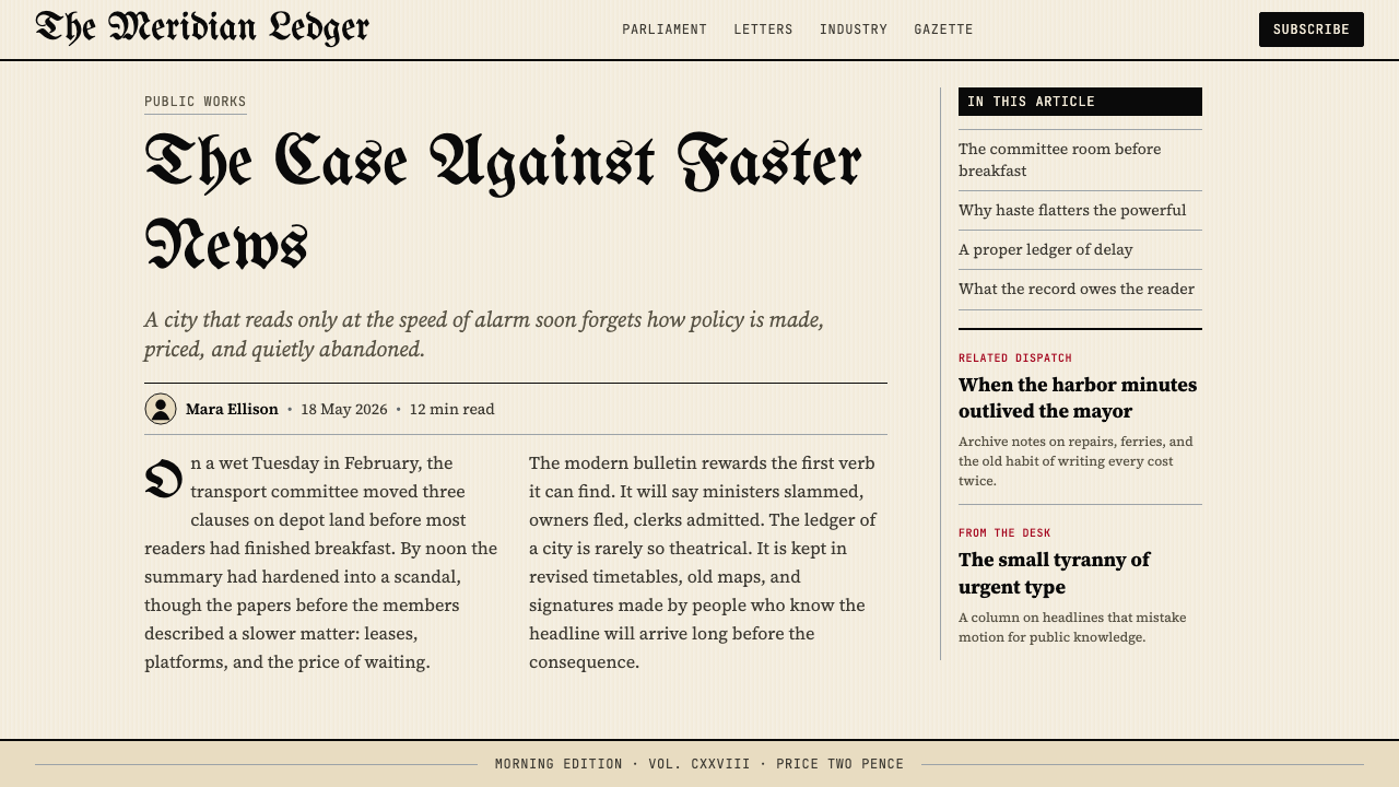
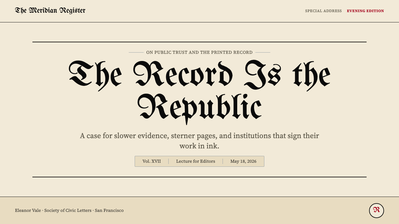
For presentation slides, the style excels on cover and section-break pages. A cover built in this aesthetic uses the full-width masthead treatment as its title: the presentation's name rendered in dense Gothic letterforms, centered or flush-left, above a thin separating rule, against a warm cream ground. Below the rule, in spaced transitional serif capitals at a fraction of the masthead size, sits the presenter's name, date, and organization. Content slides should abandon the Gothic for the body — blackletter at body text size becomes illegible — and instead use a restrained transitional serif for all running text, reserving the Gothic exclusively for slide titles or section headers where scale makes it readable. Data slides work especially well in this system when charts are rendered with thick black axis lines, no background fill, and labels in tight transitional serif rather than the rounded sans-serif faces that digital defaults tend to produce.在演示文稿中,这种风格在封面和章节分隔页上表现出色。以这种美学构建的封面将全幅报头处理作为标题:演示名称以浓密哥特字形渲染,居中或左对齐,横亘于一道纤细分隔线之上,铺设在温暖的奶油底面上。横线之下,以报头字号的一小部分,间距拉开的过渡衬线体大写字母排印演讲者姓名、日期和机构名。内容页应放弃正文中的哥特字体——黑体在正文字号时变得难以辨认——转而对所有流动文字使用克制的过渡衬线体,将哥特字体专门保留给比例使其可读的幻灯片标题或章节页眉。当图表以粗黑轴线、无背景填充渲染,标签以紧凑过渡衬线体而非数字默认偏好的圆润无衬线字体标注时,数据幻灯片在这套体系中表现尤为出色。
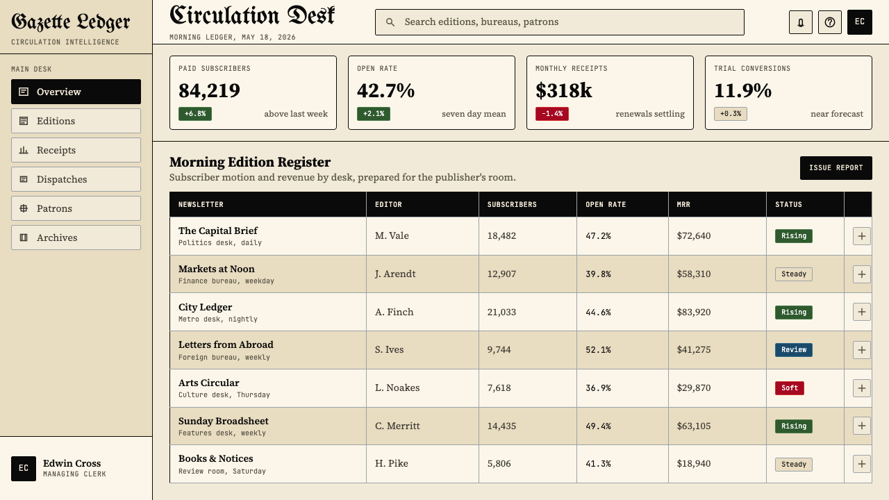
For web user interfaces, the style suits publishing platforms, archival databases, literary journals, and any product whose brand story involves historical depth or editorial authority. A newspaper-masthead-inspired dashboard uses a cream or warm off-white surface, all body text in a readable transitional serif, and the Gothic reserved exclusively for the product wordmark or primary navigation label. Card components should use fine ruled borders rather than soft-shadow elevation; dividing lines between content sections should be hairline weight. Pricing pages in this style work by presenting tiers as typographic columns — each tier headed by a Gothic display label, with features listed in tight serif below — rather than with the colored card grids that modern SaaS conventions favor.对于网页用户界面,这种风格适合出版平台、档案数据库、文学期刊,以及任何品牌故事涉及历史深度或编辑权威的产品。受报头启发的仪表板使用奶油色或温暖的近白色界面,所有正文以可读的过渡衬线体排印,哥特字体专门保留给产品文字标识或主导航标签。卡片组件应使用纤细边框而非软阴影高度;内容板块之间的分隔线应为发丝线宽。这种风格的定价页面将服务层级呈现为排印栏目——每个层级以哥特展示标签为首,功能以紧凑衬线体列于其下——而非现代SaaS惯例所青睐的彩色卡片网格。
For editorial and marketing work, the associations are most directly useful. A literary magazine, arts journal, independent newspaper, or heritage brand can use the full vocabulary: cream grounds, Gothic mastheads, hairline rules, and dense transitional serif body text. Marketing materials for law firms, financial institutions, universities, or any organization where longevity is a competitive asset benefit from selective deployment — a Gothic headline above a clean body of text, or a masthead-style lockup for a campaign that wants to signal considered, non-trend-driven values. Event posters for cultural institutions, conferences, and academic programs can use a full broadsheet layout as a graphic device, treating the poster surface as a miniature front page with a mock masthead at the top.对于编辑和营销内容,这些联想最为直接有用。文学杂志、艺术期刊、独立报纸或遗产品牌可以使用完整词汇:奶油底面、哥特报头、发丝横线和浓密过渡衬线体正文。律师事务所、金融机构、大学或任何以长久历史为竞争资产的机构的营销材料,受益于选择性部署——干净正文之上的哥特标题,或针对希望传达经过深思熟虑、非趋势驱动价值观的活动所使用的报头式锁定标识。文化机构、会议和学术项目的活动海报,可以将完整大报版面作为图形装置,将海报表面视为顶部有仿制报头的微型头版。
The most common mistake when applying this style is conflating 'blackletter' with 'decorative Gothic' and using the letterforms as ornament rather than as weight-bearing display type. Blackletter should appear only at large scales where its texture reads as authority rather than as illegible pattern. The second common mistake is applying the style to contexts that require warmth, approachability, or speed — a health application, a consumer e-commerce product, or any interface where users need to feel comfortable rather than impressed. The severity that gives the style its authority in one context is exactly what makes it alienating in another. The cream-and-black palette also carries specific cultural associations with old-media institutions that may clash with products positioning themselves as modern, digital-native, or globally inclusive.应用这种风格时最常见的错误,是将「黑体字」与「装饰哥特」混为一谈,将字形作为装饰而非承重展示字体使用。黑体字只应在字形质感被读作权威而非难辨图案的大比例下出现。第二个常见错误是将这种风格应用于需要温暖感、亲切感或速度感的场景——健康应用、消费类电商产品,或任何用户需要感到舒适而非被震慑的界面。在一种语境中赋予风格权威性的严肃,恰恰是它在另一种语境中令人疏远的原因。奶油与黑色的色彩搭配也携带着与旧媒体机构相关的特定文化联想,可能与将自身定位为现代、数字原生或全球包容的产品相冲突。
Gothic Blackletter Newspaper Masthead (1700) — FAQGothic Blackletter Newspaper Masthead (1700) · 常见问题
Can blackletter be used for body text, or only for mastheads and headlines?黑体字可以用于正文吗,还是只适合报头和标题?
Blackletter at body text size is effectively illegible for readers not trained in it, which means it should be reserved exclusively for large display applications — mastheads, section headers, and major headline treatments where the scale is sufficient for the texture to read as authority rather than as visual noise. Historically, German-speaking regions maintained blackletter as a body text standard well into the twentieth century, but this was a consequence of cultural familiarity rather than inherent readability. For any contemporary application targeting an international or even a general English-speaking audience, confine blackletter to display scale and use a transitional serif for all reading-length text.黑体字在正文字号时对未受过专门训练的读者来说实际上难以辨认,这意味着它应当专门保留用于大型展示场景——报头、章节页眉和主要标题处理,在那里比例足以使质感被读作权威而非视觉噪音。历史上,德语地区将黑体字作为正文标准一直维持到二十世纪,但这是文化熟悉度的结果,而非固有可读性使然。对于任何面向国际受众乃至一般英语读者的当代应用,将黑体字限制在展示比例,所有阅读长度的文字使用过渡衬线体。
How does this style differ from Victorian decorative typography?这种风格与维多利亚时代装饰排印有何不同?
Victorian decorative typography and blackletter newspaper mastheads were contemporaneous but philosophically opposite. Victorian display type — used in trade cards, circus posters, and commercial ephemera — celebrated ornament, novelty, and visual complexity. Letters were embellished with shadows, inline stripes, dimensional effects, and decorative flourishes. The blackletter newspaper masthead was anti-ornamental by definition: its density was inherited from manuscript tradition, not added for visual interest, and its authority came precisely from its refusal to compete with the decorated commercial culture around it. If Victorian type shouts for attention, the broadsheet masthead simply declares its presence with calm finality. This distinction is critical for application: using a decorated or shadowed blackletter face produces Victorian pastiche rather than editorial authority.维多利亚时代装饰排印与黑体报纸报头是同时代的,但在哲学上截然相反。维多利亚展示字体——用于商业名片、马戏团海报和商业印刷品——颂扬装饰、新奇和视觉复杂性。字母被阴影、内嵌条纹、立体效果和装饰花饰所点缀。黑体报头从定义上就是反装饰的:它的密度继承自手稿传统,而非为视觉趣味而添加,其权威恰恰来自于它拒绝与周围装饰性商业文化竞争。维多利亚字体高声呼唤注意,大报报头则以平静的终结性简单宣告自身的存在。这种区别对应用至关重要:使用经过装饰或加阴影的黑体字面,产生的是维多利亚式仿古,而非编辑权威。
Is the cream background essential, or can the style work on white or dark grounds?奶油色底面是必不可少的吗,还是这种风格在白色或深色底面上也能成立?
The cream ground is not a rigid requirement, but it carries significant meaning that white and dark grounds do not. Pure white makes the system feel contemporary and clinical, losing the material specificity that connects the style to the print tradition it references. A dark ground — black or very deep charcoal — can work for inverted applications, but it fundamentally changes the visual logic: the blackletter masthead, which reads as dense darkness against a warm light field, becomes a reversed element that requires careful weight adjustment to maintain legibility. Dark-ground versions of this aesthetic are more commonly found in entertainment, nightlife, and editorial contexts than in the institutional publishing applications where the style's full authority is most clearly expressed. If the cream is abandoned, the transitional serif body text and hairline rules become more important, not less, in maintaining the recognizable broadsheet grammar.奶油底面并非硬性要求,但它承载着纯白和深色底面所不具备的重要意义。纯白使体系显得当代化和临床化,失去了将这种风格与其所参照的印刷传统相连接的物质特殊性。深色底面——黑色或非常深的炭色——可用于反转应用,但从根本上改变了视觉逻辑:黑体报头在温暖光底上被读作浓密的暗,变成了需要仔细调整字重以维持可读性的反转元素。这种美学的深色底面版本更常见于娱乐、夜生活和编辑语境,而非这种风格的完整权威最清晰呈现的机构出版应用场景。若放弃奶油色,过渡衬线体正文和发丝栏线在维持可辨认大报语法方面变得更加而非更不重要。
How should white space be handled in this style?这种风格中应如何处理留白?
In authentic broadsheet design, white space is a consequence rather than a design tool. The page is dense by default; margins exist to prevent text from running to the physical edge of the paper, not to create breathing room as a deliberate aesthetic gesture. This is the opposite of most contemporary design thinking, where generous white space is treated as a premium signal. When applying this style in digital or presentation contexts, resist the temptation to open up the layout with large empty areas — this immediately reads as contemporary minimalism and drains the style of its authority. Instead, keep text blocks dense, allow columns to run close to dividing rules, and use scale contrast rather than open space as the primary organizing tool. When white space does appear — as it inevitably does between the masthead and the first headline, for example — it should be narrow, purposeful, and measured.在真正的大报设计中,留白是结果而非设计工具。版面默认是密集的;页边距的存在是为了防止文字延伸至纸张物理边缘,而非作为刻意的美学姿态来制造呼吸空间。这与大多数当代设计思维截然相反——在当代设计中,慷慨的留白被视为高端信号。在数字或演示语境中应用这种风格时,应抵制用大片空白区域打开版面的诱惑——这会立即被读作当代极简主义,并耗尽这种风格的权威性。相反,保持文字块的密度,让各栏紧贴分隔线,以比例对比而非开放空间作为主要组织工具。当留白确实出现时——比如不可避免地出现在报头与第一条标题之间——它应当狭窄、目的明确且有节制。
Does this style work for digital products, or is it inherently a print style?这种风格适用于数字产品吗,还是它本质上是一种印刷风格?
The style translates to digital with some adaptation, but it requires confronting an inherent tension: broadsheet design was optimized for a very specific physical format — a large sheet viewed at arm's length, in good light, by a reader who has already decided to engage. Digital interfaces are used at multiple screen sizes, often in variable lighting, by users whose attention is competed for by many other applications. The elements that work best in digital translation are the typographic hierarchy (which scales well), the cream background (which is easy on screens and reduces eye strain relative to pure white), and the hairline rule dividers (which are sharper on high-resolution screens than they ever were on newsprint). The blackletter masthead works on large screens and desktop web but should be treated with great care on mobile, where the density of the letterforms can collapse into illegibility. Fully responsive implementations of this style typically convert the Gothic display type to a slightly more open transitional serif at smaller viewport sizes, preserving the authority of the hierarchy while ensuring legibility.这种风格经过一些调适可以迁移至数字场景,但需要正视一种内在张力:大报设计是为非常特定的物理格式优化的——在良好光线下于臂长距离观看的大幅版面,由已决定投入阅读的读者使用。数字界面在多种屏幕尺寸下使用,通常处于可变光线环境,由注意力被许多其他应用竞争的用户使用。在数字迁移中表现最佳的元素是排印层级(可良好缩放)、奶油底面(对屏幕友好,与纯白相比减少视疲劳)以及发丝线分隔符(在高分辨率屏幕上比在新闻纸上更为清晰)。黑体报头在大屏幕和桌面网页上有效,但在移动端需格外谨慎——字形的密度在小屏幕上可能崩溃为难以辨认。这种风格完全响应式的实现,通常在较小视口尺寸下将哥特展示字体转换为略微更开放的过渡衬线体,在确保可读性的同时保留层级的权威感。
Related design styles相关设计风格
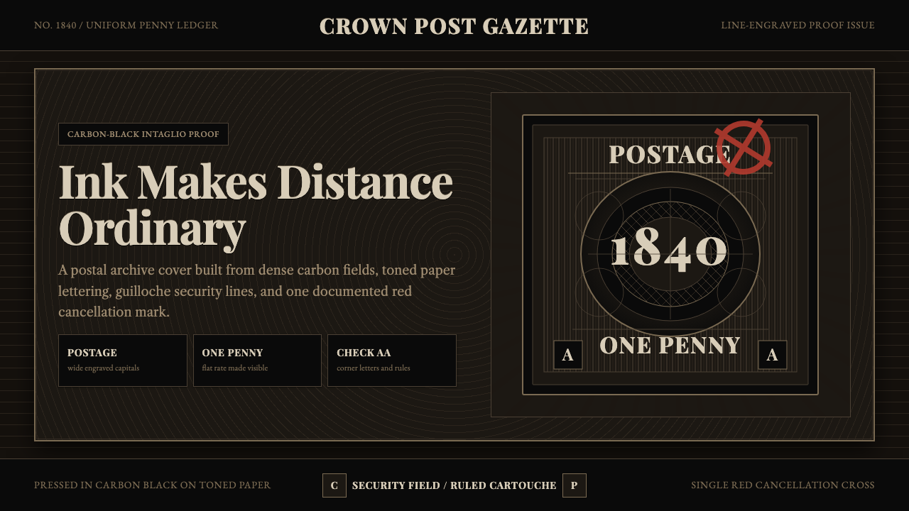 Penny Black StampBlack carries authority. Guilloche lines, Victorian serifs, and one red cross…黑色即权威:番纹线、维多利亚衬线与一枚红十字,皆如凹版压印。
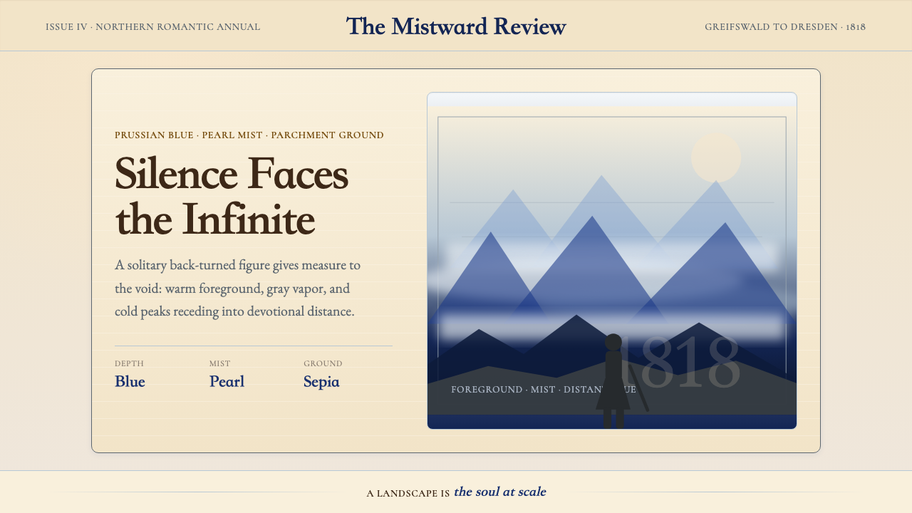 Caspar David FriedrichSilence becomes vast. Prussian blue depth, pearl mist, and parchment framing…寂静变得辽阔:普鲁士蓝纵深、珍珠雾与羊皮纸框层层后退。
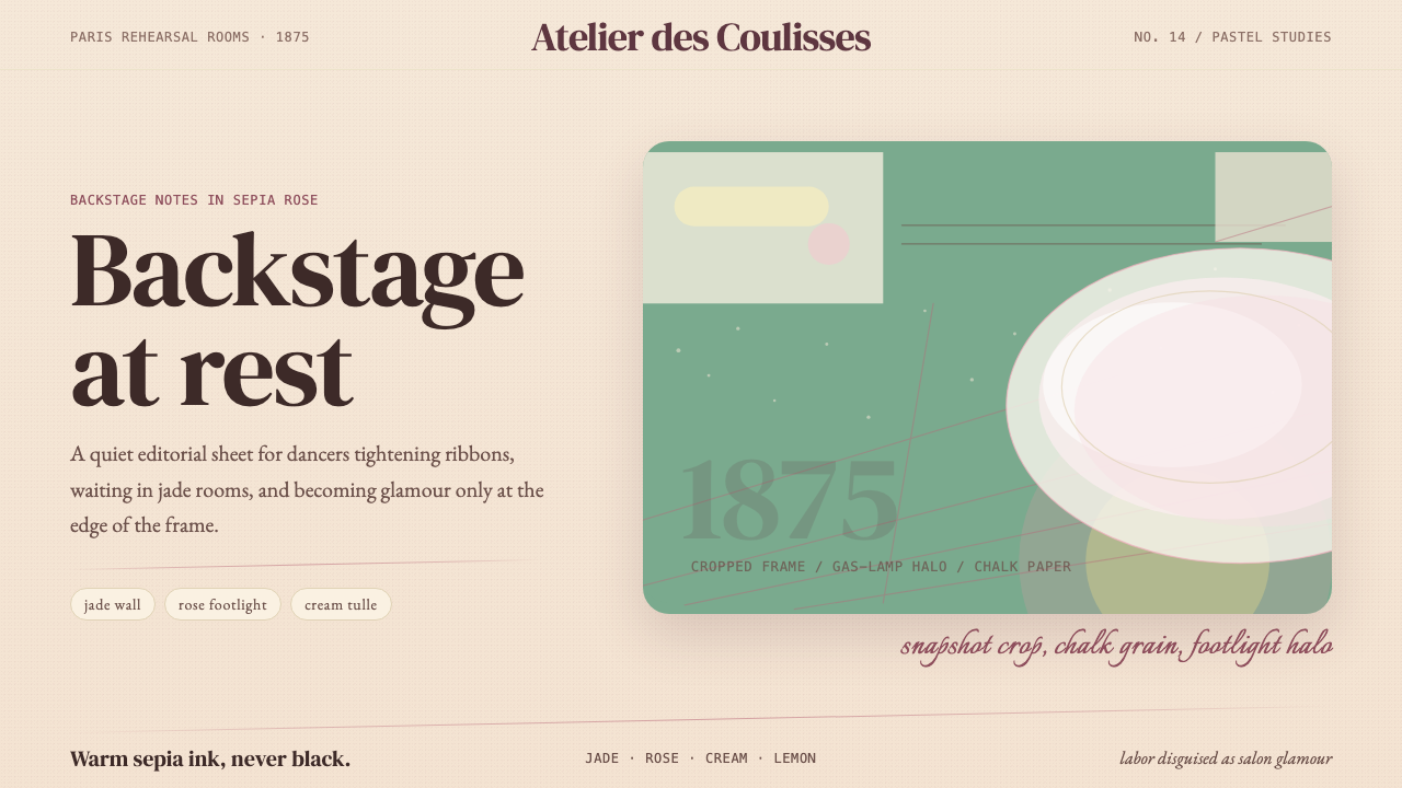 Degas Ballet PastelsBackstage glamour is labor. Jade walls, rose footlights, cropped serifs on cr…后台华丽即劳动。玉墙、玫瑰脚灯与裁切衬线落在奶油纸上。
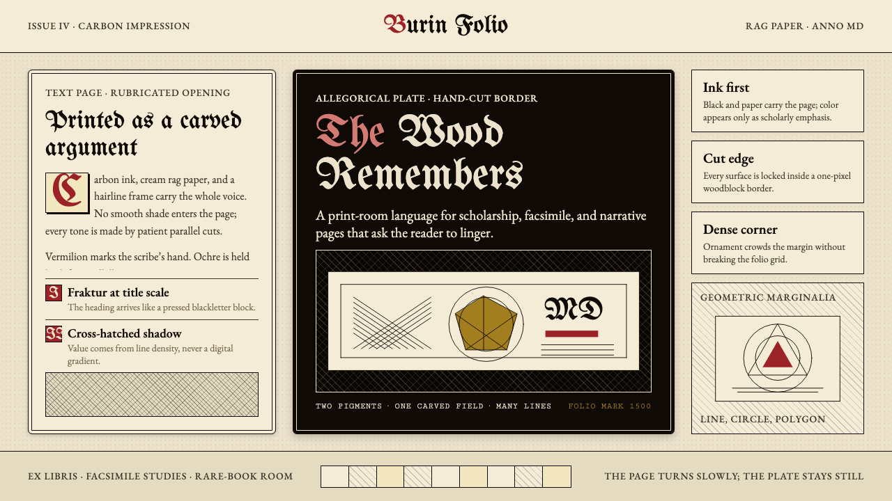 Dürer WoodcutInk remembers everything. Fraktur titles, rag-paper cream, and cross-hatched…木刻记住一切:哥特标题、破布纸奶油色与交叉排线。
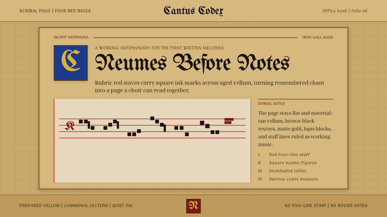 Gregorian Chant NeumesNotation becomes scripture. Rubric red staff lines and square neumes sit on t…记谱如经卷:棕褐羊皮纸上,红谱线承托黑色方形纽姆。
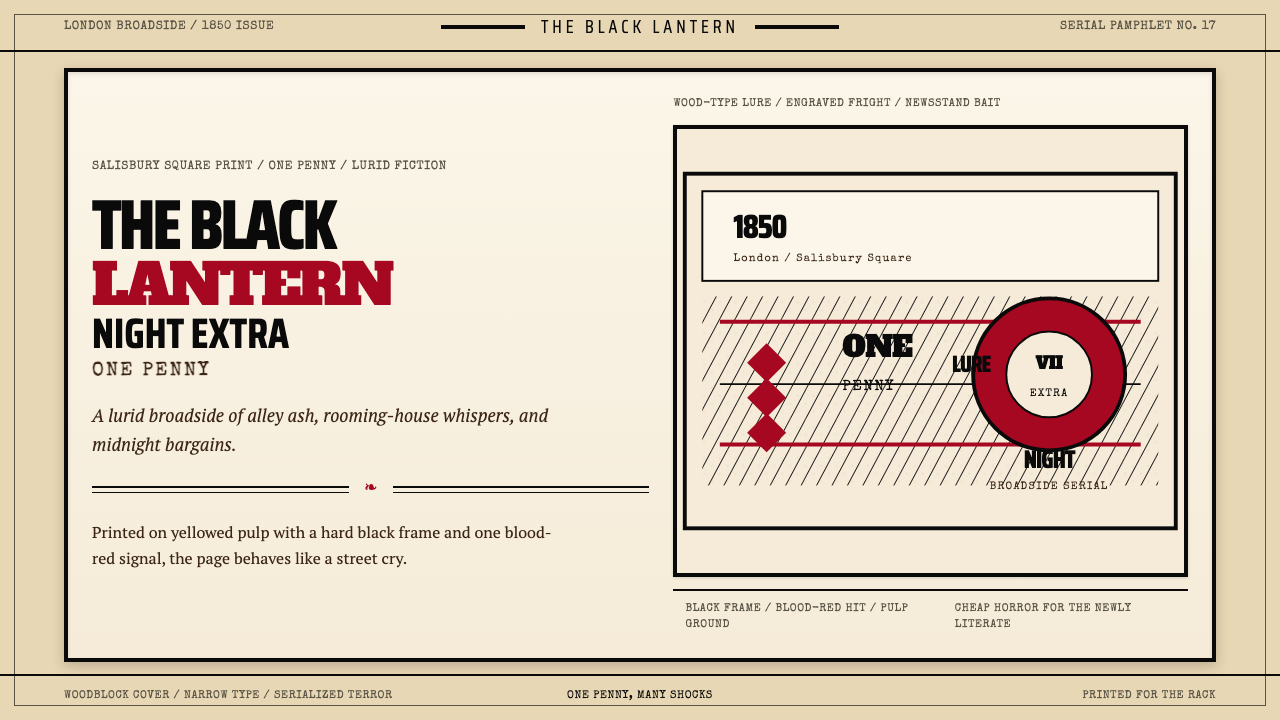 Penny Dreadful Victorian Headline (1850)Cheap terror in full cry. Condensed wood-type, black borders, and one blood-r…廉价恐怖全速开喊。窄体木活字、黑框和血红点染钉在泛黄纸上。